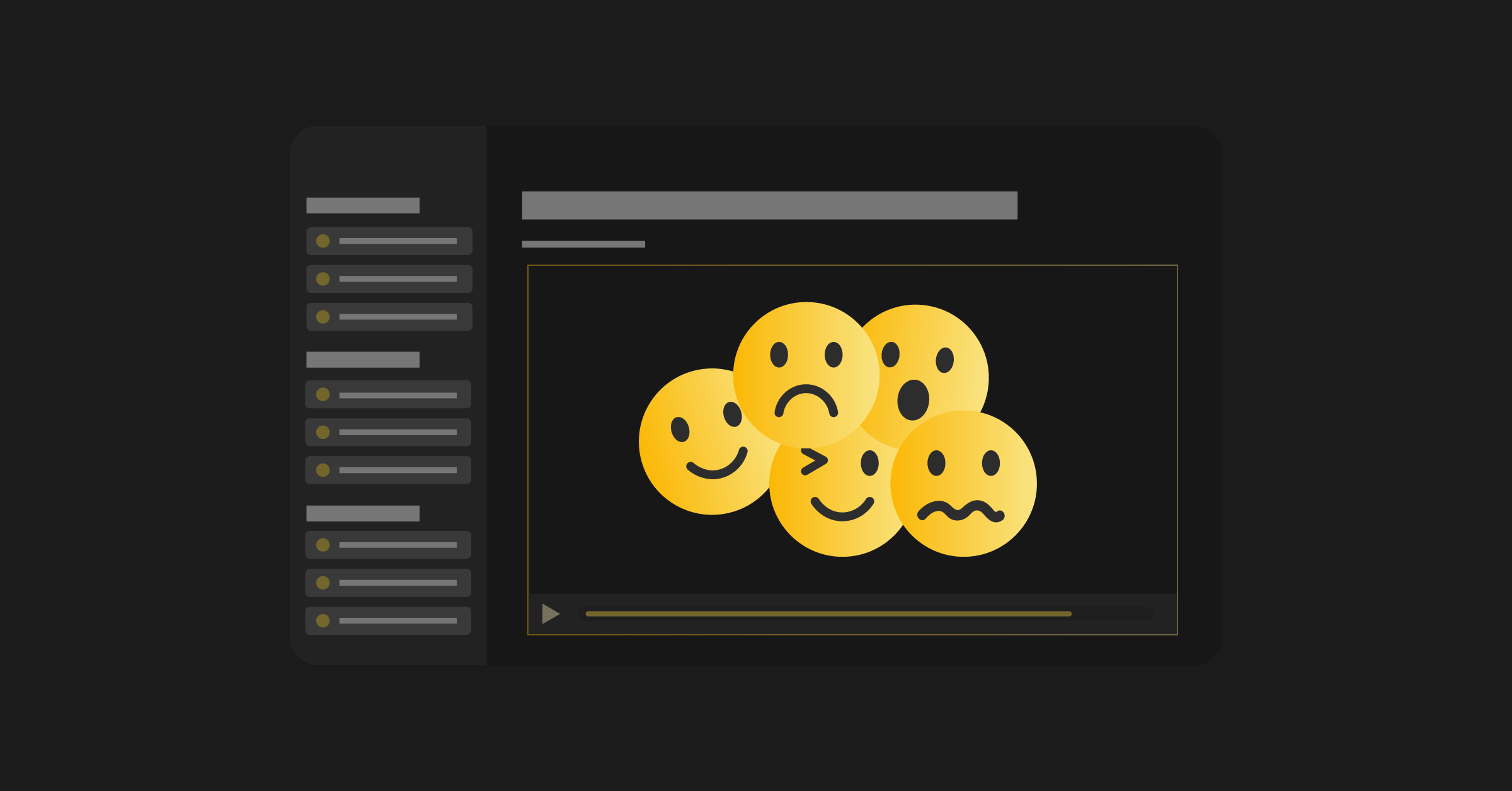
Without a good website, your product-led company is growing on “hard mode” and will likely run into issues with your SaaS website conversion rate.
The average difference in how users treat info above versus below the fold is 84%. This stat demonstrates why a well-designed, user-friendly website is a must.
Your website is critical in promoting your product’s value and helps sell more software. When you combine sales strategy with a specific target market, you get clarity on what performs best for your business.
Your sales strategy will differ depending on your core customer. Targeting enterprises or selling directly to end-users will direct your decision-making.
Ultimately, you want buyers to engage with a demo, proving that your solution achieves the advertised results. This will most likely be a free trial when dealing directly with users. In every case, experiment with how to place your product in the customer’s hands to boost conversion to sales.
We’ve all been there – you design a website and get carried away choosing the perfect colors and layout, only to think about the copy at the last minute. But, doing so is a considerable risk. Prioritizing copy ensures that you’re speaking to the customer in their language, and this targeted approach and focus on language-market-fit increases conversion.
7 SaaS Website Best Practices to Boost Conversion Rate
- Discover Your Value Proposition
- Frame Your User as the Hero
- Experiment With Trial Alternatives
- Embrace Testing and Experimentation
- Design a User-Friendly Experience
- Focus On User Flow and Navigation
- Show the Product
Let’s delve into each of these best practices in more detail.
1. Discover Your Value Proposition
Your value proposition is the first impression you give of your company. Ask yourself how it catches the eye of potential customers: Is it inspiring? Specific? Is there a clear call to action?
There’s no one correct formula for a value proposition. However, with some trial and error, you can work out what you want the focus to be.
3 Value Proposition Formulas
- What Your Product Is: Include a simple, snappy statement describing the product.
- What Your Product Does: Outline the intent of the product.
- What You Can Do With Your Product: Sum up the product’s potential and what the user can achieve through engagement.
Generally, the best value propositions are:
- Targeted: Clearly state who the product is aimed at.
- Specific: The value proposition isn’t specific enough if it can be applied to another product.
- Unique: Set your product apart from competitors.
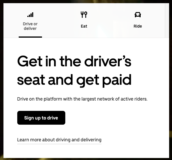
Examples of Brands With Great Value Propositions
Take a look at Uber’s strong value proposition. The goal is to entice potential drivers. They successfully do this with the “Get in the driver’s seat and get paid” headline, followed by an appealing statistic about its rider network.
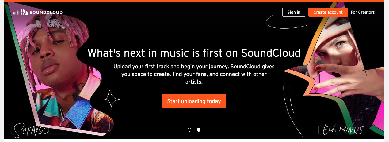
SoundCloud has taken a different approach, focusing on the product’s potential in its value proposition by highlighting what users can get out of it. In this case, space to create, find your fans, and connect with other artists.
Ultimately, pick a value proposition that sticks in people’s minds for positive reasons. The best way to do that is to get to know your audience.
How to Write Your Value Proposition
Tackle the challenge of writing customer-optimized copy. Start by asking your customers:
- Why are you engaging with our brand?
- What problems do you have?
- What solutions are you looking for?
You don’t have to reinvent the wheel. Learn from what others have done to increase their products’ SaaS conversion rates.
Neil Patel is an online influencer with lots of advice about the importance of speaking directly with your customers.
Here’s one of his top tips for getting started writing your value proposition:
Ask open-ended questions (not multiple choice). Doing so helps you record a breadth of language that you can translate into effective messaging for customers. By hearing the types of phrasing used commonly by customers, you will be better informed about how to word your own content.
And remember, collecting answers is only step one. Using customer feedback to prioritize certain features is also important. Many areas of your business may already be doing this customer research, so now it’s about identifying and utilizing it. Talk to your team, share insights, and do whatever it takes to get real user feedback.
2. Frame Your User as the Hero
Speak to your users. Your entire communication strategy should address them directly.
Visualizing the benefits of your SaaS product is helpful to customers. Paint a vision in the customers’ minds of the perfection and ease that your product can bring to their job and daily tasks.
A great technique is showcasing the old way of doing something (before or without your product) and the new way (how much easier the solution of your product makes the task in question). Make sure that the before and after gap is very evident.
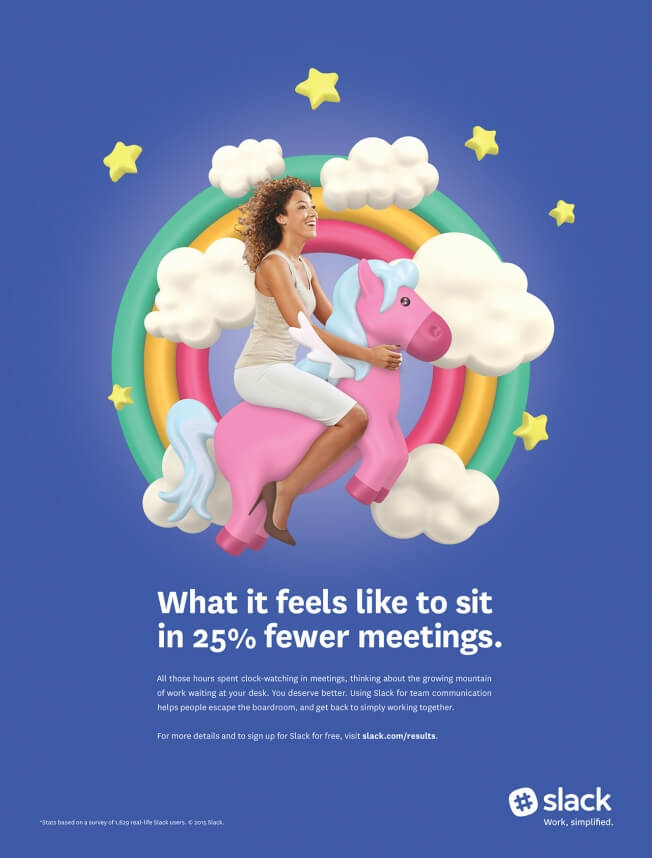
This Slack advertisement uses a catchy value proposition in the “before and after” style.
The picture you paint of your product needs to be credible, clear, and easy to grasp. Speak as a trusted friend, and don’t use vague language to draw people in, only for them to be later confused or disappointed.
This is why asking your customers many questions directly is useful – content based on customer research is most helpful to them. Your focus will likely be on encouraging SaaS users to sign up for a free trial, so consider keeping some content ungated, as barriers can be off-putting.
Finally, your homepage needs to have these five elements:
- Overall Value Proposition
- Before and After
- Explain the Problem
- Introduce Your Solution
- Close With a Call to Action
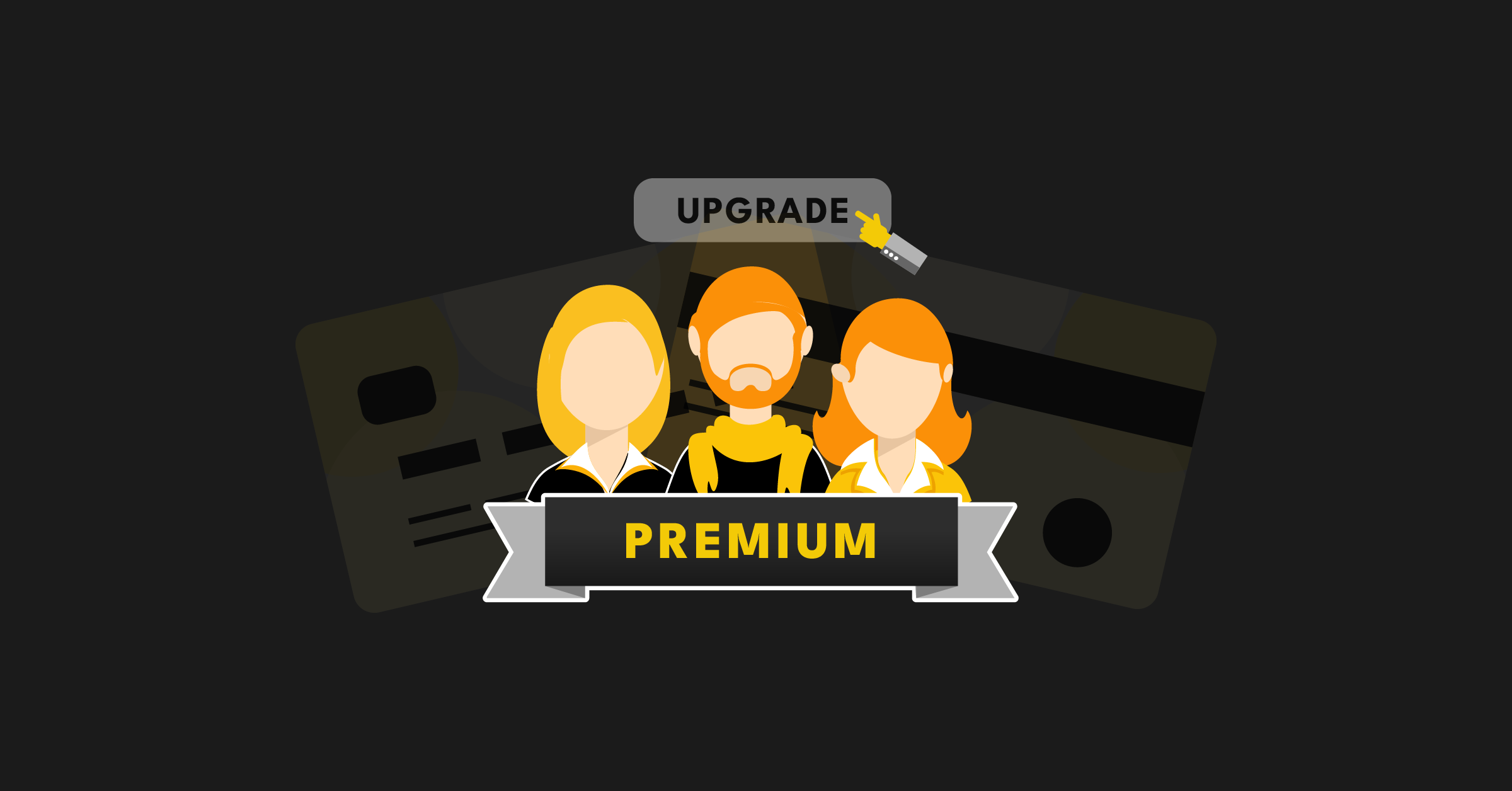
3. Experiment with Trial Alternatives
Try experimenting with trail alternatives to boost the conversion rate of your SaaS website. In other words, place your product into the customers’ hands.
We all love a free trial – getting to try something out before we part with our hard-earned cash is very appealing. When it comes to SaaS, offering a free trial can be beneficial. However, you should first consider why you are offering the trial and decide if it is the best option for your SaaS product.
First and foremost, the potential user needs to understand the value of your product without much effort. Free trials are often the go-to strategy, but other ways exist to achieve the same goal. Try:
- Social Proof: Provide statistics or recognizable logo designs in your branding to show customers that your product has received external validation from esteemed companies that they will have heard of and respect.
- Recap on the Benefits: Be clear and direct with your top-selling points.
- Just Get Started: Add a very brief introduction to your product.
- In-Line Sign-up: Users don’t need to go to a separate page within your website to sign up. They can simply enter their email address on the homepage.
- Plain Vanilla: Your customer is already on your site, so there’s no need to make a hard sell. Keep the message simple.
4. Embrace Testing and Experimentation
How should changes be made and introduced to customers?
“If Edison had just focused on continuous improvement, he would have just come up with a better candle.”
This quote is often thrown about as part of the radical vs. iterative debate. Edison’s lightbulb was radical, but he tried more than 1000 iterations. Radical has value, but it’s one variable to find the mountain and another to climb it.
The best teams embrace testing and experimentation to build the best website. Success rarely comes on the first attempt.
Always monitor and test:
- Homepage Value Proposition
- Demo/Trial/Signup Points
- Call to Action
- Homepage Flow
- Product Tour Flow
- Pricing Page
- High-Traffic Landing Pages
- Customer Service Chatbots
- Email Subject Lines and Body Text
Every variable is constantly evolving and changing. You’ll fall behind without a method to gather data and keep your website updated. A new website becomes obsolete if you wait two to five years to make updates.
5. Design a User-Friendly Experience
It is thought that beauty makes you trustworthy and your partner tolerant; the same goes for websites. However, in this context, beauty means familiarity and simplicity.
Following website conventions – such as the search function on the top right-hand side — can be a good starting point for drawing in people. As a general rule, more website clutter translates to lower conversion rates. More simple designs are often seen as more beautiful and white space draws focus to the value proposition or other point of interest.
Appcues is a great example of a user-friendly SaaS website built with conversions in mind.
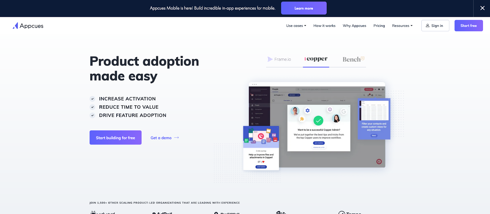
Want to boost your conversion rate? Start with a design that places its value proposition above the fold.
In the case of Appcues, “Product adoption made easy” is stated above the fold. This value proposition is reinforced with bullet points, a screenshot of the product, and “Start building for free” and “Get a demo” call-to-action buttons.
Regardless of the direction you take with design, don’t lose sight of its purpose: to engage visitors from the second they land on the homepage.
6. Focus on User Flow and Navigation
Flow and navigation are critical to designing a high-converting SaaS website.
You want visitors to follow these steps once they land on your site. Keep the user focused and guide them to the next step. A user left feeling clueless will likely abandon your website.
Memberstack doesn’t take user flow and navigation for granted.
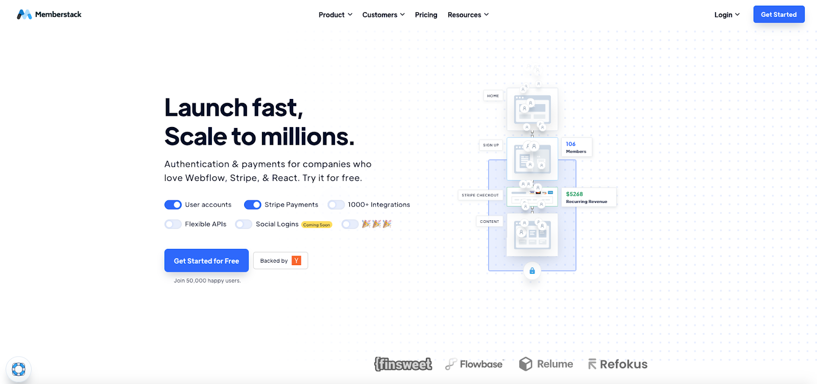
Whitespace draws your eyes to the middle of the screen –and that’s what Memberstack wants. Here, you’ll find a “Get Started for Free” call-to-action. If you don’t click the button, the navigation bar at the top of the screen picks up the slack. You can click Product, Customers, Pricing, or Resources for more information.
7. Show the Product
The show the product (STP) principle gives the user a feel for the product. It’s intended to demonstrate the product’s core functionality, potential, and specific uses.
Social proof can also be helpful in this area. People like to buy on recommendation, so making clear any well-known clients or allies, or even outlining some customer success stories, can be a strong strategy.
Speaking of social proof, Kisi does it right.
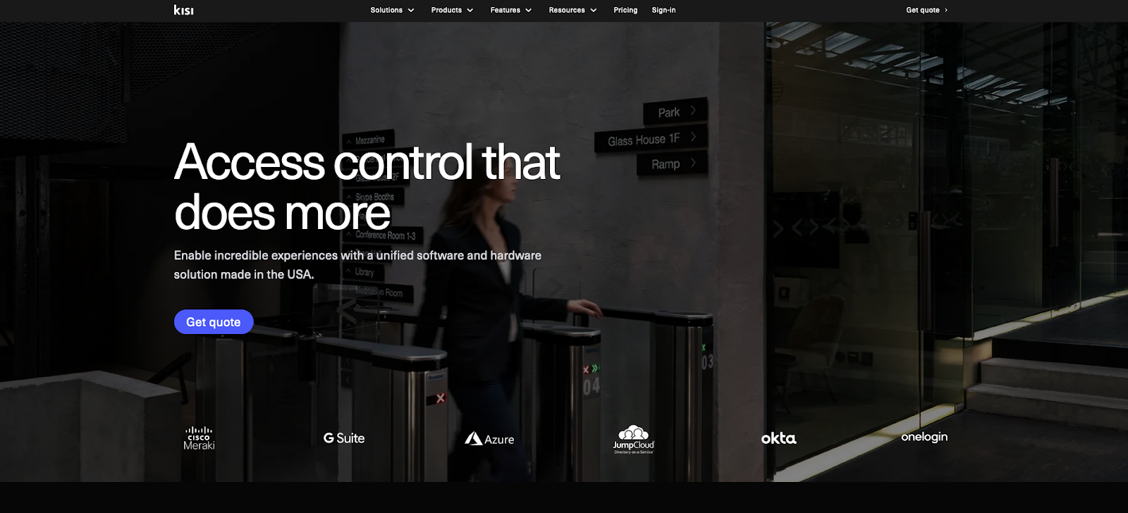
With a homepage free of clutter, it’s hard to overlook the six logos below the value proposition and the “Get quote” button. While these variables don’t give the user a hands-on experience, it shows them that other trusted brands are using Kisi. This allows you to “show the product” in the best light possible.
Are You Using These Best Practices on Your SaaS Website?
Now that you understand the finer details of these seven best practices, it’s time to review your website in search of areas for improvement. We’ve shared a few starting points that will help you build a SaaS website that converts.
Remember:
- Get your value proposition right.
- Put your customers at the center - if you don't know how they speak, ask them.
- Your company’s purpose is to help users to do their job.
- Focus on getting the users’ hands on the product - eliminate friction points that might impede this.
- Embrace testing and experimentation as a culture.
Want to go beyond theory and actually implement PLG the right way?
Over the last 9 years, the ProductLed team has helped companies like Microsoft, Boomi, GrooveHQ, and 400+ others generate over $1B in self-serve revenue. In doing that work, we noticed something: most PLG operators only understand pieces of the puzzle.They might know onboarding, or pricing, or user research - but not how it all fits together. That’s the exact gap the ProductLed MBA™ was built to solve.
Whether you’re a product leader, marketer, or founder, the MBA helps you diagnose PLG bottlenecks, accelerate key user activation milestones, and start seeing meaningful results - without spending years or tens of thousands on a traditional MBA. It’s a highly actionable, self-paced program built for operators who want to do, not just learn. With lifetime access, a supportive peer community, and 100% money-back assurance in the first week, it’s the hands-on blueprint to take your PLG strategy from concept to compounding growth.
Get started with ProductLed MBA today.