How to Personalize Your User Onboarding Experience
Onboarding
All

The Bowling Alley Framework is a powerful onboarding strategy.
I’ve used it to help brands make millions—without spending a dime more on marketing. Whatever industry you’re in, this system can help you nail your onboarding and turn users into customers.
When it comes to increasing your customer base, use bumpers to guide your user to the outcome that your product promises.
When users get sidetracked or leave the product, it’s our duty to bump them back in the right direction. By doing so, we guide users to the part of the product that matters most. You’ll prevent users from trailing off and have more users return to the product after the first visit.
To master the Bowling Alley Framework, you need to do three things:
One of the best parts about the system is that it’s not salesy. It works so well because even a complete newbie can get a strike. This is crucial. As Richard Kipp, CPO at Grow, reminds us, “As you remove pain and friction from your user’s experience of attaining their valued objective, your total addressable market grows.“
One of the best ways to remove pain and friction is to develop a straight-line onboarding experience.
A straight line is the shortest distance to get from Point A to Point B. Unlike a sales-led organization, in which the goal is to take people from Point A to Point B in a sales cycle, we want to take people from Point A to Point B in their lives. This is done by letting users try before they buy and doing everything we can to help them experience the value of our product.
The problem, however, is that most users never make it to Point B—that promised land where they experience the value of your product. Why? Most often, we don’t know the desired outcome people are looking for, the reason they signed up to use your product.
Take Canva, a simple graphics editor, as an example. You can use the product to create posters, cards, and presentations—you name it. Given the incredible number of use-cases, Canva created a web page that shows exactly how to create a poster. On this page, you simply click the call-to-action to create a poster, and within seconds you’re editing a poster in the product.
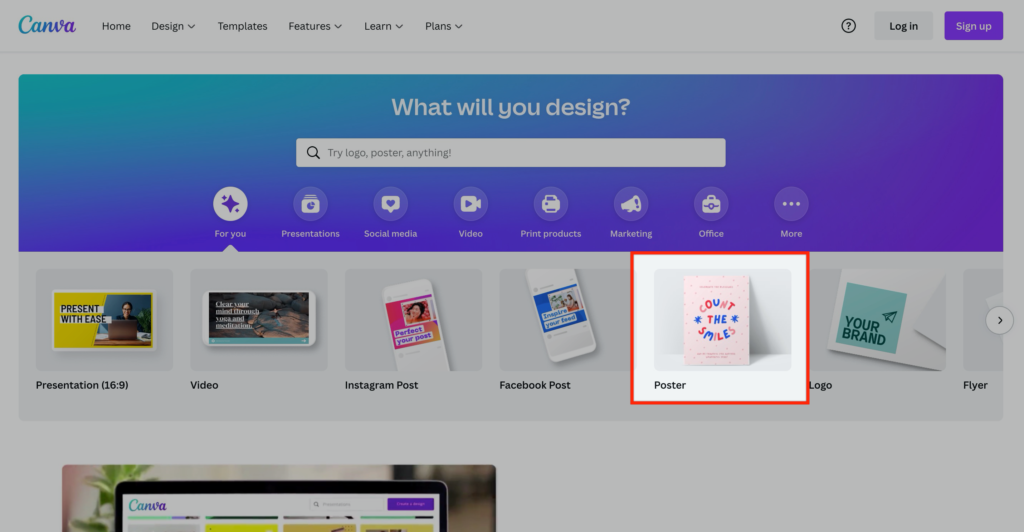
By understanding the problems people were searching to solve (e.g. how to make a poster) and customizing the onboarding experience to help users solve them, Canva cut their time-to-value in half.
As you can see, knowing your users’ intent behind using your product helps us catapult them to the areas where they can experience value as soon as possible. If we can do that one thing—and get consistently better at it—you’ll eventually increase the number of free users that turn into paying customers.
By bringing our users to the promised land and delivering on our value, the next logical step for them is to convert to paying customer. Lincoln Murphy of Sixteen Ventures explains: “You’ll get that ‘they convert to a paying customer’ outcome you want, by focusing on the outcome they want.”
This sounds fine and dandy. But how do you develop your straight line? How do you help users achieve their desired outcomes in a fraction of the time? You can do this by:
To get the most out of this book, complete these three steps with me. Pull out a pen and paper or open your laptop. Let’s get started!
In my experience, well over 30% of required user onboarding steps are rubbish. (Yes, yours, too.) Tell me if this sounds familiar. There are form fields that you don’t really need to ask people when signing up. There are required steps that first-time users don’t really need to complete right away. And, of course, there are steps that don’t really need to be there at all.
Ring a bell?
Before you develop your straight line, I dare you to sign up for your product and complete all the steps it takes to accomplish a meaningful outcome. As you complete each step, take a screenshot. Even small steps like clicking an “OK” button should make the cut.
If you aren’t ready to complete this step yet, here’s an example.
Let’s pretend you’re an established ecommerce business with multiple Amazon and eBay stores. Every day you spend three hours manually logging into each account so that you can respond to customer messages. The more eBay and Amazon accounts you have, the more logging in and out of each account you need to do.
After some research, you find that ConnectHero (a company I just made up) has a product that allows you to forward all of your Amazon and eBay messages to a help-desk solution of your choice (e.g. Zendesk).
Once you sign up for ConnectHero’s free trial, you’re required to integrate your Amazon and eBay accounts with one help-desk solution. Once that’s complete, you see messages pop up in your help-desk solution from eBay and Amazon—it’s a miracle. This is when you decide that you’re going to upgrade once the free trial is over. The product delivered on its promise, and you’re a happy camper.
Naturally, ConnectHero wants everyone to get to this point in their user journey, but integrating a help desk with Amazon and eBay isn’t easy—users need to take over 50 steps. To make it easier to set up an account, we need to reduce the number of steps. Developing a straight line is the easiest way to do this.
To start, we’ll take a screenshot of each step of the onboarding experience. Take screenshots of every step, from the second you land on your homepage until you accomplish a meaningful outcome in the product. Once you’ve mapped out all the steps, it’s time to label every step.
Label each step throughout your onboarding experience using the colors green, yellow, or red:
Removing your red steps and delaying yellow steps moves you closer to building a highway that speeds users to the promised land.
Growing up in Hamilton, Canada, I took a bus to get to my downtown school. It took between one and two hours. Why the variance? Well, there was no shortage of red and yellow lights in between me and my destination. The bus was constantly starting, stopping, and idling.
To reduce the number of idling cars and speed up traffic, the City of Hamilton introduced a green light sequence for Main Street, the busiest road in the city—and the main road my bus traveled along. If you hit one green light, you kept hitting green lights until you turned off Main Street.
This one innovation helped me get to school 25% faster.
If we go back to our hypothetical example of Amazon and eBay account integration, these might be the first three steps:
Integrating your Amazon account is a must, so we’ll label it green. Setting your custom signature is an advanced step. Do you need a custom signature to see incoming messages from Amazon and eBay? Not at all. Once you see the product’s value, it’ll make sense to complete this step. For now, we’ll label this step yellow. Lastly, sharing your nickname is totally unnecessary. Hence, we’re going to label this step red and remove it completely.
When it comes to your product, cut out as many red and yellow lights as possible. You’ll create shortcuts for your user to experience the desired outcome of your product. If you’ve already broken down each step between sign-up and the desired outcome, meet with your team to discuss all the steps you can potentially remove. Include people from the product, engineering, marketing, and sales teams if you want a lively discussion.
One of the reasons I love the straight-line system is because there is no bullshit. You will learn that your users simply need to complete steps X, Y, and Z for you to deliver on your product’s value.
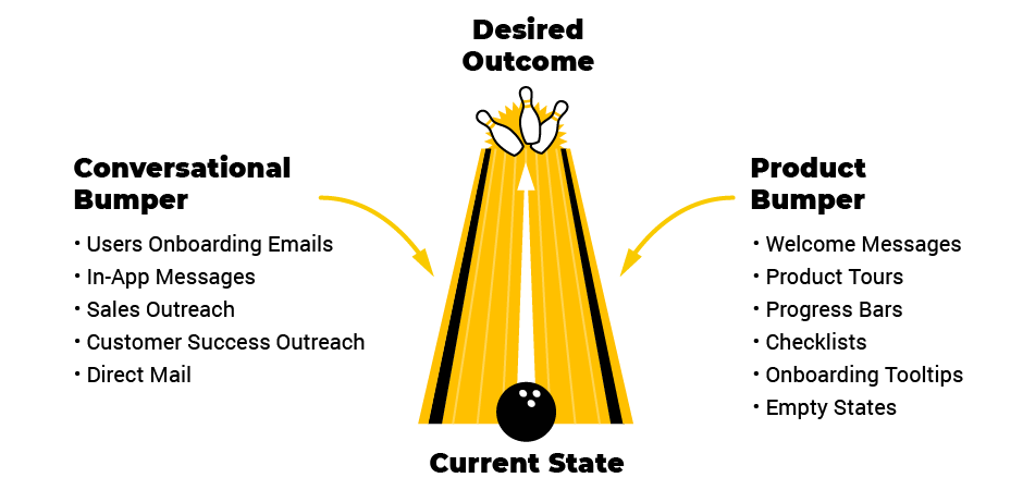
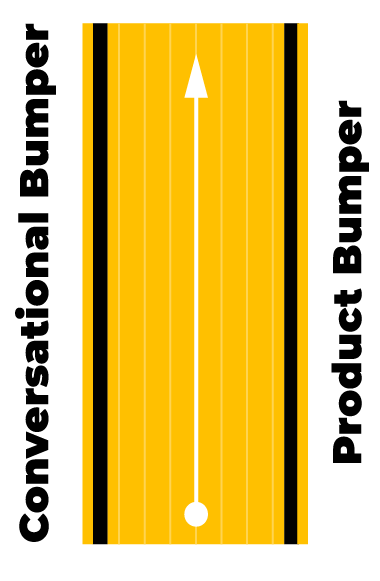
Even if we create the best possible experience, we’re still going to see lots of users get stuck in the gutters (and never return to our product). Others will go off-track, and we need to plan for detours. We can do that with bumpers that keep users on a straight line to their desired outcome.
As in bowling, we need two bumpers to keep our ball out of the gutter. We can use the product and conversational bumpers to guide users to a key outcome.
To guide users to a desired outcome in the product, you need both bumpers.
|
Common product bumpers: Welcome Messages Product Tours Progress Bars Checklists Onboarding Tooltips Empty States Common conversational bumpers: User Onboarding Emails Push Notifications Explainer Videos Direct Mail |
|
Even if you’re familiar with these tools, I’ll walk through each. You’ll be confident that you’re using them in a way that will increase your number of customers. Write down the ones you haven’t tried yet or need to update. Then, create a list of inputs to run through in your next Triple A sprint.
Product bumpers help users experience meaningful value in the product. Out of the two bumpers, product bumpers are arguably the most important. That’s because if you help people accomplish something meaningful in their life with your product, they’ll come back on their own.
That’s not to say that conversational bumpers aren’t useful—they just play a different role. For instance, if someone signs up but never touches foot in your product, the best product bumper in the world won’t help you.
Given the importance of product bumpers, I want you to identify one or two that can guide your users to the promised land. Maybe there’s an area in your onboarding that could benefit from a progress bar or checklist. Who knows?!
Here are the main product bumpers I’ll break down:
If you knock on a door to a friend’s house, what kind of response would you expect? Would your friend welcome you? Or would they not say a single word, letting you walk around their house and eat the food in the fridge?
The second scenario sounds weird. Friends say hello to friends. But in user onboarding, companies often forget to welcome guests who sign up for a product. It’s a “help yourself to the kitchen” mentality. As a user, it can feel odd. We have an innate desire to feel welcomed.
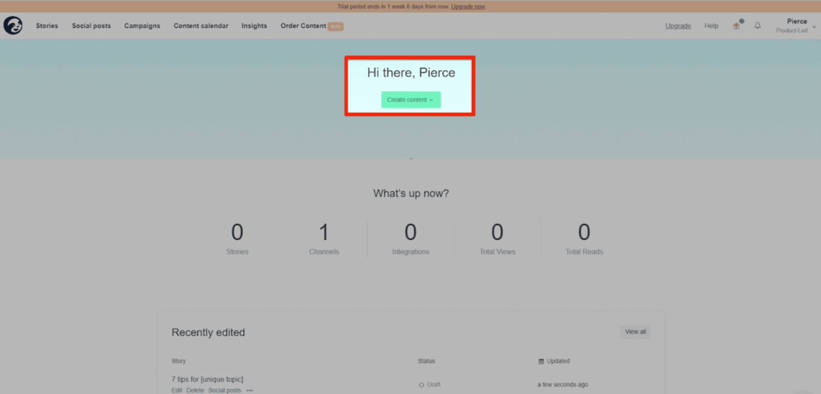
In this example by Userlist, they showcase a message from the CEO that personally welcomes the user to the product.
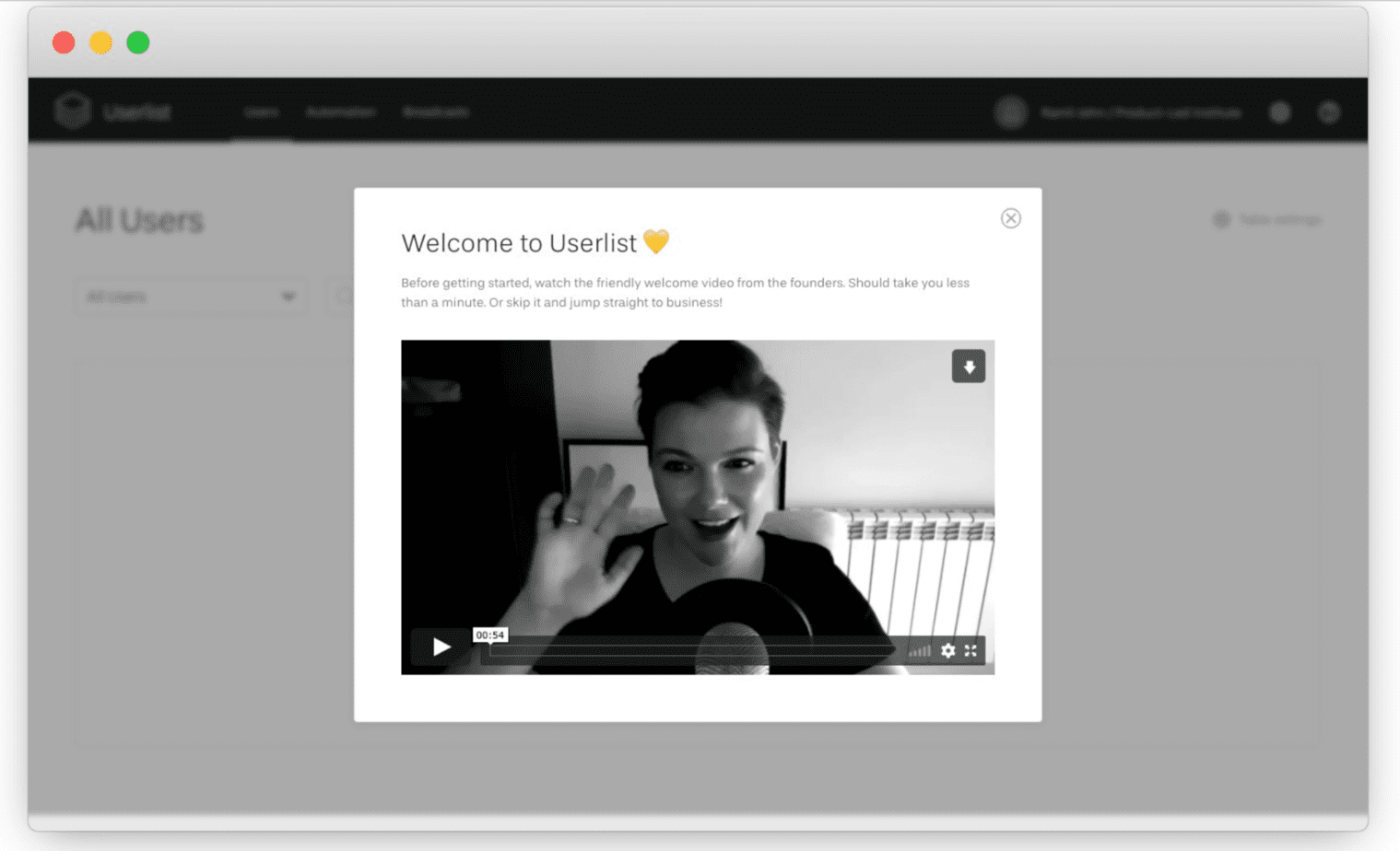
The message explains why the founder created the product and restates the value proposition. Welcome messages can also increase a user’s motivation for using the product by clearly explaining the value and building suspense.
Key Takeaways:
Now that we’ve welcomed new users, it’s time to help them set up their accounts—fast.
Product tours are the ultimate product bumper. They eliminate distractions and give you only a few important options. In my experience, I reserve product tours for the most important green-light items in your straight line. I recommend using only three to five steps in your product tour.
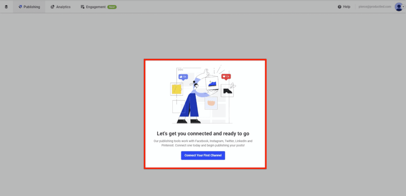
As you can see below, ConnectHero uses a product tour to help us select which help desk solution we’d like to integrate:
With this approach, your response can trigger a different straight-line onboarding track—one that’s specific to your desired outcome (e.g. forwarding your Amazon and eBay messages to Zendesk).
If you have a multi-product business, using a product tour at the beginning of your onboarding can be a gamechanger. You catapult people into the areas of the product that they care most about.
If you have a simple consumer application, you might be able to get away without using a product tour. But if you have a complex product with features that accomplish different tasks, a product tour is a must.
I recommend using a “focus mode” that hides background elements to minimize the initial number of choices. Such product tours are extremely effective because they leverage Hick’s Law (decision time increases with every additional choice) and the Paradox of Choice (more choices make people less likely to choose).
By eliminating the number of decisions a new user has to make, you increase the likelihood that they will make the right decision. When structuring your product tour, don’t reinvent the wheel. Include some of the required green steps in your straight line to help your product deliver on its value faster.
Key Takeaways:
All in all, product tours are one of the most effective ways to bump users toward experiencing meaningful value in the product. Typically, this kind of forceful bump is best deployed at the beginning of a user journey; however, as the user progresses along your straight line, you might want to use a more gentle bump, such a progress bars.
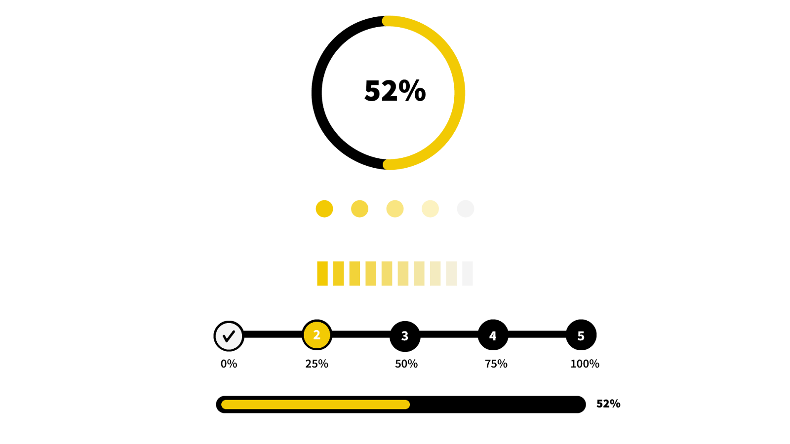
Progress bars indicate how far a user has come, and how far they need to go. When running a marathon, I look forward to seeing the markers for each kilometer—they remind me of how far I’ve run and how far I have to go.
At first, it can be demotivating to see that you’ve run only 1 out of 42 kilometers. However, once you get close to the 30-kilometer mark, your motivation goes up. You push yourself harder until you cross the finish line.
The same principle holds true for user onboarding. Humans are addicted to progress and will work hard to finish something once they think it’s achievable. One caveat: Goals need to seem realistic. Just think of how demoralizing it would be to sign up for an account only to see a progress bar with “0 out of 99” steps completed.
Break down goals to make them achievable. Think about a marathon. Forty-two kilometers sounds intimidating, but dividing it into nine 5-kilometer races helps you feel like you’re constantly making progress.
Progress bars can come in many shapes and sizes. According to Formisimo, here are the most common progress bars:
If we were to put what we just learned into action, we could simply add a progress bar to our product tour for LinkedIn. Voila!
Now, we’re setting an expectation for how many steps are ahead for our users. This reassures them that the onboarding process won’t take long and that they’re only a few steps from completion. As a result, users are more likely to stick around.
Key Takeaway:
After the initial setup is complete—and progress bars are filled—what’s next? You often need to give specific instructions. Onboarding checklists are a great way to go.
Checklists break down big tasks into bite-sized ones. For ConnectHero, we could use an onboarding checklist to help users set up their account:
But checklists alone can take you only so far. If you want to get the most out of your onboarding checklists, have them partly filled out by the time the user sees them. This simple tactic employs the “endowed progress effect”—people who think they’re close to completing something are more likely to see it through.
In addition to giving users an overview of how to set up their account, checklists simultaneously increase user motivation because users know how many steps it takes. For best results, I recommend having between three and five checklist items for a new user to complete.
According to Zapier, onboarding checklists also work well because of the Zeigarnik Effect, our tendency to think about incomplete tasks more than completed ones. Not finishing a task nags at us. Researchers call this “task tension.” Only completing the task can relieve it.
It’s why cliffhangers are effective in movies and television. It’s why crossing off an item on your to-do list feels satisfying. It’s also why seeing 59 unread Facebook Messages might freak you out.
Key Takeaways:
If there are specific actions that users need to complete, onboarding is an effective way to motivate users. However, sometimes you also need to show users how to do something. That’s where onboarding tooltips come in.
Onboarding tooltips help users learn how to use a product. They can reduce the burden on support and scale usability. Here are the main ways you can use hotspots and action-driven tooltips:
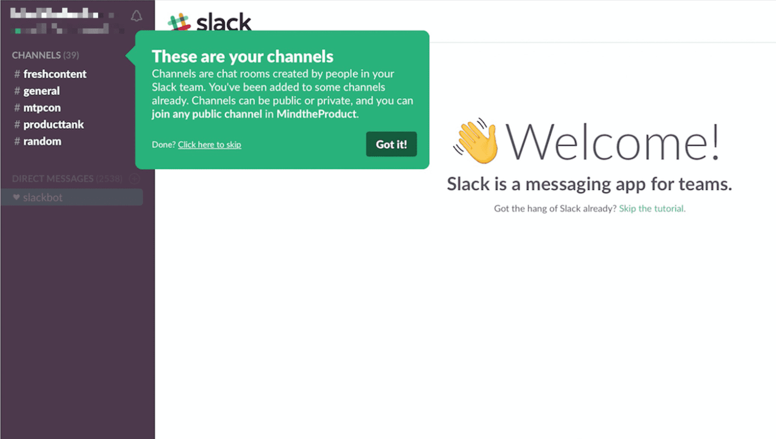
For Slack, we could simply use a tooltip to provide some more context behind what’s required for them to setup their account.
Or, we could use a tooltips to show people around important areas of the product. A benefit onboarding tooltips is that they’re relatively easy to set up if you use a tool like Appcues, GainsightPX, WalkMe, or Pendo.
However, a lot of companies use onboarding tooltips incorrectly. Tell me if this sounds familiar? You log in to a product for the first time, then a tooltip pops up and tells you to click on a feature. Then, the tooltip prompts you to click on another feature. Once clicked, another tooltip offers to show you yet another feature until you’ve explored the entire product.
This is tooltip abuse. None of the activity leads the user toward experiencing meaningful value in the product. Remember Samuel Hullick’s note: “People do not use software simply because they have tons of spare time and find clicking buttons enjoyable.”
Key Takeaways:
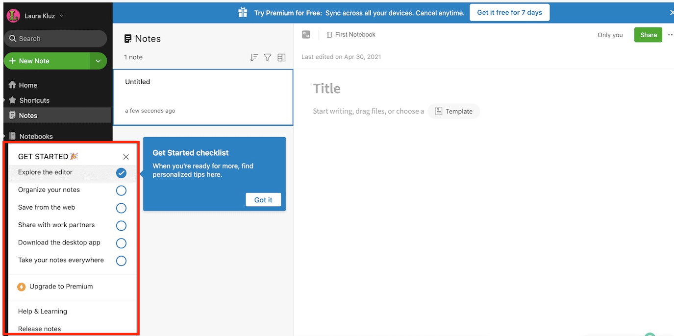
Onboarding tooltips can be a great way to show people what to do within a product. But what should you show people the first time they see your product’s dashboard? Dummy data? That won’t get anyone excited about a product. Nor does it help us get closer to experiencing value. If prospects had wanted to see dummy data, they would have signed up for a demo.
Instead of showing dummy data, explore empty states. They can guide users through the first few steps of setting up their account while being less intrusive than a product tour.
Upon first login, most software applications are boring. There’s no data specific to you; it’s just the raw application. So what should you show people? An empty state can show people what they need to do to set up their account and experience meaningful value.
For UserList, this could simply be showing people the steps they need to take to complete their account setup.
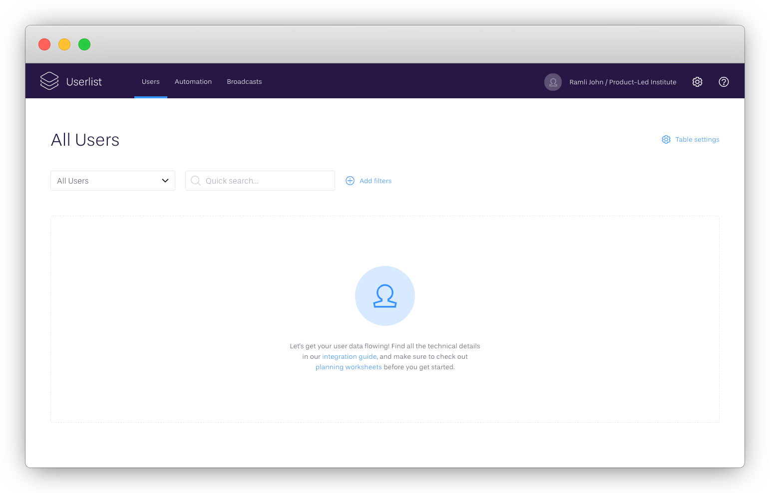
One of the benefits of empty states is that you immediately show users what needs to be done.
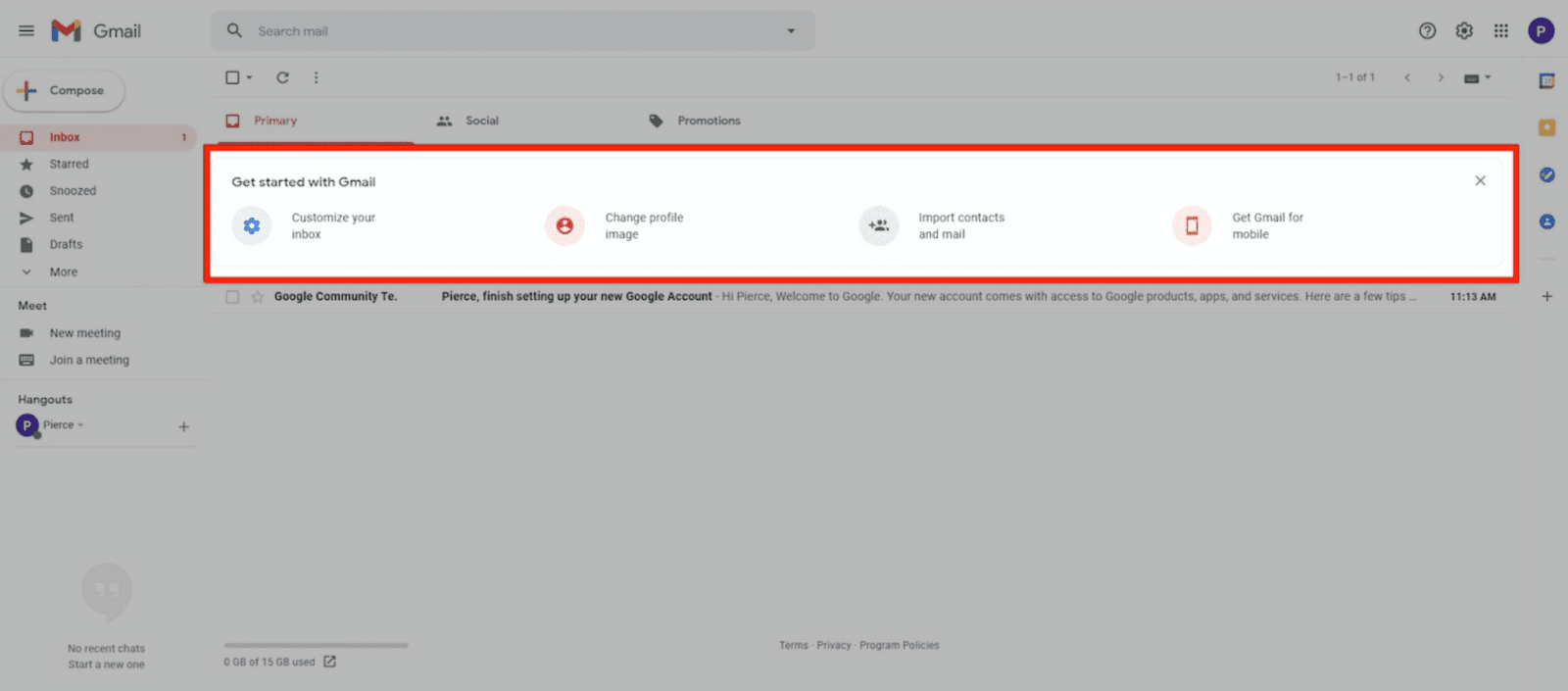
Gmail uses an empty state to help users set up and personalize their account:
Story Chief has an empty state to encourage users to craft their first story:
Buffer’s empty state encourages you to connect your social media accounts. No one will use Buffer unless they complete this step. As such, Buffer ensures that people connect their social media accounts right away.
To decide what to include in an empty state, ask yourself:
Takeaways:
Do you have to use empty states, onboarding tooltips, checklists, and product tours? Absolutely not. Use product bumpers only when there’s a need. The context in which you use each determines how effective it is.
Now that we’ve covered the main product bumpers, let's see how conversational bumpers can complement our onboarding.
Conversational bumpers educate users, bring them back into the application, encourage them to upgrade their account, and notify users of new features. Whether you’re using email, push notifications, explainer videos, direct mail, or even SMS, any communication medium can be a bumper.
Here’s why you need conversational bumpers in your onboarding:
One of the best ways to educate users and set the right expectations is through user onboarding emails; however, you can use the same content ideas for push notifications, direct mail, etc.
A main challenge with user onboarding emails is figuring out which emails you need to send. To simplify the process, I’ve compiled a list of the top nine user onboarding emails:
The best user onboarding emails are an extension of your product. They have a magical ability to reach beyond your app or site to bring people back and move them toward customer happiness.
To get the most out of each section, draft a version of your user onboarding emails as we go through them. If you need to grab your pencil or laptop, I can wait.
Welcome emails are triggered as soon as someone signs up for an account. One of the best parts about welcome emails is the high open rate. Aim for at least a 60% open rate.
Given that it’s relatively easy to capture people’s attention in a welcome email, what content should you put in it? It’s tempting to write a lot about the product and ask the user to upgrade. I know you’ve got numbers to hit, but I encourage you not to take that approach.
Your welcome emails have two purposes. First, you need to train your audience to open your emails. Second, you need to set expectations for what’s coming next.
With that in mind, make sure your welcome email has a clear call to action. If you recently launched your product, you can learn a lot by asking, “Why did you sign up to use our product?” Eventually, this will help you pinpoint the desired outcome that people have for your product.
If you’re at a loss for words when drafting your welcome emails, don’t worry. Here are two examples of welcome emails that follow the recommendations above:
Subject: a personal hello
Body:
Hey,
I’m one of the co-founders of [Your Company], and I’m excited you’ve decided to sign up.
The [Your Company] Team and I have poured our heart and soul into making [key outcome your product solves for] suck less, so I get really fired up when someone new, like you, joins the ranks.
My top priority is to make sure that you’re able to [insert value proposition], so if you have any questions about our product, the website, or even my lackluster mustache, feel free to reply directly to this email.
I hope you can [accomplish key outcome in product]! Stay in touch!
P.S. Yes, I’m a real human.
– Wes, Co-Founder
Subject: you’re in — [ company name ]
Body:
Hey, thanks again for checking out [Your Company]. We help you:
But none of that’s going to happen if you don’t get started.
==> CREATE YOUR FIRST DASHBOARD HERE <== (your action-worded CTA)
Talk soon,
Wes
Key Takeaways:
Welcome emails shouldn’t be complicated. At some point, however, you have to get a bit more technical and offer a helping hand. That’s when usage-tip emails come in handy.
Usage-tip emails are helpful nudges that direct users to take steps in the product that set them up for success.
Be careful about what you encourage. For instance, if an activity you’re encouraging doesn’t help them experience meaningful value in the product, you dampen user motivation. Don’t send emails that ask users to complete items that aren’t part of your straight-line onboarding track.
In general, usage-tip emails should do three things:
If you can do these three things, you’ll help more users succeed. Wistia’s Soapbox product is a perfect example. After I created my first video, they sent a usage-tip email to encourage me to share it with someone.
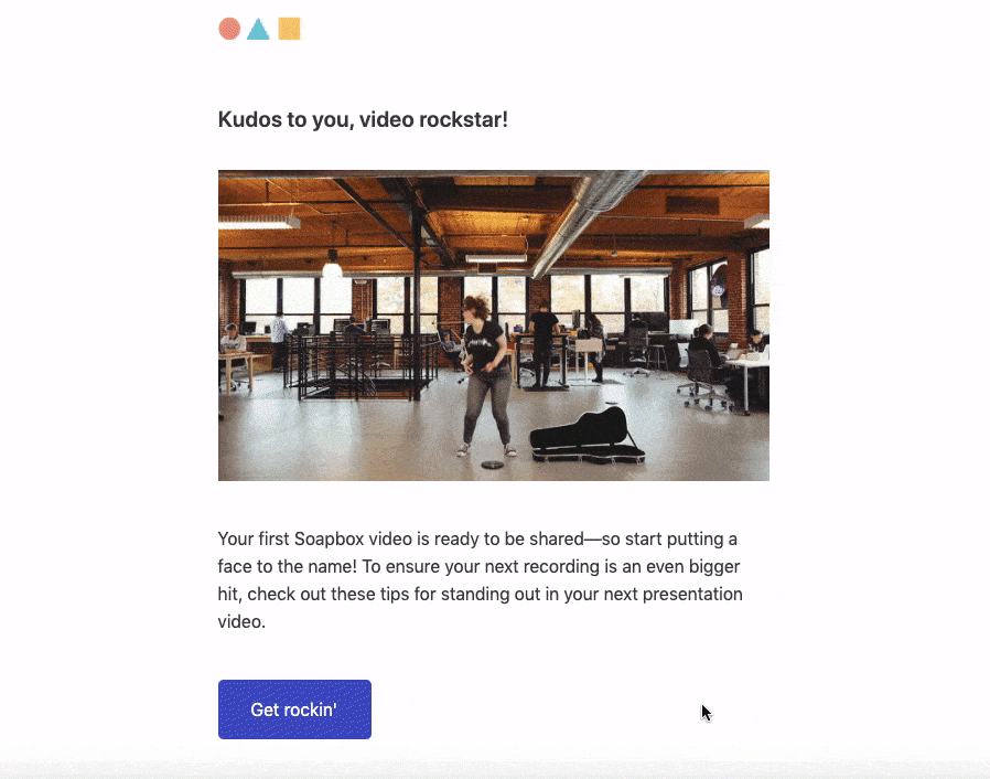
This email helped me learn more about Wistia’s features but also made it easier to experience meaningful value by sharing the video.
Key Takeaways:
If users miss a step in their straight-line onboarding track, usage-tip emails can bump them toward the next step without being intrusive. Nevertheless, you’ll eventually need to ask for the sale.
Sales-touch emails are exactly what the name implies. These emails can be automated, but the most important part is timing. If you send your sales-touch emails too soon, you’ll turn people away. If you send them too late, you’ll miss out on sales. The sweet spot for sending sales-touch emails is as soon as you deliver on your value, according to the UCD Model we covered in Part II.
For Databox, this is when you create and customize your first dashboard.
Subject: The hard part is over…
Body:
Hi Wesley,
You already did all the work to customize Databox and the hard part is over…
Were you left with any questions? If so, let me know and I will answer them. Here are some common questions I get:
Would love to learn more about you and what are you looking to accomplish with Databox. Just hit “reply” and let me know.
Thanks,
Andrew
Notice how the email doesn’t come across as “salesy.” The goal of the message is to help me get more value out of the platform. For your sales-touch emails, try two things:
You’ll find that these “sales” emails are generally well received. Users will be happy to hear what you have to say. If you’re looking for a great template, Claire Suellentrop from Userlist.io shared a great email you can use:
Subject: [Intriguing phrase about how a paid feature will make their lives easier.]
Hi {{user.first_name | capitalize | default: “there”}},
[Pain point referenced in subject line] is no fun. [Describe a few problems the pain point causes, e.g. keeps them at the office late in the evening, forces them to delete important files or scatter them across multiple locations, wastes precious hours each week preparing for meetings and then having to reschedule.]
With [paid feature], you’ll [get huge benefit, e.g. have the freedom to take Friday afternoons off, rest easy knowing their files are all in one place, increase productivity by 18%].
Since [paid feature] is part of our [paid plan name] plan, you’ll just want to upgrade to [paid plan name] and you’ll be good to go!
Just head to your billing page now, so you can start [getting benefit] [link].
Talk soon,
[Signature]
Takeaways:
As you can see, sales-touch emails are largely about timing and offering a helpful hand. However, sometimes we still need to clarify our product’s value to build a convincing case to upgrade. One of the best ways to do that is through case-study emails.
As Joanna Wiebe from Copyhackers notes, case studies are great—as long as you tell the story right. And by “tell the story right,” I mean be a good storyteller:
If you don’t have conflict, you don’t have a story (or a hook). And who would read that?
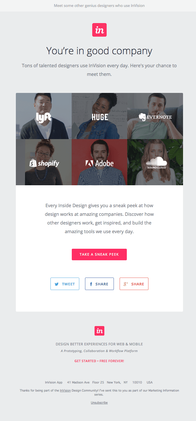
Whether you send a case-study email that includes a video testimonial, customer story, or old-fashioned case study, tell your customer’s story about using the product. Invision does this by showcasing some of the incredible designs their customers have created with the product.
How do you decide which testimonials to showcase? One of the best ways to decide is based on the objections you regularly receive when selling your product. These objections could be:
Pair your top objection with a testimonial that addresses the objection head on. For instance, if your top objection is that the price is too high, include a testimonial that showcases the amount of value the customer received from using your product. You address a top objection head on, with your testimonial doing the heavy lifting.
If you send case-study emails before selling users on your product, you’ll improve your free-to-paid conversion rate.
Key Takeaways:
Case studies are a powerful way to combat objections. However, sometimes we still need to communicate product benefits. One of the best ways to do this is through better-life emails.
Better-life emails communicate the benefits of the product. The main call to action in these emails is often to upgrade an account. But you can also direct people to try specific features.
Better-life emails don’t tell a customer story. They focus on communicating the benefits of the product. Twist uses better-life emails to encourage people to “take back the workday” and sign up their team.
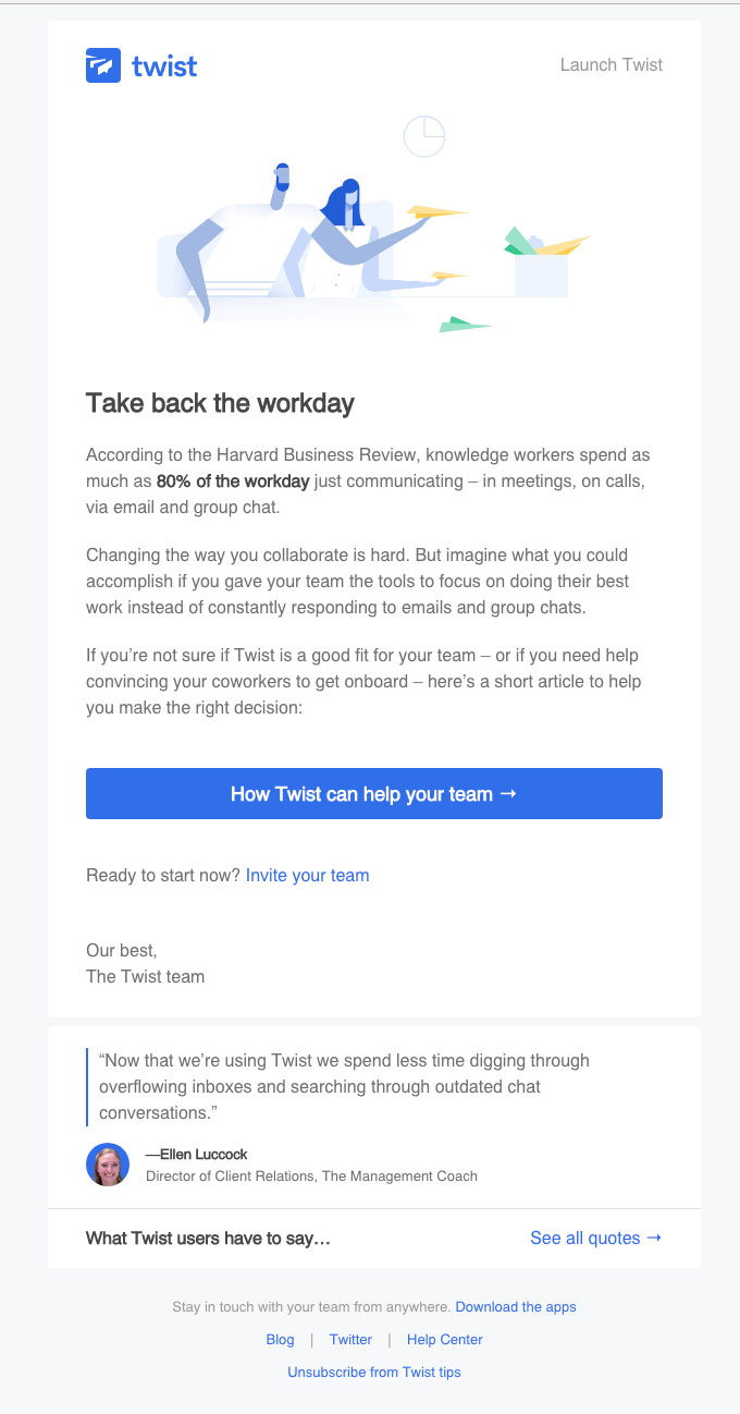
Showcase how your product improves a user’s life. If you’re selling a business intelligence tool, highlight how the user will no longer need to spend countless hours crunching numbers in Excel.
A common mistake with better-life emails is focusing only on the functional outcome of your product. Remember: You need to account for functional, social, and emotional outcomes. Here’s a breakdown of each:
If you know the three reasons why people buy your product, you can boost your conversion rate and ultimately acquire more customers. Before writing your better-life emails, ask yourself these questions:
You’ll have a better idea of which benefits to feature.
Key Takeaways:
Product-led companies often forget to emphasize the better life that their product offers during the trial period. By assuming users know the benefits, you miss an opportunity to restate your value and build a convincing case. If you have a free trial, that’s a critical window: You have limited time to do so.
Expiry-warning emails remind the user to upgrade before a free trial ends. Freemium models don’t use expiry-warning emails because part of the product is free forever. That said, if you have a hybrid model (with a free trial and freemium offer), expiry emails can still motivate users to upgrade.
If you have an opt-out free trial (you require a credit card upfront), you must send expiry-warning emails. If you don’t, you’re guaranteed to annoy users and flood your support reps with refund demands. Think about it: What did you do the last time you signed up for a product with a credit card and missed the deadline? Did you continue paying for the product for a month or two before realizing you forgot to cancel? Or did you demand support give you a refund because you forgot to cancel your plan?
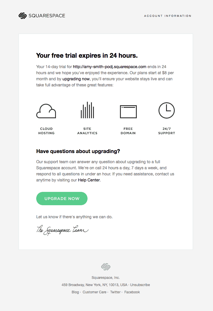
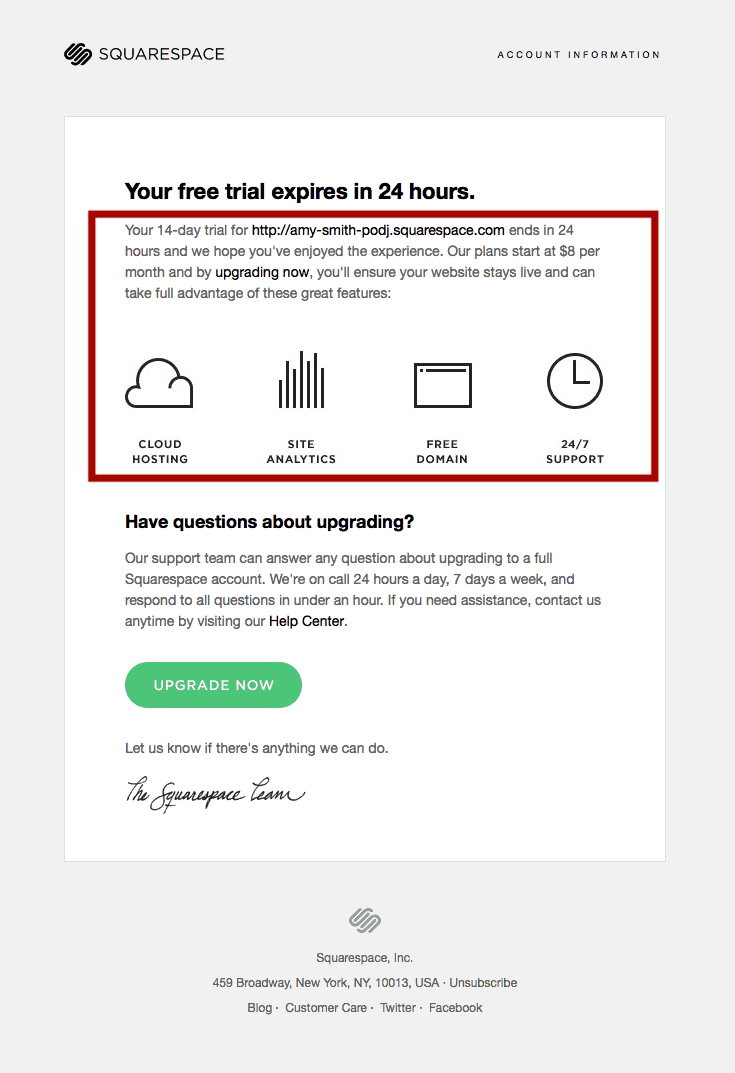
I won’t dive into whether you should or shouldn’t have a credit-card requirement during the free-trial sign-up, but, as a general rule, make it easy for users to cancel their account. Squarespace sends emails to notify users that their trial will expire soon. This email is great because it restates the value proposition and why it makes sense to upgrade now.
According to PostMark App, expiry-warning emails have three goals:
Trials end—that’s just how they work. However, if users provide a credit card as part of the sign-up process, they’ll be charged automatically. Make sure to give them a few days notice about the charge so they aren’t surprised.
The last thing you want to do is annoy users who forgot that they signed up for your product and paid accidentally. When they figure out that they were charged, they’ll demand a refund.
Even if you don’t require a credit card, you want to craft a painless transition to paying customer.
The best way to do that is by:
Some people will upgrade, and some won’t. As such, you want it to be easy for people to upgrade. Still, most people won’t upgrade, so it should be easy for users to cancel their accounts. The expiry email can make this process easy and leave a positive impression.
The transition from trial to paying customers can be stressful. Once a customer decides to use your software, they want to make the transition seamless. When will they be charged? How can they get approval from their team? In some cases, they may also wonder if they can maintain data from their current trial.
There are countless questions and concerns. Make sure that customers know that they can get help and know where to find it. Even if you check the box on all of the recommended ways of using expiry emails, you need to avoid some common mistakes.
Trial expiration emails serve two very different user types:
In the same email, you need to address the needs of both groups—without making the email confusing. Most mistakes in expiry-warning emails stem from these conflicting goals.
Weekends, vacations, and travel can interfere with the timing of a trial expiration. It’s important to give people a heads-up. That way, users know exactly when a trial will expire, whether they want to transition to paying customers (and avoid a service interruption), or if they want to cancel their account (and avoid an unintentional payment).
I recommend sending an expiry-warning email at least three days before the end of each user’s trial. This gives users enough time to make a decision to move forward with your product or not.
One of the biggest mistakes I see companies make with expiry-warning emails is not including the product’s main value proposition. Offering a compelling reason to take action results in (surprise) more people taking action.
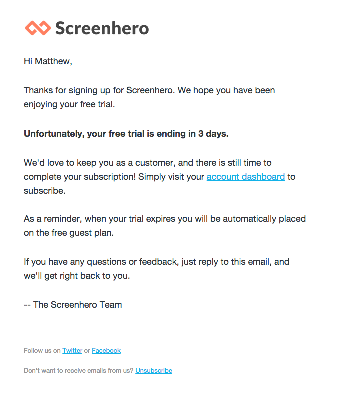
Just because someone signs up for a free trial doesn’t mean that they’re ready to buy. Most people who sign up for your free trial or freemium model won’t convert. You need to include compelling reasons for someone to upgrade. Screenhero proves this point by failing to include a convincing reason to upgrade.
On the other hand, Squarespace’s expiry email does a great job highlighting the key benefits of the platform. Now we know why we should upgrade, right?
To recap, your expiry-warning emails should be able to answer these questions:
Key Takeaways:
If you have a free trial, expiry emails are a great way to motivate users to upgrade—there’s genuine urgency behind the email. However, what do you do when people take you up on your offer? For starters, send a customer-welcome email.
Have you ever purchased a plane ticket on a questionable travel website, then waited nervously for email confirmation? When you buy something from a brand you don’t trust, waiting for a confirmation email can feel like an eternity. Your new customers feel the same way.
To reduce that anxiety, use customer-welcome emails:
Too many businesses don’t welcome new customers immediately. Most reach out manually, but it takes time. In the interim, new customers become nervous, wondering if they made the right decision. Don’t make your new customer think twice. Remind them why they made the right decision. Spotify welcomes users as soon as they upgrade to premium:
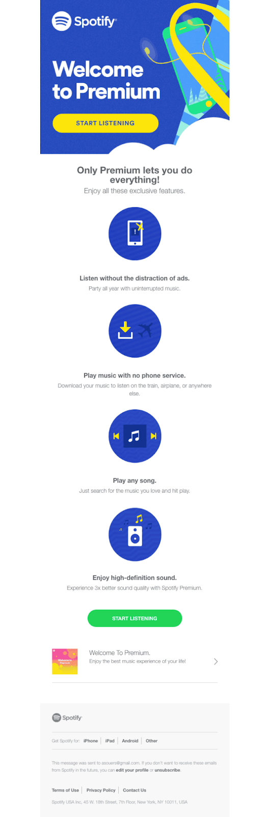
One thing Spotify has done really well is to remind users why they upgraded, showcasing the value of the platform. This email increases user motivation to check out the product and listen to some great music without ads. If you have a freemium product, recap your premium features so that users can explore them right away.
Key Takeaways:
Customer-welcome emails are a great way to remind new customers that they made the right choice. But no matter how hard you try, not everyone will convert—nor should they. Your product might not be the right fit. It might be too expensive. The list goes on.
To improve your free-trial experience, you need to learn why it didn’t work out for some users.
This is why I almost always recommend using post-trial survey emails.
Even with the most amazing free-trial experience, most users won’t convert. Some aren’t a good fit. Some might not have had time to check out your tool. Others, well, they might have needed more time or someone to help them learn to use the product.
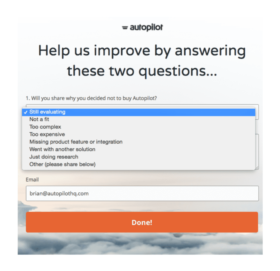
There are countless reasons, but you’ll never learn to understand them if you don’t implement post-trial survey emails. For Autopilot, their post-trial survey email looks like this:
Subject: Wesley, have 60 seconds to share why?
Body:
Hi Wesley,
I noticed that you have not purchased Autopilot so far. I'd love to hear your thoughts on your trial experience in this super quick survey. It will only take 60 seconds (we have measured it!)
Your response will help us focus on improving your trial experience and better meet your needs.
Thanks in advance,
Lauren
What I like about this email is how it gets straight to the point and encourages you to fill out a quick survey:
Based on your response, Autopilot enrolls you in an automated sequence. Autopilot recommends starting with this list:
If you use your free-trial survey in this manner, you’ll combat buyer objections and provide a more personalized experience for each user.
Key Takeaways:
As in bowling, if you don’t get a strike in the first throw, you have another shot. So, why not use post-trial survey emails as a way to rekindle the opportunity and provide an incredible experience? After all, these same users were interested in using your product for a specific reason. Let’s help them out.
Now that we’ve gone through all of the user onboarding emails, let’s do a quick review.
Even with the best copy in the world, if your onboarding experience lacks personalization, you’ll lose out on conversions. Imagine that I just signed up for your product and spent several hours using it during the first couple of days. I’ve gone through all of your onboarding tooltips and experienced the value of your product numerous times. I’m a power user and am sold on your product. I love it!
Now, imagine what must be going through my head when you send me an email on how to complete a very basic step in your onboarding process—one that I’ve already completed. I’ll look at this email for two seconds and make several assumptions:
I still love your product, but compare that to another potential experience. Imagine, three days into my trial, you notice that I’m getting incredible value out of the platform. You send me a timely email asking if I want to upgrade. Since I’m already sold on your product, I convert on day four of your free trial.
There’s a big difference between these two scenarios. The first experience wasn’t relevant, while the second recognized where I was in the user journey.
For most free trials, here’s what a user onboarding email sequence looks like:
This is a one-size-fits-all approach. It doesn’t serve any of the outliers below:
The only way to avoid these scenarios and improve your free-to-paid conversion rate is to create a smart conversational bumper system.
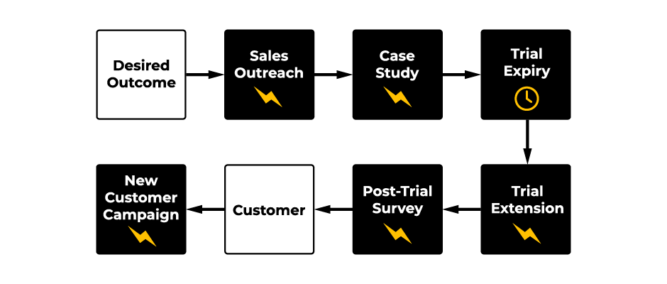
Smart signals tell us when we should send a specific conversational bumper to keep users on a straight line. Here are the four main signals:
Each signal tells us about where the user is in their journey. Based on the signal, we can enroll people into different email onboarding tracks. For instance, if someone experiences a quick win in the product, we can send emails on how to dive deeper into the product. Or, if someone experiences a desired outcome, we can send sales-touch and case-study emails to encourage users to upgrade.
For the onboarding tracks below, I want to point out one detail that’s easy to miss. If you see a lightning bolt underneath the email, it’s a trigger-based email. If you see a clock underneath an email, it’s time-based. Now, that we’re on the same page, let's dive in!
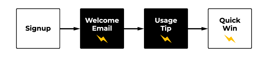
As you can see above, when someone signs up, it signals the start of the conversational bumper track. A sign-up should trigger a welcome email immediately. Depending on how complex your product is, you might need one or even five usage-tip emails to support account setup.
As we covered earlier, usage-tip emails do three things:
In the first onboarding track, the only thing we care about is getting someone to experience a quick win in the product. If we operate a business intelligence software solution, our first quick win might be setting up a dashboard to visualize our analytics. At first, every email we send to new users should focus on that outcome.
You don’t need to send usage-tip emails to users if they accomplish the quick win the first time they use your product. Remember, product bumpers also guide users toward achieving their desired outcome. Conversational bumpers are there only if users don’t take the required actions we’ve set out in our straight line.
Let’s say you’re CrazyEgg, a heat-mapping tool, and your first quick win is getting users to upload a tracking script to their website. If they accomplish this in the first-run onboarding experience, why send more emails about how to upload the script? On the flip side, if you didn’t upload the script, it would be extremely helpful to send an email that guided users on the process.
Key Takeaways:
Once your users have accomplished a quick win, it’s time to think about how you can turn your new users into repeat users. One of the best ways to do that is to help users achieve their desired outcome in the product.
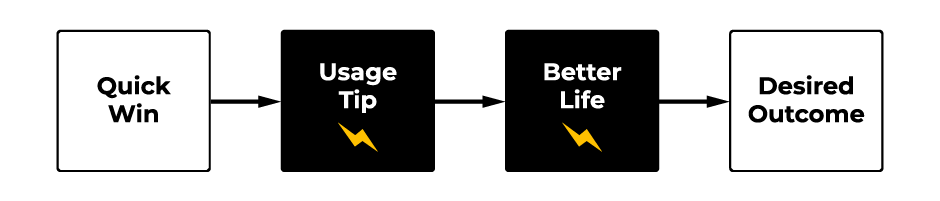
Conversational Bumper Track 2 starts as soon as someone gets a quick win and ends when someone experiences a desired outcome in your product. Once again, we’ll use usage-tip emails; however, we’ll focus on helping users experience the desired outcome.
Do you really need Track 2? It really depends on your product. If you have a simple product like Netflix, sending usage-tip emails on how to click “Play” is overkill. On the flip side, if you have a complex product, your quick win might have been uploading a piece of JavaScript. Track 2 can drive users closer to their desired outcome.
One reason I’ve included better-life emails in this mix is that you need to remind users why they signed up. Given that these emails showcase the desired outcome, you want to challenge users to give the product a shot.
Key Takeaway:
Once users have experienced your product’s desired outcome, it’s time to convert them into customers—if they’re a good fit.
As Derek Gleason of CXL wrote, “Freemium and free-trial signups have one thing in common: Neither generates revenue.” For the first two onboarding tracks, we’ve avoided revenue generation. That wasn’t by accident.
You see, most people go wrong with their conversational bumpers by trying to monetize users too quickly. Skipping the first two bumper tracks, as the English would say, “is a bit forward.” If that’s you, go back and implement the first two conversational bumper tracks. Without that solid foundation, the strategies and tactics in Track 3 won’t be nearly as effective.
At first glance, Conversational Bumper Track 3 looks a bit overwhelming. You have a bunch of different email types:
One of the best parts about Track 3 is that each email focuses on upgrading the user to become a paying customer. You might be thinking, “Wes, if I sent out every email you recommend, I’ll overwhelm my users.” Not necessarily. Each bumper track is trigger-based. So, if your user experiences a quick win in the product during the first visit, you won’t send any usage-tip emails, and you’d auto-enroll them in Conversational Bumper Track 2.
On the other hand, if your user experienced the desired outcome in the first-run onboarding experience but never came back, you’d enroll them in Track 3 to bring them back and upgrade.
The true beauty of the Conversational Bumper Track is that you meet your users where they are in their journey. As soon as a user upgrades, you automatically stop sending them upgrade emails. (Or, at least, I hope you would.)
For Track 3, how you reach out to each user depends on the average LTV of each customer. If you have a relatively high LTV, you can afford a higher CAC, so you may want to explore a low-touch sales model as soon as someone experiences the desired outcome. Just remember: You have to match your sales approach with your average LTV. Otherwise, unsustainable CACs will destroy your margins.
Key Takeaways:
Now that we’ve gone through the three main tracks, it’s time to review everything.
Your conversational bumpers keep people from going in the gutter and never returning to your product. Conversational bumpers work because they reach people where they are. Whether you decide to use email, SMS, remarketing ads, or direct mail, there are countless ways to bring people back to the product after they leave.
At the end of the day, recall that conversational bumpers are like training wheels on a bike. They’re invaluable when you’re first learning, but the long-term goal is to make them unnecessary. If you have a great product, people will naturally come back and continue using it. Just think about how many times you check social media in a week. You’re hooked.
By now, I hope you see how the bowling alley framework can help you drive more users to become customers without resorting to salesy messaging, discounting, or those “fun” countdown timers. Delivering the value that you promised builds trust quickly and helps people understand how your solution can help them.
Once a user signs up as a customer, don’t think you’re off the hook. You still have two more levers to pull to grow your business. First, we’re going to cover how to increase your ARPU. Then, we’ll dive deep into retention.