

I joined Shopify to lead Solution Engineering for the retail merchant segment. As with any fast-growing tech company, the needs of the business shifted quickly. Within weeks of joining, I was asked to lead the user onboarding function too. Onboarding was a new discipline for me.
The challenge was three-fold.
First, the team wasn’t hitting its performance targets. Second, the senior leadership team didn’t understand why – was this a team problem? A communication problem? A leadership problem? Third, it was unclear what the impact was on merchants (Shopify’s customers).
This three-fold challenge became a single focus for me: understanding what drives great onboarding outcomes for customers and communicating it in a digestible way to senior leadership.
During this time, I was handed a KPI for the team to focus on: time-to-value.
I came to learn that time-to-value is pretty ubiquitous in the onboarding world.
My problem is that time-to-value is the wrong KPI to monitor. It’s incomplete and not indicative of onboarding performance or impact on customers. Sure, it’s nice to know how long (on average) it takes users to activate through onboarding. But, we were missing targets, and it didn’t help me understand why.
My senior leaders wanted clarity on:
- Why onboarding was underperforming, and
- What the plan was to improve.
They came to expect this from my sales leader peers. So they had the same expectations of me.
This posed two big challenges:
First, sales leaders have the ability to forecast monthly sales, monitor daily/weekly progress, influence progress to hit monthly targets, understand how new hire ramp impacts hitting targets, etc. It’s a pretty high standard to be held to, and at the time, I couldn’t provide them with the same depth of understanding for the onboarding team.
I couldn’t answer questions like:
- How many monthly Activations are forecasted?
- What’s the impact on revenue?
- What are your leading indicators to improve Activations in onboarding?
- We’re off track, and it’s seven days into the month – why?
Secondly, sales targets are rooted in data and aren’t typically arbitrarily set. For my onboarding team, our time-to-value metric was handed down without any data.
The target was synthetic.
I didn’t know if the target was feasible or even if it represented the actual behavior of our users. I wanted to understand the current onboarding momentum better. I was uncomfortable being held to the target.
To find comfort, the task ahead became:
- Evaluate if our time-to-value metric was feasible. If not, make a case for what it should be.
- Get to a place where I could: forecast Activations, project if we’d hit monthly targets, monitor for early warning signals if we were off-track, and demonstrate how the growth team could impact onboarding performance along with customer outcomes.
When I looked across the room to my sales peers, they had great instrumentation. They could answer every single one of these questions. I was jealous and frustrated. I wanted to have the same kind of deep understanding of what drove onboarding. Then I, too, could be proactive, solve problems, and achieve a greater performance overall to impact customers.
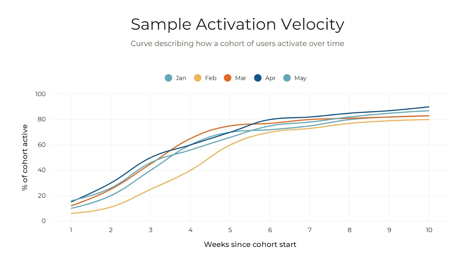
My solution was to reset leadership's understanding of baseline performance using a new metric: Activation Velocity.
Activation Velocity is a curve that illustrates how a cohort of users reaches a key onboarding milestone (Activation) over time.
This metric painted a more complete story about onboarding performance. Applied comprehensively, I was able to answer the same questions as my sales counterparts. And, it had the added benefit of helping us understand what product actions yielded the best onboarding outcomes for customers.
Below is a sample Activation Velocity chart. It shows how five cohorts of users (from January to May) activate over time.
In this article, we’ll explore:
- What an Activation Velocity Curve is
- Why Activation Velocity is powerful
- Optimize using Activation Velocity
What an Activation Velocity Curve is
For the math people out there, Activation Velocity is a cumulative distribution curve. For everyone else, the curve is intended to show how a cohort of users activates over time.
Here’s a simple example: 100 users signup for your software in January. You want to understand how those 100 users become paid users (Activation) over time.
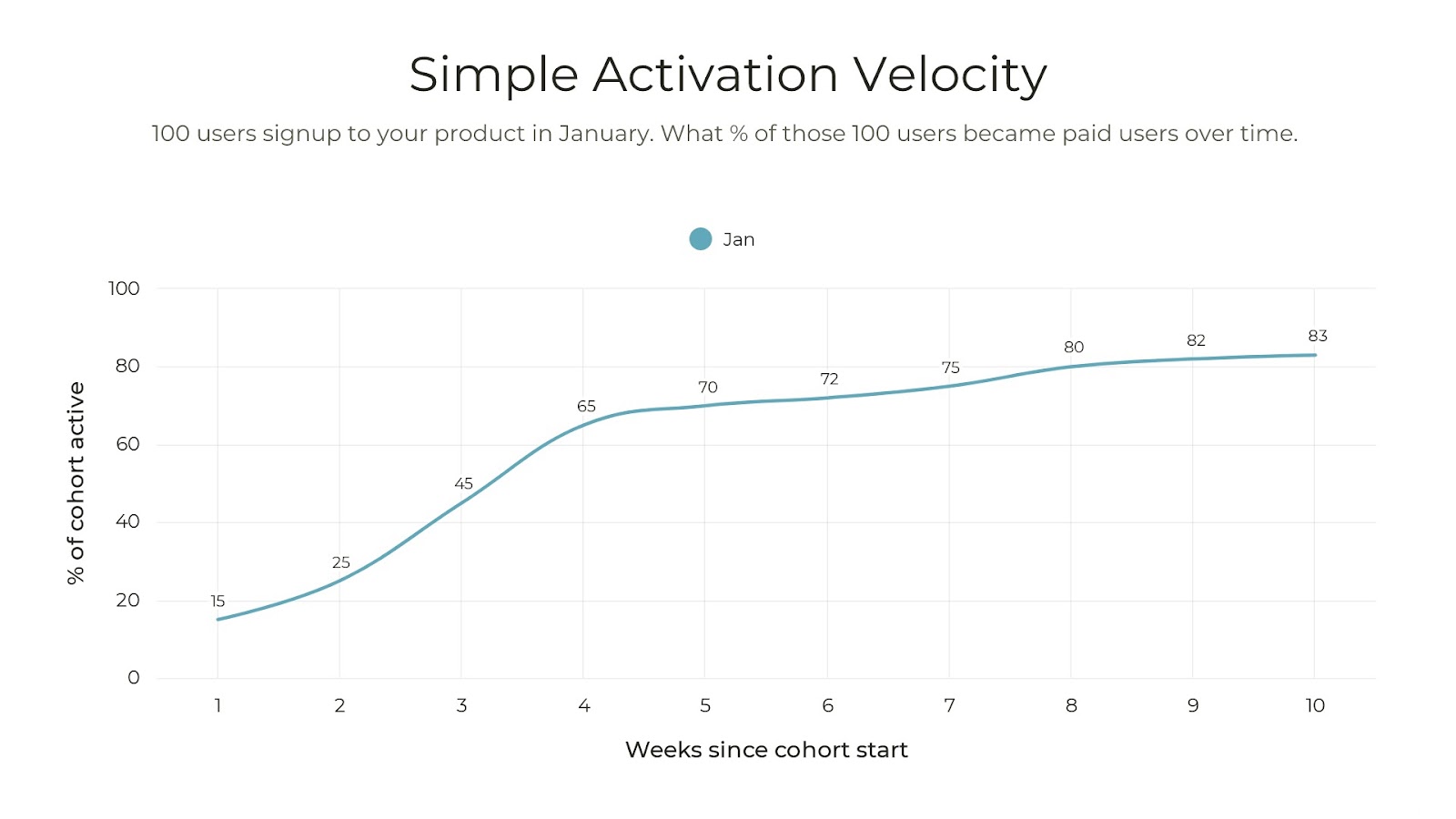
Of 100 users who signed up in January, 25% activated by the end of Week two (January 14), and 65% activated by the end of Week Four (January 28).
Creating your first curve should be relatively simple to do as long as you're collecting some data. You only need two data points. In the above example, we used:
- Start date: the date a user completed a simple signup form (e.g., email and password). So 100 users in January.
- End date: the date the user became a paid user (activated). If a user did not activate, the date would be empty.
What ‘Activation’’ means to your business is unique. If you have an existing definition with your team, use that. If you don’t, my recommendation is to not overthink it. Pick something downstream in your onboarding journey that you are collecting data for, so you can easily start to measure from today.
Here are a few examples of definitions:
- When a user becomes a paid user in a freemium model.
- When a user invites a second user in a teamwork-based software.
- When a user completes their first project in a project management software.
Note: I’ll cover more about how to use Activation Velocity to uncover better Activation definitions below
Now that you have some data, use a spreadsheet to calculate what percent of users activated by Week One from signup, Week Two from sign up, and so on. (Here's an example you can copy.)
Voila, you have your first Activation Velocity Curve!
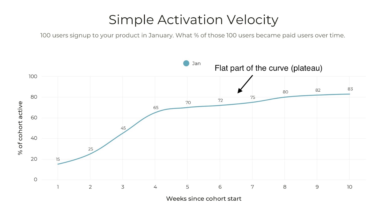
Your first observation should be that your user cohort plateaus (line becomes flat). The plateau starts around Week 5 at 70% and goes to 83% by Week 10.
Why Activation Velocity is powerful
Activation Velocity is an easy way to visualize how quickly a cohort of users activates.
There are five key benefits to visualizing a cohort in this way:
1. Not all users are equal.
Not all of your users will go through your onboarding at the same speed. Some are more tech-savvy. Some are experiencing a current pain that your software solves and are highly motivated. Others are just exploring.
A metric like time-to-value tells you how the average user activates. It doesn’t paint the picture of such nuances. Understanding how a group of users across the spectrum of motivations gives you more depth to understanding. It allows you to identify a true baseline to communicate the performance of your onboarding program.
2. Invest in the steepest part of the curve.
The steepest part of the curve tells you where your cohort has the most momentum.
Momentum is critical to helping users feel great about a decision to choose your software. The more users who activate within the period of the steepest part of the curve, the more likely that cohort will outperform your baseline.
In the example below, the steepest part of the curve is between Week One and Week Four. A user has a 65% probability of activating in the first four weeks. After Week Four, there’s only an 18% probability to activate.
Focus on helping the most users in this period.
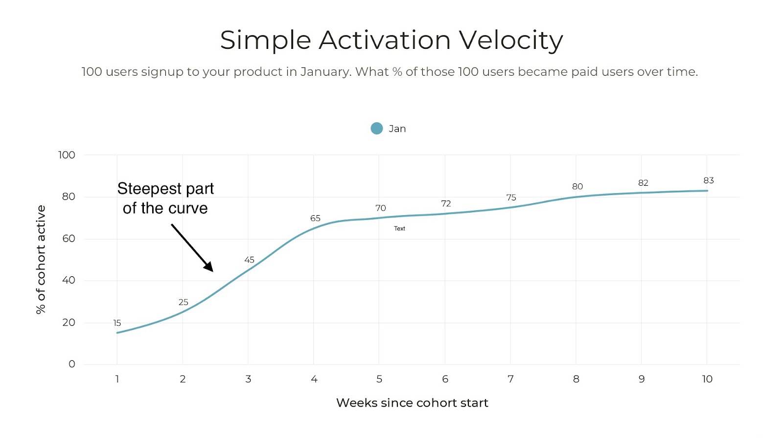
My onboarding team at Shopify discovered that the first six weeks were the steepest. We had to capitalize on momentum here. We agreed that we’d reach out to customers every five days for the first six weeks of onboarding to check on their progress. After the 6th week, we’d stop.
By doing this, we increased cohort Activation by 5%.
In your case, maybe you have a three-week marketing drip that prompts users to go through your onboarding flow. If the steepest part of the curve is four weeks, consider expanding your drip to four weeks from three.
Using the example above, if you can improve the percent of users who activate by the end of Week Four by 5% (so from 65% to 70%), that creates a big long-tail difference (87% active by Week 10 vs. 83%)
3. Reconsider how you invest in the flattest part of the curve.
Similar to focusing on where momentum is highest, you want to think about where momentum is the lowest. Are you investing heavily into win-back campaigns or helping stranded users activate many weeks after they started their onboarding experience?
Re-building momentum is hard to consider if that’s the right place to focus the energy of your team.
At Shopify, after Week Six, we stopped our five-day outreach program. An optimization we could have explored would be to send automated messages to customers who didn’t activate in the first six weeks to try to nudge them along. This is a lower level of effort and is very scalable. It could have been the right strategy for customers that otherwise would never reach Activation.
4. Using Activation Velocity for early detection
Once you have your Activation Velocity Curves set up, you should be able to monitor cohorts daily or weekly.
This is a huge benefit over time-to-value since you may need to wait until a cohort ages before learning if the cohort is performing or not. For example, if your time-to-value benchmark is 60 days, you won’t know by Day 30 if your cohort will hit the 60-day target or not.
Below is an example of early detection.
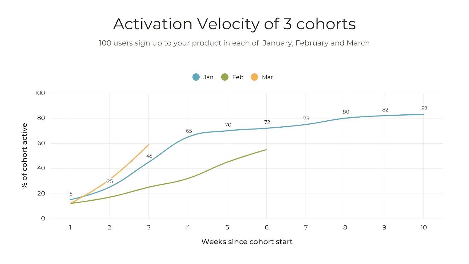
Consider a cohort of users who signed up in February. By Week Two, we’re already seeing this cohort is not performing as well as the January cohort. Why was that? Was there a product or marketing change? Did something happen in the market?
Here’s an example of this in action from Shopify.
When COVID-19 hit, our onboarding team knew early about how it would impact Activation. We reached out to customers quickly to understand the new challenges they were facing. In this new environment, the impact on Activation could be indefinite. That was a totally reasonable impact based on the environment. It would have been unreasonable not to take early action to understand that impact.
Equivalently, you may find that a cohort of users is moving faster. In the above example, why is the March cohort at 31% active vs. 25% active for the January cohort? It’s important to understand why your users are moving slower or faster in their onboarding experience.
5. Your leadership team will understand
I mentioned above that my team held high standards for understanding the business. With Activation Velocity, I could demonstrate how our experiments were impacting user onboarding outcomes – including the impact on revenue.
Having the ability to show a lift in Activation Velocity (i.e., more users activating faster) was a direct correlation to growing revenues. With this tool, I was better equipped to tell the story of onboarding and make a case for the team's growth.
Optimizing using Activation Velocity
Activation Velocity became the go-to tool to experiment with onboarding. We used Activation Velocity and its established baselines to measure how those changes influenced how quickly users were going through the onboarding experience.
Here are a few ways we applied Activation Velocity to optimize.
1. Scaling onboarding
My onboarding team started as a human-led experience.
Sales growth outpaced our onboarding team growth, and capacity became a bottleneck.
So, we experimented with using a content-led approach to onboarding. We took a segment of customers, and instead of having them work directly with the onboarding team, we loaded them into a content drip. We used Activation Velocity to monitor how that segment would activate vs. our baseline from our human-led approach. We were nervous that customers wouldn’t activate and the experience would be poor.
The results: customers in the content-led journey activated FASTER – 10% faster! So, we increased capacity by 5x.
This proved we could scale with content. So we added marketing and content hires to our team growth strategy.
2. Finding blockers in your onboarding journey
Earlier I mentioned that to create your Activation Velocity Curves, you need two dates: a start date and an end.
You can create multiple Activation Velocity curves by setting your start date as the date a user first completes a product action, uses a feature, etc. Using your Activation as the end date, you’ll get a curve that shows you how correlated a product action is to Activation.
A flat curve suggests that users are getting stuck. This is a great tool to use to investigate further.
A steep curve suggests users are maintaining good momentum or the product action is at the end of the onboarding journey.
Experiment with moving around the order of your onboarding journey to see how that impacts Activation too.
For my team, we created individual Activation curves for five to eight product actions we thought were critical to onboarding. We discovered that users who logged into the mobile app were 2x faster to activate.
In our current onboarding flow, we had users log in to the app near the end of the journey. But with our new data, we hypothesized that if we had users log in earlier in the onboarding journey, it would have a positive impact on Activation, a perfect candidate for an A/B test.
By contrast, we had other product actions near the end of the onboarding journey that had a poor correlation to Activation. Perhaps these actions weren’t part of the critical onboarding path.
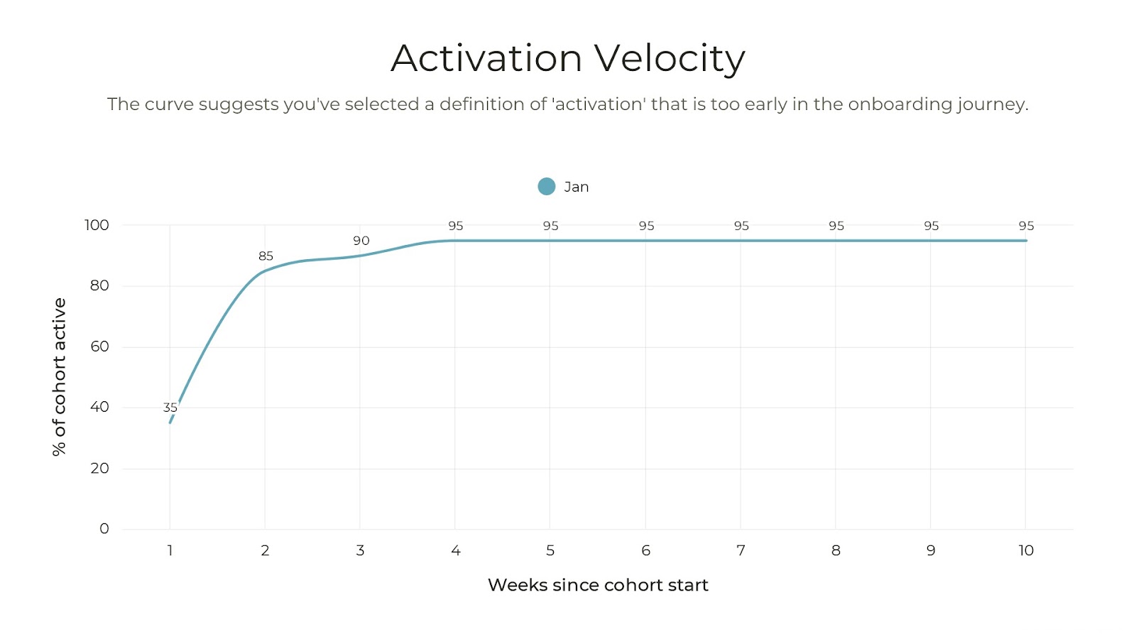
3. Updating your definition of Activation
Earlier I mentioned not to spend too much time deciding on your Activation definition.
The reason is that as you start to update your onboarding journey and start seeing improvements in your Activation Velocity, you’ll naturally ask, ¨what do our users do next after they activate?¨ This is a great opportunity to consider revising your Activation definition to something further down the user journey and using the same set of approaches to improve again.
Here’s an overly simplified example:
If you see that your Activation Velocity is really steep and rises to 95% active quickly, you may have chosen a definition too early in the onboarding journey. For example, defining Activation as the time when a user completes signup with their email and password is too early in the onboarding journey.
Experiment with Activation Velocity today
Getting started with Activation Velocity is simple. It requires only a little bit of data to be able to tell a more complete story of how your onboarding program is performing.
Like all things in product-led growth, it's iterative. Start simple with understanding your baseline. As your team starts collecting more data around feature usage, you can get more creative and start looking at areas to optimize. When you’ve optimized, consider expanding your scope by revising your definition of Activation to help users continue down the path of getting sticky with your product.
Communicating using Activation Velocity will help your team and your leadership understand the impact onboarding is having on customers.
All for great outcomes for customers.


