

This article is based on one core component that's revealed in The Product-Led Playbook. Packed with case studies and templates, it's the go-to manual you need to build a successful product-led business.
Imagine having an offer so good people would feel stupid to say no.
With this kind of no-brainer, you could scale your business so much easier with a fraction of the effort.
In this article, we’re going to unpack how you can craft an irresistible offer from top-to-bottom. We’ll even give you free templates that will help build out your irresistible offer and turn it into a high-converting homepage.
But first, let's get on the same page about what an offer really is—an offer in a product-led business is nothing more than a promise to help.
The best offers go beyond mere sales pitches. They genuinely connect with visitors and address their pain points—and provide solutions that resonate deeply with them.
But not all offers are created equal.
Let’s create your irresistible offer.
The Offer Component was created by Wes Bush and Pedro Cortés. Combined, they have helped hundreds of software companies such as Baremetrics, Expandi, Microsoft, and Wavo create irresistible offers.
Why a free offer is critical
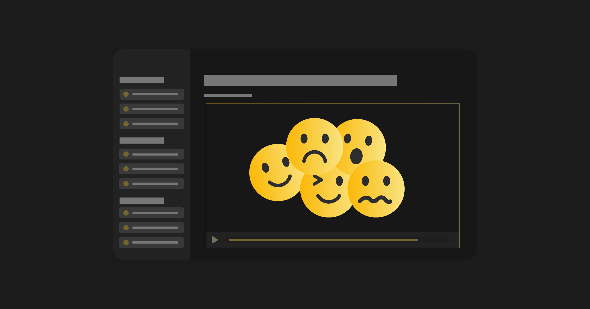
The second someone learns about your brand, they make a snap decision on whether you can help them or not.
Within seconds, your users will put you in one of three buckets:
- You can’t help me (not a good place to be).
- You might be able to help me (not sure if it’s the best solution).
- You can absolutely help me, and I believe this is the best solution for me (bingo!).
If your visitors can’t figure out if you can help them or not, they’ll move on and most likely never engage with your company again. Even if you solve exactly the problem they need help with.
If your user thinks you might be able to help, they might sign up for the product to check it out. But they’re not going to be that motivated to go through and set it up or try it out because they’re still unclear if you can really help them or not. These are typically the users who bail halfway through your onboarding experience because your offer didn’t give them enough “motivation juice.”
Lastly, you’ll have users who “get it,” and are hungry for your solution.
The goal is to get as many of your users to this point regardless of what stage in the customer journey they are in.
Sounds simple, but why is creating an irresistible offer hard?
Why creating an irresistible offer is hard
An irresistible offer involves both great positioning and messaging.
Positioning is the exercise of planning how you want to come across to potential users and buyers. (Remember, we defined the market that cares a lot about you in the User Component.)
Messaging is making sure that people actually understand how you want to be positioned.
Positioning without proper messaging will be just a bunch of useless exercises. If you ever spent a few hours thinking about the perfect positioning but then had no idea how to communicate it, then this article is for you!
We’ve broken this piece down into three phases:
- Phase 1: Defining your offer.
- Phase 2: Nailing your messaging for your offer.
- Phase 3: Launching your offer so you can earn a position in your user’s mind.
By the end of the Offer Component, you’ll have a high-converting offer that clearly states what the heck you do and, more importantly, compels your ideal users to sign up.
You can use this to replace your existing homepage or test it out as a landing page first.
Note: if you get this irresistible offer right, it will likely be unappealing to those who are not your ideal user.
One of my favorite stories is about a company that went through this same process with Pedro. Although they only had a 10% increase in their signup rates, the users that did sign up converted into paying customers, resulting in 40% more revenue. Why? It spoke to their ideal users and what made the company’s product more unique, which meant that the users who did sign up were more motivated and saw the value in their solution.
I’m by no means promising that you’re going to 2x your revenue, but I am indicating that if you apply everything we’re going to walk you through here, it’s not uncommon for you to see an increase in:
- Signup rates
- Users getting to value
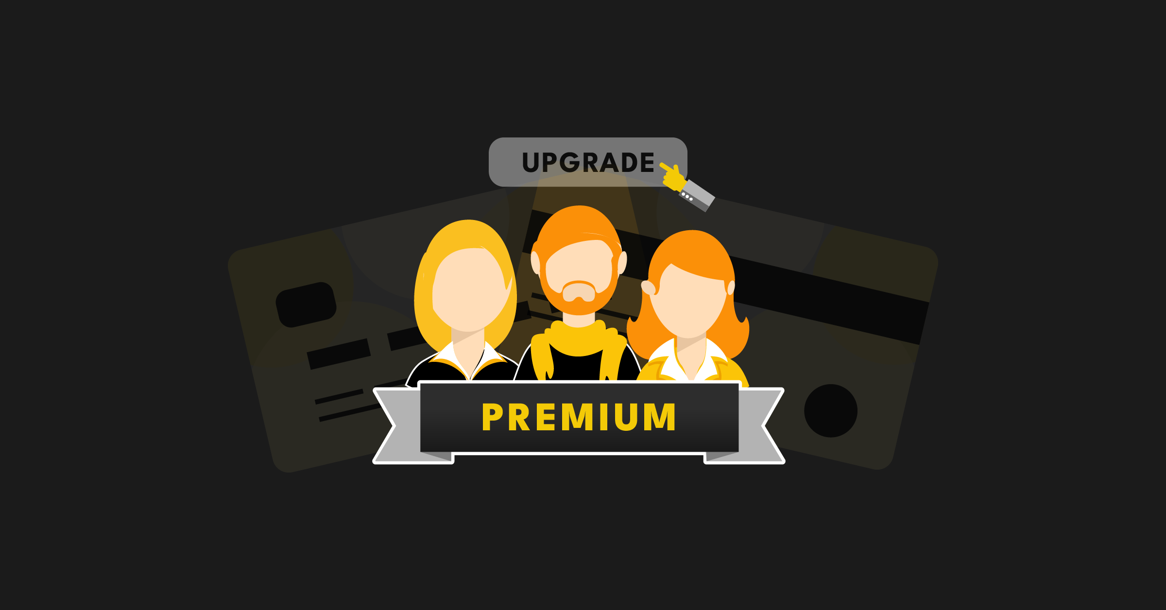
- Users upgrading
All because you have a compelling offer.
So, enough hyping you up.
Let’s dive into Phase 1 and nail your offer.
Phase 1: Define your offer
At its core, defining your offer is the pursuit of answering why your product is awesome for your users.
But where do you start?
Pedro argues that building an irresistible offer is as simple as mastering three key pillars. Once you do that, you shouldn’t need to spend countless hours poring over copywriting and positioning books. It all comes down to understanding your market and your users' needs.
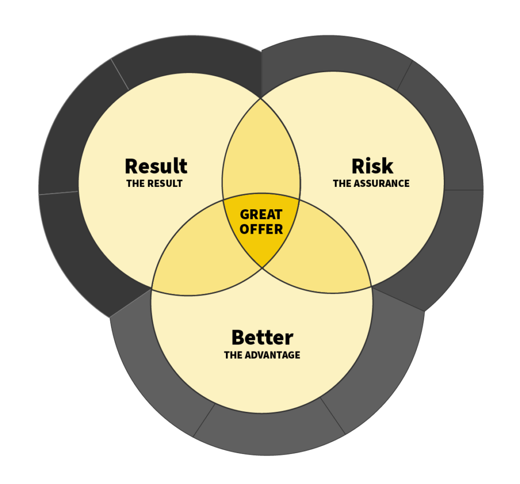
These three pillars of a winning offer are:
- The Result
- The Advantage
- The Assurance
To establish these pillars, you need to dig deep into your customer's psyche. Ask "why" at every stage to uncover the true essence of their problem, along with the unique benefit your product provides. Otherwise, you're stuck at surface level, blending in with the crowd, which won't get you conversions or strong positioning.
Let’s dig into each of these.
Pillar #1: The Result
This is the tangible, measurable outcome your product delivers. It’s not about vague benefits; it's about concrete results that align with the top priorities of your user. What are you doing to help your users save time or increase their profits? Anything not directly attached to an outcome is not specific enough.
Example: Let's take the case of a business with an email automation tool for WordPress. An ineffective approach would be to use vague terms such as: "better," "faster," or that it will "grow their business." That doesn’t really promise a specific result.
The better approach? Highlight specific, relevant benefits. Their tool was "Designed for agencies using WordPress," eliminating the need to learn a new platform and saving them time. They also offer flat rate pricing, which translates to significant cost savings as an email list grows. These points directly address the user's needs and position their product in a compelling way.
Pillar #2: The Advantage
This is where you need to highlight how your product is significantly better than other options in the market. If your product only seems marginally better, you won’t convince potential customers to make the switch. It has to be a game-changer.
Example: Claims like "we're easier to use" or "our platform is faster" won't cut it. It lacks substance and doesn't provide a clear context of how your product is better.
The better approach? Dig deeper. Why is your product easier to use? What specific feature or aspect of your product is currently impossible with their existing solution?
Pillar #3: The Assurance
This one is crucial. If potential customers believe there's a risk involved in switching to your product, they won't make the leap, regardless of how good your offer is. Addressing their fears and uncertainties directly can make all the difference.
Example: Vague assurances like "fast" or "easy" won't convince anyone.
The better approach? Be specific about why it's easy to get started with your product and why there's no risk. Quantify everything, and explain in concrete terms why their fears are unfounded.
Pro Tip: The crucial tip here is to continually ask "why" at every stage of crafting your offer. It helps you dig deeper and arrive at answers that resonate strongly with your potential users.
Hopefully, by now, you can see why these three components are critical.
Take a company that communicates the Result and Assurance – why should you use that solution and not another? You don’t know why that solution is better.
Take a company that communicates its Result and Advantage - what’s the risk of signing up?
Take a company that communicates the Assurance and the Advantage - what’s the result? Why should you invest your time signing up for your solution?
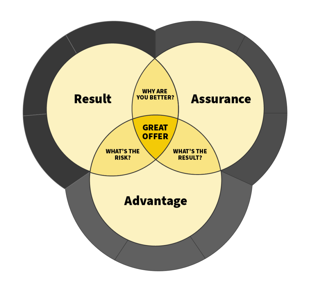
It’s not enough to have one or two of these components; you need all three to position your offer correctly.
Luckily, we’re going to show you an easy way to approach this.
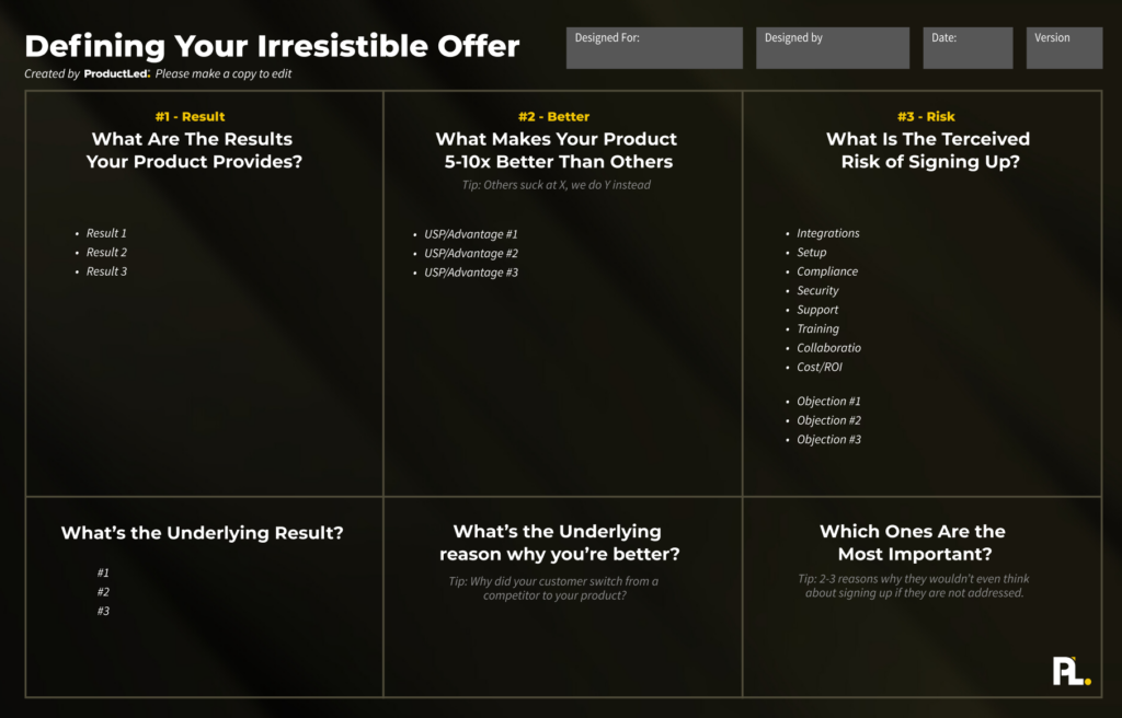
First, you need to start by asking yourself three questions:
- What are the results your product provides?
- What makes your product 10x better than others?
- What is the perceived risk of signing up?
Each of these questions unpacks what the Result, Advantage, and Assurance outcomes are.
To get the best results, start by listing out as many potential answers to the questions above. It’s not about quality at this point. Just list everything you can think of for each question.
To unpack your key result, think about what user success is for your ideal user (remember, we defined this in the User Component. If you don’t have that yet, you’ll want to complete it first). Take it one step further and ask what measurable ways this user would get if they knew they got value. Is it revenue? More signups? More time? And if so, how much? The more specific you can get about the result, the better.
Next, you’re going to unpack three clarifying questions to hone in on your irresistible offer:
- What’s the one main underlying result?
- What’s the one main underlying reason why you’re better?
- What are the two to three most important perceived risks to address?
Unlike answering the first question, this time, you’re going to get hyper-specific on what really makes your offer, in fact, irresistible.
Pro tip: Complete the first three questions individually and then book a meeting with your team to hone in on your irresistible offer. Nothing brings clarity like a heated debate.
Action items:
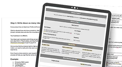
- Complete and fill out the Offer Canvas.
Once you’ve filled out the Offer Canvas, you’ve got the foundation for an irresistible offer. But just like a skeleton is a core to making your body stand on two feet, you need muscle, tissue, and organs to actually walk, talk, and do all the amazing things you’re capable of doing. That’s why you need strategic messaging that persuades your ideal user that this offer is, without a doubt, right for them.
Let’s give your offer legs.
Phase 2: Nail Your Messaging
Imagine you’re an artist for a second.
You’re at the top of a mountain overlooking a beautiful lake that’s surrounded by a dense forest. Everywhere you look, it’s green, and there’s no sign of civilization around you. It’s quiet, yet you can hear birds chirping and leaves rustling as a cool, refreshing breeze flows down the mountain. It’s a bright sunny day, and you pull out your blank white canvas and start to paint.
It’s time to capture this beauty.
You start by outlining the main components, such as the ridges of the mountain and lake, and the key elements in the view.
Then, you give some of the main components more definition by building them out.
Lastly, you invest time in building out everything else and truly bringing the painting to life.
That’s how crafting your messaging should feel.
One step after the other brings your messaging to life until it pops.
To turn your messaging into an irresistible offer, we’ll follow three steps:
- Step 1: Define the components.
- Step 2: Write the headlines.
- Step 3: Fill in the blanks.
By the end of these three steps, you’ll have crafted a product-led homepage that converts.
Let’s dig in.
Step 1: Define the Sections
The best product-led home pages all have the same sections.
After analyzing hundreds of home pages, Pedro boiled this down to six sections. Here’s a free template to fill out yourself based on this exact structure.
- A Hero Component outlines the main value proposition and focuses on getting your attention by clearly communicating the main value you’ll get from the product.
- A Problem Component that clearly communicates the main problem your product solves and builds your interest around what the solution might be.
- A Solution Component that explicitly answers the “How does it work?” question that so many users want to know before signing up.
- A Risk Reversal Component addresses the main reasons that might prevent someone from signing up.
- A Social Proof Component assures the user they’re making a great decision to sign up.
- A Call-to-Action Component that asks the user to sign up and gives compelling reasons to support why they need to take action.
It’s easy to overcomplicate your homepage with way too many sections, but at its core, these are the main ones you need.
Let’s break down these six sections and build them out for your homepage.
Deal?
Step 2: Build Each Section
Building out each section can take the majority of your time when it comes to crafting your messaging. Although it’s tempting to delegate this step to a copywriter, I’d strongly encourage you against doing so at this point. You want to complete the first draft so you can ensure that your irresistible offer comes through.
You can use this template to build out your product-led homepage.
Hero Section
Your Hero section holds the first words users see when they land on your homepage. It’s arguably the most important part of your entire homepage. Why? Because it sets the impression for what you do as a business, and in seconds, your user will decide whether they should continue scrolling down or ditch your site completely and never return again.
Our goal is to help you craft a hero section that grabs your user’s attention.
Here’s our Hero section template:
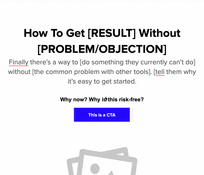
If we break it down further, there are really five pieces to cover:
- A tagline communicates the main underlying result you offer as a business.
- The sub-copy reinforces what you do as a business and prompts them to get started.
- A call-to-action is nothing more than a simple prompt to take the first step to sign up.
- A visual aid is optional but can often quickly communicate what your product does in ways that words can’t.
- Finally, social proof assures your users that you are dealing with a reputable business.
Since you’ve already done the hard work of filling out your Offer Canvas, you’ll notice that completing the Hero section is a lot easier as you’re not starting from scratch when it comes to defining your result and common objections.
Now it’s your turn to take action:
- For your V1 Hero section, complete the tagline, sub-copy, and call-to-action.
- Bonus: Complete the visual aid and social proof pieces.
Remember: a great Hero section leaves your users wanting to sign up and learn more - it must be compelling.
Once you’ve completed your Hero section, let’s dig into your Problem section.
Problem Section
A good Problem section quickly points out why your current approach is not the best path forward.
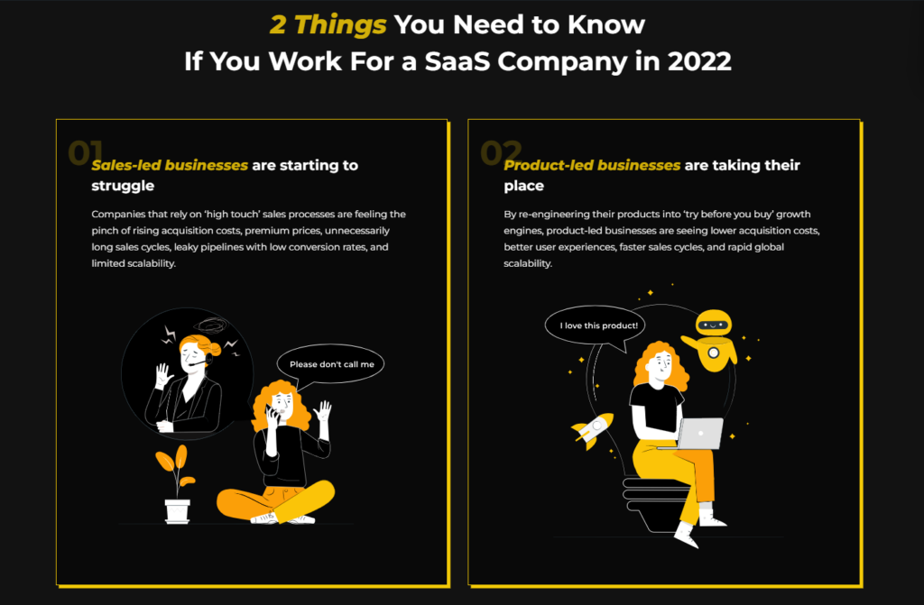
At ProductLed, we’re strong advocates of why it makes sense to be product-led versus sales-led, so our Problem section used to focus on that in the early days of product-led growth.
Your Problem section might point out:
- What the problems are with other tools.
- What the main problems are with their current solution.
- Just point out the underlying problem they need to address.
One of the easiest ways to define what to lead with for your Problem section is to think about the main obstacle that blocks your users from seeing value.
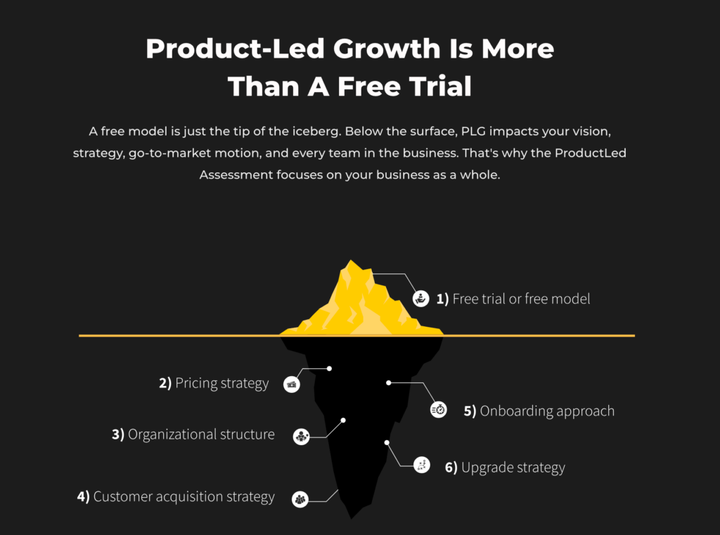
For example, at ProductLed, we’ve helped hundreds of companies transition to PLG and scale from pre-revenue to billions in revenue. When we started to analyze what separated the successful product-led companies and the ones that weren’t having success, we realized that if a company didn’t approach product-led growth as a company-level strategy, or understand that it was more than a free model, then they were basically screwed.
Not to say they couldn’t adapt. But if they held the common belief that “product-led growth was no more than a free trial,” then they weren’t “all-in” and, therefore, wouldn’t find success.
Wes Kao, founder of Maven, refers to this as your spiky point of view. It should be a tad bit controversial. Not over the top, but it should definitely not be something everyone can agree to.
If you’ve done a good job identifying the underlying reason why you’re better as a business, your spiky point of view should absolutely play into it.
For instance, at ProductLed, what makes us better than anyone else in our space is that we have a holistic approach to product-led growth. So when our problem statement is “Product-led growth is more than a free trial,” it leans into the fact that we believe a free trial is just one of many pieces of a successful product-led business.
Here’s the template you can use to build out your Problem section:
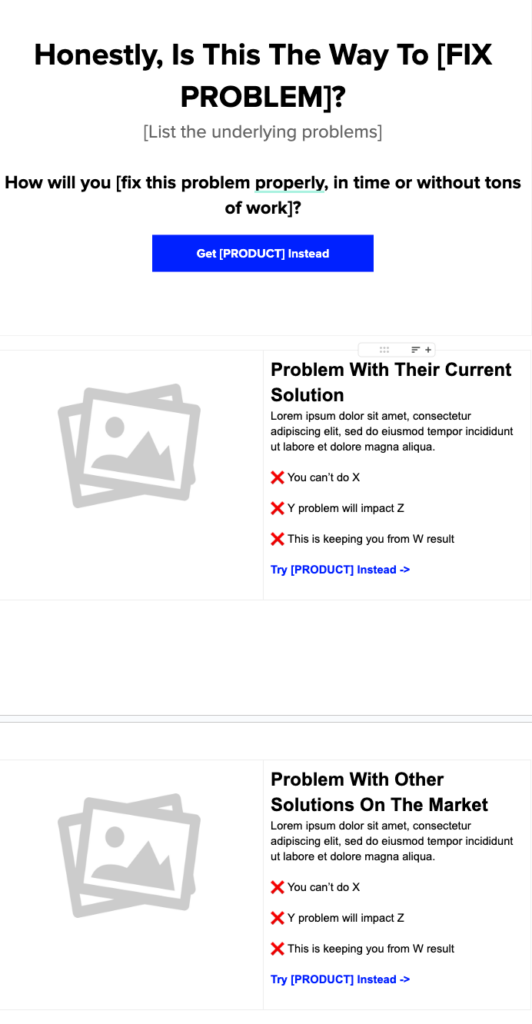
Now, unlike the Hero section, which is pretty clear-cut, your Problem section is flexible.
If it takes a lot for your users to understand what the main challenges are with their current approach, you may opt for something like the template above, or if it’s more well-known, you could slim it down and use something more streamlined like this.
The golden standard in messaging is to communicate more with fewer words.
Now it’s your turn to take action:
- Build out your Problem section
Pro Tip: Write your Problem section out as a LinkedIn post and see if it strikes a chord with your audience. If it falls flat on its face, chances are you don’t have a spiky point of view. If it drives a lot of engagement quickly, chances are that you’re on to something!
Once you’ve built out your Problem section, let’s put on our solution hat.
Solution Section
A good Solution section answers the “How does it work?” question that so many users want to know before signing up.
Yet, when most companies get to this section, they tend to overcomplicate it and list out ALL of the required steps to get to value. If your solution section leaves users feeling overwhelmed, you’ve gone too far. If your solution section leaves users feeling empowered, you’re on the money.
A great solution section reinforces the underlying result that your product promises while typically showcasing how much easier, simpler, or faster it is to achieve that specific result.
Here’s your solution section template:
.avif)
Ideally, you have no more than four or five steps when it comes to breaking down what you do.
Each step of the solution doesn’t have to be linear.
The best solution sections reinforce that you can achieve a specific result…
- in less time,
- without doing a lot of grunt work and
- ever worrying about doing it again.
What makes a Solution section compelling is that you need it to feel like you could achieve that specific result after reading the copy alone.
A bad example of a Solution is something like this:
- Step 1: Sign up for our free product.
- Step 2: See the incredible value.
It doesn’t feel believable. It’s too quick and trimmed down.
Everyone with a brain knows there’s usually a bit more to it.
Now it’s your turn to take action:
- Build out your Solution component
Once you’ve completed your Solution component, we can dig into reversing the risk associated with potentially signing up.
Risk Reversal Section
Out of every 100 visitors that go to your website, only a select few will decide to take action.
Something is holding these users back from taking action on your homepage at this point.
They understand your offer.
They understand what’s unique about it.
They understand how it works for them.
Yet, something is holding them back.
The million-dollar question is - what specifically is doing that?
I can’t tell you what that is for your solution.
However, someone on your team probably has a hunch why.
If you are customer-facing, you probably hear reasons why your users don’t sign up.
Start listing them out every time you hear why a potential customer doesn’t sign up for your product to spot the patterns.
Alternatively, if you have a good amount of website traffic, you can deploy an exit intent popup that asks why they didn’t bother to sign up.
This can quickly help identify some of the top objections.
Once you’ve got a list of your top objections, narrow it down to the top three objections and then confront them.
Here are a few great examples of how to do just that:
Objection: “Does it work with the tools I use? What can I do with them? How long does it take to implement?”
Let's say your SaaS tool integrates with Slack. Instead of showing the Slack logo, your website might say:
"Supercharge Your Team Collaboration: With our Slack integration, you can automatically receive updates in your preferred Slack channel whenever there's a change in our tool. This ensures your entire team stays informed and can act immediately, boosting productivity and efficiency."
This message not only demonstrates the integration but showcases a tangible benefit of using your tool with Slack.
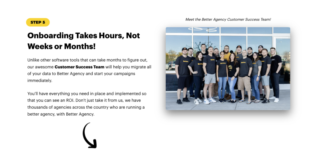
Objection: Setup time – “How long does it take to set up? Will you help me migrate data over?…”
Let's look at BetterAgency. This client did all the heavy lifting in terms of migrating data over and getting their customers up to speed but never mentioned it on their previous website version. We took it upon ourselves to make sure these features were emphasized, addressing setup time, support, and training objections in the process.
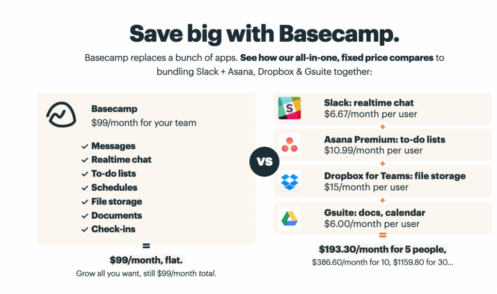
Objection: ROI – “What’s the result I’ll get versus the price I’m paying for this? Are there any hidden costs? Are there any contracts required?”
Normally, you’d answer these on pricing pages. Look at this example from Basecamp, where they anchor their price based on how much you’ll be able to save with an all-in-one tool that charges the same regardless of how big your company is.
Hopefully, by now, you’re able to see that when you confront these objections head-on, you’re able to increase your overall conversion rates dramatically.
Feel free to start off by filling out this Risk Reversal template to get started:
Action items:
- Identify all objections to why users don’t sign up for your product.
- Narrow it down to the top three objections.
- Address your top objections on your homepage - if this is the first time you’re going through this, start with addressing one objection.
Now that you’ve taken away a lot of the risk from signing up for your product, there are still some users who need some assurance that this is the right thing to do.
Social proof is how you make that happen.
Social Proof Section
Think about a time when you visited a landing page and spotted a familiar logo or testimonial from someone you knew or respected. Instantly, you felt a wave of trust. Great social proof assures your user that everything is going to be okay and that you’re making the right decision.
Although social proof is its own section, it doesn’t necessarily have to have its own place on your homepage. You can deploy social proof alongside every section.
For instance, you can and should include it below the above-the-fold section.
You can use a before and after story from a customer to reinforce the Problem section of what it was like before your solution and what it is now.
You can use social proof below each step of your Solution component to expand on either how easy it was, how much time it saved them, or how big the result was.
And of course, you can use social proof for risk reversal. In fact, it might even perform better for you if your customer says the objection and why they made the right decision to sign up instead of your company.
It just comes across as more authentic.
Although Social Proof is one of the easiest sections to roll out, it can be tempting to think that quantity trumps quality, and that couldn’t be further from the truth.
You want to use Social Proof to reinforce the Result, Assurance, or why your solution is better.
And the more specific, the better.
For instance, say you’ve got two testimonials. One says, “This solution is great!” and another says, “This solution helped us save $10,342 on our last tax return,” opt for the latter as it’s more specific.
For the Social Proof section, here are your action items:
- List out all of your social proof
- Reinforce each component with social proof
- Create a testimonial section that leans into the core Result, why your solution is Better, and Assures users they’re making the right choice.
Here’s the Social Proof template you can start off with:
Once you’ve reassured your user why they’re making a great choice to signup, it’s time to wrap up the page with a compelling call-to-action.
Call-to-Action Section
A good call-to-action asks the user to sign up and gives compelling reasons to support taking action.
The key here is not to introduce any new content or insights. It’s a recap of the main reasons why these users should sign up. After reading a compelling call-to-action section, you should feel “fear of missing out (FOMO)” if you’re an ideal user for that product.
To do that, you must lean into the top reason why someone should sign up for your solution and then cover why your solution is better, less risky to use, and gives people a lot of great results.
Here’s a great template to follow for a call-to-action section:
Now it’s your turn.
Action items:
- Build out your call-to-action section.
- Make sure it passes the FOMO test.
Once you’ve completed your call-to-action section, let’s put everything together!
Putting it all together
Now that you’ve built out every component, you’ve officially just created your high-converting homepage with your new offer.
Congrats!
As I’ve mentioned in this chapter, every time you answer each of the columns, it’s important to keep asking “why” so you can go from surface-level insights to real ones that you can use to improve your positioning and conversions.
Step #1: What’s the result your product provides? It can’t be something vague like “saving time.” If it’s not directly related to saving or making more money in the most specific way possible, then it won’t sound interesting enough.
Step #2: Why is your product better? Not marginally better, 10x better! Those USPs need to be everywhere in your marketing. A good way to think about these is to figure out why people switched from other products to yours in the first place. It takes even more convincing to have someone switch from a competitor to a similar tool, so if you find out why, it will help you filter through the best USPs much faster.
Step #3: What’s the perceived risk of signing up? Think about all the reasons that could keep people from signing up, like the ones we’ve covered before (support, integrations, compliance…). Then find the top three and think about a good way to address each one.
Step #4: Get rid of 80% of what you wrote. Now that you’ve filled all of the columns, it’s now time to find the underlying reasons for each topic. Boil it down to three items to get the clarity needed to make your messaging as clear as possible.
Pro Tip: Find what’s common with all of the items you wrote in each column. That should give you a good indication of what’s the underlying point here.
Often at this point, I get asked if you should follow the section templates to a tee.
The answer is no. Make them your own and ensure your irresistible offer is front, right, left, and center in each section.
Unless you’re a professional Conversion Copywriter or a Product Marketer, don’t be cute adding additional components.
Now that you’ve built the homepage, let’s get this offer out into the wild.
Phase 3: Launch
Depending on the size of your business, you may need to refine this offer further and send it to your Design and Marketing teams to improve.
However, it’s important to set an aggressive deadline to ship this page.
We can edit it on the go once it’s live.
Too often, I see companies spend months refining their homepage to ensure it’s perfect.
But here’s the truth. Because we started with defining an irresistible offer, this page will most likely convert better than a well-designed page that doesn’t have those same elements.
Even if your page doesn’t feel “perfect,” still launch it.
Once you launch, you can gain user feedback faster.
Your page will not be perfect, but that’s okay.
Launch it.
Now that you’ve made it to the end of the Offer Component, please share your top takeaway(s) in the comments below!
To continue on your journey of building a successful product-led business, be sure to continue building out the other eight components of the ProductLed System™️.
Up next is building out your Onboarding Component. You can read that here.
Alternatively, if you’d like to work with a coach to implement these components into your business, be sure to check out the ProductLed Implementation Program.
It’s our intensive implementation program where we’ll help you build a strong foundation for product-led growth so that you can scale faster and with more control.
What’s unique about this program is we’ll work with you and your team to implement the proven ProductLed System™️ so that you can scale faster with less stress.
We’ll go through everything we went through today with your team so you can create an irresistible offer for your users.
Just click here to learn more and apply now.
About the Authors
Wes Bush
Wes is the CEO & Founder of ProductLed and wrote the bestselling book Product-Led Growth: How to Build a Product That Sells Itself.
Pedro Cortés
Pedro helps PLG companies convert more visitors or attract more enterprise deals through the use of clearer messaging and positioning.