How to Personalize Your User Onboarding Experience
Onboarding
All

This is an excerpt of a new book I’ve written with Wes Bush called Product-Led Onboarding™: How to Turn New Users into Lifelong Customers. You can buy it now!
When user onboarding is bloated with too many unnecessary steps, new users will abandon an app and leave it for good.
You’re in a race against time.
Users have little to no patience to read long directions and no time for steep learning curves. The default is to find the easiest and quickest path. That’s why it’s important to reduce your time-to-value as much as possible.
The goal is to shorten the time-to-value (TTV), the amount of time it takes a new customer to realize the value of a product. A short TTV means customers receive a faster return on their investment of time—and that means they are more likely to stick around!
Unfortunately, in my experience, most onboarding experiences are anything but a straight line. Well over 30% of them are superfluous and end up creating more friction for new users than necessary.
In this article, I'll share three steps to shorten your time-to-value and ensure every step in the early stages of your customer’s journey is as efficient and effective as possible.
To help you visualize this, I’ll be going through the steps to develop the Straight-Line Onboarding of a fictional online party invitation tool that I’ll call PartyParrot.
The first step is to sign up for your own product as if it’s your first time. It’s probably been a while since you’ve done that. More likely than not, it’s been a while since anyone in your company has done that.
The goal is to come in with a fresh perspective and map out each step in the user experience before they become highly engaged users. To do this, you’ll want to go beyond filling in the form on your site. Go through the motions of signing up to study the first impression of your product, whether that’s a Google search, paid ad, blog post, or email invitation.
Document every step that’s required for users to achieve your product’s First Strike. Be sure to reference every field that you’re asking users to complete, including each button they need to click. I also recommend taking a screenshot of every step so you can refer to it later (you’ll need this for later steps in the framework).
If you’re doing this with the onboarding team in a room, you can use sticky notes and markers. Write down each step in one sticky note. For this exercise, consider each field a user has to fill out as an onboarding step. So if there are ten fields on a signup page, that’s eleven steps, including clicking on the submit button.
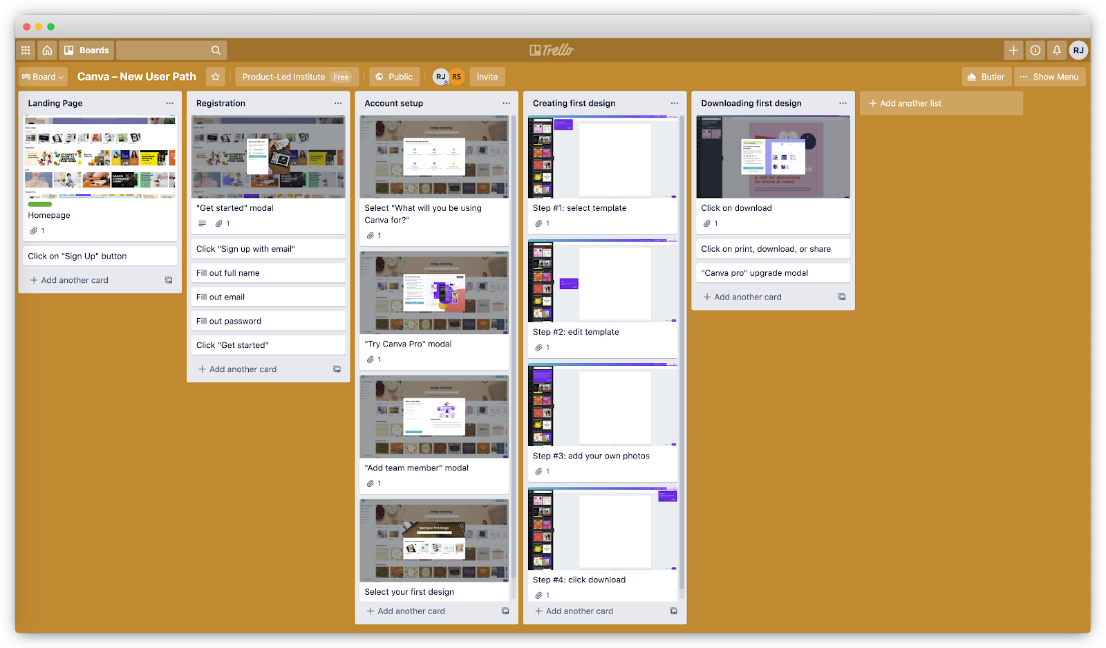
If your team is remote, you can use tools like Trello, Notion, or Miro. I’ve listed out every step in Canva’s onboarding process with Trello at https://bit.ly/canva-path.
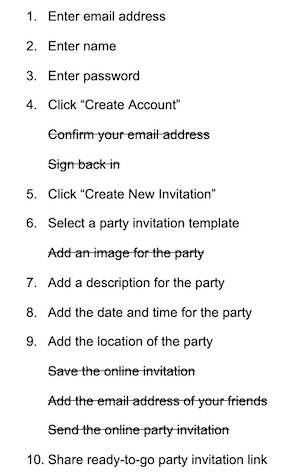
For the remaining steps, I’ll use PartyParrot as an example. Let’s say the current onboarding path from their website looks something like this:
The next step is to evaluate each onboarding step for three components:
Each step in the onboarding path is yet another opportunity for users to drop off. Go back to your onboarding path and evaluate if the value of each step outweighs the risk they pose of a drop-off. Any steps that add more friction for users to achieve the First Strike should be removed or delayed.
Use green, yellow, and red labels to easily identify where each step falls in the onboarding process:
Do this step collaboratively with the onboarding team.
Ask each team member to label every step on their own. Then, go through each step together to identify which ones are necessary. Removing the red and yellow steps are imperative to building a Straight-Line Onboarding experience so more users achieve the First Strike.
Let’s go back to PartyParrot and evaluate each step.
Does step five–confirming the email address–help new users accomplish their immediate goal of sending online invitations?
This step is one of the biggest onboarding conversion killers.
Working with a graphic design tool Snappa, we discovered this firsthand. About 30% of new users never confirmed their email addresses. Once we did some simple math, we realized that with the removal of this activation step from the beginning of the onboarding flow, we'd be able to generate a 6-figure annual recurring revenue (ARR) outcome. In less than a week of implementation, we started to see their monthly recurring revenue (MRR) grow substantially.
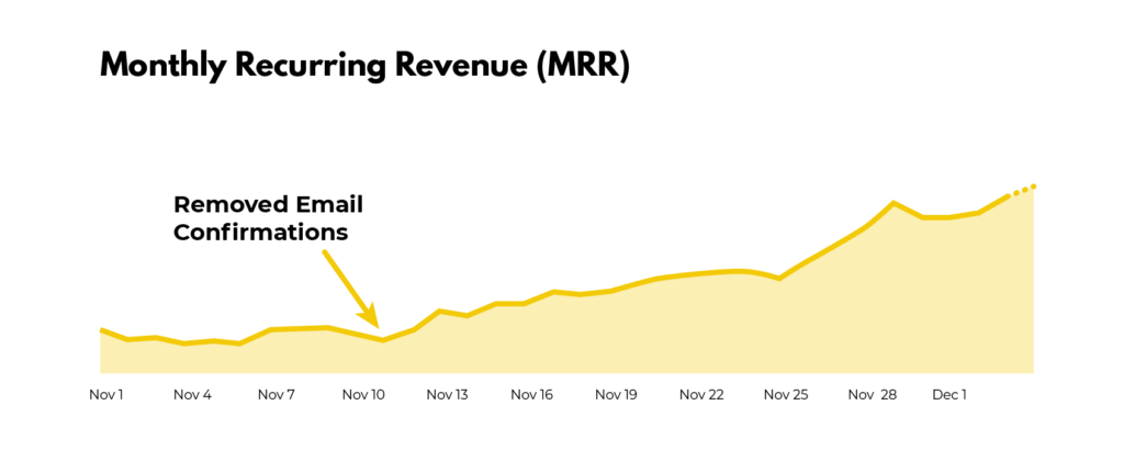
For those who still require new users to activate their email address before logging into the product, check your product analytics and see what percentage of new signups never touch foot in your product. Chances are 10% to 30% of new users never see the product because of this step.
So, let’s get rid of step 5. As a result of this, users don’t have to sign in again (step 6).
For step 9, does someone really need to add an image to send out party invites? One could argue that if the party invitation templates are well designed, users might not need to add a photo. Without any data, remove this for now.
Step 13, “save the online invitation,” could be replaced with an autosave feature. It might seem small, but anything you can do to relieve people from performing another task could help improve new users achieving the First Strike.
Imagine the pain of manually entering the email address of each of your friends. That’s why it makes more sense to replace Step 14 with a unique invitation link users can easily send out.
We’ve now narrowed the touchpoints down:
Are there any steps in your onboarding that can be removed or delayed after the First Strike?
A word of caution: be careful with cutting too deep. Although friction slows down users, sometimes it may be helpful in successfully onboarding more people. For example, requiring users to input more data gives them more ownership.
This is what Wave (an invoicing and payroll software) does during the user onboarding process. It asks for a logo. Once they have it, they automatically identify the brand colors and update the invoice template to match the branding.
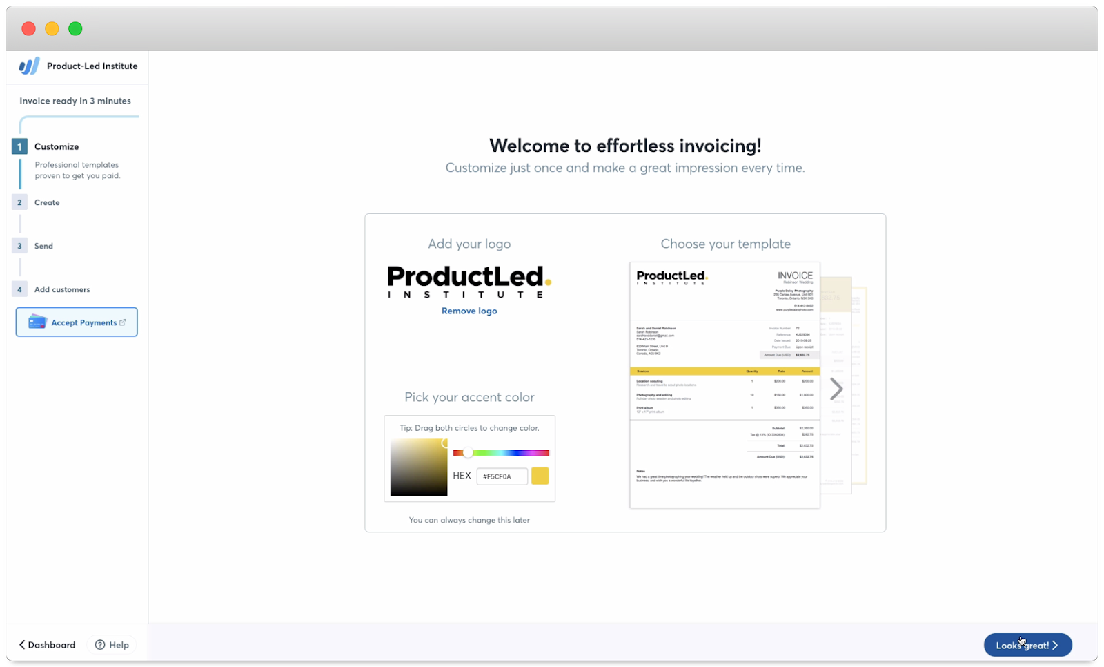
Some may think that this step is unnecessary and should be removed. But, after doing customer interviews, the Wave team found that this step got users excited about Wave:
This is the IKEA Effect in action. It’s a cognitive bias in which consumers place a disproportionately high value on products they partially created or customized. The name refers to the furniture retailer IKEA, which sells items that require assembly. When people put in the effort to assemble furniture, they were willing to pay 63% more for it than the same pre-assembled one.
So, before you cut a step out of your onboarding, ask yourself three questions:
I call these questions the DAD test. (Yes, it’s a riff on Rob Fitzpatrick’s MOM test!)
Baby steps are easier than large leaps. It’s much more painless to commit to a smaller task at first and then gradually increase the difficulty. Imagine trying to run a marathon if you’ve never even run five miles in your life!
The Principle of Commitment and Consistency states that the smaller the initial ask from someone, the more likely they are to agree to bigger requests. This principle can be applied to user onboarding by reorganizing the steps from easiest to hardest.
HEY, an email app created by the team behind Basecamp, does a good job of applying this principle to their user onboarding. They focus on teaching users one step at a time, with each step gradually increasing in complexity and difficulty.
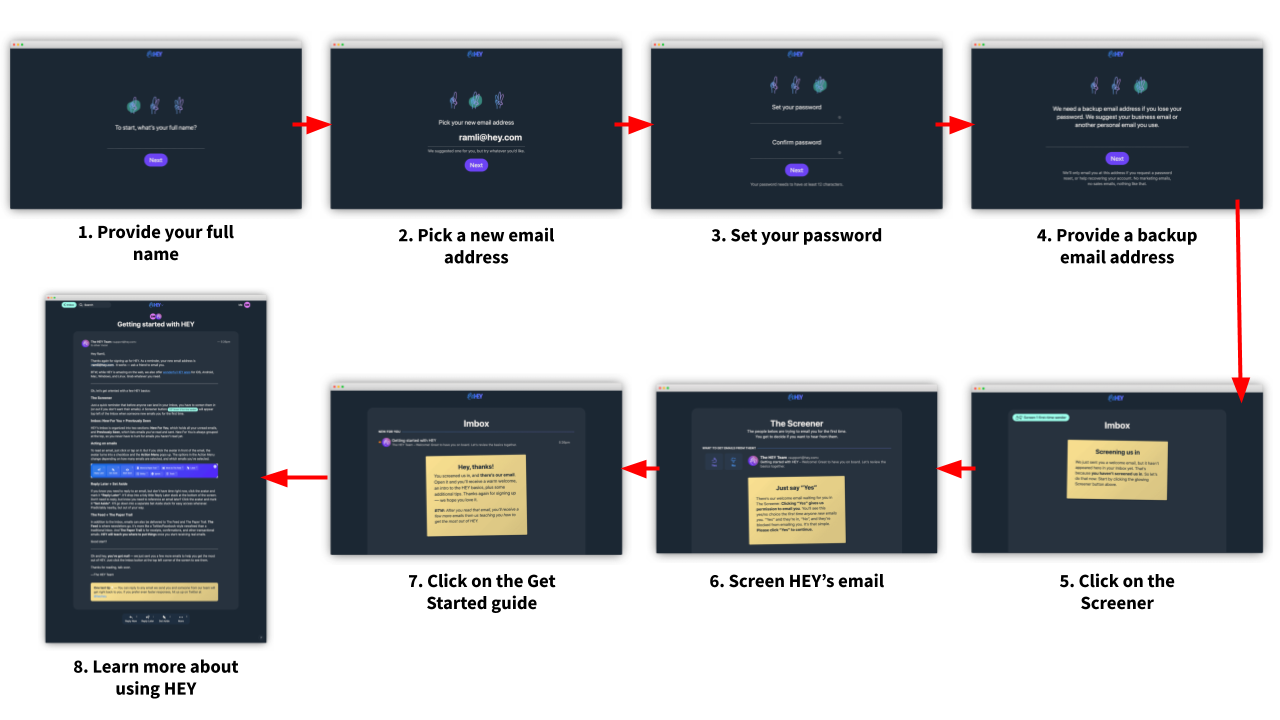
If you’ve played any video game like Super Mario, you’ve also seen this in action. Usually, they start with showing users’ core actions. For Super Mario, this consists of moving forward, jumping, picking up a mushroom, and destroying a Koopa. As you become more familiar with the game, you learn new skills such as swimming, shooting fireballs, and running jumps.
The same principle can be applied to user onboarding. First, show core features of the product that users need to accomplish their Customer Job. As users become familiar with your product, unveil new options. This maintains simplicity for new users and brings power to advanced users.
Here’s the onboarding path for PartyParrot again:
For steps 1 and 2: “Enter email address” and “Enter name,” which one is an easier request to complete? Most likely, asking for a name. So flip them around.
We could probably take this a step further and ask users to create an account after they’ve already picked a party invitation template and filled in the details of their party. This is the Sunk Cost Effect in action. When people invest time, money, or effort into something, they’re motivated to make it work. By investing in the customization of their party invitations, users are more likely to create their account.
With this concept in place, we can replace step 5 with “Click ´Create an Account to Save Your Invite’”
We’ve now shrunk the onboarding path by 33% from 15 to 10 steps. Without unnecessary steps to bog new users down, more people will reach their First Strike!
For your onboarding, are there any steps you can reorganize from easiest to hardest?
There are situations where it’s not possible to remove or delay the bottlenecks in the user onboarding experience. In that case, simplify as much as possible.
According to Hick’s Law, the time it takes for users to make a decision increases logarithmically as you increase their number of choices. Thus, more choices lead to users becoming overwhelmed and abandoning the signup altogether. Take, for example, the following form with more than 20 fields. Would you sign-up for this product?
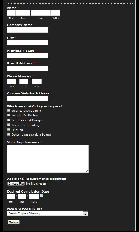
For me, heck no! But I understand the intention. They’re probably trying to learn more information about new users.
But, come on, did they really need to ask for your suffix? Really?!
Let’s give them the benefit of the doubt and say all of those fields are absolutely necessary to experience the value of the product. Simplicity can still be achieved with a few tweaks.
First, consider a concept called progressive disclosure, where only a few essential options are shown to users, but a broader set is displayed upon request. In Shopify’s signup process, only three fields are visible.
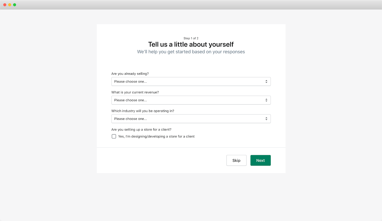
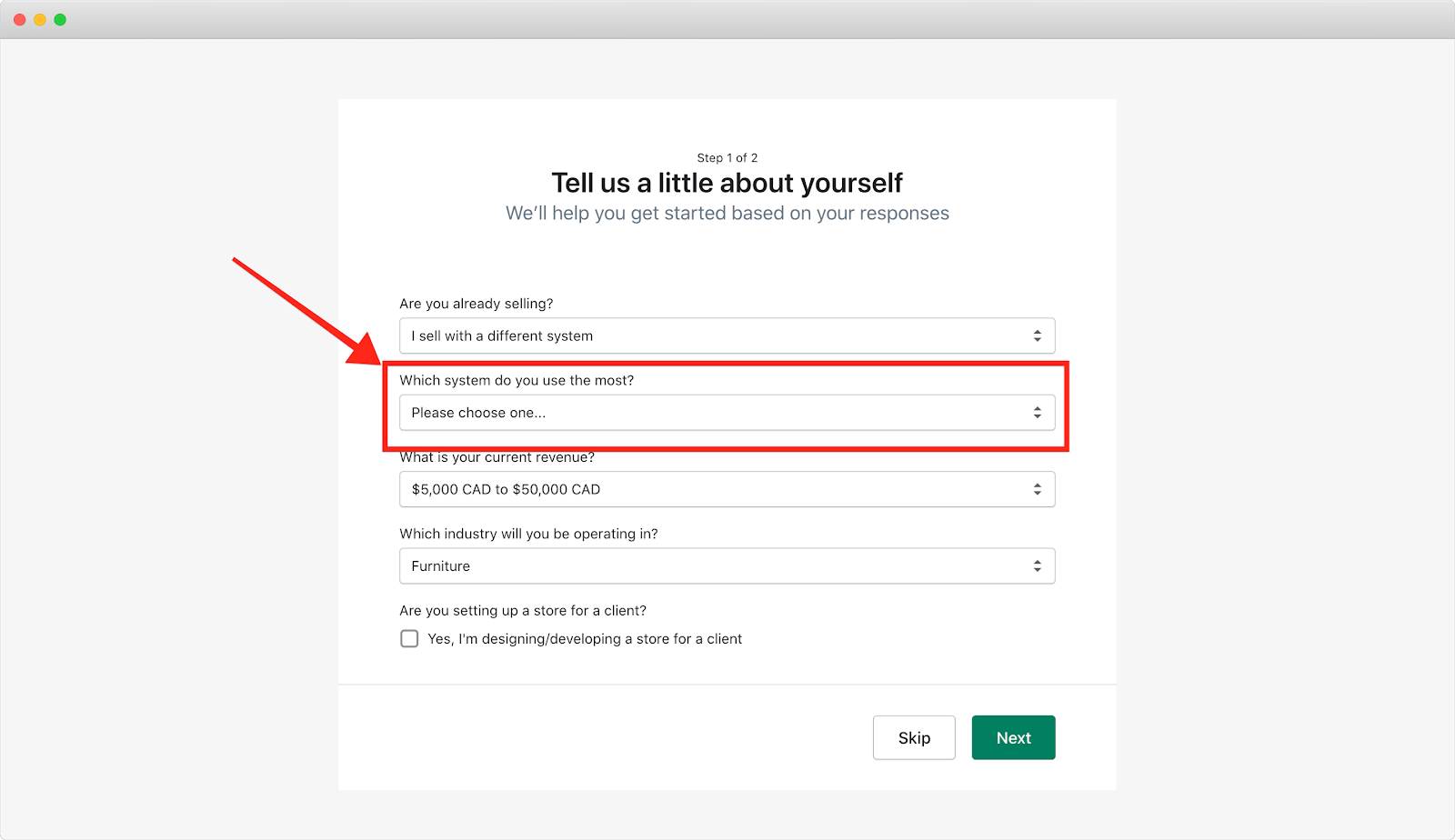
The moment you let Shopify know you’re already selling online with another platform, a fourth field appears to ask which one you’re using.
This works because of Hick’s Law. Instead of cramming all of the information in one overlay page or setup wizard that almost everyone will ignore, guide users one step at a time by showing fewer options. Whatever information you present should be contextual, relevant, and immediate.
The second approach to simplifying complex forms is to break them up into multiple pages. Shopify also achieves this in their signup process. On the first page, they ask for four pieces of information (or three depending on your answer to the first question) about your eCommerce business:

Once you complete these fields, the next step is to answer 10 additional questions, all related to the business address.
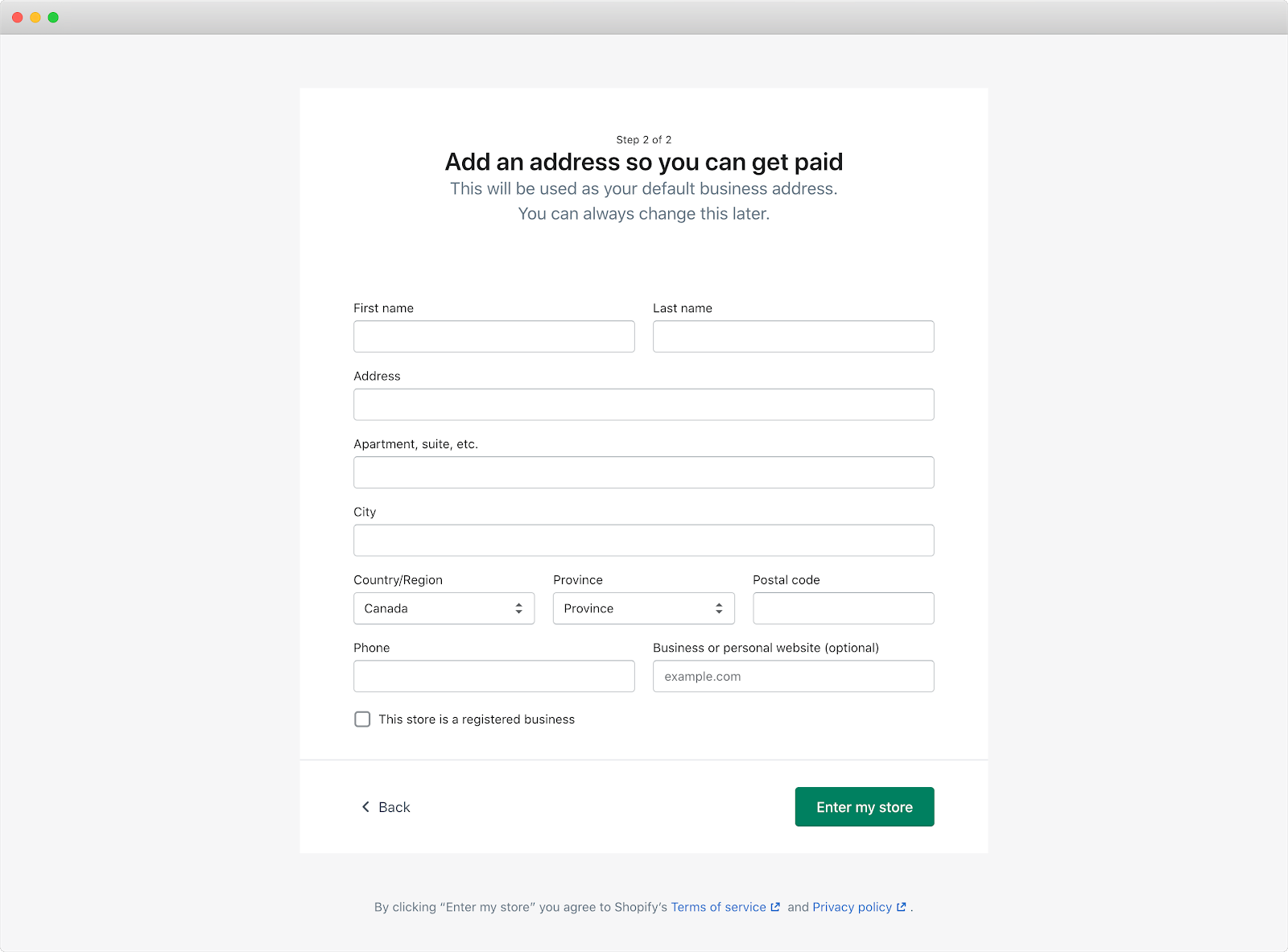
By using a multi-step signup process, users only see a few fields on the page at a time, rather than the 14 required fields needed to complete it. Notice there are almost double the number of fields in the second step (10 fields) than in the first step (4 fields).
This is another example of the Principle of Commitment and Consistency in action. By breaking down the signup page into two pages and moving the majority of the fields to the final page, Shopify’s signup process is much more manageable.
Is there a way to show fewer options through progressive disclosure? Are there complex processes in your onboarding that could be broken up into smaller steps?
Now, back to those color-coded labels. Once you’ve labeled each step in the onboarding path, gather those green ones together. This is the first iteration of your Straight-Line Onboarding because they are the steps users need to take to experience a product’s value.
Again, here’s the Straight-Line Onboarding for PartyParrot:
It’s important to finalize this list with each team within your company. Everyone from product to engineering to customer support should have a say. Do they agree with each of the necessary steps for users to achieve their desired outcome? Would they add back in steps that you’ve removed or delayed? Would they remove any steps?
This is an excerpt of a new book I’ve written with Wes Bush called Product-Led Onboarding™: How to Turn New Users into Lifelong Customers. You can buy it now!