This article is based on one core component that's revealed in The Product-Led Playbook. Packed with case studies and templates, it's the go-to manual you need to build a successful product-led business.
Without data, you’re flying blind in your business. You can have a hunch around what’s going on, but nothing will confirm it faster than verified data.
As an organization grows, data becomes more critical because you can’t manually count the number of signups, new customers, and churned customers coming in and out of the door.
In any product-led business, there's a time when the founder can't keep an eye on everything anymore. So, whatever can't be watched closely has to be measured instead.
By the end of this article, here’s my promise—you’ll understand what is and isn’t important to track in your business. This will ultimately help you understand what’s working in your business, so you can grow faster with much less hassle.
Why is data so important for product-led businesses?
Unlike sales-led businesses, where talking to every potential customer is part of the sales process, in a product-led business, you will not talk to most potential users. You need to understand our users without talking to them.
This is the equivalent of knowing what your partner is thinking by the look on their face.
Just like body language tells us 55% of communication – what users do and don’t do allows us to understand them without talking to them.
Even if you think you’ve got your metrics nailed down to a tee, I still encourage you to read this article, as I will simplify what you measure. And rest assured, if you’re like most folks reading this who don’t feel confident in your data, I’m writing this for you.
With that said, there’s a lot to the word “data” – let me quickly share what I will and won’t cover in this article.
What will I cover?
- How to approach data at your company.
- Core metrics you must track.
- A simple process for getting better data at your company.
- How to use your data.
What I won’t cover in this article:
- All the metrics you should cover. As your business matures, you will want to add more metrics specific to your business. I want to give you 80% of the metrics you should track, and then empower you to identify the remaining 20%.
- How to bore you with all the possible details around data. I get it. For most, data is a dry topic. I’m aiming to present it in such a way that it’s still engaging while informative. You can be the judge of that, though.
Before we dig into how to set up your data component, let’s quickly go through some easy mistakes to avoid.
Easy data mistakes to make
I’ll spare you the lot and focus on the most common ones.
Tracking everything
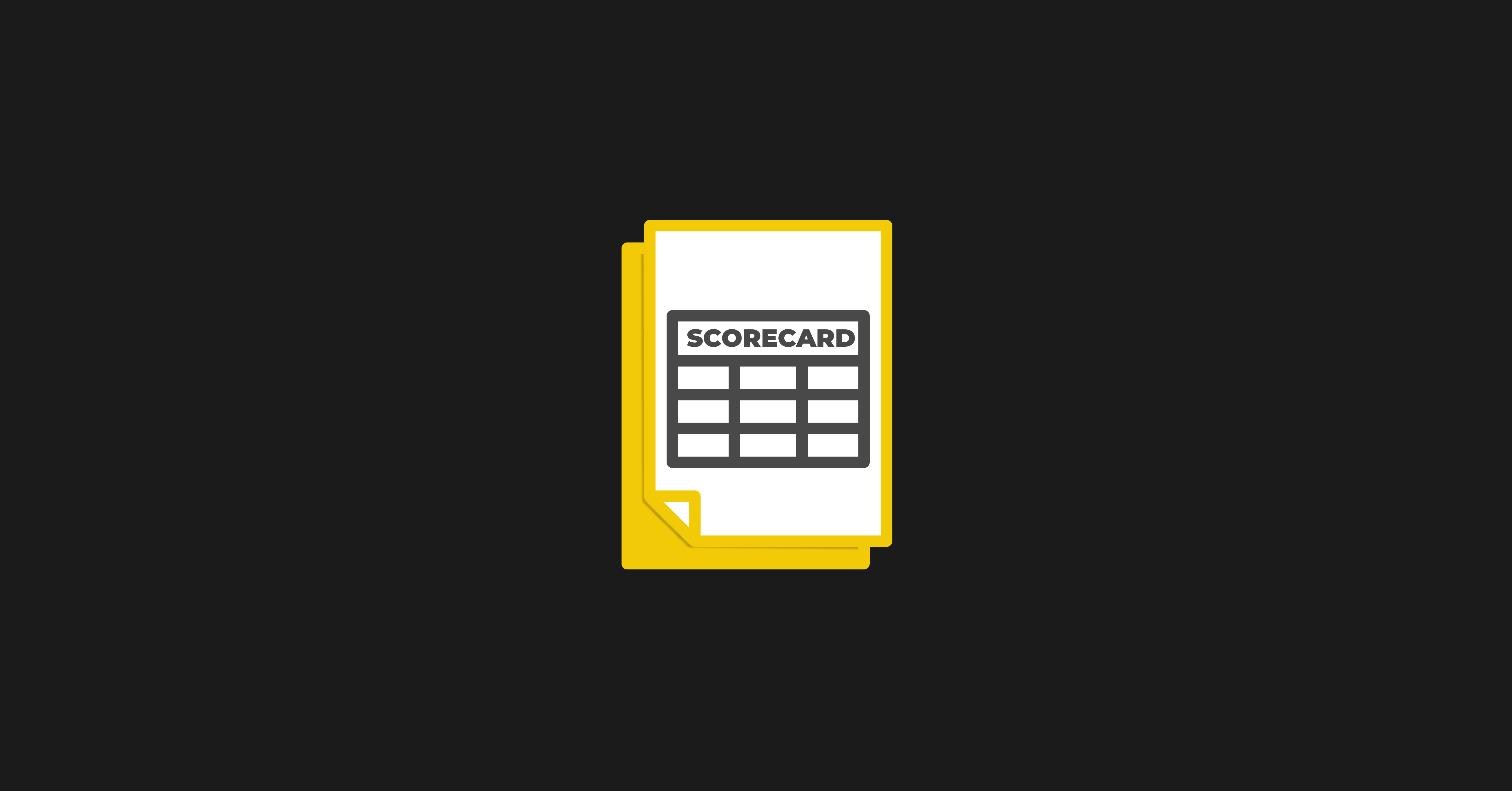
I remember the first time we set up our Company Scorecard at ProductLed.
It was a Google Sheet with a bunch of metrics… 36 metrics, to be exact. And each metric had someone listed who was accountable for that metric. Since we were a small team, some people were responsible for 5 to 8 metrics each. This simple oversight of tracking too many things meant that our team didn’t know where to focus, and we made little meaningful progress on any of the metrics since our attention was spread thin.
Lesson: Each additional metric you add decreases the importance of the other metrics. You know how the saying goes, “If everyone is special, nobody is.” The same applies to your metrics. You need fewer metrics for them to be special in your business. We’ll ensure you avoid this mistake.
No accountability
When nobody is accountable to a metric, it often doesn’t improve. By getting super specific on who’s responsible for every important metric, you will start growing faster by having everyone responsible for key metrics. You’ll also quickly identify gaps in your business where there’s no accountability and nobody can drive a specific metric forward. This is a great hiring opportunity.
Not measuring what matters
This one is all too easy to do. Should we track how many likes we get on our Instagram posts? Should we track how many impressions our videos are getting on YouTube? I get it. Depending on your business, some of these metrics might be important to look at occasionally, but most likely, they’re vanity metrics. You can spot a vanity metric in your business if it’s fun to track and has very little or no connection to driving meaningful results for your business or user. We’ll help you avoid wasting time tracking many vanity metrics by the end of the article.
Not using it
This is way too common. You gather data, create company-level scorecards, track your funnels, and now you don’t do anything with it. Sigh. I wish I could say this wasn’t common, but I can’t. Without routines built around reviewing your data and making decisions around them, you’ll waste time building your data component. We’ll help you prevent that without making it a burden to review your data.
Not segmenting users
If your users aren’t segmented, you will get a mixed bag of analytics when you view your analytics. Your mediocre conversion rates might be great if you just looked at your ideal users. Your amazing marketing campaign might be really bad because it didn’t bring in the right ideal users. Segmenting your users is one of the best ways to understand the full story of what’s happening. Different user segments might have distinct needs, behaviors, and preferences. Failing to segment users appropriately can lead to ineffective strategies.
Now that you know the most common mistakes to avoid, let’s dig into ProductLed’s Data Process.
The ProductLed Data Process follows three phases:
- Company Data Phase: We’ll focus on getting a solid understanding of how your business is doing by designing a simple Company Scorecard.
- Customer Data Phase: We’ll gain a holistic understanding of your customer journey and where the biggest blockers are. We’ll build out a Customer Scorecard so you can easily track each step of the customer journey.
- Product Data Phase: We’ll do some digging and identify your one main metric to focus on and align your entire company around.
Please go through these phases in order. They build off of each other.
By the end of implementing the ProductLed Data Component, you will have clarity on what your bottlenecks are as a business and the insights you need to make great strategic decisions moving forward.
Let’s dive in!
Phase 1: Company Data
A good handle on your company data is critical if you want to scale up eventually. This is the first phase of ProductLed’s Data Process because if you don’t understand your company data and what’s happening, nothing else matters if your business runs out of money. It’s game over. We will build a strong foundation by starting with the fundamental metrics that make your business.
So where do you start?
The best way is to have your bookkeeper share a Daily Cash Blueprint with you as the founder.
Here’s the best way to structure the Daily Cash Blueprint email:
- Subject Line: Company Name, Total Assets, Date.
- Notes: Shares any big variations in cash positions (i.e., 20% cash fluctuations).
- Accounts: List all your bank accounts and how much you have. This section ends with the total amount. That total amount is what is in the headline of the email.
- Receivable: What money is going to be coming into the business?
- Payables: What money is going out of the business that month?
Here’s what the Daily Cash Blueprint email could look like:
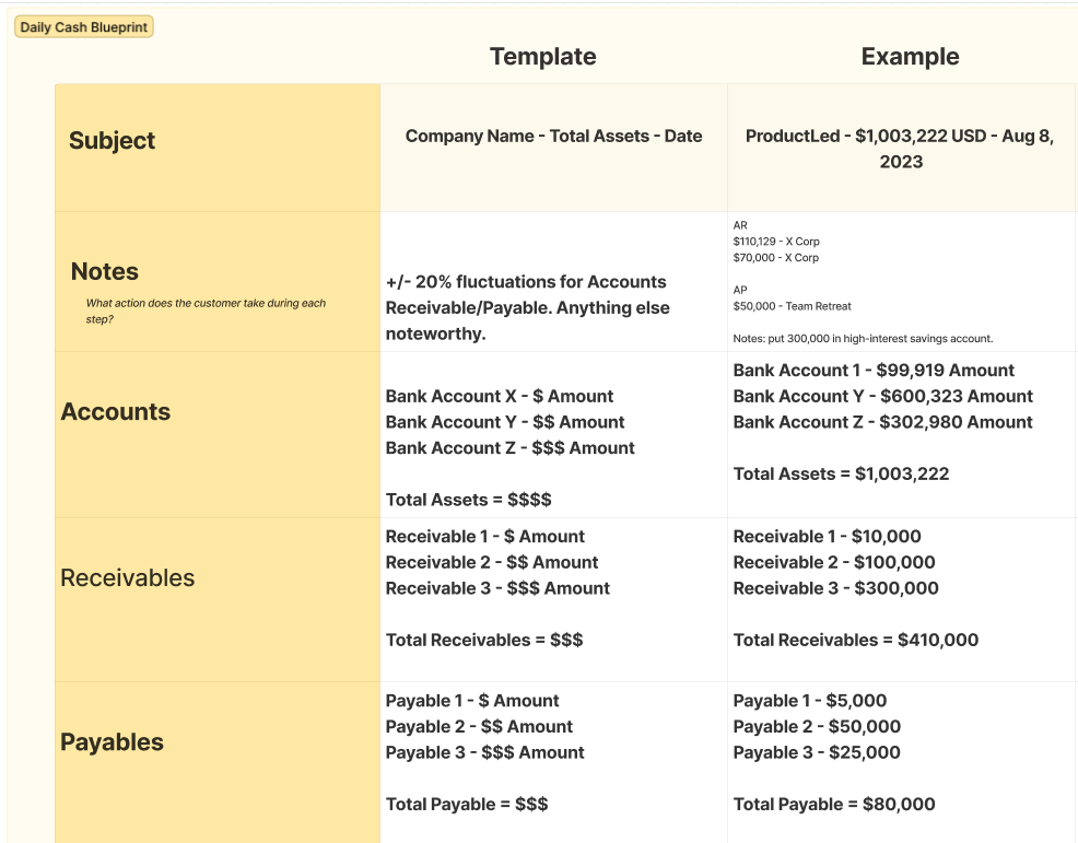
This Daily Cash Blueprint email is simple but will get you up to speed on what matters. You’ll eventually get a feel for how cash flows through your business.
Action items:
- Identify these five metrics in your business for the last few months and see if you’re tracking in the right direction.
- Ask your bookkeeper to fill out the Daily Cash Blueprint daily or weekly.
- Review the Daily Cash Blueprint and notice how cash flows through your business.
Now you might be thinking, “Wow, these are really basic data points to track… is the rest of this article this basic?”
Not quite. We start with the basics because most people look over them. They get obsessed with tracking their customer funnel and then realize they’re losing money with each new customer they take on.
You’ll spot potential financial issues with a daily cash blueprint way earlier.
Your results will go where your attention goes.
A daily cash blueprint ensures you focus on building a sustainable business that actually makes money.
So now that you’ve got the basics down, let’s go through your customer data.
Phase 2: Customer Data
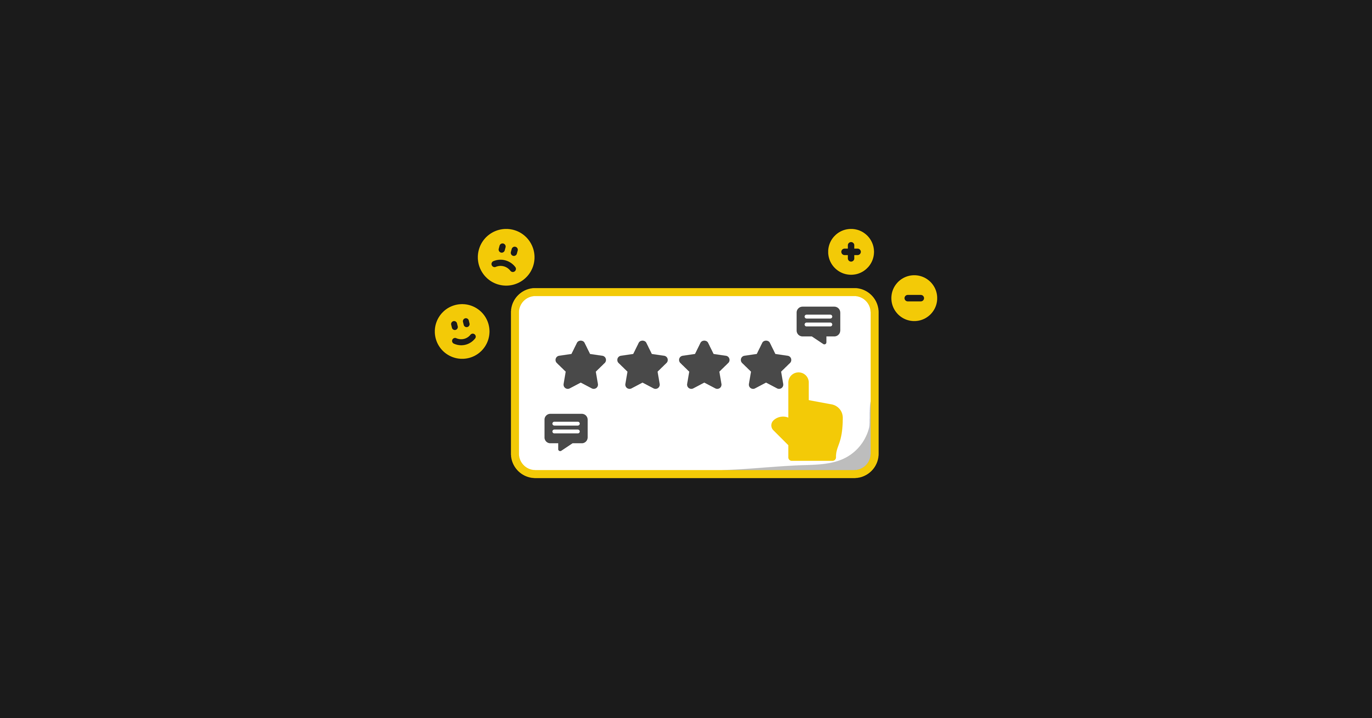
Customer data tells you what is and isn’t working for your customers. When you’ve done a great job mapping your customer journey, you’ll be able to spot the exact bottleneck in your business quickly. With great customer data and the right data integration software, you can launch much better experiments.
By the end of implementing customer data, you’ll have built out a Customer Scoreboard that you can use daily to track the important metrics in your business and gain a pulse on what is and isn’t resonating with them.
But where do you start?
I’ve broken this down into three simple steps:
- Get crystal clear on your customer journey.
- Build out your customer scorecard to identify bottlenecks in your customer journey quickly.
- Create clarity through ownership and accountability.
Let’s start with the first step.
Step 1: Get crystal clear on your customer journey
Like a typical Disney movie, most journeys have a pattern.
The hero has some aspirations. But the hero encounters a villain and/or many problems along the way. The hero overcomes them. It’s predictable.
We love hero journeys.
Predictability in a movie is boring for me.
Predictability in a user journey is a godsend.
But before we can go through the six main stages of a user journey, let’s tie it back to the three pillars of building a product-led business.
You need to Acquire users.
You need to Engage users.
You need to Monetize users.
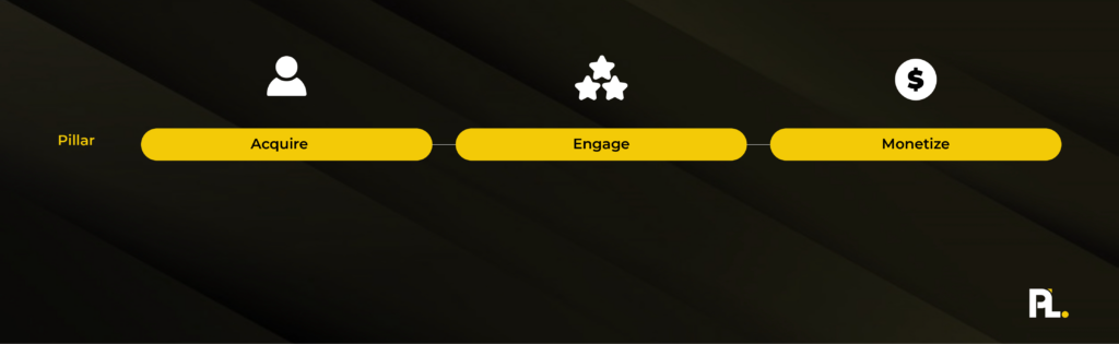
Straightforward, right?
But there are six stages that follow these three pillars.
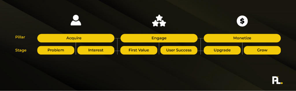
I’ll walk you through each of them.
Problem Stage
The Problem Stage is when your user encounters a problem that rubs them the wrong way. In jobs-to-be-done research, they often refer to this as the struggling moment. Good researchers will dig into what initially prompted people to consider searching for a solution.
For example, before buying a new computer, you might have used an old one for years and were about to join a Zoom meeting. But it took your computer five minutes to boot up, and then when you opened Zoom, it crashed. Meanwhile, a prospect is waiting on the call for 15 minutes and leaves frustrated that you didn’t show up. They vow not to do business with you and write you a nasty email. You apologize and blame your computer, but deep down, you start to think… as someone who works online, it’s my responsibility to have good tools to do my job. I’m going to stop making excuses for being late to meetings and get a new laptop that is reliable and fast. That’s the struggling moment.
It’s often painful for many people, yet it’s beautiful when you zoom out. Somebody encounters a problem, and then they commit to making it better. They might not have a solution immediately but they commit to finding it.
The problem with this stage is you typically have a short period to capture somebody’s interest. They’re motivated most right after they encounter the problem. They need to find a solution soon. Ideally, your solution.
This brings us to the second phase.
Interest Stage
Once you have a user who has a meaty problem and starts searching for “how” to solve it, it’s only a matter of time before they identify a potential solution. At this stage, they might evaluate several other solutions. Or if it’s a simple problem like “I’m bored,” Netflix is only a click away.
In the interest stage, it’s key to position your product as the solution that will solve your user’s problem. In 100M Offers, Alex Hormozi claims this all comes down to making an offer so good that users feel stupid saying no. A free version of your product that promises to solve your user’s problem is compelling. Yet, you still need to consider other questions: How can you make this product easy to use? How can you showcase testimonials so that these users see us as the go-to solution to this problem? How do we reduce any risk the user might have from signing up? How do we make it effortless to get started?
All these questions are great starting points to ask yourself in the Interest stage. The whole goal of the Interest stage is to get your user to commit to trying you out as a potential solution. For product-led companies, this typically gets them to sign up for your free product.
Once you’ve achieved that, your user has shown interest in your product, but the journey is far from over. The real challenge is just about to begin.
First Value Stage
Back to the story analogy. If there’s a big problem for most product-led users, it’s at this stage.
Product-led leaders cry at this stage and ask themselves why do, “40-60% of users never came back after this stage?”
Users cry at how painful it is to use the damn product.
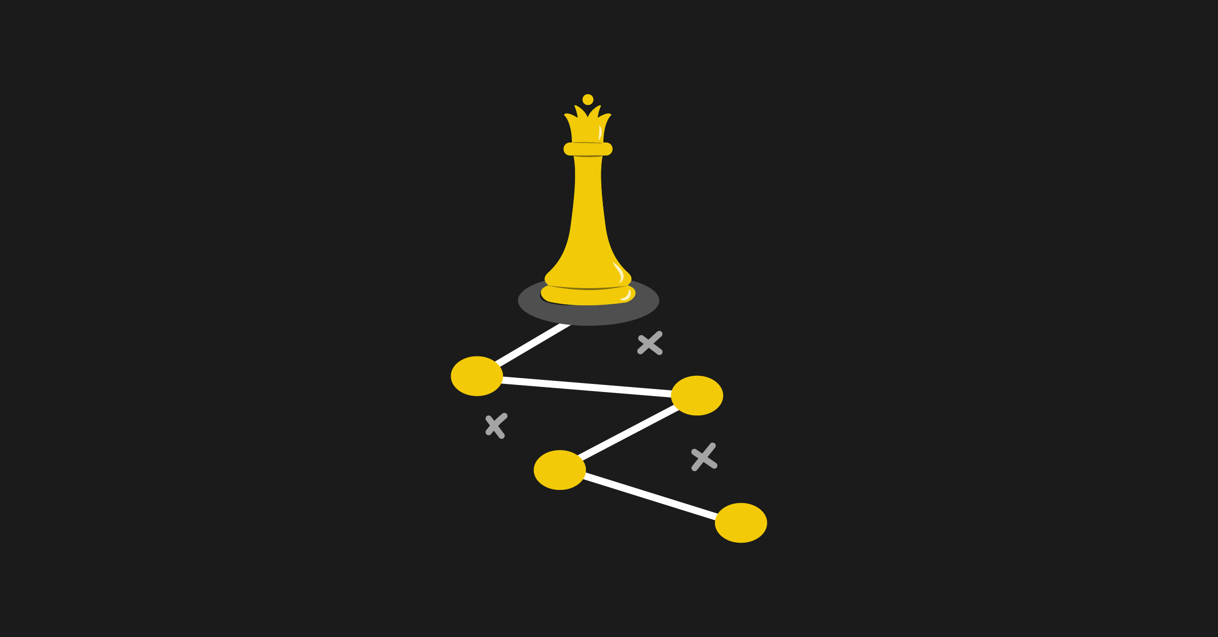
The time it takes for users to experience the first value is the biggest challenge for most products. Remember: your user is somewhat motivated to solve your problem, but the more steps they have to go through to see the value, the more likely they will give up.
There’s a simple reason why, and hopefully, you’re catching on by now. Back to the BJ Fogg Behavioral Model.
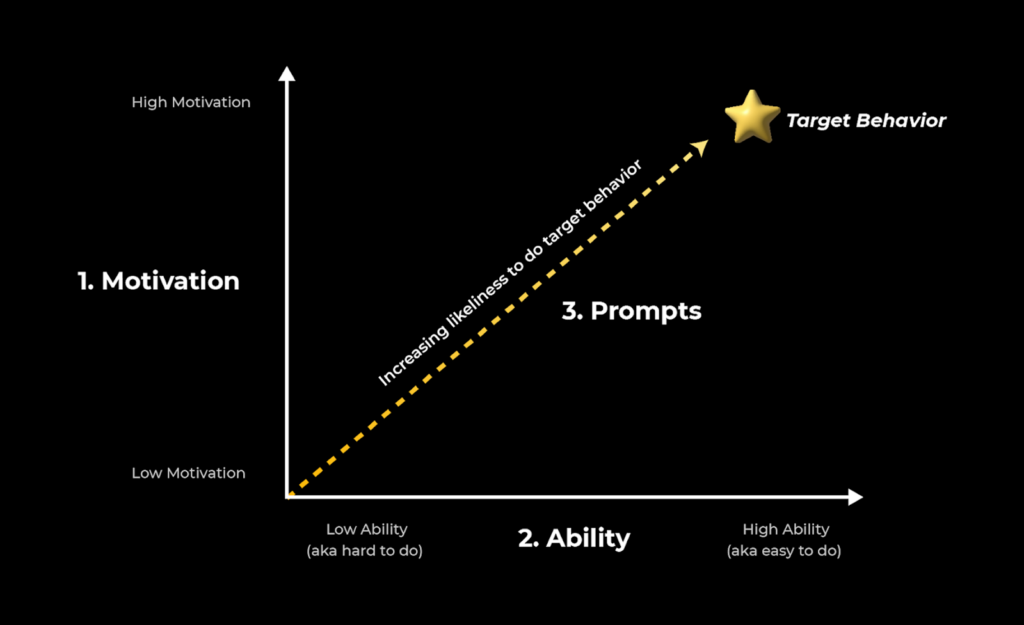
Your user only has so much motivation to pursue a solution.
They also only have so much ability to figure out your solution. If it’s challenging for them to figure out, good luck.
Also, if they don’t get any prompts from folks like their boss, spouse, email, or reminders to continue pursuing this solution, that well of motivation might dry up.
And you know what happens then?
Your user typically goes back to doing what they’ve done in the past.
Your biggest competitor isn’t your biggest competitor.
It’s the status quo.
And that’s never going to change because that’s how humans work.
Once you do get your users to the first value, you’ve crossed the hardest part of the user journey, and it’s all about getting them to user success.
User Success Stage
User success is all about getting a user to a meaningful milestone. First value is different in that it’s mostly about getting a user to see some sort of micro value. They get how your solution works.
User success, on the other hand, is retaining these users and either getting them to increase usage of your product’s value or solving more meaningful problems. I’ll share an example that will help explain the differences:
Calendly
- First Value: Having someone schedule a meeting for the first time. Why is this First Value? They understand how the product works. It saved them time. They understand why they want more of this in their life.
- User Success: Using Calendly whenever scheduling a non-recurring meeting. Why is this User Success? This is a retained user who’s using Calendly all the time. When they think of scheduling a meeting with someone, they use Calendly to book it.
For most B2B products, it typically takes at least two to three visits for a user to return to the product and get to value. Ideally, this is instant, but as we know, it’s not always realistic.
Once you’ve got your user to value realization, the next step is to get them to purchase.
Upgrade Stage
The goal isn’t to get your users to spend a fortune immediately. It’s to get the ball rolling in the right direction.
If you’re Calendly, it’ll be getting you to use Calendly for some advanced features. This could start with trialing out multiple meeting structures, sending follow-up emails to increase show-up rates on the meetings, and integrating Calendly with your CRM tools. Whatever prompt you encounter at this stage should be tied to getting more value out of the product.
Users at this stage have a great handle on the value of the product but will run into some cap that pushes them over to purchase.
The most common ones are:
- Time caps
- Feature caps
- Usage caps
These three represent 90% of the reasons why users upgrade to a paid plan. Yet, if you rely on these caps, you’ll miss the point of why we called this the upgrade stage.
Upgrading isn’t just about turning a user into a paying customer. It’s about upgrading what they can do with your solution. By upgrading, they will be able to either continue or start doing something previously challenging for them to do on their own. That’s what the focus should be at this stage. You’re upgrading the user's life and tying their success to your business's success.
This is the part in your user journey where, if you’ve done your job well, you’ll have a nice percentage of users pulling out their credit cards and paying for your solution.
Yet, this is just the beginning of the customer journey.
The next stage is all about growing customer value.
Grow Stage
At this stage, you can grow customer value in several main ways:
- Usage
- Features
- Users
What’s important to note is that value is two-sided at this point. As you grow value, if you’ve set your pricing up correctly, you’ll naturally grow with your user as they tackle more advanced challenges with your product. We cover more of this in the Activate Phase, but for now, know that the Grow Stage is about expanding your user’s value. Maybe that’s introducing more products to your customers, introducing them to new features, or getting more of their team to adopt the product.
It’s less important what you do and more important that you increase value. This is most often done by helping your users solve more advanced problems.
Your Turn
Now that we’ve mapped out the six stages of the user journey, it’s time for you to identify what each stage looks like for your business.
The first time you go through this activity, I’d encourage you not to overthink it. Just go with what you think is best. You can validate this later as time goes on. You will find some stages are harder to answer than others. This is always a telling sign that this is an area you need to research further.
Questions to Answer
- What is the most common problem users encounter before seeking out your solution?
- What solution would interest users struggling with that problem?
- What would the first value be for our ideal user?
- What is user success for your ideal user?
- What does the first purchase stage look like for our ideal user?
- What does value growth look like for our company?
Remember: having the “right” answer here is less important. It’s more important at this stage to have an answer you feel is directionally correct.
Once you’ve mapped out what you think the six stages of your user journey are for your ideal user, it’s time to put yourself in your user’s shoes for each of these stages.
Step 2: Build out your Customer Scorecard
Wouldn’t it be great if everyone on your team could access a report that quickly told them where the biggest bottlenecks are?
Or told you who was smashing their goals and who wasn’t making an impact on your team?
You can do all that and much more with a Customer Scorecard.
How does it work?
For every customer stage, there’s a corresponding metric that tells you if a customer has arrived at that particular milestone.
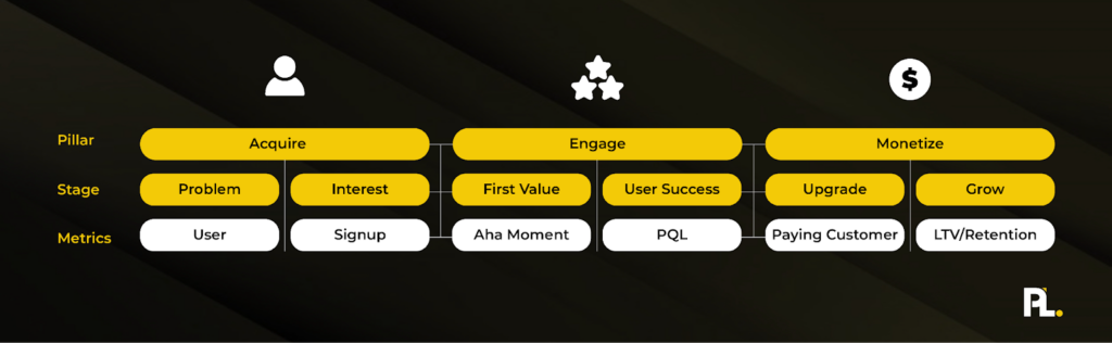
For the problem stage, this could be as simple as getting a new user on your website.
For the Interest stage, this could be getting users to signup. Signing up is one of the best signs a user is interested in what you do.
For example, this could be having someone else successfully book a meeting with you if you’re Calendly.
Then user success would be consistently having three or more meetings booked with you every week.
While the Upgrade stage is when they become a paying customer.
And the Grow stage is when users upgrade to a higher plan, increase usage, or buy more from you.
For most companies I coach, understanding the Acquisition metrics is easy – tracking your users and signups.
However, when it comes time to track engagement… well, that’s when things start to get dicey.
Especially if you don’t have product analytics installed.
But, I encourage you to find a way to break down what that first value and user success is for your business.
If you’re struggling with identifying a metric for these two sections, go back to the User Component and map out all your user’s milestones again. Odds are that one of these milestones should represent first value and user success.
Once you’ve identified your engagement metrics, it’s time to find out what your monetize metrics are.
The Upgrade stage is usually almost always the number of paying customers. It’s crude but gives you a quick idea of how good your conversion rates are.
The Grow stage is a bit more tricky as it really depends on how you grow customer value. For a project management application like ClickUp, it could be as simple as getting the entire company to use the solution.
For an email marketing platform like ConvertKit, this could be expanding your list. A Grow goal could be getting their client’s another 10,000 email subscribers. So they’d have a metric that would track what percentage of customers gain an additional 10,000 subscribers through ConvertKit’s tools.
Now it’s your turn.
Action items:
- Identify one metric for each of the six stages of your customer journey.
- Ensure you can track these metrics.
- Track these metrics daily starting tomorrow.
For your first Company Scorecard, I recommend using a simple online spreadsheet. Whether you use Microsoft or Google Sheets, it doesn’t matter.
At this point, I just want you to list out all the metrics in a spreadsheet and track them for the previous day.
By this point, you have a rough outline of your Customer Scorecard but it will have nowhere near the impact you want it to have unless you complete step 3.
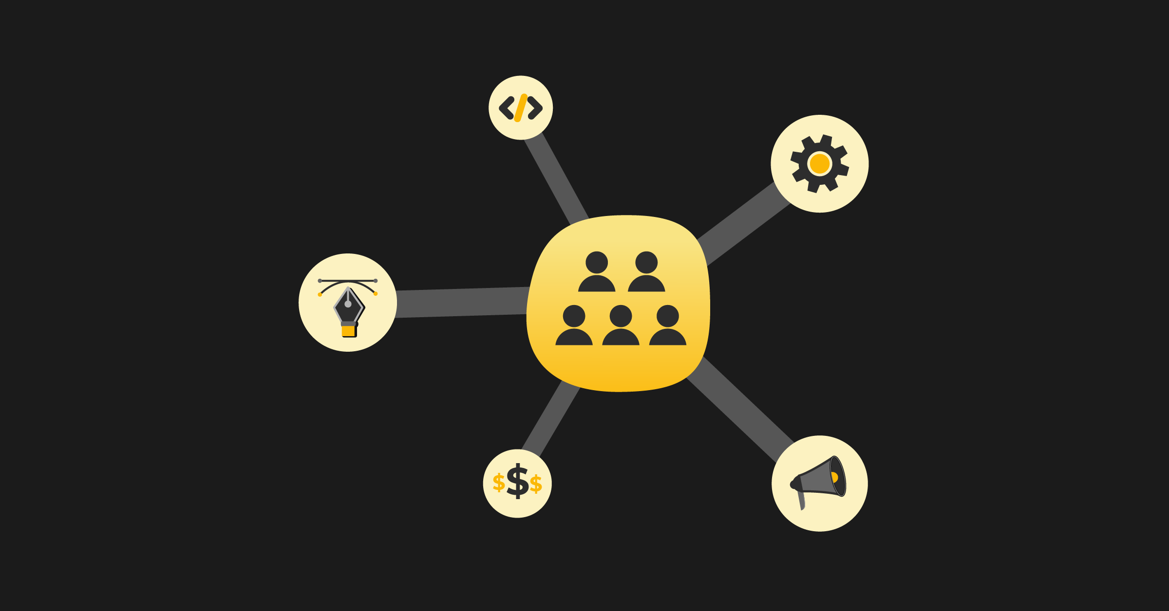
Step 3: Establish ownership, accountability, and awareness
Identifying metrics is important, but getting the right ownership, accountability, and awareness will create a new level of focus on your teams. Even if you implement this part of the Data Component, you’ll notice the numbers you track will start to grow.
By the end of this step, you’ll have aligned your team on what is important and who’s in charge of what.
Creating ownership
One of the best parts of a startup is you typically attract people who take ownership. Even if it’s not on their job title, they’ll pitch in and help. It’s amazing. Yet, as the company grows, especially beyond seven employees, you’ll notice that processes start to break down. Suddenly, because everyone is “taking ownership,” nobody owns specific key parts of the business. Funny how that one works.
To address this quickly, I recommend going through each key metric you’ve outlined and identifying a key owner for each.
This is best done on a live call altogether as what’s most important is that the team agrees who should ultimately be responsible for owning each metric.
Now as you decide who the owner is for each metric, make sure the owner passes the Ownership Test:
- Will they be able to make a big impact on this metric?
- Do they want to own this metric?
- Do they have the capacity to own this?
These three questions will ensure you’re putting the Right Person in the Right Seat.
Without that test, you may end up putting the best person who’s capable to own that metric but because they don’t want to own it, they either burn out or end up leaving your company altogether.
Your action items:
- Host a meeting with your team.
- Assign owners for each metric.
- Ensure each person passes the Ownership Test.
Once you’ve got your owners in place, it’s time to ramp up the accountability in your team.
Creating accountability
A-players want to be held accountable and know where they stand. Are they on or off track? They need goals to stay motivated. Without a goal, they won’t be challenged and know exactly where to direct that energy.
To create accountability, you need to establish goals with each owner.
For your Customer Scorecard, this is simply identifying a realistic daily target for each of the metrics you’ve decided to track.
To get the best results, decide on these daily goals with each owner and then share new daily goals with your leadership team so everyone knows the daily standards.
For these goals to mean anything to the owner, they need to be able to be able to have an impact on them.
For instance, putting your customer support representative in charge of getting 100 signups per day might not get you the desired results because they don’t have the training to make an impact.
Your action items are:
- Identify daily goals for each of the key metrics with each owner.
- Share the daily goals with the entire team to reinforce the new standards.
Now that you’ve created ownership and accountability over each metric in your Customer Scorecard, it’s time to increase awareness of each of your team’s progress.
Creating awareness
Most companies forget that creating ownership and accountability isn’t enough. You need constant triggers to prompt teams to review these metrics. How you decide to create awareness is up to you as the founder, but I will share some common ways you can create awareness of your key metrics.
Review in a weekly leadership meeting: As part of your weekly agenda, review your Customer Scorecard and ask every owner if their metrics are on or off track. If it’s off track, you can add it as an issue to discuss later in the meeting. Given how every metric will impact the other metric, it’s important to address these issues when a metric is off track. For instance, if someone isn’t hitting their user target, then all the other metrics might not be hit that week as a result. Although one person is responsible for the user metric, every team member can help unblock this person on the leadership team meetings.
Weekly reports: One of the easiest ways you can see if you’re on or off track is to ask each owner if their metric is on or off track in either an asynchronous report or 1:1 meeting. If they’re consistently not hitting their targets, it’s worth identifying if the target was unrealistic for them, if they’re focusing on the right things to move the needle, or if you have the right person in the right seat at this point.
Celebrate wins: Whenever an owner hits their target, use this as a chance to publicly praise them. This is the new behavior you want to have on the team. It’s also a great opportunity to ask the owner what contributed to this success.
Daily updates: Regarding updating your Customer Scorecard, there are two schools of thought. There’s someone who wants to automate this scorecard right away, and there are benefits to that, as it you can format this report in easier-to-visualize ways. Yet, something must be said about asking each owner to get the data to fill in the scorecard daily manually. This creates a high level of awareness, and when that owner does dig into the data, if it’s on/off track, they can dig into why that’s the case. As we mentioned before, results go where attention flows. Not automating things does make it easier to pay attention to what is important.
So there you have it.
These are three main ways you can create more awareness around the key metrics of your Customer Scorecard.
Your action items are:
- Identify 2-3 ways you create more awareness around each key metric
- Implement all of them
Once you’ve created more awareness around the key metrics, you now have a Customer Scorecard that will have an impact on your business.
Putting it all together.
You need to understand the main stages of your user journey and set up metrics to monitor how users are progressing through their user journey.
By doing this, you’re going to be able to spot where users drop off and learn how to better serve them.
Pair that with the right ownership, accountability, and awareness and you’re left with a team that is hellbent on improving your user’s journey.
Which leads to more successful users.
And more successful users leads to more customers.
Your user’s success will ultimately become your success.
Now that you’ve built out your Customer Scorecard, it’s time to think about what goes on in that product of yours. Are users getting value from it? Are they likely to churn?
What’s going on in that black box?
Let’s unpack it in the product data phase.
Phase 3: Product Data
Your product data facilitates an important relationship between your company and the customer.
It creates the necessary alignment to scale.
Too often, companies focus on revenue metrics only to prioritize what’s best for the business. This might not be a dealbreaker in the short term, but over a long enough time horizon, users and customers will take note, and growth will slow down.
The prerequisite to sustainable scale is ensuring a symbiotic relationship between the company and the customer. You need to align your interests.
Having a North Star Metric is one of the easiest ways to make that happen without complicating it.
What is a North Star Metric (NSM)?
A North Star Metric is one metric that captures the core value that your product delivers to customers.
It aligns with what your customer and company’s needs are.
I’ll share some North Star examples to break it down:
Intercom# of Customer Interactions Per WeekSalesforce# Of Records Created Per Account Per WeekZoom# Of Hosted Meetings Per WeekMedium# Of Minutes Spent Reading Per WeekTwilio# Of Total Messages Sent Per MonthDocuSign# Of Documents Signed Per WeekAirbnb# Of Nights Booked Per MonthUber# Of Trips Booked Per WeekInstagram# Of Active People Per DaySlack# Of Messages Per Week
What I love about these examples is that they showcase how aligned the customer and company are. For instance, with Airbnb, nights booked is a perfect NSM because when someone books a night, the customer, host, and Airbnb all win.
When someone signs a document using Docusign, the customer and Docusign win.
If Instagram focuses on Daily Active People, you’ll get more value when you post something, and other people are more likely to engage with your content, while Instagram has more opportunities to monetize your attention.
Hopefully, by now, you can see the connection between the core value you provide as a business and the value the user achieves in your product.
What makes a great North Star Metric?
For starters, it needs to align the value between your company and the customer.
A revenue metric wouldn’t work as it’s just focusing on what benefits the company.
Focusing on the number of times a user performs an action doesn’t always tie back to company value if you don’t monetize around based on the value your product provides yet.
If we dissect all the NSM examples above, they have three components to them:
- Quantity metric: typically a number (i.e. how many times your user did a specific quality metric)
- Quality metric: an automated or manual action that takes place in your product (i.e. your product automatically fixes a bug on your customer’s website or they share a graphic they designed).
- Frequency: how often you expect someone to do an action.
Let’s look at Slack’s NSM of “# Of Messages Per Week.”
Messages represent their quality metric. Why? If users are measuring each other the odds are they are getting value from the product. No messages either means everyone is on vacation or they took a hiatus from using the product. Hopefully, the first scenario for Slack.
Frequency focuses on the cadence that makes the most sense for your users. For Slack, given that it’s a communication tool for work, it makes sense that the frequency is weekly, as a standard work week is a good reflection of the cadence of how you’d use the product. If you were to do a daily cadence it wouldn’t be as relevant or as useful as you’d always be struggling to get more engagement on the weekends. For a product like Instagram, it’s the opposite. They want you to use the product every single day, so that’s why they focus on the number of Active Users Per Day.
At Amplitude, a product analytics platform, they focus on the number of shared reports per week that have been viewed by 2 or more people on a team. They’ve dubbed this Weekly Learning Users. It shows them that users aren’t just logging into their platform, but are finding insights that are useful enough to share with others. That sharing component represents their quality metric.
So there you have it, your NSM must have a quality, quality, and frequency metric.
The best template for this is:
Number of X metric on Y frequency
So now that you know what makes a great North Star Metric, how do you find yours?
How to identify your North Star Metric?
If you’ve completed the Pricing Component, I’ve got some good news for you.
Your value metric should be a leading candidate for your NSM.
Let’s say you run an email marketing platform and currently charge customers based on the number of subscribers customers have.
Your NSM could be the number of new subscribers per account. Your goal would be to help these companies get more subscribers and keep them engaged through great email marketing. As your customers gain more subscribers, you could charge them more because they’re most likely deriving more value from your solution.
Now it’s your turn, what is your NSM?
Write down as many potential options as you can think of.
Then use the NSM Checklist:
- It is easy to measure.
- It has a high correlation with user success.
- Be a behavior that your best customers do a lot in your product.
- Have clear communication with your company’s strategy.
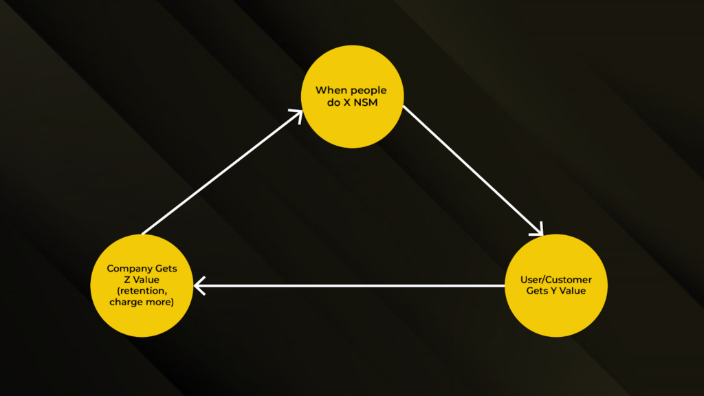
Here’s what you should notice when you pick the right NSM:
- Your user does the NSM behavior.
- Your user gets more value.
- Which leads to your company getting more value (this value could be in the form of a more retained user, making more money by charging more).
Even if you’ve gone through all these examples, used our NSM checklist, and hired ChatGPT to screen your NSM, you still may not be completely confident in what you’ve chosen. That’s okay.
I still want you to pick an NSM and start tracking it.
It should be obvious over time what your best ideal users do in the product. You can approach this from both the company and customer angle. From the company angle, look at the actions your highest LTV customers do consistently in your product. From the customer angle, look at what your best retained users consistently do with your product.
And if you don’t have product analytics installed yet, don’t use that as an excuse to delay this activity.
Take your best guess and then validate it once you set up a product analytics tool.
To recap, here are your action items:
- Write down as many potential NSM candidates as you can think of.
- Take each NSM candidate through our NSM checklist to narrow your list down.
- Identify your NSM.
- Track your NSM on a daily and weekly basis.
Once you’ve found your NSM, you no doubt will find that your team is more aligned and focused than ever before. However, you’ll miss out on the true impact of your NSM if you don’t use it effectively. Let’s break down how to do just that.
How do you use your North Star Metric?
Now that you’ve done the hard work of nailing down your North Star Metric, here are several ways you can maximize its effectiveness in your organization.
Introduce it to the team the right way
By this point, after introducing the Customer Scorecard, your team will get the hang of being held accountable.
What’s different about introducing the NSM is that it’s a shared metric – everyone owns it. This needs to be apparent right from the beginning. Everyone should understand why this metric is important and should have an idea of how their role helps contribute to more users experiencing the NSM.
Use the NSM as a filter for decision-making
The word “North Star” isn’t by accident. Whenever you’re unclear on how to make a decision or launch a new initiative, always bring it back to the NSM. If it doesn’t make an impact, don’t do it. If it will make a negative impact, don’t do it. If it will make a positive impact, do it.
Report on it
Like the Customer Scoreboard, this isn’t one of those metrics you set and forget. You want to report on it with whatever cadence frequency you deem makes the most sense for your company.
As the CEO, it’s your job to report on this metric as you’re ultimately responsible for designing a team and company that can excel at increasing it. In order to make your NSM top-of-mind, consider putting up dashboards and automatic reports that constantly remind the entire team of what the NSM is.
Set goals around your NSM
Your NSM might not be all that great right now. That’s normal when you first identify it. Setting company-wide goals and OKRs around improving it is critical for the rest of the company to truly understand how important this metric is. Without goals and initiatives to support improving the NSM, you’re not going to get the results you seek.
Celebrate progress
Lastly, and most importantly, when you make meaningful progress on improving your NSM, this is a great reason to celebrate as a team. This is one of the few metrics that your entire team is aligned on so make sure to celebrate it together, as everyone will have played a part in improving it.
Finally, Iterate and Learn.
Over time, gather insights from your efforts and adjust strategies based on the outcomes. Continuously learn from successes and failures, adapting your approach to achieve better results.
It’s not a set-it-and-forget-it.
It’s a set it and remember it.
Putting it all together
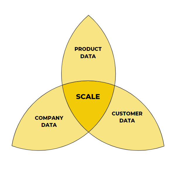
To truly understand how to scale your business, you must leverage customer, company, and product data.
Each component helps you identify a powerful way to scale.
By focusing on understanding your Company Data first, you’re able to build a strong financial foundation around what’s actually going on in your business. You’ll learn how cash flows through your company.
Once you’ve got the financials down, it’s time to track each stage of your customer journey and set metrics and accountability around key milestones, so your team is invested in consistently improving the customer experience over time.
Lastly, we recommend identifying a North Star Metric that aligns your entire team. This creates focus around a win-win scenario for both the customer and your company.
But to sustain that momentum, you’ll need to continuously iterate and learn. As you add more products, evolve your ideal user profile, or scale your business, your metrics will also need to evolve.
Start with what you have now—but don’t set it and forget it.
To continue building your product-led business, work through the other eight components of the ProductLed System™.
Need help getting started? You can take the PLG readiness assessment to see where you stand, book a strategy session to explore implementation options,
or partner with a certified ProductLed Implementer for hands-on support.