How to Personalize Your User Onboarding Experience
Onboarding
All


Most product-led businesses focus on signup conversion.
But if you do the math, optimizing the user onboarding process is much more impactful to your company's growth.
That’s why we set out to analyze more than 150+ user onboarding experiences. We looked at emails. We looked at product tours. We looked at social proof.
Guess what? The world’s best product-led companies share some common user onboarding traits.
And today, I’m going to share them with you.
Below are eight findings with multiple user onboarding examples of each in action so you can find inspiration from product-led companies doing it right.
So what do the best user onboarding examples have in common?
Now, let's dive see those best user onboarding examples in action.
Let’s look at the six basic types of social proof:
You should use at least one of these in a business onboarding experience.
Let’s see them in action.
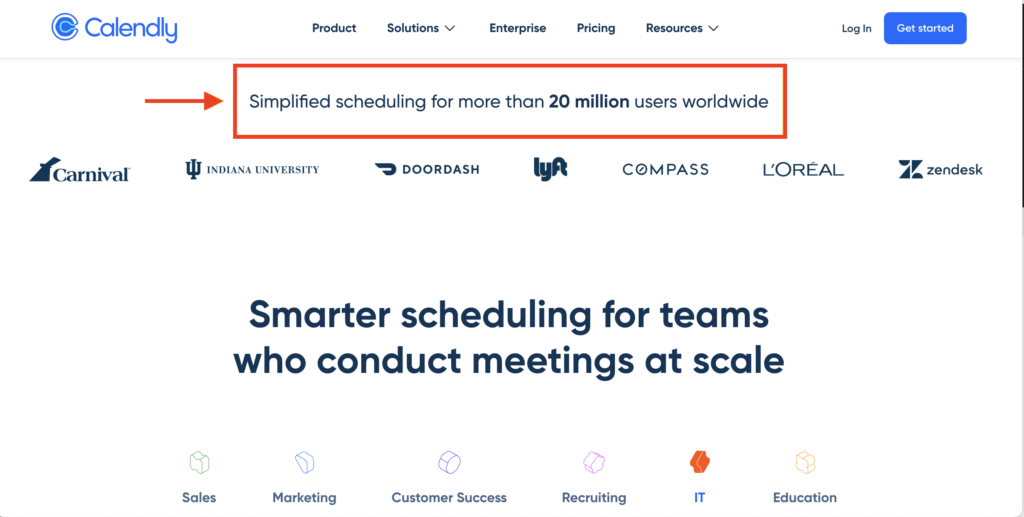
First up: Calendly.
Here’s their homepage.
Join The ProductLed Newsletter
Practical tips to scale smarter with product-led growth
Every Sunday morning, you'll get 1 actionable deep dive to build & scale your product-led business in under 5 minutes.
No fluff, all value. 100% free.
Join 43k+ Readers
Here’s why the copy works:
Next up is ShipBob.
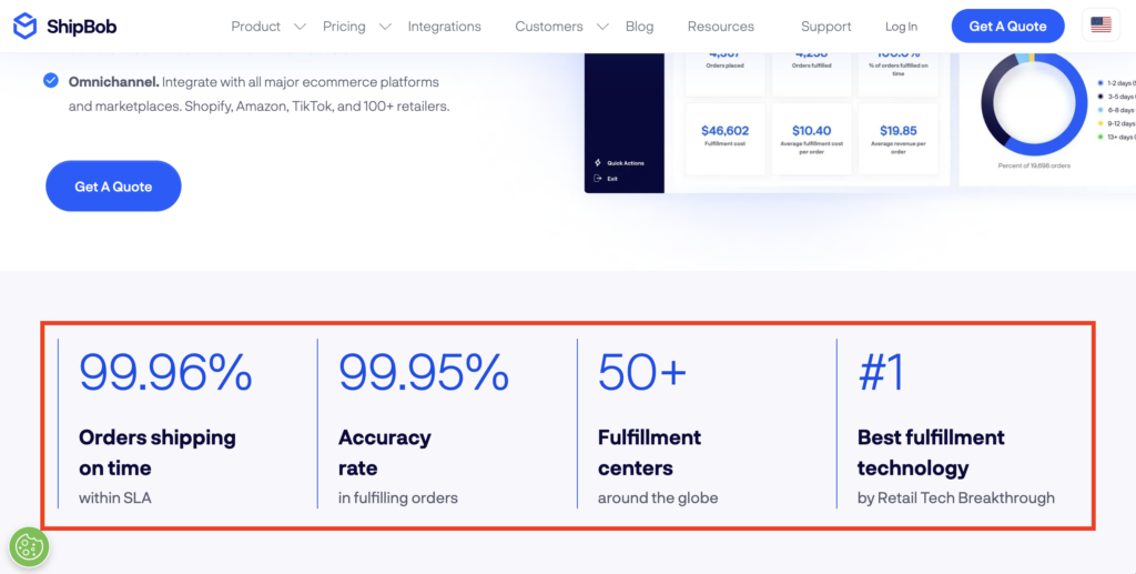
Here’s why it works:
Before you even sign up for Calm’s meditation and sleep app, they ask users what their intention is.
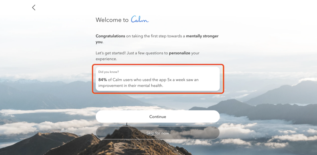
Here’s why it works:
Next is Lucidchart’s signup page.
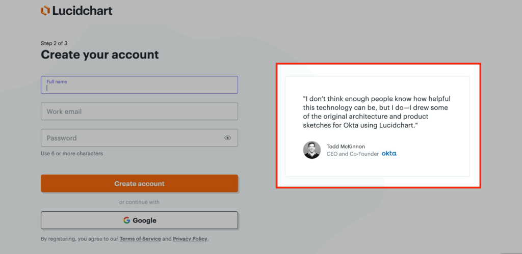
Here's why the testimonial works:
Here we have another great example from Monday.
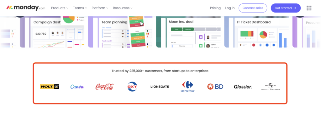
Here’s why it works:
Another great example from Deputy:
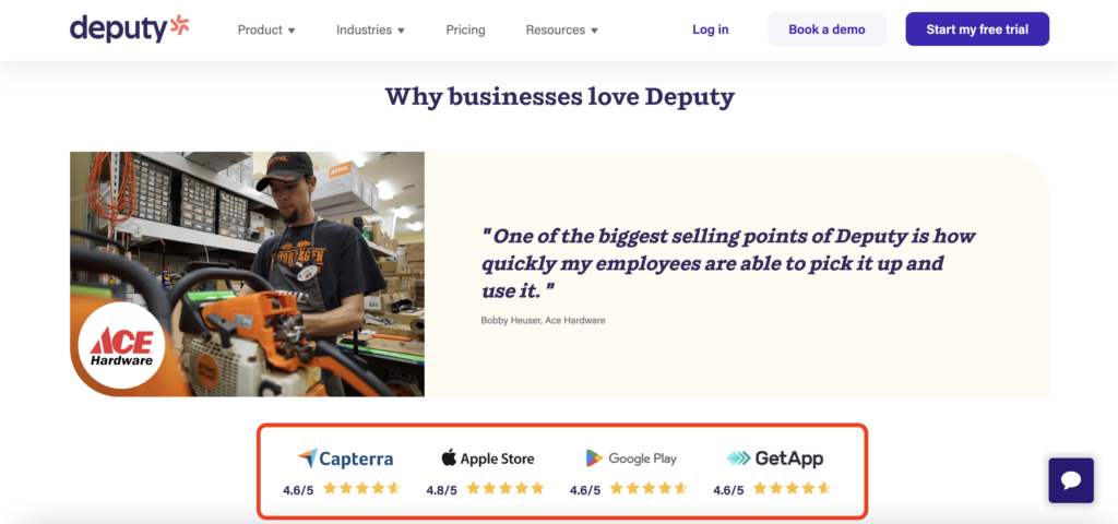
Here's why the reviews work:
Another prime example is during Wave’s account signup process.
Here’s why the copy works:
Another great example is Loom.
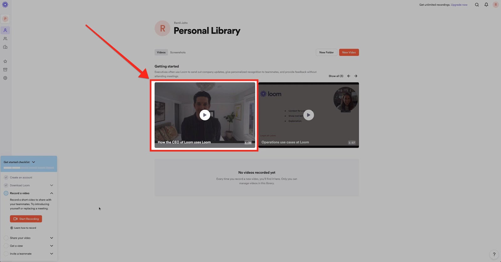
Here's what works:
One of the world’s leading e-commerce platforms also does a great job with this.
Here’s what they have in their onboarding email.
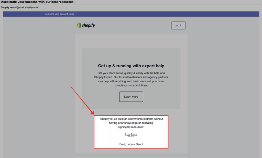
Here’s why the testimonial works:
The social proof lives on their pricing page.
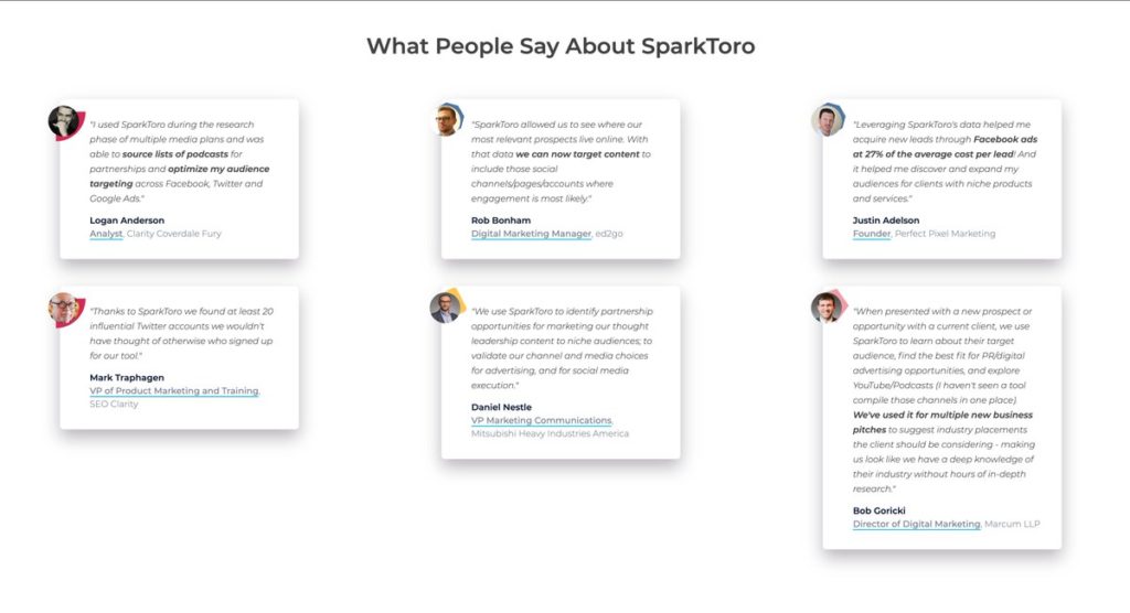
Here’s why it works:
One of the most popular language-learning apps shows great social proof directly on their free-to-paid trial signup page.
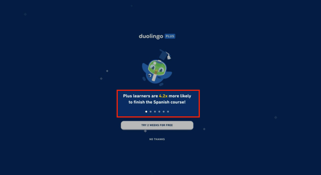
Here’s why the copy works:
It's become the standard for most apps.
Users sign up. They hit a page: "Please verify your email."
Users wait for the email.
Minutes pass, and it's still not there.
They check spam. It's still not there.
So they give up.
We've found that 30-50% of signups don't verify their email. Why?
Whatever the reason, it could be hurting your growth more than you think.
Before we dive into examples of how to handle this, let me tell you a story.
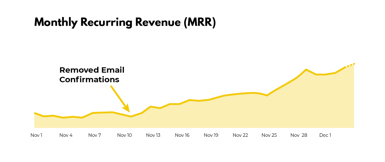
Snappa required every new signup to activate their email address before logging into the product. This is what the activation email looked like:
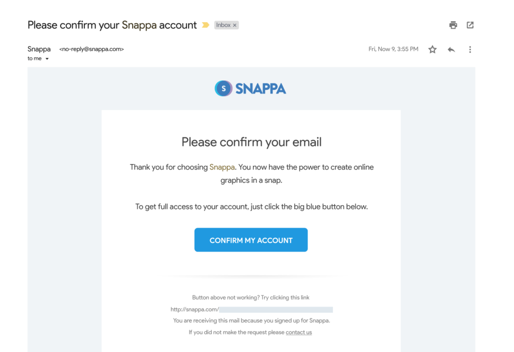
But 27% of all Snappa’s signups never ended up activating their email address.
These new users simply signed up and never touched foot in the product, ever.
Snappa removed the activation step right at the beginning of the onboarding process and started to see their MRR grow substantially.
Now let’s look at some solutions if you’re worried about removing this step.
If your email bounced after signing up, you're notified in a red banner that they couldn't deliver the verification email.
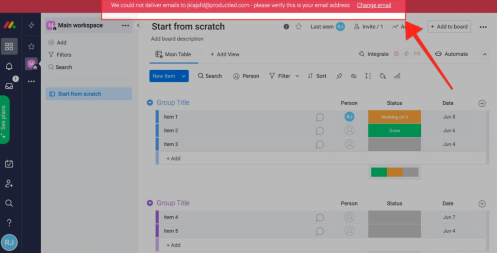
This allows the user to try out the product instantly.
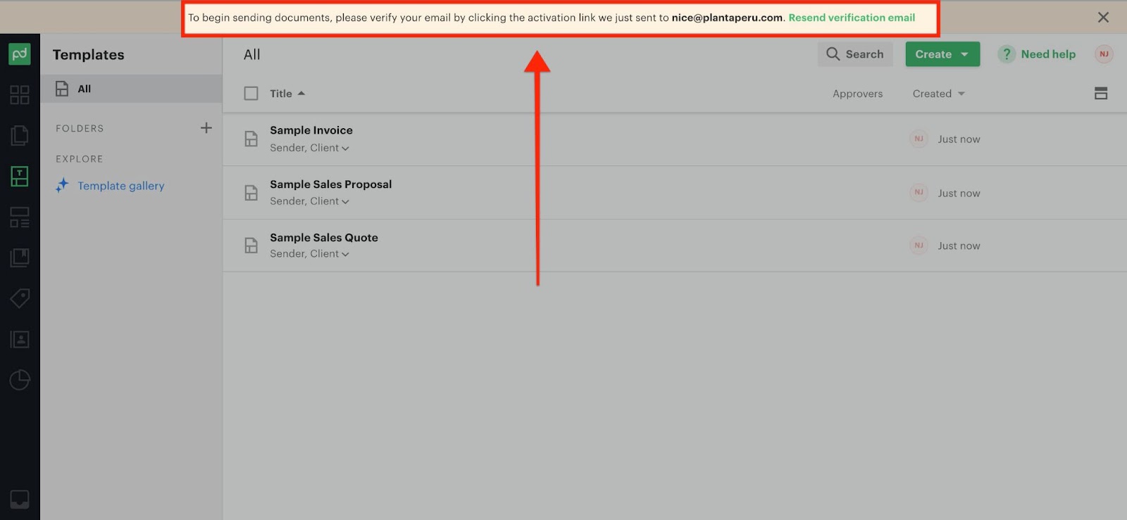
PandaDoc requires users to verify their email before they can begin sending a document.
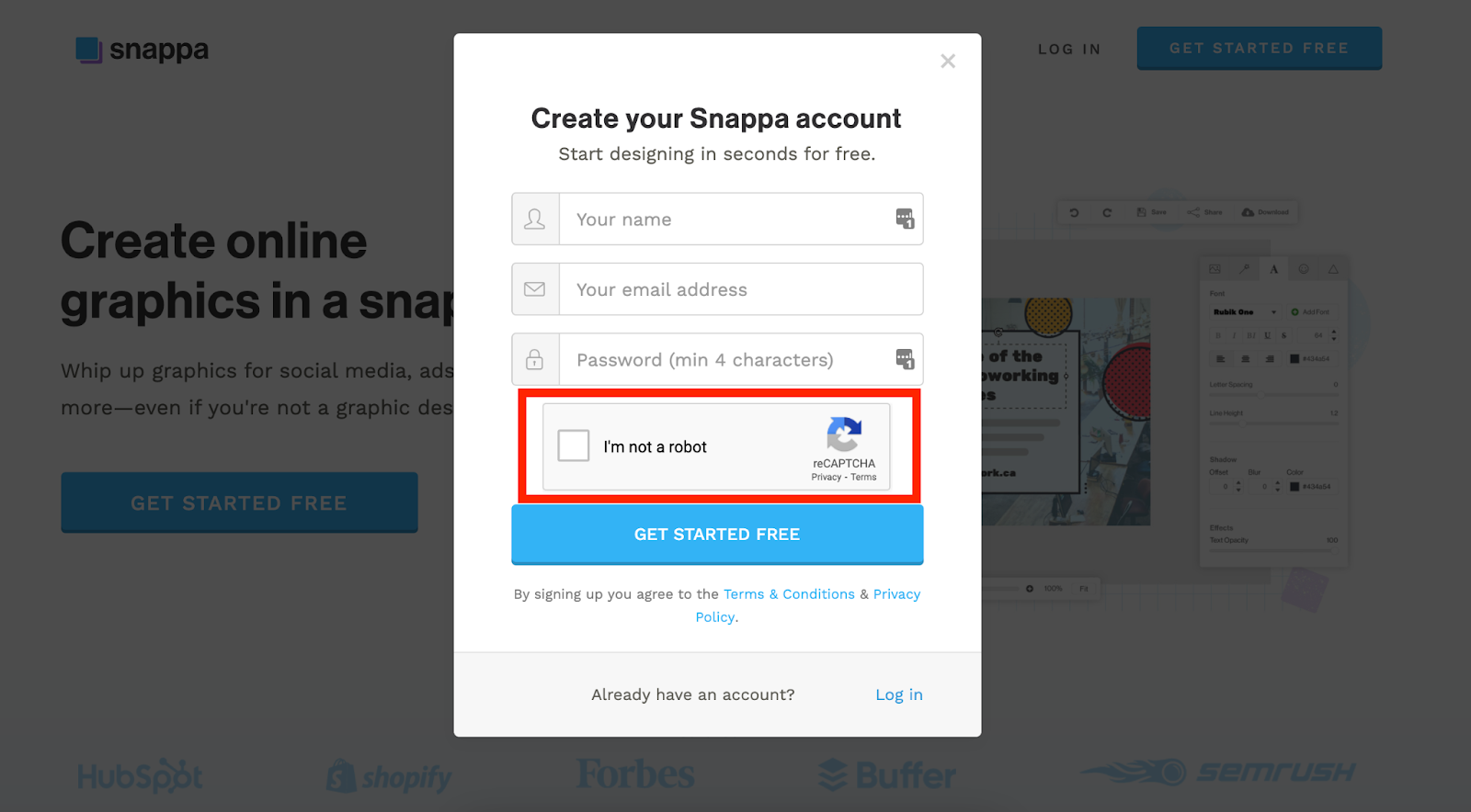
If you're worried about spam, use RECAPTCHA.
In our experience, well over 30% of required user onboarding steps are rubbish. Yes, yours too.
There are form fields that you don’t need to ask people when signing up. There are required steps that first-time users don’t need to complete right away. And, of course, some steps don’t need to be there at all.
Every field, button click, and page is an opportunity for users to abandon your app for good.
Take a look at this form field. Would you sign up for this?
Probably not.
That's why it's essential to vet every single step in your process. To do that, you should check out this article.
In the meantime, let’s look at some examples of companies doing this right.
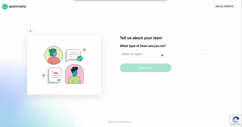
In Grammarly’s signup process, they practice progressive disclosure so that necessary steps don’t feel overwhelming.
At first, only one field is visible. The moment you tell them what team you are on, a second field appears to ask how many people are on your team, and so on.
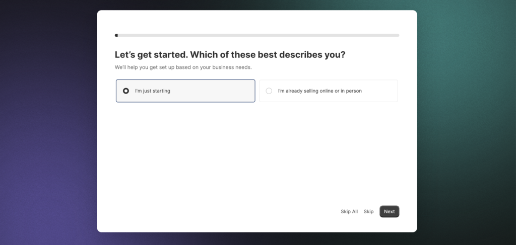
The second approach to simplifying complex forms is to break them up into multiple pages.
Shopify achieves this in its signup process. On the first page, they ask one question about your e-commerce business:
Once you answer, the next page appears another question, asking you to select all options related to your business.
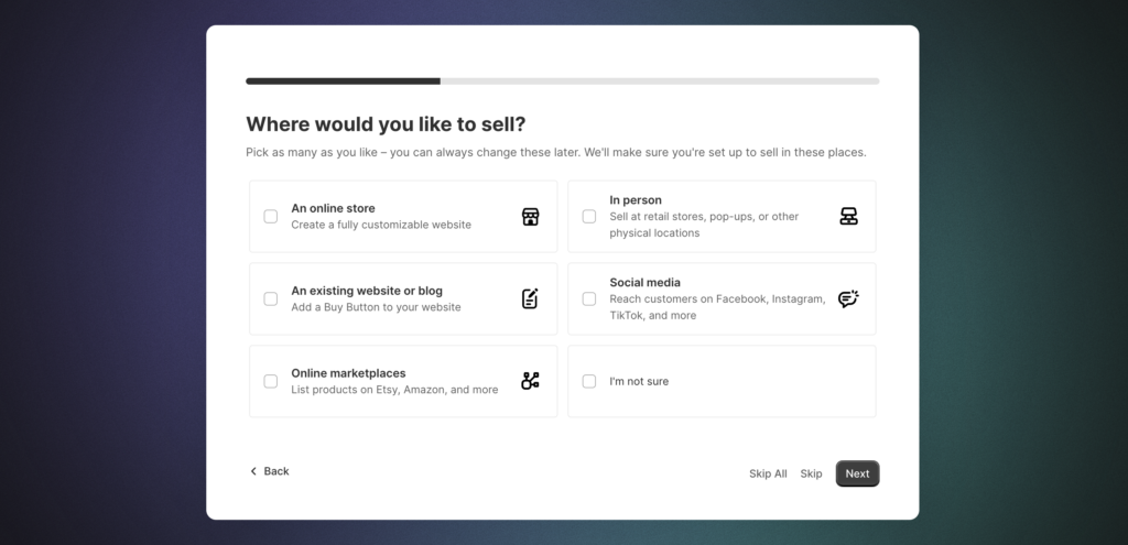
By using a multi-step signup process, users only see a few fields on the page at a time, rather than the 14 required fields needed to complete it.
It’s important to vet what is really deemed “unnecessary.”
During the user onboarding process, Wave asks for a logo. Once they have it, they automatically identify the brand colors and update the invoice template to match the branding.
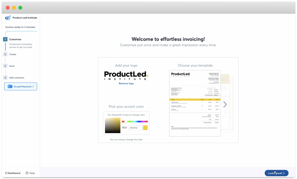
Some may think that this step is unnecessary and should be removed.
But, after doing customer interviews, the Wave team found that this step gets users excited about the product and encourages them to continue using it.
People don't hate product tours.
They hate:
Ultimately, product tours should help put your users on the right track.
Let’s take a look at companies doing it right.
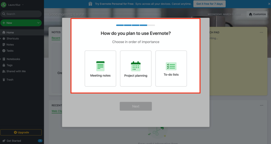
The product tour shouldn’t be a one-size-fits-all guide.
In Evernote's case, they ask users how they intend to use the product to create a more personalized experience and help users achieve their goals.
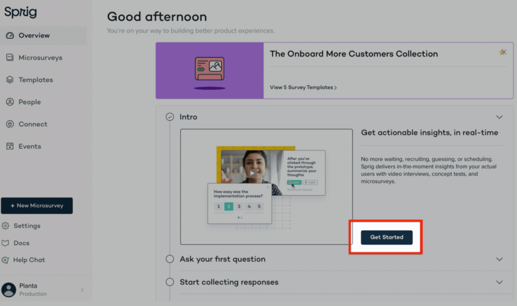
Users typically don’t like being forced into a product tour. So ask users if they would like to start as Sprig does.
Product tours are typically between two to five but can be longer or shorter depending on the complexity of your product. The goal is to provide users with enough information to experience the product’s value without being overwhelmed by too many unnecessary steps.
ZenDesk uses four steps in its product tour.
.avif)
Product tours should cover important step(s) that set users up for success using the product.
So ask yourself: What are the first few steps a user needs to take to get value from the product?
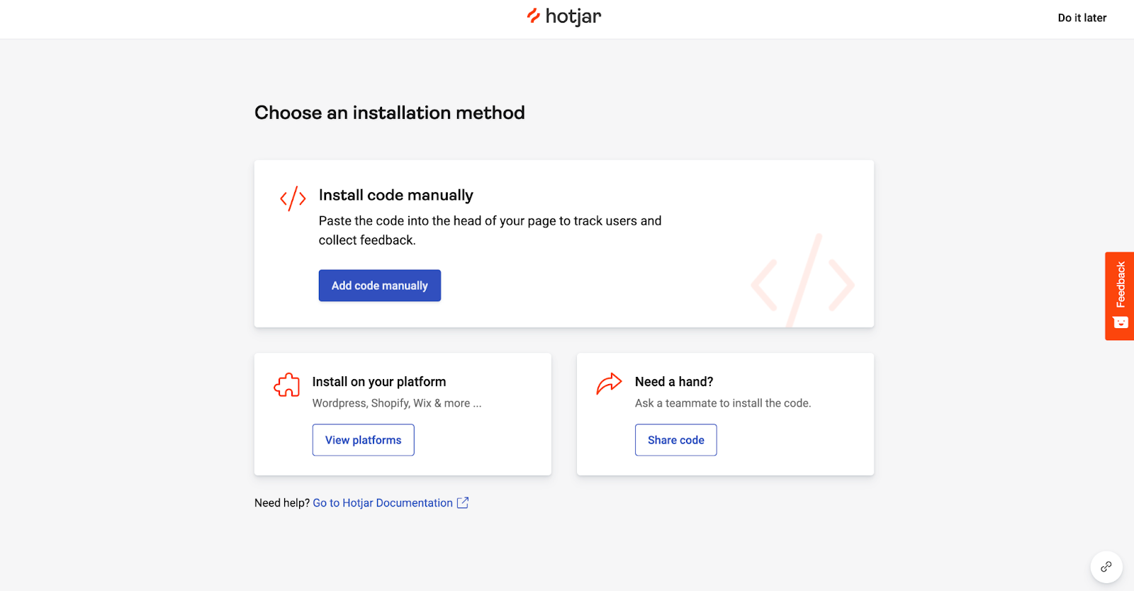
To get started with Hotjar, one of the first questions they ask is: where do you want to install Hotjar?
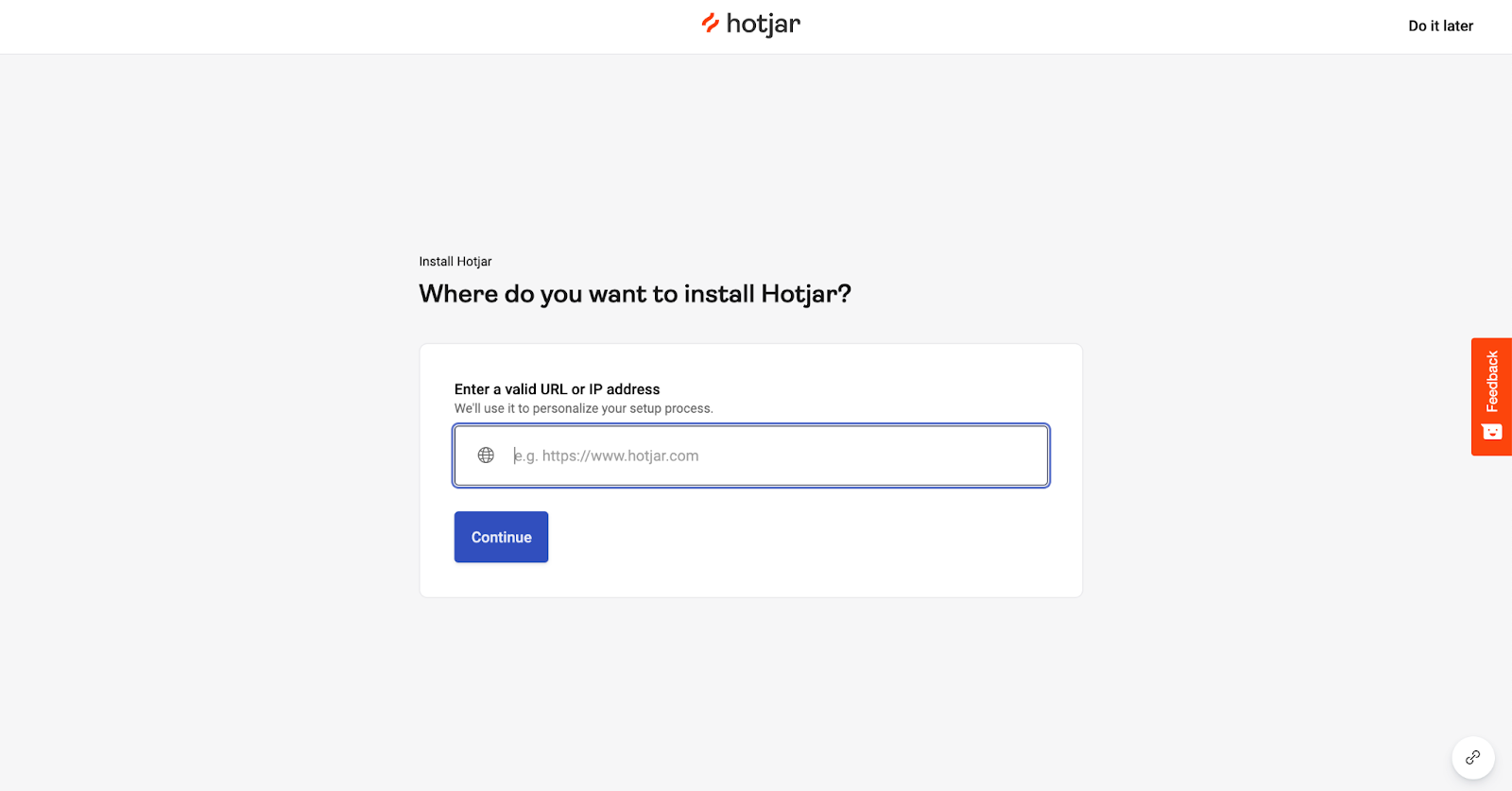
Then, Hotjar automatically generates a code so users can install it on their website straight away.
AirTable asks users to select a template to get them started with the product.
Notice the background?
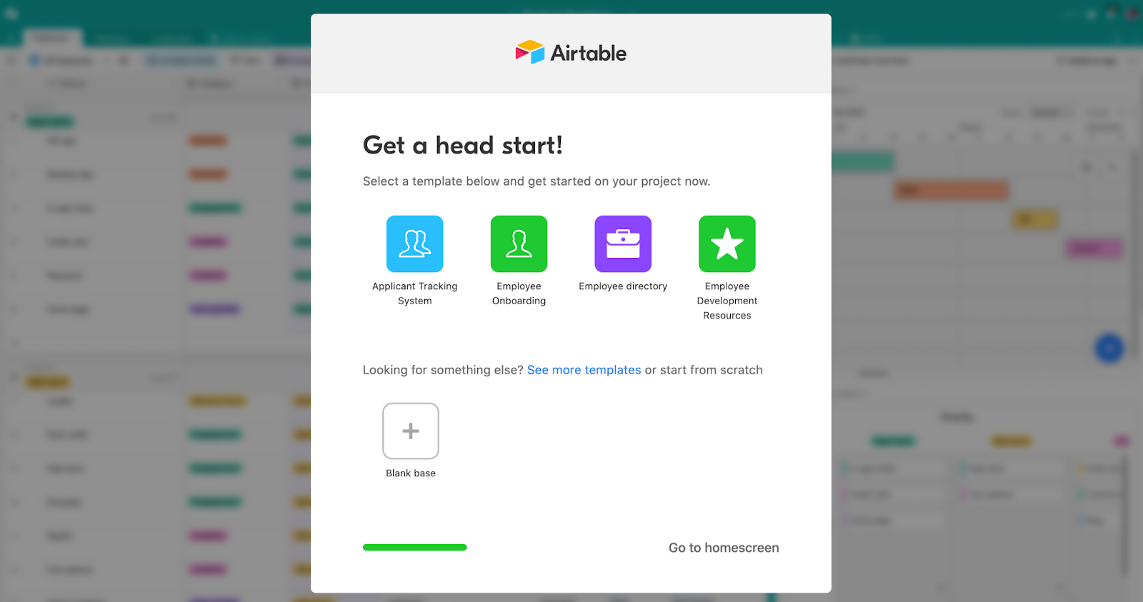
High-performing product tours often utilize “focus mode,” where all unnecessary elements like the navigation bar are stripped away from the product until the user completes the product tour.
Context and segment matter.
Most products have many different features, and the majority of the time, a user arrives to find a solution to one problem.
By helping users accomplish their desired outcome from the start, they’re more likely to see its value and adopt the product.
That’s why Miro asks users what they want to do with the product.
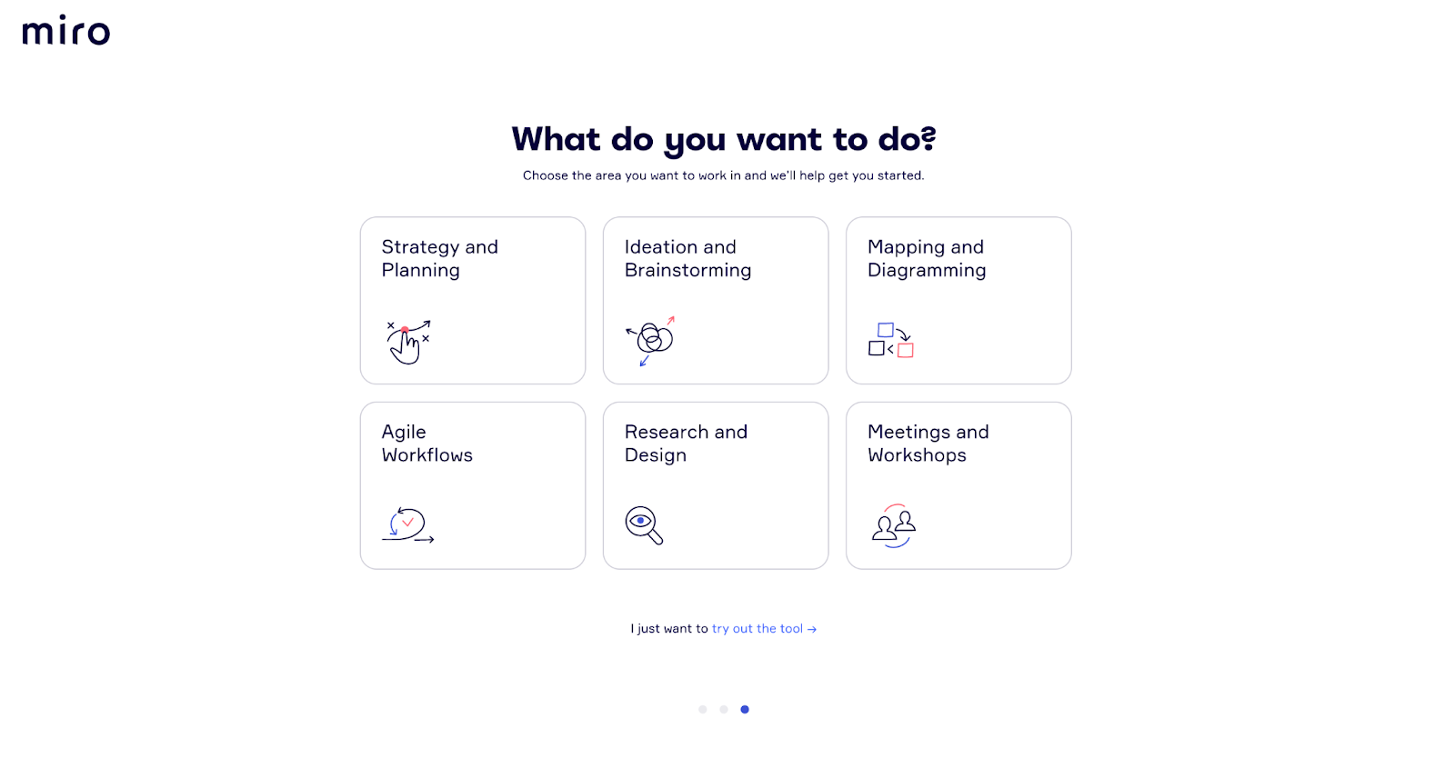
This allows them to segment and tailors their onboarding experience to the intended outcome of each user.
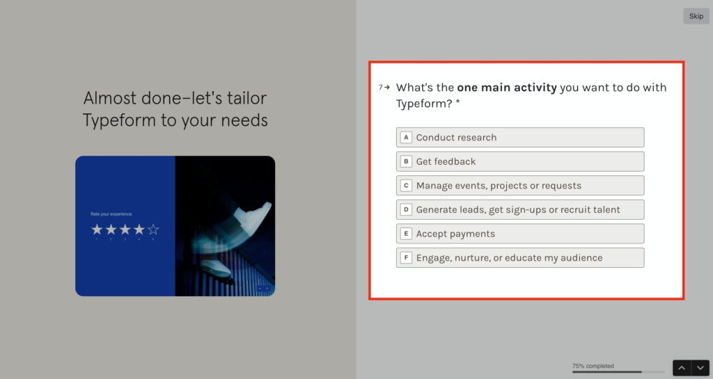
Same with Typeform – they ask what you’ll mainly be using the product for.
This doesn’t even need to be complicated. Instead of asking about a users’ challenge or goal, you can simply ask what team they’re on.
This is what Airtable does.
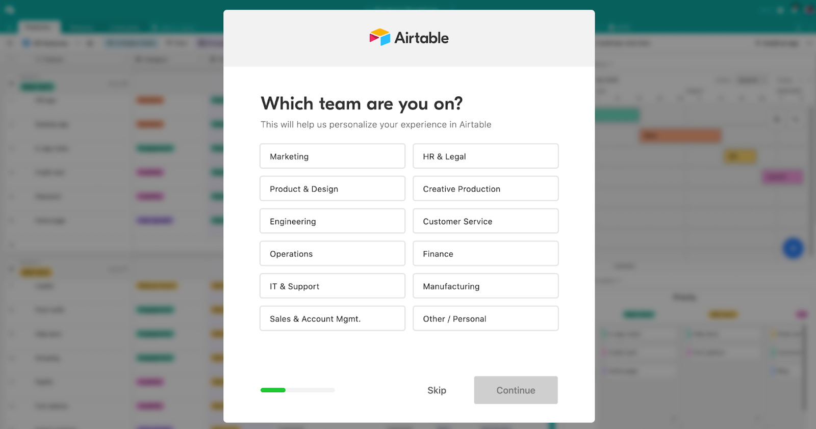
Users then see popular templates based on their chosen team to help them experience the First Strike as quickly as possible.
Often, teams approach the content of signup screens and onboarding elements as a low priority—and it shows. It’s usually focused on product features rather than communicating the benefits of these features.
This is a mistake.
Every word in the entire customer onboarding process is an opportunity to speak to users’ needs and desires. This is the ultimate motivation — show users how the product can help improve their lives.
Use content to amplify the solution to their current pain points, calm their anxieties, and help them to overcome their existing habits.
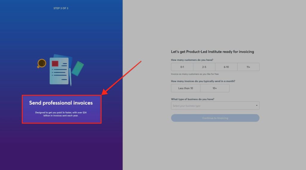
Let’s go back to the example with Wave. The third step in the signup process reminds new users of the value of their invoicing software.
To the left, it reads: Designed to get you paid 3x faster.
It’s not only great social proof but a great boost of motivation. After all, who doesn’t want to get paid three times faster?

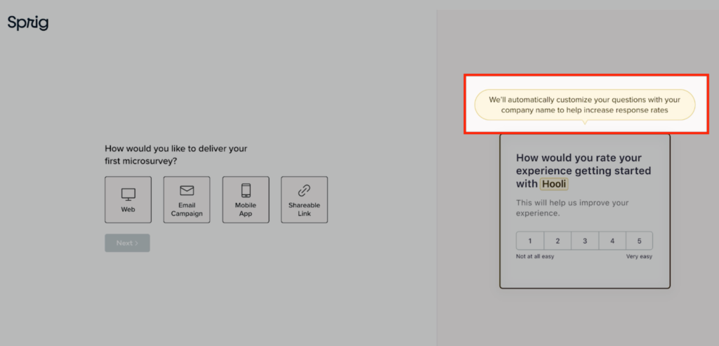
Going back to Sprig, they call out a leading solution to the right as you set your account up: We’ll automatically customize your company name to increase response rates.
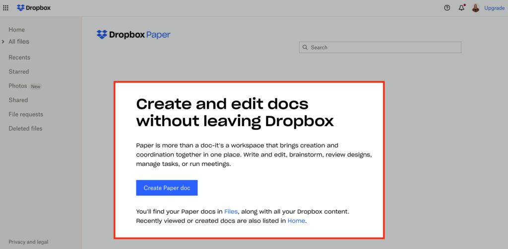
Another example is Dropbox Paper.
They don't say, "You have ZERO files."
Instead, they describe the value of Dropbox Paper with a CTA to get started: Create and edit docs without leaving Dropbox.
Grammarly takes an approach of “learning by doing.” Users see a document already filled out with highlighted grammar mistakes so that they can see the program in action from the get-go.
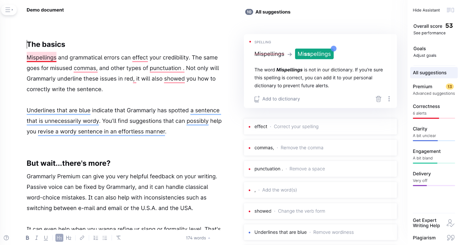
Notice how the last two examples are great examples of using empty states to your advantage.
This brings us to our next findings.
Most SaaS products are relatively boring when you first log in. There's no data specific to the user; it's just the raw application. So, when you first log in to an application, what do you show people? Do you show them dummy data?
Instead, use the empty state to show people what they need to do to successfully set up their account and experience meaningful value in the product.
When it comes to deciding what items to include in an empty state, make sure to ask yourself these questions:
If you ask yourself those three questions, you'll have a much better idea of what items you should include in an empty state.
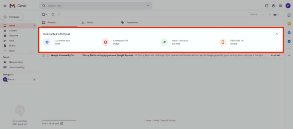
In Gmail's case, they use an empty state to help the user set up their account. As you can see, each of the items listed in Gmail's empty state guides users to set up and personalize their accounts.
For Story Chief, they personalize the empty state and encourage users to craft their first story.
For Buffer, they use an empty state to encourage users to connect their social media accounts. If you think about it, nobody is ever going to use Buffer unless they complete this step.
So the Buffer team has done a great job ensuring that people connect their social media accounts right from the beginning.
With empty states, avoid showing zeroes or stating negative statements. Stay positive and reiterate the value of the product.
Then direct users to the next step to experience it.
It’s best to avoid a purely time-based email flow.
The problem with this approach is:
To avoid coming across as annoying and spammy, trigger emails based on users’ actions they have or have not taken inside the product. This ensures that the communication is both timely and relevant.
Wistia’s Soapbox product is a perfect example of a usage-based onboarding email. After users create their first video, they send a usage-tip email to encourage them to share it with someone.
.avif)
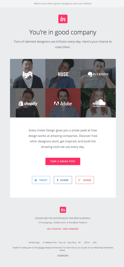
Another type of onboarding email is a case study. This could include a video testimonial, customer story, or old-fashioned case study. InVision does this by showcasing some of the incredible designs their customers have created with the product.
Don’t forget about Welcome Emails! They typically have high open rates, and while it’s tempting to put a lot of product features in the email, it should only have two purposes.
First, you need to train your audience to open your emails. Second, you need to set the expectation of what's coming next.
Fiverr also does a great job at this with their welcome onboarding email.
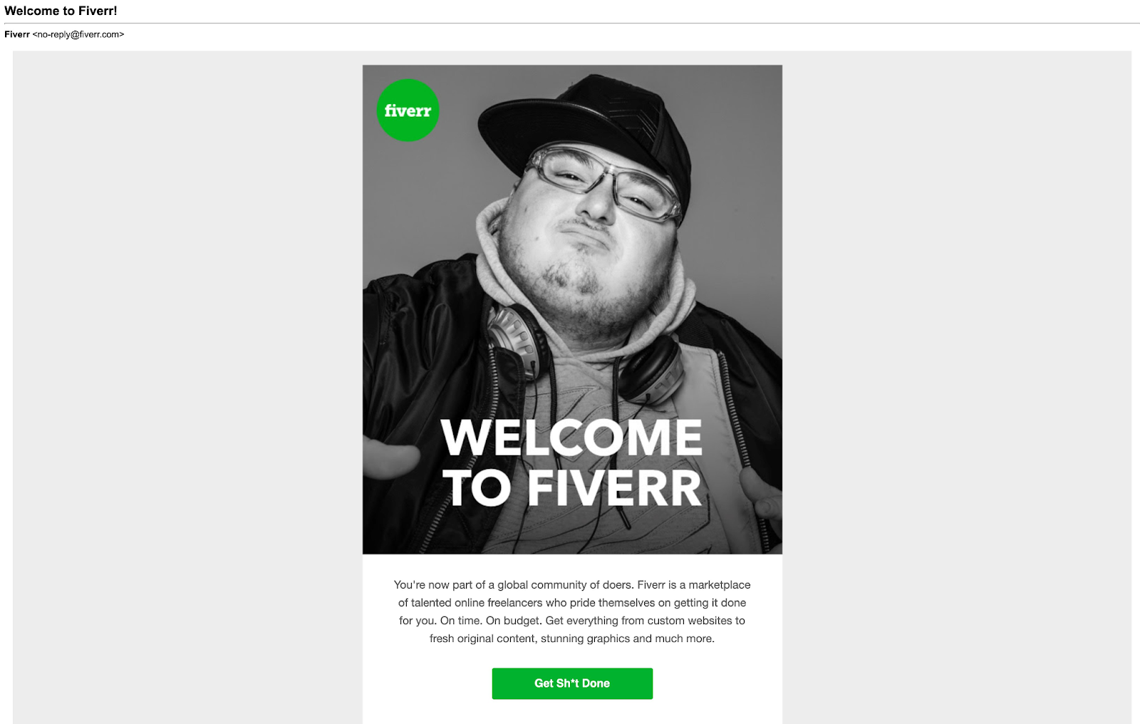
It's a creative dude who looks like someone I could hang out with at a bar.
The call-to-action (CTA) reads, "Get Sh*t Done."
This email is full of character and personality. It’s likable!
The best time to send out your sales touch emails is as soon as someone experiences something meaningful.
For Databox, this is when you create and customize your first dashboard.
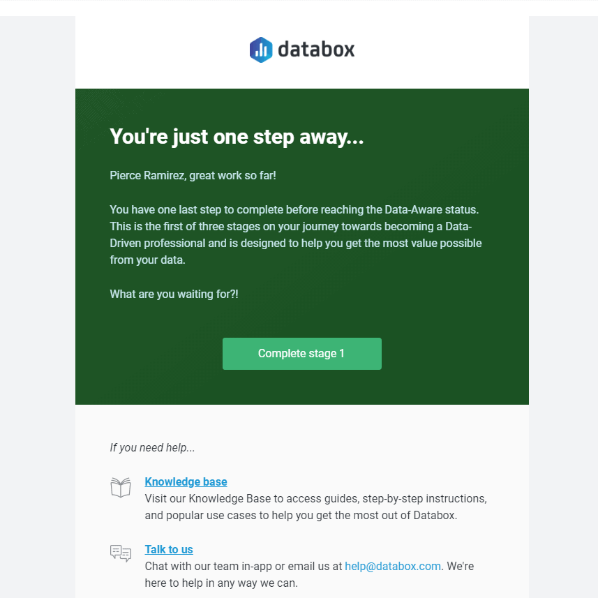
Notice how the email doesn't come across as "salesy," and the goal of the message is to help me get more value out of the platform.
User onboarding is just a means to an end – a better life for users.
Did you know 40% to 60% of users who sign up will never return to check out your product after that first experience?
That’s a major loss.
Yet, most users sign up because they genuinely want to experience the value of your product.
That’s why they signed up, after all.
However, a ton of challenges can get in their way.
Maybe your signup process is too long with too many unnecessary steps. Maybe there’s a value gap. Maybe you’re treating users as customers too early.
To successfully onboard SaaS users, they must quickly and easily experience value.
An effortless experience is the key.
You need to make onboarding effortless for users to sign up, experience value, and upgrade. This is exactly what we do at ProductLed Academy.
If you’ve been taking notes on the best onboarding practices from our examples but are still unsure which approach will make the most impact, it might be time to work with a product-led coach.
Our coaching program helps you optimize your onboarding with a proven framework designed to deliver value to users faster. Onboarding is one of nine components that Wes Bush and product-led specialists focus on in our three-phase system to scale your business and break through your PLG growth plateau.
Discover more about the benefits of our coaching program.