To master user onboarding you need to put yourself in your users’ shoes. Understanding the underlying thought processes of users is your ticket to:
- Eliminating any friction
- Grabbing their attention
- Breaking through barriers
It’s why these seven principles work to improve onboarding:
- The Principle of Commitment and Consistency
- Progressive Disclosure
- Likability Principle
- Zeigrarnik Effect
- IKEA Effect
- Hick's Law
- Fitt's Law
In fact, these exact principles have accounted for 20%+ monthly recurring revenue for our SaaS clients.
Want to see how these work in action?
Let’s dive right in.
1. The Principle of Commitment and Consistency
The smaller the initial ask from someone, the more likely they are to agree to bigger requests.
For your onboarding, look for ways to reorganize fields and steps from easiest to hardest.
Have a lot of required fields for your signup?
Break it up to multiple pages.
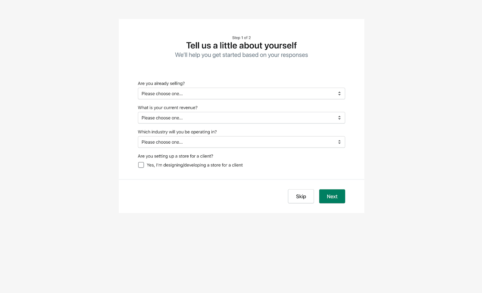
A brilliant example of this is from Shopify. They break up the account setup into two pages.
The first page has 4 fields.
The second page has 10 fields!
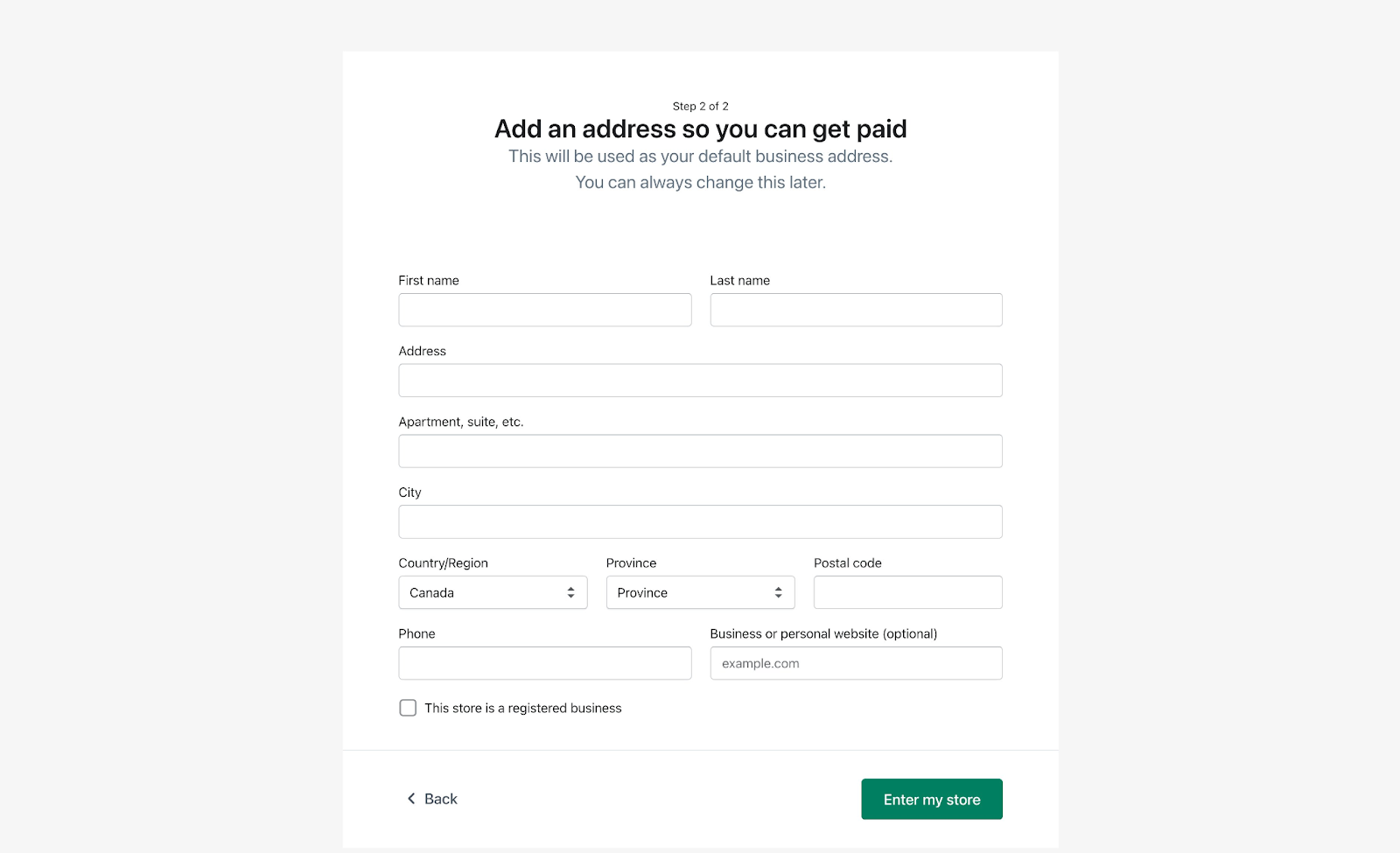
Visitors are more likely to complete the second page if they've already completed the first page.
This Principle of Consistency & Commitment is part of the reason why multi-step signup forms can perform up to 271% better than a big single-step form.
2. Progressive Disclosure
An interface is easier to use when complex features are gradually revealed later.
During the onboarding, only show the core features of your product, and as users get familiar, unveil new options.
Shopify again does a great job with this.
Certain fields only appear after you've completed the first one.
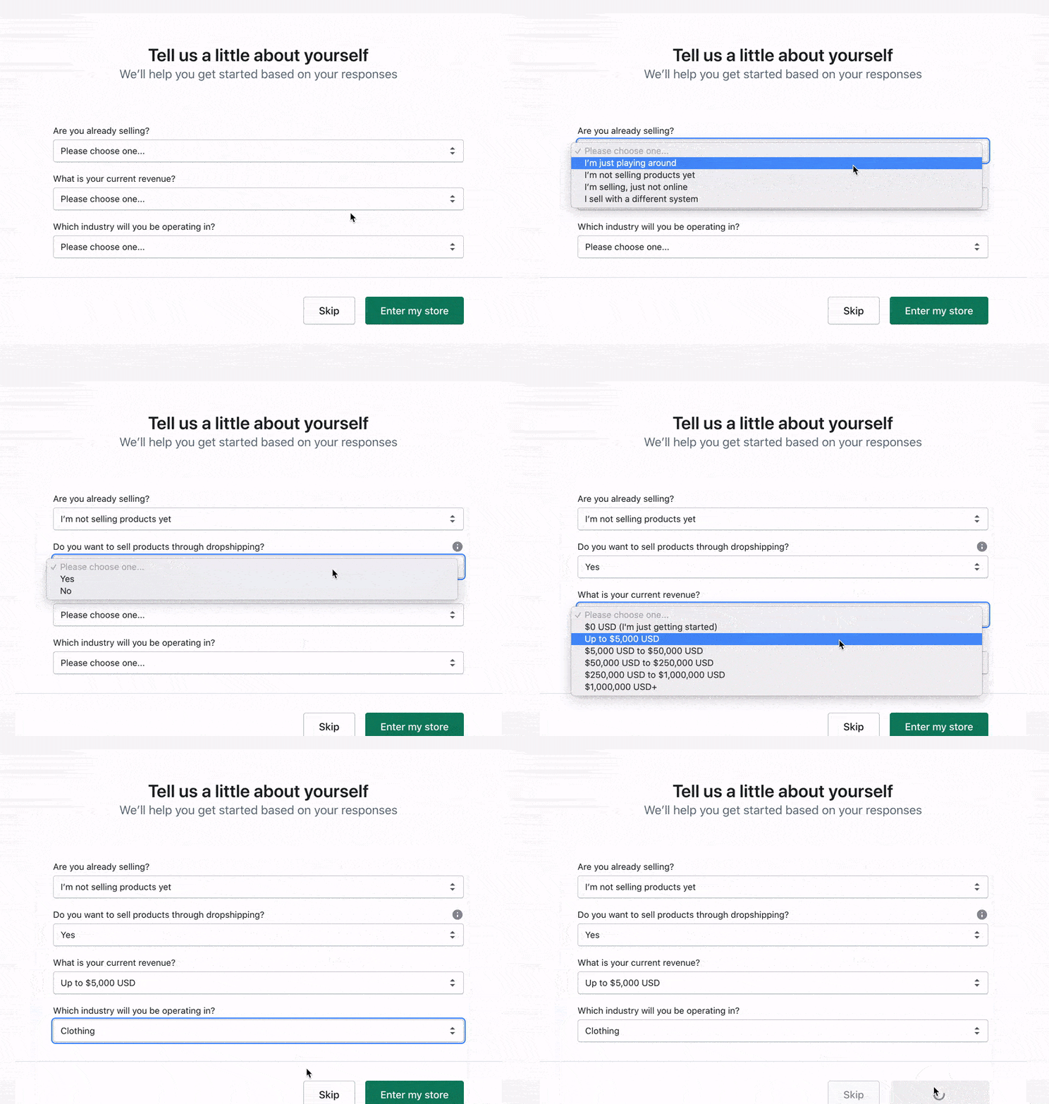
This is another great way to get users to complete the signup and setup process.
3. Likability Principle
You're more likely to agree with people who are:
- Similar to you
- Pay you compliments
- Cooperate with you to attain mutual goals
In other words, people are more likely to say yes to you if they like you.
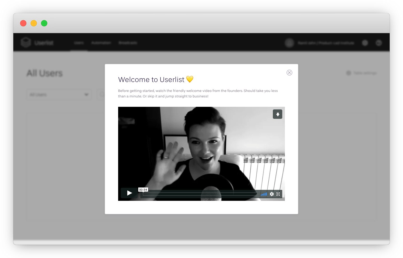
One way to harness this powerful principle in the user onboarding experience is to welcome new users.
With a short video from their three founders, Userlist creates a bond with users thanks to the personal message.
Fiverr also does a great job at this with their welcome onboarding email.

It's a creative dude who looks like someone I could hang out with at a bar.
The call-to-action (CTA) reads, "Get Sh*t Done."
This email is full of character and personality. It’s likable!
The lesson is to use your welcome message and email to:
- Create a connection with new users
- Find a common mission
- Set expectations
4. Zeigarnik Effect
There’s an internal tension that occurs when a list of tasks appears to be incomplete. This tension is relieved when the task is completed.
This is the principle at work with progress bars and checklists.
For example, when you sign up at GrowthHackers, you see a checklist of tasks you need to do to complete your profile.
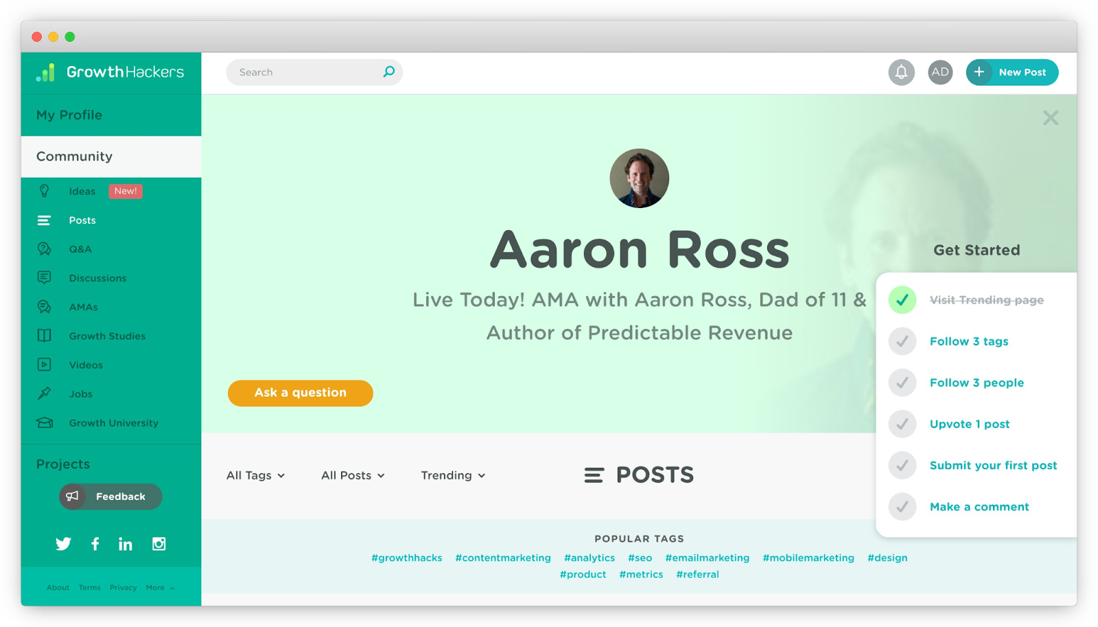
In general, I love onboarding checklists. They're a great way to guide users without being too pushy.
Pro-tip for checklists: have at least 2 items checked off already when you show it. It creates more tension in users to complete all of the tasks.
5. IKEA Effect
The IKEA effect is a cognitive bias in which consumers place a disproportionately high value on products they partially created or customized themselves.
The name refers to Swedish manufacturer and furniture retailer IKEA, which sells furniture that requires assembly.
Wave asks new users to upload their logo. Based on that, Wave shows you how your invoices could look like with your brand color and logo! The team at Wave told me this creates excitement and delight for their new users.
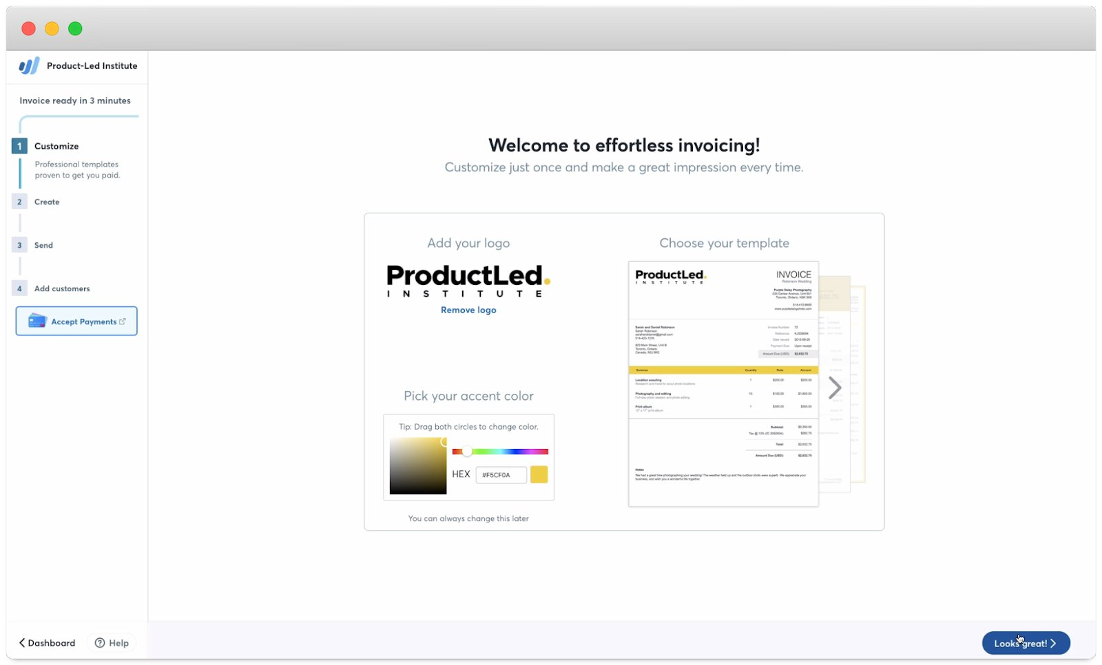
This is a perfect example of how some friction in the onboarding experience can be good.
If it directs users to the next step, personalizes the experience, and delights users, consider keeping those "friction" steps.
6. Hick's Law
The time and effort it takes to make a decision increases with the number of options available to you.
The more choices, the more time users take to make their decisions.
For user onboarding, keep it super simple and show fewer options.
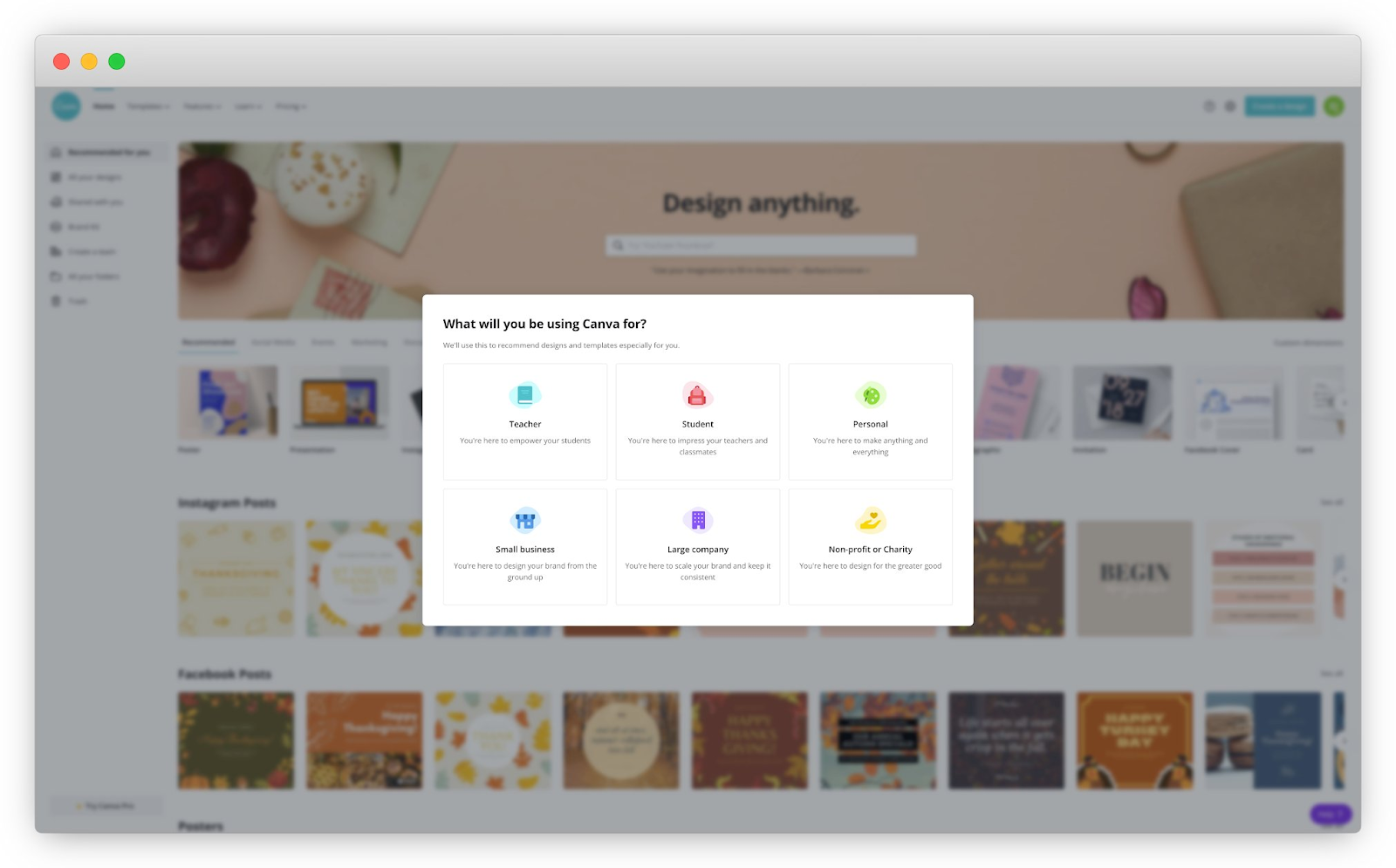
Canva shows relevant design templates to users based on their response to the signup questions.
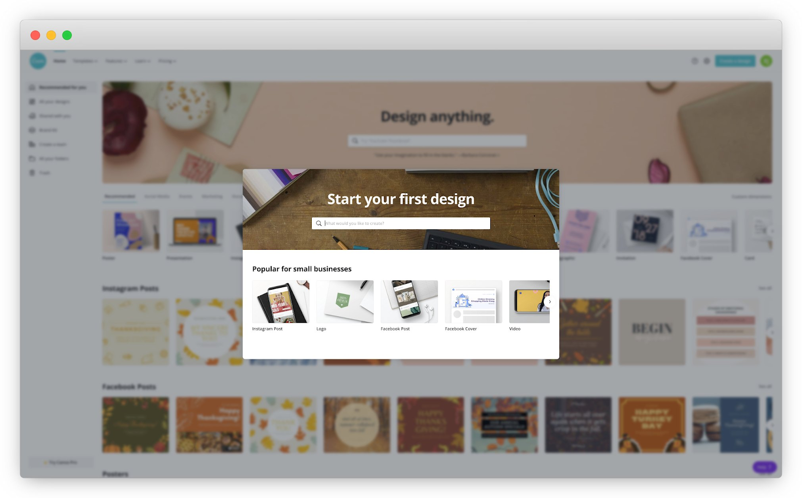
Instead of offering too many choices, this step helps speed up the design process.
Pro-tip: ask new users what they're trying to achieve with your product from the get-go, like how Evernote does it.
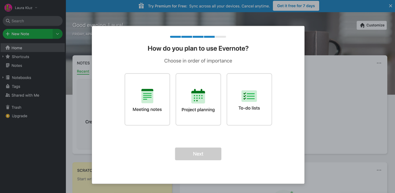
This way, you only show relevant tips and features based on that. This way, you also avoid overwhelming new users.
7. Fitt's Law
The time it takes for users to click on a button is a function of the distance to and size of the button.
In other words, make the next step in the onboarding *super* obvious.
When you sign up for Dropbox Paper, they show a thoughtful empty state (the moments in an app where there is no data to display to the user.)
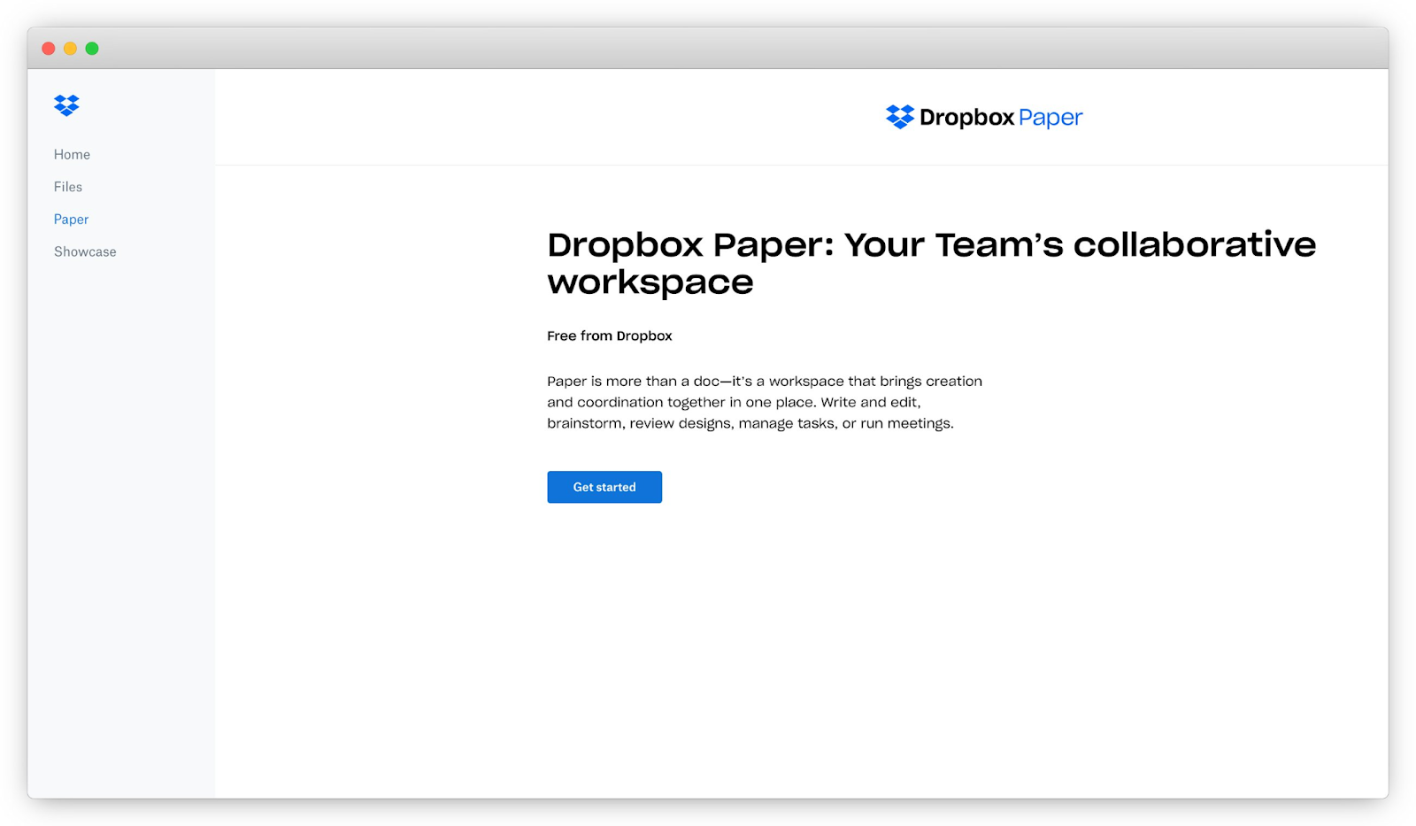
In the empty state, they re-iterate the value of the product.
The CTA, "Get Started," is prominently placed in the middle of the screen.
Notice how it's the only button on the screen. It's Hick's Law in action again!
To Recap
These 7 psychology principles are responsible for +20% monthly recurring revenue growth for our SaaS clients by improving onboarding!
Here they are again:
1. Commitment & Consistency
2. Progressive Disclosure
3. Likeability Principle
4. Zeigarnik Effect
5. IKEA Effect
6. Hick's Law
7. Fitt's Law
Which one will you implement in your onboarding next? Drop it in the comments below.


