A good and great free trial landing page can be the difference between getting one hundred versus a thousand signups a week.
In this article, we will break down everything you need to know to build a world-class free trial landing page.
Why Have a Free Trial Landing Page?
There are two reasons for your product-led company to have a free trial landing page. Most people get the first purpose but miss the second one.
The first purpose of your free trial landing page is to get someone to sign up.
Revolutionary, right?
Now, most people stop here.
But the second purpose of getting visitors excited to use the product on your free trial landing page is equally important.
For customers to experience the total value of your product, they may need time to adjust to new technology or dashboard features. An effective landing page can help motivate and remind users why it's worth sticking around to figure out your product.
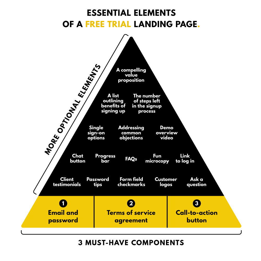
Elements of a Great Free Trial Landing Page
A successful free trial landing page converts visitors into leads. Every page should include three must-have components, and companies can then integrate additional elements into their design depending on their needs.
3 Must-Have Components
As helpful as it would be, a cookie-cutter template that works for every brand doesn’t exist – the requirements of companies are just too unique.
However, for a free trial landing page to be great, it must include:
- Email & password (the minimum number of fields required to set up an account)
- A good call-to-action button
- Terms of service agreement
Additional Nice-to-Have Elements
The elements below can enhance your free trial landing page:
- A compelling value proposition
- Social proof (customer logos, number of customers, client testimonials, etc.)
- Single sign-on (SSO) options (like logging in with Google or Apple)
- Handles common objections (no credit card required. etc.)
- 3 or 4 bullet points reminding people of what they're going to get from signing up
- Chat button
- A link to log in (i.e., Already using Appcues? Log in here)
- FAQ
- Demo overview video
- Fun microcopy (what you say when someone gets an error, etc.)
- Question (i.e., “What are you hoping to accomplish with Clearbit?” or “How did you hear about us?”)
- The number of steps left in the signup process
- Progress bar
- Form field checkmarks when people put in the right kind of information
- Password tips (i.e., the password must be at least eight characters and contain at least one capital letter, one lowercase letter, and one number.)
The objective isn’t to pack your landing page with these nice-to-have elements. Instead, each company should evaluate the needs of its users to determine additional features that enhance the effectiveness of your free trial page.
Here are a few scenarios to explain why:
First, let’s say you own a startup, and not many people are familiar with your brand. Testimonials showcasing customers raving about your product might be the social proof a visitor needs to sign up for your free trial instead of leaving your website.
For this second scenario, your product requires a Gmail plugin. It’s beneficial to have a landing page with an SSO so visitors can easily create a free trial account using their existing Google account.
10 Incredible Free Trial Page Examples
Let’s dig into the free trial landing pages of SaaS companies. I’ll highlight the features that make the success of each landing page unique.
Remember that fantastic design elements in the example might not be required for you to build a kickass free trial landing page.
1. Zendesk's Free Trial Offer
Zendesk offers customer service software and sales customer relationship management (CRM). The company promotes its free trial and the option to view a demo on the homepage above the fold (content viewed before scrolling).
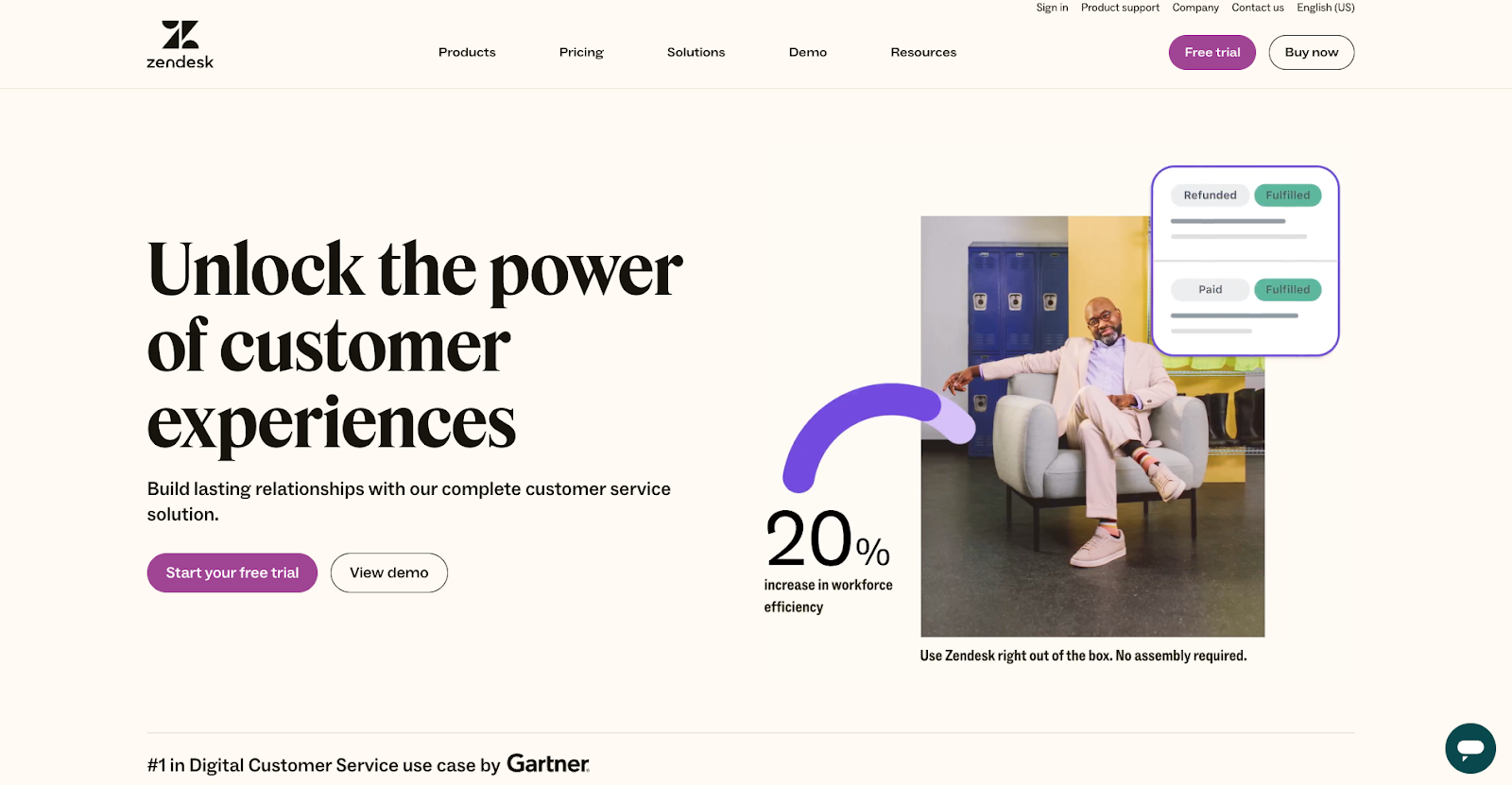
Clicking Start your free trial takes you to a nine-step registration process, beginning with your work email.
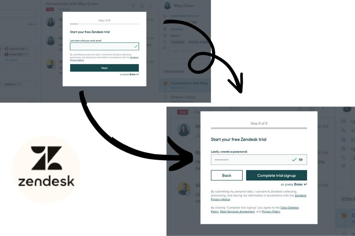
Elements featured in Zendesk’s free trial registration process:
- There’s a progress bar for completing steps one through nine.
- A green checkmark appears when a form field is correctly filled.
- Questions are professionally related, including your work email, job title, what company you work for, and number of employees.
- Each free trial step is showcased against a sneak peek of the Zendesk dashboard in the background.
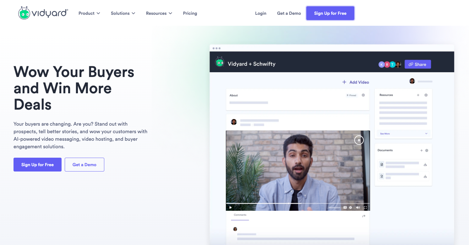
2. Vidyard’s 14-Day Free Trial
The bold purple Get Vidyard Free button demands attention when you open the homepage of Vidyard. At the right is a peak at a general Vidyard dashboard playing a live video to spark curiosity.
Elements of the free trial landing page:
The homepage’s Sign Up for Free button on the homepage takes you to the free trial landing page.
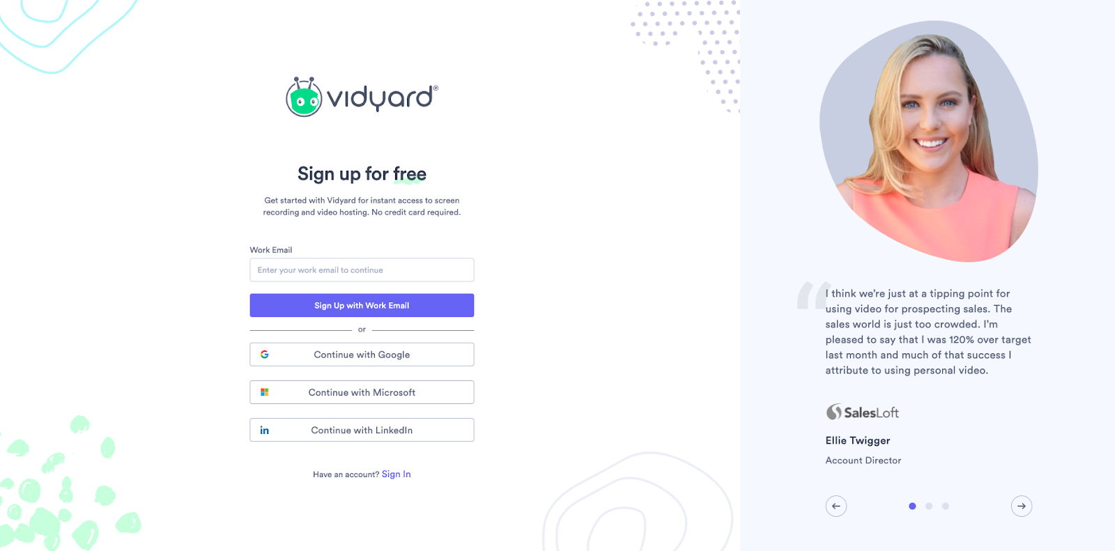
The page includes:
- Testimonials and photos of higher-ups at SalesLoft, Jostle, and Revenue River.
- SSO with Google, Microsoft, Apple, LinkedIn, or your work email.
Vidyard Pricing Page
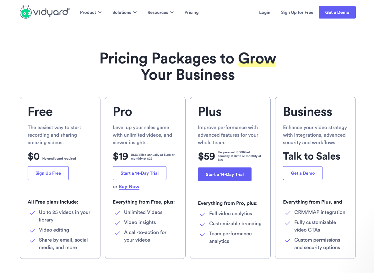
Noticeable nice-to-have page elements:
- A list of key features makes it easy to compare the different level products, including the Free Plan and the option to try the Plus during a 14-day free trial.
- A chatbot is available to help answer your questions.
3. Appcues's 14-Day Free Trial
Appcues has a Start Building for free button alongside a demo option on its homepage.
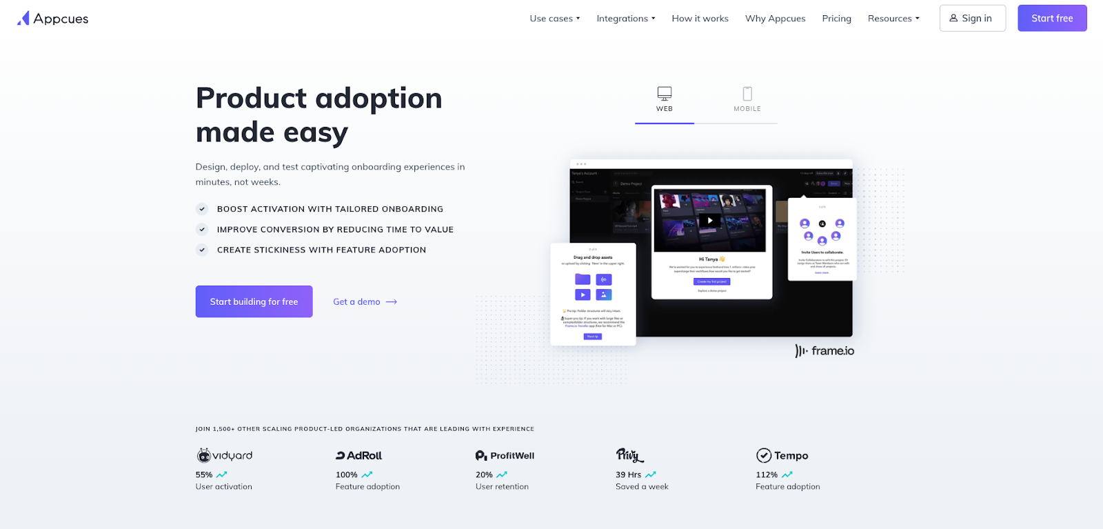
Homepage elements to encourage free trial signup include:
- Bullet points outline what services Appcue offers its users.
- Examples of social proof on the homepage include logos, statistics, and the sentence “Join 1,500+ other scaling product-led organizations that are leading with experience.”
The Appcues free trial registration is simple:
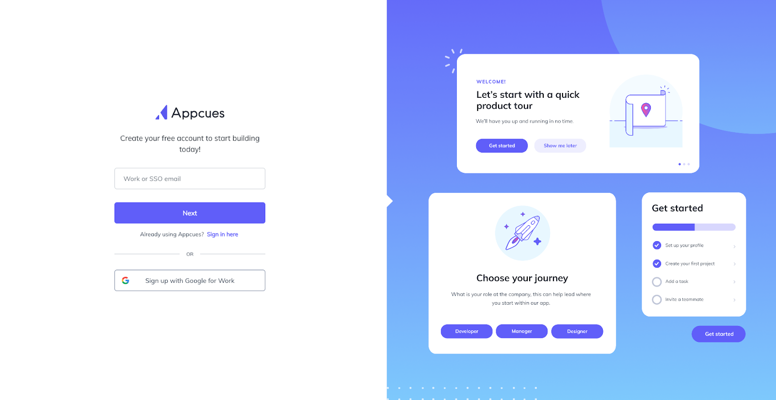
Registration options with Appcue include:
- Create an account using your work email, full name, password (at least eight characters), and your role at the company.
- Or SSO with Google for work.
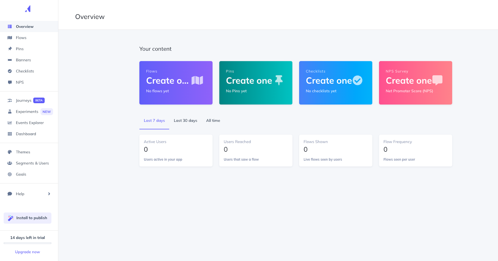
After signup, you can start enjoying your 14-day trial and then have the option to upgrade.
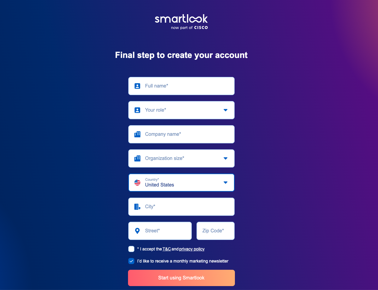
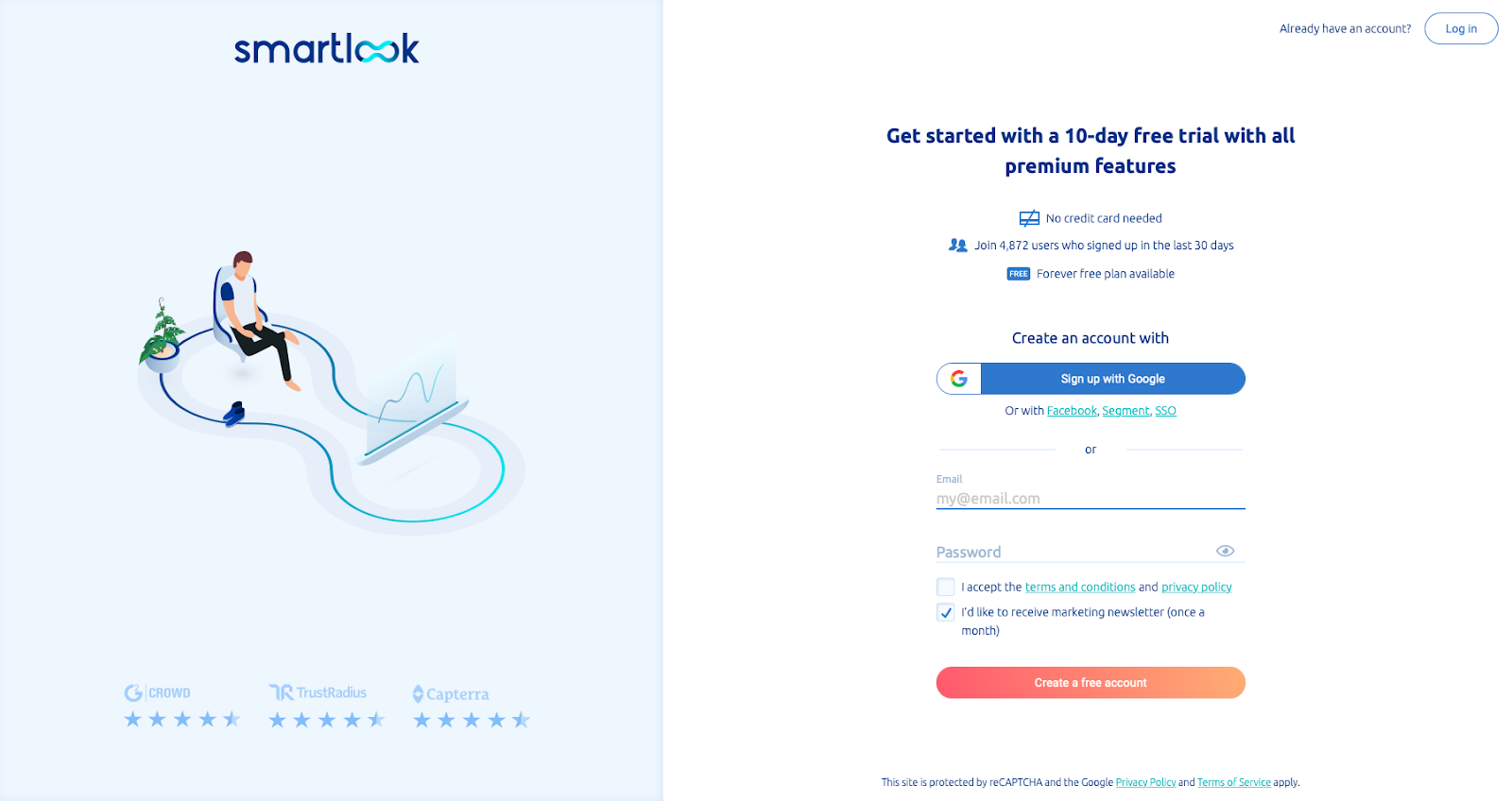
4. Smartlook's 30-Day Free Trial
Smartlook provides session recording and behavior analytics tools. The Try it Free button on the company’s homepage takes you to its account registration page to get started with a 30-day free trial with all the premium features.
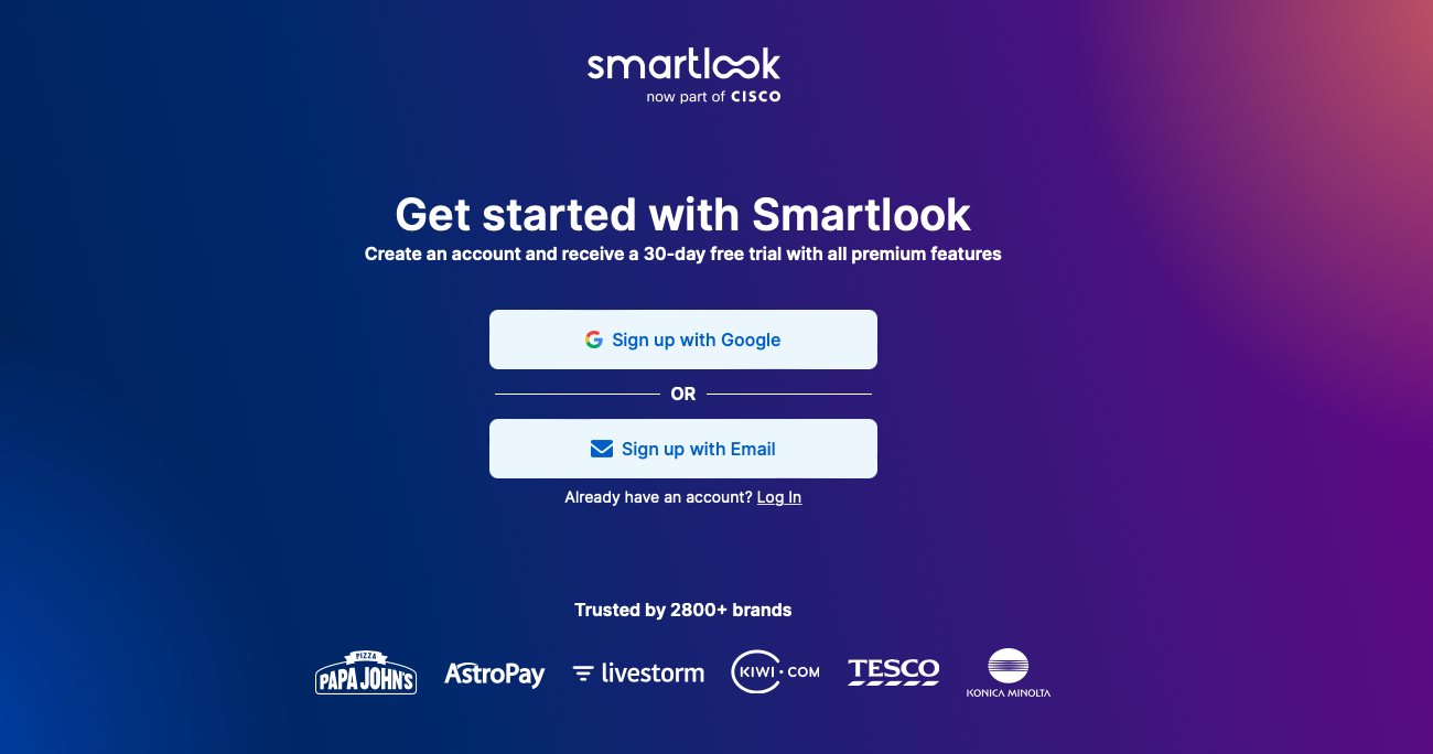
Elements enhancing Smartlook’s free trial landing page:
- Known clients, including AstroPay, Tesco, and Papa Johns, are showcased.
- Trusted by over 2,800 brands is more social proof.
- SSO with Google or sign up with email.
- No payment details are required to start your free trial.
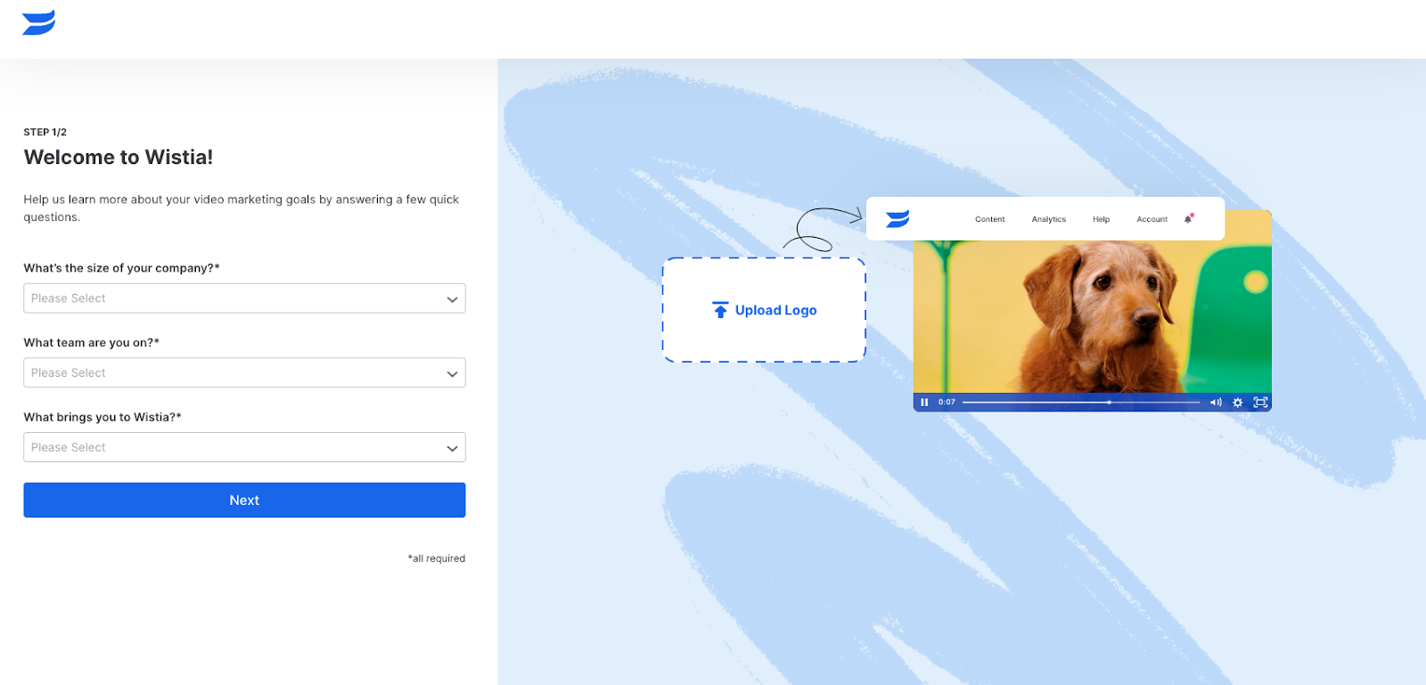
5. Wistia's 14-Day Free Trial
Unlike other SaaS companies, the free trial options for Wistia aren’t showcased on its homepage. Instead, the free trials are on the Pricing page under the paid subscriptions.
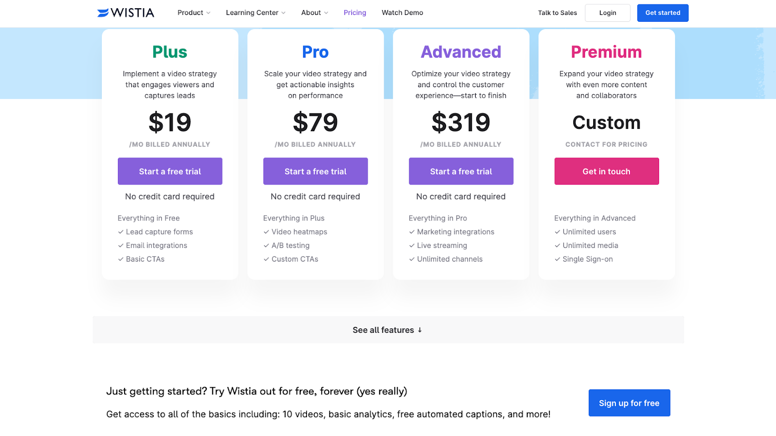
Clicking Start a free trial for one of Wistia’s advanced plans takes you to a simple free trial signup.
Here’s what the Pro Plan Trail free registration page looks like:
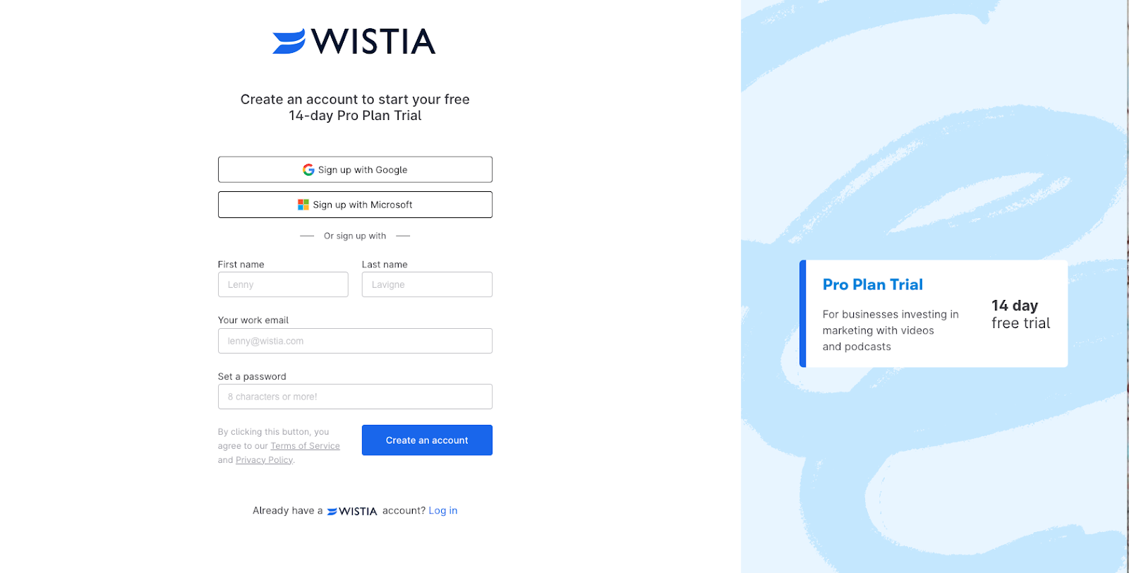
The page elements are simple. You can either sign in with Google or Microsoft or create a free account using your name, work email, job title, and set an eight-character or more password.
But here is where the landing page gets exciting and differs from other examples in our list.
The initial email registration takes you through a two-step setup process. The little video of a cute dog and different platform features showcased on the left entice you to keep going.
Step 1 of 2: Ask some basic questions.
Step 2 of 2: A little customization.
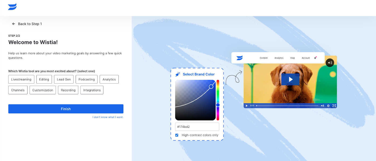
Then, your 14 free trial begins!
6. Notion’s Discreet Free Trial Offer
Notion doesn’t have its free trial offer showcased on its homepage.
Its minimalist free landing page includes:
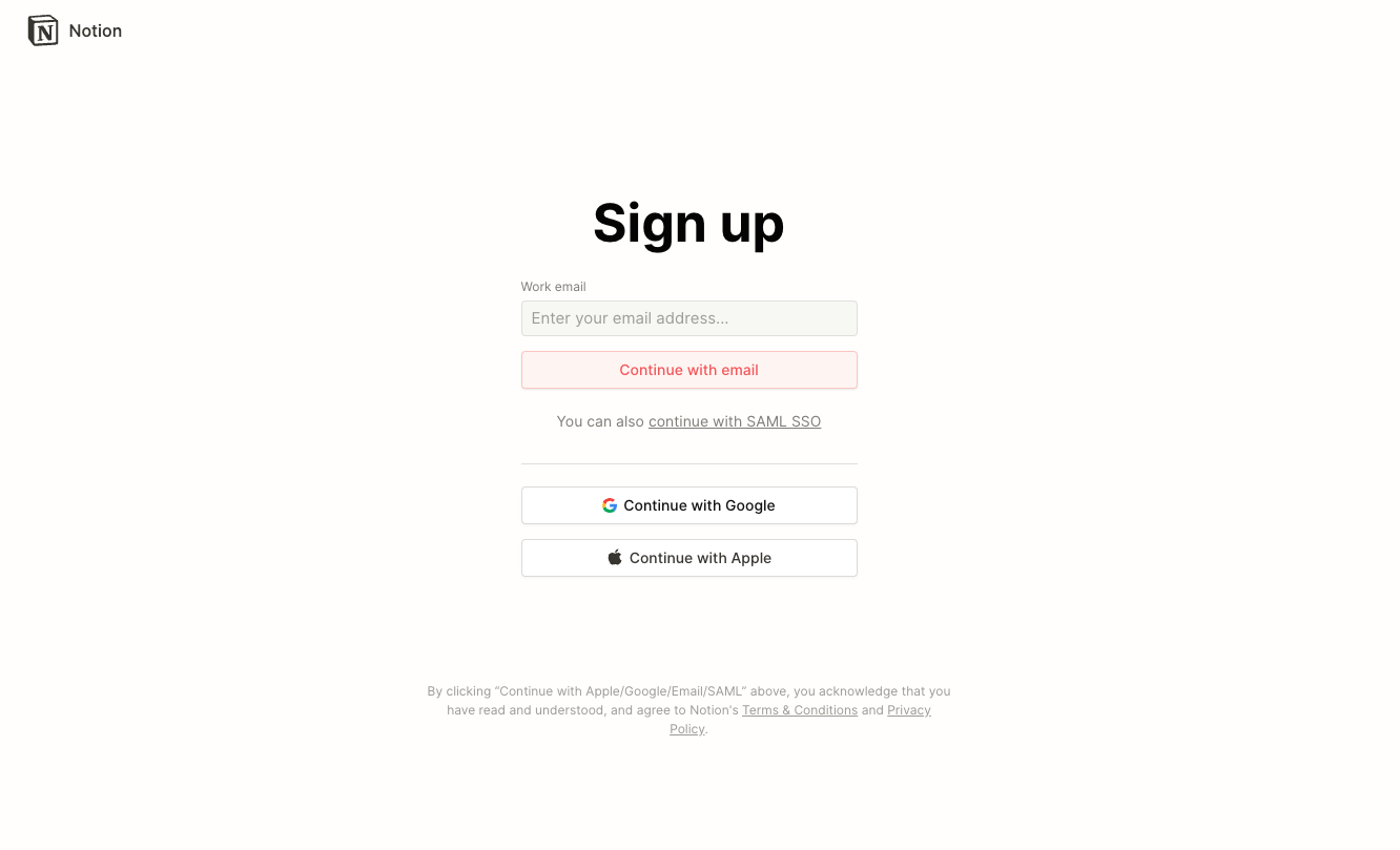
The only three elements on the page are:
- Sign in (email and password/SSO)
- A call-to-action button
- Links to the terms and conditions and privacy policy
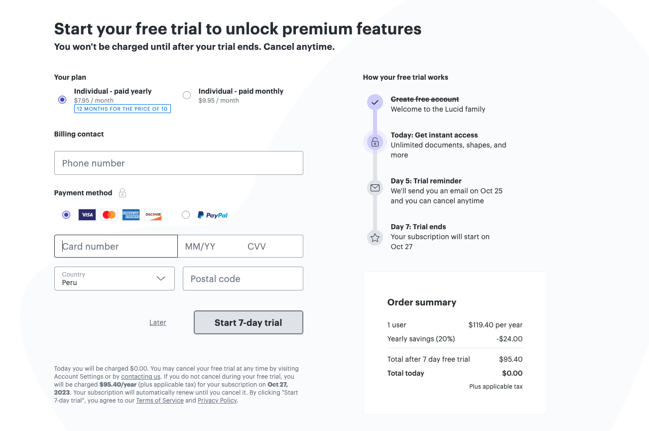
7. Lucidchart’s 7-Day Free Trial Process
Lucidchart is an intelligent diagramming application. The company has a Sign-up Free button on its homepage. Unlike other SaaS businesses, the customer journey to inputting their data on the free trial landing page differs.
First, go to “Step 1 of 3: Choose your plan” by clicking Sign up free on the homepage.
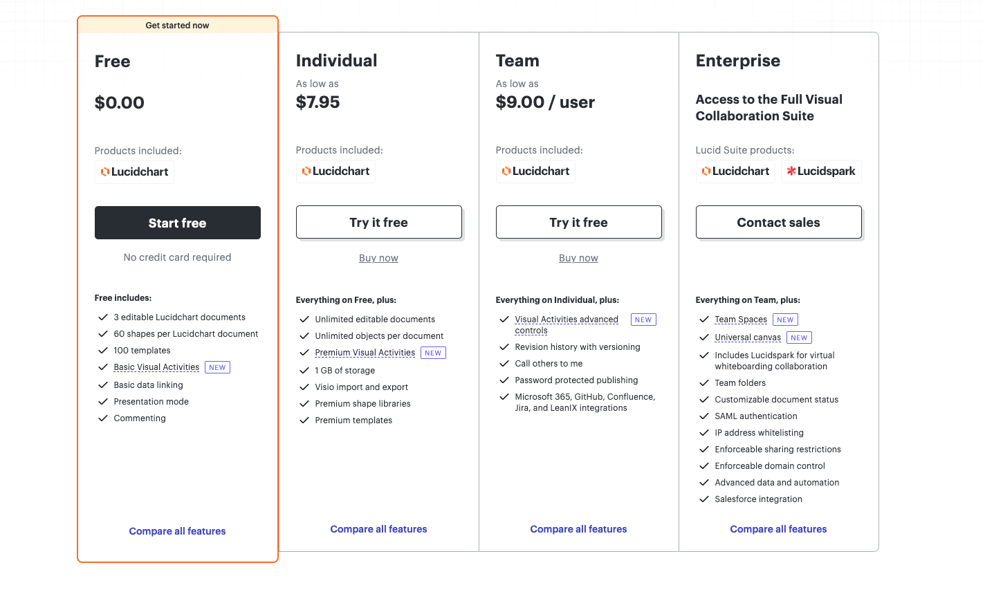
The benefits of the Free plan are highlighted in orange. But this first step lets users see what additional features are available with the different paid plans. The Individual and Team plans have the option to Try it free.
Elements on the landing page of Step 1 include:
- Listicles of the features included (or not) for each plan
- The social proof logos and the statement “99% of the Fortune 500 choose Lucidchart.”
Then, press “Try it free” to advance to “Step 2 of 3: Create your account.”
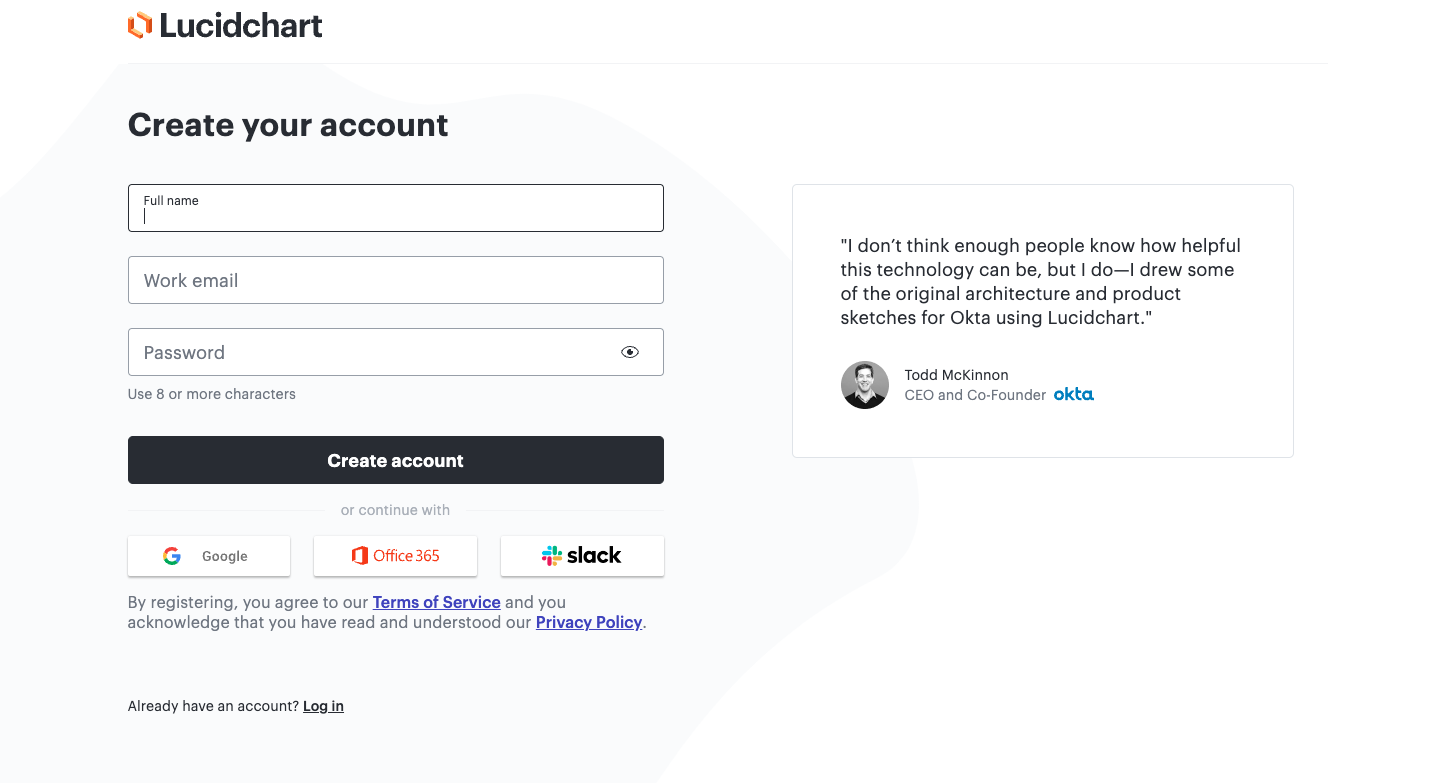
Elements on the landing page of Step 2 include:
- New account creation (full name, work email, and password)
- Single login option with Google
- Photo and written testimonial from a CEO
Finally, arrive at Step 3. Here, before you can start your 7-day trial, you need to submit your payment details.
8. Litmus's 7-Day Free Trial
Litmus, an all-in-one email marketing platform, offers two free trials for the Basic Plan ($79 per month) and the Plus ($159 per month).
Here’s the free trial landing page for the Litmus Basic Plan:
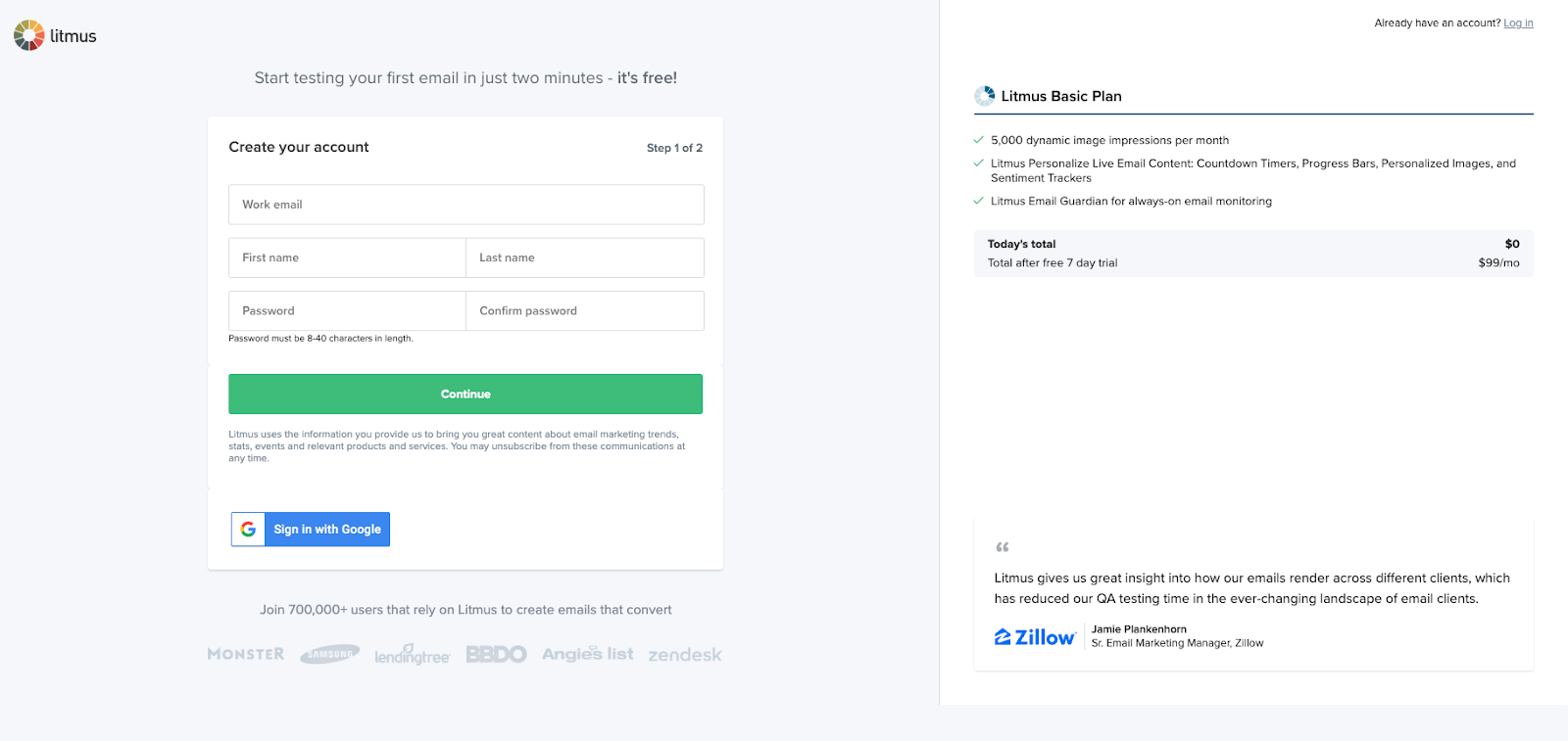
Elements Litmus has incorporated into this landing page:
- Fun microcopy, “Start testing your first email in just two minutes – it’s free!”
- Social proof, “Join 700,000+ users that rely on Litmus to create emails that convert.”
- Written testimonial with customer logo.
Unlike the SaaS free trial landing pages, the one for Litmus is very sales-oriented.
First of all, you know they offer a free trial, but it’s not immediately clear for how long. In the photo, do you see “Total after free 7-day trail: 99/mo?”
9. Chargify's Free Trial
Chargify is a subscription billing service for B2B SaaS companies. The company took a “go big or go home” approach to selecting their free trial landing page elements.
Interestingly, in 2023, the company removed the free trial offer and replaced it with demos.
Here’s what Chargify’s free trial page used to look like:
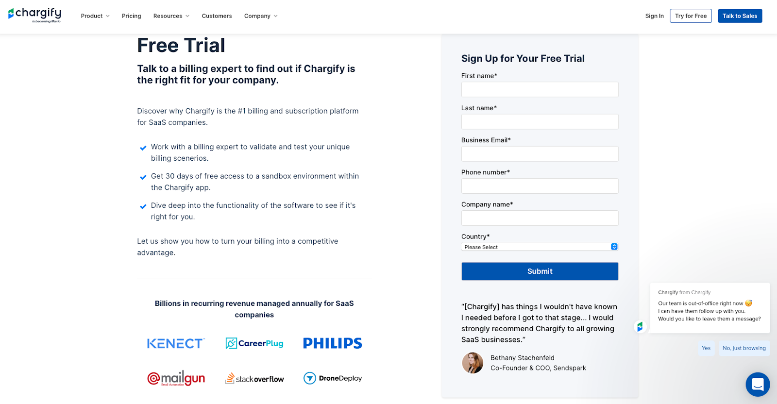
Elements the company page included:
- Customer logos are social proof.
- Written testimonial from the co-founder and COO of Sendspark
- A bullet list of reasons explains how you benefit from Chargify services.
- Chargify didn’t offer a single-use login option, unlike other SaaS companies.
- A chat icon was in the bottom left corner. You can chat with a representative during office hours or message their team.
Currently, free trials are not part of the company’s growth strategy.
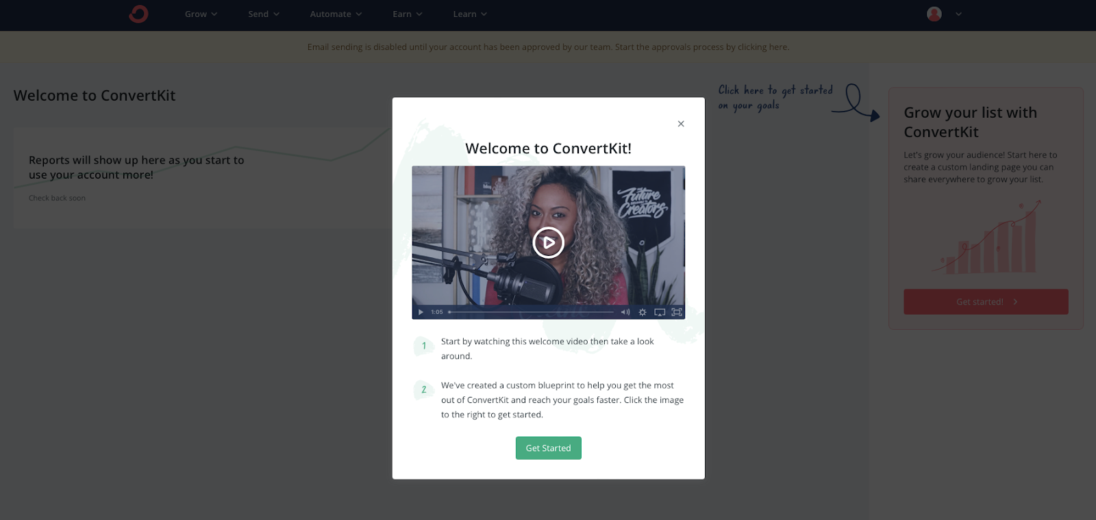
10. ConvertKit’s 14-Day Free Trial
Musicians, authors, podcasts, and coaches use ConvertKit. It may be the element of mystery that entices creatives to sign up and try CovertKit for free. How exactly does CovertKit serve you?
.avif)
The company’s free trial landing page is basic. You create a new account using your email and password (no character specification listed) and tick the box that you comply with the terms of service and privacy policy. There’s an image of a guy working on a podcast but no written testimonial or additional social proof.
Next, click “Get Started” and answer questions about migration, audience size, creation type, and personal goals.
Then, CovertKit welcomes you. Watch the welcome video or start exploring.
Typical Journeys of Landing Page Users
I noticed a pattern analyzing several free trial experiences.
The majority resembled the free trial page of Smartlook (example 4 in the section above). It was short, to the point, and focused on getting you into the product.
However, others took you directly to the pricing page once you clicked "Get Started." Lucidchart (example #7 above) and Litmus (example #8 above) did this.
Why?
Hard to say without talking to them, but I imagine they are trying to use the price to disqualify users who might not be able to afford a $99+ plan.
With that said, I can understand why Litmus would do this with that line of reasoning. Yet, Lucidchart does it with a product that sells for about $7 a month, so maybe there's another reason they do it beyond that.
Now, I want to challenge you to optimize for a particular game.
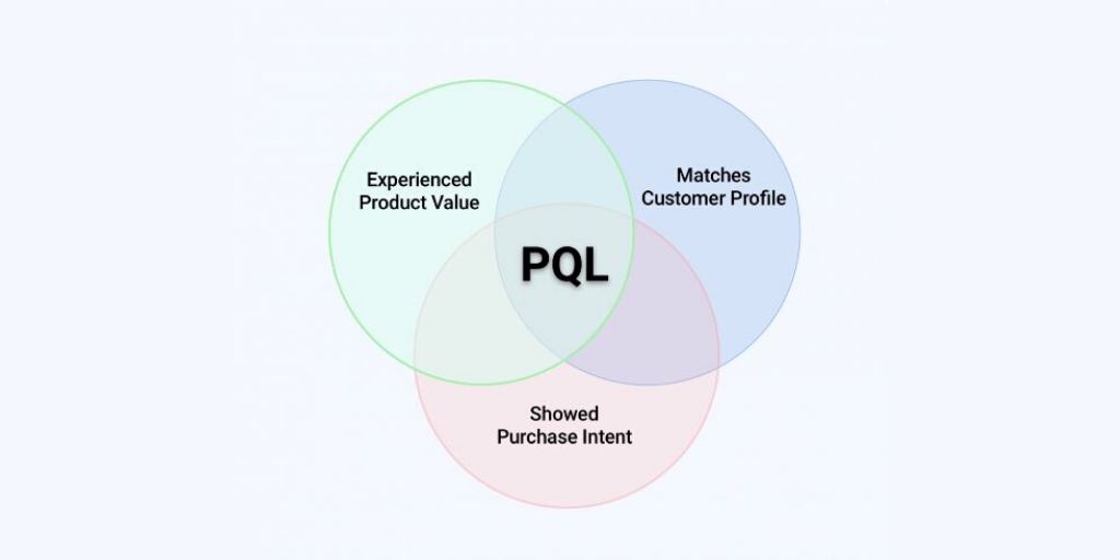
The 3 Games of Conversion, Understanding, and Quality
The primary purpose of a free trial landing page is to get people to sign up for your product. However, knowing which game you're optimizing for helps you make inevitable tradeoffs that benefit your business in the long term while potentially making no sense in the short term.
Game 1: Conversion
If this is the game you're trying to play, you must strip out everything on your free trial landing page that doesn't help people convert as easily as possible. Doing so might mean you stop asking for your user's phone number, mailing address, or even their Social Security Number. You get the point.
Typically you'll play the conversion game when you're in hypergrowth and trying to scale as fast as possible.
Game 2: Understanding
When you're playing the game of understanding, you care more about understanding what makes your users "tick" than driving as many of these users through your funnel as possible.
It's a significant tradeoff to make if you're a pre-product market fit or don't have a good handle on who your ideal customer profiles are as a business. By taking this approach, you may decide to introduce additional friction to support and understand your users in the long run.
This additional friction doesn't necessarily have to be bad for the user. Suppose you've signed up for Notion (example #6 above). But once you finally get into the product, it's customized to your user preferences, so it doesn't feel like a waste of time.
For an excellent example of this in action, review ConvertKit's free trial (example #10 above) and the questions they ask before you can sign up.
Game 3: Quality
If you're dealing with a high noise-to-signal ratio for users signing up for your product, you may proactively add more friction or steps to reduce the flow of leads.
Typically most product-led companies will do this when they don't yet have a good Product Qualified Lead metric to score users and accounts. Or maybe they want to make sure that users who sign up for their free trial know that they have to pay them a good chunk of change at the end of the trial. You can see that Intercom and Litmus all took this path.
Never Stop Testing
I challenge you to never stop testing. Your free trial landing page is one of the most valuable pages on your entire website. Treat it as such, and you're going to see the benefits!
Need help building a landing page that converts?
The hard truth is that without signups, you're not going to build a successful product-led business. In ProductLed Academy, we actually create your landing page during the weekly live workshops, with live feedback from Wes Bush. It's designed this way so you actually execute and make massive progress on your product-led journey.
Here's what else is covered in this coaching program:
- Vision: What is your company really good at?
- User: Who do you serve best?
- Model: How do you create a ton of value for your users to win?
- Offer: Have you crafted an irresistible free offer for your ideal users?
- Experience: Have you created an effortless path to value for your users?
- Pricing: Is it easy for users to upgrade without talking to anyone?
- Data: Do you know where users are getting stuck in your product?
- Process: Do you have a growth process that enables your team to build out experiments, prioritize the high-impact ones, and launch the ones that are easiest?
- Team: Is your team full of A players capable of taking you to the next level?
While you can have one or more of these dialed in perfectly, if you’re missing one of these key players, you’re going to have a hard time with growth.
If you’re not sure where your current gaps are, you can take our PLG readiness assessment to get a clear picture.
Or, if you're exploring your options for implementation, schedule a strategy session to map out your next step.
Apart from focusing on those key areas of your business, ProductLed Academy comes with:
- Weekly 60-minute group coaching call with Wes Bush, where you'll go through each of the components of the ProductLed Method (including your offer) to master a self-serve model.
- Weekly non-negotiable tasks to keep you accountable.
- Access to an exclusive ProductLed Founder Community so you can meet other ambitious founders and receive support 24/7.
- Access to the ProductLed Vault, where you'll gain access to all of our programs, templates, and frameworks.
If you're ready to break through to the next level and create a landing page that converts, be sure to check out ProductLed Academy.