Do you want to increase your conversion rate optimization for SaaS to get more users for your product? If you're struggling to get visitors to understand your product's value, this process will help you get them to the "Aha! moment" quicker.
Plus, you don't need any copywriting or design experience to improve your SaaS conversion rate. In this post, you'll learn how to use messaging to make your product irresistible to encourage more free trial users.
The best part is you won't have to go through tons of iterations.
Let's get started.
Why people don't convert
There is only one reason why people don't convert, no matter what your conversion stats might show:
You failed to answer basic questions about your SaaS product.
Here are just a few of the questions that a hesitant visitor may have when visiting SaaS landing pages:
- What does this do?
- Can it fix my problem?
- Does it work with other tools?
- Why is this better than what I'm already using?
- Why is this better than other solutions on the market?
- How much time will it take to set up and learn?
If your pricing page fuels more questions than answers, people will look for an alternative solution.
For example, you have an excellent salesperson providing product demos. They explain the features of your product and show the trial users different ways the product can help solve their problems, along with social proof of how it has helped others.
But then the user asks questions at the end of the demo, and the salesperson can't answer them.
The easy solution is to train your salespeople to answer questions and overcome objections. This would help close a lot of deals.
It's the same for your website.
Someone hears about your great SaaS product, but when they visit your website they're not sure how your product works. They have unanswered questions and objections so they leave without signing up, tanking your conversion rate.
How to have a fail-proof redesign
If you have a problem with your website, copywriting alone won't help increase your SaaS conversion rate.
Let's look at the redesign of Drift's home page:
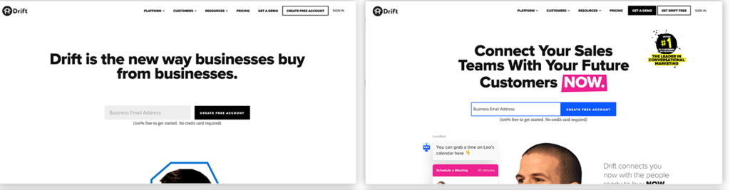
It's not clear who the customer is, how they are better than other chatbox tools, or that they can replace contact forms. They changed a few words, but they didn't answer these questions for the website visitor.
They might see incremental lift in their SaaS conversion rate, but most products need more than incremental results.
A perfect example of this is hammering all day but never hitting any nails. You hit 100 times an hour but you have nothing to show for it. And it's the same for many redesigns. They're not hitting the nail.
Don't waste time and money redesigning your website unless you intend to fix the underlying issue. All you need to do is answer their objections.
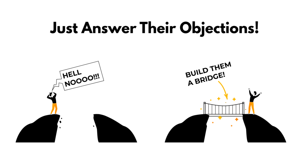
There is a big chasm between where the user is and where they want to go.
If their objections aren't answered, there is a very big leap most people aren't willing to take. But if you answer their questions, you're building a bridge to help them cross the chasm, and that's a big step toward conversion rate optimization – you're reducing the risk for the user.
Ask yourself: the last time you redesigned your website, did you miss the nail? Or did you answer questions and anticipate objections?
Three steps to help you redesign to improve your SaaS conversion rate
You can take three steps to help you have a successful redesign that helps craft a high-converting conversion funnel.
Step #1: Why do people buy your product?
Start by simply understanding what drives a user to become a paying customer. Once you have those reasons in mind, write down the top five reasons why people buy your product.
To help you along, think about why people choose your SaaS instead of your competitor's product:
- What makes users excited about your product?
- What are their favorite features?
It's very tempting to list all of the technical features inside your product. That's not why a customer will sign up for your free trial in the first place. They will sign up if they have an "Aha! moment" about how you can make their life easier.
Step #2: Why people don't buy your product
Step two is understanding why people don't buy your product. To figure this out, it helps to list every hesitation you can think of that might arise for a free trial user deciding to become a customer.
Some common objections that visitors might have include:
- How does this affect my bottom line?
- How long does it take to set up?
- Does it work with the X, Y, Z tool?
- Do I have to change my process?
- Why is this better than X tool?
When your list is made, take a look at each objection and answer them on the website.
Here's an example from GravityView, a tool that helps you display GravityForms entries in WordPress.
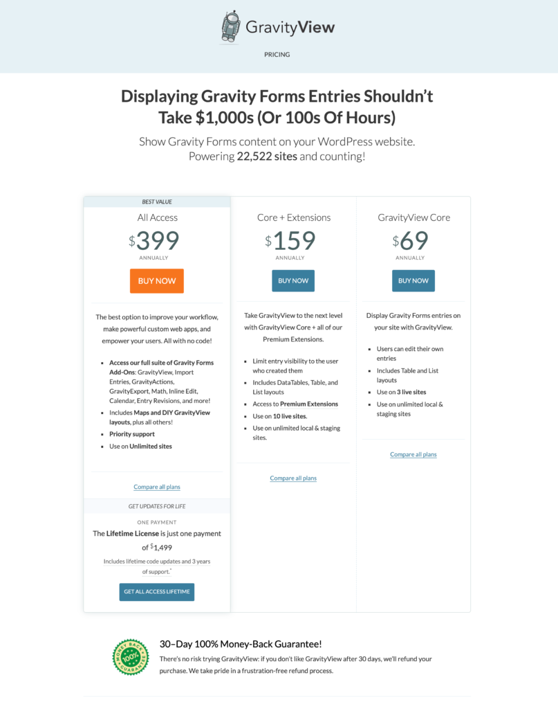
Visitors could not tell which pricing plan was best for their needs. So they updated the messaging on the pricing page to help increase conversions:
- Explained the plans better
- Anchored the prices
- Added money-back guarentee
- Offer help to potential customers
They were able to boost their conversion rate by 40% by answering the one objection of "which plan is right for me?"
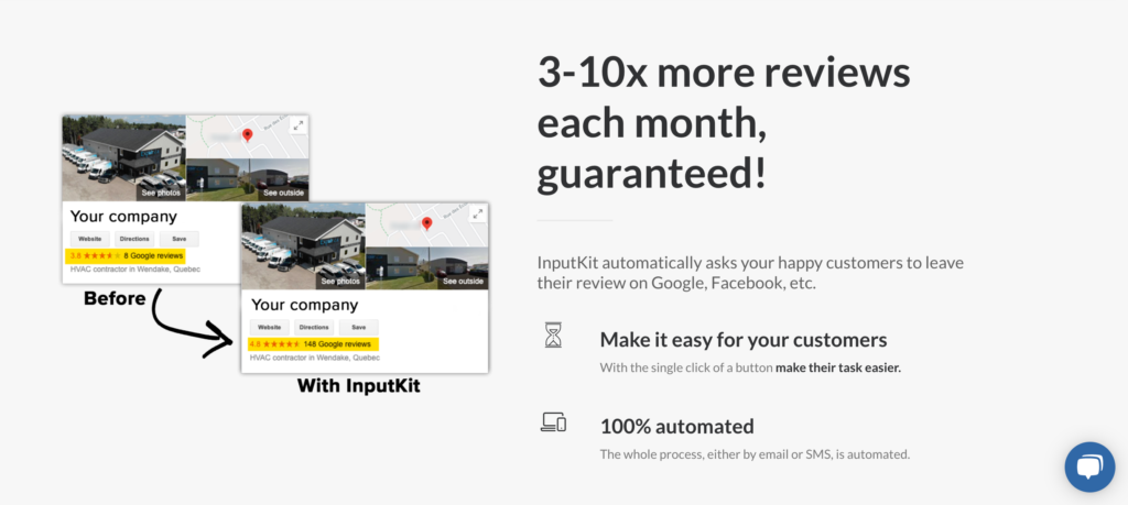
Here's another example from InputKit, a tool that helps you collect reviews. They were trying to sell to restaurants, but restaurants didn't see how the tool could help them. Once they clarified on their site that online reviews help users make a decision and that this tool increases the number of patrons creating reviews, the free trial conversion rate exploded.
Step #3: Have a formula/process
When you understand why people buy or don't buy your product, you can develop a formula to help craft landing pages that boost your SaaS conversion rate. You begin the process by taking the lists you created from steps one and two. Then, fill in every section in order and check if you missed any objections. Here's a more in-depth overview of the formula:
#1: The "Aha! moment"
The "Aha! moment" is what gets users excited about your product.
You want your messaging to accurately showcase it at the top of the page. Headlines stating, "How to get X without Y" are very effective. One of my favorite examples is "Finally, an affordable messaging tool to help you onboard, engage, & retain more customers." This message is engaging because it opens the possibility of getting enterprise-level features at a price within the reach of a smaller SaaS startup.
#2: The problem
Next, focus on the problem. Remind visitors of how painful it is to use other tools on the market, and that your tool won't have that pain.
Talking about your user's problems shows you are aware of the issues and therefore have the solution. Before you know it, visitors are craving more information about your product, and they want to learn more about it. They enter the investment mindset and become more open to the possibility of becoming a customer.
It may seem counterintuitive, but you want to explain the problem before you describe your features. It makes a big difference for SaaS conversion rates.
#3: The solution
The next step is to explain in three to five steps how you solve the problem. There is no need to discuss all of the features. Stay focused on the outcome because that's what people need to know before signing up as a user of your product.
#4: Call-to-Action
Finally, you need to include a great CTA to get visitors to convert. Let people know why they should sign up and why signing up for a free trial is risk-free.
Also, let people know what the next steps are to complete the process. If you do not answer these questions, you leave room for more objections. People will begin to doubt your product, and if your CTA is not convincing enough, you'll lower your free trial conversion.
The formula is like a coloring book
Having a formula is like a coloring book where you get to have the fun of creating beautiful art without having any drawing skills. You can add content without having copywriting or design skills.
It just works, like in this example from Baremetrics:
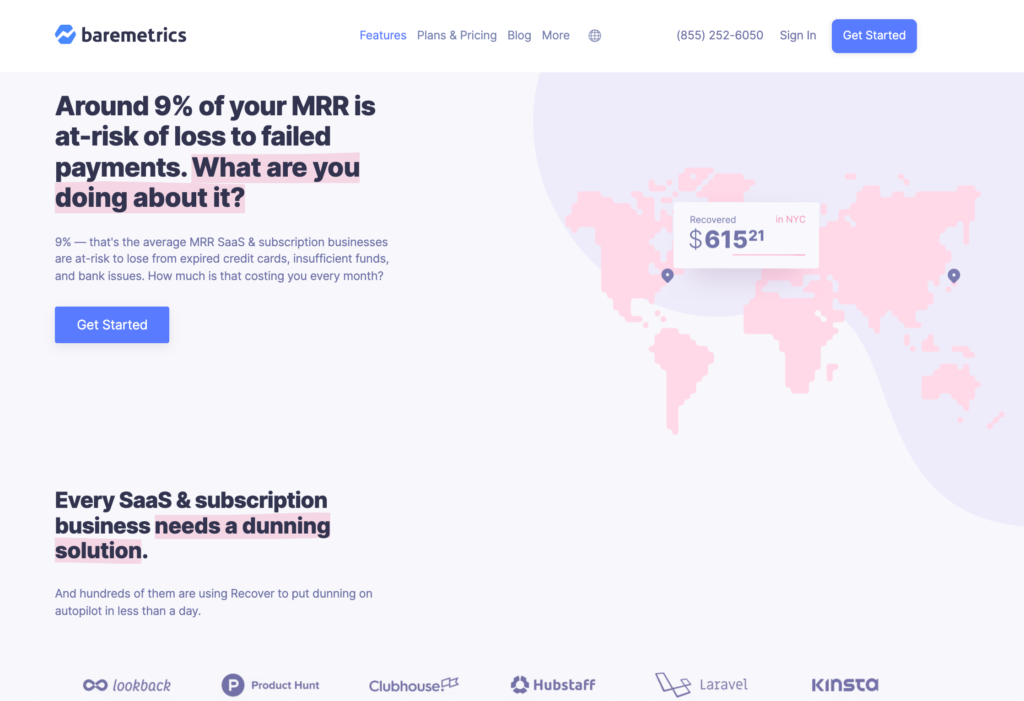
Previously the messaging talked about drip campaigns to customers with failed payments. There was no urgency to the message.
But by focusing on the outcome of recouping 9-10% of a business' MRR with only one line of code and a five-minute setup, they saw a huge revenue boost. Again, we followed the formula and made it risk-free for a user to try it out. It's very powerful.
That whole process took about an hour, and now that they know the formula, he can do it again and again in every area of their marketing.
Potentially thousands of different people may visit your website. Many are your ideal customer. However, they have questions that need answering. If your page does not address their objections, they will leave and you won't have a new customer.
Only an average of 0.05% of people will try your product without having answers to their objections. Each time you miss out on an objection, you miss out on a conversion.
Conclusion
Most landing pages fail because they focus on the wrong reasons why people buy the product. They also tend to identify the wrong objections or get stuck and work on the same thing that didn't work before and isn't working now. People also fail when they don't have a process, and they focus on iterations too much.
If you want to increase your SaaS conversion rate and craft a high-converting SaaS landing page without having any copywriting or design experience, make sure that you answer all of your visitor's objections. You can use the formula discussed in this post to help you do that properly.