User journey maps illustrate every interaction a user has with your product. They help key members of your SaaS team, including the Product team and UX designers, in understanding the product from a user’s perspective.
But here's the exciting part – when you do this right, it can help boost your business success by up to 22%.
So, how can you create a user journey map that you and other team members can use to visualize the user’s interaction within your product?
Let's dive into what user journey mapping is and why this element matters for your SaaS company. I'll cover the essential elements of a good map and share a simple four-step process to ensure users love your product and keep coming back for more.
The importance of user journey mapping
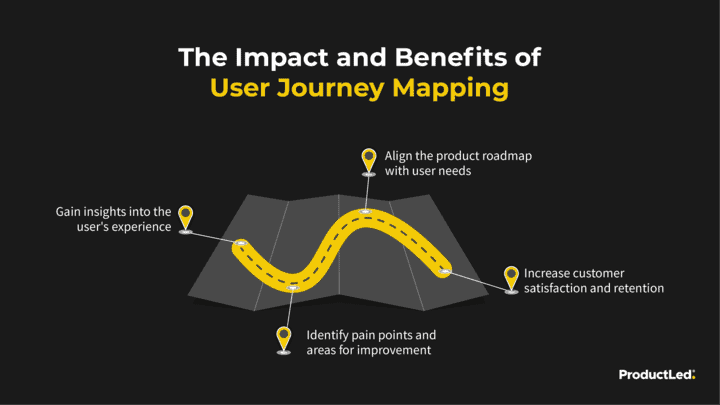
A user journey map represents a user's interaction with a product. The purpose of journey mapping is to gain insights into the user's experience, identify opportunities for improvement, and align the product roadmap with user needs.
Traditionally, a user journey map outlines all the different touchpoints between a user and a product, often utilizing a timeline approach. This method makes it easier to observe how users interact with a product step-by-step.
This approach enables a detailed visualization of how users interact with the product, encompassing all the steps a user takes to become a paying customer and complete the sales cycle.
In product-led growth (PLG), this process is significant for better understanding the user journey and can help identify bottlenecks, improve user experience, and drive growth.
Why user origins in journey mapping are crucial
Understanding where users come from is crucial for mapping their journey effectively.
This customer information helps you identify channels and sources that drive traffic to your SaaS product.
By analyzing the origin of your users, you can optimize your SaaS marketing efforts and focus on the channels that bring in the most qualified leads.
To begin, work backward from the end of the customer cycle to the beginning. Ask yourself:
- Where do users come from?
- What do they do?
- What’s the least amount of steps to get there?
Some tools to help answer the customer cycle questions above include Lucidchart, Kissmetrics, and Mixpanel.
Remember, creating a user journey map is an ongoing process.
As your SaaS product evolves and your user base grows, it's essential to regularly update and refine your journey map to ensure it accurately reflects the user experience and aligns with your business goals.
5 key elements to know before creating a product journey map
Before creating a user journey map, you must tackle a series of tasks. The first and foremost step involves identifying the essential elements that your map will encompass.
While the specifics may vary from company to company and map to map, the following five general elements always come into play.
1. The buying process
The buying process is the path you intend your customer to take to reach a specific goal, such as making a purchase. Start with an overview of the typical buying process stages to lay out an easy-to-follow, horizontal map.
2. User actions
User action elements detail what a buyer does during every buying process step. Knowing this allows you to manage emotions, pain points, and solutions more effectively.
Do buyers typically speak with co-workers before making a purchase? How about friends and/or family? From there, they may read online reviews, request a demo, and make a purchase on your website.
Know the actions that a buyer will take to achieve the goal.
3. Emotions
Incorporating potential customer emotions — such as relief, anxiousness, or satisfaction — into your user journey map. Adding these emotional triggers lets you focus on the positive and move customers away from negative thoughts.
You may find that your long, tedious buying process results in boredom, dissatisfaction, and restlessness. Or perhaps you learn that your ultra-fast process receives an overwhelmingly positive response.
The emotions during the buyer journey can have a long-term effect on your brand, either negative or positive.
4. Pain points
What pain point is causing a negative emotion such as anxiousness or fear?
Adding a pain point element to your map helps you pinpoint when it’s happening and the reason why.
5. Solutions
This crucial pre-user journey mapping creation element is when you outline potential ways to improve the buying process.
Your focus should be reducing pain points and helping buyers maintain a positive mood.
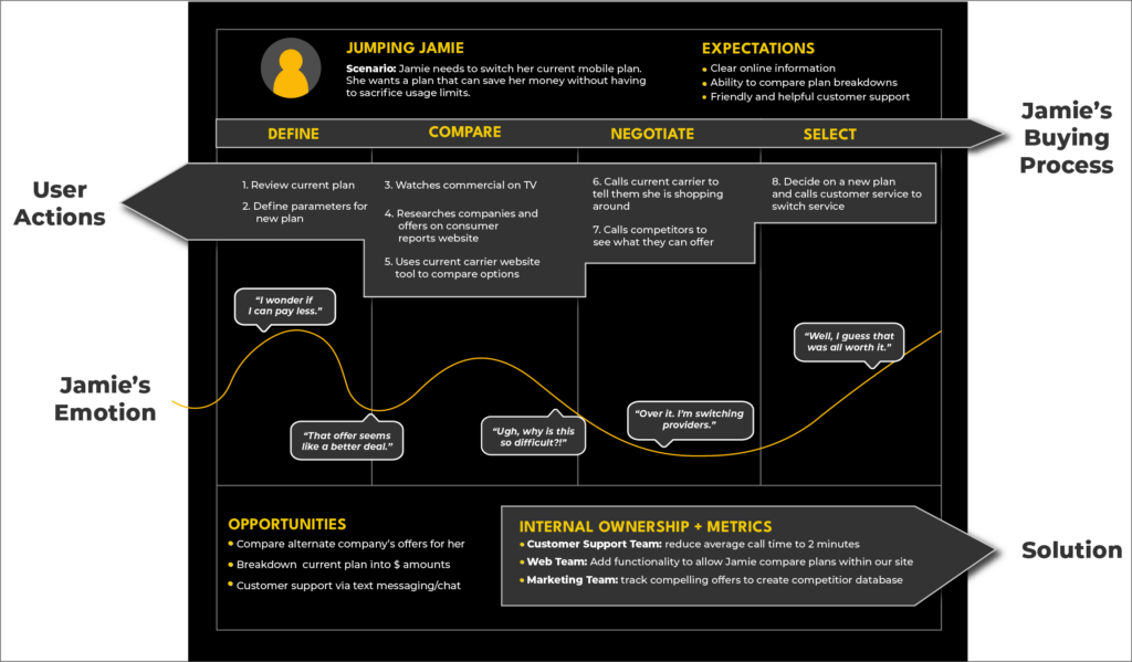
Phone plan example:
The graphic below shows Jamie’s journey as she explores alternative cell plan options to save money without compromising data usage limits.
It labels her buying process, user actions, emotions, and corresponding solutions.
Optimize your user journey for value
The first mindset or ‘big picture’ approach you need to embrace is that you need to make sure that people get value out of your product.

Identifying the value of your product can be a little tricky if you’re only focused on the product itself.
Product value example
Here’s an example of what I mean by this:
Let’s say that you’re selling Slack. Yes, you’re technically selling a messaging application, but that’s not why people download and use Slack.
People use Slack to communicate with teams fast and get projects done more efficiently.
So, you’re not selling a messaging app; you’re selling a way for teams to communicate with each other effectively.
Strategizing around your product's "Aha!"
When optimizing for value, the most efficient funnel isn't necessarily the best.
Instead, focus on getting users to your product’s "Aha!" moment as quickly as possible. Keep the final outcome of your product at the forefront of your mind when building a user journey map.
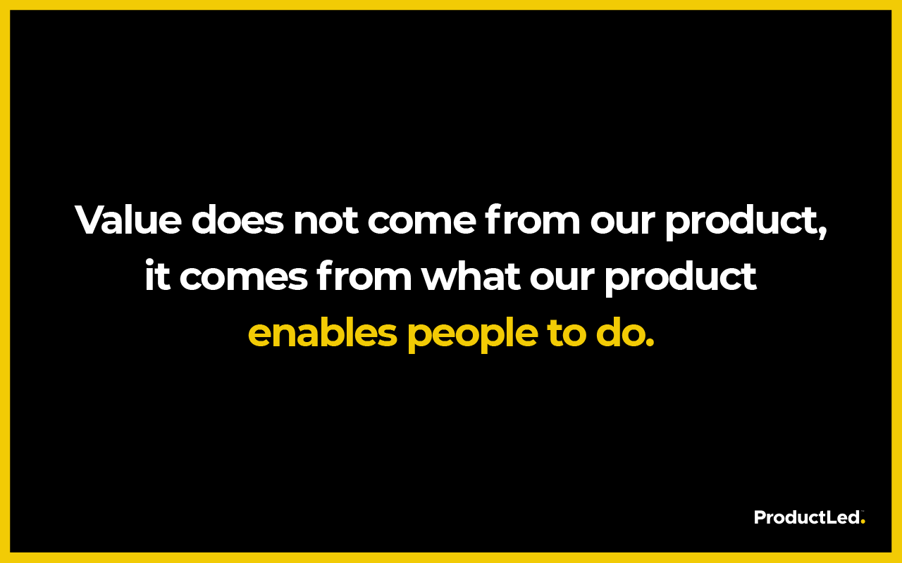
When considering how to optimize your user funnel for value, consider what users get from your product.
What does your product enable people to do?
Your answer to this question is the value that your product provides. To help you answer this question, consider how your product makes people’s lives easier.
What pain point does your product help solve?
Now that you know your product's value, you must devise a way to optimize for that value.
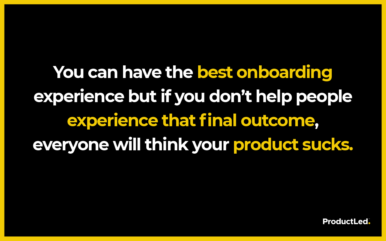
4 steps to optimize your product journey
There are four key steps to help optimize your product journey and conversion funnel:
1. Perform a gut analysis
The first step is the initial gut analysis of your conversion funnel (product journey map). This involves considering whether you are solving the right job with your product.
At first, marketers will want to focus on the functional job of a product. However, you also need to address and communicate the emotional and social job that your product does.
- Functional Job: The core tasks that customers want to get done
- Emotional Job: How customers want to feel (or avoid feeling) as a result of executing the core functional job.
- Social Job: How customers want to be perceived by others.
Hick’s Law and Paradox of Choice
Why is this relevant to your product and the user journey map?
Well, Hick’s Law states that the more choices you give someone, the longer it takes for that person to make a decision. In other words, decision time increases with every additional choice.
Not only that, but the Paradox of Choice reveals that the more choices someone is given, the less likely they are to choose anything.
With this in mind, ask yourself about the choices you give to users. Are there too many choices? Are you making the decision process more difficult than it has to be?
Directional cues
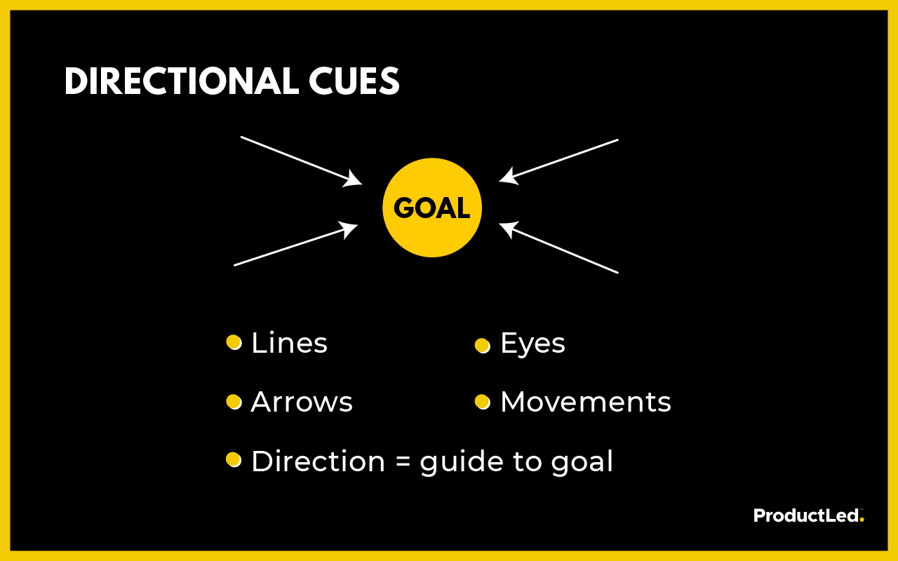
Directional cues are another important matter to think about. Design elements like arrows, lines, movement, and so on can be super powerful. But you need to make sure your directional cues effectively direct attention to the goal.
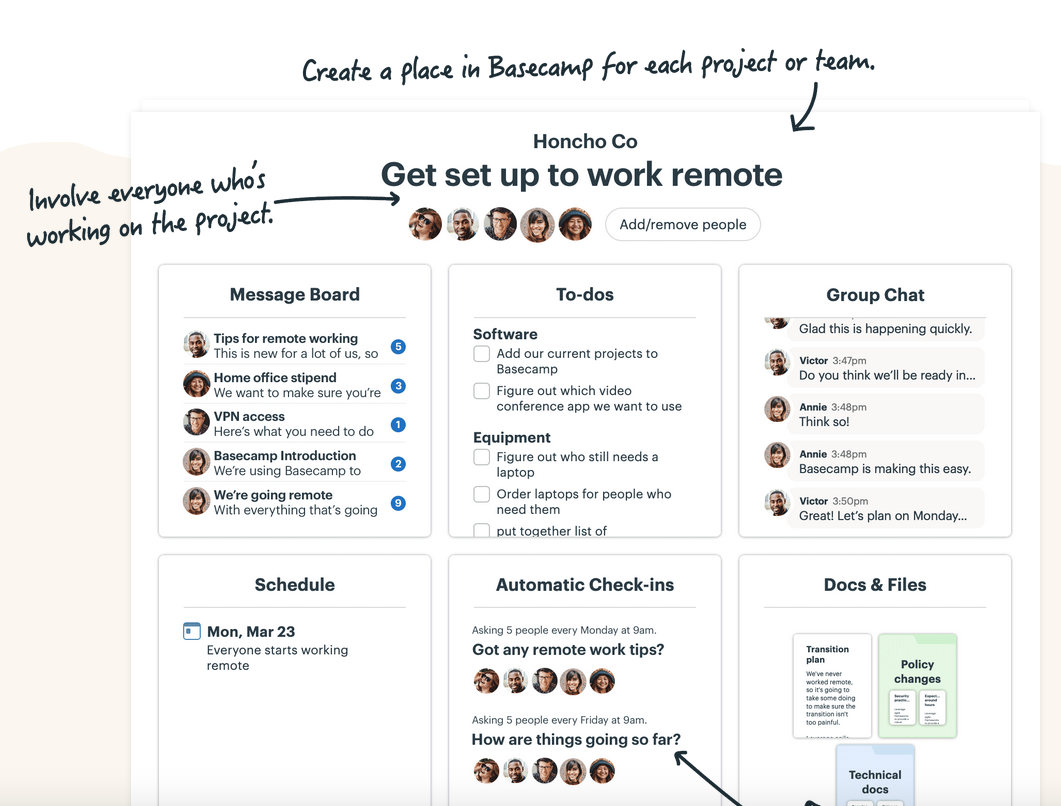
Here’s a great example of how Basecamp uses directional cues to direct the viewers’ attention to key features.
Your directional cues and elements in the onboarding phase must work together to achieve the same goal. This includes everything from your headlines to your imagery, videos, copy, social proof, call-to-action, and the overall onboarding experience.
Gut analysis checklist
Here’s a gut analysis checklist for both before and after signup:
Gut Analysis: Before Sign UpGut Analysis: After Sign Up+ Touchpoints have a consistent narrative threat from one to the other.
+ Each touchpoint helps the user accomplish a functional, emotional, or social job they actually want to do.
+ The touchpoints promise an improvement to the user's life ("whoa, I...").
+ That improvement's positioned within the context of their current situation (frontload the "aha moment")
+ Points of anxiety & struggle are directly addressed wherever they arise
+ The product's personality is engaging and consistent across the board
+ The product's credibility is established with social proof, testimonials, and real-world outcomes it generates
+ All unnecessary points of friction and distraction are removed from critical workflows+ The first-run experience leads to a specific, relevant, meaningful "quick win"
+ The workflow for the first-run experience is as streamlined as humanly possible
+ Users' time spent floating in "limbo" states is managed undefined limited
+ Make it fun like Slack. If coach marks undefined tooltip tours are used at all, they're primarily to spur activity, not point at buttons
+ Blank states and preloaded content are self-descriptive and helpful
+ Social and directional cues are provided to indicate highly-valued behaviors
+ Key early use activities are explicitly called out, in the form of to-do lists or completion meters
+ Key tasks are reciprocated with a success state such as Mailchimp's high-five
+ People are incentivized to form social bonds with others, and thus become more accountable for ongoing use
+ Lifecycle emails are positioned to act as catalysts driving return visits
Even with all this knowledge and insight, some product creators still make mistakes.
The most common mistakes when doing gut analysis
Here are the five most common mistakes – look at them and try to avoid them!
- Not directing users to the product and relying on activation emails
- Having a free trial page that takes more than three seconds to load
- Not showing onboarding progress
- Not making it easy to experience a quick win or "Aha!" moment within the product
- Not using the "focus mode"
2. Map the user journey
The product journey map shows how users get from point A to B.
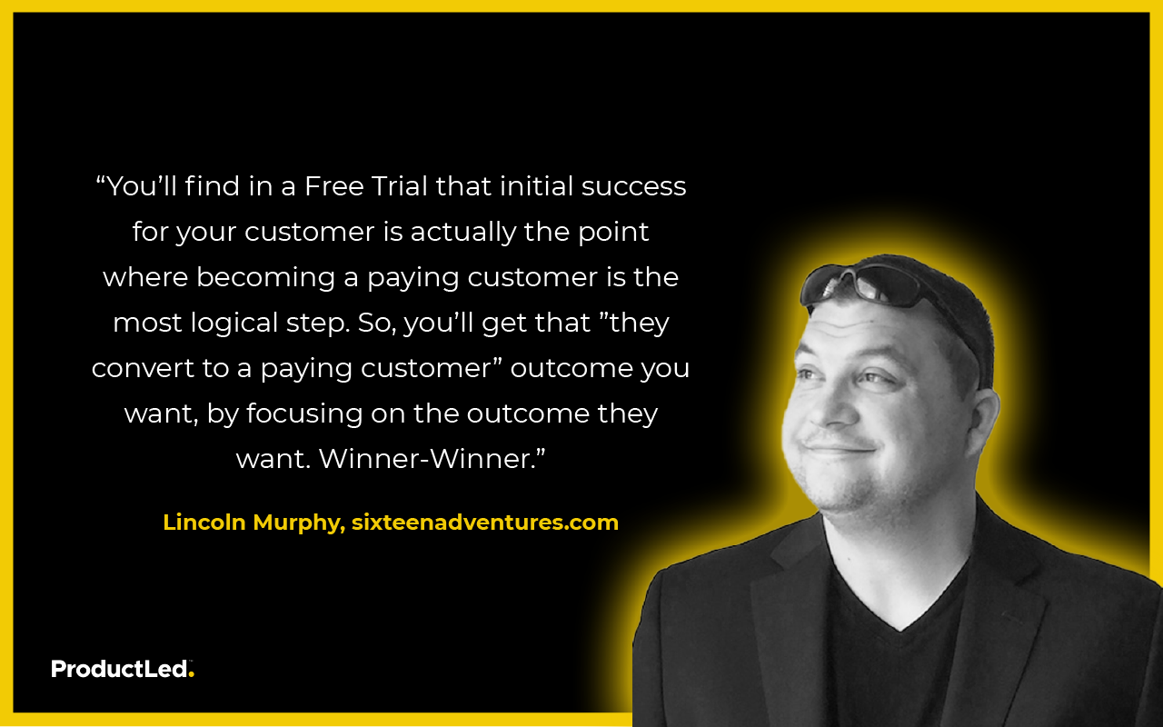
If you offer a free trial of your product, customers will be able to experience its value and, hopefully, upgrade to become a paying subscriber.
Lincoln Murphy from Sixteen Ventures puts it perfectly:
There are many ways to set up a user journey map, such as using Trello or another mapping tool to create a storyboard of the user journey.
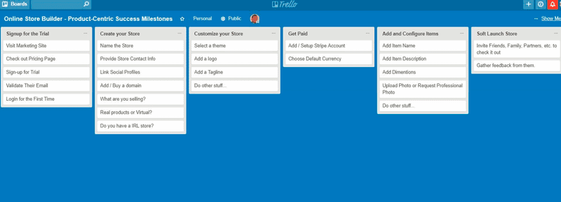
The easiest way to visualize your product journey map is by thinking like a customer and going through the entire experience yourself.
Tips for building a user journey map
Here are a few pieces of advice to successfully create your user maps:
- Record your screen going through your product experience using a tool like Loom.
- Watch the recording of yourself and your users using a tool like Fullstory.
- Write out every step someone has to take for every marketing channel.
- Identify the macro and microelements.
- Put all your information in a tool like Lucidcharts or Trello to visualize your user journey for each marketing channel.
3. Perform a quantitative funnel analysis
When users sign up to use your product, it’s exciting. It’s good news when a user decides to commit to your product but what happens when they suddenly stop using it?
The best way to improve retention is by figuring out exactly where users drop off in the user journey and why.
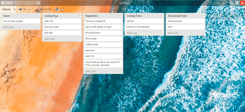
One of the biggest mistakes people make at this stage is focusing too much on microelements along the product journey map. For example, the registration step for many products involves microelements such as signing up with an email address, confirming email, filling out personal details, etc.
While microelements are important, you should try to group these elements (see an example below using Canva). Doing so will help make the entire process easier to understand and help you find any bottlenecks in your funnel.
4. Harness motivation
Do you ever sign up for a new online product and never end up using it?
This is so common, and the main reason why is that humans are easily distracted. Something else always demands our attention, so what can you do to ensure users actually use your product?
The answer is to instill motivation in the user to use the product.
Here are some effective ways to create motivation for your product:
- Checklists
- Percentages
- Progress bars
- High-fives
- Reaffirm your product's Value Proposition
- Showcase the people behind the product
- The promised land
- Personalization
- Add a sense of humor
Remember, value doesn’t come from our product. Value comes from what our product enables people to do.
Measuring the success of user journey mapping
Creating a user journey map is a significant investment of time and resources. To ensure its effectiveness and justify the effort, it's crucial to establish measurable metrics for success. Here are key aspects to consider when measuring the success of your mapping efforts:
Conversion rates and key performance indicators (KPIs)
Monitor changes in conversion rates at various stages of the user journey. Identify specific KPIs that align with your business goals, such as sign-up rates, engagement levels, and customer retention. A positive shift in these metrics indicates the impact of your journey map on user behavior.
Start mapping your user journey for SaaS growth
I hope this post has helped you get a clearer idea of how to build a journey map so that more people can experience the value of your product.
In summary, there are two overarching points to remember:
- Understand the five elements of a user journey map and how they pertain to your product.
- Optimize your user journey and conversion funnel.
Does this sound like an approach that will work in your favor? If so, it’s time to dig deeper into product-led strategies and how they shape your company’s growth.
If you’re unsure where you stand today, you can complete the PLG readiness assessment to get a clearer picture of what’s working—and what’s not.
Already thinking a few steps ahead? You can schedule a strategy session to explore what implementation might look like for your team.
Properly mapping your user journey opens the door to greater success. To continue building your product-led business, check out my ProductLed GTM System. I developed this nine-component framework to help you scale your self-serve revenue faster—without working harder.
The ProductLed System will show you how.

