For SaaS development, it’s critical to have confidence that you are building a product that will motivate behavioral change in your users.
We’ll walk you through a 5-step framework to drive growth with user research. This framework leverages Behavioral Science to build products that motivate behavior change and drive growth. We then incorporate the framework with a real-world example to show you how to apply these principles.
But first, let’s make sure we are on the same page regarding Behavioral Science.
What Is Behavioral Science?
Behavioral Science is the study of how people really make decisions. We like to emphasize the word really because another field of study, economics, also studies how people make decisions.
So what’s the difference between the two?
Our emotions and environment – made up of physical, digital, and social factors – heavily influence our decisions. There’s a gap between what we say we do, what we want to do, and what we do.
For example, we all know how to be healthy. Eat fruits and vegetables, get some sleep, and exercise daily. But how many of us hit the snooze button and skip our morning workout because of binge-watching Netflix the night before?
Behavioral Science is particularly good at closing this gap between knowledge and behavior. And understanding that gap is critical for product-led companies.
Why? Because if we don’t recognize the role of people’s emotions and how their environment and social factors affect their decisions, we will start designing products assuming our user is more like Spock than Homer.
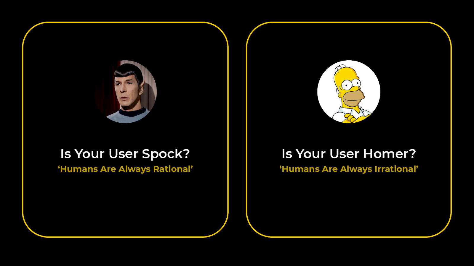
When you think your users are more like Spock, you assume they're always rational. So you believe that they will make optimal decisions if you give them more information and choices about your products.
But in contrast, you need to recognize that users are more like Homer Simpson. I.e., sometimes they have the best intentions, but they aren’t perfect. In this case, you may find that less information is better, and it’s more beneficial to systematically nudge your users towards the optimal path.
Now that you understand how a behavioral scientist sees the world, let's dive into how we apply Behavioral Science insights into user research.
How To Leverage Your Research With Behavioral Science
There are many different methodologies for doing research. This section will show how Behavioral Science can improve your qualitative and quantitative methodologies.
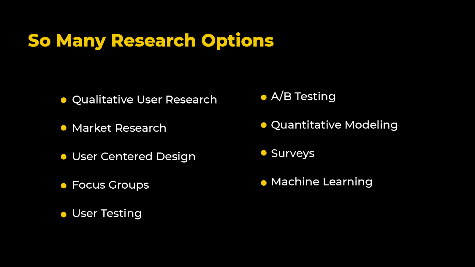
Since the user base is more like a Homer than Spock, you need to change the way you communicate to your users.
We created The Science of Design, an actionable and timely methodology so companies can get their insights in weeks, not months. It’s backed by quantitative research, which gives us confidence the interventions we are introducing will lead to behavioral change at scale.
But first, let’s break down the different elements of The Science of Design with our five-step process to drive growth.
The 5-Step Framework To Drive Growth Using Behavioral Science
We call this framework The Science of Design. This methodology helps a company identify all of the different opportunities to take Behavioral Science and apply it with different types of research to create insights and usable places for design.
So instead of trying to control all of the contexts, it’s better to understand the context first and then start running experiments. The idea is to run controls once you better understand the environment where people make decisions.
So here is the five-step framework to apply Behavioral Science to your research.
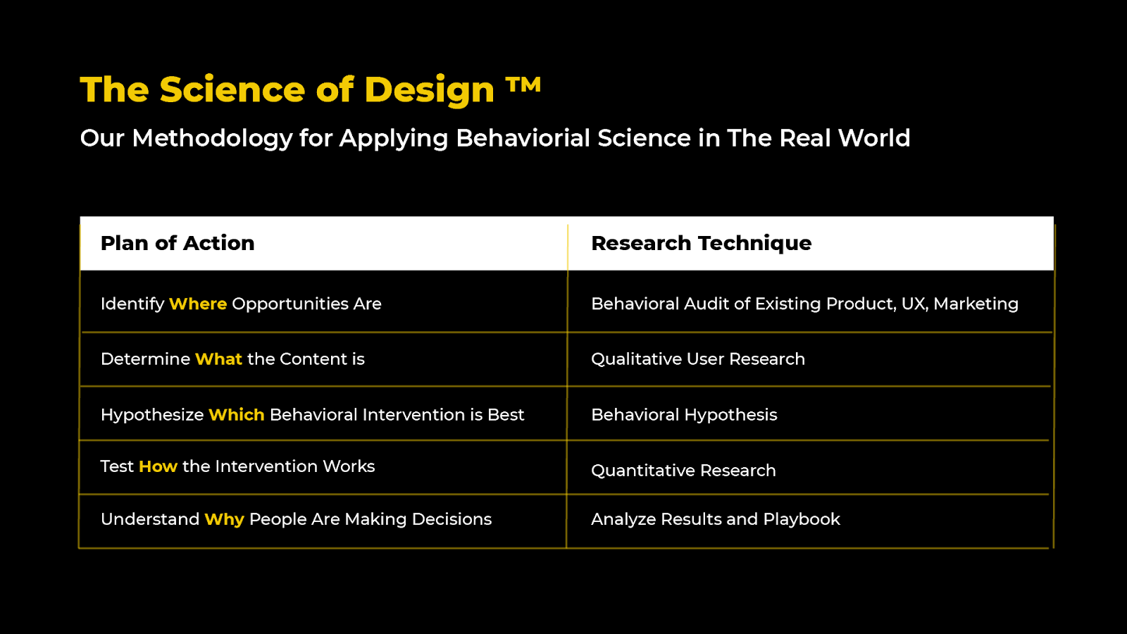
Step 1: Behavioral Assessment
Start by doing a behavioral audit to identify where the opportunities are. Next, go through the user experience and use the product in a non-biased way. Then try to understand the user’s objectives when using your product.
By taking both the inside and outside bubble approaches and then overlapping them, you will get a lot of insights into where to deploy behavioral opportunities. In addition, this process helps you understand where to start unpacking that content.
Step 2: Qualitative User Research
To determine what the context is, start talking to people and gather your qualitative user research. Places where you overlap can be problematic.
Sometimes there are simple solutions that you know will work to fix them. Other times you need to dig to understand the context better –and that’s where you typically find powerful new ways to create new interventions.
5 Best Practices For Qualitative Research
Using different insights from the realm of Behavioral Science, we can ask better questions when doing qualitative research. One of the biggest problems is companies using “loaded questions” or behavioral biases in their questions.
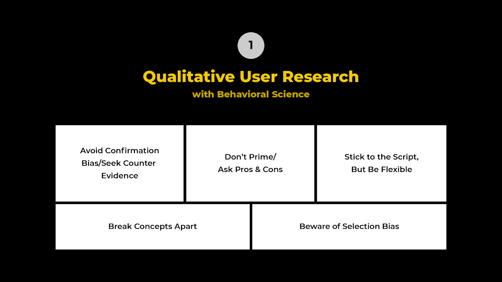
Here are five of the most common ways we see companies using behavioral biases when building questions for their qualitative research.
#1. Don’t Prime/Ask Pros & Cons
When doing qualitative research, the first thing to avoid is to ensure you are not priming. Priming means exposing people to one stimulus that influences their response.
For example, if you're asking them to rate your product on a scale of how easy it is, that's a prime for them to answer in a way they think you want them to answer.
However, when you leave the question more open-ended, you allow room for accurate insights into the user experience. For example, what were the pros and cons of the product?
#2. Avoid Confirmation Bias/Seek Counter Evidence
The next thing to avoid is confirmation bias; you want to make sure you're seeking counter-evidence. Confirmation bias is a tendency to interpret new evidence as confirmation of your existing beliefs.
Many people go into qualitative research thinking, "I need to confirm the thing I think is correct." That's a very normal human approach to it.
However, it’s more effective to say, "I want to shoot down this idea.” So think, "How can I pull down this argument?" Then, if it survives, it might be a real true insight.
#3. Stick to the Script But Be Flexible
Being flexible means thinking about what you know you know versus what you don't know that you don't know and all the shades in between.
Often with qualitative research, the most valuable question is the one right in front of you that you didn’t think to ask.
If you cram 20 questions into 20 minutes and don't leave any room for users to talk or ramble, you're only ever going to get answers to the information you think you know.
But if you build in the time to let users go off script, you tend to find more insights that you don't know that you don't know.
#4. Break Concepts Apart
The next step is to break the questions and concepts apart to ensure you aren’t priming, creating confirmation biases, or not permitting people to ramble.
For example, if you are asking questions like:
- Why is my product great, and how?
- How do you use my product, and why is it great?"
Those are concepts pre-supposing an answer from a previous part of that question. This means you're doing a little bit of priming, confirmation bias, and leading them to give you an answer. So break those concepts apart.
For example:
- Are you familiar with my brand?
- How do you use it?
- Why do you like it or not like it?
This is a much more balanced and discreet way of asking and getting answers.
#5. Beware of Selection Bias
The final and most common problem in qualitative research is selection bias.
Selection bias is obtaining a sample that isn't representative of the broader population you intend to analyze. This is particularly problematic because we tend to hear from users who are the easiest to receive feedback from.
These are your power users, the people you've already convinced. And they're providing you with a very slanted view of the insights you want to generate.
So try to get feedback from the users you don’t typically hear from. To find them, ask yourself:
- Who are the unhappy users?
- Who are the warm leads?
- What do our lukewarm users have to say?
People that don’t like a product usually have a lot of opinions, and their insights are invaluable and more representative of the population at large.
Step 3: Hypothesize Which Behavioral Intervention is Best
Once you’ve completed qualitative research, try to develop some hypotheses around what types of interventions will work best to optimize the behavior that you want to optimize.
It's important to think of these hypotheses as true hypotheses.
That means they're falsifiable and coming from tangible insights. So take something like loss aversion or social proof and apply it to your intervention. This way, you can test to see if it actually works to provide a durable insight.
Step 4: Quantitative Research
Once you have those hypotheses, test how that intervention works using quantitative research. Often, that's an A/B test where you take one of your hypotheses and design an intervention that leverages them versus a control. The data from the A/B tests will provide a better understanding of why your users make decisions.
For example, if you only ran a control group of blue versus red, or a version one versus a version two, you will very quickly run into the problem of not understanding why the user made that decision.
But if you use the loss of version and it changes users’ behavior, you have a portable way of taking that insight and putting it into the rest of your product – from marketing to the sales process.
3 Ways To Improve Quantitative Research With Behavioral Science
Our goal here is to show you how to leverage Behavioral Science in the context of your quantitative research.
Using the framework we've adopted from our friends at Common Cents Lab, it's called the 3B framework in three simple steps. This framework will help you leverage Behavioral Science in your quantitative research.
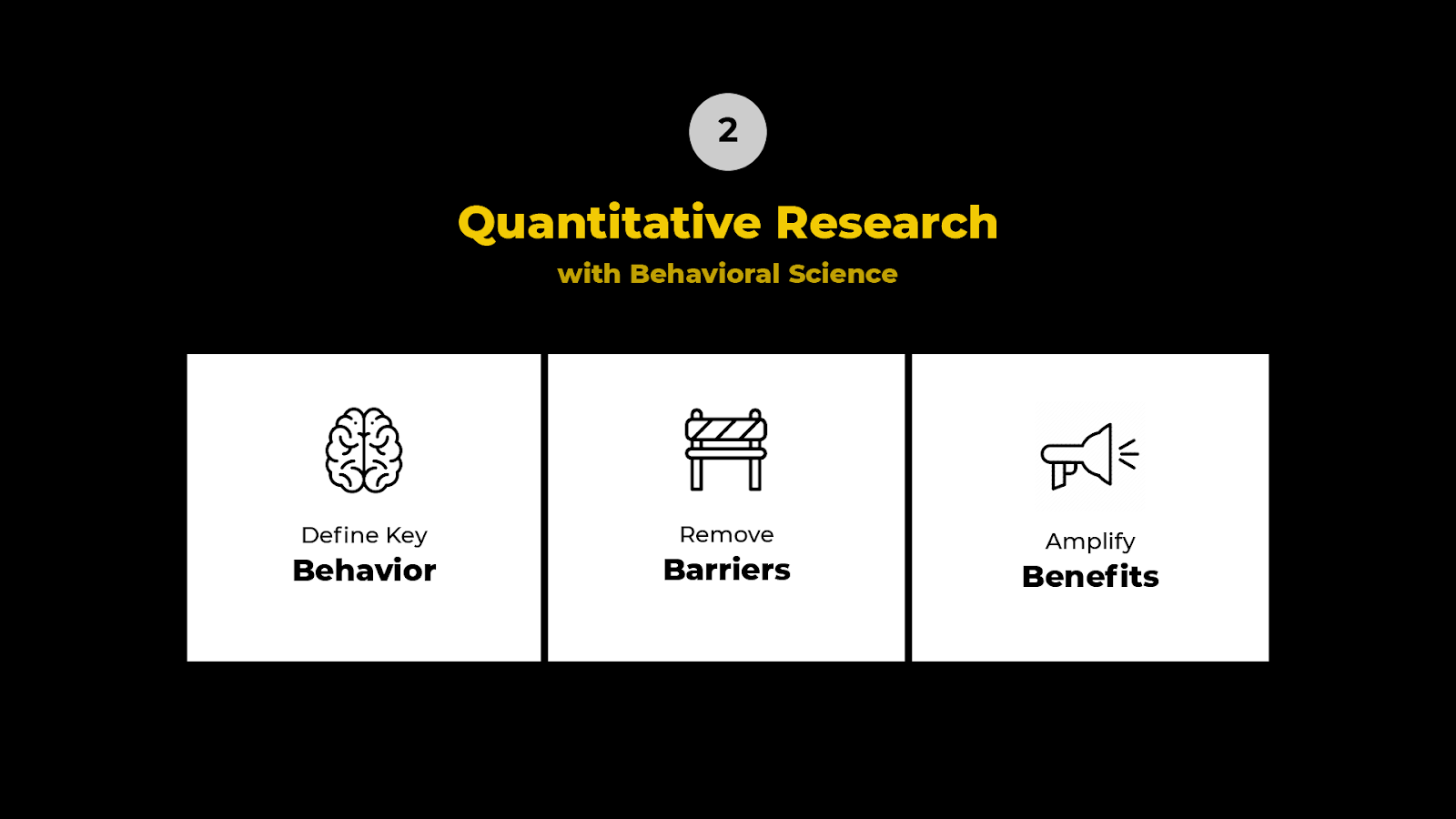
#1. Defining Key Behavior
When defining key behavior for your product or your interface, one of the most common challenges is mistaking the outcome you're trying to create for the behavior.
For example, I want my users to lose weight as an outcome. But the key behavior is I want them to go for a run every Tuesday.
So when you define a key behavior, you are uncomfortably specific. And that helps you understand what the next steps are to build a plan.
#2. Remove Barriers
Once you've figured out the key behavior you want the user to do, figure out all the ways a user might have friction in doing that key behavior. Then systematically remove these barriers.
There are several ways you can do this using Behavioral Science principles.
Cognitive Load
Cognitive load is a fancy term for keeping it simple. Cognitive load is made up of different elements of a website such as:
- the design
- topography
- fonts
- spacing
- colors
- jargon
It’s important to analyze where you may have too large of a cognitive load and reduce it.
For an example of this in action, here’s a page from Asana, a project management tool. You can see how they’ve done a good job reducing cognitive load on their web page.
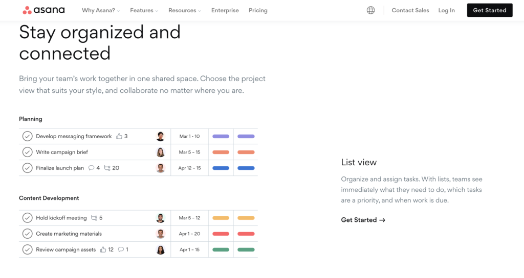
You see this in both the visual design, with the spacing and the topography.
They're also very mindful of what they're loading into what we call your working memory, where they clearly communicate exactly what the end benefit of using their product is.
Then they follow through with that low cognitive load and in their signup process, as shown in the image below.
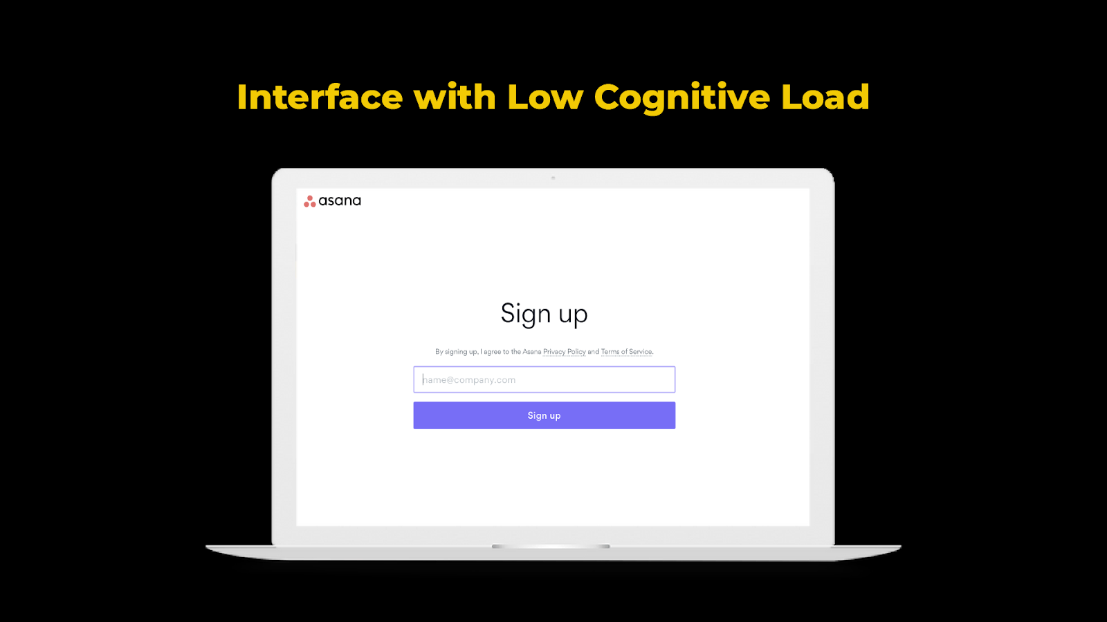
You can see there are not a lot of distractions for their user. It's pretty simple. The call to action is obvious as well.
Reduce Choice Overload
Companies tend to assume that providing users with more options is a good thing.
But in contrast, when we’re presented with too many options, we tend not to make a decision.
So it’s important to figure out where your interface may give too many options and decide how to reduce them systematically.
Add Defaults
Similar to choice overload, see if you can introduce defaults in your process. The more decisions such as input fields there are, the higher the probability of users leaving without onboarding.
#3. Amplify Benefits
Here is where you start thinking about how to introduce all the key benefits to the user so they want to do that key behavior.
You do this with:
- Social Proof
- Framing
Social Proof
We often look to others to guide our decisions. For example, when you’re choosing a doctor, you're probably going to ask your friends, check out review forums, and see recommendations for doctors in that field.
There are three different types of social proof at play.
- Expert Social Proof
- Peer Social Proof
- Numbers Social Proof
An example of expert social proof is sports ads. It’s the idea of leveraging somebody people aspire to be, somebody aspirational.
This could be:
- Influencers
- Thought leaders
- Professional athletes
- Musicians, et cetera
On the other hand, peer social proof is people like you and me. It can be a very powerful driver of behavioral change.
A great example is a company founded by two Harvard grads. They wanted people to reduce their energy consumption.
They did this by sending out reports that show a home’s energy consumption compared to neighbors so you could see how you ranked in energy efficiency in the neighborhood. This was so effective that they reported about an 80% response rate to their emails when they leveraged this concept.
Finally, numbers social proof shows a large number of people doing something specific. For example, a McDonald's sign reads, "Billions and billions of people served."

Framing
Another principle that helps amplify benefits is framing.
Here’s an example if I gave you a choice:
"Hey, I've got frozen yogurt, and it is 80% fat-free," or "I've got frozen yogurt, and it's 20% full of fat."
More often than not, you’ll choose 80% fat-free.
While we all know they’re exactly the same. But the idea is that people act differently based on how choices are presented. When you think about the benefits of your product, think about how you can reframe it to be more palatable and interesting to others.
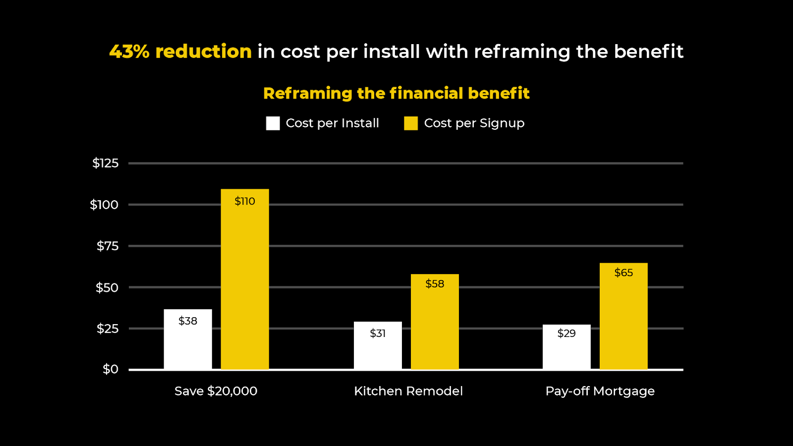
An example of this is a real estate technology client of ours. In the U.S., realtors typically charge around 3% to sell a home. With our client, it's between 1-1.5%. Since some homes are expensive, that difference in percentage can translate to up to $20,000 in terms of a home price.
We decided to reframe the savings from $20,000 to a kitchen remodel or pay off a mortgage.
By reframing the cost-savings benefit into something much more tangible, the reframing took off.
Step 5: Build a Prototype
Next, take those insights and develop a playbook to make them useful. Most of these behavioral insights are transferable and can live further on into the product journey.
Make it part of your sales, product, and creative team’s conversation to become more effective at selling your product.
Applying The Framework to a Real-World Example
Here’s a real-world example from start to finish so you can see firsthand how to apply this framework we’ve laid out for you.
This example is from the largest trade association in North America (in the construction and agricultural industry). The trade association runs a large trade show every three years. The challenge is a huge initial spike in interest, but the interest falls off with that three-year time gap. The goal was to create a constant interest in the show.
To do this, they decided to build a platform where people could interact with products to connect buyers and sellers. Unfortunately, the platform wasn't yielding results. So we applied The Science of Design to see where the problems were.
Step #1. Behavioral Assessment
We started with a behavioral assessment, which requires data analysis. During the assessment, we realized research was done in a very biased manner. They asked users to rank features as highly valuable or not valuable.
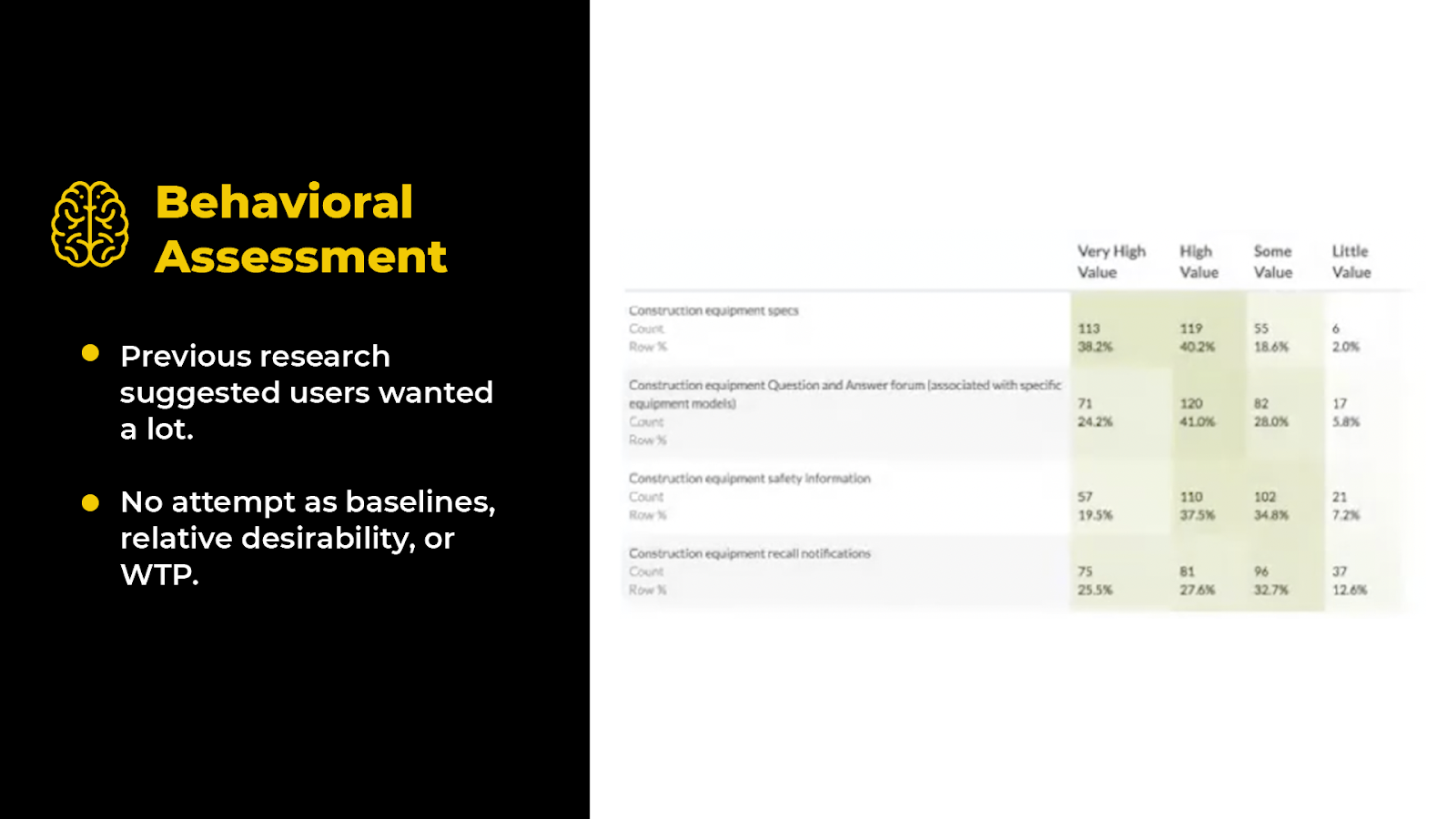
But if you don't provide any baseline or contrast, users will tell you, “it all sounds amazing!” And that's exactly what happened.
So the association built features into their platform that users said they were interested in. The result was a platform that tried to do everything for everybody but actually did nothing.
Step #2: Qualitative User Research
So we went back to do some qualitative research and to understand what their users really wanted. We talked to different users of the platform, people who were both very engaged and not engaged at all.
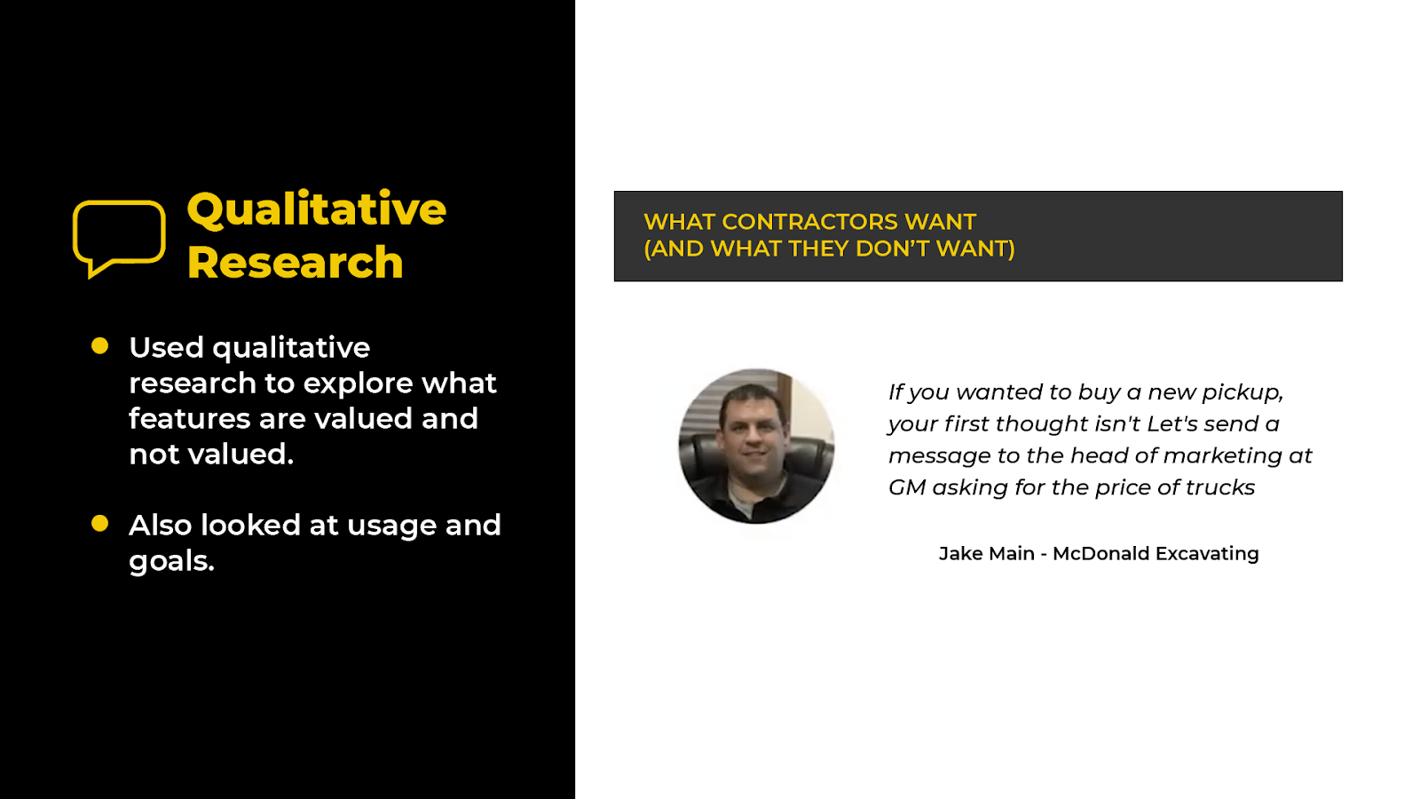
We quickly realized that we could cut the list of 20 features/value propositions down to five because some already existed, and others weren't valuable.
Step #3: Quantitative Research
Next, we took this new list to the executive team, narrowed it down from five to three, and decided to test those three features.
At that moment, no one was using the platform in the volume needed to run tests. So we moved them up the funnel into the marketing domain to see if there was a demand for these products.
We ran five different ads, three of them tested the different value propositions.
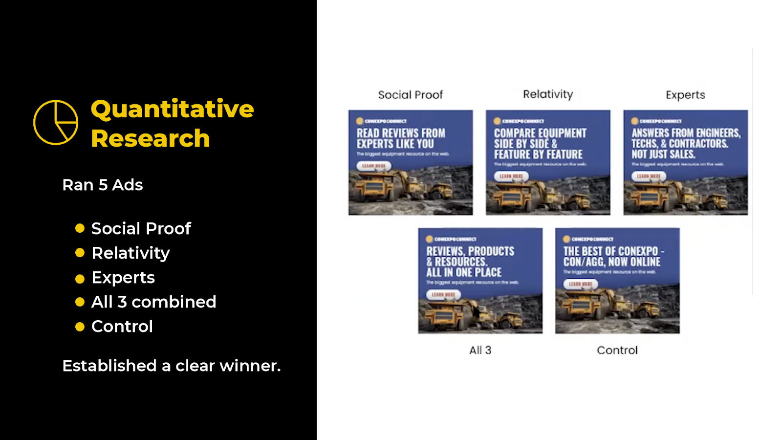
Then we ran an ad that combined all three. We followed that with control to see if a generic ad was performing as well.
The good news is that marketing works. Our control performed better than most of the ads. We saw one ad was by far the winner, with about a 147% increase over the control.
This made it abundantly clear which product to focus on first. It also gave us a hierarchy of interest in the product. So relativity was our winner, reviews were our second place, and experts came in third.
Step #4: Building a Prototype
So we took these insights, built a prototype based on these insights, and focused on that top feature. We then put the prototype in front of others to validate its effectiveness again.
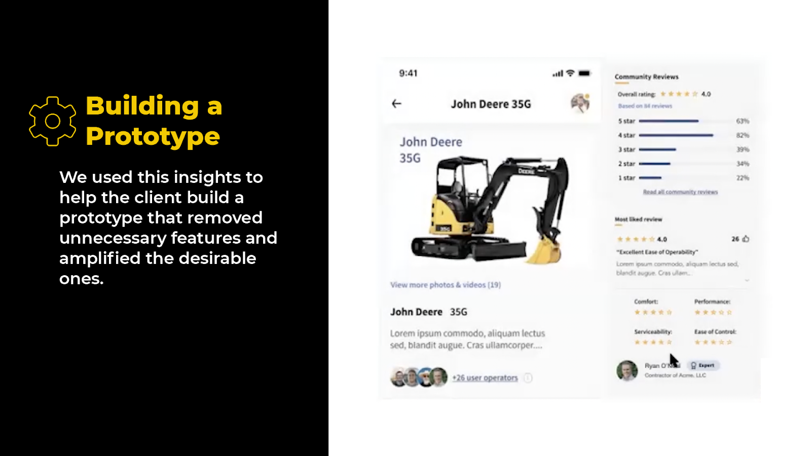
So that's an example of The Science of Design methodology in practice and how you can use Behavioral Science to do better qualitative and quantitative research to find results that matter.


