How to Personalize Your User Onboarding Experience
Onboarding
All

Welcome to the third Product-Led Onboarding™ Teardown here at Product-Led Institute. My name is Ramli John, And today, we’ll be breaking down the onboarding experience of Hey.com, a new service from the team behind Basecamp.
Today, I have two special guests with me on this teardown. First, is none other than Wes Bush, the author of Product-Led Growth. But, I also have a SaaS copywriting whiz Josh Garofalo from Sway Copy.
In this onboarding teardown, we’ll be taking a look at five main things.
Before we get started, I just want to let you know that we've put together a free one-page Product-Led Onboarding™ checklist.
Use it to take stock of your current onboarding experience, and run all your new designs past it before unleashing them on the world! Get the Product-Led Onboarding™ Checklist.
Let’s jump right in with Josh to check out the “home page.”
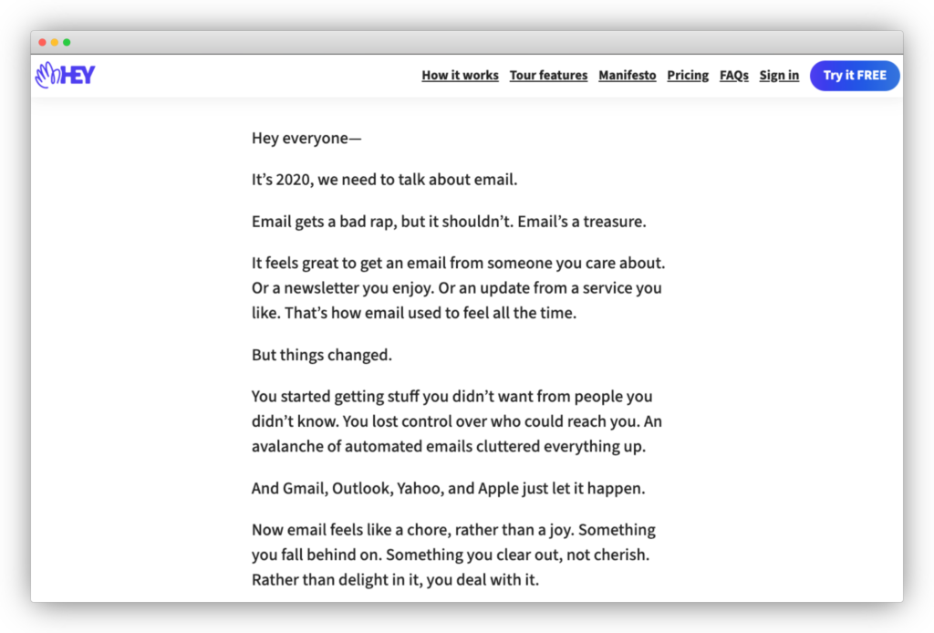
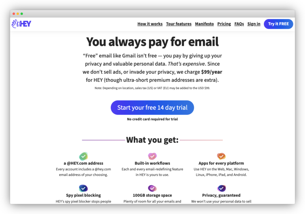
I say homepage in quotes because if you go to hey.com, it’s not technically a traditional homepage. It’s more of a short love letter about email.
If you scroll to the bottom of the page, there’s a button that reads, “See how HEY works.”
Click on that, and it’ll bring you to a traditional-looking homepage.
Here's what Josh thinks:
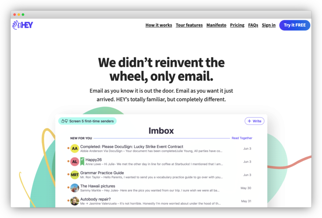
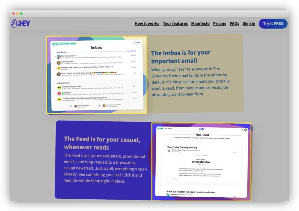
Right below this headline is a screenshot of Hey. They deliver on that promise that HEY is "completely different" because this doesn't look like any email platform I've seen before.
Instead of an inbox, you're in our "imbox." Spoiler alert, imbox stands for "important inbox."
There's also a button on the upper-left of the image that reads, "Screen 5 first-time senders."
I think this image's goal is to pique your curiosity because right below this is a call-to-action that reads, "Got 37 minutes? Really curious? Here's a full product walkthrough from our CEO."
My first reaction is, “Whoa, that’s 37 minutes long.”
.avif)
Most companies would just do a one to two-minute video explainer. Here’s what Josh thinks about this:
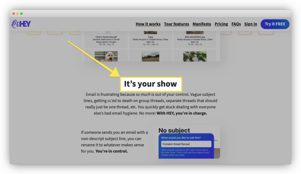
What comes next is an exhaustive list of everything you need to know to figure out if Hey is for you or not. Since this page is "How it Works," there's no way you go through this and don't at least have a pretty decent understanding of exactly how HEY works.
I’m going to go through the rest of the page briefly with Josh so we can focus more on the onboarding flow.
There are three main things that HEY does so well on the rest of the page.
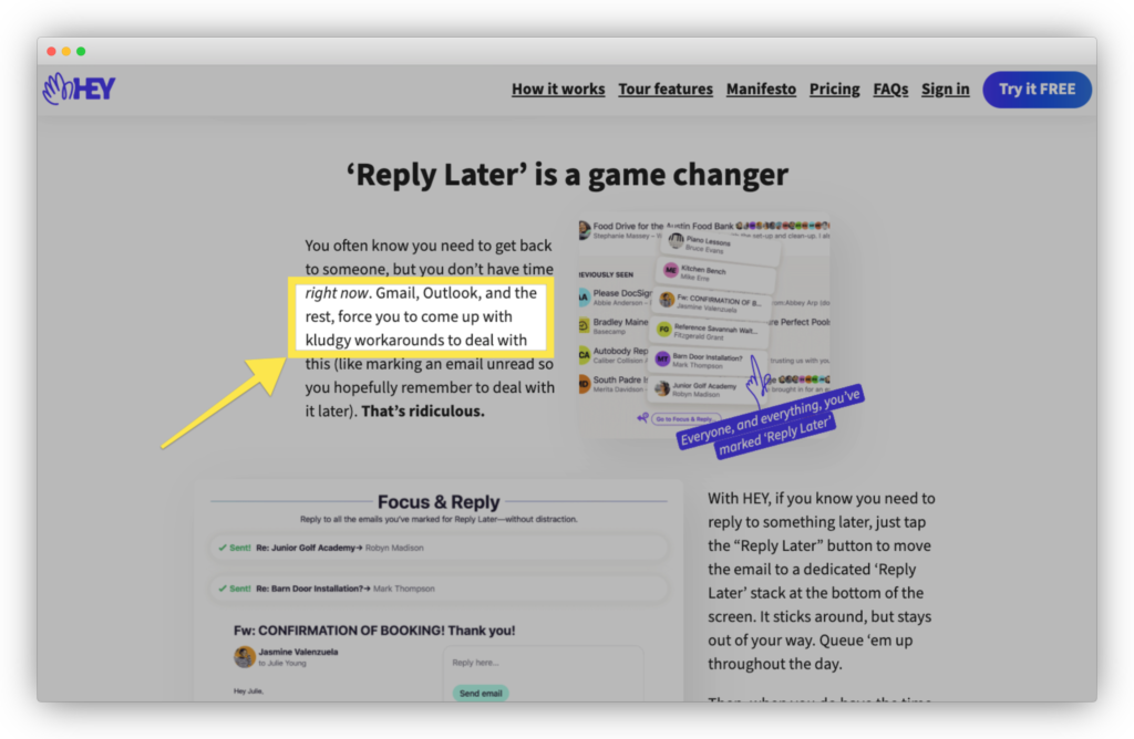
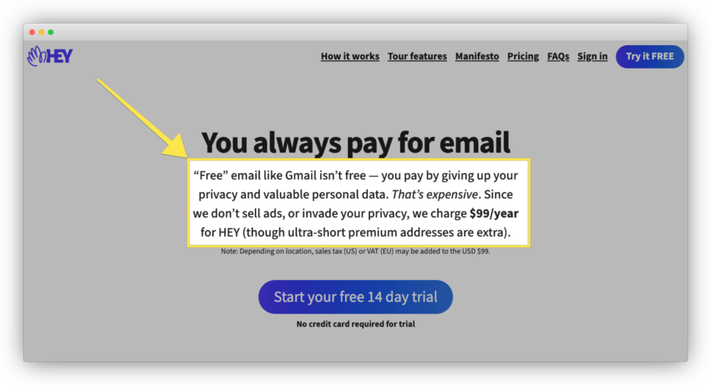
First, the rest of the copy is a masterclass in the "us-versus-them" strategy. HEY has a bone to pick with free email tools like Gmail and Outlook.
They call them out: "Gmail, Outlook, and the rest, force you to come up with kludgy workarounds."
Picking a fight is great for awareness, but it's also smart because it uses what we already know about email to explain something new.
Second, they don't shy away from calling out HEY's competitive alternatives, but they also get into the nitty-gritty in describing their product.
There are 815 words on this page. Yup, you read that right.

According to the Conversion Benchmark Report by Unbounce, they've found that most landing pages have 250 to 750 words. The advantage of having a long copy is that you can be very specific in describing your product's benefits and details.
There's a particular section where they really drive home the unique selling point of HEY. They repeat the phrase, "You're in control" five times here.
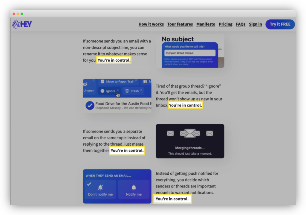
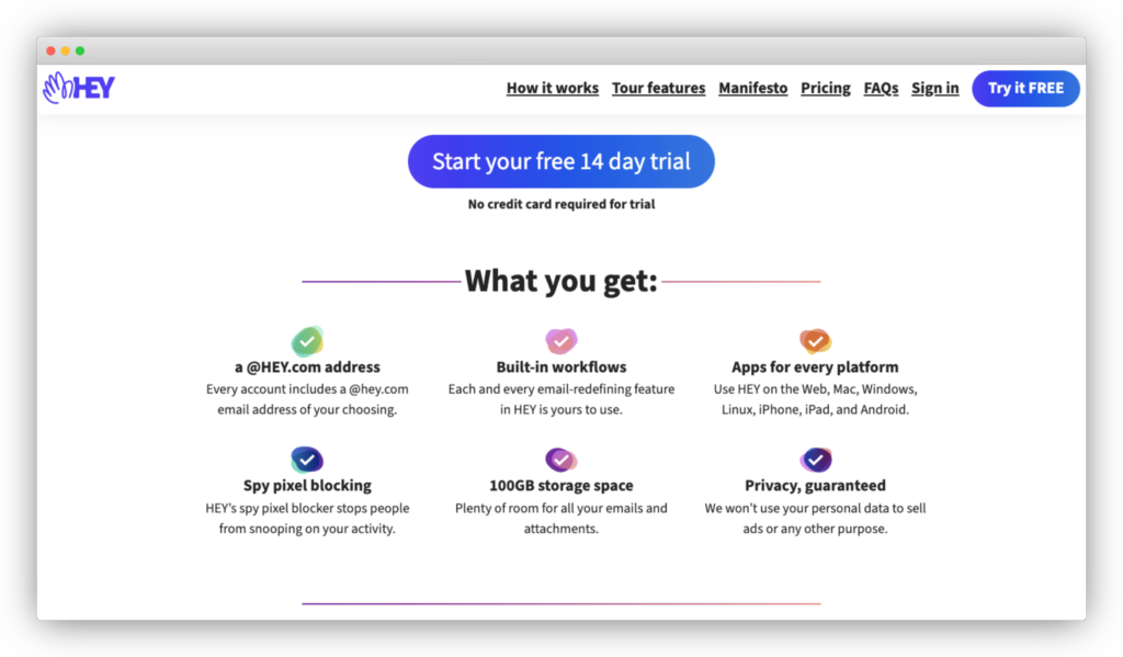
Finally, they actually include images of their product. There's this annoying trend Josh and I have talked about before with SaaS companies using pretty illustrations.
I know this is starting to sound like a HEY lovefest. So, I asked Josh what's one thing he would change about this page:
Enough about this page. Let’s go over briefly to the pricing page.
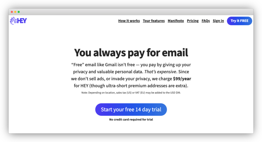
Let’s hear what Josh thinks about this:
Josh pretty much covers everything I have to say about the pricing. Let's jump into the signup flow by clicking that "Start your free 14-day trial" button.
Welcome to the signup flow of HEY. What's fascinating is that they don't just drop you into a signup form to fill out your name, email address, and password. They welcome you right away.
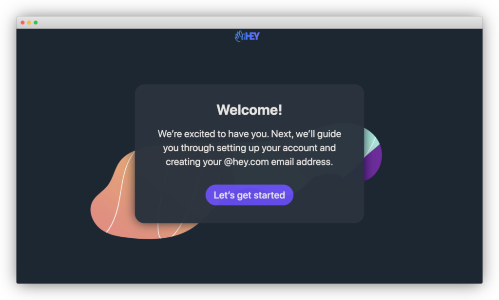
The very first page reads, "Welcome! We're excited to have you. Next, we'll guide you through setting up your account and creating your @hey.com email address."
You're going to notice that something the Hey team likes to do is prepare you for what's next, so you're never guessing ahead. As Wes points out, doing this is an excellent way to motivate users to complete the onboarding process.
Let’s click on, “Let’s get started.”
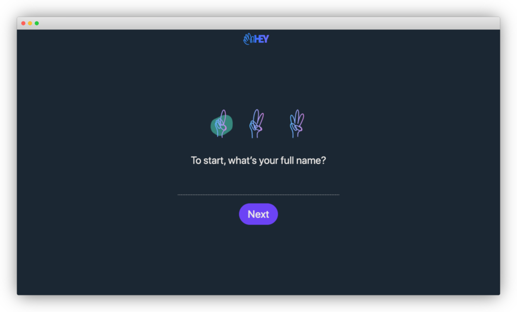
The first thing I notice here is the fingers. Boy, do they look weird.
I know they're trying to stay on brand. It's the Hey logo. Betcha you didn't notice that!
I love how conversational the form is here. It reads, "To start, what's your full name?" There's one field, so you're not overwhelmed with too many things.
Let's fill in our name and click on Next.
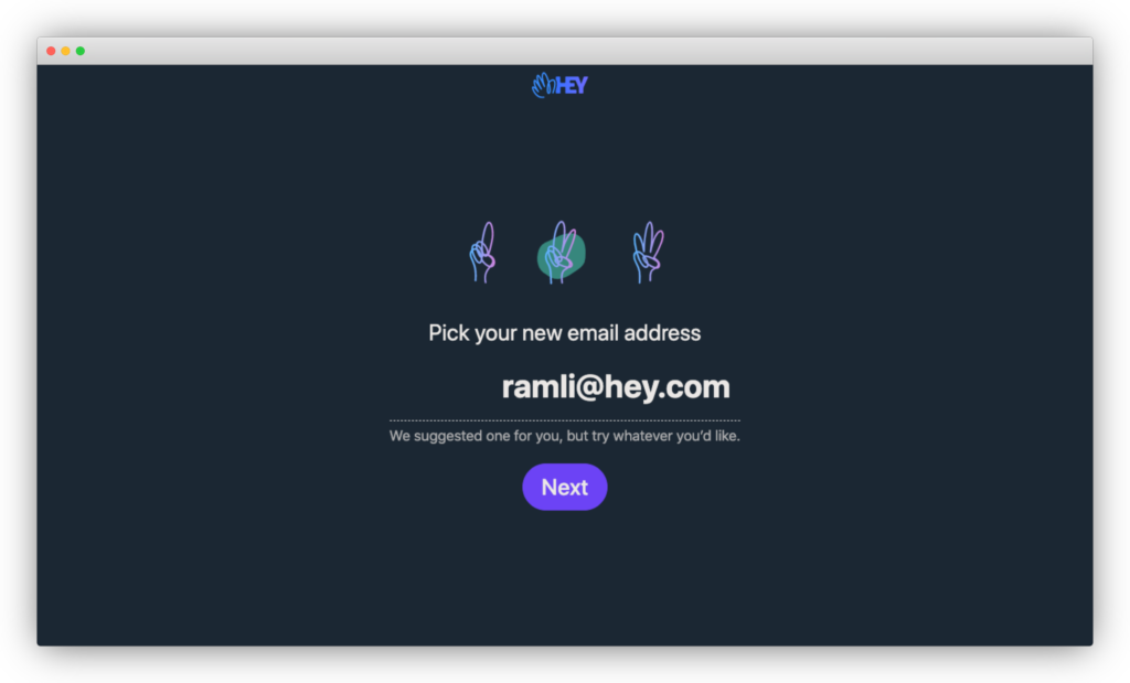
The next step is picking your new email address. Well, would you look at that, they suggest an email for you.
Fortunately for me, my name is unique enough that I got ramli@hey.com. If you can save your new users time by pre-populating fields, do it!
Let’s click on Next.
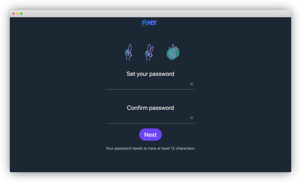
On the third and final step, you set your password. You only have one clue here. "Your password needs to have at least 12 characters."
Hmm, interesting. Let me try a common password, "abcdefghijkl."
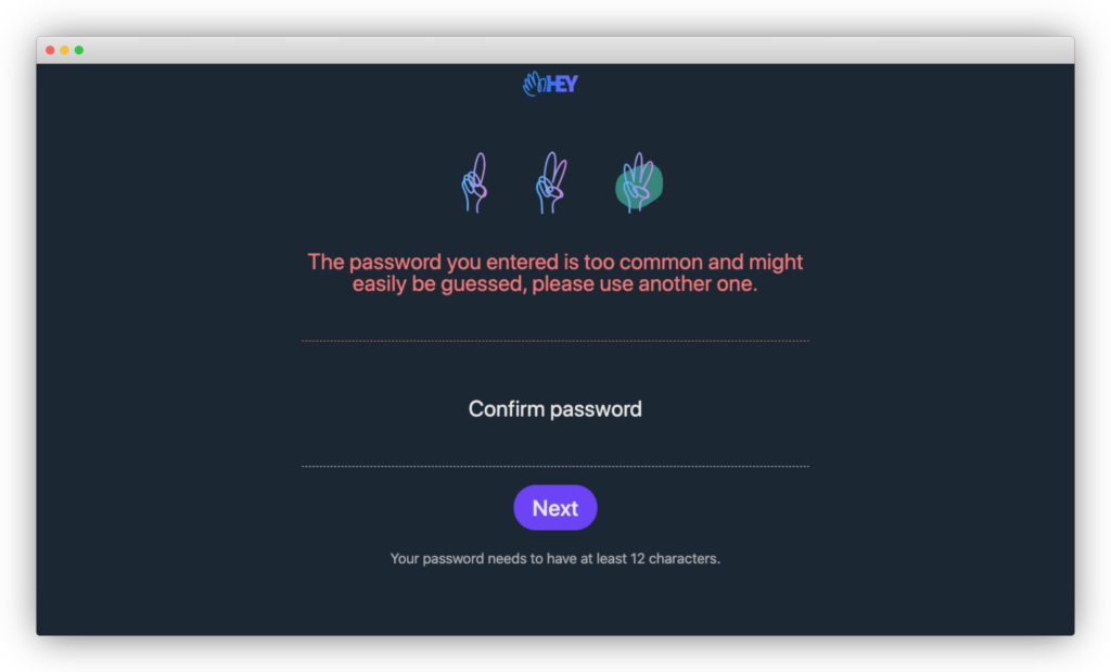
Ah, so we just got an error message, "The password you entered is too common and might easily be guessed, please use another one.
.avif)
C'mon! I met your requirements here. Don't leave me guessing how you think a common password is.
The lesson here is, don't leave your new users guessing what your password requirements are. It can be so frustrating when you leave them guessing.
Let’s finally get into Hey and click Next. This is step three out of three. So this is it, right?
Wrong! There's a secret fourth step.
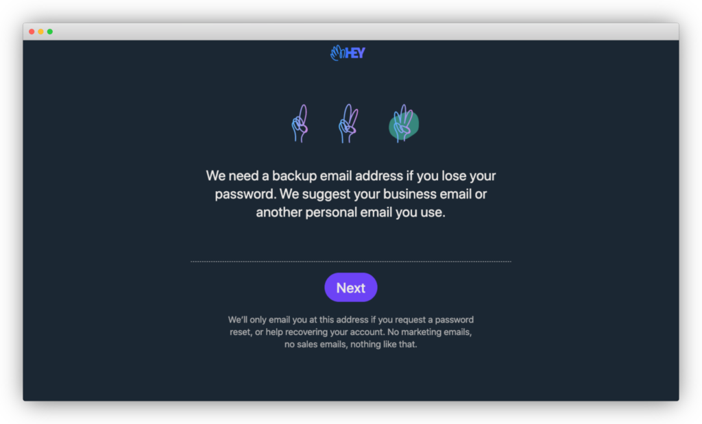
You're supposed to add your backup address if you lose your password. Wes and I question if this step is required to get new users to experience HEY's full value.
After this secret fourth step, I’m not sure if I know what the Next button here leads to. Is there a secret fifth step?
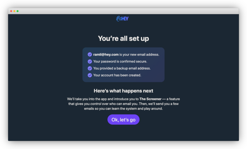
Nope, that's it. I love this success state. The four checked items correspond to the four steps we just completed.
The micro-copy below prepares you for what to come next. They'll take you to "The Screener – a feature that gives you control over who can email you. Then, we'll send you a few emails so you can learn the system and play around."
Every single chance they have so far, they’ve set clear expectations about what the next steps are in the onboarding.
I’ve said this before and I’m going to say it here, surprise is the greatest enemy of user onboarding. If you’re not clear what’s coming up next, new users might feel frustrated and confused so much that they abandon your product forever.
It’s like someone driving and changing lanes without ever using a turn signal.
It’s annoying and dangerous! I don’t know about you, but I hate it when other drivers do that. In the same way, use your turn signals for your product by letting new users know what’s next.
But, my only issue is "The Screener." If you only skimmed the homepage, "The Screener" sounds like a bouncer at the club deciding who goes in or not. "You, you're in. You, you're out!"
.avif)
Wes describes it like this:
Let’s get into the product and click, “Ok, let’s go.”
Welcome to the first product experience of Hey. They don’t just drop you into the email “imbox.”
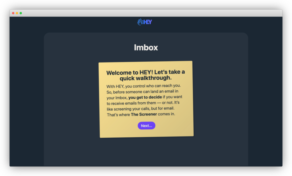
They first show a welcome message that reads, “Welcome to HEY! Let’s take a quick walkthrough.”
I really love this. A lot of companies miss this step during the onboarding experience. You want to welcome your users. Even if it feels like adding another step, a lot of users appreciate it.

As Wes points out,
Once again, they provide you a clear description of what’s coming next. Another added benefit of this is that it increases user motivation to complete the onboarding.
If I have to nitpick something so far, it's the term "Imbox." If I missed that part on the homepage about what the Imbox is, I'd be super confused.

They don't explain it in the signup flow at all. Even here, they just say that The Screener helps determine if emails end up in your Imbox or not. But, they should have mentioned that Imbox is where your important messages go.
I get it that it's part of their launch strategy. They even bought itsnotatypo.com, which explains what Imbox means, which is your important inbox.
Moving on, let's click on "Next…"
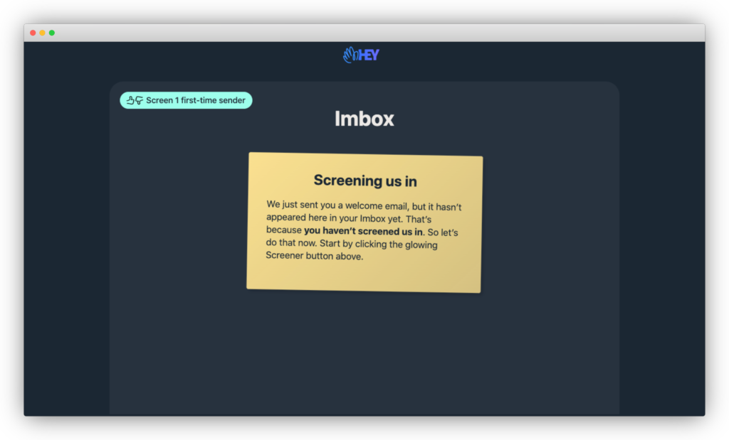
This step reads, “Screening us in. We just sent you a welcome email, but it hasn’t appeared here in your Imbox yet. That’s because you haven’t screened us in. So let’s do that now. Start by clicking the glowing Screener button above.”
The instructions here act like a tooltip directing you to click on the glowing button. But, they got something right with the tooltip that most user onboarding gets wrong.
To add to that, they didn’t just direct new users to click on a button to do something like, “Click here to change your settings,” or “Click here to add your logo.”
HEY doesn't tell you what to do but also why you should do it, which goes back to one of the differentiators of HEY. You can screen your emails like you screen your calls.
Let’s click on the glowing Screener button.
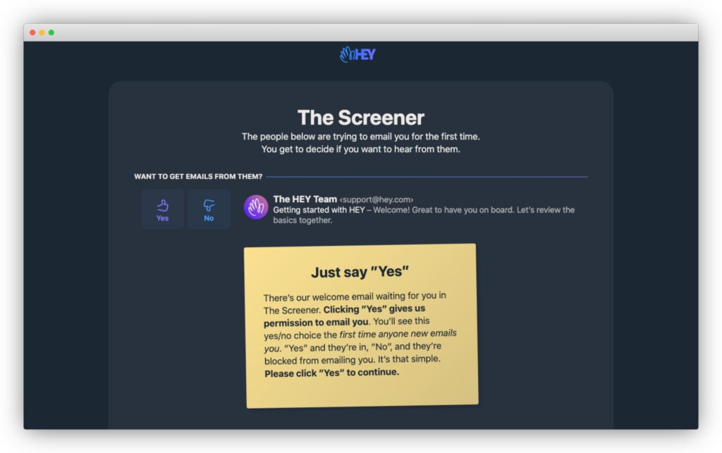
The headline on this page reads, “The Screener. The people below are trying to email you for the first time. You get to decide if you want to hear from them.”
There’s an email below from The HEY team.
The instructions below describe how you give permission for the first time anyone new emails you. "Yes," and they're in, "No," and they're blocked from emailing you. The call-to-action reads, "Please click 'Yes' to continue."
Easy enough!
Before we click on Yes, there’s something that most companies do with the user onboarding that HEY has avoided. They haven’t overwhelmed you with a bazillion features and dropped you in a dashboard or an empty state.
Let’s click, “Yes.”
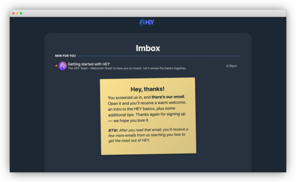
The next step reads, “Hey, thanks! You screened us in, and there’s our email. Open it and you’ll receive a warm welcome, an intro to the HEY basics, plus some additional tips. Thanks again for signing up – we hope you love it. BTW: After you read that email, you’ll receive a few more emails from us teaching you how to get the most out of HEY.”
Did you notice it here? They’re telling you once again what to expect for the next steps. They give you heads up that they’ll be sending you more emails to teach you how to get the most out of HEY. I also really love how conversational this is. It reads like a sticky note that a friend would leave you.
Another thing they’ve done exceptionally well is to show you how to use HEY by doing:
Let’s click on that email!
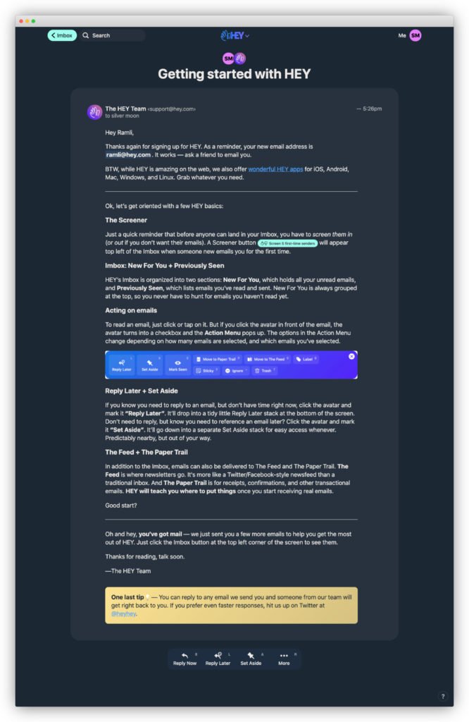
This is a long but useful email. I'm just going to give an overview. Right off the bat, they thank you for signing up again. This is the third time they've thanked you for signing up, which is great! They encourage you to ask a friend to email you on your new email address to check that it works.
They provide instructions on a few HEY basics, including downloading the native HEY app for your phone, screening your emails to Imbox, acting on emails, replying later, and getting to your Feed and Paper Trail.
Again, they remind you that you'll be getting a few more emails from them to get the most out of HEY.
The call-to-action is to check out the Imbox. Let's go check it out.
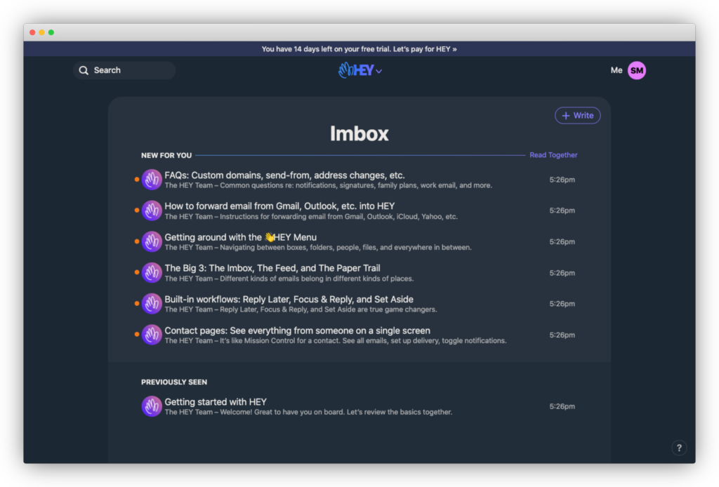
We see six new emails from Hey, the first one being an FAQ. The second one provides instructions to forwarding your Gmail, Outlook, and other emails into HEY.
In my opinion, this should have been part of the onboarding flow for HEY. As soon as I got my HEY email set up, I started forwarding my email to HEY.
Why?
I wanted to see how HEY handles my current emails. I got a chance to test out The Screener, the Reply Later feature, and Imbox, Feed, and Paper Trail stacks. What a better way to see HEY in action than with my own emails?
My hypothesis is that once new users see enough of their emails go through HEY, they're more likely to become HEY customers. With a new email and a short 14-day trial, the only way to get this to happen is to encourage new users to forward their emails to their HEY email address.
Do you agree with me? Let me know in the comments below if you think that HEY should do this or send me an email to ramli@hey.com.
I may or may not accept you to my Imbox.
See what I did there?
.avif)
Let’s take a look at the purchase experience.
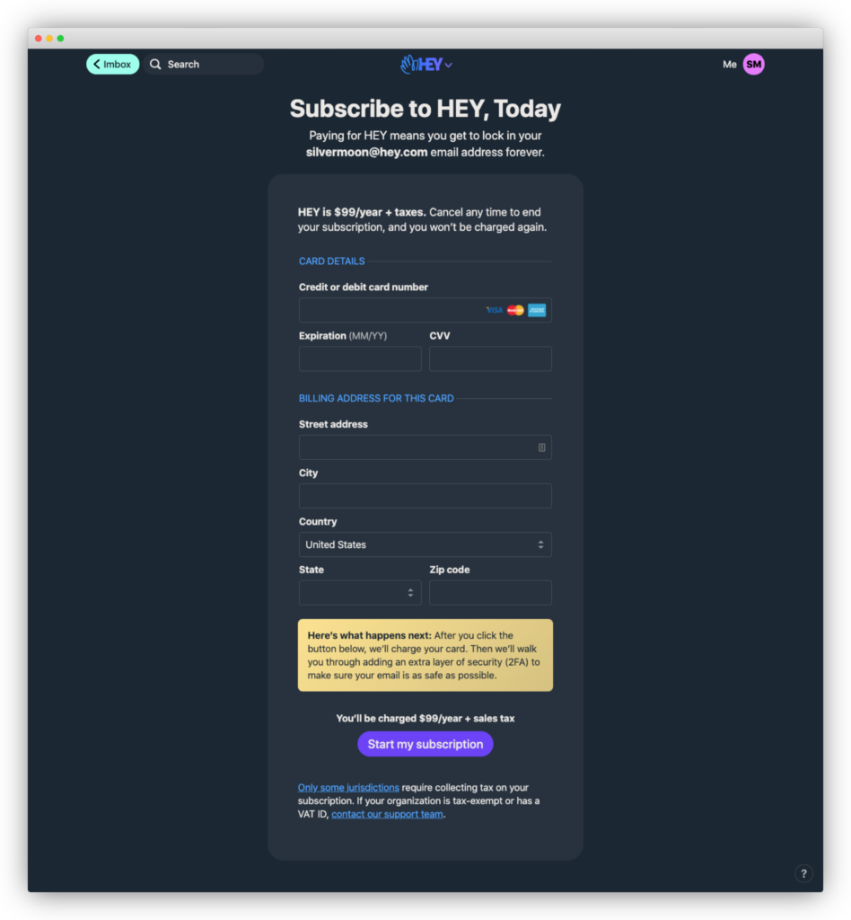
If you click on the banner on top of HEY, you'll end up on the purchase page. The headline reads, "Subscribe to HEY, Today. Paying for HEY means you get to lock in your ramli@hey.com email address forever. HEY is $99/year + taxes. Cancel any time to end your subscription, and you won't be charged again."
I love this copy because it describes what you're buying, which is locking in your email address forever, and address objections you might have about canceling your subscription.
The HEY team is making one big assumption here, though, that most people would want to pay $99 to lock in their email address.
The @hey email address is probably the sexiest feature of Hey because it's a short email address. But, some users might be buying HEY for its privacy feature or for "The Screener." So it might be worth listing out what you'll get again with HEY much in the same way they had it on the pricing page.
Finally, I want to call out the text right above the button, which reads, "Here's what happens next: After you click the button below, we'll charge your card. Then we'll walk you through adding an extra layer of security (2FA) to make sure your email is as safe as possible."
Once again, they're giving you a clear expectation of what's to happen next as soon as you complete your purchase, so there are no surprises.
Just like Josh said, this is one of the best onboarding experiences I’ve gone through so far. I would give HEY’s user onboarding an A++.
Here are the five things that I thought HEY did remarkably well during the user onboarding experience:
First, they've brilliantly positioned their product from other free email services.
As Josh points out, they started by naming and shaming their enemy, free email solutions like Gmail as we know them today, more specifically, the price of free.
You pay by giving up data, seeing ads, spying, and feature bloat designed to give everyone enough to hopefully not complain. They repeatedly say in their product page that with HEY you're in control. You'll see this messaging appear throughout the signup and onboarding experience.
Second, every single chance they have so far, they’ve set clear expectations about what the next steps are in the onboarding.
I’ve said this before and I’m going to say it here, surprise is the greatest enemy of user onboarding. If you’re not clear what’s coming up next, new users might feel frustrated and confused so much that they abandon your product forever.
Third, every single step in the signup and onboarding process had one clear focus.
Many products just drop you into the dashboard, where you're overwhelmed with buttons, tooltips, and product tours. Instead, HEY helped new users learn how to use their products one step at a time. There are no distractions to pull your attention away from what you need to know and learn.
Fourth, they re-iterated the value of HEY throughout the onboarding process.
Most user onboarding tells you what to do and not why you should do it. They direct you to "Click here to change your settings," or "Click here to add your logo." Instead, HEY told you how The Screener could help make sure you only get the emails you want in your Imbox.
Fifth, instead of a traditional checklist, they used emails to provide more instructions about HEY.
This is a brilliant way to get users to adopt HEY's email tool, which does two things. First, it makes sure that new users aren't faced with an empty Imbox as soon as they log in for the first time. Second, it helps new users get used to HEY's user experience.
In terms of what could have been better, I have to nitpick to really find anything. These three are things that could have improved the onboarding experience.
First, as Wes pointed out, the progress indicators on the signup page are confusing.
They look like sausages and not fingers. You'd have to really look at them to realize that they indicate which step you're on. Though I think it's neat that they use the HEY logo for this, I'd rather opt for clarity over cleverness.
Second, I think they should have explained what Imbox is during the onboarding process. Not everyone who signups up might have read the homepage or checked out itsnotatypo.com. From what I can tell, they're banking that most early adopters probably follow Jason and David on Twitter. But, as more users try out HEY, dropping people into the Imbox might confuse people.
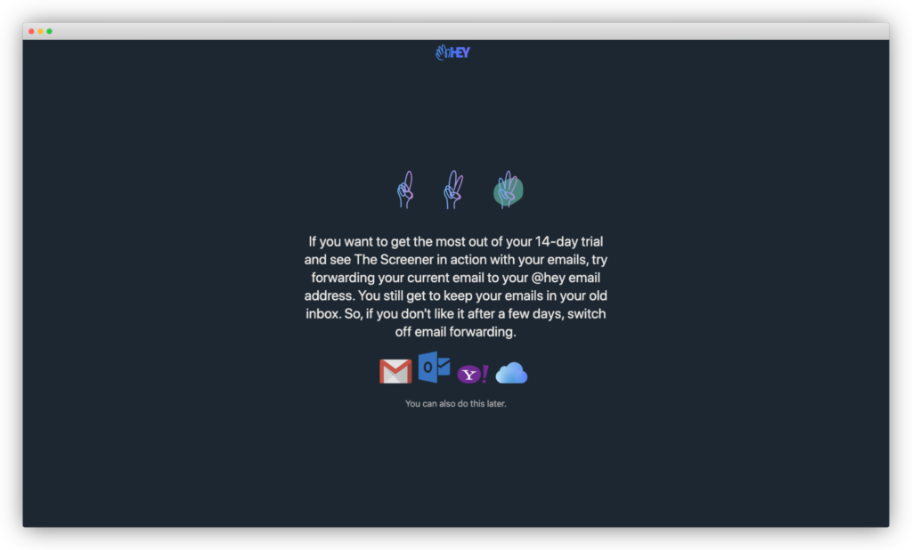
Third, they should encourage users to forward their current emails to their HEY email. My hypothesis is that once new users see enough of their emails go through HEY, they're more likely to become a HEY customer. With a new email and a short 14-day trial, the only way to get this to happen is if people forward their emails to their HEY email address.
HEY could pitch it this way: "If you want to get the most out of your 14-day trial and see The Screener in action with your emails, try forwarding your current email to your @hey email address. You still get to keep your emails in your old inbox. So, if you don't like it after a few days, switch off email forwarding."
This way, it's about what the users want.
What do you think? Did I miss something that HEY did really well or something they did that could have been better? Let me know in the comments below. I reply back to all comments. ????
Before you go, we've put together a free one-page Product-Led Onboarding™ checklist.
Use it to take stock of your current onboarding experience, and run all your new designs past it before unleashing them on the world! Get the Product-Led Onboarding™ Checklist.
Second, Wes and I can also do a full audit of your product’s user onboarding experience. It’s a bit like this, but more in-depth.
We’ll go through not just your the user experience, but also review your analytics (whether that’s Google Analytics, Mixpanel, or whatever analytics tools you have). We’ll even dig into your emails, in-app messages, and more. I guarantee you if there are bottlenecks in your product’s onboarding, we’ll identify it and break down how you can fix it. If you’re interested in getting an onboarding experience audit of your product, learn more about it here.
Finally, I want to let you know that Wes and I do Onboarding workshops for select companies. In those training, we'll walk you through a battle-tested onboarding framework that will help you create onboarding experiences that convert without resorting to short-term, sales-y tactics.
Through our history working on onboarding experiences for companies like Grow.com, Dynatrace, Outsystems, and more, we've seen inside more SaaS onboarding experiences than anyone else on the planet.
You can find out more about our onboarding workshops at productled.com/training
That’s it for now! Until the next onboarding teardown