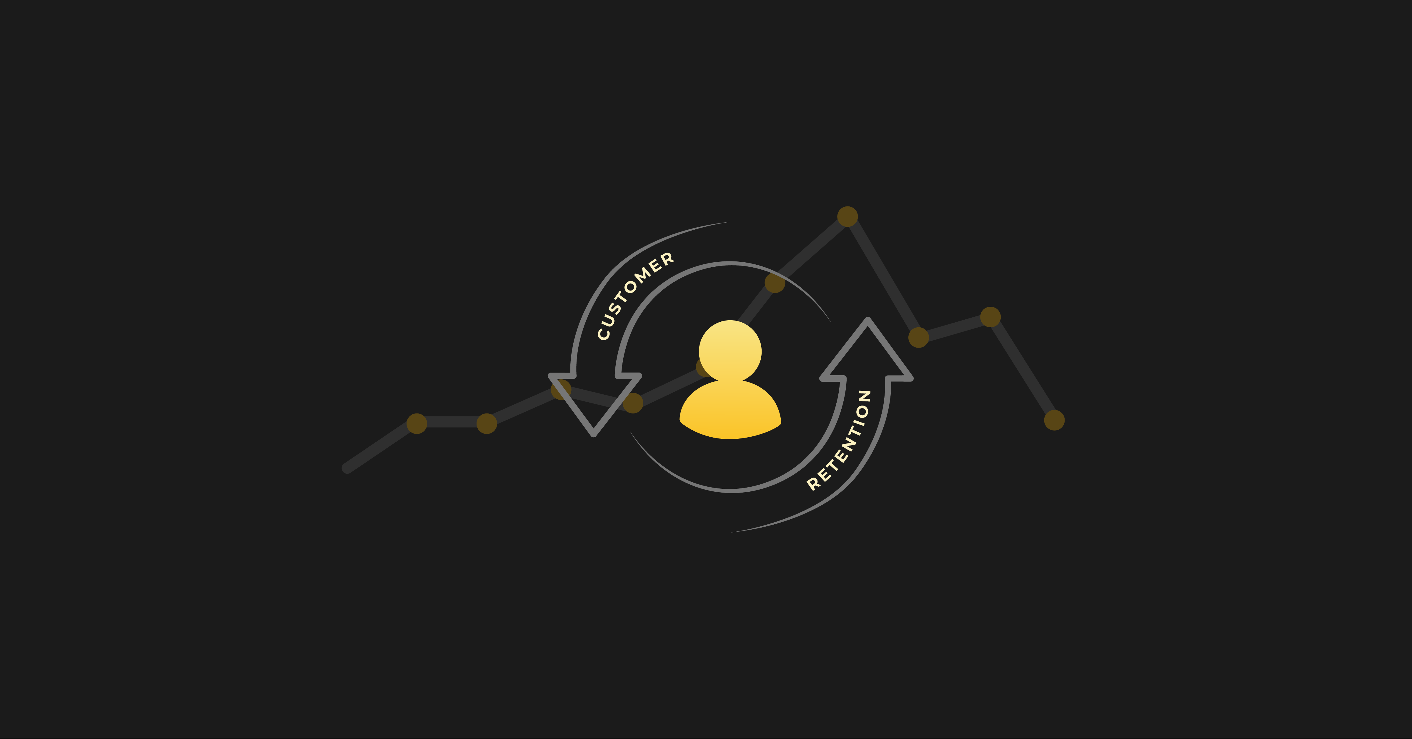
SaaS buyers have become extremely savvy online shoppers. They often do 85% of the research they need to make a purchase decision before ever talking to a salesperson. The information they look for varies according to their business needs, but it often revolves around pricing, features, social proof, outcomes, and competitor comparisons.
With all this in mind, there's no guarantee that free trial signups will roll in without effort.
It comes as no surprise that SaaS companies themselves feel pressured to provide all of that information - upfront, and as soon as possible - in the shopping process. This approach leads to homepages stuffed with an overwhelming amount of information, links, customer logos, social media buttons, quotes, case studies, product screenshots, and CTAs.
Crazy Egg has been around since 2004, so we've had an awful lot of time to hone our website landing pages. And since one of our main features is an A/B testing tool for website optimization, naturally we have spent a fair amount of time perfecting our own most valuable piece of digital real estate: crazyegg.com.
If you've visited us online, you may have noticed something a little different about the way we structure our homepage. Despite many cosmetic changes run as A/B tests over the years, the design is often what one might call "minimalist."
PREVIOUS (CONTROL):

CURRENTLY BEING A/B TESTED AS A VARIANT:

About Our Homepage Layout
As a website visitor, we only give you three options:
- Log in (which only applies to current customers)
- Sign up (which only applies to new customers)
- Learn more (Ditto)
We have very deliberately aimed you toward using our primary feature (heatmaps) and taking the plunge (signing up for our free 30-day trial).
Notice that if you want more details - the feature descriptions, the additional value adds, even the footer - you have to click “Learn More” to unlock the rest of our homepage content:

If you’re familiar with A/B testing strategy, then you know that an A/B test is never really finished; you just add more challengers over time so that each improvement builds on the next. Believe it or not, the extremely focused, current version of our homepage has defeated all challengers for the past four years straight, including this one from early 2015.
.avif)
Talk about a champion!
As our COO Amee Shah puts it, “We’ve had that for years, we’ve tweaked it over time, but it performs the best.” And as our GM Suneet Bhatt says, “Even in the past year we've tested alternatives to the homepage. Nothing works better than that simple, clean, push to add a domain.”
How We Got Here
Crazy Egg didn’t always take a minimalist approach to website design. About four years ago, we had your typical, long sales type homepage. It provided a lot of upfront information to help drive more free trial signups.
.avif)
We kept a close eye on everything from free trial conversion rate to the trial period.
But there were two reasons why we weren’t satisfied with this approach:
- Highlighting our core features upfront took attention away from getting our website visitors to the next, all-important steps: Signup and credit card capture. We’d lost focus and it was affecting our marketing across the board.
- Over the years, CRO had gone from beautiful, simple, efficient, and functional to complex, jargon-filled, extensive, and inaccessible. There was more competition, and therefore a lot of noise in the market. We wanted to stand out so a user could clearly see what we brought to the table.
To address these marketing challenges, we threw caution to the wind and tested out an extremely succinct homepage version, designed solely to capture credit cards during the free trial signup process. It didn’t even have a lock screen with our additional, gated value prop; it was just super short.

Asking people to enter their credit card and commit to Crazy Egg was a filter on the front end of our free trial (aka an opt-out free trial). Not everyone was willing. However, we wound up having higher than average conversion rates in our funnel -- because the people who entered were interested enough in our features to continue with the signup process, even when we asked for a payment method upfront.
When the abbreviated version of our homepage design showed an 11% conversion rate improvement, but we started seeing higher-paid user churn, we aimed for the middle ground. We decided to balance under-and over-educating our website visitors by gating our supporting information.
As a course correction on sharing TMI with prospects, our current, minimalist homepage was born.
Suneet shares, “We feel like we've really nailed simplicity. And by doing that on the homepage we have formulated a very different point of view of what customers want and are looking for. While the market continues to build more, to sell more, to stuff more into the product, and to ask customers to do more, our emphasis on simplicity has us moving in a different direction. Simplicity started as a home page optimization exercise. It's turned into a mantra because of its success.”
Where We’re Going Next

We’re on an endless quest to find something that will defeat (or at least improve upon) our A/B testing champion. This will help us build the best possible SaaS product.
This is very meta, but we are currently running Crazy Egg user behavior reports on the Crazy Egg homepage itself. There are a few low-hanging pieces of fruit that we can A/B test during the next round.
https://www.youtube.com/watch?v=0RgxUXXsNsE&t=1s
Click the video above to hear our GM talk about how we leverage user behavior reports to place our calls to action where people are paying the most attention. Our aim is to move from a hotspot (which is just one form of unique engagement) to a sweet spot (which is where multiple forms of attention and engagement converge).
Conclusion
Our testing capabilities are limited only by how quickly we can get new versions designed and developed. This is what we need to develop better marketing campaigns, increase free trial sign ups, and pin down a pricing model that suits our target market.
No matter what variant we decide to test next, we can use our “Compare Snapshots” feature to look at the before and after versions of our homepage and verify whether the changes we made actually moved the needle. And that will tell us how to find the next free trial sign up, new user, and hopefully paid customer.
A marketer’s work is never done., but that's what makes it fun. There's nothing better than seeing your free trial conversions go through the roof!