This article is based on one core component that's revealed in The Product-Led Playbook. Packed with case studies and templates, it's the go-to manual you need to build a successful product-led business.
How do you get users to upgrade from free-to-paid easily?
Getting users to upgrade is infinitely easier if you’ve created enormous value for your users.
If your users haven’t experienced the value of your product, getting them to upgrade is hard.
I say this because no matter how beautiful your pricing page is, it’s just a pricing page. Your users are upgrading because of how valuable your product is.
Yet a good pricing page has the ability to align your business goals with the users. It sets the terms for the relationship.
In this article, I break down ProductLed’s Pricing Process so you can build a high-impact pricing page that makes it effortless for users to pull out their credit cards and upgrade their plans.
We also give you all the tools, templates, and resources you need to launch a brand-new pricing page to make it easier for you to implement everything.
You can get access to everything here.
Our ProductLed Pricing Process can be broken down into four phases:
- Phase 1: Craft the packages
- Phase 2: Identify your value metric(s)
- Phase 3: Identify your ideal pricing
- Phase 4: Design your pricing page
Each phase will take you one step closer to crafting a world-class pricing page.
In your pursuit, there are several big pricing traps I want you to avoid, as they’re easy to make.
I would know because, well, I made them all.
6 Pricing Traps to Avoid
Even if you’ve done a fantastic job getting users to value, you could still fall into one of these traps.
1. Not building on a strong foundation
Too many companies rush into updating their pricing without clarity around some key questions like:
- What is your company strategy?
- Who is your ideal user?
- What is user success?
- What is your product-led model?
- What is your core value proposition?
Don't read this if you aren’t confident with your answers to those questions. Return to the ProductLed System™️ and tackle the area you must address.
Without a strong foundation, you’re just guessing and will waste a lot of time and energy crafting a new pricing page that won’t generate great results.
The other pricing trap is needing to be more transparent.
2. Not being transparent
You know the drill. If you go to a company’s website and don’t see the price…
It’s expensive, right?
Most likely, you’re right.
When it comes to pricing, a lack of transparency puts the user at a huge disadvantage. A user doesn’t know if you’ll charge them 10x the price of another user just because you have a more valuable use-case to solve. A lack of pricing information allows sales-led companies to charge each customer a different amount based on value dynamically. You could say this is good business. Yet, the whole sales process lacks transparency and takes a long time to close a deal.
Whether you hide your pricing, ask users to request a price, or force users to talk to you to understand your pricing needs, it’s all a lack of transparency. One of the easiest ways a company can build trust is by showcasing its pricing. It’s not easy to do, but it builds trust over time and increases a user’s odds of purchasing from you in the future. Product-led companies need to be transparent with their users from the beginning, whether promising what’s for free, letting people use the product, and knowing the price before signing up. A lack of transparency will kill your conversion rates.
But even if you are transparent, you may fall into another pricing trap.
3. Giving too much or too little away for free
Giving too much away is very common for early-stage companies. It’s tempting just to give everything away. But if you have strong engagement and lots of users activating but not many users paying, chances are you’re in this bucket.
On the flip side, not giving enough away for free will kill your engagement rates. The three most common reasons users decide to upgrade are:
- Time limit
- Usage limit
- Feature limit
If a user hits these limits before reaching value, your odds of getting them to upgrade are low.
Hence, deciding when these limits occur is a balancing act and depends on your business goals (which we’ll get into shortly). Then, in Phase 1, we’ll dig into how to craft packages that give your users just the right amount of value for free.
Another common pricing trap pops up when the incentives aren’t aligned.
4. Misaligned incentives
Your incentive as a business is to make more money, right? Well, your user’s incentive is to maximize the value of your product.
Great pricing aligns the incentives between what your company and the customers want.
Symptoms of not aligning incentives show up when you have difficulty increasing the lifetime value of a customer easily, and your average revenue per user is flat.
When you align incentives, you’ll see that you’re automatically able to make more per customer, which is great because one of the biggest benefits of building a product-led business is the fact that you can land and expand each account so easily.
For example, let’s say you run a payment processor solution like Stripe.com, and you currently charge based on the features of your solution. Your pro plan is $99/month, giving you access to tools to charge international customers. Walmart.com signs up for your plan and processes $100 million in the first month. Your team is scrambling. The amount of requests and support required to process that cash is overwhelming. You have to either cancel the customer or find a new business model to support and maybe even encourage that kind of customer to grow.
You need a simple pricing model that scales with the value your customers receive. In Stripe’s situation, it’s pretty simple. For every dollar a customer makes, you’ll charge between 2 to 3% as a fee, like a credit card. As companies like Walmart.com sign up to use Stripe, you’ll be able to support them as they scale up and be incentivized to help them grow. We’ll explore how you can align incentives in Phase 2 so you can win as a business when your user wins.
Yet, even if you have aligned incentives, you can still turn away great customers if you’ve got a big jump in pricing.
5. Big jumps in pricing
Product-led companies are land and expand machines. You might start charging users a small amount, but as users access more features and use your solution more, it’s natural they’ll be charged more.
Yet, taking users from free to $2,000 per month is a steep jump. Not many users are going to do it without talking to you. Most companies with a steep pricing jump don’t have a pricing metric that scales well, so they try to capture as much value as possible early in the relationship. This scares off a lot of potential customers from purchasing. This doesn’t mean you can’t charge $2,000 per month at some point; it just means you might start off with a small amount, like $50 per month. As the account grows well above $2,000 per month, they’ll use more features and get more value out of your product. We’ll cover how you can avoid a big jump in your pricing by uncovering what your customer’s willingness to pay is for each package in Phase 3.
The last pricing trap is the easiest to fall into – it happens when your pricing is confusing.
6. Your pricing page is confusing
Billions of dollars are lost each year on bad pricing pages. Due to complexity, you can bundle your plans well, align incentives, and botch the conversion.
At this stage, you need to make it a no-brainer for your users to select which plan is right for them.
I call this the 5-second test. If users can’t determine which plan is right for them in less than 5 seconds, your pricing page needs work.
We’ll cover how to make a simple pricing page in Phase 4, but for now, just keep in mind that your pricing page needs to be simple to drive conversions.
Before we unpack the ProductLed Pricing Process and help you overcome all of these common pricing traps, let’s take a step back and get clear on your monetization strategy.
What’s your monetization strategy?
You don't have a monetization strategy if you don’t know the answer to this question.
And it’s costing you.
You just don’t know how much.
What’s unique about deciding your monetization strategy as a product-led business is that your customer acquisition and pricing model are inextricably linked together.
If you give more away for free, you might make less money.
If you give nothing away for free, you might make less money.
The goal is to find the sweet spot that aligns your pricing and customer acquisition model.
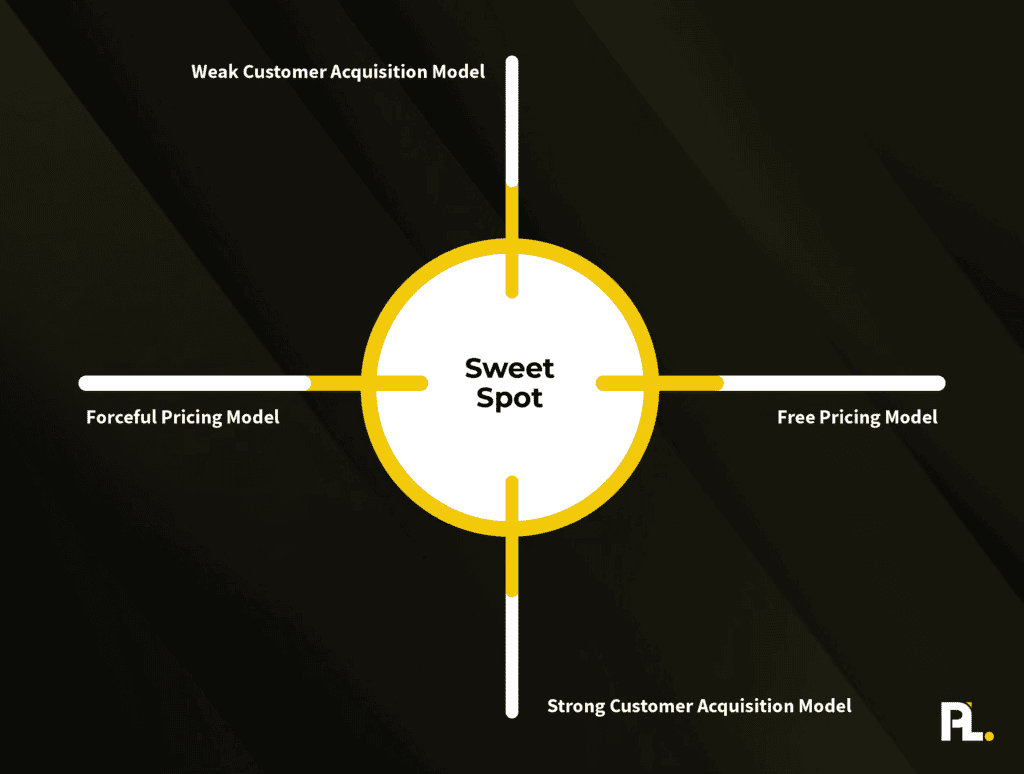
Yet, as I walk you through the main pricing strategies you can deploy as a business, you may decide to optimize for a monetization strategy that doesn’t aim to find that magical sweet spot.
As I walk through each monetization strategy, I want you to consider which strategy makes the most sense for your business. Deal?
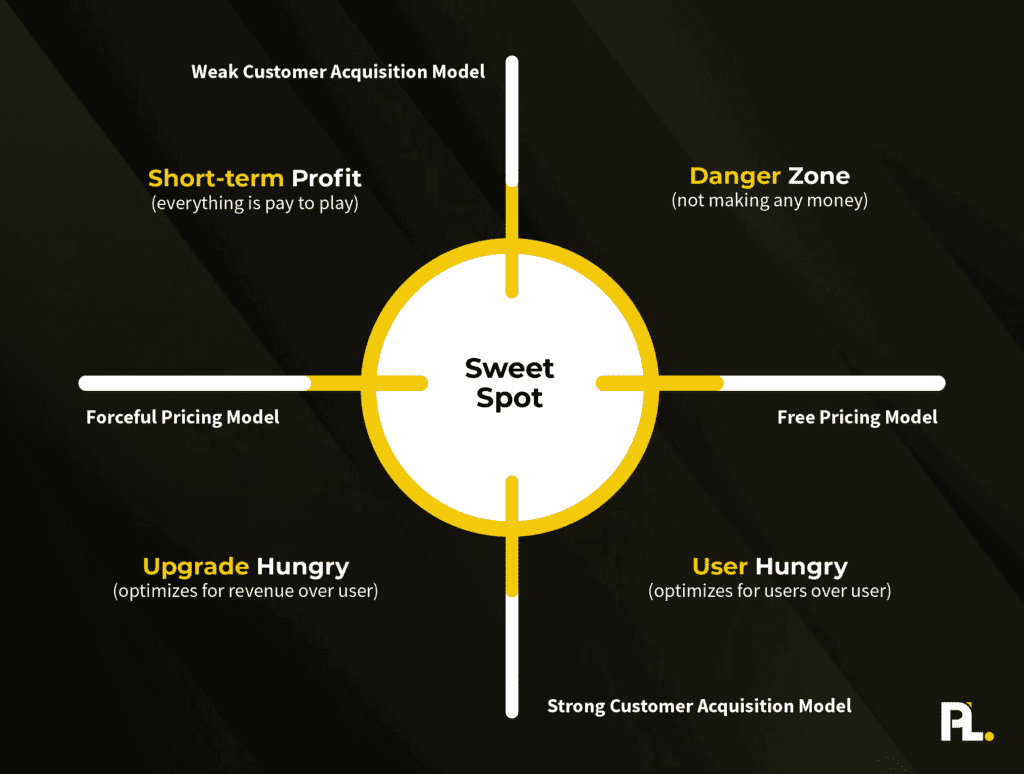
User-Hungry Strategy
A user-hungry strategy is often deployed when you’re trying to craft a powerful customer acquisition model and optimize for market share over profits. This is often deployed by early-stage venture-backed startups that want to dominate their space and leave little room for new entrants while they take a land grab of all the users.
One example of a company that followed a user-hungry strategy in the early days was Codeacademy. When I sat down with the founder, Zach Sims, on the ProductLed Podcast, it was fascinating to hear how they gave everything for free for years to get millions of users in the early days.
Yet, Sims even said they probably waited too long to focus on monetization – it’s a muscle you need to build a sustainable business. Had they started earlier, they could have grown the business faster and wouldn’t have been as reliant on VC funding.
Another example of a user-hungry startup was Loom. In the early days, you could create unlimited videos with no caps on time. This enabled you to share hundreds of videos for free and given that you’d share a video with another user who potentially had never seen a Loom video before – you, as the user, would be doing their marketing for them. This was a brilliant play in the early days to become the dominant video tool for communication.
The main disadvantage of deploying a user-hungry strategy is it can be expensive to pull off, and you can attract lots of non-ideal users. It might not even be an option depending on the cost of supporting a free user. However, if there’s a very low cost to supporting a free user and those free users can bring in new free users by using your free product, you might benefit from being user-hungry in the early days of your business.
Now the question is…
Would being user-hungry benefit your company?
Upgrade-Hungry Strategy
An upgrade-hungry strategy isn’t an option for every business, as the requisite is that you have a strong customer acquisition model powering your business.
It’s typically deployed by later-stage businesses that have established a ton of trust and goodwill in their business. This may be a premium pricing strategy or maximizing profits from a cash cow product.
The main benefit of this strategy is you’re typically going to be able to generate the most profit in the short term out of all the other strategies.
Yet, it’s a short-term strategy. Over time, focusing on forcing people to upgrade and providing less value might slow down your customer acquisition model as users start looking for alternatives to your solution.
Use the upgrade-hungry strategy sparingly. Most companies unintentionally roll out an upgrade-hungry strategy when they don’t give away much for free and expect users to upgrade.
Would being upgrade-hungry be the best strategy for your business?
Short-Term Profit Strategy
A short-term profit strategy is when you have a weak customer acquisition model and give very little free value while leaning heavily into upgrading each user. We see this constantly with sales-led companies trying to transition to product-led. They roll out a short free trial with their product, keep their pricing high, and are desperate to close every user that comes in the door.
They aim to maximize how much money they can make off the user in the initial engagement. Maybe they only allow people to sign up for annual plans, or there’s a push to X. Either way, it’s a strained funnel, and everyone feels the pinch. The business and user both feel like it’s hard to get value.
This is an uncomfortable place to be as a business for an extended period of time.
Typically, companies fall into this place unknowingly, and it isn’t until they hit a plateau or negative growth that they change their approach.
Danger Zone
The last strategy isn’t really a strategy. It’s a place you want to avoid. It’s when you give everything away for free and have little to no people checking out what you’re doing. This often happens to founders that create something they want, but nobody cares about. It solves a personal pain point that few outside the founder resonate with.
If this is you, start from the beginning of the ProductLed System™️. By going through each component, you can avoid the danger zone.
Now, it’s your turn.
Action item:
- What’s your current monetization strategy?
- What do you want your new monetization strategy to be?
We can determine your pricing once you’re clear on your monetization strategy. I wanted you to get clear on your monetization strategy first because I’m going to walk you through a defined process that might feel rigid to some. With a monetization strategy, it’ll be easier for you to know when to bend the rules and give more or less away for free, depending on your strategy now that you have one.
Let’s dig into how to craft your pricing.
Phase 1: Craft the packages
Packages are the simplest way to break down the different goals of your users.
Well-crafted packages align your user’s goals with your pricing packages.
To make it easy, we will only build three packages for your users - one of those packages will be free.
There are three steps to follow if you want to craft simple packages for your users:
- Step 1: Complete the model canvas.
- Step 2: Generate solutions.
- Step 3: List out the product features that your user needs to succeed.
If you’ve completed the Model Component, you can skip to Step 3 already since you’ve got the skeleton of what’s included in your packages, and this section will be easy.
Let’s dig into step 1.
Step 1: Complete the model canvas
Our model canvas is a simple way for you to break down your user journey and unpack how you can help your users at each stage.
My favorite way to easily break down a user journey is in three stages: beginner, intermediate, and advanced.
Let’s say you are the founder of a software application that helps photographers run their businesses easily and share their photographs with clients.
Your ideal user is a female wedding photographer in their 2nd year of running their business, is great at her craft, has consistent client engagements, and is looking to go full-time in her photography business eventually.
Along the journey, she’s going to hit several milestones, such as:
- Beginner Milestone: Delivering incredible client experiences without any hassle
- Intermediate Milestone: Becoming a professional photographer
- Advanced Milestone: Scale their business so they have time and financial freedom
These milestones represent the desired outcomes at each stage of your ideal user journey.
Your job is to pinpoint what those main milestones are for your ideal user.
Once you’re done, let’s unpack the obstacles preventing users from achieving those milestones.
Don’t limit yourself to just product obstacles. Most times, in the earlier stages of a user journey, those obstacles have more to do with their mindset and knowledge gaps.
Now it’s your turn to list out all of the obstacles that users will encounter in pursuing their milestones.
Just click here to get the Google Doc template for this activity.
For example, let’s say our wedding photographers will face these five obstacles on their way to delivering premium client experiences without the hassle:
- Challenge 1: How to get more clients consistently.
- Challenge 2: How to easily give clients a way to download limited images.
- Challenge 3: Overwhelmed with all the steps to get where they want to go.
- Challenge 4: Lack of community and support - they feel lonely on this journey.
- Challenge 5: How to get high-paying clients.
At this stage, list as many potential challenges as possible that your user faces, then narrow the list down to the top three to five challenges that get in your user’s way.
Once you’ve done that, list all the potential solutions you can create to solve those challenges.
Step 2: Generate solutions
For example, if our budding wedding photographer is struggling with getting clients, how could we solve that?
I recommend using the PCR test to generate solutions quickly.
P stands for product solutions.
C for content solutions that you consume (i.e., webinars, blog posts, guides, etc).
R for resources that you use (i.e., website graders, quizzes, helpful databases, discounts on tools, etc.)
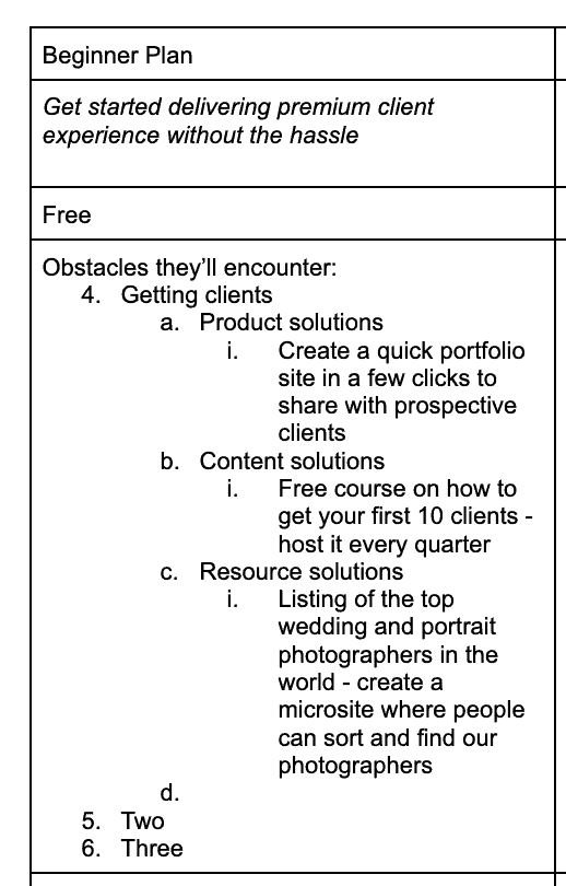
Let’s take the first stab at using the PCR Test to get clients for our photographer.
Potential solution:
- Product solutions
- Create a quick portfolio site to share with prospective clients in a few clicks.
- Content solutions
- Free course on how to get your first 10 clients that is hosted every quarter.
- Resource solutions
- Listing the world's top wedding and portrait photographers by creating a microsite where people can sort and find our photographers.
I just shared one example per category, but you want to create as many potential solutions as possible when you do this.
In your Google Doc template, build solutions for each of the main obstacles like this for your beginner and intermediate plans.
Once you’ve generated solutions for each main obstacle your users face, it’s time to get specific on what you will include in each package from a product standpoint.
Step 3: List out the product features that your user needs to succeed
Based on the milestones your user needs to accomplish at each stage of their journey, what specific product features do you need to give them to succeed?
Suppose they aim to get started on delivering a client experience without hassle, like in the photography example. In that case, we’d need to give them:
- Access to using at least a few client galleries.
- Access to enough storage to upload a few client photoshoots (say 10 gigabytes).
- Enough time to complete the photoshoots. Given that there’s a big variance in how long it would take a new photographer to complete their photoshoots, we shouldn’t cap the time required for a user to use the client galleries.
Now it’s your turn.
List all the product features and quantities your users would need to achieve each milestone.
Once you’ve completed that, you’ve crafted your packages, which should look like this.
Your plans are listed, and you have a great gauge of what you need to include in each plan to help the user succeed at each stage.
Now, it’s your turn.
Action items:
- Build out your packages
- Give your users everything they need to complete each milestone successfully.
Once you’ve built out your packages, it’s time to identify your value metrics so that you can align your user’s success with your success as a business.
Phase 2: Identify your value metric(s)
A value metric is the way you measure value exchange in your product.
Ultimately, value metrics are the linchpin to successfully executing a product-led go-to-market strategy. Why? Because you're aligning your revenue model with how successful your user is.
Your value metrics are vital in pricing, setting up your product metrics, and building your team. But what the heck does it look like?
- A value metric for a video platform like Wistia could be the number of videos uploaded.
- A value metric for a communication application like Slack could be the number of messages sent.
- For a payment processing platform like PayPal, a value metric could be the amount of revenue generated.
According to Patrick Campbell, CEO of ProfitWell, there are two types of value metrics: functional and outcome-based.
| Functional Value Metrics | Outcome-Based Value Metrics |
| Pricing scales around a function of usage Example frequency metrics: "per user" or "per 100 videos" | Charge based on an outcome Example outcomes: how many views a video received, how much money you made your customer |
Now, many SaaS businesses rely on feature differentiation to justify higher price points. But this comes at the cost of higher churn. As Campbell notes, value metrics outperform feature differentiation with up to 75% less churn. Outcome-based value metrics take this a step further with an additional 40% reduction in churn.
Campbell continues:
“This trend continues further when looking at expansion revenue. Both value metrics still outperform feature-differentiated pricing models with at least 30% more expansion revenue, but outcome-based value metrics push those gains to nearly 50%.”
We all don’t have the luxury of pricing based on the outcome, though, because sometimes it’s hard to perfectly measure how much money someone gained from using your product or how much the time you saved them is worth. Yet, we can still take a lesson from this data to ensure we get as close to that customer and as close to value as technically possible.
Why Value Metrics are Important
Value metrics are useful in answering two key questions:
- What does our ideal customer want in a product or service like ours?
- How much is the ideal customer willing and able to pay?
Many customers will subscribe to your solution based primarily on its value. They’re willing to spend money because of what they get in return. Value metrics represent what’s needed to push customers to sign up, upgrade, or renew.
You can also use value metrics to determine why users remain on a free plan instead of upgrading. Why do users downgrade to a free or lower-priced plan instead of maintaining their current plan or upgrading?
There are other critical metrics – such as customer lifetime value and customer acquisition cost – but these shouldn’t replace value metrics. Value metrics are too powerful to ignore.
Before we dive into how to find your value metric, let's step back and identify what makes a good value metric.
What Makes a Good Value Metric?
According to Campbell, a great value metric must display these three features:
1. It’s easy for the customer to understand.
When someone visits your pricing page, will they immediately know what they’re paying for and where they fit in your packaging? If not, you need to pick a new value metric.
Below is a sample pricing page detailing the different options for Appcues.
Viewing how your competitors charge if you’re in an established market makes sense. Many competitors might use a similar value metric. For instance, if you’re in the email marketing space, most solutions charge by the number of contacts you have, so using contacts as your value metric makes sense.
However, if you’re in an emerging space like artificial intelligence, you’ll want to opt for a more data-driven approach to discover your value metric, something we’ll cover later.
2. It’s aligned with the value the customer receives from the product.
Consider the low-level components of your high-level outcome.
Let’s say you have a live-chat solution. To acquire more customers, you need to monitor how many messages customers have on their websites with your live-chat solution.
Here’s a simple live-chat option from FreshBooks.
By tracking the number of conversations, you can see, at a high level, how much value they’re getting. Most SaaS companies use product-qualified leads (PQLs) to measure this internally.
Or, if you run a churn-prevention solution, you need to monitor how many customers set up automated emails that prevent churn due to credit card failures. You can easily see your impact on saved revenue depending on how many emails are sent to recover churned customers.
In both examples, we’re simply looking for what it takes to achieve a specific outcome. What core components lead someone to experience a meaningful outcome regarding your product?
- Is it the number of contacts used by your CRM?
- Is it the number of live-chat conversations started?
- Is it the content they download?
3. It grows with your customer’s usage of that value.
If customers get incredible value from your product, charge them more – your product is worth it. Conversely, charge customers less if they aren’t getting the full value from your product.
Slack does a great job emphasizing this on its pricing page by creating a fair billing policy. Given that Slack’s value metric is the number of users you add to the messaging platform, it makes sense to charge per user.
However, if you’re an enterprise with many users, one of your most significant objections is not knowing how many people will use the platform. Slack created a fair billing policy to combat this: you get charged only for active users.
Although it’s easy to suggest what makes a good value metric, choosing the wrong one is even easier.
User-Based Pricing: A Common Mistake
One of the most common traps is charging per user. For many businesses, charging per user is like tying a rope to an anchor tied to your feet, and then tossing the anchor overboard. You’ll get dragged down until you figure out how to cut the rope and pick a new value metric.
As Campbell explains, “The reason per-user pricing kills your growth and sets you up for long-term failure is that it’s rarely where the value is ascribed to your product.”
If you get charged by the user, will you share that product with your entire team? Or are you going to limit the usage to a select few? If you have a messaging application like Slack, it’s perfectly fine to charge by the user – the product has network effects and gets more valuable with more people.
But Slack is the exception, not the rule. So why is user pricing still the most common way people price solutions? According to the Pacific Crest Survey, part of the reason is that most companies don’t know better or have anyone to evaluate objectively if per-user pricing makes sense. Why?
“It’s counterintuitive,” Campbell notes, “but because pricing touches on every part of your business, it’s often ignored. That’s because it’s at the intersection of marketing, sales, and product – so nobody in the organization owns it.”
If you think about it, this happens all the time in volleyball. Everyone assumes someone else will get it whenever the ball goes directly between four players, so nobody gets it. Don’t you hate when that happens?
How to Find Your Value Metrics
Finding your value metrics helps you monitor if users achieve meaningful outcomes in your product. They also play a critical role in reshaping your pricing strategy.
Choosing your value metric doesn’t need to be complicated – you don’t even need to get it right the first time. If you’re a small company, you can afford to test several hypotheses (as long as you take a data-driven approach).
I’ll a simple exercise to help define your value metric depending on your company size.
Step 1: Subjective Analysis
By now, you should have at least a couple of hypotheses about your value metric:
- Is it messages sent?
- The number of users?
- Total revenue generated?
Review your packages from Phase 1. One of the easiest ways to spot value metrics is to look at which items remain the same across all packages but have different numerical amounts.
For instance, in the photography software business below, we can quickly spot two potential value metrics:
- Number of gigabytes per plan
- Number of client galleries
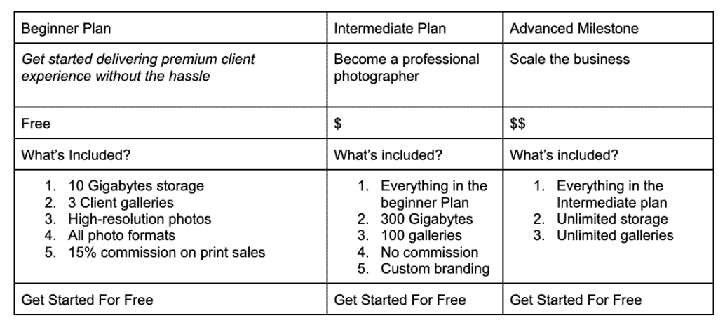
The other items are all feature-related. Those two metrics are good proxy metrics for scaling value. Because the pricing is around a usage function, they are functional value metrics. We can make the reasonable assumption that if a user is using 100+ galleries and 300+ gigabytes of storage, they are getting value from the product. Why else would they spend so much time uploading photos to create galleries?
To help us determine whether we should keep these as value metrics, let’s take them through the value metrics scratchpad:
| Condition | True? |
| It’s aligned with the value that the customer receives from the product | X |
| It’s aligned with the value that the customer receives in the product | X |
| It grows with your customer’s usage of that value | X |
Luckily, both of these value metrics pass the test so we can use them.
Now it’s your turn.
Pull out a piece of paper and jot down everything you think could be a value metric. Once you have the list, run it through the value metric scratchpad.
Value Metric Scratchpad
| Condition | True? |
| It’s easy for the customer to understand | ⬜️ |
| It’s aligned with the value that the customer receives in the product | ⬜️ |
| It grows with your customer’s usage of that value | ⬜️ |
How did your value metrics stack up? Did you find a value metric that works? If not, stop reading this and continue brainstorming new value metrics until you have one that passes these three conditions.
To recap, here are your action items:
- Make a list of your top potential value metrics.
- Narrow down your list by taking each value metric through the value metric scratchpad.
- Choose one or two value metrics.
Pro Tip: Limit your value metrics to one or two metrics. Less is more. Aim to use outcome-based vs. functional value metrics whenever possible, as you’ll align your business’ success with your user’s success.
Yet, even if you’ve outlined your packages and identified the right value metrics, you can lose out on a ton of potential profit if you price too low and miss out on many opportunities if you charge too much.
That’s what we’re going to unpack next.
Phase 3: Determine the price
Price is what you pay, value is what you get. - Warren Buffett
Basing your pricing on market and customer research is one of the best ways to understand how much your customer is willing to pay for your product or service. The model I’m about to share with you is based on the Van Westendorp Price Sensitivity Meter. (I’m not sure how to pronounce “Westendorp,” so we can just refer to this as the “Van West Model” from here on out.)
This is the same model pricing experts at ProfitWell, OpenView, and Simon-Kucher use to help SaaS businesses nail their pricing. (I’m not sharing their proprietary method. This is simply one part of their framework.) One of the most significant benefits of using the Van West Model is that it will help you find an acceptable price range.
Finding an acceptable price range is especially important because we want to avoid two disastrous consequences:
- We set our price too high and lose out on most sales.
- We set our price too low and lose out on most profits (while also hurting our brand, which appears “cheap”).
You can figure out the acceptable price range in three steps.
Step 1: Prepare Questions to Ask
Kyle Poyar, VP of Market Strategy at Openview, suggests an alternative way of using the Van West Model:
While the proper technique involves four categories of questions, I focus on two:
- What the buyer considers an “acceptable” price (good value for the money) and
- At what point would the price start to get “expensive” (they’d have to think twice about buying it).
If the price you were considering is below what an average buyer considers “acceptable,” then you’re leaving money on the table. If the price is above what an average prospect considers “expensive,” then you’ll probably face adoption hurdles and need to work especially hard at proving the value.
In short, if you want to follow Poyar’s advice, you can find your acceptable price range by asking just two questions:
- What would you consider to be an “acceptable” price (good value for the money) for [our product]?
- When would [our product] seem “expensive” (they’d have to think twice about buying it)?
If you don’t have a lot of customers, I’d recommend using Kyle’s method. You’ll get more people to answer your questions, which brings us to our next topic. How do we get people to answer these questions in the first place?
Step 2: How to Ask
The ideal people to ask depends on which package you’re trying to determine the price.
If you’re trying to find out how to price your intermediate package, ask your ideal free users.
If you’re trying to determine your price for your advanced package, ask your intermediate customers.
Who you ask matters more than how you ask.
The reasoning is your ideal users might be willing to pay 10x the rate that your non-ideal users think the product is worth. If you jumble up all the data, you could pick an ideal price range for everyone while missing out on the landslide of profits from your ideal users.
As for how you ask, there are two main ways:
- Survey tools (Typeform, SurveyMonkey)
- Interviews
Either option has advantages and disadvantages. For instance, you’re unlikely to schedule an interview with a customer to ask them only four questions about pricing. I would frame interviews as a way to improve the product and better understand your users’ needs. This way, you’re not pitching it as a pricing interview, and you can ask other valuable questions.
If you decide to go down the survey route, you can make it easy for survey respondents to pick a price range by displaying multiple options.
| Willingness to Pay | $100 | $300 | $500 | $700 | $900 | $1100 |
| When would [our product] seem “expensive” (you’d have to think twice about buying it)? | X | |||||
| What would you consider to be an “acceptable” price (good value for the money) for [our product]? | X |
Giving survey participants a range of responses will improve your completion rate. But your results may be off if you don’t know the reasonable price range for your product. Be careful when picking a price range, or just ask people to give you an exact number for each question. You’ll get fewer survey completions, but your results will be more accurate. Once you have answers, it’s time to do some digging.
Step 3: Determine your ideal price for each package
Now, you’re going to map it out on a graph.
With the Van West Model, your X-axis includes the prices people said they’d be willing to pay. The Y-axis has the percentage of people who selected each price range.
Pay attention to the points of intersection. Between the “Acceptable” and “Too Expensive” price ranges, the Optimal Price Point shows where people consider our product cheap. Don’t charge less than that.
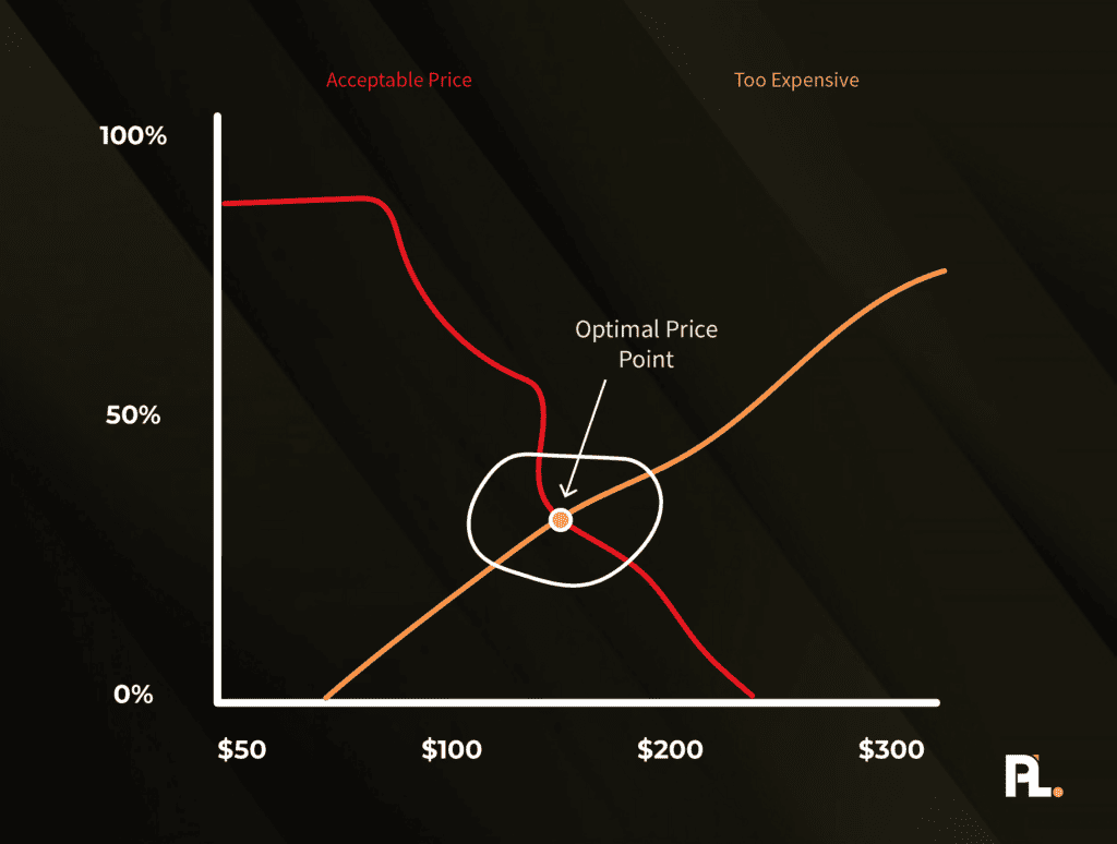
At the intersection of “Acceptable Price” and “Not Expensive,” we find the Optimal Price Point. This is an excellent place to be — the point where people are most likely to buy.
As Price Intelligently notes, you may uncover more than one ideal price range: “Just as with feature analysis, you can then break these numbers down by buyer personas, finding the optimum price point for each potential customer.”
To recap, here are your action items:
- Determine who you’re going to ask your pricing questions to.
- Create a simple survey to send your users.
- Analyze the data to determine your optimal price point for each package.
Now that we know how to find our acceptable price range, it’s time to transfer everything we’ve learned onto the pricing page.
Phase 4: Design the pricing page
A well-crafted pricing page makes it easy to determine what the best plan is to choose in less than 5 seconds.
What are the essential ingredients to a world-class pricing page?
Essentially, you need clearly defined packages, value metric(s), and a price.
Everything else is a bonus.
Before we dig into how to design your pricing page, let’s go through several great pricing pages so you can understand what they do well.
What are Great Examples of Simple Pricing Pages
Before getting into how to build your simple pricing page, let's review a few examples of great product-led pricing pages.
DropBox
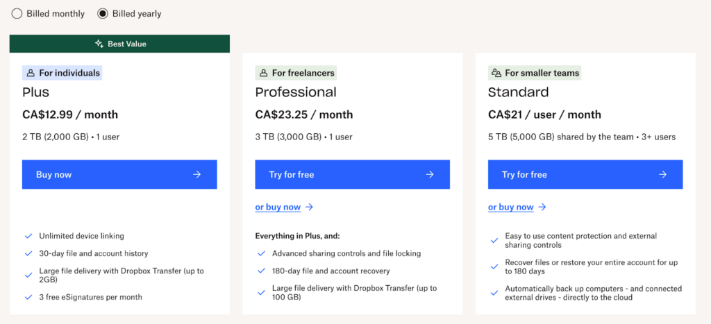
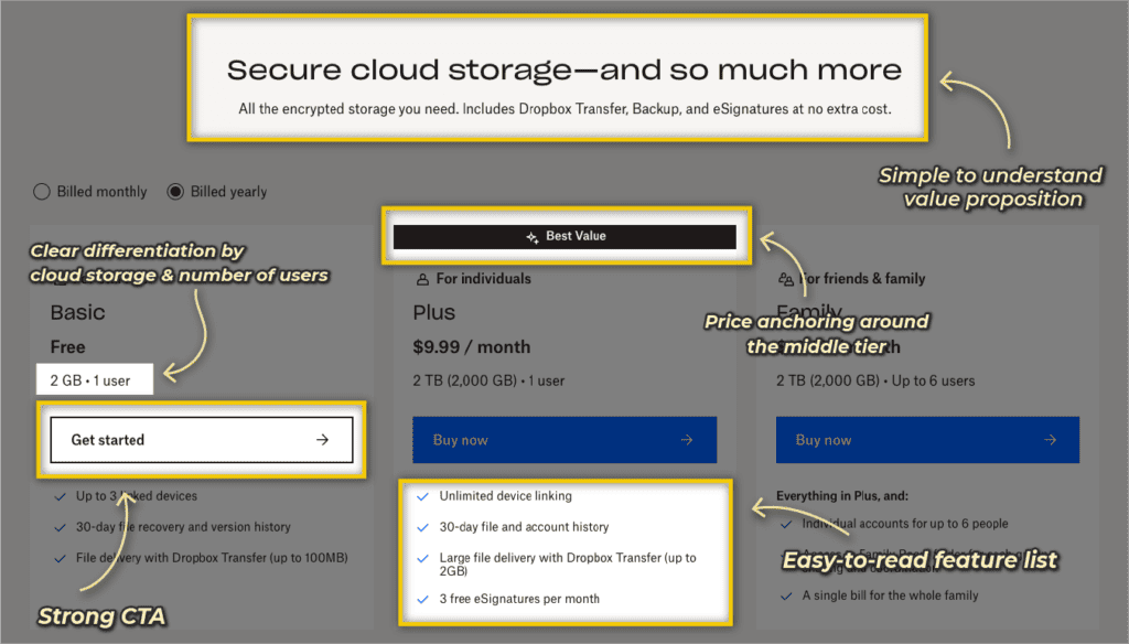
DropBox does a fantastic job of building its pricing page with a mix of both usage and packaging-based pricing. They do this by bundling cloud storage (usage based) with high-value product features (packaging based) to create differentiation between each product tier.
Pricing Page Breakdown
So, what’s so awesome about this pricing page?
- Clear differentiation by cloud storage and number of users.
- Their household tier bundles high-value features to show it is more valuable as the price increases.
- Simple to understand value prop.
- Compelling design pattern:
- Easy-to-read feature list
- Price anchoring around the middle tier
- Highlighting the most popular option
- Strong CTAs
Gusto
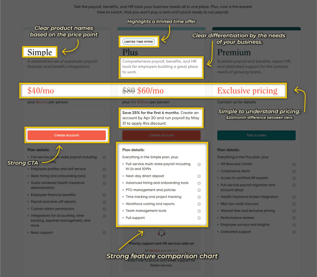
Gusto’s pricing page is a good combination of product-led mixed with a sales-led offering. They have tiers where you can sign up yourself or contact sales.
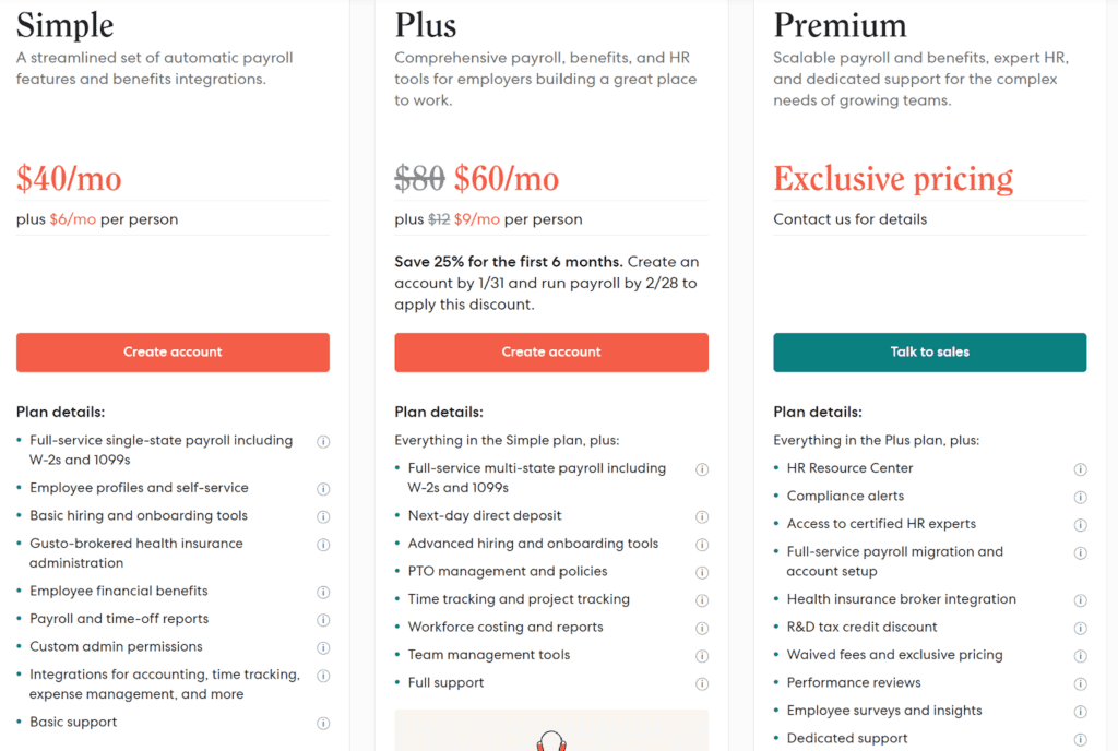
They use flat subscription pricing (packaging-based) mixed in with a number of seats (usage-based), where you charge based on the number of users you onboard on the platform.
Pricing Page Breakdown
So why is Gusto’s pricing page great?
- Clear differentiation by the needs of your business.
- Bundle a set of features that increases as you move by product tier.
- Simple to understand pricing: $20/month difference between tiers.
- Compelling design pattern:
- Strong feature comparison chart
- Highlights a limited-time offer
- Clear product names based on the price point
- Strong CTAs
Xero
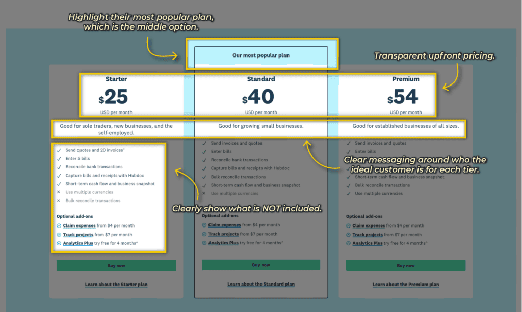
Xero mixes in usage with package-based pricing by capping the number of invoices and bills while also bundling a set of product features.
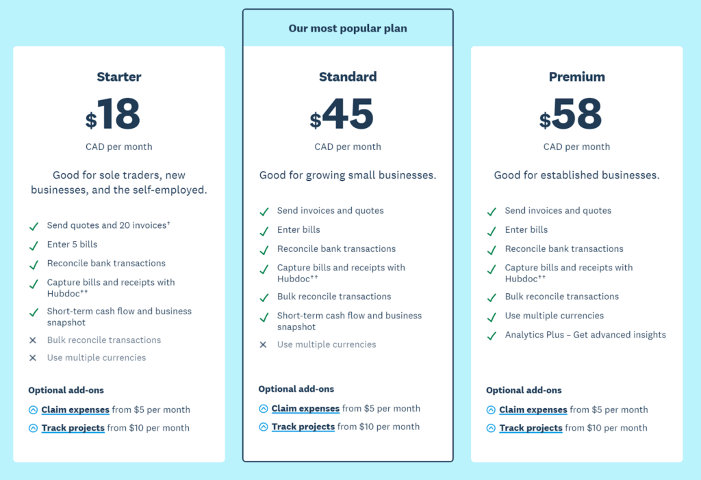
They do a nice job of being upfront with their pricing while also highlighting the optional add-ons. It is clear with their messaging who the target customer is for what product.
Pricing Page Breakdown
Why is it so good?
- Clear messaging around who the ideal customer is for each tier.
- Highlight their most popular plan, which is the middle option.
- Clear differentiation between tiers.
- Clearly show what is NOT included.
- Transparent upfront pricing.
Now that you know what mistakes to avoid and what separates good from great pricing, let’s build out your pricing page in three steps.
First, we’ll start with building your pricing matrix, which is the main course.
Then, we will build out all the other complimentary elements that support your pricing page.
And lastly, we’ll launch it.
Let’s start with Step 1.
Step 1: Complete your pricing matrix.
Your pricing matrix is one of the most important elements on your pricing page.
It should make it easy for users to understand which plan is right for them in less than 5 seconds.
That’s the golden standard.
You can use this template to fill out your pricing matrix.
I’ll walk you through how to fill out each component.
Plan names
Plan names are simple ways of categorizing your packages.
Some common plan names are:
- Basic, Pro, and Advanced
- Free, Starter, Professional
- Starter, Business, Enterprise
Pro Tip: Please don’t get fancy the first time you do this. Just pick one of the three combos and be done. You can easily edit this later and make it more specific.
Action item:
- Decide on your plan names
Once you have your plan names, let’s dig into the milestone copy.
Milestone copy
In Phase 1, we broke down each plan by the specific beginner, intermediate, and advanced milestones, which helped us decide what to include in each plan.
Now, we can simply create a one-liner that indicates this main outcome.
Let’s say your beginner milestone is to craft incredible client experiences.
Your milestone copy could be: “Everything you need to craft incredible client experiences.”
Price
This one is simple.
Just list the price for each plan based on your research in Phase 3.
What’s included
List out the main features you’re giving away that you decided on in Phase 1.
Call to Action
Lastly, list out the call-to-action for people to take the first step.
For most product-led companies, this is typically “Get Started For Free.”
Now it’s your turn to complete your pricing matrix.
Let's build out the other components once you’ve completed your pricing matrix.
Step 2: Build out all complimentary elements
The fun part is building out all the other complimentary elements to your pricing page.
Although you can add many bells and whistles to your pricing page, I encourage you to keep it stupid simple.
To do that, we’re going to focus on adding only four complimentary elements, which are:
- Above-the-fold value primer
- Pricing matrix
- Social proof
- Frequently asked questions
I’ll go through how to approach each of these, but please follow along and build everything out using the full pricing page template.
1. Above-the-fold value primer
If you have completed the Offer Component of the ProductLed System™️, this part will be easy.
You just need to share your main value proposition and then break down why your solution is unique and/or risk-free to sign up and get started while giving a clear call-to-action of the next step.
Your action item is to fill out those three pieces.
Once you have, you’ll list out your pricing matrix.
2. Pricing Matrix
At this point, you shouldn’t add anything new to the pricing page. The only two elements to consider adding are which plan is the most popular to incentivize users to sign up for that plan.
The second element is adding a toggle showcasing the prices between the monthly and annual plans.
Once you’ve added your pricing matrix, let’s pick some high-impact social proof.
3. Social proof
At this stage in a user’s journey, they most likely hesitate to sign up and/or purchase your product. You want to pick one to three testimonials that address those specific objections. For instance, if potential customers typically have objections that state the price is too high, have a testimonial stating how much value they got from your solution in such a short time. Your customers can handle user objections better than you can, as they aren’t biased.
Your action item is to identify one to three testimonials that tackle your top objections and then add them to the template.
Lastly, let’s dig into the common questions.
4. Frequently Asked Questions (FAQ)
What are the top questions you repeatedly hear before someone signs up?
Write them down and come up with a response.
If you don’t know your frequently asked questions, put a simple chat widget like Drift, Intercom, or GrooveHQ to ask your users on the pricing page what questions they have before signing up. You’ll gain a ton of insight into what’s preventing users from signing up, and you’ll be able to identify the most common ones quickly while coming up with the best response to each question over time.
Once you’ve listed out your FAQs, you’ve completed your pricing page!
Congrats!
This is a huge accomplishment, but it doesn’t mean anything until it’s launched.
Step 3: Launch the pricing page
I won't go into many of the specifics here as this process will differ for every business depending on if you’re…
- just launching your pricing page for the first time,
- a well-established business and need to test your pricing updates first, or
- updating your pricing for a large user base
However, what I will recommend is that you start with setting an aggressive deadline that gives your team time to:
- Design the page
- Develop the page
- Update customers and users on the pricing changes
A tight deadline will allow you to ship this pricing page faster so that you can learn it.
Putting it all together
Your pricing isn’t a one-off event. It should be something you consistently re-evaluate and update as it’s one of the most important levers in your business.
Monetization is how you align your company with your user’s success.
To design a pricing page that skyrockets your upgrades, you need to:
- Get crystal clear on your monetization strategy.
- Create packages that align with the stages of your user’s journey.
- Identify value metrics so you can align your company’s success with your user success.
- Determine the optimal price points for each package.
- Design a simple pricing page.
If you can do these five things, you can avoid the most common pricing traps.
Now that you’ve made it to the end of the Pricing Component, please share your top takeaway in the comments below!
To continue on your journey of building your product-led business, be sure to continue building out the other eight components of the ProductLed System™️.
Up next is diving deep into how to set up your Data Component.
Alternatively, if you’d like to work with a coach to implement these components into your business, be sure to check out the ProductLed Implementation Program.
It’s our intensive implementation program where we’ll help you build a strong foundation for product-led growth so that you can scale faster and with more control.
What’s unique about this program is we’ll work with you and your team to implement the proven ProductLed System™️ so that you can scale faster with less stress.
We’ll go through everything we went through today with your team to ensure everyone is aligned on the pricing strategy for your team.


