

Welcome to another product onboarding teardown here at Product-Led Institute. Today we'll be breaking down the onboarding experience of Userlist, a customer behavior messaging platform for SaaS companies.
In this onboarding teardown, I'll be taking a look at four main things.
- Pre-signup
- The signup flow
- The first product experience
- The verdict
Watch Userlist's onboarding teardown from the beginning
I also have Jane Portman, the Co-founder and CEO of Userlist, to shed more light on the user onboarding flow. I interviewed her for the Product-Led podcast.
If you haven't already checked it out, go give it a listen. She explains why they opted for a $9 per month plan instead of a freemium plan. You can find that link in the description or comments below. You can listen to the full episode on Apple Podcast, Spotify, Overcast, Google Podcast, and Breaker.
Get our Product-Led Onboarding™ Checklist for free
Before we get started, I just want to let you know that we've put together a free one-page Product-Led Onboarding™ checklist.

Use it to take stock of your current onboarding experience, and run all your new designs past it before unleashing them on the world! Get the Product-Led Onboarding™ Checklist.
What is Userlist?
Before we go any further, let's first find out what Userlist is. Here's how Jane explains it:
Userlist is a customer messaging tool for SaaS, and we started out two and a half years ago. We started with just doing email automation, but then we recently added in-app messages to the mix so you can pick the right channel for each message. There is a ton of awesome tools out there you can use, so the special sauce is that we think that we know what SaaS founders need specifically, so this is built just for them.
After taking a look at the homepage and pricing page, I love what Jane said, that Userlist is built specifically for SaaS founders. As you'll soon see, this focus really carries through the copy in an excellent and brilliant way.
1. Pre-signup
As we take a look at the homepage and pricing page, I love what Jane said that Userlist is built specifically for SaaS founders. As you'll soon see, this focus carries through the copy.
Let's jump right into the homepage.

The headline reads, "Behavior-based customer messaging. Perfect for your SaaS." The text below reads, "Onboard and engage your SaaS users with targeted behavior-based campaigns. Choose the right channel — email or in-app messages — to deliver the right information when your users need it the most."
I love this! There are a few things that make this copy stand out.
First, they emphasized not just what Userlist is, but how it can help SaaS founders. One of the most common mistakes made by businesses of all sizes is a failure to recognize that you can't target everyone with your product. Seth Godin said it best, "Everyone is not your customer," because when you speak to everyone, you speak to no one. Userlist is not for eCommerce businesses. It's not for media companies. It's for SaaS.
- They emphasized not just what Userlist is, but how it can help SaaS founders. One of the most common mistakes made by businesses of all sizes is a failure to recognize that you can't target everyone with your product. Seth Godin said it best, "Everyone is not your customer," because when you speak to everyone, you speak to no one. Userlist is not for eCommerce businesses. It's not for media companies. It's for SaaS.
- They focused on the jobs-to-be-done. I expected this as Claire Suellentrop is a big proponent of the Jobs-To-Be-Done framework. This framework highlights how customers buy a product to solve a problem, not for the product itself. It describes the primary goal users are trying to accomplish with your product.
For a customer messaging tool, the problem it solves for SaaS founders it to "onboard and engage SaaS users," and "deliver the right information when your users need it the most."
The lesson here is to talk more about your customers and their problem rather than how sexy your product is. Don't talk about how your product uses AI, machine learning language, blockchain, or whatever is the hot tech of the day.
User onboarding is not about teaching people how to use your tool. It's about introducing them to a new and better way of doing things to solve a problem. Userlist's behavior-based customer messaging tool helps SaaS founders "onboard and engage your users."
Finally, the button copy is descriptive and avoids any confusion. The button copy reads, "Start Free 14-Day Trial."

You're not signing up for a free account. You're signing up to try Userlist for free for 14-days.
Button copy is crucial in providing users a clear expectation of where that button will take you or what it'll do. Without any context, button copy like, "Next," "Continue," or "Let's do it," might not be helpful and could even cause users to hesitate in clicking the button.
It's not the case here. Props to the Userlist team. ????
To speed things up so we can focus more on the signup flow and first product experience, let me briefly go through the rest of the homepage.
Overall, it is well done. They carry on all the good things we've seen above-the-fold, focusing on the jobs-to-be-done for SaaS founders. They've called out their target customer again in the logos section, which reads, "Trusted by founders around the world."

I'm not familiar with any of these companies. But, a quick LinkedIn search shows that most of these companies have less than ten employees, except Branch, which has about 400 employees. As we'll see on the pricing page in a few seconds, Userlist is quite affordable for small startups compared to other messaging tools.
Right above this is an image of Userlist in action for an imaginary SaaS company, sparkle.io. Interestingly enough, when you go to sparkle.io, you can see that the Userlist team created this imaginary photo editing app as a demo example. I love this easter egg!
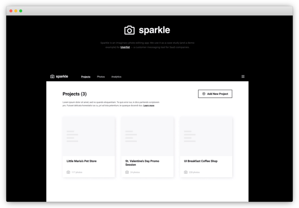
The image on the homepage shows how you can use Userlist to send a welcome email and in-app message to new users. It reads, "Welcome to Sparkle, Dear friend, welcome on board! It's Jeremy, the founder, on the line."
The next part is the only criticism I have about the homepage. It reads, "Loren ipsum dolor sit." This is a Latin text that some use as dummy text or filler words in their design.

It looks like this part is incomplete because of these filler words. I would have changed this to look like a real welcome message.
That's it! The rest of this page is outstanding. I particularly appreciate the two testimonials from the founders of startups who re-emphasized the value of Userlist. One reads, "Userlist is a must-have SaaS tool," and that it's "well-designed and not bloated like other products."

Let's move on to the pricing page.
Watch Userlist's onboarding teardown starting at 6:55 – The pricing page
The pricing page
The pricing page's headline reads, "Pricing plans. Simple, predictable plans. All features available starting from day one. Perfect for growing your SaaS."

Did you notice what they did here? First, they addressed two objections right up front.
- Will the plans have complicated add-ons and pricing tiers? "No, our plans are simple and predictable."
- Will the free trial includes only some of the features? "You get all features available from day one."
Second, they reiterated who Userlist is for – growing SaaS companies. They've mentioned Userlist is for SaaS companies ten times between the pricing page and the home page. They certainly want to drive home this point.
On the plan comparison table below, they certainly deliver on the promise that their plans are simple.

There are four plans – Starter, Basic, Growth, and Scale. There are only two differences between the plans – the number of users and the type of support (standard or premium).
The Basic plan stands out from the rest. It juts out of the table and is the only one with a blue font.
These prices are quite affordable for startups. It starts at $9 per month and scales up to $229 for up to 20,000 users.
For SaaS businesses with more users, there's a not below for this, which reads, "Need more? Get in touch to discuss your custom High Volume plan. All plans come with a free 14-day trial period. Your plan will be calculated automatically based on the number of users by the end of your trial."
It's nice to know that the 14-day trial period doesn't have any limitations on the number of users.
To speed things along, let's click on "Start Free Trial Now."
2. The signup flow
Watch Userlist's onboarding teardown starting at 8:39 – The signup flow
The signup page looks minimalistic and straightforward, like the Userlist homepage.

The headline reads, "Let's Get Started." Right below this, it shows that this is step one of three in the signup flow.
Progress indicators like these are a great way to keep impatient new users like me motivated to complete this process. It promises a reward or indicates the user how close you are to finish the onboarding process.
They ask for three pieces of information on this page – your full name, email address, and password.
What's interesting is that the password field doesn't have any requirements. We're going to test shortly if a simple password like "abc," will work.
When asking new users for passwords, it’s better to state outright your password requirements. Do I need at least one digit or at least one capitalized letter? I don’t know.
Imagine how frustrating it can be to enter a password and get rejected! No one wants to be rejected!
Right below the button here, it reads, "You'll need to provide your card details before starting your trial. This helps us prevent spam and provide a better onboarding experience for you."
Though I'm not a fan of asking users for a credit card upfront even before you try the product, the copy here is impeccable! First, they let you know right on the first step that you need to put your credit card to start a trial, so you're not surprised when you get to that page. Second, they provide a reason why they ask for a credit card for a free trial, to "prevent spam and provide a better onboarding experience."
I got a chance to ask Jane more about this during my chat with her:
Anyway, let’s fill in the fields here and click on, “Create New Account.” On to step two!

The headline of step two reads, "Company Details." Right below this, it reads, “These company details are necessary for sending messages to your users. You can always change them down the road in Settings.”
Once again, they provide the reason why they’re asking for the information on this page, which ties back nicely to why people signed up for Userlist in the first place.
On this page, they ask for your company name, website, and company email address. I'd be confused about why they're asking for my email address again if they didn't provide clues that this is different. It's the email address that will show up in the "from" field. They give an example, "support@sparkle.io."
The button copy here reads, "Continue." I'm not generally a big fan of a vague button copy like this. In this context, it's clear clicking this will bring me to the third step. I've already gone through this setup process. I know the third step is to fill in the billing details. So, a better button copy would be, "Continue to Billing Details."
Onwards! Fill in the details here and then smash that "Continue" button.

The final step is to fill in my billing information. What I love here is that the copy addresses objections right away. It reads, "We'll charge your card only after your free 14-day trial, with a friendly, heads-up notification." The last part is so important, "friendly, heads-up notification."
There are some apps (I'm not going to name which ones) that hope you just forget you signed up for this free trial. Fourteen days later, you see a charge on your card.
That’s not cool.
But, Userlist ain't like those apps because you'll get a friendly reminder, not one that nags you or guilt-trips you.
The text here goes on, "Your plan will be assigned automatically based on your number of tracked users (see our pricing page for details)." I'm sure they'd let you know how much they would charge you in their friendly reminder.
One thing that I don't see here the reason they're asking for your credit card. I know they mentioned it in the footer of step one, but that's easy to miss. It's good to reiterate again on this page.
The text below the credit card field reads, "Your card details are safe with advanced SSL encryption and Stripe security."
I'm going to assume that since they're targeting SaaS founders, they'd know what "SSL encryption" and "Stripe security" means. Stripe is a popular tool to allow SaaS companies to accept recurring charges.
Let's fill in our credit card information. Then, let's click "Finish Setup."
3. The first product experience
Watch Userlist's onboarding teardown starting at 13:16 – The first product experience
Welcome to the first product experience of Userlist. They don’t just drop you on to the product. They first show a welcome message that reads, “Welcome to Userlist. Before getting started, watch the friendly welcome video from the founders. Should take you less than a minute. Or skip it and jump straight to business!”

I love this video. It’s personal, warm, and inviting. All three co-founders make an appearance in this video:


Many products miss this step. Imagine walking into a party and the host not greeting you and showing you around. You’ll feel snubbed and hurt!
Welcome messages also set the tone of the kind of relationship you want to have with your customers. Personal videos like the one from Userlist imply that they’re personally involved in your success as a SaaS founder.
After watching the video, you end up on the Userlist dashboard. Since you don't have any user data, it's empty. In the middle, they provide instructions, "Let's get your user data flowing! Find all the technical details in our integration guide, and make sure to check out planning worksheets before you get started."

Clicking on the integration guide, you’re directed to the help article “Getting Your User Data into the System.” They provide instructions on how to connect your app to Userlist using Segment, Ruby on Rails, Javascript, and PHP.

These instructions would be more helpful if they were linked directly from the Userlist. Look at how FullStory shows how to connect your app to their product:

From my experience, setting up integrations like Userlist takes some time. I appreciate that they’ve provided planning worksheets to help you build an in-app and email communication strategy.

If you think that Userlist’s onboarding is very minimal, that’s by design. Jane wrote an article explaining Userlist’s five onboarding principles:
- Inspire, not instruct. Our experience shows that an inspired user gets things done without many prompts.
- Tooltips and tours aren’t too effective. They’re often treated as interruptions. Instead, we should be focusing on thoughtful blank states and overall usability of the product.
- Enforcement and monetary rewards yield negative results. Jane's goal at Userlist is to promote genuine interest and goodwill instead of rewarding users with discounts or extra days.
- Treat others as you want to be treated. This means less email in the modern world but more thoughtful content available at the customer's fingertips.
- Build a personal connection. Showing a warm welcome to our users and maintaining that connection through thoughtful, personal support has worked well for the Userlist team.
I like how they’ve really thought this out. I don’t think a minimalistic approach works for every product. But, it works for Userlist.
4. The Verdict
Watch Userlist's onboarding teardown starting at 16:24 – The verdict
Overall, I thought Userlist's user onboarding was well-thought-out and designed. I'd give it an A.
What Userlist did well
Here are the four things that I thought Userlist did remarkably well during the user onboarding experience:
First, they’ve clearly described what Userlist is and who it is for.

One of the most common mistakes made by businesses of all sizes is a failure to recognize that you can't target everyone with your product.
Seth Godin said it best, "Everyone is not your customer," because when you speak to everyone, you speak to no one. Userlist is not for eCommerce businesses. It's not for media companies. It's for SaaS. This increases the quality of the trial signups.
Second, they let users know upfront that a credit card is required to signup for a trial. I've said this before, and I'm going to say it here, surprise is the greatest enemy of user onboarding, especially if you're asking for a credit card.
For Userlist, they had this information on the pricing page and the first page of the signup page, where it reads, "You'll need to provide your card details before starting your trial. This helps us prevent spam and provide a better onboarding experience for you."

I love how they provided a reason why they ask for a credit card for a free trial, to "prevent spam and provide a better onboarding experience."
Third, they welcomed new users with a video from all three founders.
One of the user onboarding principles that Userlist applied for onboard new users is to build personal connections. You can't get more personal than a video from the founders of the company. Userlist's welcome video is warm and friendly, which puts a face behind the company.
Fourth, they provided clear next steps as soon as you log in to the app for the first time.
After watching the welcome video, you’re presented with a thoughtful empty state directing you to instructions to integrate Userlist to your app. They’ve also included a planning worksheet to help craft your in-app and email communication strategy while you wait to get Userlist up and running.
What could be improved
In terms of what could have been better, I have to nitpick to really find anything. These two are things that could have improved the onboarding experience.
First, they should let new users know the password requirements for Userlist.
It seems like they accept any length of passwords. For some founders, this might be a major concern since their customer information is valuable. If they do have password requirements, it's better to list out the requirements, so users aren't left guessing. It can be frustrating entering a password and getting rejected for not meeting the requirements.
Second, though I appreciate how thoughtful and minimalistic Userlist's user onboarding is, I would have moved the instructions from the Userlist support pages to the app.
FullStory does this well by giving new users three easy ways to install their app. The first option is the easiest and requires no code via Google Tag Manager.
For Userlist, the easiest way to integrate it would be through Segment. Finally, FullStory provides an option to email the instructions. Doing this eliminates some friction from getting non-technical users to forward the instructions to their technical team.
Closing thoughts
What do you think? Did I miss something that HEY did really well or something they did that could have been better? Let me know in the comments below. I reply back to all comments. ????
Get our Product-Led Onboarding™ Checklist for free
Before you go, we've put together a free one-page Product-Led Onboarding™ checklist.
Use it to take stock of your current onboarding experience, and run all your new designs past it before unleashing them on the world! Get the Product-Led Onboarding™ Checklist.
Learn more about our onboarding workshops
Finally, I want to let you know that Wes and I do Onboarding workshops for select companies. In those training, we'll walk you through a battle-tested onboarding framework that will help you create onboarding experiences that convert without resorting to short-term, sales-y tactics.
Through our history working on onboarding experiences for companies like Grow.com, Dynatrace, Outsystems, and more, we've seen inside more SaaS onboarding experiences than anyone else on the planet.

You can find out more about our onboarding workshops at productled.com
That’s it for now! Until the next onboarding teardown.


