At Intercom, our success took us from a single simple product to a broad product range. That’s great news for us, but it meant that, inevitably, customers now find it harder to navigate the product when they first join than they might have in the past.
That sent us back to the drawing board.
We had to establish what it is that new customers want when they first come to our product and how we can effectively demonstrate that we can do that to these new customers.
The experience that we shipped resulted in 2x the activation rate for some customers who initially struggled with the product.
I want to share some of those learnings with you and how we distilled them into four key principles for great new user onboarding.
Defining onboarding and first-use experience
Before we get into the details, I want to make sure we’re all on the same page with what we’re talking about here.
The process of onboarding is the process of moving someone who is a brand-new user all the way to a highly engaged power user.

This goes way beyond click-through tutorials and FAQs, onboarding is a deeper, longer process towards achieving value.
At the very beginning of onboarding is the first-use experience – those first few clicks in your product or even on your signup page.

Who is a first-use experience for?
In 1898, American sales pioneer E. St. Elmo Lewis created the AIDA model to describe how customers buy. The AIDA model described four steps that buyers follow when accepting a new idea or purchasing a new product:
Attention, Interest, Decision, Action (AIDA). The framework was the foundation of the various sales frameworks and marketing funnels that we use today.

You have to get your prospective customers’ attention, you have to drive interest for them by showing them the benefit, then they’ve got to decide to purchase your product, and finally they act and buy it.
This idea has persisted because, honestly? It’s accurate.
… Or, rather, it used to be.
Software and digital products don’t follow this pattern.

What happens in SaaS is more like AIAD:
You get someone’s attention, you build interest, but then they take action.
This really flips the funnel – people that have signed up for your product haven’t actually decided to buy it, let alone use it. All they’ve done is expressed an interest.
The whole purpose of free trials and ease of getting started with consumer products is to drive a customer really quickly to have a product experience. That product experience is what drives them to make the purchase decision.
This is why it’s crucial you make it easy and effective for your customers to understand how they’re going to benefit from using your product.

For more complex products, the shortest path to value… isn’t short.

What makes a great first-use experience?
A great first-use experience is one that quickly proves to new users that your product does the job they are hiring it for.
There’s a lot to dive into in that definition, so I want to break it down into some more manageable steps and the principles behind them.
Principle 1 – Focus on jobs, not features
This is such a common mistake – SaaS companies try to sell their product based on its features, rather than what those features do for users.
This comes back to the traditional concept of Jobs to be Done. Your customers hire your product to do a job – they don’t want a drill bit, they want a hole in a wall.
By focusing on the job your product does, it makes it far easier to build and iterate your product – and its onboarding sequence.
If you build your onboarding with this in mind, following a process I call Value-Based Onboarding, you start with the Job to be Done. Then, you look at the features that help that job to be done. Then, you talk about how your product delivers on that.
Let’s look at Intercom’s user map as an example. In a sentence, what the user map does is let our customers visualize where in the world their users are.
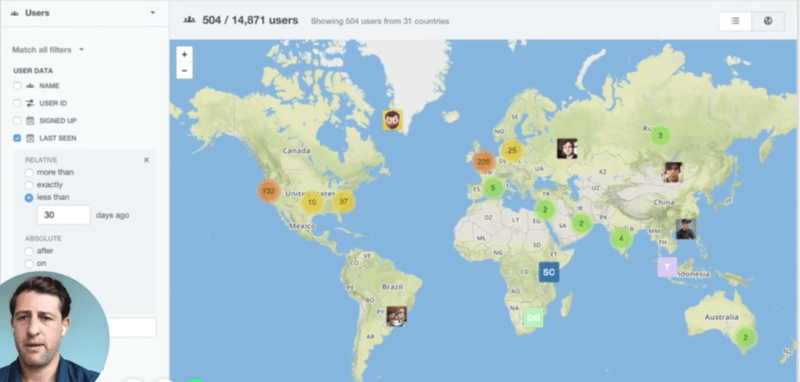
If we think of this map in the same way we think about Google Maps, then when we onboard new users to the map we might focus on the typical map features such as the ability to zoom and pan around the map.
But that won’t be effective. Because the job that this feature does is less like a map and more like a billboard. Our customers like this feature because it allows them to show investors, prospective customers, and even random people on twitter how many users they have.
To onboard new customers effectively, we should talk about the features that make this map great at showing people how many users you have. This is not pan and zoom, but the way it looks great with live animations, the way we make it easy to share on Twitter, how we allow you to hide sensitive information.
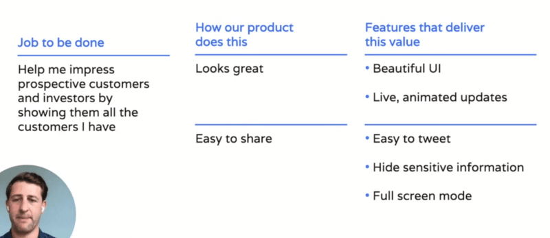
When we know the job that our customers are hiring our product to do, it bring the benefits of the product into sharp relief. Great onboarding engages new customers because it highlights the features that really deliver on these benefits that customers are seeking.
Principle 2 – Onboard everybody
At Intercom, one of the ways our customers use our product is conversational marketing (also known as website lead generation).
Onboarding for a lead generation feature should be simple, right? Show the customer how many more leads they’ll get and the revenue those leads will generate.
Not exactly.
We need to consider who exactly is buying our product. Because each of these buyers has slightly different needs:
1) Marketing Leader – they want to generate more leads in an on-brand way
2) Sales Leader – they want to grow their pipeline and increase productivity
3) Sales Rep – they want their commission!
As a result, it’s imperative that you create different onboarding sequences based on user profiles and needs.
Principle 3 – Show (if you can’t do)
There are many ways we can prove things to others. The least compelling way to prove something is to tell people. Better than telling is to show – to demonstrate an action within the product that illustrates its use and benefits. Best, though, is to ‘do’ – do it for them!

SaaS products are, sadly, usually too complex to simply ‘do’ the proof part. If you can’t ‘do’, you’re better to try and show.
If you’re not sure what or how to show, find the best ways that you can make the core benefit of your product feel real and tangible to new users. You’re looking for the “Minimum Viable Aha!” - making the results feel close enough to real that a new customer gets what’s possible.
Airbnb does this beautifully. From a host point of view, Airbnb is a complex product. Getting set up to offer a space on Airbnb involves plenty of work and hoops to jump through: writing a listing, taking photos, setting up a calendar.
To motivate prospective hosts throughout the process, Airbnb focuses on why people want to host a space: to make money. And while Airbnb can’t just give prospective hosts income, they do the next best thing - they help prospective hosts visualize what it’d be like to make that money.
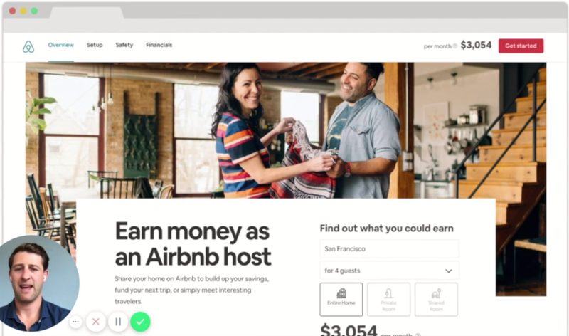
In about two clicks on their host landing page, I can get a personalized estimate of what I could earn from being a host. It’s so much more compelling than the copy to the left which tells me I can “Earn money as an Airbnb host” because it shows me a precise-seeming estimate of what I could earn.
Principle 4 – Remove non-essential friction
Getting started with a new product is hard enough, and so a great onboarding experience doesn’t add any extra unnecessary friction.
A simple test of the experiences you’re giving new users to test whether it’s essential – ask:
1) Is this quick and easy?
2) Does it help to prove?
If the answer to either of those is no, then you have two choices: remove that step or simplify that step.
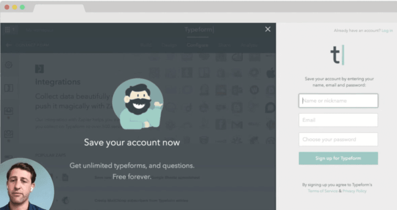
Typeform are a great example of removing friction. Many products require new users to create their account, setting passwords and nicknames and so on before they could create their survey.
None of this is especially simple, nor did it deliver any proof of value. So, Typeform removed account set up from their onboarding sequence.
Now, new users only have to go through that process after they create their survey and choose to save it.
If you’re looking to simplify, consider this approach we took at Intercom with our Custom Bots (customizable website chatbots).
This is a fairly complex product to set up – you need to figure out a whole logic tree for what the bot should say in various situations and what should happen based on that.
But process of building out a detailed tree doesn’t help prove that the feature works – but it does add friction.
So, we offer users the choice. They can set up manually, or they can follow one of two templates.
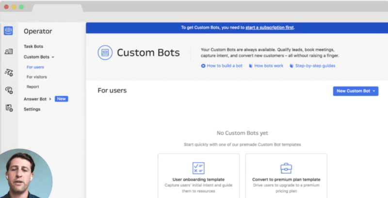
We studied how our existing users use this feature (always a great idea for product and feature development) and found the two most common use cases were for onboarding and premium plan conversion.
We go from the user having to do all the ideation and creation, to clicking a single button and having a template set up and ready to go.
As a result of this change, we saw twice as many customers creating Custom Bots.
Focus on these principles to create great user onboarding sequences
These four principles have helped Intercom create, streamline, and improve our various onboarding sequences.
1) Focus on the jobs, not features
2) Onboard everyone
3) Show (if you can’t do)
4) Remove non-essential friction
Follow these tips and I think you’ll find you’re able to create really compelling first-use experiences.
I’d love to hear how you get on, so keep me updated over on Twitter!


