This is the ultimate guide to user onboarding.
I'm going to share the same tactics and strategies I use to help SaaS companies launch and optimize million-dollar user onboarding funnels. (Here's where you can check out examples of the best user onboarding experiences).
You’re going to see tested strategies that are working right now. The entire guide will take you well over 80-minutes to read and months to implement.
So if you’re looking to up your user onboarding game this year, you’ll want to bookmark this guide.
Don't have time to read this whole guide right now?
No worries. Let me send you a copy so you can read it when it's convenient for you. Just let me know where to send it (takes 5 seconds)
If you're looking to dive deep into user onboarding, check out the new book I wrote with Ramli John called, Product-Led Onboarding™️: How to Turn Users into Lifelong Customers. It's a 6-step framework designed to help you build the best onboarding experience on the planet.
First off, what is the goal of user onboarding and a funnel?
Although counterintuitive to what many people think, the goal of user onboarding is to NOT help people become better at using your product.
The goal of user onboarding is to help people become better at what your product enables people to do.
For Slack, this is communicating internally.
For Canva, this is creating beautiful graphics seamlessly.
For CrazyEgg, this is understanding how people use your website.
Why user onboarding is a means to an end
The only thing your user onboarding needs to focus on is helping new users experience what your product enables them to do.
Take Google Adwords, for instance, one of the first things they do in their user onboarding is help you set up your first advertisement. It makes sense, people who sign up for Adwords want to generate more leads for their business. Creating an advertisement brings you one step closer to hitting your lead targets that month.
If Adwords had spent all their time simply walking you through the entire product and showing you all the bells and whistles within the platform, you’d (actually) be worse off.
To be great at user onboarding you need to understand the big context behind why people would even consider using your tool. If you don’t know why people use your product, be sure to read this article first.
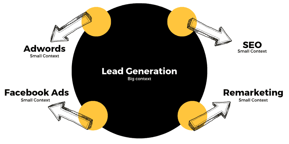
Let's say your goal is to generate 1,000 leads for your business this month, you might need to use Adwords, Facebook Ads, SEO, and remarketing in order to hit your goal.
As such, each of the platforms needs to help your lead target goal. As you can see in the graph below, each of the tools and channels can fit into the big context of lead generation.
Now, back to you, what big context does your product fit into?
Is it lead generation? Is it getting more fit? You tell me!
This may sound straightforward, but many businesses don’t know the big context behind their product. As a result, many businesses unknowingly force unnecessary steps onto users in the customer onboarding process.
It’s easy to do. If you don’t know the key outcome you want to drive your users to, what’s stopping you from showing users unnecessary features that “might be helpful”?
This happens to the best of us whenever there is confusion around what outcome to guide new users towards. Even non-trivial steps like activation emails can put a significant dent in your free trial to paid conversion rate if you’re not careful.
User Onboarding Mistake One: Activation Emails Kill Your Onboarding Flow
Let me tell you a story, I was having a conversation with Christopher the founder of Snappa who, at that time, required every new signup to activate their email address before logging into the product. This is what the activation email looked like.
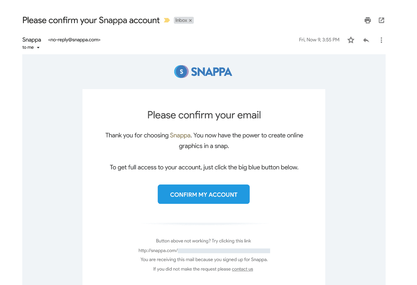
Requiring users to activate their email is common practice for many SaaS business. However, what Christopher didn’t realize was that 27% of all his signups never ended up activating their email address.
In fact, these new users simply signed up and never touched foot in the product, ever.
Once we did some simple math, we realized that if we removed the activation step from the beginning of the onboarding flow, we'd be able to generate a 6-figure ARR outcome.
In less than a week, Christopher's team removed the activation step right at the beginning of the onboarding process and we started to see his MRR grow substantially.
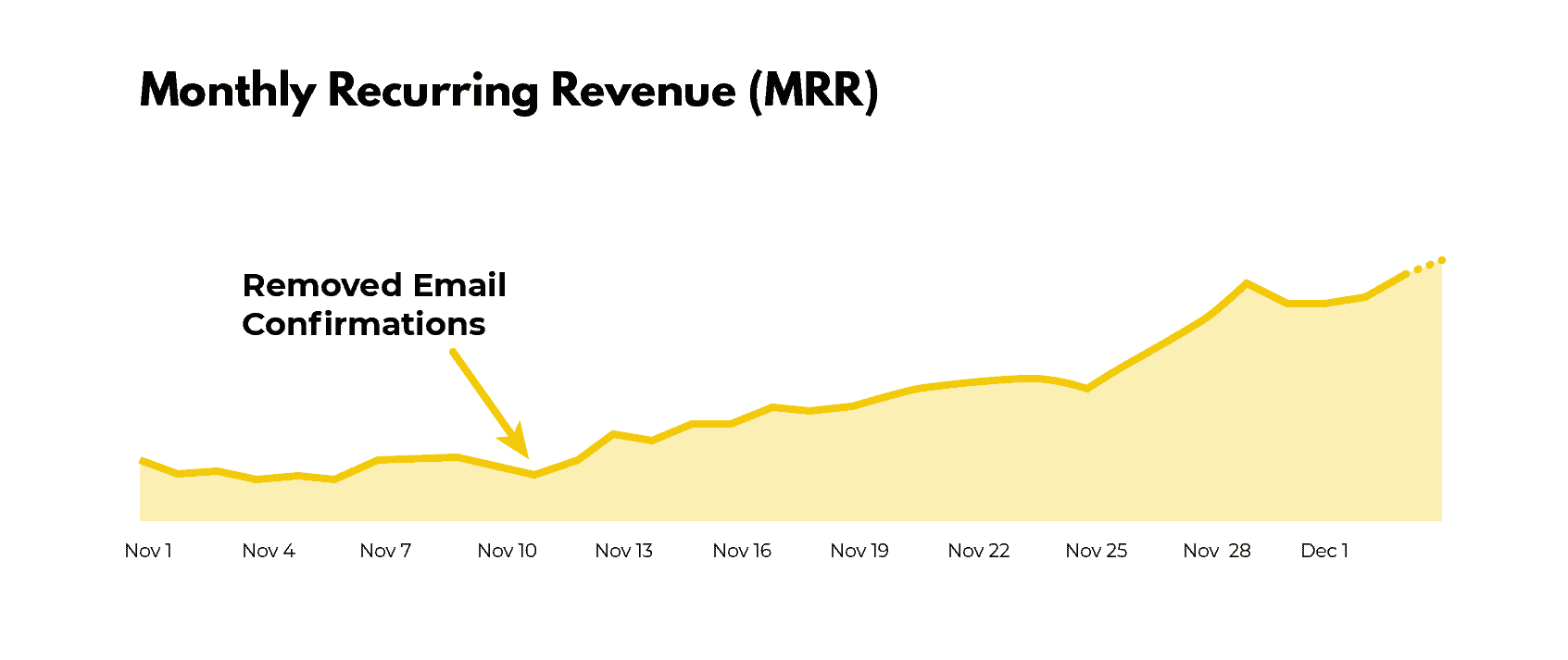
For Snappa, just changing when users were required to activate their email address resulted in a 20% boost in MRR.
For those of us that still require new users to activate their email address before logging into the product, check your product analytics and let me know what percentage of new signups never touch foot in your product.
This can be very sobering as you'll most likely see that 10-30% of your new users never touched foot in your product.
This should come as no surprise. The email activation step is comparable to telling a kid who just waited in line to ride a wooden roller coaster (your product) that he needs to go to the main ticketing booth (his email platform) to re-verify his ticket to make sure things “check out.”
It’s frustrating and that kid is very likely to check out another roller coaster on his way to the ticketing booth. If your wooden roller coaster isn’t the main attraction in the park, you might never see that kid come back. He might just discover that there are more modern roller coasters that don't require ticket reverification. Gasp!
Now, we’re not kids anymore, but how often do we get distracted when checking our email? We are human after all. If we see a more interesting email when we login, we’re going to click on it and most likely forget about the activation email.
To fix this problem, all you need to do is require second-time users to confirm their account. That way when people first sign up for the product, they’re able to use it immediately and experience meaningful value. In other cases, I also recommend using a simple banner in your application to remind users to activate their account during their free trial. How you go about this depends entirely on your business. So, please, rethink when you require new users to activate their email.
One thing I hope you’re not thinking is that you should eliminate the email activation step altogether. Verifying emails is still important but you should ask yourself this question, "when is the best time to ask new users to activate their account?"
Next up, if you think onboarding starts in the product, please think again.
User Onboarding Mistake Two: User onboarding does not start in the product
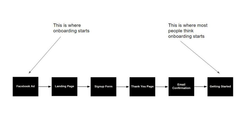
User onboarding starts the second someone interacts with your brand.
As such, acquisition plays one of the most critical parts in user onboarding.
For instance, if your product offers video hosting but people are signing up thinking it’s a video marketing agency, they’re doomed from the start — no wizard or product tour can save that. Period.
Oftentimes, it's not quite this black and white. One of my coaching clients was the founder of an SEO tool that had next to no users convert into paying customers. From his product data, you could see that new users were using the product once they signed up and experiencing the aha moment in the product, but they never upgraded. From the data, it would look like this was an activation problem, but, when we looked at who actually paid for the product we noticed a big clue...
The only people that upgraded were consultants and agencies as they used the product multiple times and got ongoing value out of it.
The problem with the business owners targeting was that the majority of users signing up for his product were solo business owners who only wanted to audit their website once, make the changes, and then never use the product again.
In hindsight, this seems like an easy problem to fix, but, believe me, when you're running the business it's often easy to miss.
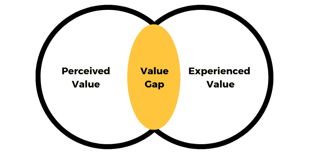
One of the big problems with thinking that user onboarding starts as soon as you enter the product is that you need to create an experience that delivers on people’s perceived value of your product.
For instance, if you see a Facebook ad promoting accounting software that takes less than 30 seconds to sign up, you’re going to have a hard time spending 30 minutes setting up your account. In this scenario, you experience a value gap. You thought the product could solve your accounting problems in 30 seconds or less when, in reality, it took you well over 30 minutes to set up.
This brings us to our second point. You need to keep your promise. Or else, a value gap is going to eat your conversions.
User Onboarding Mistake Three: Having a Value Gap
We all have that friend or family member who exaggerates their experiences. After a while of hearing them talk, do you find that it is hard to trust what they have to say?
I can hear your "yes" from a mile away.
The same thing applies when selling your software solution.
What we promise in our copy is the perceived value.
What we deliver is the experienced value.
Ideally, the perceived value lines up exactly with the experienced value like in the graph below.
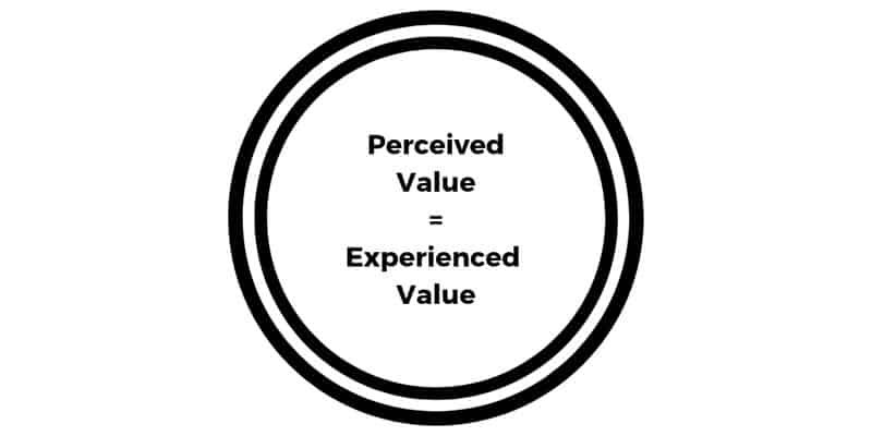
But, this is rarely the case. Most companies struggle with overpromising and underdelivering. That’s one big reason why free trial and freemium models are booming.
People want to see for themselves if an application can do what it promises. If you keep your word, this is a great way to build trust. If not, your users will lose trust in you and your value gap grows bigger.
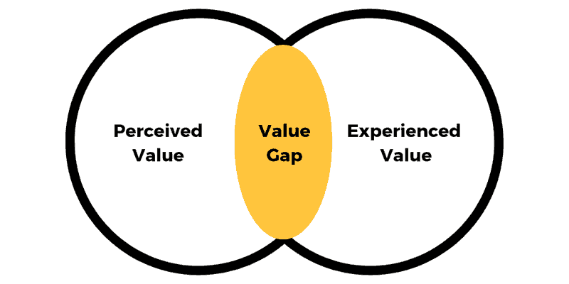
If you want to identify value gaps in your organization, I’d recommend asking your support team for some pointers.
Oftentimes, support teams are sitting on a treasure trove of common complaints that can tell you how big your value gap is when people sign up.
Even if you have an outstanding product that delivers on its promise, many new users might not be able to experience the product’s value unless you structure a quick win for them in the product.
This quick win is the light at the end of the tunnel that shows people just a glimpse of what the product is capable of. It brings them in. It shows them why your solution is powerful. And, most importantly, it gives them a damn good reason to come back.
User Onboarding Mistake Four: Not Delivering a Meaningful Quick Win in Your Product
Have you ever signed up for a product that had a walk-through like the picture below that went through the entire product?
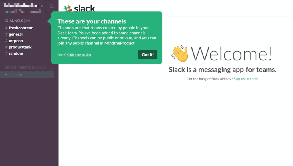
It might have gone something like this:
- Hey, Welcome to the product!
- Here’s a feature
- Here’s another feature
- Why look at that, here’s another feature, my friend
- And it just kept going on and on until you explored every inch of the product
Have you experienced the never-ending walk-through yet? If not, it's only a matter of time.
Often when companies use tooltips to walk through the entire product experience, it can feel like a real estate agent is showing you around a home that you're contemplating buying. The agent wants to show you around and point out certain things that you might not have otherwise been aware of. This is extremely helpful so that you can make an informed buying decision about the house.
But when it comes to software, the "real estate agent strategy" can hurt your conversion rate more than it can help.
Your user onboarding should not be like a real estate agent showing you a home you’re about to buy. We are not making the biggest financial investment in our life when we sign up for a free trial or freemium model.
A free trial or freemium model’s whole point is to show you the value of the product fast so that you see if the product is a good fit for you.
A free trial or freemium model should be like a fitting room at a retail store. It should give you a quick sneak peak of what it will be like with the product. Does it fit your needs or not?
The sooner you help people experience a meaningful quick win in the product, the sooner your users will come back to your product and eventually turn into customers.
The problem, however, is that most businesses treat their users like they’re customers and it’s hurting their free to paid conversion rate.
User Onboarding Mistake Five: Onboarding Users like They’re Customers
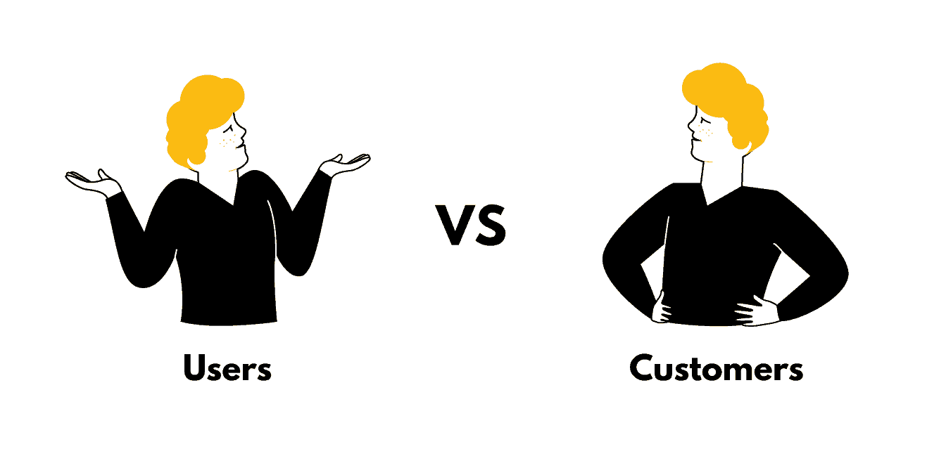
The problem is the terms: users and customers often get used interchangeably when in fact they are distinctly different. The situations of the user and customer are entirely different. Their motivations are different. Their abilities are different. When you look at it, they're on the opposite ends of the scale. Users don't have the time and patience to consume everything about your product. They'll cozy up with the first tool that shows them progress and value with ease. But customers need more. Left unsupervised, they will stagnate and churn. You need to keep them moving forward with your product or they'll start to look elsewhere for their next “aha” moment. Thus, onboarding users like customers, and vice versa, is not a smart thing to do. - Ty Magnin, Appcues
It’s helpful to understand that when someone signs up for a free trial, we need to help them change their current behavior so that they can experience a new and better way of doing things.
For instance, if you’re selling a business intelligence solution like Grow, your users are most likely using spreadsheets or some system they’ve cobbled together themselves to understand their business metrics.
It’s up to you to help them solve their pain points, but, more importantly, leave their old way of doing things behind.
One of the most effective models for helping people transition to a new way of doing things is the BJ Fogg Behavior Model. The best part is there are only three elements to help people experience a new target behavior in your product.
The three elements we can influence in the BJ Fogg Behavior Model below are:
1) Motivation – the general desire or willingness of someone to do something.
2) Ability – how easy or hard people find it to use your product
3) Triggers – tools you can use to prompt a certain behavior
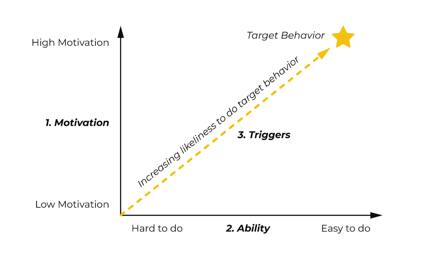
One of the key differences that Ty Magnin pointed out is that the motivation and ability of users and customers could not be more different. Customers, on one hand, are highly motivated to use your product and exploit the full value of the solution. While users just want to see if your product is a good fit for their business.
Customers are often well-versed in your solution and have a high ability to use the product. Whereas, users take time to get up-to-speed and experience the full value of the product.
As you can probably start to see, the motivation and ability of whoever we’re helping place a crucial role in onboarding success.
User Onboarding Mistake Seven: Sending Nagging Emails
When it comes to user onboarding emails, nobody likes receiving nagging emails as they aren't based on where users are in their customer journey.
Oftentimes, we send nagging emails without thinking twice. For example, say one of our users creates a dashboard in our platform and then the next day receives an email prompting them to set up their first dashboard. What do you think the user is thinking when they read that email?
Since you're still thinking, I'll answer this one for you. The user can sniff out your automated emails from a mile away and now thinks that your emails aren't that helpful.
Nagging emails are devoid of personalization make user's hate opening your emails.
To avoid sending nagging emails, here’s what I recommend doing:
- Don’t assume the recipient already knows the product is worth their time
- Don’t assume that since someone signed up for a trial, they’re immediately ready to buy
- Make each email specific to where the user is in the user journey
- Only focus on how the reader will benefit, not you.
- Don’t be impersonal, cold, and solely concerned with making a sale
Top User Onboarding Mistakes: Where Your Funnel Went Wrong
User onboarding is not about helping your users become proficient at using your product.
The goal of user onboarding is to help people become better at what your product enables people to do.
As such, everything we set out to do in our user onboarding should be focused on helping users experience meaningful value in our product.
To recap, please make sure not to make these six user onboarding mistakes:
- Force users to activate their email at the beginning of your onboarding flow.
- Treat onboarding like it starts in the product. Onboarding starts the second someone interacts with your brand.
- Have a value gap. When a user thinks that the perceived value of the product doesn’t line up with the experienced value of the product, you have a value gap. The bigger the gap, the more users who won’t return to use your product.
- Don’t walk your new users through your entire product. Instead, focus on helping them achieve a quick win in your product.
- Don’t treat your users as customers. Users have far less motivation when it comes to using your product. They want to quickly explore if the product can work for their business.
- Avoid sending nagging emails that are devoid of personalization.
If you avoid these six user onboarding mistakes, you will be well on your way to improving your activation rate and be ready to implement advanced user onboarding strategies.
User Onboarding Starts Like Building a Car
When assembling a car, you can have all the parts you need but if you don't know what tools to use, there's a slim chance you're going to build a car that can get you from point A to point B.
User onboarding is no different.
You can have all the right parts but if it's not assembled together properly, you'll be left with an expensive "solution" that doesn't work. And that's no fun.
The problem most people have is that they just don't know what user onboarding tools they can use to improve their free user to paid conversion rate.
Who can blame them though? There are countless user onboarding tools and it's only becoming a more crowded space as more brands adopt product-led growth.
To simplify all the tools we can use to assemble our high-converting user onboarding flow, let's divide all the tools into in-app and conversational onboarding tools.
In-App Onboarding Tools help users adopt the product in the application itself.
Conversational Onboarding Tools work to educate users, bring them back into the application, and eventually upgrade their account.
When it comes to in-app onboarding tools, here are the most common tools you can use:
- Welcome Messages
- Product Tours
- Progress Bars
- Checklists
- Onboarding Tooltips
- Empty States
For conversational onboarding tools, here are the most common ones you can use:
- Lifecycle Emails
- Push Notifications
- Explainer Videos
- Direct Mail
Even if you're familiar with the majority of these onboarding parts, I'm going to walk through each one so that you can be confident that you're using the onboarding tool in a way that will improve your free user to paid conversion rate.
In-App User Onboarding Tools
In-App User Onboarding Tools help users adopt the product in the application itself.
Ideally, every tool below works in unison to help users experience meaningful value in the product.
Here are the main in-app user onboarding tools I'll break down:
- Welcome Messages
- Product Tours
- Progress Bars
- Checklists
- Onboarding Tooltips
- Empty States
Welcome Messages
If you knock on a door to a friend's house, what kind of response would you expect?
Would your friend welcome you? Or would they not say a single word and let you walk around their house and eat the food in the fridge?
In this context, the second scenario sounds weird. Friends say hello to friends.
Whenever it comes to user onboarding, a lot of companies don't even welcome their guests when they sign up for their product. It's a "help yourself to the kitchen" kind of deal. As a user, it can feel a bit odd. All humans have the innate desire to feel welcome.
In this example from Userlist, they were able to showcase a message from the CEO that personally welcomed the user to the product.
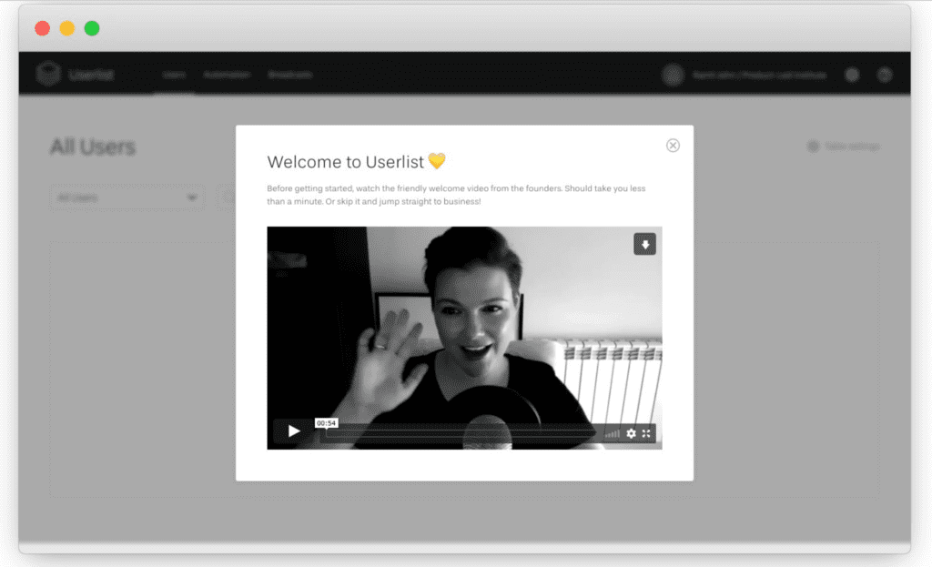
The message simply shares a little bit about why the founder decided to create the product and reinstates the value proposition. This message can also help increase a user's motivation for using the product.
Key Takeaways:
- Welcome messages are your opportunity to welcome new users and make them feel invited - you are the host after all.
- In addition to saying hello, you can use this as an opportunity to reinstate your value proposition and increase your user’s motivation before diving right into the product.
- Welcome messages can also be used to set expectations of what people should expect in their experience using your product.
Product Tours
Ultimately, product tours help put your user on the right track.
In Evernote's case, this might include trying to understand how you intend to use the product so that they can help you accomplish your goals.
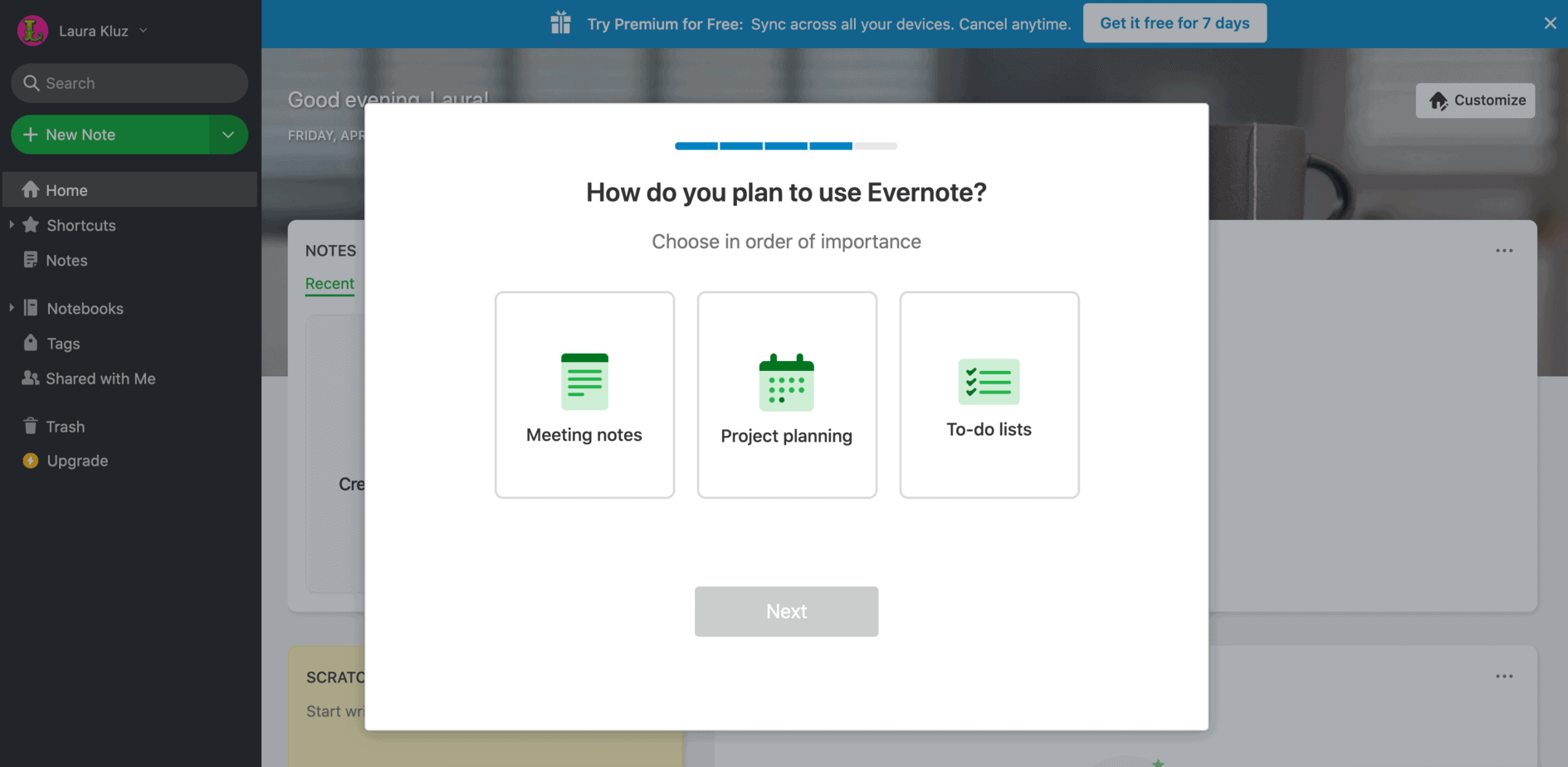
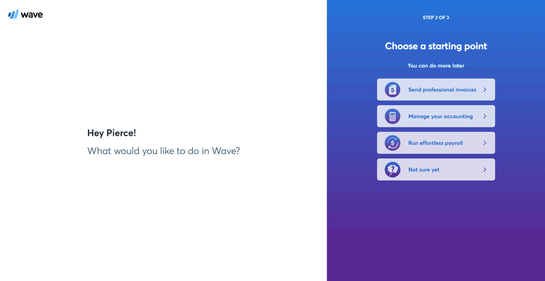
In Wave's case, they want to understand how you plan to use the tool so that they can guide you to the part of the product that is most relevant to you.
In Drift's case, they want to learn how you are planning on using the product from the beginning.
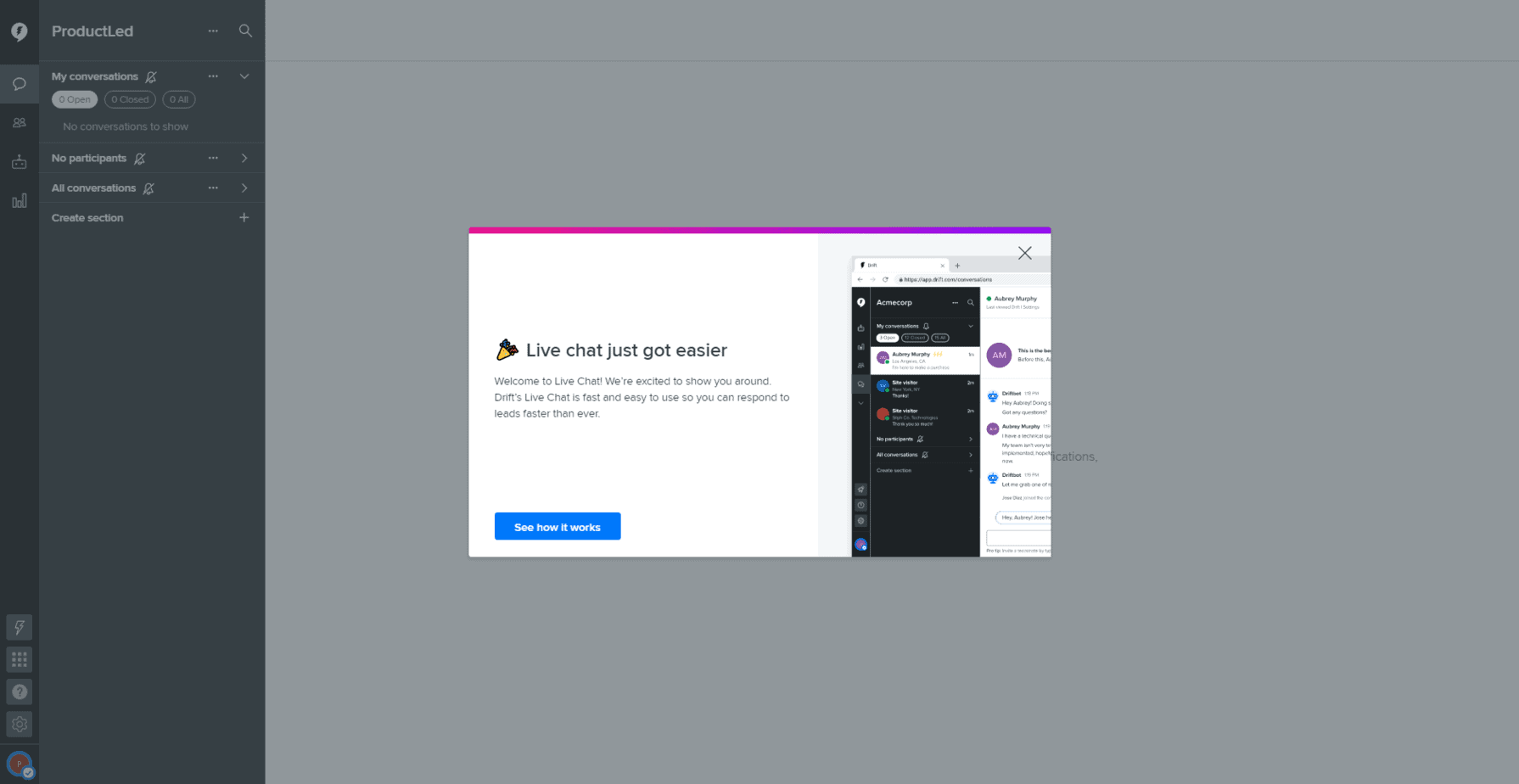
Although completely different products, Wave, Evernote, and Drift are asking you to identify your main job-to-be-done in the product. Your response to this question can trigger a different onboarding track that is specific to what you want to accomplish. This is not a one-size-fits all model.
If you have a simple consumer application, you might be able to get away without using a product tour step, but if you have a complex product with features that accomplish different tasks, a product tour is a must.
To improve adoption, I recommend utilizing "focus mode" where background elements are hidden and the number of choices someone can take is minimal. A great example of this is the Wave product tour below.
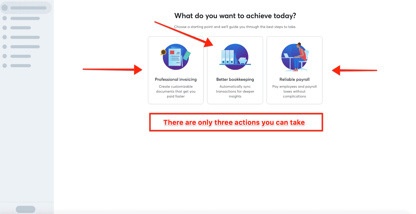
One of the reasons product tours are extremely effective is because they leverage Hick's Law and the Paradox of Choice.
Hick's Law: Decision time increases with every additional choice.
Paradox of Choice: More choices, less likely to choose.
By eliminating the number of decisions a new user has to make, you increase the likelihood that they will make the right decision.
When structuring your product tour, it's important to ask yourself these questions:
- What is each user trying to accomplish in the product?
- What are the first few steps a user needs to take in order to get value out of the product? For example, CrazyEgg, Drift, and HotJar are borderline useless products until you upload javascript on your website. Once you complete this one action, there's incredible value in each platform but users need to complete the initial step. If you have a must-have step like the javascript example, you should consider covering it in the product tour.
Key Takeaways:
- Product tours should ask users what they're trying to accomplish in the product.
- Product tours should cover important step(s) that set users up for success using the product.
- High-performing product tours can often utilize “focus mode” where all unnecessary elements like the navigation bar are stripped away from the product until the user completes the product tour.
- Product tours are typically between 2-5 steps, but can be longer or shorter depending on the complexity of your product.
Progress Bars
When running a marathon, I often look forward to seeing the markers for every kilometer I've run so far. Each marker reminds me of how far I've run and how far I have to go before the race is over. At first, it can be demotivating when you see that you've only run 1 out of 42 kilometers.
However, once you start getting closer to the 30 km mark, your motivation goes up, you push yourself harder and you run until you cross the finish line or, in my case, pass out.
When it comes to user onboarding, the same principle holds true. Humans are addicted to progress and will work hard to finish something they think is achievable.
When first using LinkedIn, we'll see a progress bar to showcase how far we've come along setting up our account. When we see that we're a beginner, we're curious what it takes to become an expert and will work through the steps LinkedIn has laid out in order to fully set up an account.
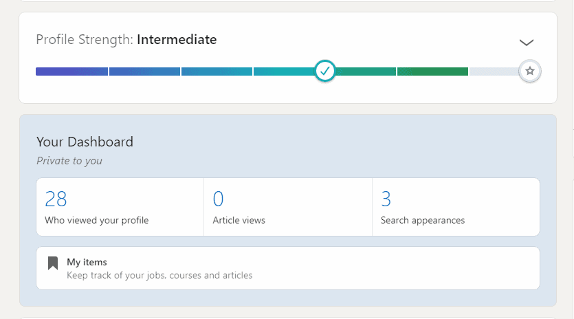
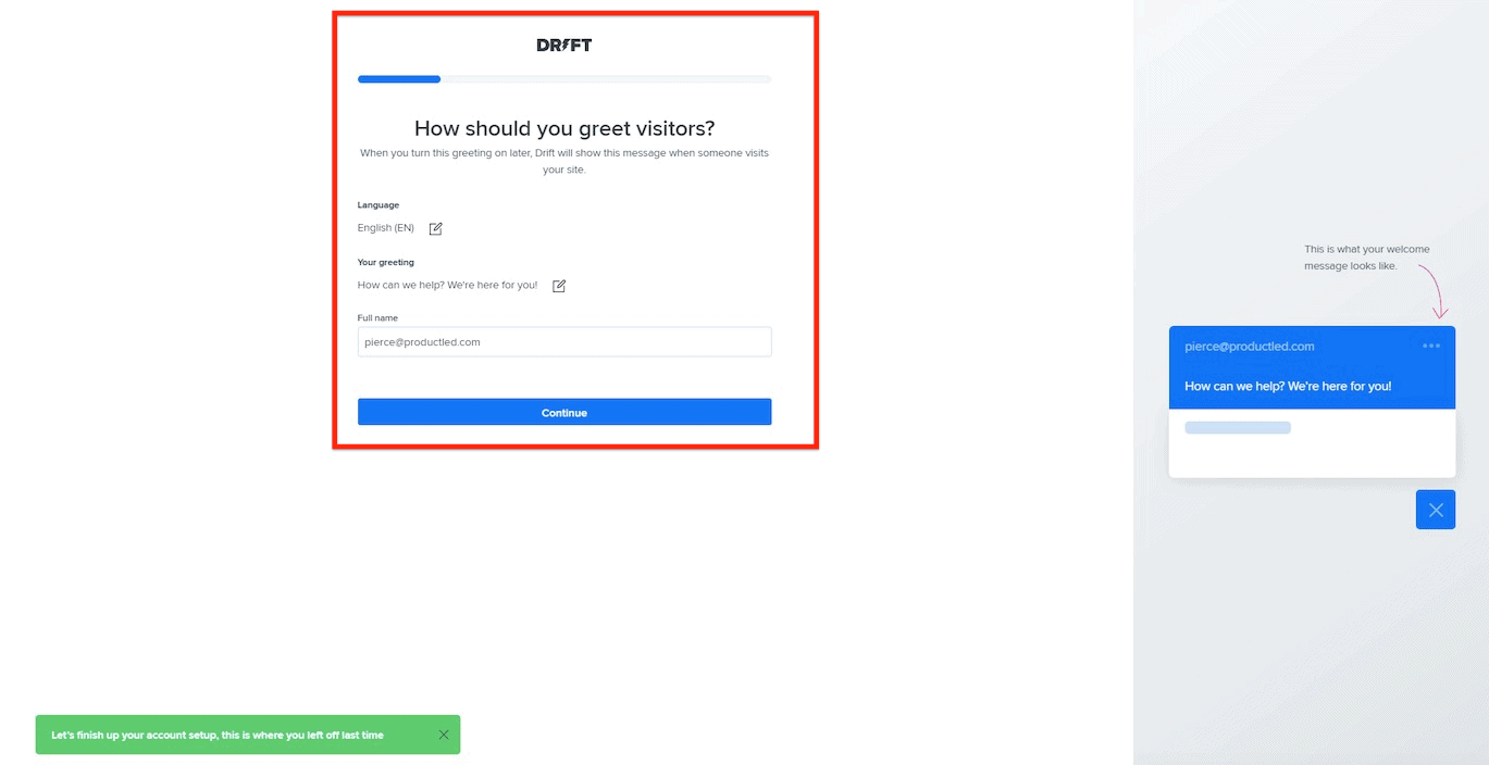
When setting up a Drift account, they use a progress bar to showcase how far you have to go in order to complete the onboarding steps. This reassures people that the onboarding process won't take long and that you're only a few steps away from completion.
Key Takeaways:
- Progress bars that play best to our bias start with a substantial percentage of the bar filled out. This helps us feel like we're already underway instead of starting from scratch, and it increases our desire to complete the task.
Onboarding Checklists
Checklists have been proven to help us break down big tasks into bite-sized ones.
In Evernote's case, they use an onboarding checklist to help users setup their account.
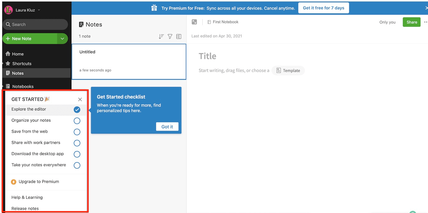
Checklists alone can only get you so far. If you want to get the most value out of your onboarding checklists, you'll want to have them partly filled out by the time the user sees them.
This simple tactic allows you to employ the “endowed progress effect”, which is a psychological phenomenon that basically boils down to this: the closer people think they are to completing something, the more likely they are to actually see it through.
In Quora's case, once you go through their product tour, you'll automatically complete 1-3 of the checklist items.
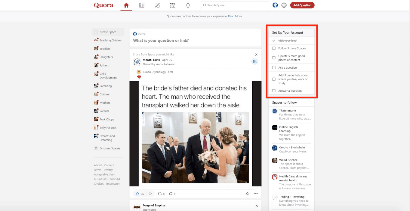
In addition to giving your users an overview of the steps they need to set up their account, you simultaneously increase the user's motivation because they now know how many steps it takes.
For best results, I recommend having between 3-5 checklist items for a new user to complete.
According to Zapier, another reason why onboarding checklists work so well is because of the Zeigarnik Effect. This phenomenon is based on the tendency to think about uncompleted tasks more than completed tasks.
Basically, not finishing a task or tying up loose ends can be really bothersome, nagging at us until we complete it. Researchers call this task tension. It’s that nagging feeling that helps someone stay the course until they’ve achieved the goal and can relieve that tension.
It's why cliffhangers are so effective in movies and TV shows. It’s why crossing off an item on your to-do list can feel so satisfying. It’s why this might freak you out.
Key Takeaways:
- Checklists can motivate new users to complete the crucial setup tasks required to get your product up and running.
- Checklists can turn complex, multistep processes, such as scheduling out a month of social media content, into simple, achievable tasks
- Onboarding checklists work to our advantage because they employ both the Endowed Progress and Zeigarnik Effect.
Onboarding Tool Tips
Onboarding tooltips can be used to help users learn how to use a product.
Tooltips can reduce the burden on support and scale up usability.
Here are the two main ways you can use hotspots and action-driven tooltips:
- To show first-time users how to use the product.
- To offer helpful tips to new users. Think of this as a coach.
- To show experienced users new areas of the product they might never have tried otherwise. This is great for increasing the retention of customers.
In Drift's case, they use hotspots effectively to direct new users to explore key areas of the product.

In Slack's case, they use hotspots to show you how to use the platform quickly. With a product like Slack, where they're literally training you to communicate in a different way than you're used to, these hotspots train you quickly on how to use the platform.

One of the benefits of using onboarding tooltips is that they're relatively easy to setup. However, a lot of companies use onboarding tooltips incorrectly.
Tell me if this sounds familiar? You log in to a product for the first time and then a tooltip pops up and tells you to click on a feature so you do. Then the tooltip prompts you to take you through one feature after another until you've explored the entire product.
This abuse of onboarding tooltips is like playing whack-a-mole.
The problem with this approach is that it leads the user to experience no meaningful value in the product.
Contrast the experience I just shared with you to an onboarding tooltip that walked you through how to create your first invoice.
One leads you aimlessly through an entire product, while the other is laser specific on helping you. Now, tell me, how are you going to use onboarding tooltips from here on out?
Empty States
Most software applications are relatively boring when you first login. There's no data that is specific to you, it's just the raw application. So, when you first login to an application, what do you show people? Do you show people dummy data?
Unfortunately, there is no broad stroke answer to this one, but I would suggest against using dummy data in most cases.
What I would recommend is using an empty state to show people what they need to do in order to successfully setup their account and experience meaningful value in the product.
In Gmail's case, an empty state is used to help the user set up their account. As you can see, each of the items listed in Gmail's empty state help users setup and personalize their account.
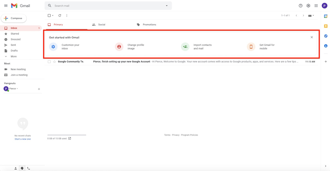
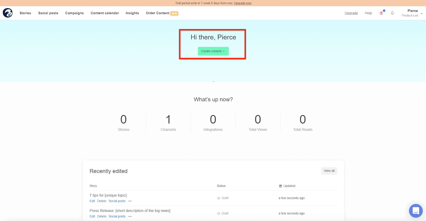
For Story Chief, they use an empty state to encourage users to craft their first story.
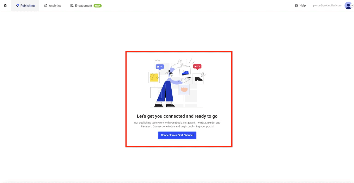
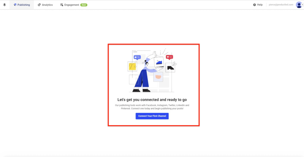
For Buffer, they use an empty state to encourage you to connect your social media accounts. If you think about it, nobody is ever going to use Buffer unless they complete this step. As such, the Buffer team has done a great job ensuring that people connect their social media accounts right from the beginning.
When it comes to deciding what items to include in an empty state, make sure to ask yourself these questions:
- What steps do I need in order for a user to experience a quick win in the product?
- What mandatory steps are there in my onboarding process?
- How can I make sure that the majority of users complete this step?
If you ask yourself those three questions, you'll have a much better idea of what items you should include in an empty state.
Takeaways:
- Empty states are commonly found when a user hits a product's dashboard for the first time.
- Empty states should prompt people to take an action that will lead them closer to experiencing a quick win and meaningful value in the product.
In-App User Onboarding Tools
When it comes to user onboarding, these are the top in-app onboarding tools:
- Welcome Messages
- Product Tours
- Progress Bars
- Checklists
- Onboarding Tooltips
- Empty States
Each tool can be used to help users experience meaningful value in your product. However, the context in which you use each tool will determine how effective it is.
For instance, using welcome messages on the second visit won't be nearly as effective as showing users the first time they login.
Now that we've covered the main in-app onboarding tools, let's dive into conversational onboarding tools and see how they can complement our existing onboarding.
Conversational Onboarding Tools
Conversational Onboarding Tools work to educate users, bring them back into the application, and eventually upgrade their account.
Here are the most common conversational onboarding tools you can use:
- Lifecycle Emails
- Push Notifications
- Explainer Videos
- Direct Mail
These are some of the main reasons why conversational onboarding tools are becoming widely adopted:
- It helps educate users
- You can set the right expectations
- You can get your users where they are and pull them back into your app.
- You can work to increase people's motivation to use and buy your product.
One of the biggest problems conversational onboarding tools address is that far too many people look to tools to solve their problem when, in reality, there's often an underlying issue why something is not working.
Take going to the gym as an example. If you buy a membership but never touch foot in the gym once, you're not going to wake up the next day looking like Arnold Schwarzenegger. The gym could help you become more fit, but it's useless unless you invest the time in using it.
The same concept can be applied to software. We need to make sure that we do our job educating people and setting the right expectations.
One of the best ways to do educate users and set the right expectations is through lifecycle emails.
Lifecycle Emails
In this video below, I'll share how you can create a just-in-time user onboarding email system that will help you convert free users into paying customers.
The primary function of lifecycle emails is to do something your site can’t: go get your users where they are and pull them back into your app. That’s to say, if your gym members aren’t showing up, lifecycle emails drive out to their house and haul them out of bed on your behalf. That said, the end goal of lifecycle emails is to eventually not need them, in the same way that you don’t permanently install training wheels — the point is to help see the adjustment period through, then let the “real” use take over. For software, that means habitual & unprompted use. To accomplish this, lifecycle emails should be set up to nudge people along through the most critical inflection points of the journey from signup to thriving user. They’re kind of like a joint between two bones, in that sense: acting as the connective tissue that links one key activity to the next. - Customer.io
When it comes to setting up lifecycle emails, one of the most challenging parts is figuring out what emails you even need to send in the first place.
To make this whole process easy on you, I've compiled the top nine lifecycle emails you should use:
- Welcome Emails
- Usage Tips
- Sales Touches
- Usage Reviews
- Case Study
- Better Life
- Post-Trial Survey
- Expiry Warning / Trial Extension
- Customer Welcome Emails
At their best, lifecycle emails act like an extension of your product with the magical ability to reach beyond your app or site to get people to come back and make progress towards customer happiness.
In this next section, I'm going to break down the ten most common lifecycle emails. To get the most value out of this section, I would recommend crafting a rough draft version of your lifecycle emails while going through each section.
Welcome Email
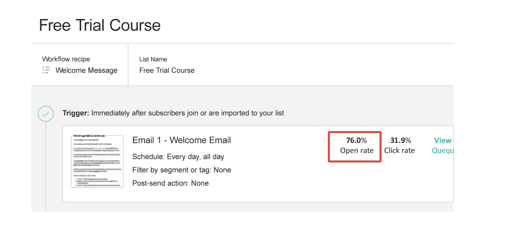
Welcome emails are triggered as soon as someone signs up for an account. One of the best parts about welcome emails is that it has the highest open rate. Typically you should aim for 60%+ open rates.
Even with our Product-Led Growth Certificate™️ training program, I'm easily able to hit above 70% open rates and I'm no email extraordinaire.
Given that it's relatively easy to capture people's attention in a welcome email, what content should you put in it?
Although it's tempting to write a lot about the product and ask the user to upgrade in a welcome email, I encourage you to not take this approach.
Your welcome emails should only have two purposes. First, you need to train your audience to open your emails. Second, you need to set the expectation of what's coming next.
To make sure your audience receives this email and it doesn't get caught in a lovely spam filter, I recommend using "plain text" and no images, at least for the first email.
Lastly, make sure your welcome email has a clear CTA. If you recently launched your product, you can learn a lot from just asking the question, "why did you sign up to use X product?."
If you're at a loss for words when it comes to drafting your welcome emails, here are two examples of welcome emails that follow the recommendations above:
Welcome Email One
Subject: a personal hello 🙂
Body:
Hey,
I'm one of the co-founders of [Your Company] and I'm excited
you've decided to sign up.
The [Your Company’s Name] Team and I have poured our heart and soul into making [key outcome your product solves for] suck less, so I get really fired up when someone new, like you, joins the ranks.
My top priority is to make sure you’re able to {insert value proposition], so if you have any questions about our product, the website, or even my lackluster
mustache, feel free to reply directly to this email.
I hope you are able to [accomplish key outcome in product]! Stay in touch 🙂
P.S. Yes, I'm a real human.
- Wes, Co-Founder
Welcome Email Two
Subject: you’re in -- [ company name ]
Body:
Hey, thanks again for checking out [ company name ] (we help you [
<5 word summary of what you do ] ).
● Customer benefit 1 (“You don’t have to worry about X
anymore”)
● Customer benefit 2 (“You can finally actually achieve Y, and
in less time”)
● Customer benefit 3 (“It’s free for the first month” / statement
on the value received)
But, none of that’s going to happen if you don’t get started 🙂
==> CREATE YOUR FIRST DASHBOARD HERE <== (your action-worded
CTA)
Talk soon,
Wes
Key Takeaways:
- Welcome emails have the highest open rates out of all lifecycle emails.
- Your welcome emails should only have two purposes. First, you need to train your audience to open your emails. Second, you need to set the expectation of what's coming next.
- To make sure your audience receives this email and it doesn't get caught in a lovely spam filter, I recommend using "plain text" and no images, at least for the first email.
Usage Tip Emails
Usage tips are helpful nudges that direct users to take steps in the product that will set them up for success.
One thing to keep in mind when using usage tip emails is that you should be careful what activity you encourage. For instance, if the activity you're encouraging users to take isn't lined up with experiencing meaningful value in the product, you risk losing the user's motivation.
In general, your usage tip emails should do these three things:
- Direct users to a specific in-app page (e.g. “Manage users” page)
- Link to specific help center articles or blog posts (e.g. “how to invite a user from outside your company”)
- Give actionable best practices, or invite abandoned users back
If you can do these three things, you'll be in a better position to help your users become successful.
A perfect example of a usage tip is from Wistia's Soapbox product. As soon as I created my first video, they sent a usage tip email to encourage me to share it with someone.
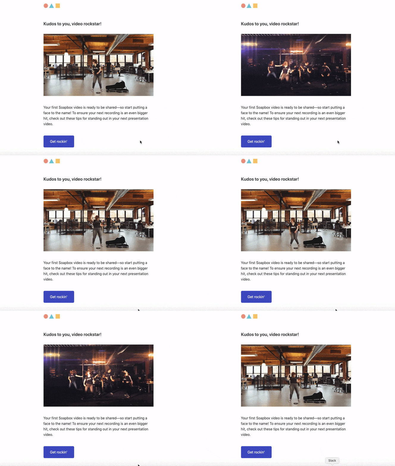
This email helped me learn more about Wistia's features, but also made it easier for me to experience meaningful value from the product when I eventually shared the video.
Key Takeaways:
- Usage tip emails nudge users to take steps in the product that will set them up for success.
- The best usage tips are trigger-based and sent out once you do or don't complete a certain item in your onboarding.
Sales Touch Emails
As the name implies, sales touches are when the sales team reaches out to users. These emails can be automated, but the most important part here is timing.
If you send your sales touch emails too soon, you'll turn people away. If you send them too late, you'll miss out on sales.
The sweet spot for sending sales touch emails, ladies and gentlemen, is as soon as someone experiences meaningful value in your product.
As Lincoln Murphy puts it, “You’ll find in a Free Trial that initial success for your user is actually the point where becoming a paying customer is the next most logical step. So you’ll get that “they convert to a paying customer” outcome you want, by focusing on the outcome they want. Winner-Winner.”
The best time to send out your sales touch emails is as soon as someone experiences meaningful.
For Databox, this is when you create and customize your first dashboard.
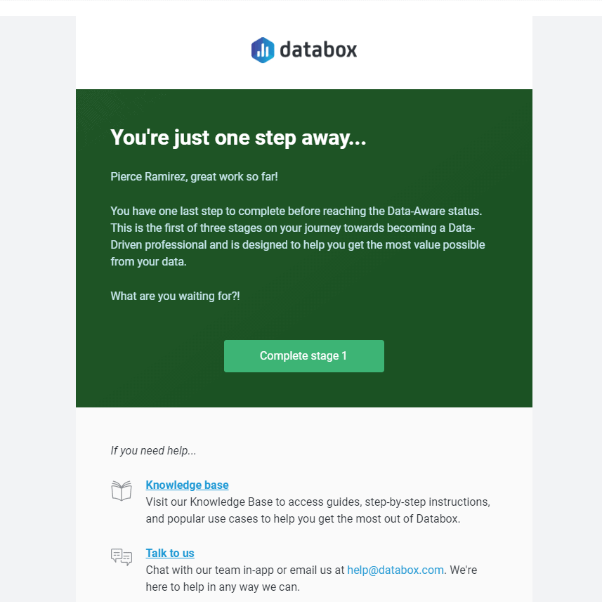
Notice how the email doesn't come across as "salesy" and the goal of the message is to help me get more value out of the platform.
When it comes to your sales touch emails, I'd encourage you to try two things:
- Frame your sales touch emails as a “success meeting” to celebrate the user achieving an aha moment and to get more use out of the product
- Invite inactive users to an orientation demo (e.g. “30-minute crash course on how to share documents and collaborate between teams”)
You'll most likely find that these "sales" emails are well received and users will be more than happy to hear what you have to say.
When writing your sales touch emails, Userlist.io provides a few free templates to help you get started. I've included one of my favorite sales touch emails below:
Subject: [Intriguing phrase about how a paid feature will make their lives easier. E.g…
Hi {{user.first_name | capitalize | default: "there"}},
[Pain point referenced in subject line] is no fun. [Describe a few problems the pain point causes. E.g., keeps them at the office late in the evening, forces them to delete important files or scatter them across multiple locations, wastes precious hours each week preparing for meetings and then having to reschedule.]
With [paid feature], you’ll [get huge benefit. E.g., have the freedom to take Friday afternoons off, rest easy knowing their files are all in one place, increase productivity by 18%].
Since [paid feature] is part of our [paid plan name] plan, you’ll just want to upgrade to [paid plan name] and you’ll be good to go!
Sounds great. Take me to my Billing page now, so I can start [getting benefit] [link].
Talk soon,
[Signature]
Takeaways:
- The sweet spot for sending sales touch emails is as soon as someone experiences meaningful value in your product.
- Craft your sales touch emails in a way where the goal of the message is to help users get more value out of the platform.
Usage Review Emails
Usage review emails showcase the value of your product.
These emails should far outlive your onboarding experience as they remind people why your product is valuable.
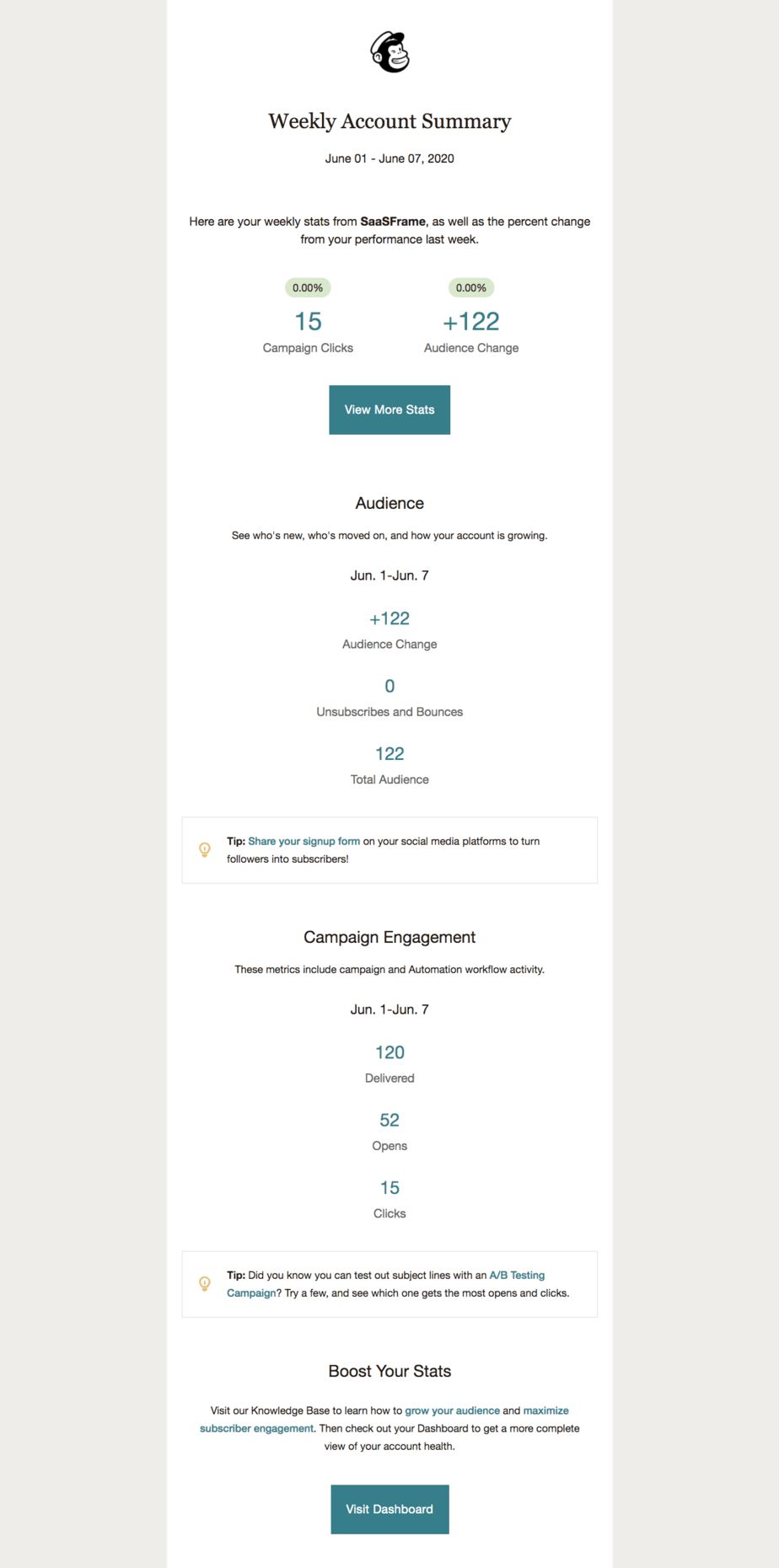
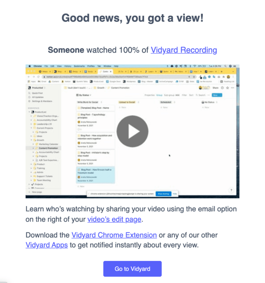
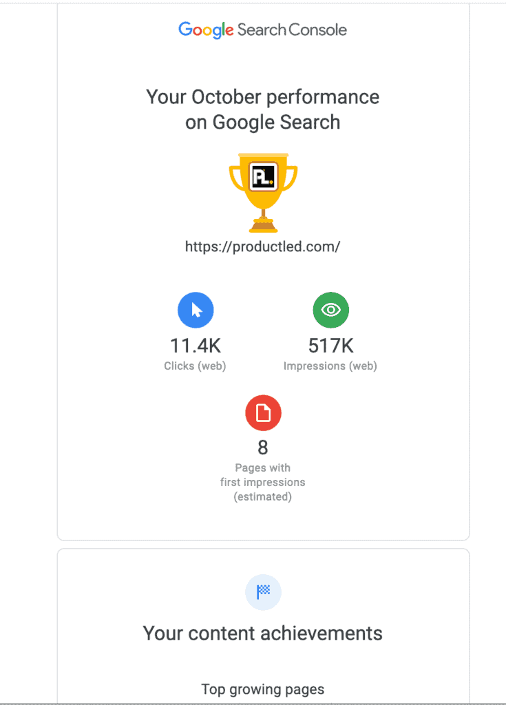
Typically these emails showcase your product's value metrics.
For Mailchimp, this is showcasing the emails you've sent.
For Vidyard, this is showcasing who watched your videos and for how long.
Google Search Console sends out a daily and weekly report on your website activity to make it extremely easy to dive into your search rankings.
For your own product, you may not be able to leverage usage review emails if your product has a long time-to-value. If that's the case, don't worry about including usage review emails in your initial user onboarding email flow.
One of the most common mistakes I see most businesses make when it comes to usage review emails is showcasing useless activity. For instance, how many times did you login? Yes, logging in counts as "activity" but nobody really cares about that genre of activity. We want to know what activity impacted our lives in a positive way.
As a filter for what metrics or data to include in your usage review emails, always make sure that it passes the "what's in it for me?" test.
With that being said, here's a usage review email template from Userlist.io that you can modify to your business:
Subject: Your [Product] weekly activity report
Hi {{user.first_name | capitalize | default: "there"}},
[Statement about what they accomplished with your product. E.g…
- Here’s how many tasks your team accomplished last week
- Here’s the current status of your proposals (drafted, sent, and accepted)
- Here’s how many hours of work [Product] saved you last week ]
[Activity section. Rule of thumb: only show activity that will make your user feel accomplished. A good barometer: is it activity they’d feel proud of, or want to show to their boss? If so, it’s probably good activity to show. E.g…
- Number of new proposals sent
- Number of new proposals accepted
- Increased productivity
- Increased traffic
- Increased engagement with their content or product
- Increased sign-ups or revenue ]
Happy [verb your product does]ing!
- Signature
When it comes to your usage review emails, please make sure you don't send them out before someone has experienced meaningful value in your product.
If you send these emails out too early, your users aren't going to be able to see the value of your product.
One thing to always consider is how you can make usage review emails more engaging as time goes on.
Sometimes it requires a bit of creativity on your end and other times it can be as simple as asking your users what they'd prefer to receive in these emails.
Key Takeaways:
- Usage review emails are used to showcase the value of your product.
- Usage review emails should far outlive your onboarding experience as they remind people why your product is valuable.
- As a filter for what metrics or data to include in your usage review emails, always make sure that it passes the "what's in it for me?" test.
Case Study Emails
As Joanna from Copyhackers would say, case studies are great. As long as you tell the story right.
And by “tell the story right,” I mean to be a good storyteller:
- Open with a hook
- Lure the reader from one line to the next
- Start in the middle of the action
- Create compelling characters
- Set the story around a central conflict
If you don’t have conflict, you don’t have a story.
If you don’t have a hook, who would read?
As Joanna points out in the two variants below, which email does a better job capturing your attention?
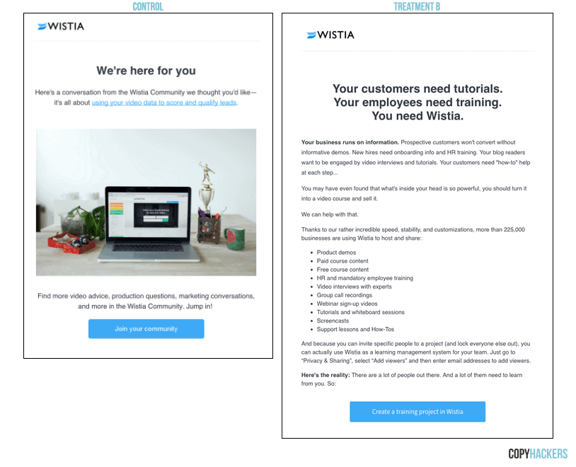
If you're like most people, Treatment B captured and maintained your attention throughout the entire email and gave you a convincing reason to upgrade.
Part of that reason is that your customers can relate better with your users and often do a much better job selling than you can.
Whether it's sending a case study email that includes a video testimonial, customer story, or case study, you need to showcase your customer's results from using the product.
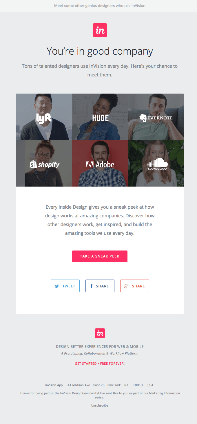
InVision does this by showcasing some of the incredible designs their customers have created through using the product.
Now, how do you decide which testimonials to showcase?
One of the best ways to decide which testimonials to feature is based on the objections you consistently receive when selling your product.
For most businesses, these objections could be:
- The price is too high.
- We don't have the budget.
- It's not important right now.
What I'd recommend doing is pairing your #1 objection with the testimonial that addresses the objection head on.
For instance, if your top objection is that the price is too high, you'd want to include a testimonial that showcases the amount of value the customer received from using your product.
That way, you're addressing your top objections head-on and your testimonials are doing the heavy lifting for you.
If you send these case study emails before selling each user on your product, you'll improve your free user to paid conversion rate.
Key Takeaways:
- Use case study emails to combat objections that your users might have before they enter the buying phase.
- Make sure that people hear "what's in it for me?" throughout each case study email.
Better Life Emails
Better Life emails focus on communicating the benefits of the product.
The main CTA in these emails will often be to upgrade an account, however, they can also be used to direct people to try specific features out on their own.
Better Life emails are different from case study emails in that it doesn't rely on you to tell a customer's story but can simply focus on communicating the benefits of the product.
For Twist, they use Better Life Emails to encourage people to "take back the workday" and sign up their team.
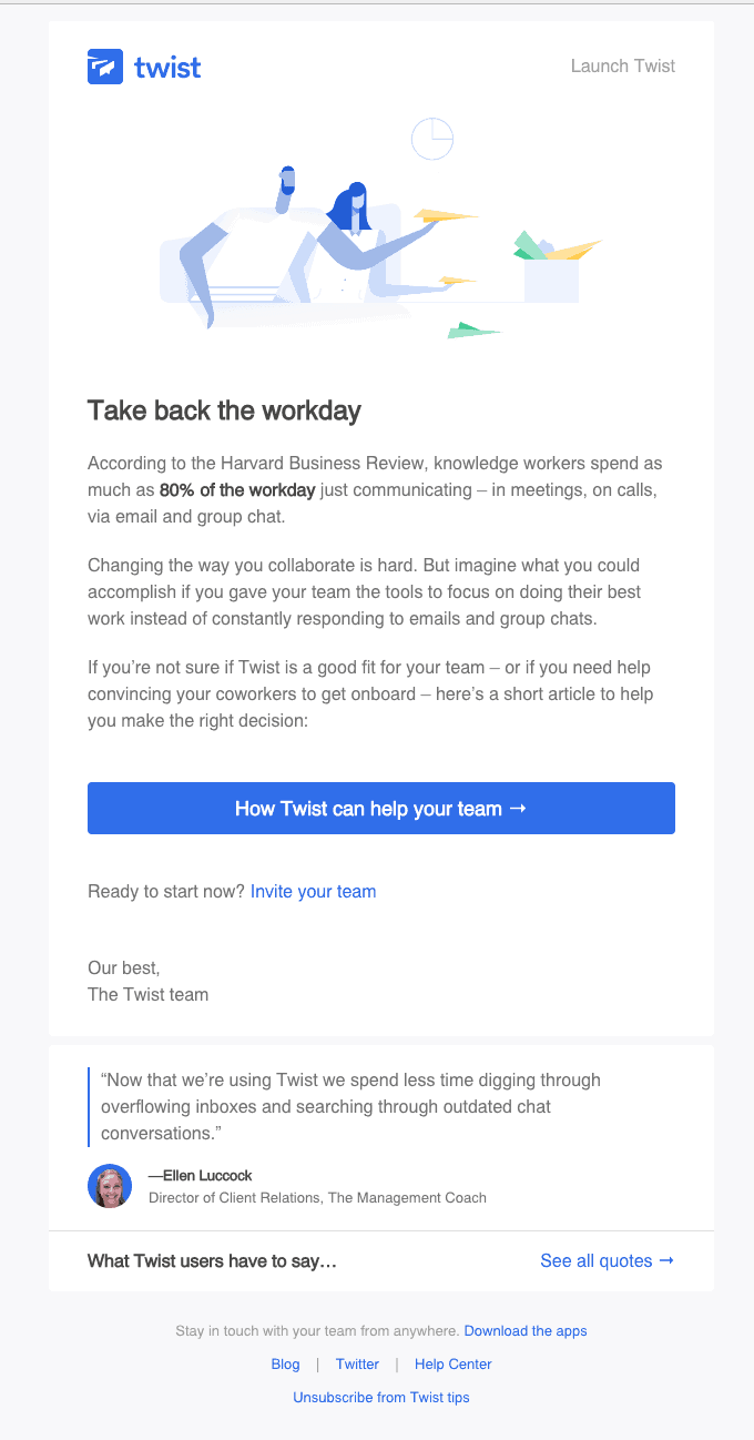
For your Better Life emails, one of the best things you can showcase is how your product will make the user's life better. If you're selling a business intelligence tool, this could be showcasing how the user will no longer need to spend countless hours crunching numbers in excel.
One of the most common mistakes when it comes to Better Life emails is only focusing on the functional job your product solves for.
To avoid this, you need to go beyond "what" the product is and do customer research. This will help you highlight the emotional and social jobs people hire your product for.
As Steve Blank would say, "Cheating on customer development is like cheating on your parachute packing class."
It’s not worth it. In any purchase, you have to account for the functional, social, and emotional reasons why people buy your product. Here's a breakdown of each job:
- Functional Jobs - The core tasks that customers want to get done
- Emotional Jobs - How customers want to feel or avoid feeling as a result of executing the core functional job
- Social Jobs - How customers want to be perceived by others
If you can understand these three main reasons why people buy your product, you can boost your conversion rate and ultimately acquire more customers.
Before writing your Better Life Emails, ask yourself these questions:
- When talking to potential buyers, what benefits get them most excited?
- What benefits make it a no brainer for people to upgrade?
If you ask yourself these questions, you'll have a better idea on what benefits to feature.
Key Takeaways:
- Better Life Emails are used to showcase the benefits of your product.
- The CTA is often used to upgrade users, however, it can also be used to help users experience those benefits for themselves in the product.
Expiry Warning Emails
Expiry warning emails remind the user to upgrade before the free trial ends.
Typically expiry warning emails are used for free trials. Freemium models don't typically use expiry warning emails because you are giving away part of the product away for free forever. With that being said, if you have a hybrid freemium model where you combine both free trial and freemium models, expiry emails can be used to motivate users to upgrade.
If you have an opt-out free trial (a.k.a when you require the credit card upfront before someone can start the trial), you MUST send expiry warning emails. No ifs or buts here.
If you don't send out expiry warning emails, you're guaranteed to annoy users who give your support a hard time and demand a refund.
Can we really blame these people though? What did you do the last time you signed up for a product with a credit card and missed the deadline? Did you continue paying for the product for a month or two before realizing you forgot to cancel? Or did you demand support give you a refund because you forgot to cancel your plan?
Now, I won't dive into whether you should have a free trial with or without a credit card at signup right now, but, as a general rule of thumb, you should always make it easy for users to cancel their account.
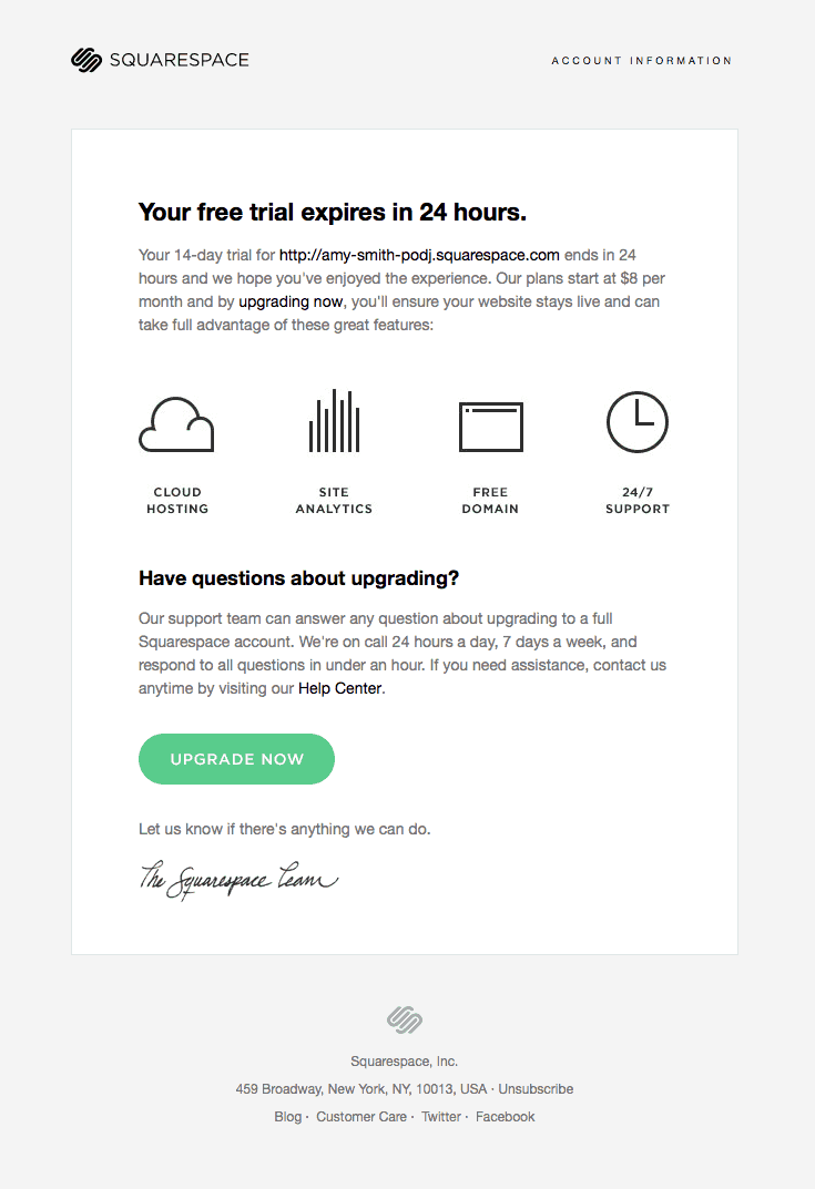
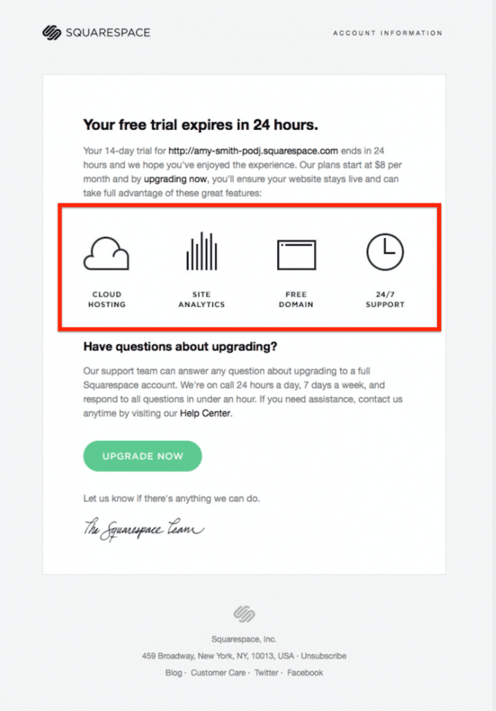
For Squarespace, they send out expiry emails to notify users that their trial is going to expire soon. What's great about this email is that they reinstate the value proposition and why it makes sense to upgrade now.
According to PostMark App, expiry warning emails have three main goals:
1. To set clear expectations.
Trials end - that's just how they work. However, if users have provided a credit card as part of the signup process, and they’ll be charged automatically, you want to make sure to give them a few days notice about the charge so that they aren’t surprised.
The last thing you want is to annoy users who forgot they signed up for your product and ended up accidentally paying. When they figure out that they were charged, they will demand a refund.
Even if you don't require a credit card upfront, you want to craft a painless transition to becoming a paying customer.
The best way to do that is by:
- Giving users as much notice as possible
- Making sure it’s crystal clear when the trial expires and what happens if the trial expires
- Providing a call-to-action for users to upgrade
2. Make it easy for users to upgrade, cancel or do nothing.
Some people will upgrade, and some won’t. As such, you want it to be easy for people to upgrade. With that being said, you also need to keep in mind that most people won't upgrade so it should be easy for users to cancel their account. Making this process clear and easy from the expiry email can serve as a great way to make a positive impression. Who knows? Maybe they’ll return someday.
3. Communicate how users can get help.
The transition from trial to paying customers can be a stressful one. Once your customers decide to use your software, they’ll want to make sure the transition is seamless. In some cases, they might even wonder if their existing data from the trial will be maintained. When will they be charged? How can they get approval from their team?
There are countless questions and concerns you'll receive, the important part is to make sure that customers know that they can get help and where to find it.
What are some common mistakes with trial expiration emails?
Trial expiration emails are special because they’re serving two very different user types.
On one hand, you have the people that want to become paying customers, and on the other hand, you have those that don’t. In the same email, it’s important to address the needs of both groups without making the email confusing. Most mistakes in trial expiration emails stem from these conflicting goals.
Mistake #1: Failing to provide enough advanced notice
Weekends, vacations, and travel can interfere with the timing of a trial expiration. So it’s important to give people a heads up. This way users know exactly when a trial will expire and you can help them avoid accidental interruptions like forgetting to cancel their account.
In general, I recommend sending an expiry email at least three days before the end of each user's trial. This will give your users enough time to make a decision on moving forward with your product or not.
Mistake #2: Assuming that the recipient wants to begin paying for the product
One of the biggest mistakes I see companies make when sending out expiry emails is not including the product's main value proposition. It should be no surprise that offering a compelling reason to take an action results in more people (actually) taking that action.
Just because someone signs up for a free trial does not mean that they are ready to buy. The majority of people who sign up for your free trial or freemium model won't convert.
As such, you need to make sure that you include compelling reasons for someone to upgrade their account in your expiry emails.
Customer.io proves this point by failing to include a convincing reason to upgrade.
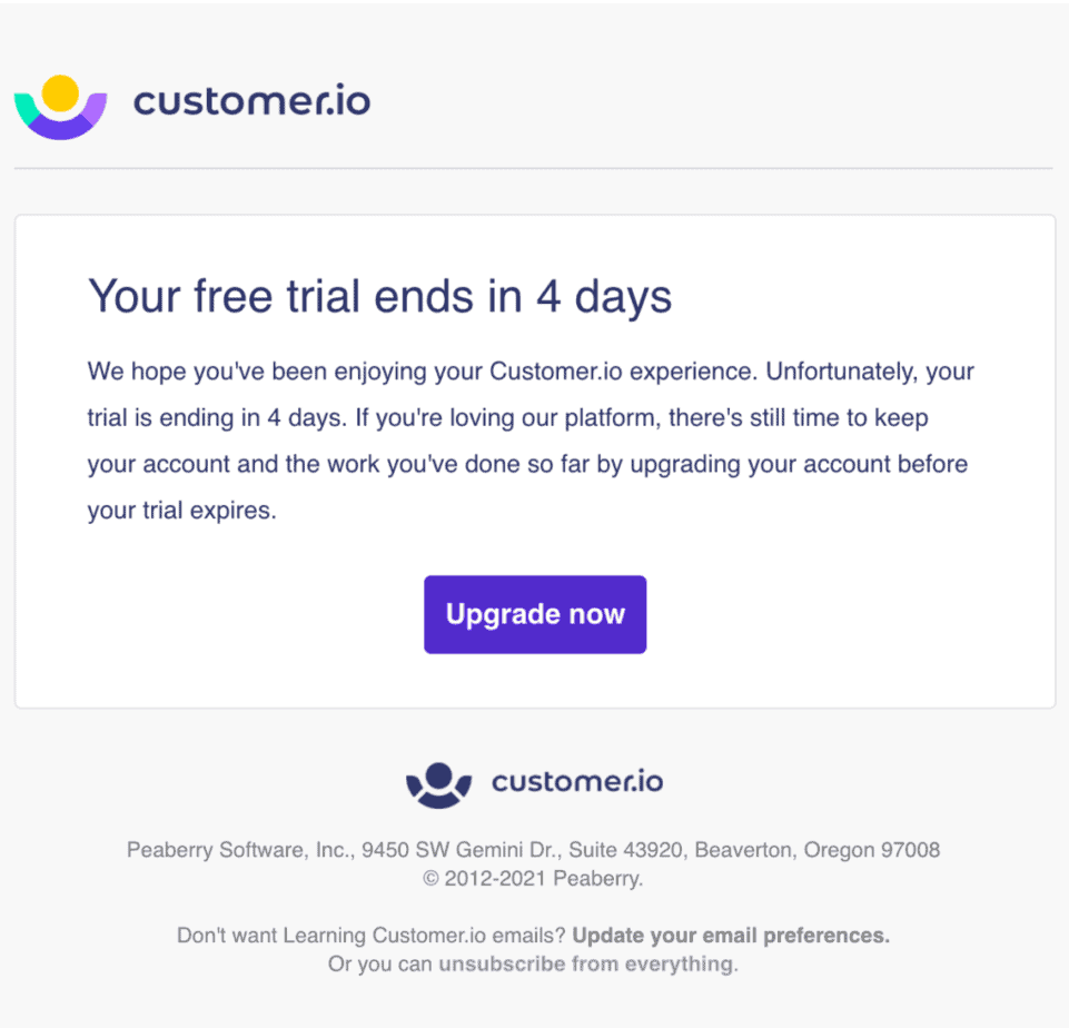
On the other hand, Squarespace's expiry email does a great job highlighting the key benefits of the platform. Now we know why we should consider upgrading, right?
To recap, your expiry emails should be able to answer these questions:
- Why should I upgrade?
- How do I upgrade?
- How much time do I have left?
- What happens when the trial is over?
- How do I cancel? If you require a credit card for your free trial signup.
- Where can I go if I need help?
Key Takeaways:
- You must send expiry emails if you have an opt-out free trial. If you don't, users will forget they signed up and get mad when they find out they've been charged for a product they haven't been using.
- Make sure you reinstate your value proposition in each expiry email. If you do, you'll create a compelling reason for users to upgrade.
- Make it incredibly easy for someone to upgrade in the expiry email.
Customer Welcome Emails
Have you ever purchased a plane ticket on a somewhat sketchy travel website and then waited for what seemed like an eternity to receive an email confirmation that your trip was booked?
When you don't have a lot of trust in a brand and buy something from them, waiting for an email confirmation email can fill like an eternity. Your new customers feel the same way.
Customer Welcome Emails have three main goals:
- You want to reassure your users that they made the right decision;
- You want to remind your users of what they can now do with the platform;
- You want to set the expectation for what's to come next. Is a customer success rep going to reach out?
One thing that is all too common is businesses that don't have an autoresponder setup to welcome new customers. Most of these businesses do reach out manually but it takes them a long time.
Meanwhile, your new customer is getting nervous sweats and wondering if they made the right decision. Pro tip: don't make your new customer think twice.
For Spotify, they welcome users as soon as they upgrade to the premium plan.

One thing Spotify has done really well in this email is reminding users why they upgraded and also showcasing the value of the platform. This email increases a user's motivation to check out the product and listen to some great music without ads.
If you have a freemium product, I'd strongly recommend including a recap of your premium features so that the user can then explore them afterward.
For Realtime Board, they send out customer welcome emails as soon as you upgrade. What's great about this email is it's easy to pay attention to the points that are relevant to you and dive into the product.

Key Takeaways:
- Customer Welcome Emails must be sent as soon as users upgrade.
- The whole point of customer welcome emails is to reassure your users that they made the right decision, remind your users of what they can now do with the platform, and set the expectation for what's to come next.
Post-Trial Survey Emails
Even if we put together the most amazing free trial experience, the majority of our users are just not going to convert.
Some users might have never been a good fit.
Some might have just not had time to check out your tool.
Others, well, they might just have needed more time or needed someone to help them learn how to use the product.
Although there are countless reasons why people may not have upgraded, you'll never learn "what stopped them" if you don't implement post-trial survey emails.
For Autopilot, their post-trial survey emails look like this.
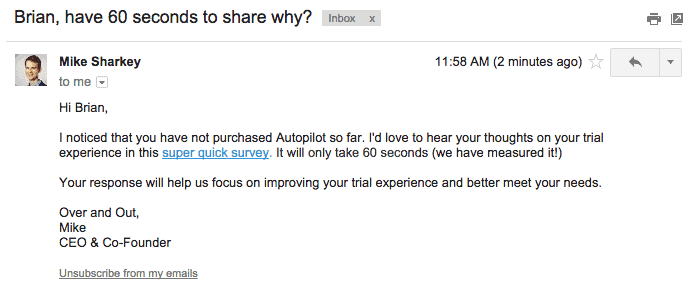
What I like about this email is how it gets straight to the point and encourages you to fill out the quick survey below.
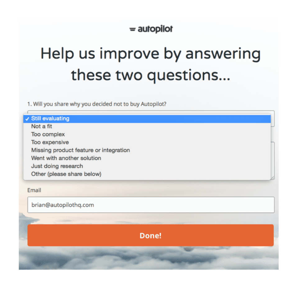
Based on your response in the survey, Autopilot enrolls you into an automated sequence.
Autopilot recommends starting with this list:
- Still evaluating → Offer a trial extension
- Not a fit → Drop into nurture
- Too complex → Schedule a customer success call
- Too expensive → Provide a one-time discount
- Went with another solution → Send top of funnel lead nurturing emails to stay top of mind when the other service doesn’t work out
- Just doing research → Add to nurture (notice the nurturing trend?)
- Missing product feature or integration → Update your product roadmap, let the expired trialist know when it’s live
If you use your free trial survey in this manner, you'll undoubtedly be able to handle objections as to why people didn't buy your product, learn more about how you could improve your free trial experience, and ultimately help more people.
Key Takeaways:
- Post-trial survey emails can help you improve your free trial to paid conversion rate if you trigger certain events based on the user's feedback. For instance, if a user says the product was too complex, you can then have a customer success representative reach out to try to walk the user through the product.
Lifecycle Emails Overview
When it comes to user onboarding emails, these are the most common mistakes:
- Not outcome-driven
- Not tied to what you’ve done in the product
- 100% time-based
- Feature-driven
- One-size fits all
Sound familiar?
The entire experience is devoid of personalization. As a result, this process results in many different forms of waste, such as:
- Waste of over-producing content;
- Waste of the new users' time if the content is not relevant;
- Waste of resources driving signups;
- Waste of customer support team's time;
- Waste of sales team's time trying to sell low potential users;
Don't get me wrong, this process can still convert users into paying customers but it misses the mark on meeting the user where they are in their journey.
For a 14-day free trial, here’s what a typical email engagement program looks like:
- Day 1 - Welcome Email
- Day 3 - Content to Educate User
- Day 5 - Check-In Demo
- Day 8 - Product Features
- Day 12 - Expiry Warning Email
The problem with this approach is it’s one-size-fits all and doesn’t bode well for the outliers below:
- If you're a power user and keep receiving product feature emails for a feature you've already used, it’s pointless.
- If you've never logged into the product, why should you receive advanced lessons on how to use the product?
- Or if you already upgraded and continue to receive all the emails, how does that feel?
The only way to avoid these scenarios and improve your free user to paid conversion rate is to use smart signals.
Based on the user onboarding emails we covered, I'm going to share how you can create a just-in-time onboarding email sequence that converts.
Create a Just-In-Time User Onboarding Sequence

Signals tell us when we should send a specific email or enroll a user into a new campaign.
In my Just-In-Time Email Onboarding Sequence above there are only four signals:
- Signup
- Quick Win
- Product-Qualified Lead (PQL)
- Customer
Each of these signals tells us an important part about where the user is in their journey.
Based on the signal, we can enroll people into different email onboarding tracks. For instance, if someone experiences a quick win in the product, we can now send emails based on how to dive deeper into the product.
Or if someone becomes a Product Qualified Lead (PQL), we can now send sales touch and case study emails to encourage users to upgrade.
You're soon going to see how we can use all of those emails we just talked about.
Before diving in, I wanted to point out one small detail that is easy to miss. In the onboarding tracks, if you see a lightning bolt underneath the email, it is a trigger-based email. Whereas if you see a clock underneath an email, it is time-based.
Now, that we're on the same page, lets dive in!
Just-In-Time User Onboarding Track One - Quick Win

Signal: Signup
Key Outcome: Quick Win
As you can see above, when someone signs up it signals the start of the email onboarding track. As soon as someone signs up, it should trigger a welcome email immediately after.
What you might find unusual is that the next three steps all focus on usage tips.
As we covered earlier, usage tip emails only try to accomplish three things:
- Directing users to a specific in-app page (e.g. “Manage users” page)
- Linking to specific help center articles or blog posts (e.g. “how to invite a user from outside your company”)
- Giving actionable best practices, or inviting abandoned users back
In the first onboarding track, the only thing we care about is getting someone to experience a quick win in the product.
For instance, if we operate a business intelligence software solution, our first quick win might be setting up a dashboard to visualize our analytics. At first, every email we send to new users should be focused on hitting that income.
One thing that is easy to miss when it comes to Email Onboarding Track One is that you might not need to send any usage tips to users if they accomplish the quick win in the first-run onboarding experience (aka the first time someone uses a product).
Let's say you're CrazyEgg, a heatmap tool, and your first quick win is getting users to upload a tracking script to their website. If they accomplish this in the first-run onboarding experience, why would you bother sending any more emails about how to upload the script? On the flip side, if you didn't upload the script, it would be extremely helpful to have emails that guided users how to upload the script. Wouldn't you agree?
Once your users have accomplished a quick win, it's time to think about how you can turn your new users into repeat users.
According to Intercom, 40-60% of users who sign up for a free trial of your software or SaaS application will use it once and never come back.
That’s a lot of waste. One of the best ways to bring people back is through Email Onboarding Track Two.
Key Takeaways:
- User Onboarding Track One focuses entirely on helping users experience a quick win in the product.
- The only two emails you need to include in onboarding track one are welcome and usage tip emails.
- User Onboarding Track One is not focused on selling at all.
Just-In-Time User Onboarding Track Two - Product-Qualified Lead (PQL)

Signal: Quick Win
Key Outcome: Product Qualified Lead (PQL)
Email Onboarding Track Two starts as soon as someone experiences a quick win in the product and ends when someone becomes a PQL.
If you're not sure what a PQL is, I recommend reading the Beginner's Guide to PQLs or watching the video below.
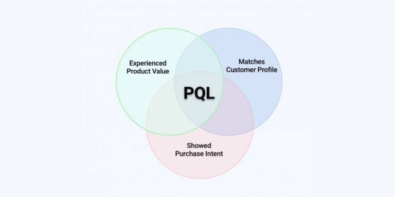
PQLs help us identify users who have experienced the product's core value and are most likely to convert as customers.
For a business intelligence solution, a PQL could be a user who creates their first few dashboards and shares it on a TV display.
For Drift, a PQL could be when someone has had 100 chats on their website using the tool.
For CrazyEgg, a PQL could be as simple as viewing your heatmaps and user recordings multiple times and uncovering an insight.
A PQL is unique to every business, however, the one commonality is that a PQL is used to monitor when users experience meaningful value in the product.
One of the best models to get more users to become a PQL is inspired by Nir Eyal’s book, Hooked.
What I love about Nir’s model is that their are only four actions you need people to take in order to create a habit-forming product.
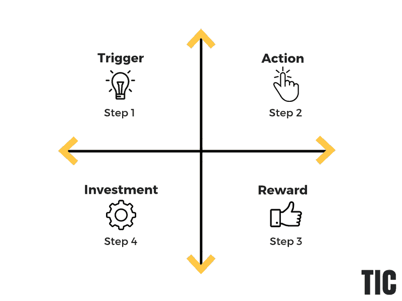
As you can see, you start with a trigger, get people to take an action, which (ideally) results in a reward and an additional investment in the product. This cycle, if repeated, builds long-time users.
Leave one item out, like rewards, and you risk losing users.
To get a better idea of how to use this framework when it comes to user onboarding, I’m going to break down each item into more detail.
Triggers
There are both external and internal triggers.
External Triggers
External triggers are much easier to control than internal triggers.
Here are a few examples of external triggers that you can use to increase the odds of having a user come back to your product:
- Paid Triggers - Advertising
- Earned Triggers - Public and Media Relations
- Owned Triggers - Website, Email, & Blog
External triggers are comparable to lighting a match. They’re typically very bright and powerful at the beginning but then they lose their effectiveness fast before ultimately not working.
That’s why welcome emails typically have a 60%+ open rate and then the open rates dramatically drop off.
The best way to use external triggers, like user onboarding emails, is to encourage users to experience meaningful value in your product.
Our whole goal in this track is to use triggers to spark an action that requires an additional investment of time in the product, which inevitably results in a reward.

The more times we take users through our habit-loop, the more likely they are to stay as users and eventually customers.
Internal Triggers
Internal triggers, on the other hand, only become stronger and stronger.
Internal triggers manifest in the mind.
Here are just a few examples of internal triggers that I'm sure you're familiar with:
- When you're bored or sitting alone at a restaurant, do you pull out our phone and check Facebook?
- When you need a quick reply from a coworker, do you send an email or a message on Slack?
- When you want to write a blog post, do you open up Google Docs?
Each time you use an internal trigger and it results in a reward, our brain is wired to remember it. Depending on how big the reward and dopamine rush is, products can become highly addictive in a short period of time.
The process of creating strong internal triggers is comparable to trying to find a new pizza shop that your friends have been raving about.
The first time you have a pizza craving and decide on going to the restaurant, you might make a few wrong turns, take some side roads, eventually pull out Google Maps, and end up taking an inefficient way of getting there.
But, if the pizza is amazing, you're going back. However, the next time you shave off 5-minutes from your previous route.
By the third time, you're taking the highway and shave off 15-minutes from the first route you took.
Although we're not selling pizza, our brains are constantly looking for more efficient ways to help us get to our yummy dopamine rush.
Internal triggers start as inefficient paths in the brain and consistently become more efficient the more we use them.
Internal triggers do take time to build but are a prerequisite to building a truly habit-forming product.
Action

The actions you ask your new users to take will have an incredible impact on if your users end up upgrading or not. In your user onboarding emails, if you ask people to do anything that doesn't help people experience a meaningful reward in your product, you can hurt your free user to paid conversion rate.
Good actions to ask your users to take often have these characteristics in common:
- The action is closely tied to experiencing a reward;
- The reward leads to an additional investment in using the product;
Whereas, bad actions you want to avoid are:
- Not aligned with experiencing meaningful value in the product;
- Not specific to what users have done in the product;
With that in mind, what are the three actions you want people to take in your product? What actions currently result in a reward and an additional investment in your product?
To help you answer these questions, here are a few examples from well-known products:
For Soapbox by Wistia, whenever you record your first video and don't share it with coworkers, they send you a user onboarding email encouraging you to take the action to share it with your colleagues or prospects.

Once you take the action to share the video, Wistia is teeing you up to experience a reward. Whether that be saving you time explaining something complex or having your co-worker say they really enjoyed the video.
This cycle naturally leads users to want to invest more time and energy into using the product.
Investment

This is where the user does a little work. The user "pays” with something of value: time, money, social capital, effort, emotional commitment or personal data.
"Investment is about future rewards that make the next action more likely." - Nir Eyal, Hooked
Without any form of initial investment, most software products aren't that valuable.
If you think about Salesforce, the CRM solution gets its value from integrating with other tools, managing your contacts, analyzing your deals, and building reports to understand your business better.
By definition, it's a Do It Yourself (DIY) kind of deal when you sign up. Sure, the Salesforce team can onboard your team but you need to show up, invest your time, learn how to use the tool, and then train your team how to use it.
It isn't until you invest the time, energy, frustration, and money until you start to see how it can truly help your business.
The tricky part about investment is it is unrealistic to expect your new user to complete all the required onboarding tasks right at the beginning.
Much like you wouldn't expect to get a six-pack the first time visiting the gym. It takes time, but what you need to do early on in the onboarding process is understand the first few investments you need your user to take.
In many cases, this could be breaking down the steps it takes for a user to experience a quick win in the product and then using those steps as the first investment you ask users to take.
That way users won't get demotivated right at the beginning. If the user can see progress, you'll be able to keep them motivated.
For Buffer, the first investment they ask users to take is to connect their social media accounts. This small investment brings the user much closer to experiencing meaningful value in the product.
For Wave, they start with asking you what you're planning on using the product for. This product tour helps eliminate a significant investment of time for users who don't want to setup all the features in the account at the beginning.

To recap, if you want to build a habit-forming product, you need to create habit loops that start with a trigger and end with additional investment in the product. If you can do this, you'll have a habit-forming product that hooks users to continue using your product.

Once your users are hooked, the most logical next step is asking users to upgrade.
Key Takeaways:
- User Onboarding Track Two is all about building a habit-forming product.
- The goal is to use habit loops which include triggers, actions, rewards, and investments that motivate the user to continue to use the product.
- Although we can rely on external triggers (like email) to motivate users to come back to the product, external triggers quickly lose their effectiveness over time. To build a habit-forming product, you need to invest in building internal triggers.
Just-In-Time User Onboarding Track 3 - Convert

Freemium and free-trial signups have one thing in common: Neither generates revenue. - Derek Gleason, ConversionXL
For the first two onboarding tracks, the entire focus has been devoid of generating revenue. In case you were curious, that wasn't by accident.
You see, where most people mess up in user onboarding is trying to monetize too quickly. One of the biggest mistakes I see happen over and over again is skipping the first two onboarding tracks and focusing on converting users.
It's so easy to do. By not focusing on the first two onboarding tracks, you will inevitably have a terrible free to paid conversion rate, unless your product is one-of-a-kind. So, naturally, you jump to how to improve free to paid conversion rates.
If that's you, go back and read the first two onboarding tracks. Without that foundation, all of the strategies and tactics I'm about to share won't be anywhere near as effective.
If you're still reading this, I'm going to assume that you've read the first two user onboarding tracks.
At first glance, Onboarding Track Three looks a bit overwhelming.

You have a bunch of different emails, but one thing is clear. Every email is focused on upgrading the user to a paying customer.
As far as emails go, you have:
- Sales Outreach Emails
- Case Study Emails
- Better Life Emails
- Trial Expiry Emails
- Trial Extension Emails
- Post-Trial Surveys
- New Customer Welcome Emails
Now, that's quite a lot of emails. By this point you might be thinking something like, "Wes, if I realistically sent out every email in Onboarding Track 1,2, and 3, that would overwhelm my users."
My response to you would be, well, not necessarily. Each of these onboarding tracks is trigger-based. So if your user experiences a quick win in the product the first time testing out the product, you wouldn't need to send them any usage tip emails and would auto-enroll them into Onboarding Track Two.
For Onboarding Track Three, if the user upgraded when they received the case study email, you'd immediately stop sending them more emails to upgrade. Or at least I hope you would.
The beauty of these three onboarding tracks is that they are specific to where the user is in their journey.
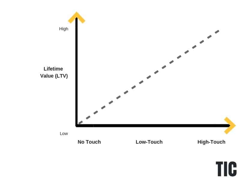
Whenever it comes to Onboarding Track 3, it's important to note that how you reach out to each user is entirely dependent on the average LTV of each customer.
If you have a high LTV, you can afford a higher CAC and a more manual sales approach. Or if you're like many SaaS businesses that fit somewhere in the middle, you'll want to deploy a low-touch sales model as soon as someone becomes a PQL.
How you reach out really depends on what your average LTV is. Although this is not a rule, if you want to grow sustainably, you'll inevitably have to match your sales approach with your average LTV so that your CAC doesn't destroy your margins.
If you do go with the low-touch approach, I would recommend learning more about how Atlassian has grown its low-touch sales model into an automated sales machine.
Key Takeaways:
- The entire focus for Onboarding Track Three is to upgrade users into customers.
- How you reach out to users is dependent on what your average LTV is. If you don't match your outreach approach with your LTV of a customer, you'll risk running an unprofitable business.
- Once a user upgrades, you need to remove them immediately from Onboarding Track Three.
Just-In-Time User Onboarding Sequence Review
When it comes to user onboarding emails, you need to catch people where they are in their user journey. This is why a good visualization of your funnel is critical. Each email we send out needs to help the user progress further and help them accomplish what your product enables people to do.
To recap, Onboarding Track One focuses entirely on helping users experience a quick win in the product.

Every email in this track is trigger-based. You will always need to send out the welcome email, however, when it comes to usage tip emails, you can skip them if users have already accomplished those recommended actions in the product.
For Onboarding Track Two, it starts the second a user experiences a quick win in the product.

The first email in the track is a usage review, however, that can be modified depending on if you can showcase value from the product.
For CrazyEgg, this could be showcasing a user's heatmap of their homepage in an email.
For some products, however, it's not that simple to showcase your product's value as soon as they experience a quick win in the product. If that's the case, you can always skip the usage review email or delay it.
For the trigger emails, all you're trying to accomplish is helping the user take meaningful action in the product that results in a reward and additional investment in the product. By doing this, you're able to build hooks into your product that are essential to building a habit-forming product.
For Onboarding Track Three, the entire focus is to upgrade users.
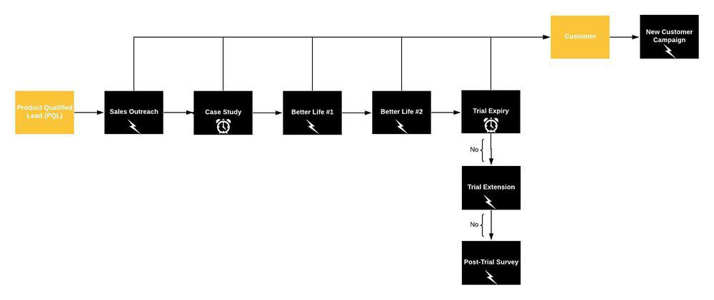
Typically sales will reach out as soon as a user has become a PQL. That way sales is only focusing on the leads that are most likely to close.
For the Case Study emails, you can have your customers help you handle any objections your users may have whether that be through a video testimonial or case study.
For your Better Life emails, you want to focus on highlighting the main benefits of your product and prompt users to upgrade.
For your Trial Expiry emails, you want to focus on communicating the value of your product while reminding people that their free trial is about to expire.
For your Post-Trial Survey emails, the whole goal is to learn why people don't upgrade and then enroll each user into a follow-up sequence.
If we put all the email onboarding tracks together, you'll have a Just-In-Time onboarding system that converts free users into paying customers.

Now, what was your biggest takeaway from this article? Do you have a better understanding of how to create a user onboarding funnel that delivers results? I'm curious.

