There’s a fine line between success and failure with SaaS onboarding. Implement all the best practices and you boost your chance of user activation and a high retention rate. Conversely, you could find yourself losing up to 75 percent of your new users within the first week if you make mistakes.
What is the goal of user onboarding?
Although counterintuitive to what many people think, the goal of user onboarding is to NOT help people become better at using your product.
The goal of user onboarding is to help people become better at what your product enables people to do.
For Slack, this is communicating internally.
For Canva, this is creating beautiful graphics seamlessly.
For CrazyEgg, this is understanding how people use your website.
Great user onboarding is a means to an end
The only thing user onboarding should be focused on is helping new users experience what your product can enable them to do.
Take Adwords, for instance. One of the first things they do in their onboarding is help you set up your first advertisement. It makes sense, people who sign up for Adwords want to generate more leads for their business. Creating an advertisement brings you one step closer to hitting your lead targets that month.
If Adwords had spent their time simply walking you through the entire product and showing you all the bells and whistles within the platform, you’d (actually) be worse off.
To be great at user onboarding you need to understand the bigger context behind why people would even consider using your tool. If you don’t know why people use your product, I recommend taking this free SaaS customer research course.
If our goal is to generate 1,000 leads for your business this month, you might need to use Adwords, Facebook Ads, SEO, and Remarketing to hit your goal.
As such, each of the platforms needs to help your lead target goal. As you can see in the graph below, each of the tools and channels can fit into the big context of lead generation.
Now, back to you, what big context does your product fit into?
Is it lead generation?
Is it getting more fit?
You tell me!
This may sound straightforward, but many businesses don’t know the big context behind their product. As a result, many businesses force unnecessary steps onto users in the onboarding process.
It’s easy to do. If you don’t know the key outcome you want to drive your users to, what’s stopping you from showing users unnecessary features that “might be helpful”? This happens to the best of us.
This confusion around what to guide new users towards ends up bleeding conversions. Even non-trivial steps like activation emails can put a significant dent in your free trial to paid conversion rate if you’re not careful.
Speaking of which, untimely activation emails are one of the biggest user onboarding mistakes I see again and again. Even if you just implement this one step I’m about to share with you, you’ll potentially be able to net an additional $100,000 ARR in 12 months. (Here's where you can see the best user onboarding examples!)
5 SaaS Onboarding Mistakes and What to Do Instead
You know potential SaaS onboarding mistakes are lurking around every corner. But what you may not know is how to identify them and what to do instead. Fortunately, I outline everything you need to know below.
Forcing users to activate their email at the beginning of your onboarding flow
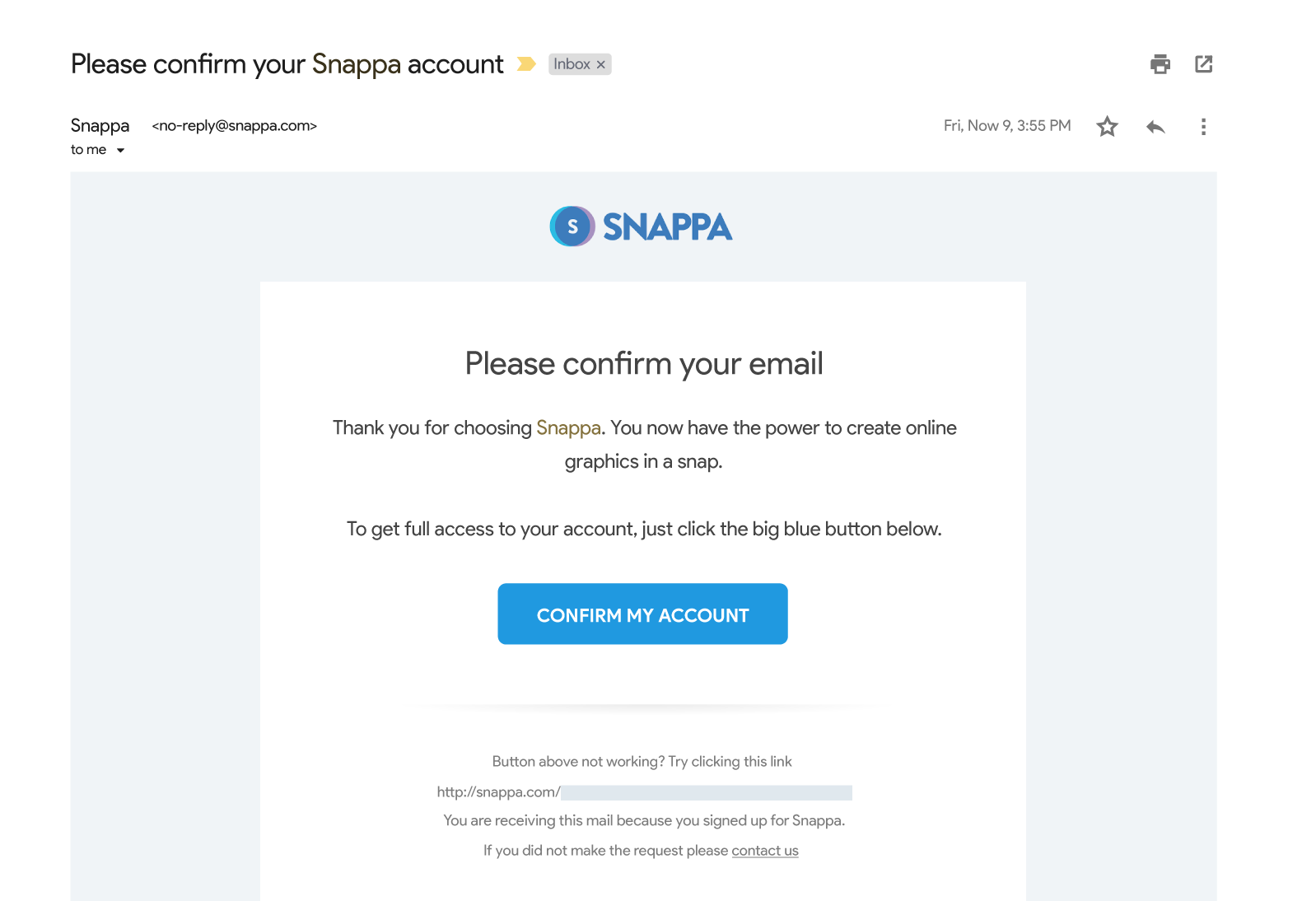
Last week, I was talking to a SaaS business owner who required new freemium signups to activate their email before logging into the product. This step is common practice for many SaaS businesses. However, what the business owner didn’t realize was that 27% of all signups never ended up activating their account. In fact, these new users simply signed up and never touched foot in the product, ever. This business owner was shocked.
I, on the other hand, was a lot less surprised. Most SaaS businesses that include an email activation step as the first step in an onboarding process lose out on 10-30% of users right away.
The activation email could very well be the biggest conversion killer in your onboarding process today.
This should come as no surprise.
Why activation emails can kill your activation flow
The email activation step is comparable to telling a kid who just waited in line to ride a roller coaster (your product) that he needs to go to the main ticketing booth (his email platform) to re-verify his ticket to make sure things “check out”. It’s frustrating and that kid is very likely to check out another roller coaster on his way to the ticketing booth. If your roller coaster (product) isn’t the main attraction in the park, you might never see that kid come back.
Now, we’re not kids anymore, but how often do we get distracted when checking our email? We are human after all. If we see a more interesting email when we log in, we’re going to click on it and most likely forget about the activation email.
Now, in this business owner’s case, he was practically saying goodbye to one in three signups. This one step ended up costing his business well over $100,000 ARR in lost revenue.
What to do instead
To fix this problem, all the business owner had to do was require second-time users to confirm their accounts. That way when people first sign up for the product, they’re able to use it immediately and experience meaningful value. In other cases, I’ve also seen businesses use a simple banner in their application to remind users to activate their accounts during their free trial. How you go about this depends entirely on your business.
Here’s an example from PandaDoc:
Here’s how Monday.com does it:
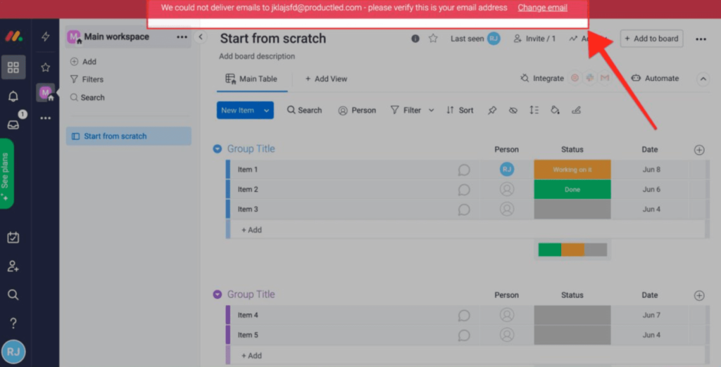
So, please, rethink when you require new users to activate their email.
One thing I hope you’re not thinking about is that you should eliminate the email activation step. Verifying emails is still important but you should ask yourself when is the best time to ask new users to take action.
Next up, if you think onboarding starts in the product, please think again.
Starting user onboarding in the product
Acquisition plays one of the most critical parts in user onboarding, but that doesn’t mean onboarding should start in the product.
For instance, if your product offers video hosting but people are signing up thinking it’s a video marketing agency, they’re doomed from the start — no wizard or product tour can save that.
Period.
Why starting onboarding with the product is bad practice
One of the big problems with thinking that user onboarding starts as soon as you enter the product is that you need to create an experience that delivers on people’s perceived value of your product.
For instance, if you see a Facebook ad promoting accounting software that takes less than 30 seconds to sign up, you’re going to have a hard time spending 30 minutes setting up your account.
In this scenario, you experience a value gap. You thought the product could solve your accounting problems in 30 seconds or less when, in reality, it took you well over 30 minutes to set up.
What to do instead
This brings us to our second point.
You need to keep your promise. Or else, a value gap is going to eat your conversions.
Sticking with the example above, don’t tout a 30-second sign-up process if you can’t back it up. Frustration will set in once the user realizes this isn’t possible. And with that, there’s a high chance of them leaving your product behind in search of another.
Having a value gap between the perceived and experienced value
We all have that friend or family member who exaggerates their experiences. After a while of hearing them talk, it’s hard to trust what they have to say.
The same thing applies when selling your software solution.
What we promise in our copy is the perceived value.
What we deliver is the experienced value.
Ideally, the perceived value lines up exactly with the experienced value like in the graph below.
But, this is rarely the case.
Why having a value gap is a bad thing
Most companies struggle with overpromising and underdelivering. That’s one big reason why free trial and freemium models are booming.
People want to see for themselves if an application can do what it promises.
If you keep your word, this is a great way to build trust.
If not, your users will lose trust in you and your value gap grows bigger.
What to do instead
If you want to identify value gaps in your organization, I’d recommend asking your support team for some pointers.
Oftentimes, support teams have a treasure trove of support requests that can tell you how big your value gap is when people sign up.
Even if you have an outstanding product that delivers on its promise, many new users might not be able to experience the product’s value unless you structure a quick win for them in the product.
This quick win is the light at the end of the tunnel that shows people just a glimpse of what the product is capable of. It brings them in. It shows them why your solution is powerful. And, most importantly, it gives them a damn good reason to come back.
Walking new users through all your product features
Have you ever signed up for a product that had a walkthrough that went through the entire product?
It might have gone something like this:
- Hey, welcome to the product!
- Here’s a feature
- Here’s another feature
- Why look at that, here’s another feature
- And it just kept going on and on
Often when companies use tooltips to walk through the entire product experience, I feel like a real estate agent is showing me around a home. The agent wants to show me around and point out certain things that I might not have otherwise been aware of. This helps so that I can make an informed buying decision about a house. But when it comes to software, this can hurt your conversion rate more than it can help.
Why you shouldn't walk a new user through your entire product
User onboarding should not be like a real estate agent showing you a home you’re about to buy. We are not making the biggest financial investment in our life. It’s an investment, yes, but it does not require “hand-holding” from start to finish.
Attempting to walk a new user through your entire product bogs down the process. It overwhelms them. It eats up too much time. And worse yet, it can complicate onboarding to the point of scaring the new user away.
What to do instead
A free trial or freemium model’s whole point is to show you the value of the product fast so that you see if the product is a good fit for you.
A free trial or freemium model should be like a fitting room at a retail store. It should give you a quick sneak peek of what it will be like with the product. Does it fit your needs or not?
The sooner you help people experience a meaningful quick win in the product, the sooner your users will come back to your product and eventually turn into customers.
The problem, however, is that most businesses treat their users like they’re customers and it’s hurting their conversion rate.
Treating users as customers
Users and customers are not one in the same. They’re not looking for the same experience. Users, for the most part, have less motivation when using your product. They want to explore it, determine if it can help their business, and take action.
Customers are already using your product. They’re invested and may require more attention.
Why you shouldn't treat users as customers
The problem is the terms: users and customers often get used interchangeably when in fact they are distinctly different.
The situations of the user and customer are entirely different. Their motivations are different. Their abilities are different. When you look at it, they're on the opposite ends of the scale.
Users don't have the time and patience to consume everything about your product. They'll cozy up with the first tool that shows them progress, outcome, and value with ease.
But customers need more. Left unsupervised, they will stagnate and churn. You need to keep them moving forward with your product or they'll start to look elsewhere for their next “aha” moment.
Thus, onboarding users like customers, and vice versa, is not a smart thing to do.
Ty Magnin, UI Path
It’s helpful to understand that when someone signs up for a free trial, we need to help them change their current behavior and experience a new and better way of doing things.
For instance, if you’re selling a business intelligence solution like Grow, your users are most likely using spreadsheets or some system they’ve cobbled together themselves to understand their business metrics.
It’s up to you to help them solve their pain points, but, more importantly, leave their old way of doing things behind.
The BJ Fogg Behavior Model
One of the most effective models for helping people transition to a new way of doing things is the BJ Fogg Behavior Model.
The best part is there are only three elements to help people experience a new target behavior in your product.
The three elements we can influence in the BJ Fogg Behavior Model below are:
1) Motivation – the general desire or willingness of someone to do something.
2) Ability – how easy or hard people find it to use your product
3) Triggers – tools you can use to prompt a certain behavior
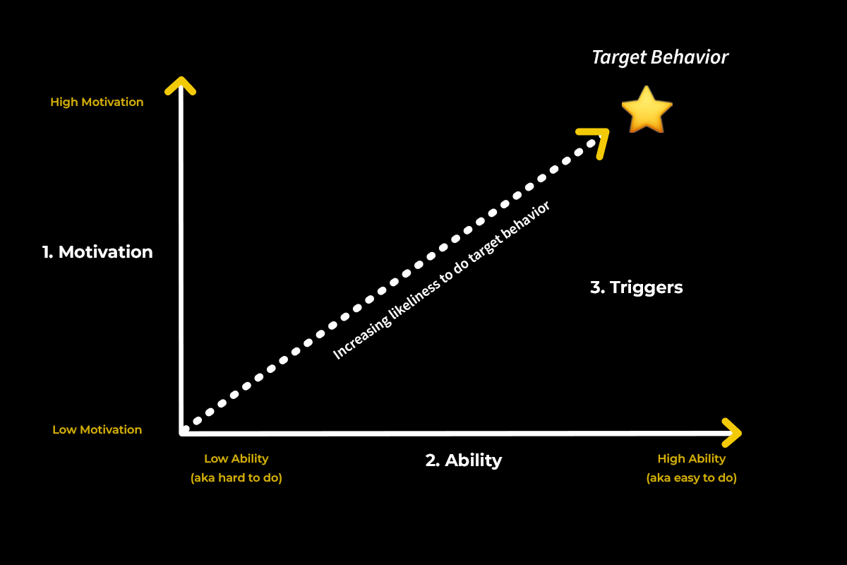
One of the key differences that Ty pointed out is that the motivation and ability of users and customers could not be more different.
Customers, on one hand, are highly motivated to use your product and exploit the full value of the solution. While users just want to see if your product is a good fit for their business.
Customers are often well-versed in your solution and have a high ability to use the product. Whereas, users take time to get up-to-speed and experience the full value of the product.
As you can probably start to see, the motivation and ability of whoever we’re helping place a crucial role in onboarding success.
What to do instead
Rather than treat users the same as customers, pin down a defined process for each. Start by understanding what your users are looking for and then decide how you can give it to them.
What can you do to make their experience as painless and efficient as possible? As you remove roadblocks, you’ll find that more users are coming to understand the value of your product.
Are You Making These User Onboarding Mistakes?
User onboarding is not about helping your users become proficient at using your product.
The goal of user onboarding is to help people become better at what your product enables people to do.
As such, everything we set out to do in our user onboarding should be focused on helping users experience a meaningful win in our product.
To recap, everything we’ve talked about, please make sure not to make these costly user onboarding mistakes:
- Force users to activate their email at the beginning of your onboarding flow.
- Treat onboarding like it starts in the product. Onboarding starts the second someone interacts with your brand.
- Have a value gap. When a user thinks that the perceived value of the product doesn’t line up with the experienced value of the product, you have a value gap. The bigger the gap, the more users who won’t return to use your product.
- Don’t walk your new users through your entire product. Instead, focus on helping them achieve a quick win in your product.
- Don’t treat your users as customers. Users have far less motivation when it comes to using your product. They want to quickly explore if the product can work for their business.
Now, I'm curious. What brands have the best user onboarding experience?


