This article first appeared on productled.org. This is an excerpt of a new book I’ve written with Wes Bush called Product-Led Onboarding™: How to Turn New Users into Lifelong Customers. You can buy it now!
One of the most impactful ways you can improve your user onboarding experience is to remove as many unnecessary steps as possible.
Doing so should reduce your product’s time-to-value and increase the number of people who experience your product’s “Aha!” moment.
But when taken to the extreme, you risk cutting too much and ultimately detracting from the experience. The goal of user onboarding isn’t to get more people to experience your product’s value as quickly as possible. It’s also to help them adopt new product habits.
Habit-formation requires some friction.
Think about the last time you tried forming a new habit, whether that was going to the gym more consistently, writing more often, or drinking less coffee. More likely than not, the first few days were tough—but necessary. Once you’ve gotten over the initial friction, it becomes easier to do the new habit.
Similarly, helping people adjust to a new and better life with your product requires some friction. The key is identifying the difference between “good” and “bad” friction so you can weed out the bad ones and keep the good ones.
I use a three-question framework I call the “DAD” test (yes, it’s a riff on Rob Fitzpatrick’s MOM test!) to help people identify good onboarding friction from the bad.
Question #1: Does this onboarding step help direct users to the next step in the onboarding process and get them closer to experiencing the product’s value?
For example, Canva shows relevant design templates to users based on their response to their sign up questions.
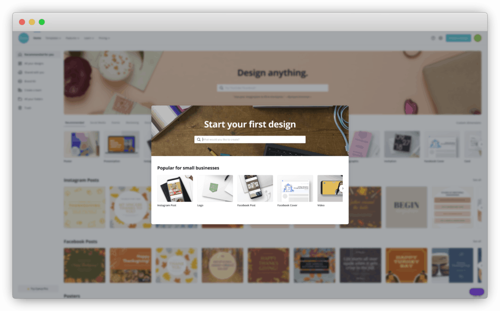
Some might consider this step unnecessary. It’s one extra screen that new users see before creating a new design with Canva. But by suggesting relevant templates, this step helps speed up the design process and allows new users to experience the product’s value quicker.
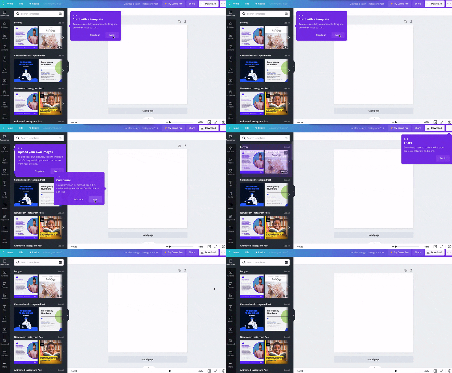
Another example could be product tours. I say “could” because often they are used to tell users what the button or feature does (i.e., “Click here to do X.”). They do not explain why they are important to helping them achieve their desired outcome. Focusing on the “what” can actually degrade your product experience by creating friction that only disrupts a user’s momentum.
When done right, product tours should help direct users to the minimum number of steps to experience the product’s value. Canva does a good job of this by guiding users through four steps to download their first design.
Question #2: Does it add to and personalize the onboarding experience for users?
Segmenting and personalizing the experience is almost a guaranteed to improve user onboarding. There are three main benefits of segmenting your onboarding:
- Users learn exactly what they need to do for them to experience the product's value.
- You can get down to the specifics of how exactly your product can help them.
- You can increase user motivation by sending targeted messaging based on each user’s primary goal.
It's why some of the best onboarding experiences I've reviewed ask users their primary reason for signing up and then they personalize the onboarding process based on their response.
For example, Wave, an invoicing and payroll software company, asks: "Hey Ramli! What would you like to do in Wave? Choose a starting point" during the signup process.
Users are presented with four options:
- Send professional invoices
- Manage your accounting
- Run effortless payroll
- Not sure yet
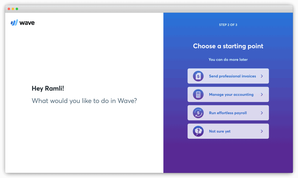
Based on your response, Wave customizes the rest of the onboarding experience, including emails, in-app messages, and product tours.
Question #3: Does it delight users and get them excited about the product?
An example of this is what Wave does during the user onboarding process. It asks for the users’ company logo. From there, they automatically identify the brand colors and update the invoice template to match the branding.
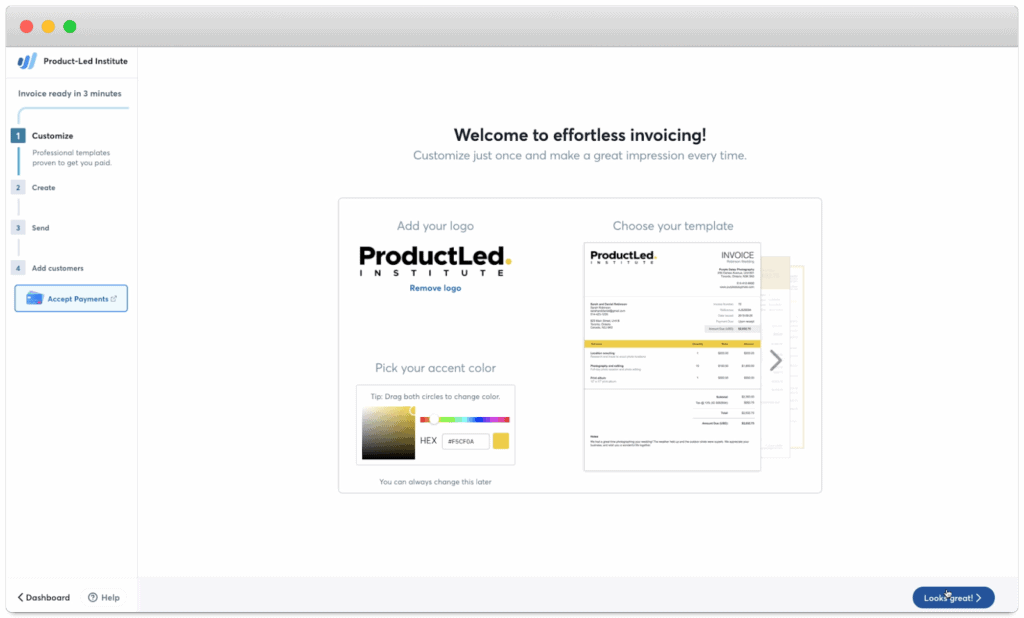
Some may think that this step is unnecessary and should be removed. But, after doing customer interviews, the Wave team found that this step got users excited about the product:
During customer interviews, the customers we talked to that saw what their invoice will look like with Wave said, “Wow! This is great! This looks professional. It’s beautiful.” That gives them a lot of confidence that the product is good. Wave is something that they can trust.
— Vivek Balasubramanian, Director of Growth at Wave (source)

Another way to delight users is to simply welcome them to the app. Many may believe this introduction is a massive waste of time. But if you create a common bond, build a connection, and relate to a shared mission, that can be an enormous boost of motivation for new users.
It doesn’t need to be anything fancy either. With a short video from their three founders, Userlist creates a bond with users thanks to the personal message.
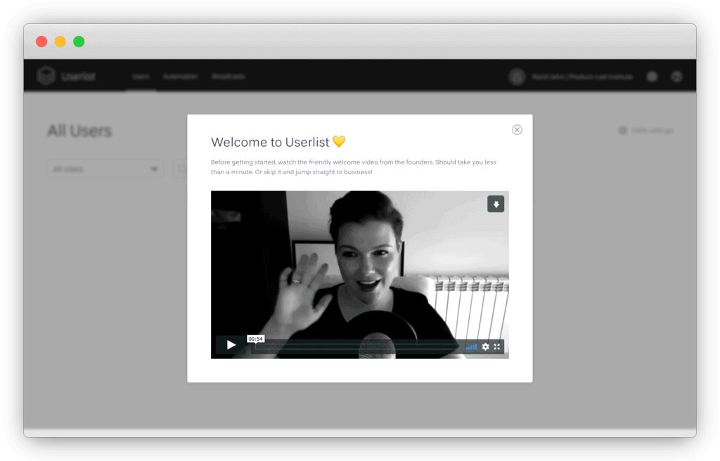
Many products ignore this critical step. But imagine walking into a dinner party without the host greeting you and giving a tour. Most likely, you’d feel snubbed and hurt!
Welcome messages also set the tone. They give customers a sense of how they’ll be treated during their relationship with the product. Personal videos are great at humanizing the experience while implying someone is personally involved in the users’ success.
The three types of “good” friction
In summary, the three types of good friction in the onboarding are ones that:
- Directs users to the next step in the onboarding process.
- Adds to and personalizes the user onboarding experience.
- Delights users and gets them excited about the product.
So, next time you’re wondering if you should cut out a step in your user onboarding process, ask yourself, “Does this pass the DAD test?”
This is an excerpt from the upcoming book EUREKA: How to Onboard New Users and Turn Them Into Lifelong Customers. Get the first chapter and join the waitlist now.


