Welcome to the first-ever Product-Led Onboarding™ Teardown here at the Product-Led Institute. Today, we’ll be breaking down the user onboarding of FullStory into five main parts:
- Pre-signup
- The signup flow
- The first product experience
- The purchase experience
- The final verdict
By the way, we also had Melanie Crissey, a Product Marketing Manager at FullStory, on the Product-Led Podcast. She shares more in-depth FullStory's onboarding and six mistakes their team made when improving it. Grab the full episode on Apple Podcast, Spotify, Overcast, Google Podcast, and Breaker
1. What is FullStory?
Before we get started, let’s first find out what FullStory is. Here’s how Melanie Crissey, a Product Marketing Manager at FullStory, explains it:
FullStory is a digital experience platform. It allows product people to understand how customers or users are engaging with their websites, web apps, and mobile apps so they can continuously make digital customer experiences better.
It used to be just a session replay tool, where people can watch what their users do on their product. But today, the product includes product analytics, developer tools, and some smart machine-trained heuristics. For example, FullStory proactively reveals instances of user frustration—we call those Rage Clicks, Dead Clicks, Error Clicks.
2. Pre-signup
Anyway, let's jump in and take a look at the homepage of FullStory! Ready?

Some of you might ask, "Wait, why are we starting with the homepage if this is an onboarding teardown? Shouldn't you start with the registration page?"
The success of your new users really starts even before they start filling out the registration form. Your homepage, landing page, and other interactions you have with users shape their expectations for three things:
- What is this product?
- How can it help me solve my problem?
- Is it the right fit for me?
In essence, you’re planting a seed for the future for new users and setting the stage for getting them excited about signing up, trying out, and giving you their credit card when they become a customer.
Now imagine if a user signs up for your product, they really have no idea what your product does. Maybe they’re just curious. Their friend told them to do it. How successfully can you onboard someone when they start things off with a misaligned impression of the value your product provides? Good luck!
Articulating your value clearly and early lets people know if this relationship will work for them or not right away.
With that in mind, I’ll only briefly go through the homepage and pricing page. I have three main questions here:
- Do I understand what this product does?
- Do I understand how it can help the product’s target audience?
- Has the product positioned itself as the best solution for the problem?
FullStory's homepage
Let's see if FullStory's homepage answers the three questions above.
The headline reads, “FullStory tells you everything you need to know about your digital experience.” The text below is, “Deliver exceptional experiences by letting our easy-to-use, intelligent software pinpoint when, where, and how user struggle is affecting your revenue and retention.”
The headline and text combined explain clearly that FullStory’s software helps companies with two important things they care about – revenue and retention. They do this with their “easy-to-use intelligent software” that helps you figure out when, where, and how users struggle with your app.
In some sense, this goes along the line of Dan Kennedy’s PAS copywriting formula, which has three main parts:
- Problem – “You don’t know when, where, and how your users struggle with your app.”
- Agitation – “This is affecting your revenue and retention.”
- Solution – “Check out our easy-to-use intelligent software to fill in the blank.”
To the right of the headline, you see an image of a line that goes up and down like a rollercoaster. Along that line, there's a young, hip millennial looking frustrated at her phone. There's a notification beside her, "Slow Page Load."
Further along, that line that dips sharply upward, someone's on their laptop. There's also a notification beside it, "Clicked: Add to Cart."
Even further along the line now slightly downward, there's a website with the notification, "Dead Click."
From what I gather, this represents the emotional customer journey with a brand.
I genuinely like how this image ties back to FullStory's value, as described in the headline and text description. I also like how the photos reinforce that FullStory is for digital experiences, and not just for website experiences. This includes mobile and web experiences.
This is a perfect example of how the images complement the copy instead of taking away from the message. This is not some random illustrated image that I see so many startups and websites use.
However, those smaller images look like random stock photos. I'm not a big fan of stock photos. They make things look inauthentic and may cause your brand to come across as fake. Maybe this is where a little bit of illustration would have been helpful.
Taking a look at the customer logos below the buttons, you can see who FullStory is mainly targeting, big consumer-facing brands such as CarMax, GNC, Hyatt, and HBC.
The text above the logo reads, “Improving billions of experiences at brands like.” This is the third time that FullStory used the word “experience” above the fold. They really want to drive home this point.
Finally, the primary button’s copy, “Get a demo,” reflects how this is a more enterprise tool.
FullStory hasn’t always been focused on getting people on a demo. In fact, as Melanie, the Product Marketing Manager at FullStory, points out, FullStory has been a more traditional product-led company offering a 14-day trial until recently:
The “Request a demo” CTA is super new. We really only shipped that in the last two to three weeks here in terms of making that our primary call-to-action. So you caught us at a kind of like a shift in our business.
In the past, our primary mode of operating was, if we can just get people in the trial, they're going to understand immediately how magical FullStory is.
Before I click on this button to see what happens, notice that this button doesn't have the same copy as the button on the navigation bar, which is "Request a demo."
I've gone through the rest of the pages before this teardown, and in other places, the button copy is "Book a demo." It would be better to have a consistent copy for requesting a demo.
Interestingly enough, after you click "Get a demo," you end up on the bottom of the homepage to "Request a demo." ????

On the "Request a demo" section, the headline is, "Take your digital experience to the next level," which connects nicely with the above-fold headline and the testimonial below. Satyen Motiani, a product manager from TrueCar, describes how FullStory has helped them increase their user engagement by 50 percent.
The next part speaks to one of the things that product managers working on new features are looking for – the confidence to know that users are using and deriving value from a new feature.
The form on the right pops out from the dark background. The form itself is basic enough. I like the last optional open-ended question, "How can we help you?" It's a great way to let prospects tell you the best way you can help them.
There's one final thing above-the-fold; there's a secondary button, "Watch the video." A huge part of the button copy is providing a clear idea of where that will take you or what it'll do.
Here, what is "the video"?
What is "the video" about?
Oh and by the way, it's THE video, whatever that means. ????♂️

Anyway, I saved you the trouble and watched the two-minute video:
It’s a well-done (and probably expensive!) explainer video of how FullStory can help brands increase customer loyalty and revenue.
It’s filmed from the perspective of a customer of a fictional eCommerce store “Teheeshop” who just wants his “Soft V-Neck Tee,” but can’t because the website is broken. This is what happens if your brand doesn’t use FullStory! The video goes on how their software could have helped Teheeshop. The final shot is of the customer getting his V-Neck Tee, finally! The end.
This video is excellent! It’s story-driven and well-paced. I just wished that the button copy wasn’t “Watch the video.” What’s better could have been “Watch FullStory in action.”
To save time, I’m going to jump into the pricing page from here so we can focus more on the signup flow and first product experience.
I can tell you that FullStory's homepage is top-notch, from the copy to the images.
Onwards to the pricing page!

The pricing page
The headline of the pricing page is, “Know your digital experience. Start today.”
The pricing page is typically one of the most visited pages of SaaS websites. This is a significantly weaker copy than the homepage.
I would have made this more value-driven and reinforce what customers really want, whether that’s to highlight hidden causes of lost revenue or craft digital experiences that wow your customers.
Looking at the plan comparison table, FullStory really has gone all-in with Enterprise. Not only is it the first plan that appears on the pricing table, but they featured it with a box shadow that makes it stand out from the rest of the page.
But, as you scroll down, you’re surprised to come across a free plan!

No way! With all the emphasis on enterprise customers and the Enterprise plan, who would have thought that there would be a free plan?
Melanie, the Product Marketing Manager at FullStory, shares how this product-led tactic can help more traditional sales organizations:
Escalating those leads from the product when they engage with certain milestones to say someone just completed this really exciting thing in the app, those are going to be much compelling, productive conversations than just someone who downloaded a whitepaper on a marketing site. And so using the product engagements to do a qualification is huge!
It’s also apparent here the limitations of the free plan, 1,000 sessions per month. What’s not clear here, though, is the most critical question: how much is it?
Are there any limitations?
What happens when we go over that 1,000 sessions per month limit?
Let’s scroll down to plan the comparison table to find out.
It seems like there’s no difference between the free plan and the paid Business Plan other than the 1,000 sessions per month limitation.
Let’s scroll down further to the frequently asked questions.
The answer to the last question seems like FullStory deletes any sessions over the 1,000 per session. Hitting that limit will probably trigger the sales team to reach out to us.
No worries! We’ll just make sure to stay below this limit.
My only concern left to be answered is the price of the business plan. It seems like FullStory is playing a traditional sales game where they hide the plan price behind a demo.
Anyway, it’s time. Let’s hit that “Start Free” button and get started.
3. The signup flow
After we click on “Start Free,” we’re brought to the signup page.
In the headline, it reads, “Start your free trial now.”
Wait, one second.
Didn’t we signup for a free account and not a free trial.

I’m confused.
Is this a free trial for the business plan?
The text below the headline doesn’t help with the confusion. “You’re minutes away from insights.”
It’s fascinating that the value of FullStory is described as “insights” here. This word has only been used once on the homepage and on the pricing page. This is a real disconnect to the copy from the homepage where FullStory’s value is described as helping “uncover hidden opportunities to improve your digital experience.”
Some might ask, “Well, didn’t you just come from the homepage, Ramli? Why are you being so nitpicky?”
This is a critical moment in the user’s journey. Every user who has ever signed up for FullStory will see this page. Anytime you can reiterate and emphasize the value of your product, you do, and you do it consistently.
Anyway, let’s fill out the required fields. The phone number is optional. There ain’t no way I’m giving my phone number on the Internet. I don’t want any more stalkers or crazies giving me a call (I kid!).
Melanie, the Product Marketing Manager at FullStory, provides some fascinating insight in my conversation with her. When they added this field, it didn’t reduce the conversion rate of the signup flow:
There were compromises made [with the FullStory onboarding], the phone number field in particular. I remember just wringing my hands over it because I was coming from a product-led mindset. I believe in no friction. I don't give anyone my phone number on the Internet!
So we ended up making it an optional field… But it's amazing. I was super wrong about that. I thought it was gonna affect our conversion rates. I thought it was going to alienate our customers. I thought the engineers were going to bounce right off the signup page. More often than not, people gave us their real phone numbers!
But for me, Imma leave that blank! Let's hit the “Get Started” button.
Ugh! I have to go to my inbox to activate my email. ????

But, there's a good reason for this. I asked Melanie, the Product Marketing Manager at FullStory, why they make every new user who signup activate their email:
We've definitely thought through what would happen if we got rid of the activation email. I think because FullStory, we accept all emails like it can be Gmail, we get a ton of spam. So for security reasons, I don't know if it's ad fraud or what's going on, but it's like people are using other people's email addresses to sign up. So, that activation is really a security measure to protect those people.
The product-led approach is to remove as much friction as possible. But, I understand the reasons behind the security and spam.
From a user experience perspective, it would have been worthwhile to include those reasons in the copy.
The copy at it stands sounds cheery for all the wrong reasons. It’s like that friend that lets you know, “Sorry, your dog just died!” all with a smile on his face!

This copy lacks empathy.
Here’s an example of a double opt-in notification from the newsletter of Joel Kletkke, a SaaS copywriter specialist.
We've got a live one! Please double-check your spam / "promotions" tab to confirm your opt-in, or you won't get any mail from me. (Also, thanks for signing up.)
See how human this copy sounds! Not only that, but Joel also provides an example of why you should go confirm your opt-in – so you can get his emails.
Everyone should be more like Joel!
(P.S. If you’re into copy, you should sign up for his newsletter. I don’t get anything in return!)
Anyway, the activation email isn’t any better. It’s the same cold, robotic email as the previous page.
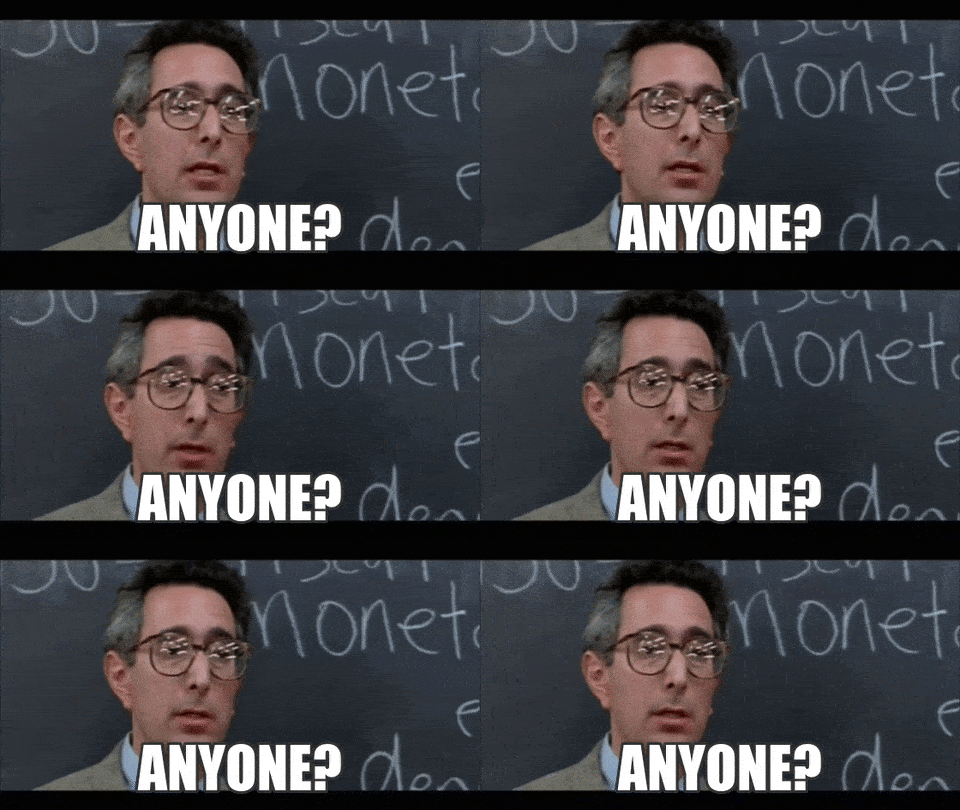
In my head, I imagine the teacher from “Ferris Bueller’s Day Off” is the one speaking this in his monotone sleep-inducing voice: “You’re almost there. Please verify your email to activate our account.”
Another thing, this email is from "FullStory Support." Why couldn’t this have come from a human, maybe someone from the customer success team?
Anyway, this is a big onboarding sin that I see a lot of SaaS companies make.
Be more human. It really does make a difference!
Enough about this, let’s click that “Activate your account” button.
Whoa! This gradient background came out of nowhere. All the pages that we’ve visited so far have flat designs with white backgrounds.
This radical change got me questioning myself, "Am I still in FullStory?"
The logo at the top says I am.
But, this shift in design says I’m not.
Let’s ignore the 80’s vibe here, and let’s keep going.
Right below the FullStory logo, it reads, ‘Welcome back! Let’s finish creating your account.”
It sounds like an engineer wrote this copy!

I can say this joke because I was a full-time software programmer before I got into marketing. And I’ve definitely put together signup pages with copy like this just to get over it!
But, this is another missed opportunity to reiterate the value of FullStory.
Imagine signing up for FullStory and forgetting to activate your email a day later. It could have been a full day since the last time you saw FullStory’s homepage.
And if you’re anything like me, you probably forgot what you ate for lunch yesterday already.
This page does a few things right.
- It pre-populates your email address. I’m lazy. I admit it. If I don’t have to type it, I won’t. Thank you, FullStory, for saving me my precious seconds by filling that in.
- They leave a hint for the password, “Must contact at least 1 digit, 1 lowercase letter, and 1 uppercase letter.” Great! I don’t have to guess. When asking new users for passwords, it’s better to state outright your security measures. Imagine how frustrating it can be to enter a password and get rejected!
Once you create a password, let's click on “Create Account.” This brings us to a really unexpected page.
As soon as you click on "Create Account," you think you'd just go straight into the FullStory product.
Instead, we're on the terms and conditions page. I wonder why FullStory puts this as the first thing I see as soon as I finish creating my account. ????
Maybe it’s for the people who signup from enterprise companies who care about the small-print details, especially anything related to data and privacy.
But, ain’t nobody got time for this. I’m going to be a rebel and click the checkbox that indicates that I’ve read this agreement (even though I haven't!) and click “Accept.”

This leads us to a more traditional-looking onboarding flow. The design is more consistent with the signup page.
The heading of this page reads, “Welcome. Tell us a little bit about you. This will help your teammates recognize you in FullStory.”
Nice! They provide a reason why they’re asking for the information on the page. This copy also emphasizes that FullStory is meant to be a team sport and not a solo adventure.
What I also like is that they’ve pre-populated the first name and last name. If you recall, I already filled this out on the signup page.
Let’s fill out what I do. It’s great that this allows you to select more than one responsibility. Especially in smaller teams, some folks wear multiple hats.
Before we click on “Set up account,” You can see at the top of the page that there are three steps to this onboarding flow:
- Create profile
- Set up account
- Start recording
Progress indicators like these are a great way to keep impatient new users like me motivated to complete this process. It promises a reward (start recording!) or indicates to the user how close you are to finishing the onboarding process.
This brings me to the button copy “Set up account.” This is a nice touch to indicate with the copy the next step in the onboarding flow. Kudos FullStory team for not leaving this as generic as “Next” or “Let’s do it.”
Let’s move on to the next step.
The headline here reads, “Thanks, Ramli. Let’s set up your account. We’ll tune FullStory features for your account with this information.”
Great copy! It’s personalized with my name. It also explains why they’re asking for the info below. As a marketer, I know they’re asking this so that their sales team can better qualify you. But, like anyone, I like my account tuned for my needs.
Also, they once again pre-populated the company name. If you recall, I already filled this out on the signup page. Alright, let’s fill in the rest of the information. How many people work at my company? And what kind of business I’m in?
Then we get to the button copy, "Continue." C'mon FullStory, you were doing so well!
Why did you go back to something generic like “Continue” and not “Start recording,” which is the next step in the onboarding flow?
Let’s move on and smash the “Continue” button.
The headline here reads, “Great. Now for the fun part. All it takes is a little bit of code to start recording sessions.”
Do I hint at a bit of sarcasm here? I love it!

This copy is so human with that added touch of sarcastic undertone. Most marketers I’ve worked with hate code.
I also like how they’ve made it as frictionless as possible by providing three options to set up the code.
The first is by installing it with Google Tag Manager. Almost all the places I’ve worked at and companies I’ve worked with have Google Tag Manager installed on their site. I understand why this is the first option because (hopefully) most marketers have access to their GTM account.
There’s a little note at the bottom to enable a popup — a great way to anticipate what happens next if a user clicks on the button and nothing happens.
For those who have access to their website’s code, you have the second option. The instruction reads, “Paste your FullStory snippet into the head of your website.”
The last option is always helpful for any app that requires code to be installed. It reads, “Nice, tidy instructions for your favorite engineer.”
Another excellent copy here. For context, most engineers I’ve worked find installing snippets like this annoying. They’ve got other important things to build, features to ship, and deadlines to meet. This is why it’s best to send small tasks like this to your favorite engineer!
The button copy here is “Send your snippet” and not just “Send.” I’m glad to know that I’m not just sending a message, but it also includes the FullStory snippet.
The text below this button is also a nice added touch, “You'll be CC’ed on this email.” Whenever I send a system-generated email like this, I like to CC myself to make sure it got sent. This is another excellent example of anticipating the objections or needs of your user.
The last thing on this page is the “Continue” button.
What one second! This is the final step of the onboarding flow. What am I “continuing” to?
This doesn’t fill like the last step of the flow here. It doesn’t provide any idea where it’ll take me. Maybe, back to the terms and conditions?
Let’s find out!
A loading screen shows up. It reads, “On more thing: privacy is a priority. Protect the privacy of your users within FullStory.” It goes on that you can exclude sensitive parts of your site easily with FullStory.
They really want to drive home the point that privacy is important to them. I have a feeling that this topic has come up over and over again in support and sales conversations. This is a great way to handle objections at the beginning and address any concerns new users might have.
The button copy reads, “Continue to FullStory trial.” Below this, there’s a text, “Flip to FullStory Free any time from Settings.”
Ah! So when I signed up for the free account, I start off in a trial. Then, I can switch anytime to free.
Let’s move on.
3. The first product experience
Hooray! We’re finally in the FullStory app.
But wait, what do we see here? It’s the snippet to install FullStory. This is what we see the first time we get into FullStory.
I get it. We can’t really do much without installing the snippet. You can’t replay any sessions or see any analytics without the code.
But, there are a few things that FullStory could have done to get new users excited about installing this. First, my first product experience is this, a face-full of code. A welcome message would have been a nice touch. Even better, a welcome video from the founder or team. That video we saw at the beginning on the homepage would be useful here to get people excited about what you can do after you install FullStory.
This could also be a good place to ask for a demo or ask for help to see FullStory in action. The little help icon on the upper right of the screen is so small. It’s easy to miss.
In any case, I’ve got access to productled.com’s code. So I’m just going to drop the code in there to continue on.
Let’s go back to FullStory to see what’s happened.
Nothing.

Have I installed the code correctly? I checked it once, twice, and thrice. The code seems to be installed properly. What did I miss?
A tool to validate the snippet installation would have been helpful here. For example, I recently installed Google Optimize, and there’s a useful button to verify that I got it all installed correctly.
Without any way else to know if I’ve installed the FullStory snippet correctly, I wonder how long it takes for sessions to appear.
Let’s find out and click on the link right above the code snippet, “How soon will sessions appear?”
This brings me to the FullStory help page related to this. It says that it sessions should appear right away. But there might be a 5 to 30-minute delay before a session is indexed. This would have been useful to know without having to read this support page.
After about an hour, I finally got a live session!
Right there in the middle is a play button. Let’s go check out our first session
In this play session, there’s a yellow flickering icon on top of the “Note and sharing” area. FullStory really is calling out how their tool is meant for teams and not just for solo users. We saw this in the onboarding flow.
Well, what else do we have to do other than click on that yellow icon?
A tooltip appears, "Share and discuss sessions with your team.” Good to know. This once again emphasizes FullStory value is for product teams and not just a single product manager.
That’s it for the first product experience. In terms of taking it to the next step with purchasing the product, FullStory makes it easy… kinda.
4. The purchase experience
There are a few places in FullStory that lead you to buy their product. First is if you click on the number of days left on your free trial.
This brings up this odd slider to the right. It reads, “Unlock the magic of FullStory.”
You can scroll to the right to see the different features of FullStory and how it can help your product team. The primary button is “Talk to us.” This is different from the homepage and other product pages, which are “Book a demo,” “Get a demo,” or “Request a demo.” I do like “Talk to us.” It comes across as more conversational.
If you stumble upon a paid feature like the “Conversions” or “Data exports” tab, you’ll come across a sales page to upgrade.
For the “Conversions” page, it reads, “Understand what’s impacting conversions.” And it goes on in the text below to explain how FullStory can help you identify problems in your digital experience that may impact revenue. The call-to-action here is also “Talk to us.”
A slider on the right appears if you click on any of the “Talk to us” buttons.
It reads, “Let’s start a conversation.” Much like what we saw in the onboarding flow, every field is already pre-populated, even my email address. This removes the friction of what not knowing what to put in the message here.
5. The verdict
Overall, I would give the user the onboarding experience of FullStory, an A-minus. There are a few things that really make it stand out from the other onboarding experiences I’ve gone through.
What FullStory did well
First, besides the few mishaps with the activation page and email, the copy from the beginning to the end has been outstanding. It has personality and comes across as conversational and helpful. I particularly love how they added sarcasm on the page for you to install the FullStory snippet, “Great. Now for the fun part.” They also do an excellent job of reminding the users throughout the onboarding of the problem they’re solving (UX issues that impact revenue and loyalty) and how their product can help product teams solve that.
Second, they pre-populated fields that I’ve already filled out before.
People are generally lazy… or maybe it’s just me. I don’t like entering things I’ve already done before. Imagine your friend asking for your email address. Then a few minutes later, he asks for your email address again. Then in another hour, he asks again! I’d be annoyed. If your app asks for the same thing over and over again, it feels like that! Don’t make your users fill out something they’ve already done.
Third, the progress indicator during the account setup helps more users complete the onboarding process.
Progress indicators like these are a great way to keep impatient new users like me motivated to complete this process. It promises a reward (start recording!) or indicates to the user how close you are to finishing the onboarding process.
Fourth, they provided steps to install the FullStory snippet in three ways.
This is one of the most significant barriers to getting new users to experience the “aha” moment of FullStory. Chances are, marketers and product managers have access to their Google Tag Manager account. So that’s the first option you see. But, you can also install the code, or send a message to your favorite engineer.
What could be improved?
Let’s talk about rooms for improvement.
First, the button copy throughout the experience has been hit or miss.
A huge part of the button copy is providing a clear idea of where that will take you or what it’ll do. Vague button copy like “Watch the video” and “Continue” doesn’t provide a clear picture of what will happen next if you click on it. There isn’t a consistent button copy to get a hold of the sales team. Is it “Get a demo,” “Request a demo,” “Book a demo,” or “Talk to us?”
Second, talking about button copy, the difference between "Start Free" and "Start a free trial" is confusing.
When I signed up for a free account, I clicked on “Start free.” Then, in the onboarding flow, it became, “Start free trial.” I was confused if I signed up for a free account (which I thought I was) or a free trial. This confusion might be caused by FullStory’s recent shift toward enterprise customers. But, it can be cleared up quickly with a few wording changes on the pricing page.
Third, there’s no welcome message as soon as you get to the product.
This is a big missed opportunity! Throughout the onboarding experience, FullStory’s copy comes across as conversational and very human. They could have amplified this even more with a welcome in-app message or even a welcome video from the founders. Instead, your first product experience of FullStory is a view of their snippet, which, according to FullStory, is the “fun part.”
Fourth, there should be a way to validate that the FullStory snippet is installed correctly.
After I installed FullStory on productled.com, nothing happened. Which made me wonder if I installed it successfully. I checked the source code. I checked the plugin I used if I set that up correctly. All of it seems like they’re set up correctly. Then I read the support pages that it could take 30 minutes for sessions to be indexed. Ah, it wasn’t me, it was you, FullStory!
Closing thoughts
What do you think? Did I miss something that FullStory did really well or something the did that could have been better? Let me know in the comments below.
Well, that’s the first-ever user onboarding teardown from Product-Led Institute.
Get our Product-Led Onboarding™ Checklist for free
Before you go, we’ve put together a free one-page Product-Led Onboarding™ checklist.
Use it to take stock of your current onboarding experience, and run all your new designs past it before unleashing them on the world! Get the Product-Led Onboarding™ Checklist.
A comprehensive audit of your onboarding experience
Second, Wes and I can also do a comprehensive audit of your product’s user onboarding experience. It’s a bit like this, but more in-depth.
We’ll go through not just your the user experience, but also review your analytics (whether that’s Google Analytics, Mixpanel, or whatever analytics tools you have). We’ll even dig into your emails, in-app messages, and more. I guarantee you if there are bottlenecks in your product’s onboarding, we’ll identify it and break down how you can fix it. If you’re interested in getting an onboarding experience audit of your product, learn more about it here.
Learn more about our onboarding workshops
Finally, I just want to let you know that Wes and I do onboarding workshops for select companies.
In those training, we’ll walk you through a battle-tested onboarding framework that will help you create onboarding experiences that convert without resorting to short-term, sales-y tactics.
Through our history of working on onboarding experiences for companies like Grow.com, Dynatrace, Outsystems, and more, we've seen more SaaS onboarding experiences than anyone else on the planet.
You can find out more about our onboarding workshops at productled.com/training
That’s it for now! Don't forget to subscribe to our Product-Led Onboarding™ YouTube channel so you get the latest onboarding teardowns, strategies, and analysis.
Until the next one.


