Want to see the best user onboarding experiences?
Look at video games!
They can teach you a lot about how to structure your onboarding.
Before we start, Miyamoto, a legendary Nintendo designer explains the design secrets why Super Mario Bros' World 1-1 is instructive but fun to play. You can read all about it here.
Now let’s break down the lessons video games can teach you in relation to customer onboarding experience:
- Focus on the user's goal
- Teach the game by playing the game
- Ramp up the difficulty
- Celebrate their success
- Onboard users in the stages or levels
Let’s go!
#1: Focus on the user's goal.
In the instruction booklet, players learn that Mario's mission is to, "free the Mushroom Princess from the evil Koopa.”
Focusing on the mission is such a great way to motivate players to complete the game!
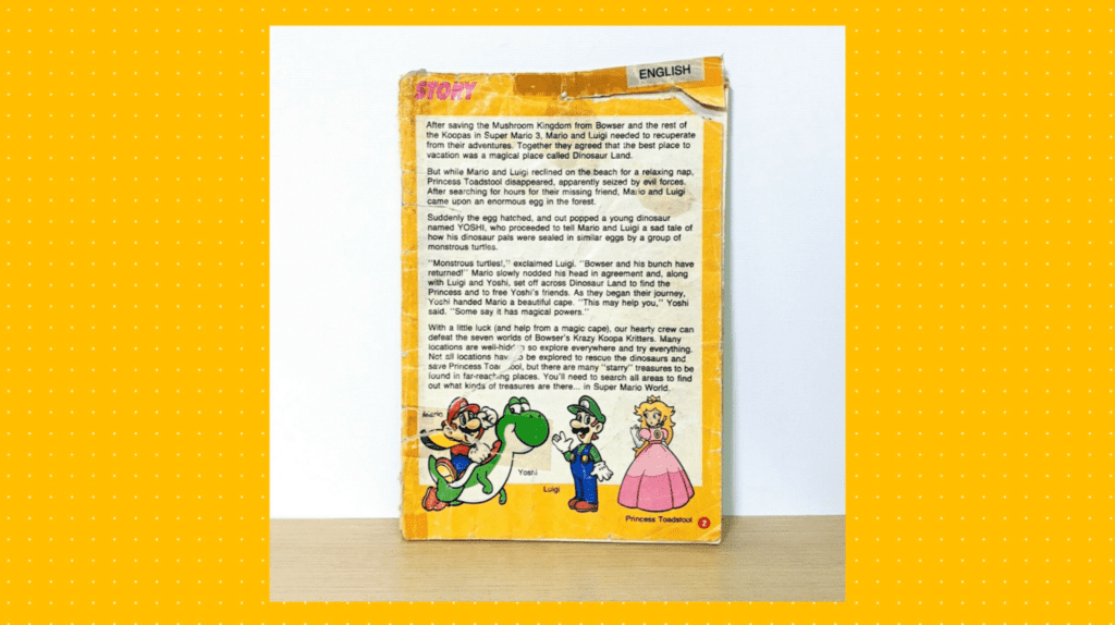
Similarly, motivate new users by focusing on the "mission" behind the product.
How will the product help them level up and improve their lives?
A big mistake in customer onboarding is that there is too much emphasis on the product and not enough on the outcomes.
As a kid playing Super Mario Bros., you’re not excited about a fire flower because it has a green stem, and it’s easy to pick up. It’s because once you pick it, you become a fireball-shooting Super Mario.
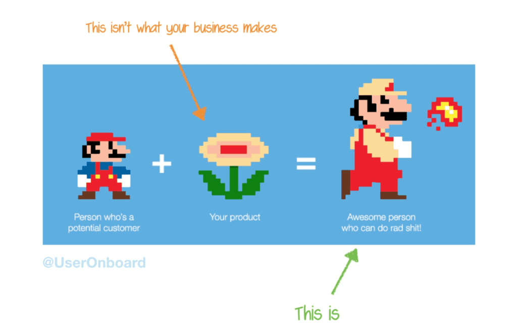
In the same way, user onboarding shouldn’t focus on the product (the fire flower) and its characteristics (green stem and easy to pick up)... even though they are important.
For your onboarding:
- How are you helping enhance users’ lives with your product?
- Is it more focused on the features of the product?
Remember the goal of the entire customer onboarding experience is to help users improve their lives. It’s important and helpful to view onboarding not as an exercise in teaching users about a product but rather how it makes them successful.
#2: Teach the game by playing the game
As you begin playing Super Mario, there are no “product tours” to show you around.
They place Mario on the left-most screen, creating “visual tension” to direct players to move him to the right.
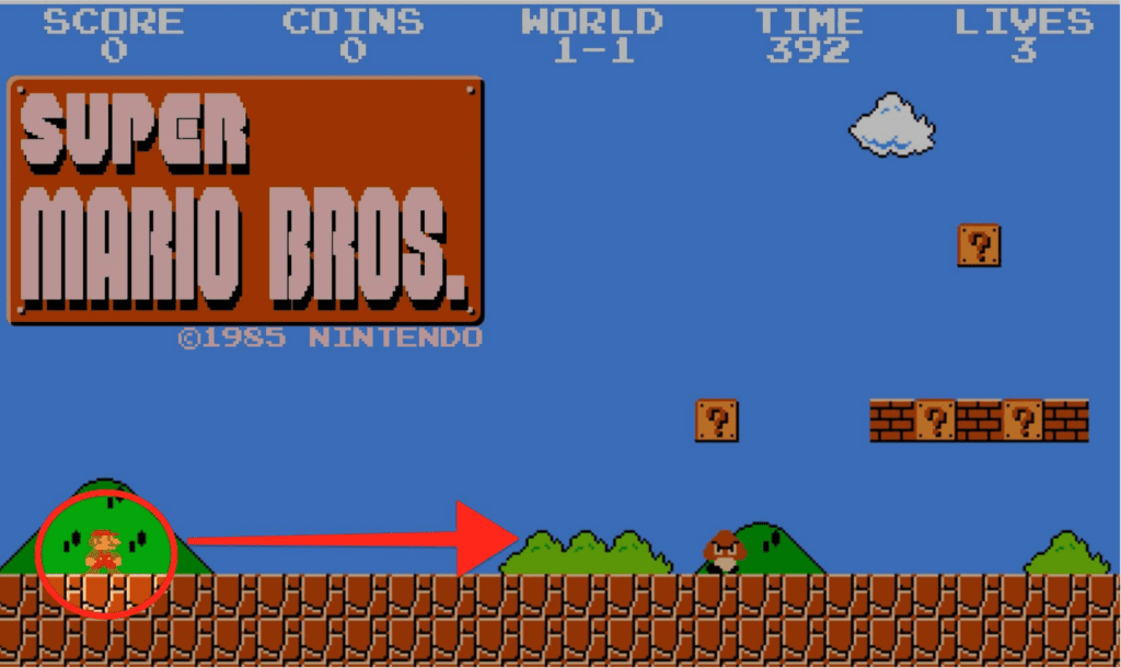
In terms of customer onboarding, product tours are often a crutch and band-aid solution to cover up terrible UX design. Most of these tours point out the bells and whistles of a product. They lack focus on the user’s goal (see tip #1 above).
If you are going to guide users with a tour, make sure it’s action-oriented rather than information-focused – avoid pointing out buttons and features that do not lead to users completing their goal.
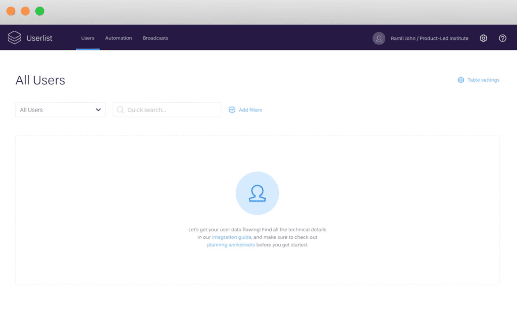
Often, a thoughtful, “empty state” is more helpful than a product tour.
An example is how Userlist directs users to instructions to connect their app and other helpful resources.
It’s placed in the middle making it obviously clear that it’s what new users should do next.
For your onboarding:
- If you have a tour, is it action-oriented that’s focused only on things to get users to accomplish their goals?
- Are your empty states designed to let users know what the next step is?
#3: Ramp up the difficulty
In Super Mario Bros. the first enemy you meet is a Goomba. You just jump on its head and it's gone!
After several Goombas, you meet a new enemy—the Koopa Troopa. But that’s when it gets a bit more difficult. You have to stomp on it twice.
This difficulty increased progressively.
This was by design. You see it again later on.
New players come across nearly identical formations with gaps in between blocks. If you fell into the 1st gap, you would be ok. But falling into the 2nd gap would kill you.
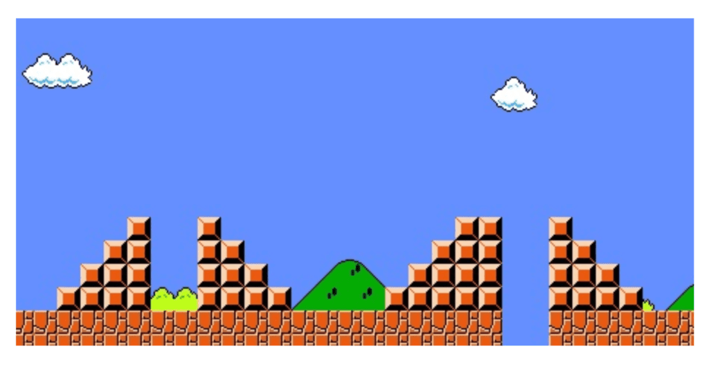
This is the Principle of Commitment and Consistency in action.
The smaller the initial task, the more likely people are to complete harder tasks. For your customer onboarding, look for ways to organize steps from easiest to hardest especially for complex processes like sign-up forms.
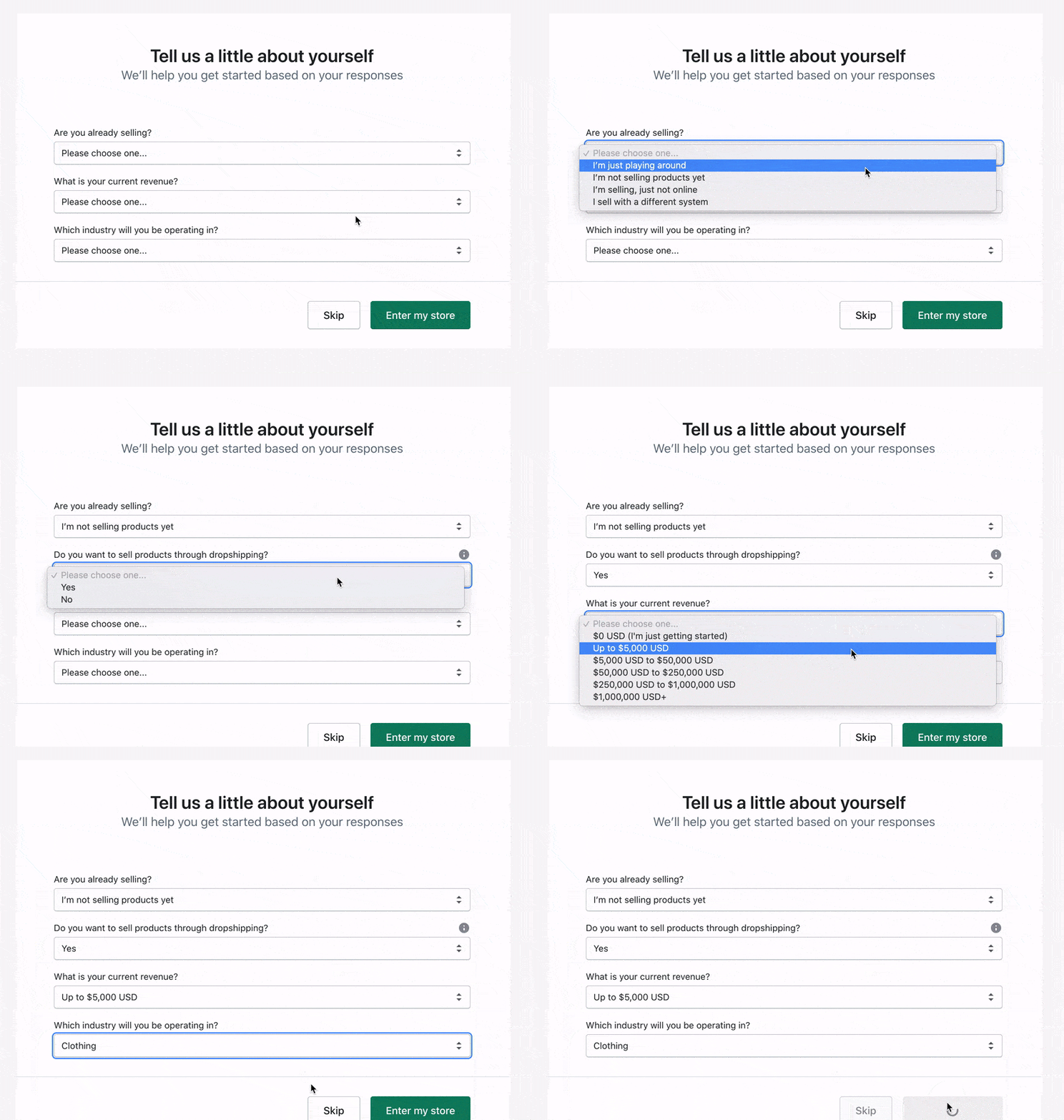
An example is how Shopify breaks up the account setup into two pages.
The first page has 4 fields. But the second page has 10 fields! That’s because users are more likely to complete the second page if they've already gone through the first page.
For your customer onboarding, ask yourself:
- Are there ways to organize steps from easiest to hardest?
- If not, is it possible to break down complex processes (such as sign-up forms) into multiple pages or steps?
#4: Celebrate their success.
After you complete World 1-1, players receive a satisfying success screen before they go to the next level.
Mario walks up to the castle and raises up the flag.

After new users successfully complete something meaningful in your product, celebrate it!
It's a simple act that's often forgotten.
This is also a great time to ask people to:
- Try out a premium plan
- Learn advanced use cases
- Talk to customer success or sales
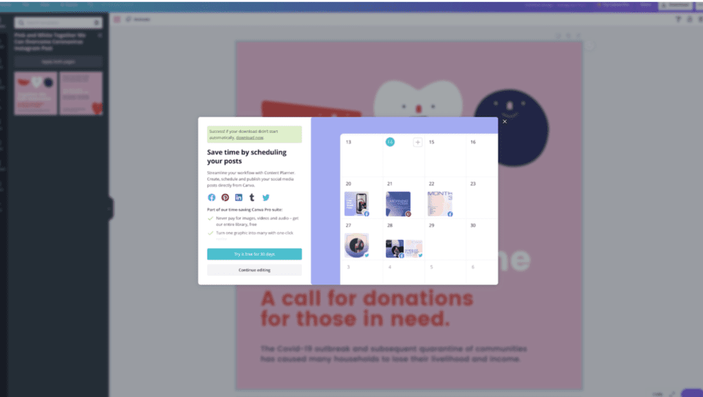
A great example of this is Canva. After designing and downloading an Instagram template, you see a popup.
It congratulates you for downloading your first design! Then, they suggest you try out Canva Pro so you can streamline uploading photos to Instagram directly!
This is a brilliant example of a contextual upsell.
In regards to your customer onboarding experience:
- Are you celebrating your users' success in-app and by email?
- Are you directing new users to the next step once you’ve congratulated them on their success?
#5: Onboard users in stages or levels.
As soon as players complete World 1-1, they enter an underground level and face tougher obstacles and a new enemy – Piranha Plants!
Unfortunately for most customer onboarding experiences, every feature in the product is pointed out. That’s a sure-fire way to overwhelm and scare people away.
Rather, be more like Super Mario Bros. and segment your onboarding for newbies, amateurs, and pro users.
For new users, what are the minimum number of things they need to know to get started and experience your product’s value?
After that, what are more advanced features or use cases they should know about to become intermediate users?
Then ask: how can intermediate users become pros?
Let’s take a look at an example with Intercom, a messaging platform that allows businesses to communicate with prospective and existing customers online.
Here’s how they level up users in stages:
- The initial onboarding cycle helps companies install live chat software on their website. This speeds up their acquisition time because they can respond to queries from prospects in real-time as visitors are surfing through pages.
- Once users have started regularly using Intercom’s live chat feature, the onboarding team helps users add smart logic that directs conversations to relevant help articles or blog posts.
- The next level helps companies automate conversations using chatbots.
With this example, the Intercom onboarding team assists users by providing more value over time. What’s even more important is that they’re encouraging users to upgrade their pricing tier: from $39 to $499 per month.
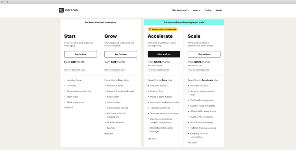
As you can see, onboarding customers to additional capabilities and use cases of a product is critical for revenue expansion and increasing the average revenue per user (also known as ARPU). But first, new users need to complete the initial onboarding.
Quick Recap
There you have it! Five lessons you can learn from video games.
Here they are again:
- Focus on the user’s goal.
- Teach the game by playing the game.
- Ramp up difficulty progressively.
- Celebrate their success.
- Onboard users in stages.
Do you think I’m missing another lesson Super Mario provides in relation to the customer onboarding experience? Drop it in the comments below!

