At Lucky Orange, we’re all about websites, conversions, and performance. As a result, we’ve got some insights that Product-Led Growth companies will really benefit from hearing.
Everyone’s website is different, of course, but there are some common features amongst all websites – and some classic mistakes we see being made on those pages.
I’m going to show you some of these common mistakes using real-life examples and illustrating how Lucky Orange tools can help us gain and use these insights.
So, let’s get ready to dive in and look at how you might improve the following pages:
- Pricing
- Navigation
- Calls To Action (CTAs)
- Pop Ups
- Forms
Common mistakes on pricing pages
Pricing is critical for SaaS companies and it is the lifeblood of our websites. We agonize over these decisions for a reason!
Let’s look at this example from alignment.io.
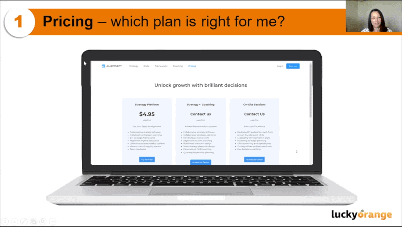
We can see they have three different packages for their platform, they use inclusion lists, a combination of prices and ‘contact us’ pricing, and are using a combination of ‘try it for free’ and ‘schedule a demo’ sales approaches.
Using a Lucky Orange Clicks Heatmap, we can see which areas of the page are getting the most clicks from visitors.
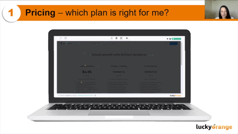
We can see that the strategy package – the first option – gets more engagement than the others.
From this, we can see that a named price is attracting more interest, suggesting our audience may be price-focused. With this in mind, it would be worth redesigning the other packages to, at the very least, give visitors an indication of price range. For example, 'Prices start from…”
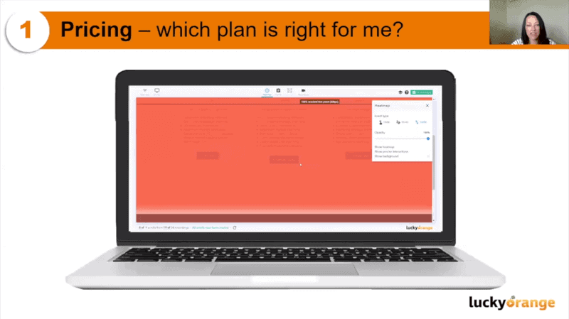
Using a scroll heatmap, we can see that visitors are getting to the bottom of the page, which means all the possible CTAs are being seen. This is good because we obviously want people to see our CTAs, but also because it reinforces the hypothesis that pricing may be the bigger issue here, as opposed to CTAs or other on-page content.
Some other considerations for this pricing page include:
· Instead of offering to schedule a demo, we could tie this more closely to the package by offering a free coaching session (or similar)
· Instead of using bullet pointed lists, use checkboxes or check and cross marks
Navigation menu tips
If you’ve ever had to build out a website with consensus from other teams or business units, you’ll know how challenging it can be to decide what goes in the main navigation menu.
The mentality is often: “If it’s not in the main navigation, it doesn’t exist.”
The temptation is to pack everything in there, but that’s not best practice. In fact, Wix recommends no more than 5-7 options in your main navigation and, if you’re mobile-first, potentially even fewer than that.
I always use the Pareto Principle with my websites – 80% of my content should be about what I know visitors are looking for and 20% should be the ‘wow’ elements that make people realize something they didn’t know before. Your navigation should be focused on making it easy for users to navigate your content.
Let’s look at this example from myEmailVerifier. They’ve got a relatively crowded main navigation, along with some offers that actually sit above the main navigation menu.
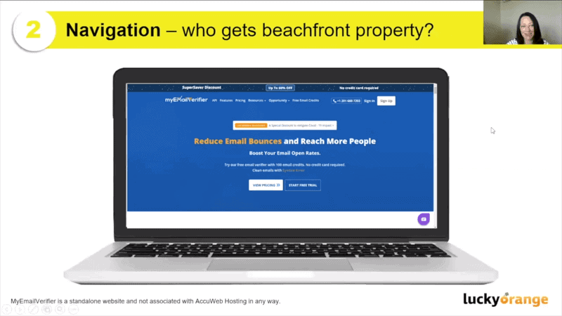
Launching the Clicks Heatmap again, we can see the interaction between elements.
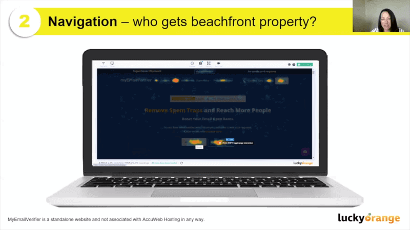
The offer above the main navigation is getting about 1% of traffic, ‘Pricing’ gets a lot of interaction, along with ‘Sign Up’ and ‘Sign In’.
So, we know that pricing is more popular and that options including ‘Opportunity’ and ‘Resources’ hardly get a look. We can consider getting rid of those two pages from the main navigation and moving them to the footer.
We could even consider replacing them with something like a ‘Compare Plans’ page, getting us focused more tightly on pricing and giving our visitors more of what we know they are looking for.
Alternatively, rather than replacing ‘Opportunity’ and ‘Resources’ don’t replace them at all. You might find when you get rid of those two categories, elements like ‘Features’ could get more interaction because you’re reducing the options competing for your visitors’ attention.
As ever, testing is key to improving performance.
Want to make sure your website and PLG strategy are aligned? Check out How to Create a Website That Supports Your PLG Strategy?
How to get your CTAs just right
There are two key considerations when it comes to your CTAs:
· What are you asking the user to do?
· Is there value in it for them?
Options like ‘Schedule a Demo’ are very straightforward, but you can be more specific and engaging. Instead, why not test something like, ‘Help your HR professionals do more remotely. Schedule a demo today.’
Putting the benefits first and embracing the context of the product make for a more compelling CTA.
Let’s look at this example from HR App.
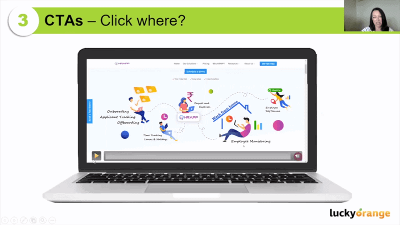
If I scroll down this page, there are 11 CTAs in total. In other words, a lot!
I’m curious to see which are getting the most engagement, whether visitors skip them all, and whether there are some that get missed completely.
That’s why I use the Lucky Orange Scrolls Heatmap, as it shows us the ‘Effective Fold’ – where 50% of visitors have stopped scrolling on the page.
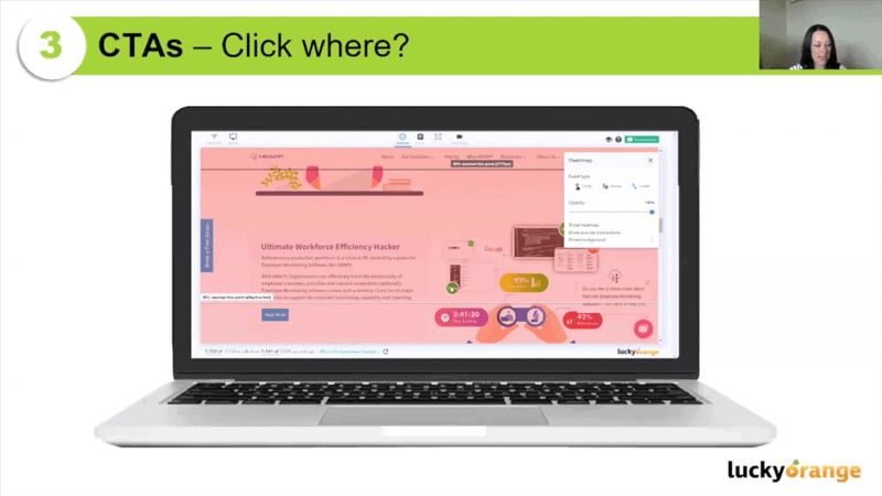
The Scrolls Heatmap shows me that out of the 11 CTAs, visitors are not seeing all of them – roughly half, in fact. If I have important, meaningful content to help me make the sale at the bottom of this page, this Scrolls Heatmap tells me that no one is getting down that far.
In addition to seeing how far people are scrolling down a page, we can use Lucky Orange’s Precise Interactions Heatmap to see exactly where people click on the page.
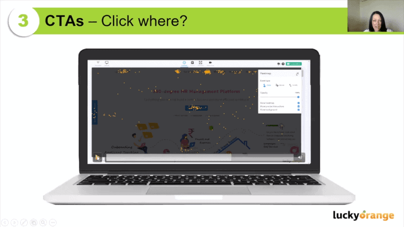
Going down the page, very few of the 11 CTAs get clicks. In fact, one of the most popular buttons on the whole page is for a YouTube video.
Using precise information about visitor behavior lets us see which CTAs are most resonant and allow us to refine our CTAs based on actual user intent and behavior.
Ease up on the popups
Have you ever been on a first date and the other person came on way too strong? Your popups might be that date for your website visitor.
When it comes to website popups, ask yourself if you’re giving your website visitors the opportunity to even figure out what’s going on before you bombard them and interrupt them.
If you’re not using a time-based trigger for your popups, you absolutely should be. I’d encourage you to go further, in fact, and deploy event-based triggers, e.g. If someone is on your pricing page for 15 seconds, initiate a popup with an offer or a live chat.
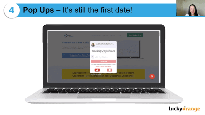
This is a perfect example of what not to do. This pop up appears immediately on the site. It pushes me to speak to the sales team by sharing my contact details…but I haven’t even looked at the site yet!
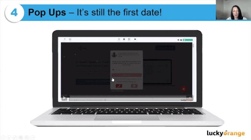
Using the Clicks Heatmap, we can see that nobody is clicking on the form fields and instead are dismissing the popup.
Now, popups generally only trigger once. Setting this popup to appear so early in a visitor’s journey means wasting its potential and preventing your visitors from accessing the information they need when they actually need it in the future.
Make the most of your forms
When it comes to website forms, I like to use the Goldilocks Test. When it comes to the information you’re asking visitors to give you, it should be not too much, not too little, but just right.
It’s well worth checking out Jake Stainer’s lesson sharing 6 SEO Secrets From My Time at Typeform if you’re interested in learning more about forms (and awesome SaaS models).
Whoever you are, whatever your company is, there are some universal truths about website forms. We all interact with forms on websites every day. The best forms become the benchmark against which we measure other experiences.
There are a few best practice tips to remember with forms:
· Use a single column layout
· Consider the type of information you require (if it can be gathered further down the line, remove it and make this more streamlined)
· Ask the easy questions first
· Use inline validation
· Use smart forms to complete the form for them
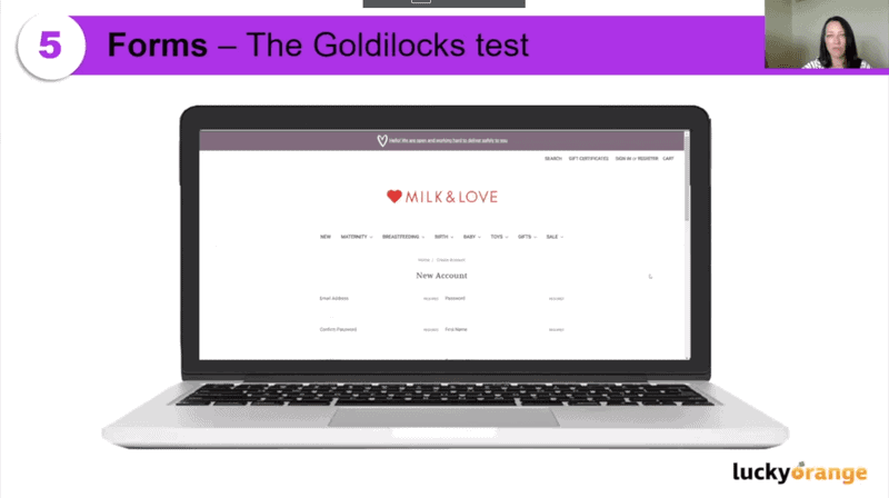
Let’s look at an example form and dive into where it’s good and where it’s lacking.
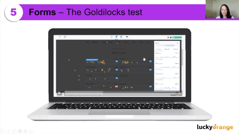
When we evaluate this with a Form Analytics Heatmap (and its specific abandonment report). In the example above we can see the percentages of which fields in the form had the most abandonment. Here, we can see a notable drop-off at the phone number field.
Many Lucky Orange customers have this same struggle when it comes to phone numbers in their forms. People see sharing their phone numbers as you asking for too much information (remember the Goldilocks Test). If it’s a required field on your form, they’ll end up abandoning it altogether.
The Zip and Postcode field is also causing some abandonment. Ultimately, it’s worth asking whether we need this as it currently exists. Could we use a smart field instead? It’s also worth remembering that this is the last field – users might be getting form fatigue or cold feet at this stage.
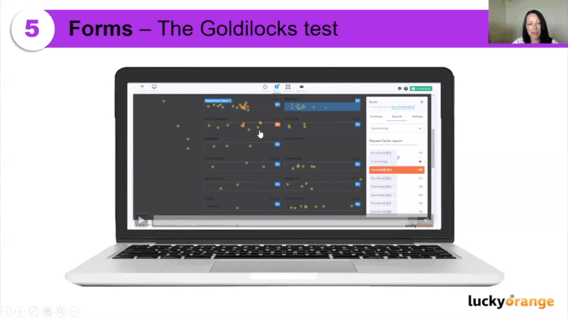
Lastly, if we use the Repeat Field Form, we can see that on the Confirm Password field, this can be an indicator that we need to use inline validation because users are going back to correct/check/redo their password. This often occurs when your direction isn’t clear about the password requirements, especially if you have safeguards in place like preventing people from re-using old passwords or requiring capitalization and special characters.
Did you know about all of these?
I hope you’ve found reading this piece useful and have found plenty of actionable tips to take away!
And as a thank you for your time today, I’d love to offer you a 21-day free trial of Lucky Orange and 20% off any plan available. Thanks again!


