I joined FullStory more than 3 years ago, and a lot has changed since then. But one of my first responsibilities was ensuring that new users had a positive experience with our product. And that meant avoiding the many onboarding mistakes lurking around every corner.
The approach you take to user onboarding won’t be identical to the next company, but one thing always holds true: tracking the right metrics allows you to make informed tweaks that move you toward your goals consistently.
For example, we found that adding more steps to the user onboarding sequence boosted the number of users reaching that magical "aha!" moment (usually, the opposite is true). Before these steps, 22% of new users got to that first "aha!" moment. But immediately after adding these, that number jumped to 31%.
Let's get into things, take a look at what FullStory’s original onboarding sequence looked like and the problems that we found with it.
FullStory’s Original User Onboarding Sequence
In 2017, when we first launched FullStory Free, this is what it looked like to sign up for FullStory.
We started with a super low friction signup form; all we required was an email address.
After signing up, users were shown the pricing page and told to check their email for the activation link.
It was a ‘minimalist’ approach to email communication, let’s say…
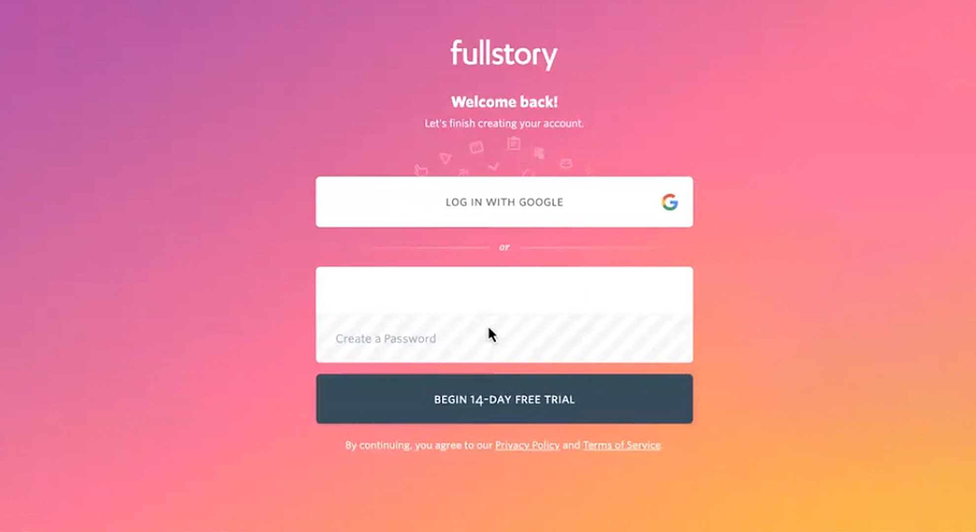
After clicking their activation link, we asked users to log in.
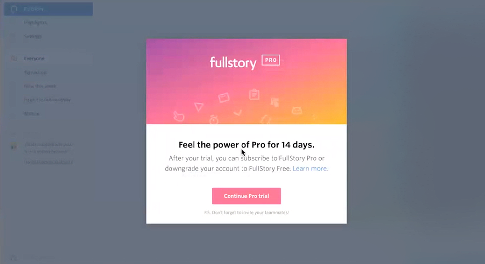
Then, their first look at the app was kindly interrupted by a modal selling our Pro product! Don’t worry, I’ll be dissecting all of this very soon – you don’t need to tell me this has problems!
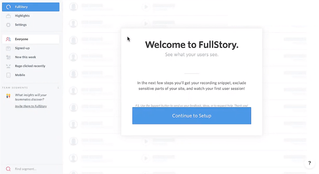
After that, it was straight into profile setup.

And hey, why not throw another modal at them before they get into exploring the product?
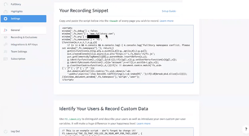
This is where they first hit their real value proposition. FullStory is a digital experience analytics tool, and installing the FullStory recording snippet is the first step to getting started. It's pretty similar to installing code for Google Analytics.
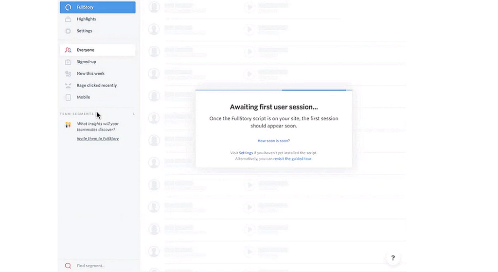
Once they completed that process, they were brought back to their dashboard — which was a kind of zero-state screen—to wait for their first session to pipe into the system.
The Results?

This is what it meant: 22% of new users got to that first "aha!" moment’.
22% is not an especially great outcome. We knew we could get that number a lot higher.
Our qualitative feedback was also painting a clear picture for us that things weren’t going right for our newest users.
All in, this wasn't working for us. New users weren't able to see the value of FullStory because they were never making it past a critical first step. From a product-led growth perspective, this product definitely wasn't selling itself.
How FullStory Planned to Improve User Onboarding
We set out a new plan to ace our onboarding, with three main goals. We wanted to:
- Streamline fragmented, frustrating modals
- Make it more clear why we were asking for personal data
- Optimize for our ‘a-ha’ moment
FullStory’s Redesigned Onboarding Sequence
Together with the FullStory Product team, we put together a plan to make a round of improvements. Our amazing designers and developers helped us turn our vision into a reality, with the second iteration of our onboarding sequence looking like this…
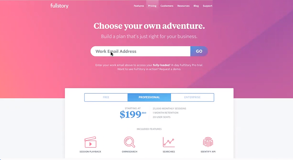

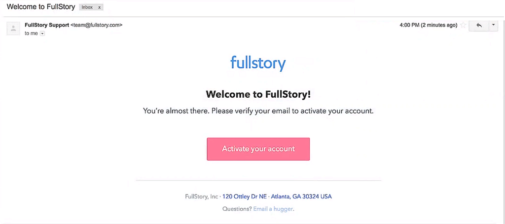
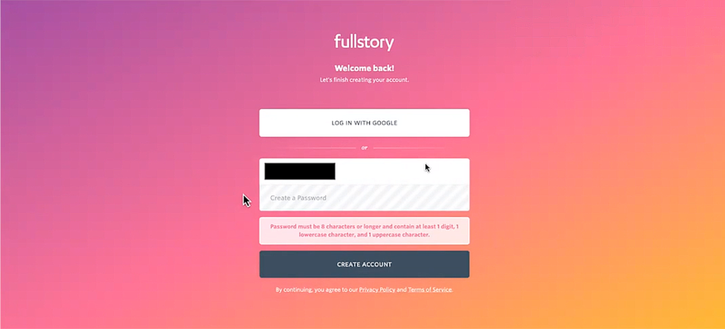
We made some easy switches that transformed the process at the top of the funnel. As soon as we had a signup, we cleared all distractions and directed them to finish the job and click the link in their (beautifully redesigned) email.
Some elements had to remain the same – setting a password is one of them – but others could be tweaked.
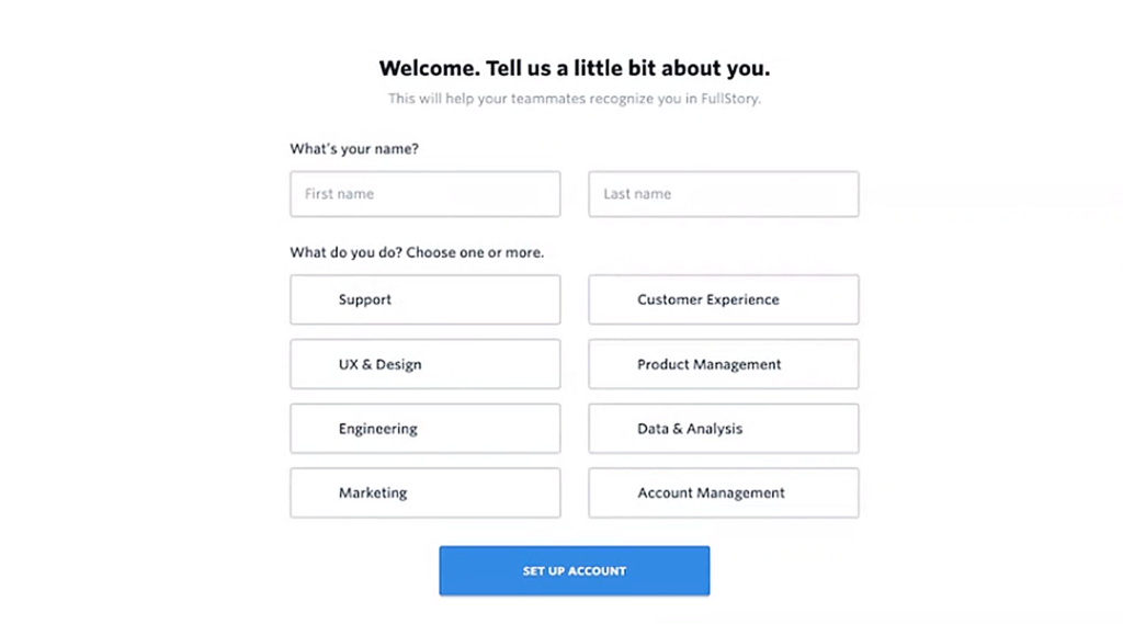
We built the different elements of the user account and profile setup into one single state, step-by-step modal that makes everything clearer and more contained.
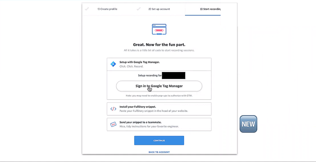
This is the vital part of the sequence: getting the recording snippet added to their site. We built in multiple options here, so that new users could install via tag manager or email their recording snippet to a friend if they didn't have access to install the code on their own.
The Results?

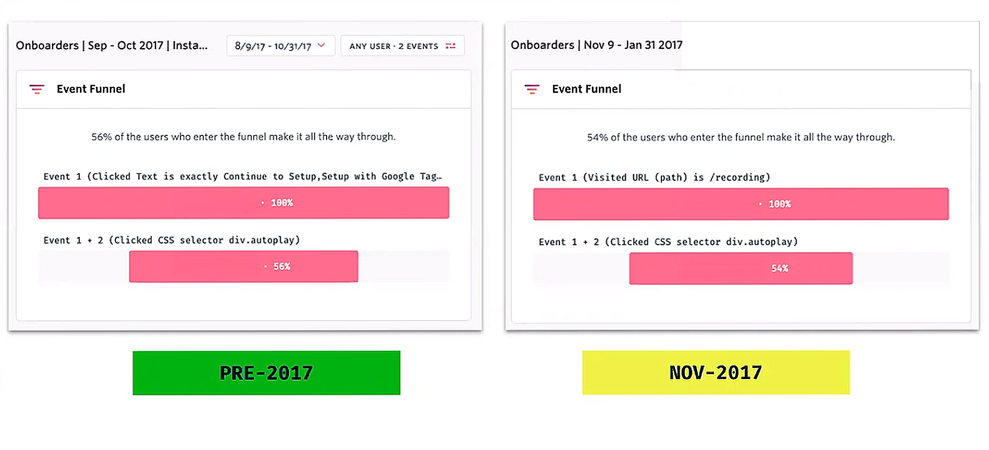
It seems counterintuitive – we actually added more steps to the sequence to achieve a higher rate of users reaching that magical 'a-ha' moment. That’s not typically the best approach, but it worked for us.
Now, truthfully, 31% was still pretty far away from our goal, but it was a meaningful step in the right direction.
When thinking about your onboarding experience, you need to consider the user's holistic experience and factors outside of your control. For example, if a new user has to ask their development team to install code to their site but they have a slow internal process for making code changes, they may not be able to get it done in the time frame you expect. What can you do to help them overcome these external challenges?
You may not be able to resolve outside issues completely, but if you get creative, you can find solutions to close the gaps.
What Made a Positive Difference in User Onboarding?
Overall, our onboarding redesign didn't have the full impact we intended. But, that doesn't mean it was a pointless exercise. We were surprised to learn that the top-of-funnel changes had the largest impact on our overall results. Those changes were:
- Sending people straight to their inbox
- Giving the activation email a facelift
There were other smaller wins and minor boosts, but ultimately, removing distractions at the start of the process had the greatest return for our conversion rates.
What Made a Negative Difference in User Onboarding?
Solving problems usually leads to more, new and exciting problems! We ran into some issues with the redesign which gave us new targets to aim at in the next few iterations of refining our onboarding sequence. Some of the major problems included:
- 62% of users hit an error when clicking the Google Tag Manager sign-in, due to a permissions fault
- 10% of users ran their onboarding from mobile, which we had not optimized for, and so ran into a UX error
- Further onboarding emails were feature-driven, not user need-driven
- Onboarding got bloated with requirements from different stakeholders (adding a marketing attribution survey, requiring phone numbers for sales teams, etc.)
- Not using the personal data that users shared for any useful or meaningful purpose
- Not enough thought through zero states, which meant we needed to build post-onboarding, onboarding sequences.
Onboarding Mistakes to Avoid in Your Product-Led Business
When it comes to product-led onboarding, my advice is: do as I say, not as I do. Onboarding flows like this require constant attention and iteration. It's an ongoing work in progress, and you need to be prepared to continuously make changes over time.
If I had it all to do over again, here are the mistakes I'd avoid (and I hope you will too!):
- Data hoarding with no meaningful plan or purpose
- Forcing full account/profile setup before users achieve value
- Ignoring errors and frustration points
- Ignoring mobile onboarding
- Selling features over success
- Shoehorning in unrelated fields and requirements
- Stopping onboarding at the ‘a-ha’ moment
Every company is different, but I hope you'll find these guidelines applicable to your projects.
Onboarding Best Practices to Aim for in Your Product-Led Business
How can we reverse these mistakes and reframe them as opportunities? Easy. We flip them, and suddenly we have a solid list of best practices.
If you want to nail your onboarding sequence, make sure you:
- Collect only the data you need
- Show value before installation
- Squash errors and frustration
- Check the lowest common device users will access your sequence through and build for it
- Focus your messaging on user success, not product features
- Stay streamlined
- Continue tailored onboarding


