Did you know SaaS companies can lose 75% of new users within the first week without effective onboarding?
In this article, you’ll learn user onboarding best practices for SaaS companies, so users understand how your product can address their needs, solve their specific problems, and wow them with what your product can do for them.
Why is onboarding important in SaaS?
A solid SaaS onboarding workflow is crucial for the success of any product-led business. The reasons include:
- Building User Confidence: New users need to feel confident that your product can help them overcome their pain points. This confidence begins with an effective onboarding process.
- Reducing Churn Rate: Retention starts with onboarding. Users with a positive onboarding experience are more likely to stick around and become loyal customers. More happy users mean lower churn.
- Improving User Product Adoption: The best SaaS onboarding process guides users to product adoption. Quicker product adoption translates into lower churn and higher retention, favorable to long-term growth and earning potential.
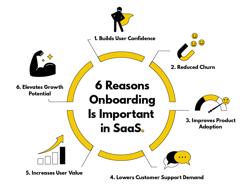
- Lowering Demand for Customer Support: User onboarding ensures retention and helps product-led companies save money and time on customer support. When done effectively, onboarding answers user questions before they ask them, and increases engagement with your product. Nearly two-thirds (or 63%) of customers say the level of support they’re likely to receive during onboarding is an important consideration in whether they value a product or not.
- Increasing User Value: Users who value your product become loyal consumers. They write positive reviews, leave good customer feedback, and recommend your products at no added expense to your company.
- Elevating Growth Potential: Onboarding is a user's first impression of seeing value in a product. A SaaS company has growth potential if they successfully draw in new users during this early phase of the customer journey.
5 SaaS onboarding best practices with examples
You can improve your SaaS user onboarding experience by unlocking behavior change and product adoption with the BJ Fogg Behavior Model. This model provides a framework to boost numbers if users fall off during onboarding.
Here are aspects of user onboarding behavior to consider:
- Is the new behavior as easy to do?
- Are users motivated to perform the behavior?
- Are there prompts inside and outside the product to help users perform the desired behavior to complete the user onboarding?
Listed below are five SaaS onboarding best practices derived from the BJ Fogg Behavior Model. The included examples show these best practices put into action by real SaaS companies.
1. Speak to your users’ desires
Often, onboarding teams approach the content of signup screens and onboarding elements like tooltips and product tours as a low priority — and it shows. Even if it’s well-written, it’s usually focused on product features rather than communicating the benefits of these features.
This is a mistake.
The ultimate motivation is to show users how the product can help improve their lives. Every word in the SaaS user onboarding experience is an opportunity to speak to users’ needs and desires.
Use content to amplify the solution to their current pain points, calm their anxieties, and remind them they can overcome their existing habits.
Wave App example
For example, the third step in the signup process with Wave prompts new users about the value of their invoicing software. The copy reads, “Send professional invoices. Designed to get you paid 3x faster, with over $24 billion in invoices sent each year.”
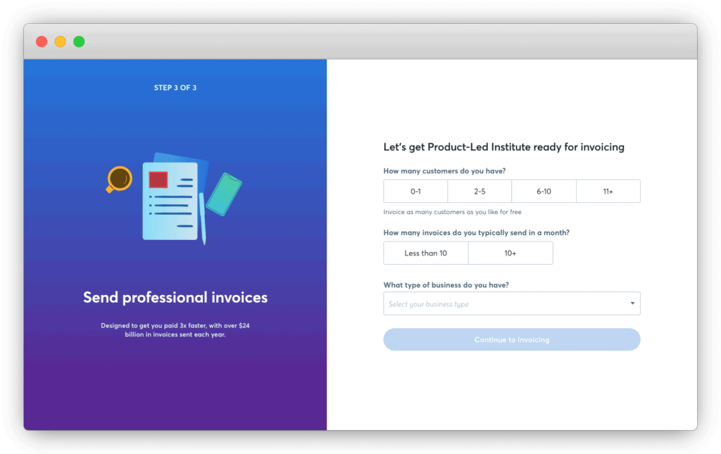
Wave’s team knows that new users are still skeptical, so they use social proof to convince them Wave is the right tool. After all, who doesn’t want to get paid three times faster?
Does the content in your SaaS user onboarding speak to the desires and needs of your users? Do you address the concerns, anxieties, and objections in your copy?
2. Show them their progress
Like a workout partner pushing you to complete one more rep, encourage more users to complete the signup, setup, and onboarding process by showing them their progress. Use progress indicators to inform users of their completion status, like the percentage of steps that are left to complete. Chances are, you’ve seen this in action before.
Canva example
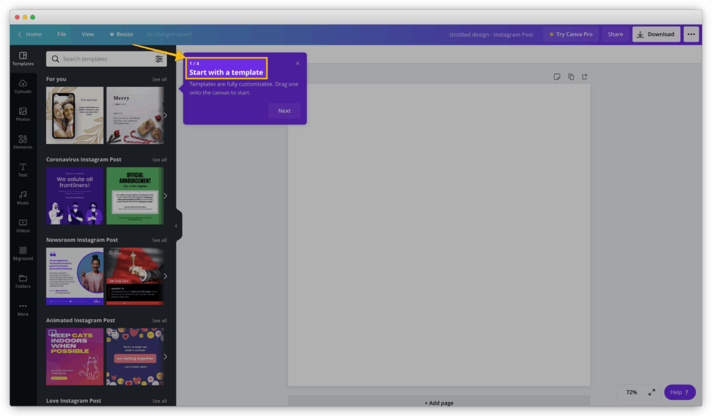
Canva uses an indicator in their product tour to show where a user is in their four-step product tour.
LinkedIn example
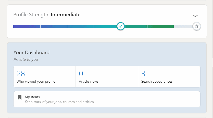
LinkedIn uses a progress bar to show how to improve your “Profile Strength.”
FullStory example
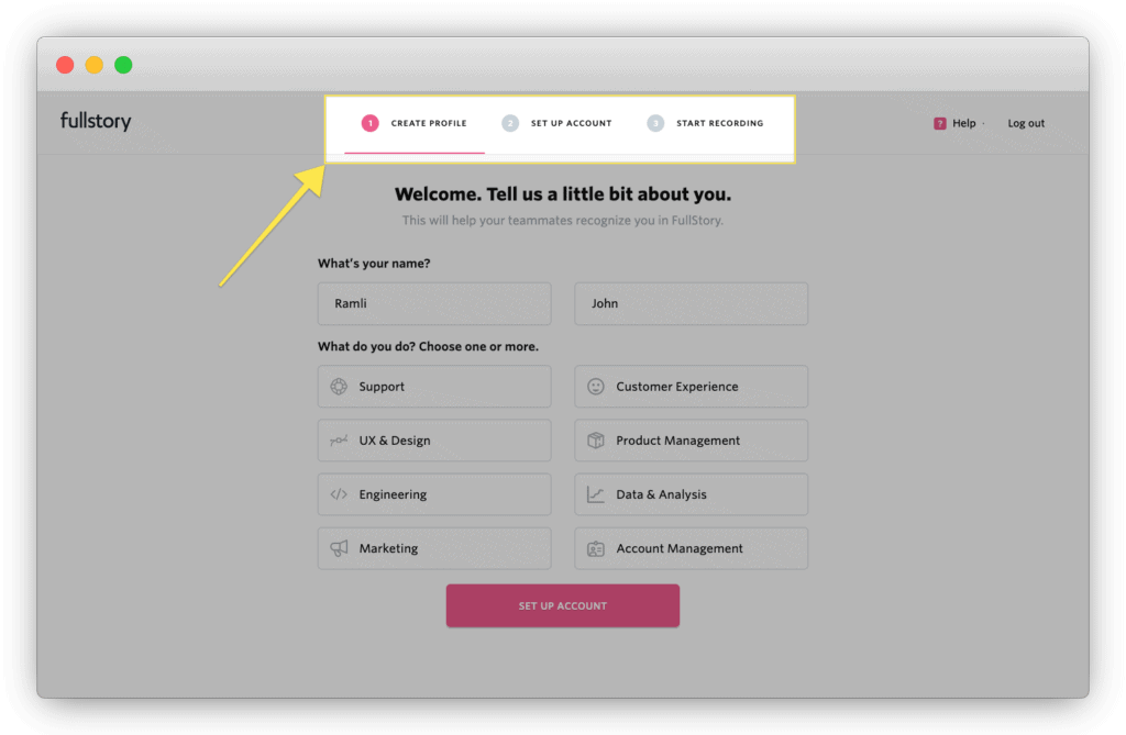
Progress indicators appear mostly in signup flows, like in this three-step signup process from FullStory.
GrowthHackers example
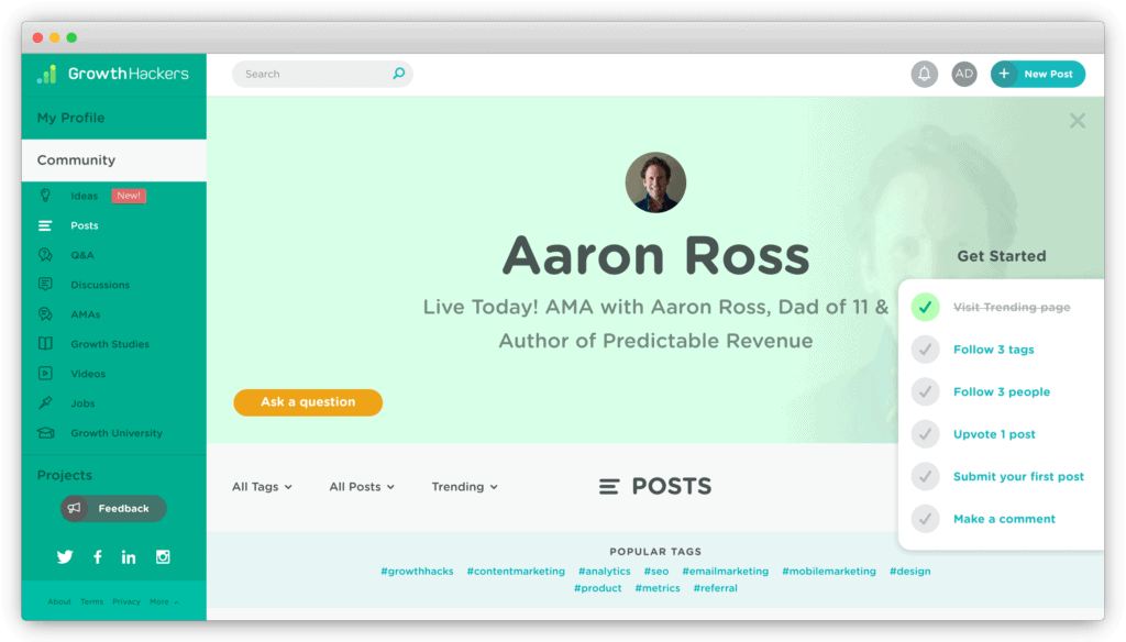
Place them wherever is most appropriate – GrowthHackers adds it as an onboarding checklist during the account setup.
Progress indicators work well because humans are wired to set goals, and we inherently feel good when we accomplish them. Finishing a complex task releases massive quantities of endorphins in your brain.
There’s tension when a checklist or progress bar is incomplete. Zeigarnik Effect is when people feel the need to complete unfinished tasks. As such, framing to-do items or signup processes as incomplete during user onboarding often leads to positive outcomes.
Do you inform users how far along they are in completing tasks with progress indicators during the signup, account setup, and SaaS user onboarding of your product?
3. Welcome new users
Usually, we’re more likely to say “yes” to requests from people we like and are attracted to, whether they’re our closest friends or strangers.
But what exactly causes attraction? Persuasion science tells us there are three essential factors. We like people who are similar to us, pay us compliments, and cooperate with us to attain mutual goals.
One way to harness this powerful principle into user onboarding is to welcome new users. About 85% of people say they’d be more likely to stay loyal to a business that invests in onboarding content that welcomes and educates them after they’ve bought.
An introduction isn’t a waste of time. Building a connection and relating to a shared mission boosts the motivation of new users.
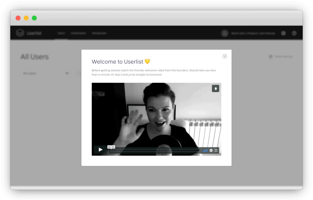
The welcome message can be simple. Userlist forms a bond with users courtesy of a personal note with a short video from its founders.
Many products ignore this critical step. But imagine walking into a dinner party without the host greeting you and giving you a tour. Most likely, you’d feel snubbed and hurt.
Welcome messages also set the tone, giving customers a sense of how they’ll be treated during their relationship with the product. Personal videos are great at humanizing the experience while implying someone is personally involved in the users’ success.
How do you welcome users to your website? What steps can you take to personalize the welcome message you already use?
4. Provide visual cues to guide them
New users sometimes need clues on what to do next. Little cues or context changes encourage users to make a specific decision. A simple image can point users to the next onboarding step.
Basecamp example
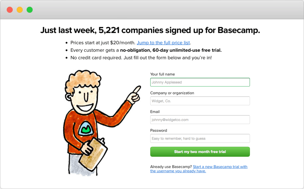
Basecamp adds fun to its onboarding by using an animated person to point out where users complete the signup form.
Visual cues can also be product bumpers that guide new users to achieve their desired outcomes.
What is a product bumper in SaaS?
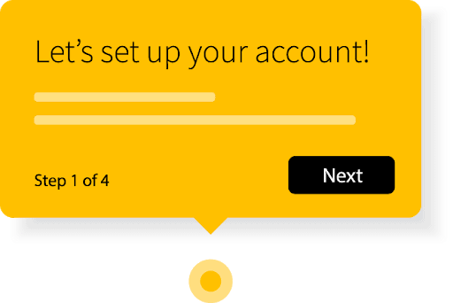
A product bumper can be product tours, tooltips, and hotspots.
Product Tours
Product tours orient new users and help them find the fastest path to their first moment of value. These tours often guide users through a critical workflow or point out a few key steps that users might miss.
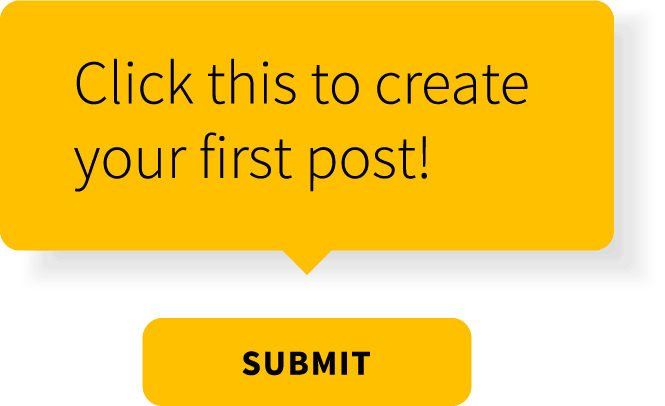
Tooltips
Tooltips isolate elements such as form fields or buttons to guide a user through the account setup. Once a user completes a step, they move to the next one.
Hotspots
Hotspots give contextual help to encourage new users to activate certain product elements or features. Unique pulsing animations catch a user’s eye. Hotspots don’t open automatically and are less invasive than tooltips because the user can ignore them.

More examples of product bumpers include checklists, progress indicators, and welcome messages (more on these features later).
Tours are usually better than a blast of tooltips when using product bumpers. They help users achieve the desired outcome through action instead of memorization.
Canva does an excellent job of guiding users through four steps to download their first design.
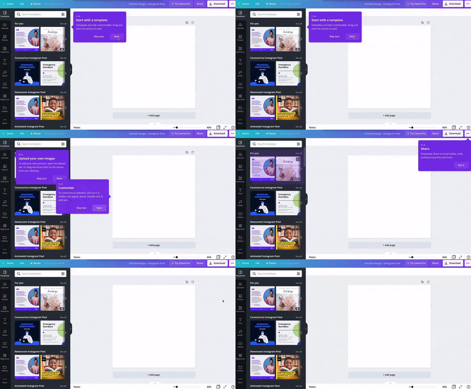
Be careful of using product bumpers as a band-aid for a bad user experience. One of my biggest pet peeves is when product tours show you what the button or feature does (like, “Click here to change the font.”) and there’s no explanation for how it helps users achieve their desired outcome.
When product tours are an afterthought, they can do more damage by disrupting the momentum for users rather than getting them excited to use the product.
Many companies believe they need a product tour to improve SaaS user onboarding, but this is wrong. Ironically, it’s often a sign someone slapped on the onboarding experience without much thought or strategy.
What visual clues can you add to help guide your users through the best SaaS onboarding experience? Does your product tour positively impact user onboarding?
5. Show a helpful empty state
When users start the onboarding process, they often see pages within a product without any activity, history, or data because it’s their first time interacting with the product. These are empty states.
Empty states are a helpful way to guide users to achieve their first strike. Typically, interface data already in place is part of the design, so the layout looks clean and organized.
Avoid giving first-time users an empty canvas
It’s disheartening for new users to see a bunch of zeros and placeholder images on the main page. The email marketing platform Mailchimp gives first-time users an empty canvas, and I don’t feel this is the best design.
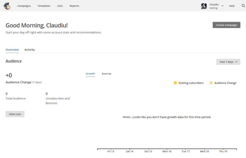
Instead, it’s better to paint a picture of progress as the user starts using the product. Emphasize the value of taking action. Go beyond showing the benefits of your app and direct them to the desired action.
Give direction on what to do next
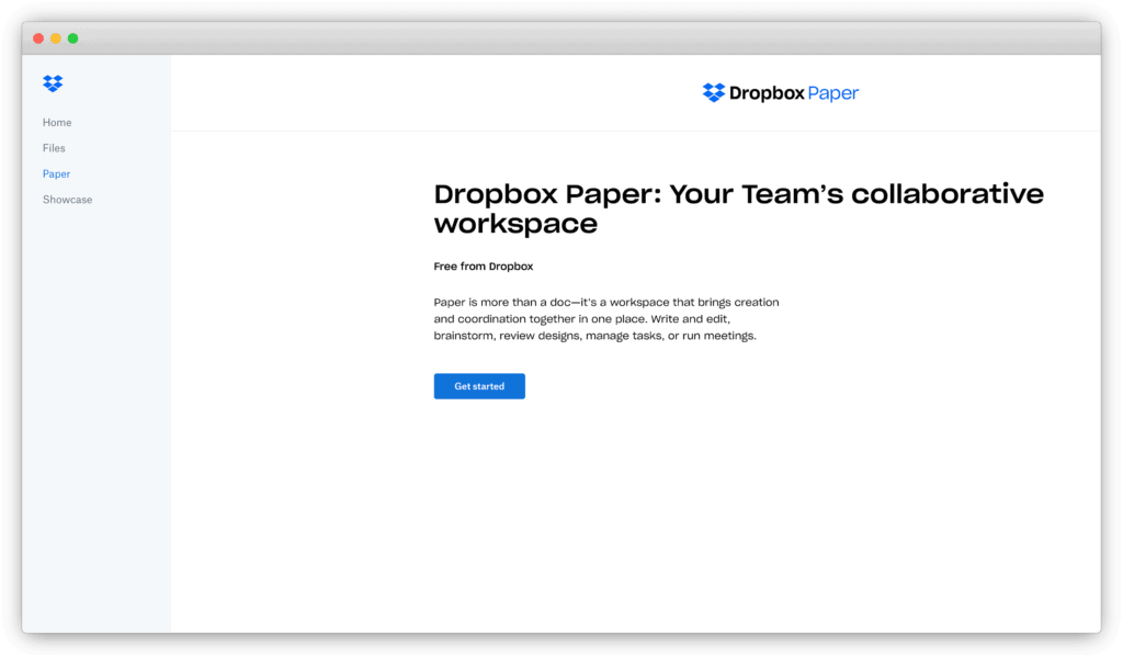
Take a look at the empty state of Dropbox Paper. The text describes how the app can help you brainstorm, review designs, manage tasks, or run meetings. A call-to-action directs users to begin using Dropbox Paper.
Be careful with dummy data
Avoid using dummy data to generate fake activity and statistics in empty states. While bringing the user dashboard to life with fake data is tempting, doing so presents the new problem of overwhelming users. You’re opening up the door to questions such as:
- Are you supposed to do something here?
- Where did this data come from?
- What data should I input?
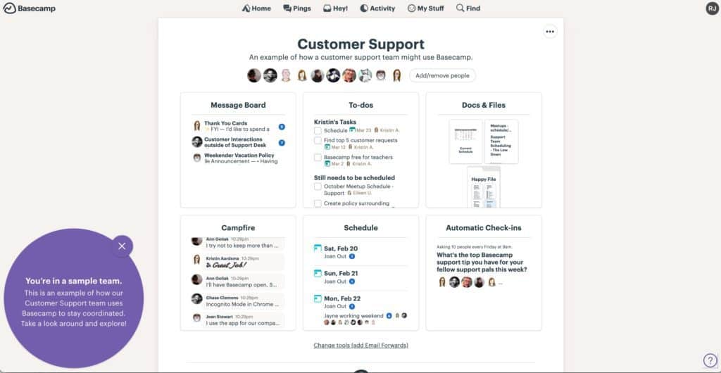
Dummy data, however, is effective when used to instruct a specific intent. Basecamp uses dummy data to explain how its product works and each piece guides you through using the product.
Are you utilizing the blank space and dummy data on your website correctly?
5 signs your SaaS onboarding needs improvement
As many as 63% of customers consider the user onboarding flow of a company when making a purchasing decision. Onboarding experiences are crucial for company growth, and specific user behavior can alert you to the need to improve your process.
There are signs of bad user onboarding:
- Users aren’t completing the sign-up process. Time-to-value is a crucial onboarding metric. Users who take longer to experience the “Aha! moment" are more likely to churn.
- Users aren’t coming back after signing up for your product's free trial. Low engagement is a red flag for the user onboarding flow. Between 40 to 60% of new users will use a product once and never return to your app.
- Users aren’t upgrading to a paid product account. Several variables come into play in this scenario, such as the size of your industry and the terms of your product’s free trial. Ideally, users who adopt your product’s value will start paying for it eventually.
- Several new customers are leaving after paying their first invoice. Customer success software can often track how much time users use your product and how active they are. A better understanding of user engagement can shed light on ways to improve onboarding metrics.
- The customer acquisition cost (CAC) is high or continues to rise. Lower CAC is a sign of good user onboarding, and the opposite implies you need to improve the process.
Must-have SaaS onboarding checklist
What makes a good onboarding experience? After analyzing more than 150 onboarding experiences from the world’s best product-led companies, we were able to pinpoint the elements they shared.
Here’s our checklist of the effective practices to achieve a good onboarding experience:
- Data, testimonials, and conversion rates need to back social proof.
Trust icons, user reviews, stamps of approval from experts, and stats indicating the number of active users are examples of onboarding experiences leveraged with social proof.
- Make sure user sign-up options are made easy.
Single sign-on options with Google or Apple help simplify user sign-up during onboarding. Email verifications can kill conversion during user onboarding. Verification emails end up in spam folders. Sometimes account confirmation emails aren’t delivered immediately, and users forget to follow up and complete the signup process.
- Each step in the onboarding process needs to be strategic.
Every page, product tour, and form field entry needs to be decisive in helping new users experience what your product enables them to do. Don’t give users a reason to abandon your app before signing up.
- Product tours should be action-focused.
A product tour should support your onboarding goal to help users find value in your product. A good product tour shouldn’t be a how-to tutorial but shine the spotlight on product features that help them overcome their problem.
- Help users accomplish their desired outcome from the start.
Segmenting users is a good onboarding practice that increases their likelihood of completing onboarding. Most products have multiple features with the potential to solve different problems of different users. A one-fits-all solution isn’t the message you want to communicate to new users.
- Every word needs to speak to the users’ needs and desires.
The onboarding process needs to show users how a product can solve their problems and benefit their lives. Use content to calm anxieties, amplify solutions to pain points, and show how good life can be with the product.
- Show helpful empty states.
As explained in the section above, empty states can show users what they need to do to set up their accounts and experience meaningful value in the product.
- User emails should be strategic.
Time-based flow emails won’t likely drive users to the next step in the onboarding process. Instead, send trigger emails based on the actions a user has or hasn’t taken inside the product. Doing so is more effective at addressing their needs, anxieties, and challenges.
A shocking 90% of customers believe the companies they buy from ‘could do better when onboarding new users. How can you improve your onboarding practices?
Download Our Free 21-Point SaaS Onboarding Checklist
FAQs about SaaS onboarding best practices
How can the SaaS onboarding process be improved?
Methods to improve your SaaS customer onboarding journey include:
- Communicating to users that your product can solve their point of pain.
- Using progress indicators to encourage them to complete the signup.
- Putting a welcome message on your product page.
- Utilizing visual clues (like product tours or tooltips) to guide users to the next step.
- Showing a helpful empty state.
What are the differences between user onboarding and customer onboarding?
User onboarding introduces new users to the benefits of a product and guides them on how to start using an app proficiently. Customer onboarding experiences are more about relationship building to help new users understand the product’s value, build loyalty, and ultimately gain paying consumers.
What not to do when onboarding users to your SaaS or website?
The don'ts of user onboarding best practices users include:
- Don’t focus more on highlighting product features than communicating their benefits.
- Don’t think a welcome message is a waste of time.
- Don’t forget to incorporate an onboarding checklist or progress bar.
- Don’t assume your onboarding needs a product tour.
- Don’t use dummy data to fill empty states with fake stats or activity.
Will optimizing the SaaS onboarding workflow decrease revenue churn?
Yes, optimizing your onboarding workflow decreases revenue churn. Good onboarding practices keep paying customers, especially if your product constantly evolves with technology. Bad reviews and word-of-mouth from unhappy users can push away potential customers when onboarding isn’t optimized.
What actions will you take to improve SaaS user onboarding?
The goal of user onboarding is simple – help users understand the value your product gives them. However, a SaaS company’s approach to onboarding requires ongoing metric analysis, close attention to user behavior, and careful consideration of do’s and don’t.
Did you know 40% to 60% of users who sign up will never return to check out your product after that first experience?
That’s a major loss.
Yet, most users sign up because they genuinely want to experience the value of your product.
That’s why they signed up, after all.
However, a ton of challenges can get in their way.
Maybe your signup process is too long with too many unnecessary steps. Maybe there’s a value gap. Maybe you’re treating users as customers too early.
To successfully onboard SaaS users, they must quickly and easily experience value.
An effortless experience is the key.
You need to make onboarding effortless for users to sign up, experience value, and upgrade. This is exactly what SaaS founders tackle during the onboarding component of our coaching program.
At ProductLed Academy, Wes Bush will guide you and your team through his nine-component, three-phase system that's proven to scale your product-led business more efficiently and profitably than ever before.
Learn more about the benefits of our coaching program and apply today.


