How can experimentation help increase your product-led growth conversion rates?
You might be wondering which of your product's variables affect your conversion rates and where you can experiment with your funnel to increase this.
At Soapbox, we offer a premium trial of our shared agenda tool. We wanted to see if we could improve our product-led growth conversion rates throughout the Soapbox funnel. We put together a plan for experimenting with 10 different factors to see if they would improve our conversion rates.
In this post, I share the lessons I've learned from each of the 10 experiments that helped our PLG conversion rates. These lessons are universally applicable and can be used to help improve your revenue growth.
1. Does trial length help or hurt your conversion rates?
You may be surprised to learn that whether your trial is seven days, 14 days, or 30 days, the conversion rates basically stays the same.
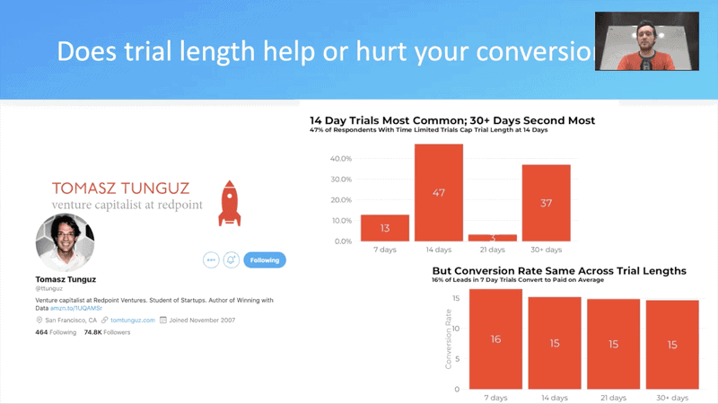
14-day trials are the most common for SaaS businesses, so we shortened our trial from 30 days to 14 days. This also made sense for our product cycle and user experience.
What we discovered was that the volume of users completing the trial skyrocketed. More people were still using the trial until the end of the 14 days, rather than the 30 days. This meant that they were experiencing the paywall’s full force after enjoying the premium features' benefits.
Conversion rates stayed the same, which proves that you shouldn't be afraid to reduce the length of your timed trial. In theory, the shorter the trial, the better.
2. Do your trial users know their trial has ended?
I was on a call with a user whose premium trial had finished when I realized that we were making it clear that users had a premium trial, but not clear enough when the trial ended.
We discovered that we had to make it as overt as possible that the trial was over and that users needed to upgrade. So, we created a big red banner to clarify that the trial was finished and the next steps they should take to continue their access to the premium features.
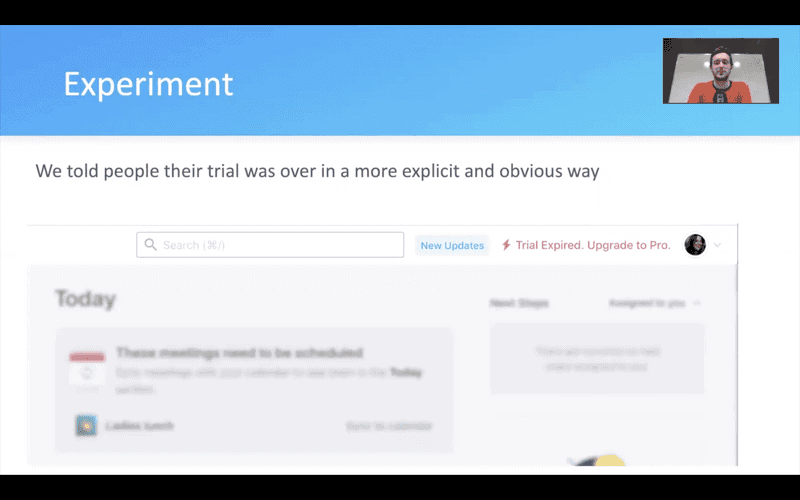
While it seemed like an obvious next step for us, this simple reminder led to a huge jump in conversion rates.
We realized that most people use the tool to do a task and aren't necessarily concerned about the trial. We avoided using an aggressive sales tactic by notifying users when the trial period had ended. Doing this and letting them know what they needed to do next enabled us to direct users to the premium tool to complete their task.
3. Will people convert in return for additional usage?
Many products have varying price points for different usage limits. When users exceed a usage limit, it can be an opportunity to increase revenue.
For example, our free plan had a suggested limit of 10 members (but we don’t cap user counts). We sent an upgrade reminder email to everyone on the small plan whose team exceeded 10 members, giving them a soft nudge to upgrade to a more comprehensive plan.
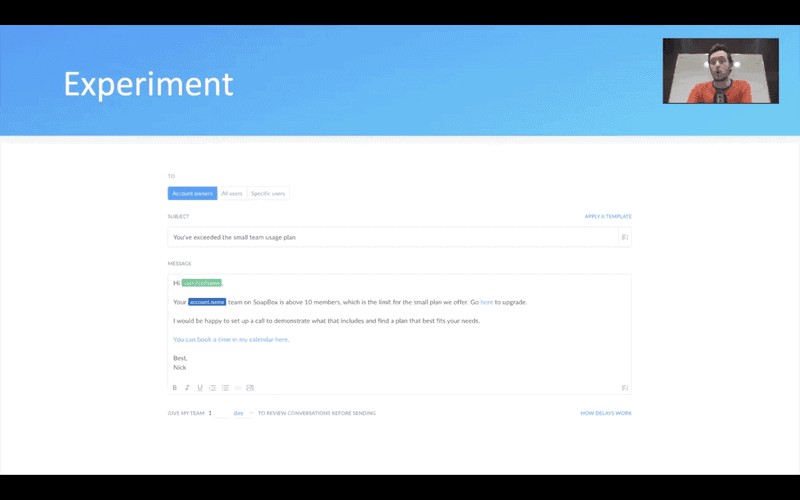
20% of users who received this email converted from our free plan to a paid, pro plan.
See where your usage limits could be, and experiment with this type of soft paywall upgrade email. This can help you find where your customers see value and where they'll convert once a paywall is approaching. An email reminder could be enough to convince users to convert.
If this works for you, you can use the information to build a real paywall and incorporate the differences in usage into your product's premium trial features.
4. Should your premium trials be opt-in or opt-out?
Before product-led growth, you couldn't access a product without requesting a demo. But now you have a choice whether to make your trials opt-in or opt-out.
Our existing setup was opt-in. While people opting-in are often keen to experience premium features, these users need you to continue to create that desire for them after their trial has ended. Otherwise, they won't convert.
We tested providing people with a free, gifted, premium trial. This opt-out approach led to a steep increase in the number of premium trials. It also affected the user's attitude towards premium features. Users who hadn't experienced the product without premium features were then driven by the fear of losing these to convert.
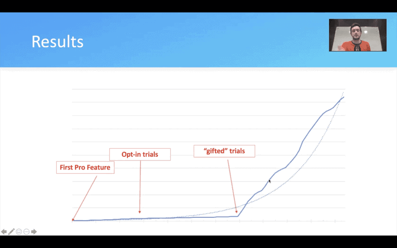
This can be a much stronger driver than desire, as they've already had access to the best parts of your product that they might want to keep.
The caveat with the opt-out approach is to make sure that you iterate onboarding effectively to help people navigate the features successfully.
We learned that our users should access our product's greatest features upfront. By not hiding these behind a paywall, people know what they're missing when they don't convert.
5. How can you make it easier for people to pay?
Some users can come up against payment obstacles. For example, they do not have access to the administration area, which prevents them from converting.
We learned that some users didn't have access to their product's admin area due to a backlog of inactive users. We came up with a solution to deactivate these inactive users and replace their administrative access with longer-lasting active users of that account.
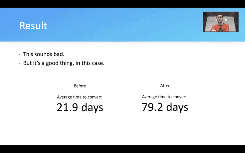
Once we implemented this change, we noticed an increase in long-term product users converting. While this metric might seem like a negative representation of conversions, it considers the users who'd been using the product for more than 100 days, who finally converted.
It's crucial to pay attention to your metrics, but you need to dive deeper into what they mean. So, while this "average time to convert" might look useful on the surface, it's better to divide it into segments. We use immediate conversion, end of trial conversion, long-term/heavy usage conversion segments and ensure that our upgrade pathways make sense for all of them.
6. What if you made the starting price a no-brainer?
People will always consider a primary investment much more carefully than a secondary one. They can be price-sensitive if they haven't bought from you before. So, you need to make it appealing for users to complete that initial purchase.
After taking on board some advice from a user, we changed our smallest payment plan to $5/month for the first 5 users.
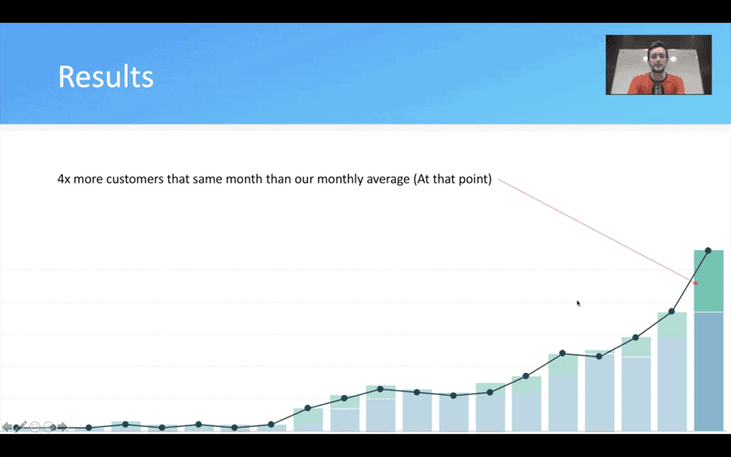
Within the same month of implementing our new payment plan, we saw customer conversions increase four times higher than our monthly average.
When users see the ROI and gain value from the product on their initial payment plan, they're more likely to upgrade.
One thing to bear in mind is that your starting deal size will go down. You have to aim to increase the volume of purchases of that initial product. You also have to help users continue to upgrade once they've seen the value your product can provide.
7. How much should you limit free features?
This can be a tentative issue with premium trial plans, as you might feel unsure about upsetting free trial users.
We decided to limit our most-used features on the free plan for one week. We then had our largest month for new customer conversions and had a record week, with the total number of conversions up by 3x.
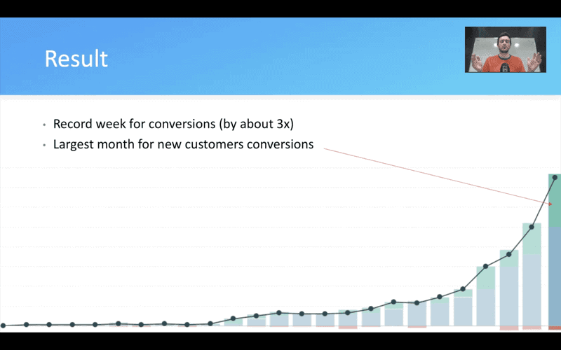
This experiment did upset some users. However, we discovered what people are really willing to pay for.
It's tricky to find the right balance because if you give away too much for free, you'll hurt your conversion rates. But, if you're not giving away enough, you won't get any free account sign-ups.
As your product develops, you'll continually add new free features, so it is worth experimenting with people's access to them to determine what they will pay for.
My advice is to experiment with limiting your features as much as possible for one week and closely monitor your metrics.
8. What's the value of product shots?
Do you reveal what your product looks like, or do you keep it hidden to spark people's curiosity?
Our website's homepage didn't use any product shots, so we began restructuring it using product images. This led to a 43% jump in conversions from our homepage alone.
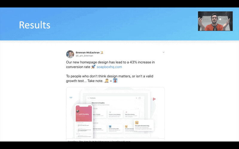
We learned that product shots build trust and show off exactly what we're good at. This also helped the activation process as people already knew a bit about the product and were more intuitive when using it instead of relying heavily on onboarding to walk them through the features.
9. What if onboarding never ended?
Small changes to your onboarding process can make a real difference to keep users returning.
We noticed that our existing onboarding process had markers of completion rather than pointers to the next steps. When users see even subtle signs that they've finished a process, they may take the opportunity to "come back later", and you might lose them.
We changed some of the onboarding process to show the user that there is always more to do.
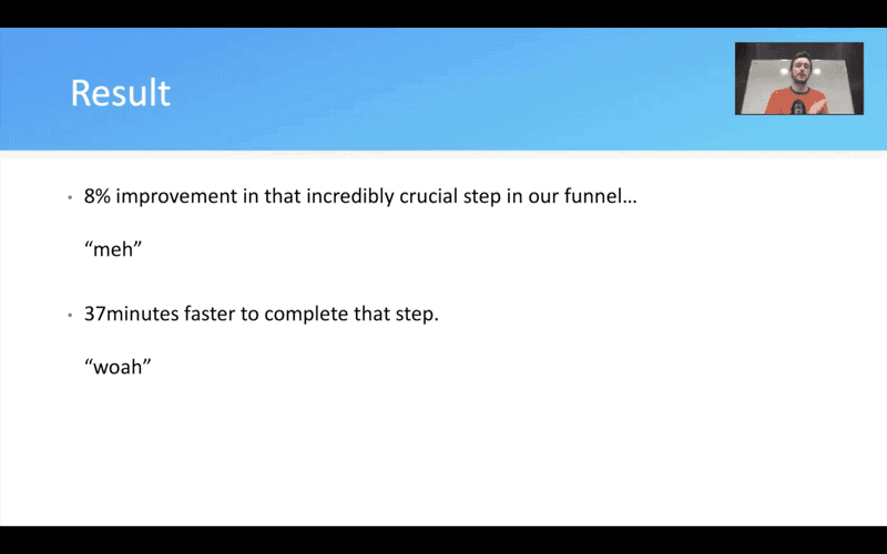
This subtle change led to an 8% improvement in that step of the funnel, but more interestingly, people were completing the step an average of 37 minutes faster. This meant that more users were experiencing more of the product in their first use, rather than finding an opportunity to leave.
10. What if you increased support volume?
We really wanted to make our product intuitive and not rely so much on support. However, we had a problem engaging with our customers.
We realized that people looking for support or who had a problem using our product were reaching out. These people were easy to find and willing to talk to us about our product.
We developed a support process involving a video call, where we adopted the method of "hugging our haters". After using this approach, 33% of the customers who booked a call with us then converted.
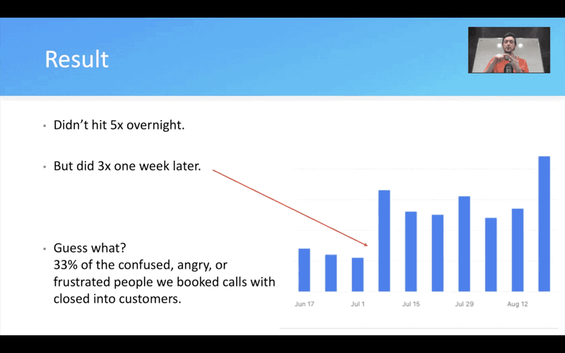
This was a great opportunity for us to not only fix a relationship with a customer but create a quick win with a really high value. When these customers feel adequately supported, they have a better chance of converting and convincing others to do so too.
The most important lesson
It might sound impossible, but we conducted these 10 experiments over just six months.
My advice to anyone trialing their own experiments is to manage your team effectively. Make sure that they have one goal that they're laser-focused on achieving. It has to be a specific goal and should feel like you're placing a high stake bet.
Ultimately, these experiments are only valuable if you're agile enough to learn faster than your competitors. So, use the results to give fast feedback and document everything to make the best possible developments to your product and your funnel in the future.


