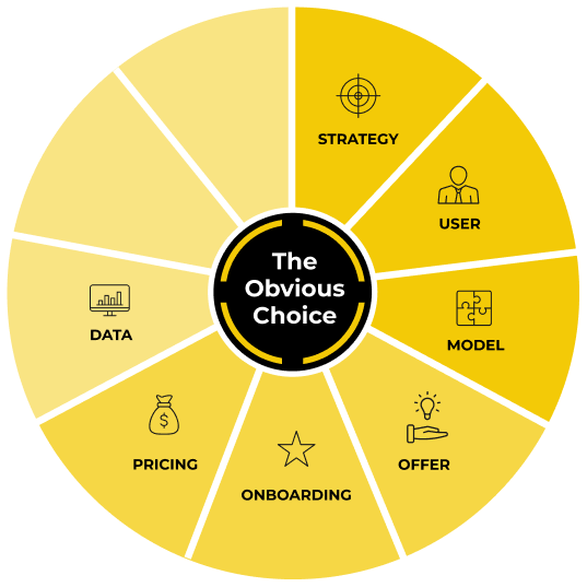
Actionable Data
How often are you aware of your #1 bottleneck in the business?
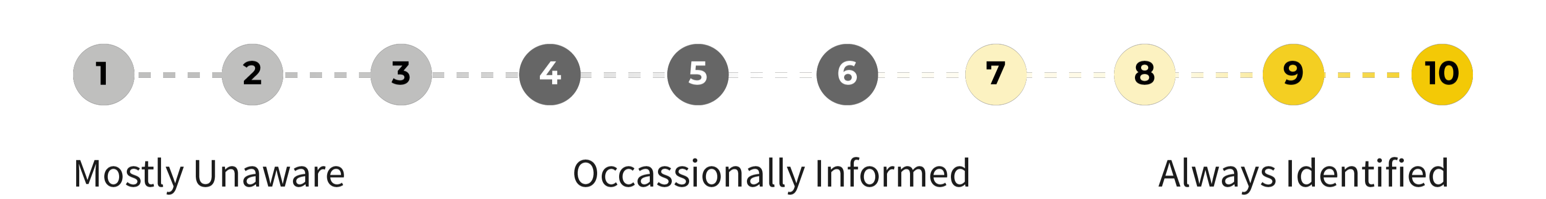
Rate yourself from 1 to 10.
Product-led companies must make data a core capability.
Unlike sales-led businesses, where talking to every potential customer is part of the sales process, you will not talk to most users. Just like body language tells us 55% of communication, what users do and don’t do allows us to understand them without talking to them.
You need to understand if your users are getting to value—and, if not, pinpoint where they’re getting stuck. In my experience, most product-led companies with a low free-to-paid conversion rate tend to jump straight to improving their onboarding experience.
In theory, that makes sense. Problem is, it’s likely the symptom of a bigger issue.
Remember that company I mentioned in the intro that spent one full quarter optimizing their onboarding with minimal results? When I dug into their data, I discovered a high volume of website visitors but a low sign-up rate.
So I went straight to their website. Their homepage lacked context on how the AI tool could solve a specific problem. Because of that, many visitors weren’t likely to sign up in the first place. And those who signed up weren’t motivated to use the product since they didn’t know how the product could work for them.
No amount of onboarding improvements would save them. They spent months optimizing the onboarding experience when they should have focused on their offer. Imagine spending an entire quarter focusing on the wrong bottleneck!
This component is your guide to using data to identify what’s bottlenecking your business at all times. You'll create a scorecard to focus your team on solving the top bottleneck. You need this data foundation before installing a predictable growth process in the upcoming Process Component.
As Jonathan Cronstedt, author of Billion Dollar Bullseye, notes, “No numbers, no business. Know numbers, know business.”
Even if you think your metrics are nailed down, this component will simplify what you measure. Let’s quickly go through four of the easiest data traps to fall into:
Trap 1: Tracking Everything
The first time we set up our scorecard at ProductLed, it was a Google Sheet with 36(!) metrics. Each metric listed someone who was accountable for it. We were a small team of five at that time, so some people were responsible for up to eight metrics. Our team didn’t know where to focus, and we made little meaningful progress because our attention was spread thin.
Trap 2: No Accountability
When nobody is accountable for a metric, it often doesn’t improve. Getting specific on who’s responsible for every important metric will help you grow faster and identify accountability gaps affecting your ability to drive a metric forward (a great hiring opportunity).
Trap 3: Not Measuring What Matters
Should you track how many likes you get on your Instagram posts? How many impressions your videos get on YouTube? Some metrics might be important to look at occasionally. Far too many are vanity metrics—fun to track but with little connection to your business or users.
Trap 4: Not Segmenting Users
Unsegmented users are a mixed bag of analytics. “Mediocre” conversion rates might be great if you looked only at ideal users. An “amazing” marketing campaign might have recruited scores of bad-fit users. Segmenting your users is one of the best ways to understand the full story. Different segments have distinct needs, behaviors, and preferences.
Avoid these pitfalls, and you’ll unlock three powerful outcomes:
- Total team alignment: By being intentional with what makes it onto the scorecard, you clarify what matters most. This clear communication helps your team understand what’s working and what’s not.
- Peer-to-peer accountability: Assigning ownership to each metric and reviewing them weekly builds a culture of accountability in which teammates hold each other to high standards.
- Accelerated growth: With a focus on the biggest bottlenecks, your team can target and eliminate roadblocks faster, leading to fewer growth plateaus and a more rapid climb.
You can achieve all of this with the True North Framework.
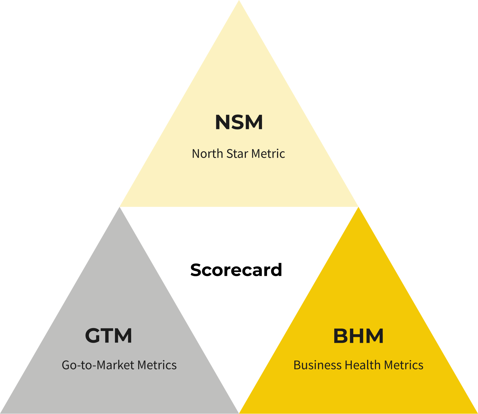
Phase 1: Identify the Core Metrics to Track
Imagine you're relaxing on a beach, finally disconnected from work. You can’t help but wonder—should you extend your vacation or head back to the office?
You check your phone, where a simple scorecard shows a few key numbers. These numbers are the vital signs of your business. If they’re solid, you know everything’s on track and you can extend your vacation without worry. But if one flashes red, it’s time to act—maybe even cut the vacation short.
This is the power of the "True North Framework." It distills your business down to its critical metrics, allowing you to understand instantly whether your business is thriving or if you need to intervene. With these numbers, you can confidently decide whether to relax or take action.
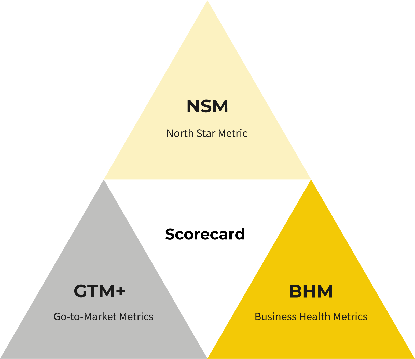
Track three core metrics:
- North Star Metric: Identify one North Star Metric (NSM) and align your entire company around it.
- Go-to-Market Metrics: Gain a holistic understanding of the user journey with a scorecard that easily tracks each step of the user journey.
- Business Health Metrics: Understand how your business is really doing each week.
North Star Metric
A North Star Metric (NSM) captures the core value your product delivers. It aligns with your customer and company needs. Improvements to your NSM should also increase revenue.
Here are a few NSM examples.
Notice the alignment. With Airbnb, nights booked are a perfect NSM because when someone books a night, the customer, host, and Airbnb all win.
What Makes a Great NSM
For starters, the value of your company and the customer must be aligned. A revenue metric focuses only on what benefits the company. The number of times a user acts doesn’t always tie back to company value.
If we dissect all the NSM examples above, they have three components:
- Quality metric: An automated or manual action in your product (e.g., your product automatically fixes a bug on your customer’s website, or they share a graphic they designed).
- Quantity metric: Typically a number (i.e., how many times your user did a specific quality metric).
- Frequency: How often you expect someone to do an action.
For Slack’s NSM of “number of messages per week,” the amount is the quantity metric, while messages represent their quality metric. If users are messaging each other, they’re probably getting value from the product.
Frequency focuses on the cadence that makes the most sense for your users. For Slack, it makes sense that the frequency is weekly, as a standard workweek reflects the cadence of how you’d use the product. If you were to do a daily cadence, it wouldn’t be as relevant—you’d always struggle to get more weekend engagement. For a product like Instagram, it’s the opposite. They want you to use the product every day.
At Amplitude, a product analytics platform, they focus on the number of shared reports per week viewed by two or more people. They’ve dubbed this Weekly Learning Users. It shows them that users aren’t just logging into their platform but are finding share-worthy insights, which is the quality metric.
If you’re struggling to define your NSM, your value metric should be the leading candidate.
Let’s say you run an email marketing platform and currently charge customers based on the number of subscribers. Your NSM could be the number of engaged subscribers per account. Your goal is to help these companies get more subscribers and engage them through great email marketing. As your customers gain more subscribers, you can charge them more because they derive more value.
If you’re still struggling to define your NSM, it might actually be your Key Usage Indicator (KUI). Slack’s KUI is when an account reaches its 2,000 message limit, so it makes sense for their NSM to be the number of messages per week. Your KUI and NSM are close cousins.
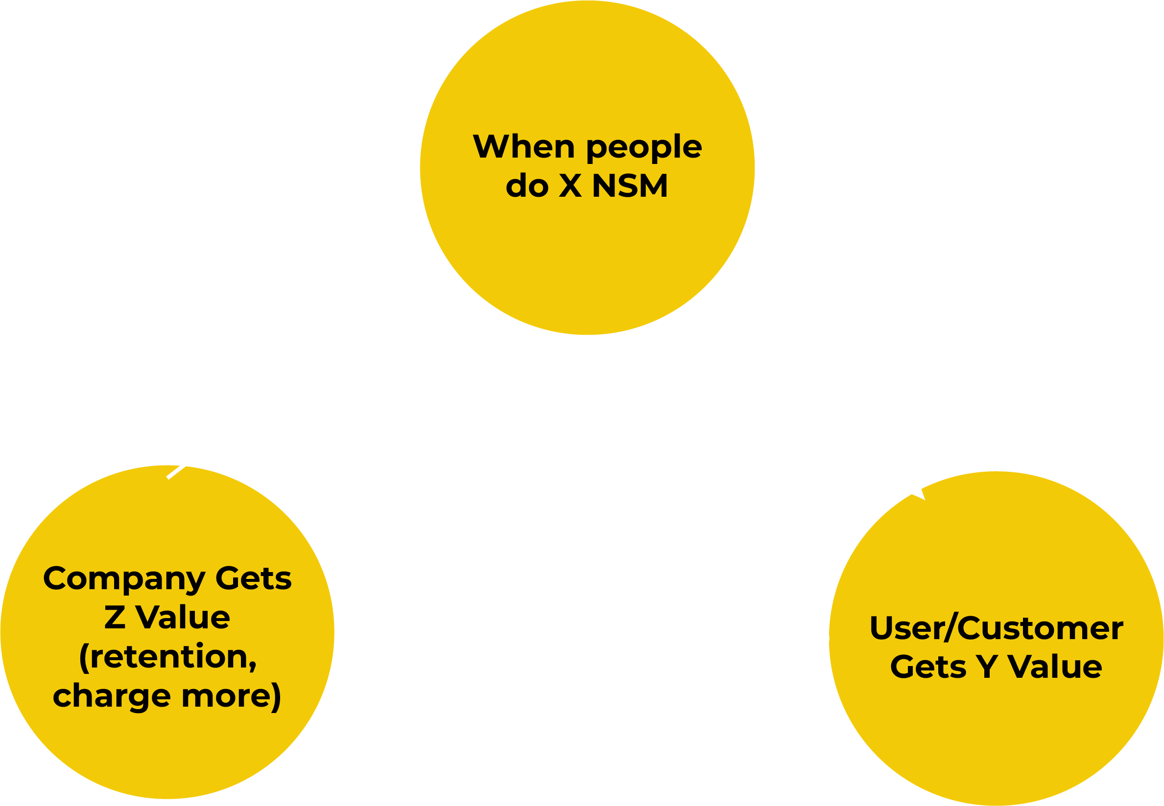
When your user does the NSM behavior, the user/customer gets more value, which helps your company capture more value (via higher retention or by charging more). This graph sums up a healthy NSM relationship between the user and the company.
Your NSM should meet the following criteria:
The first time you choose your NSM, you might not be completely confident. That’s okay. Pick an NSM and start tracking it. Over time, it will become obvious.
You can approach this from both the company and customer angle. From the company angle, look at the actions your highest LTV customers do consistently in your product. From the customer angle, look at what your best-retained users do consistently in your product.
Your Turn (To Fill In)
Once you’ve found your NSM, your team will be more aligned and focused. However, you’ll miss out on the true impact of your NSM if you don’t use it effectively.
Go-to-Market Metrics
Your go-to-market (GTM) metrics reflect the key steps in your user journey. Although you could track all of the steps, we recommend focusing on six:
- Unique visits to your website.
- Signups.
- Users who complete the setup.
- Users who complete the first strike.
- Users who complete the KUI.
- Users who upgrade.
These metrics represent the key steps of your user pathway (identified in the User Component).
You can almost immediately pinpoint the bottleneck. Say you’re getting plenty of visitors and signups, but only 1% make it through the initial setup step. Where should you focus your team’s efforts? Onboarding.
One of our clients had 7,300 monthly visitors but only four signups. The bottleneck was obvious—improving the signup conversion rate. Doubling site visitors wouldn’t have solved anything.
Even if you don’t have the right tooling to track all of these metrics, track as many as you can. Resist the urge to add a bunch of other nice-to-have GTM metrics. Less is more.
Business Health Metrics
Nothing else matters if your business runs out of money.
Keep your eye on three metrics:
- Monthly Recurring Revenue (MRR).
- Total Revenue Churn.
- Cash Balance.
You’re probably tracking your MRR and Total Revenue Churn already, but I doubt you’re tracking your cash balance on a weekly basis. A cash balance tallies all the cash your company has in its accounts.
At ProductLed, we asked our bookkeeper to track our cash balance on a weekly basis. We soon realized that although we were making good sales, we weren’t actually improving our cash position because we were unknowingly adding expenses at the same rate as revenue.
In less than six months of tracking this metric, we cut our annual expenses by more than $300,000. This might not be a lot of money for some businesses, but it made us much more profitable.
If you want to include some secondary business health metrics (BHM), consider:
- Net Revenue Retention: Measures recurring revenue after factoring in expansions, downgrades, and churn.
- Expansion MRR: Tracks additional revenue from existing customers through upsells or cross-sells.
- Average Revenue Per Customer: Calculates the average income generated per customer.
- Customer Acquisition Costs: The cost of acquiring a new customer.
Don’t get FOMO and add everything. The BHMs you choose should be like the gauges on your car dashboard—just enough information to know what’s going on.
Your Turn (To Fill In)
Compile your core metrics into a snapshot document. Remember: There are no revolutionary metrics. Change comes from how you use them to make decisions.
Phase 2: Build Your Weekly ProductLed Scorecard
Your ProductLed Scorecard is a simple spreadsheet that your entire team can easily view and contribute to.
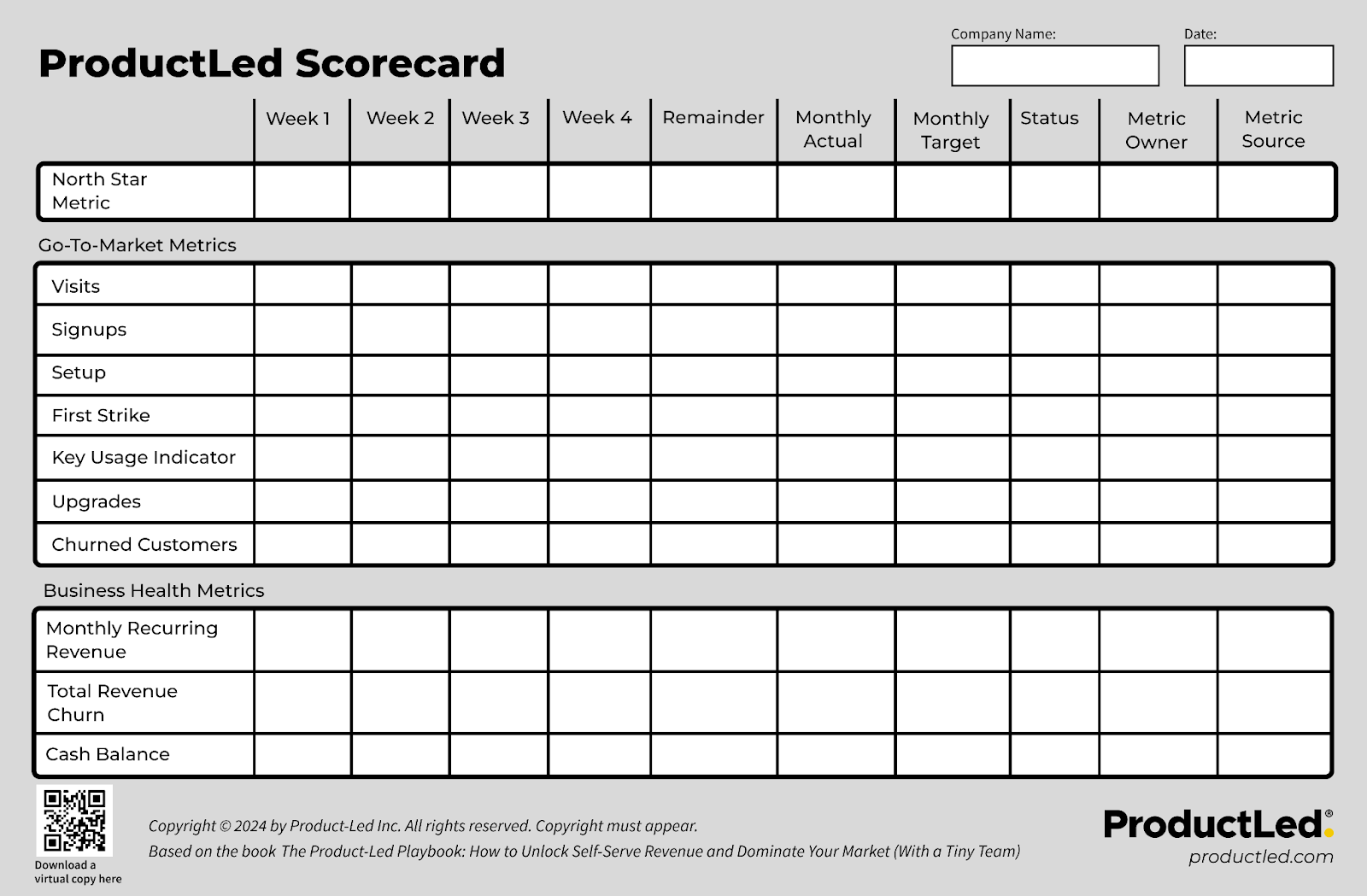
Place all of the metrics you identified in Phase 1 into the scorecard.
🎁 Action Tool: Free ProductLed Scorecard Template
Grab our free digital ProductLed Scorecard at ProductLedPlaybook.com.
To take your scorecard to the next level, layer in accountability. For every metric, assign an owner who passes the Ownership Test:
According to EOS®️ Worldwide, these three questions ensure you’re putting the Right Person in the Right Seat.
A dedicated owner ensures each part of your customer journey has someone responsible for improving a key metric. Since it’s a weekly scorecard, it guarantees that it’s a top priority.
It’s also great for your team because it makes it easy for them to know where they stand. Everyone deserves to know whether they’re doing a great or poor job. Before you assign random monthly targets for new metric owners, have each owner backfill the ProductLed Scorecard for the previous month. This will require them to identify where they can track their metric, confirm that they can track it, and give you a baseline for a realistic weekly target.
By design, the ProductLed Scorecard is filled out manually. Entering the data yourself encourages deeper thinking about why a metric is off or how to better achieve a goal. Of course, this can be tough if your data is buried in a complex data warehouse, hence the need for a simple product analytics tool, but we'll save that chat for later.
Your ProductLed Scorecard creates weekly opportunities to talk through how to get the most out of your product—and the team that manages it.
What I love most about the ProductLed Scorecard is that whoever owns an off-track metric basically becomes “CEO for the week.” Their metric becomes everyone’s top priority, and they can enlist the full support of the company to turn it around. Over time, this creates a collaborative culture and allows metric owners to attack their metrics relentlessly.
In the Process Component (up next), we’ll unpack when and how to review your ProductLed Scorecard.
Phase 3: Install Product Qualified Leads
Product Qualified Leads (PQLs) are an advanced metric. Start using your ProductLed Scorecard for at least a month before adding in PQLs. They can be more challenging to track if you don’t have product analytics in place.
A PQL is an ideal user who has successfully set up their account, received the core value from your product, and hit a KUI. You want PQLs because their odds of upgrading are high—30 to 50%.
If you’ve defined the stages of your user journey and implemented profiling questions into your onboarding flow, you have all of the ingredients to track PQLs:

- Ideal User Profile: Is this your ideal user? Ask profiling questions during signup, such as “What’s your job title?”
- Successful Setup: Have they completed the setup stage? For some tools, this could be installing a script.
- First Strike: Have they experienced tangible value? This is the first moment a user realizes how your product can help them.
- Hit a KUI: Are they forming a habit with your product? Do they experience the core value frequently?
When used correctly, PQLs:
Every team can play a part. PQLs align your team’s success with your user’s endgame.
How to Rollout PQLs
The best part about PQLs is that you need to make only a slight modification to the six core metrics you track in your GTM Metrics. Essentially, you segment your data to focus on tracking your ideal signups and you swap out KUIs for PQLs.
Here’s what it looks like:
One of the recurring themes of this book is that your user’s success ultimately becomes your success. By ensuring teams align to help your PQLs, you do just that.
Access Actionable Data
The True North Framework provides a simple approach to understanding what’s really going on in your business, where the bottleneck is, and who owns what.
Yet, creating transparency, ownership, and accountability for core metrics isn’t enough. You need constant triggers to prompt teams to review their metrics and unlock peer-to-peer accountability.
We’ll dig deeper into how to review your scorecard consistently in the Process Component.
Whenever an owner hits their target, publicly praise them. This is a new behavior you want to have on the team. It’s also an excellent opportunity to ask the owner what contributed to this success.
The gold standard is to always know what’s holding your company back so that you can invest your team’s time in attacking that gnarly bottleneck. The ProductLed Scorecard simplifies this process by eliminating guesswork and providing you with a dashboard to run your business effectively.
What do you do when you identify your bottleneck? That’s the Process Component.
Actionable Takeaways
- Each time you add another metric to track to your scorecard, you water down your focus. Less is more.
- You’ve chosen the right NSM behavior when the user gains more value from doing it, which helps your company capture more value through higher retention or increased pricing.
- Review your ProductLed Scorecard weekly with your leadership team to identify what the biggest bottleneck is in the business.
- Whoever owns a metric that is off track becomes the CEO for the week in that they call the shots and can enlist the support of the rest of your leadership team to attack their metric and turn it around.
- Use this formula to define what a PQL is for your business: Ideal User Profile + Successful Setup + First Strike + Hit a KUI = PQL
- Every team in your company can and should play a small part in increasing the number of PQLs your company has every week.