Frictionless Onboarding
How easy is it to sign up and get to value in your product?
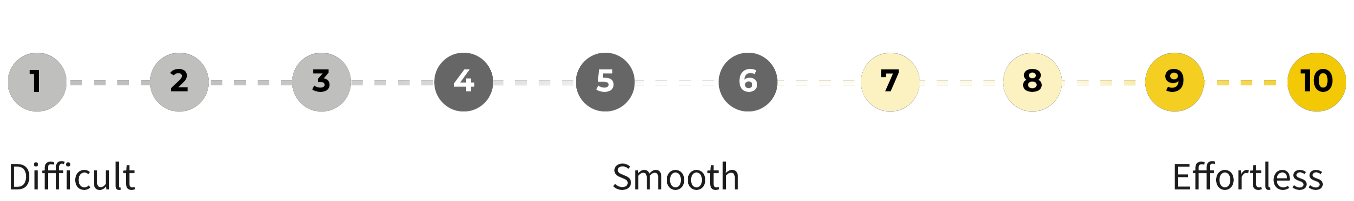
Rate yourself from 1 to 10.
Forty to 60% of users who sign up for your product never return. It’s a bloodbath. Most users who sign up genuinely want to experience your product's value, but challenges get in their way.
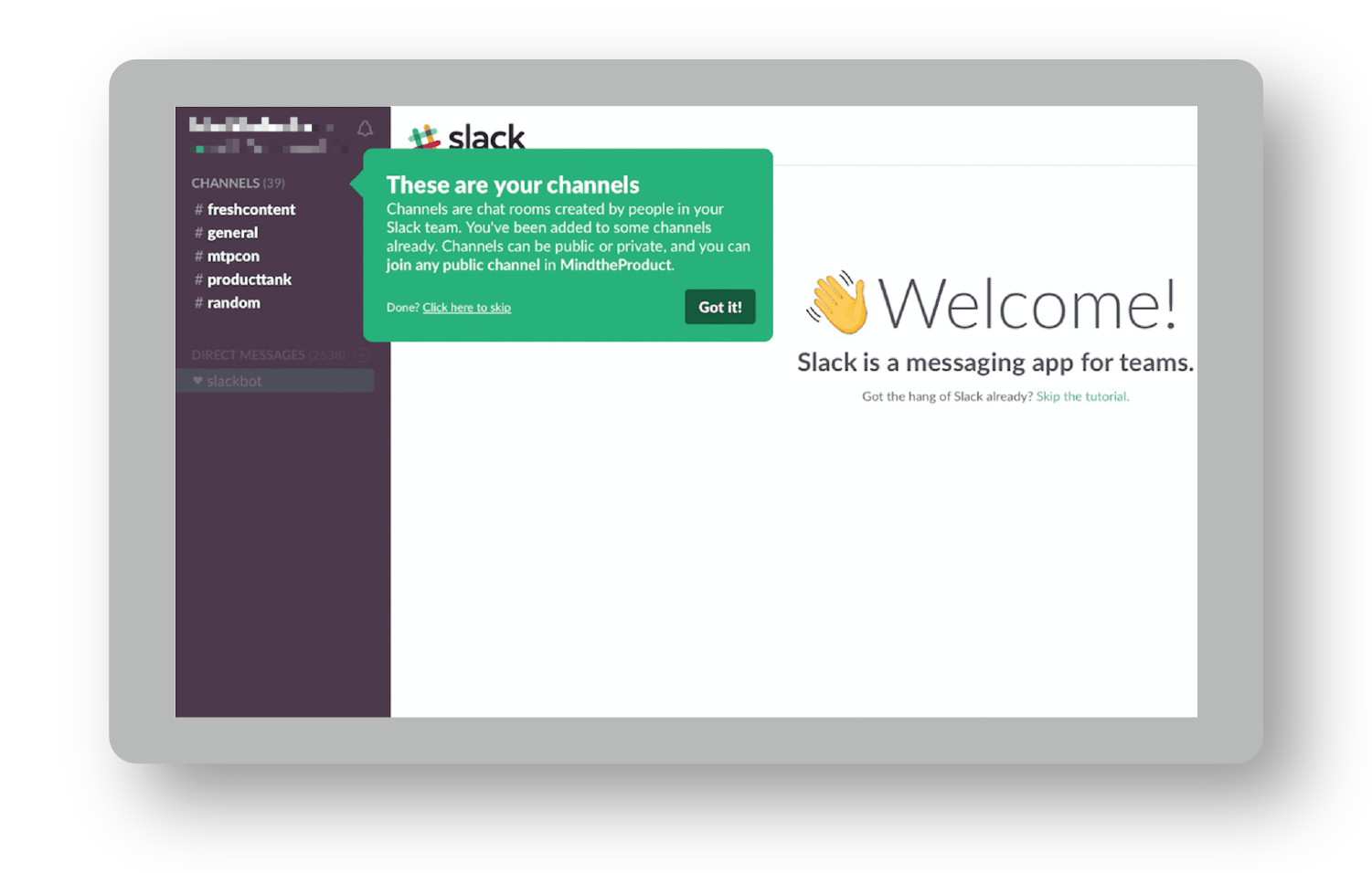
Take Snappa. They required every new signup to activate their email address before logging into the product— 27% of signups never took that step. They never even saw the product.
I pretend that every user says a simple prayer after signing up: “Please make this easy!” It’s up to us to answer their prayer. You promised something. They had faith. To turn them into true believers, you need to deliver—ideally, overdeliver—on your promise.
You must create an effortless experience:
- Effortless to sign up.
- Effortless to experience value.
- Effortless to upgrade.
How do you avoid the Snappa scenario and make that happen?
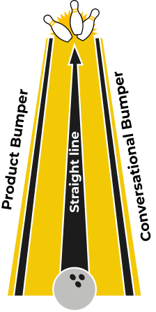
Deploy the Bowling Alley Framework
I’ve successfully used the Bowling Alley Framework to help brands make millions—without spending a dime more on marketing. Whatever industry you’re in, this system can help you craft an effortless experience that turns users into customers.
By simplifying the path for users to experience the value of your product, you skyrocket their odds of upgrading. In fact, this is how Snappa grew its MRR by 20% in one week, simply by deploying this framework.11
If you haven’t played 10-pin bowling before, here's how it works. Ten pins stand in a triangular array 60 feet away. Between you and the pins, there’s an oiled wooden lane 41.5 inches wide. You have a ball a little less than 9 inches in diameter that weighs up to 16 pounds. Your goal is to roll your ball down the lane and knock down as many pins as you can.
Here's the bad news: There are gutters on the left and right edges of the lane. If your ball falls into the gutter, you won't knock down any pins or get any points.
If you’re new to 10-pin bowling, it’s frustrating when your ball goes into the gutter. To fix this, Phil Kinzer invented the concept of "bumper bowling," in which a bumper keeps balls from going into the gutters. Avoiding the gutters virtually guarantees that you’ll knock down pins.
You can win more customers by adding bumpers to your product experience.
When users get sidetracked or leave the product, bump them back in the right direction. Guide users to the part of the product that matters most. You’ll keep users from trailing off and increase the number of those who return to the product.
With the Bowling Alley Framework, even a newbie can get a strike. This is crucial. As you eliminate challenges from your users' experience, your total addressable market expands—allowing more people to experience the value of your product.
By the end of this component, you’ll know how to create an effortless onboarding experience. Start by defining your straight line.
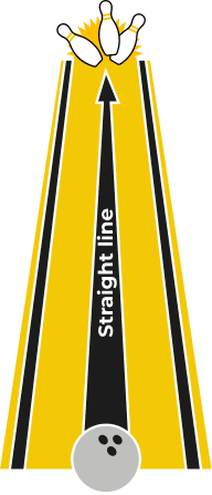
Phase 1: Build Your Straight Line
A straight line is the shortest distance from Point A to Point B.
The problem, however, is that most users never make it to Point B, where they experience the value of your product. Why? Most often, we don’t know the desired outcome people are looking for—the reason they signed up.
Take Canva. You can use the product to create posters, cards, presentations, you name it. Given the incredible number of use cases, Canva created a web page that shows exactly how to create a poster. You simply click the CTA to create a poster, and within seconds, you’re editing a poster in the product.
By understanding the problems people are trying to solve (e.g., how to make a poster) and customizing the onboarding experience to help users solve them, Canva slashed its time-to-value in half. It created a straight line. You should, too.
Step 1: Map Out the Fast Path
In my experience, 50% of required user onboarding steps are rubbish. (Yes, yours, too.) Many are required steps first-time users don’t need to complete right away. Some don’t need to be there at all.
When you first build out your straight line, map out a path to accomplishing a First Strike in your user journey—everything from Visit to First Strike is fair game. The second time you go through this activity, complete the straight line to the KUI. The third time, to the Upgrade step.
Why not map out the full experience right away? You typically lose 40 to 60% of your users during the First Strike step of your user journey, so optimizing this section will have the biggest impact.
Let’s pretend you’re an established ecommerce business with multiple Amazon and eBay stores. Every day, you spend three hours manually logging into each account to respond to customer messages. The more eBay and Amazon accounts you have, the more logging in and out you need to do.
After some research, you find our ProductLed client, ChannelReply, which has a product that allows you to forward all of your Amazon and eBay messages to a help-desk solution of your choice (e.g., Zendesk).
Once you sign up for ChannelReply’s free trial, you integrate your Amazon and eBay accounts with the one help-desk solution. Once that’s complete, you see messages pop up in your help-desk solution from eBay and Amazon—it’s a miracle! This is when you decide to upgrade. The product delivered on its promise.
Naturally, ChannelReply wants everyone to get to this point in their user journey, but integrating a help desk with Amazon and eBay takes more than 50 steps. To develop a straight line, they need to reduce the number of steps.
To map out the ideal path, document every step from the second someone lands on your homepage until they hit the First Strike. Even small steps like clicking an “OK” button count.
You can go one step further and take a screenshot of every step. This will help you visualize every step users take to reach value.
After that, it’s time to learn more about who’s signing up.
Step 2: Add Your Profiling Questions
Add more steps? You just told me to kill all these steps! Hear me out.
Profiling questions are added right after a user signs up for your product. They help you quickly identify an ideal user and personalize the user journey so you can deliver value more quickly. While it adds friction, users will thank you if you use that information to personalize their dashboard, settings, and features.
Ask as few questions as possible. Users haven't seen the value of your product, so you need to balance friction with value.
For example, ChannelReply might ask users two questions at signup:
- Where are you selling online? (e.g., Walmart, Amazon, eBay)
- What help desk solution do you use? (e.g., HelpScout, Zendesk, Freshdesk)
These questions allow them to show the steps necessary to integrate specific marketplaces with their solution. If someone isn’t selling on one of the platforms they support or doesn’t use a compatible help desk solution, they’re not an ideal user.
When deciding on your profiling questions, ask:
- What question(s) could I ask to quickly identify if this is an ideal user or not?
- What question(s) could I ask that would allow me to catapult users to value quickly?
Here’s an example from Monday.com:
- How do you want to use Monday.com?
- For my team
- For personal use
- For school
- What best describes your current role?
- Business owner
- Team leader
- Team member
- Freelancer
- Director
- C-level/VP
- What’s the size of your current company?
- 1-10
- 11-49
- 50-199
- 200-499
- 500+
- What would you like to manage first?
- Sales and CRM
- Design and creative
- Education
- Product management
- Select what you’d like to focus on first
- Roadmap planning
- Task management
- Project management
Within five questions, Monday.com knows if I’m an ideal user. This helps determine the level of support they should give me. It also gives them the opportunity to drop me into the product that would help me the quickest—in this case, roadmap planning templates.
As you’ll learn in the Data Component, identifying an ideal user will ensure you’re driving the right users to sign up.
Your Turn (To Fill In)
Once you’ve added profiling questions, it’s time to label each step.
Step 3: Label Each Step
Now that you’ve mapped every step it takes for users to reach their desired outcome, label each with green, yellow, or red:
- Green is absolutely necessary (e.g., uploading a piece of JavaScript to your website or asking for an email address to set up an account).
- Yellow is for advanced features that can be introduced later (e.g., setting up a custom signature for your email address, or running split tests on video thumbnails).
- Red can be removed completely (e.g., changing the color of your profile picture or asking for someone’s nickname when setting up their account).
Yellow is the hardest to label. Typically, it’s a necessary step. But it's not needed at that moment. You can delay that step until later. Removing red steps and delaying yellow steps straightens the line that speeds users to success.
For ChannelReply, these might be the first three steps for account integration:
- Integrate your Amazon account.
- Set up your custom signature.
- Share your nickname.
Integrating your Amazon account is necessary, so you’ll label it green. Do you need a custom signature to see incoming messages from Amazon? No. Setting your custom signature is an advanced step. Once you see the product’s value, it’ll make sense. For now, label this step yellow. Lastly, sharing your nickname is totally unnecessary. Hence, you’ll label this step red and remove it altogether.
Now you have all the components to create your straight line.
Step 4: Define Your Straight Line
Growing up in Hamilton, Canada, I took a bus to get to my downtown school. It took between one and two hours. Why the variance? The parade of stoplights. The bus was constantly starting, stopping, and idling.
To reduce the idling of cars and speed up traffic, the City of Hamilton introduced a green light sequence for Main Street, the busiest road in the city—and the main road my bus traveled along. If you hit one green light, you kept hitting green lights until you turned off Main Street.
This one innovation helped me get to school 25% faster.
This is how you want your straight line to feel for users: an unbroken string of green lights.
Once you’ve already broken down each step between signup and the First Strike, meet with your team to discuss all the steps you can potentially remove. Cut out as many red and yellow lights as possible. If you want a lively discussion, include people from product, engineering, marketing, and sales.
Keep only essential, green steps.
That is the straight line to experiencing value in your product.
One of the reasons I love building a straight line is because every step needs to fight for its life. By the end, you’ll learn that users simply need to complete steps X, Y, and Z for you to deliver your product’s core value.
Companies consistently kill 30 to 40% of steps, delay another 20% of steps, and thrive with a fraction of the steps left in their straight line.
A straight-line onboarding experience makes it 2 to 3X easier for users to experience the core value of your product.
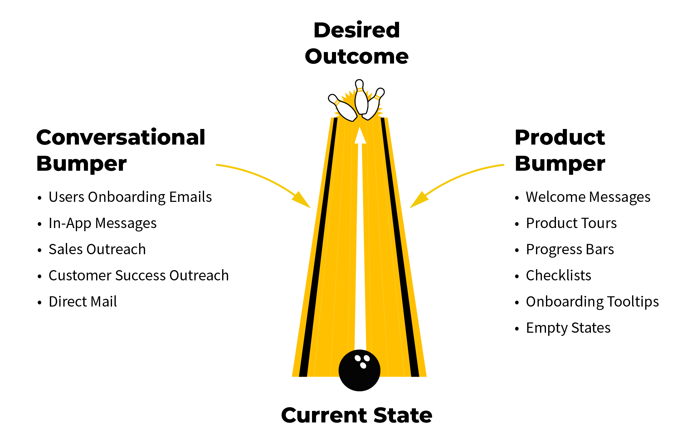
Even if you create the best possible straight-line experience, users still find a way to get stuck in the gutters (and never return to your product). You can solve this by installing two types of bumpers: product and conversational.
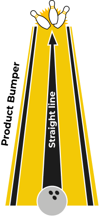
Phase 2: Product Bumpers
Product bumpers help users adopt the product within the application itself. If you’ve clicked on tooltips or checklists when you first signed up for a product, you’ve experienced product bumpers first-hand.
Product bumpers—arguably the most important bumper—help users experience meaningful value in the product. If you help users accomplish something meaningful, they’ll come back.
Here are the main product bumpers:
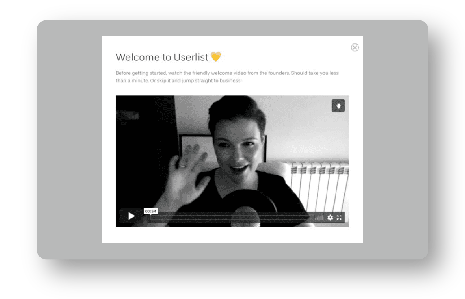
Welcome Messages: Welcome messages greet new users and make them feel invited. Use them as an opportunity to say hello and restate your value proposition to increase motivation. These also set expectations for what users will experience with your product.
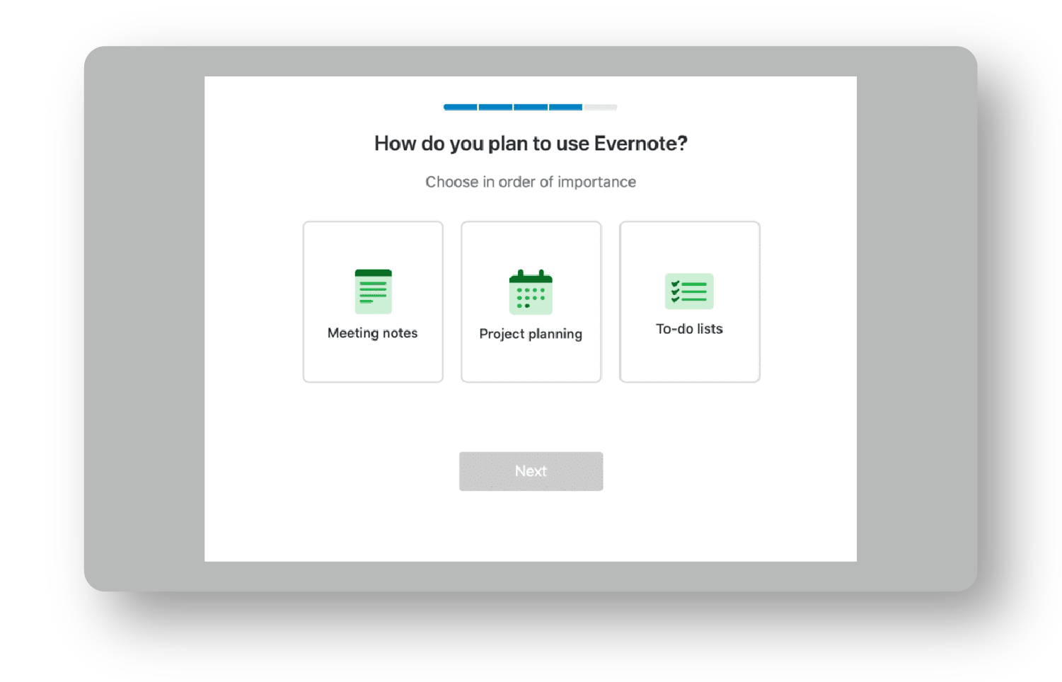
Product Tours: These eliminate distractions and give users only a few important options. If you have a multi-product business, a product tour at the beginning of your onboarding can be a game-changer. You catapult users into the areas of the product they care most about.
If you have a simple consumer application, you might be able to get away without a product tour. However, a product tour is a must for a complex product with features that accomplish different tasks.
I love using product tours to ask profiling questions right after someone signs up. Once users answer those questions, you can launch them into the part of the product they care most about.
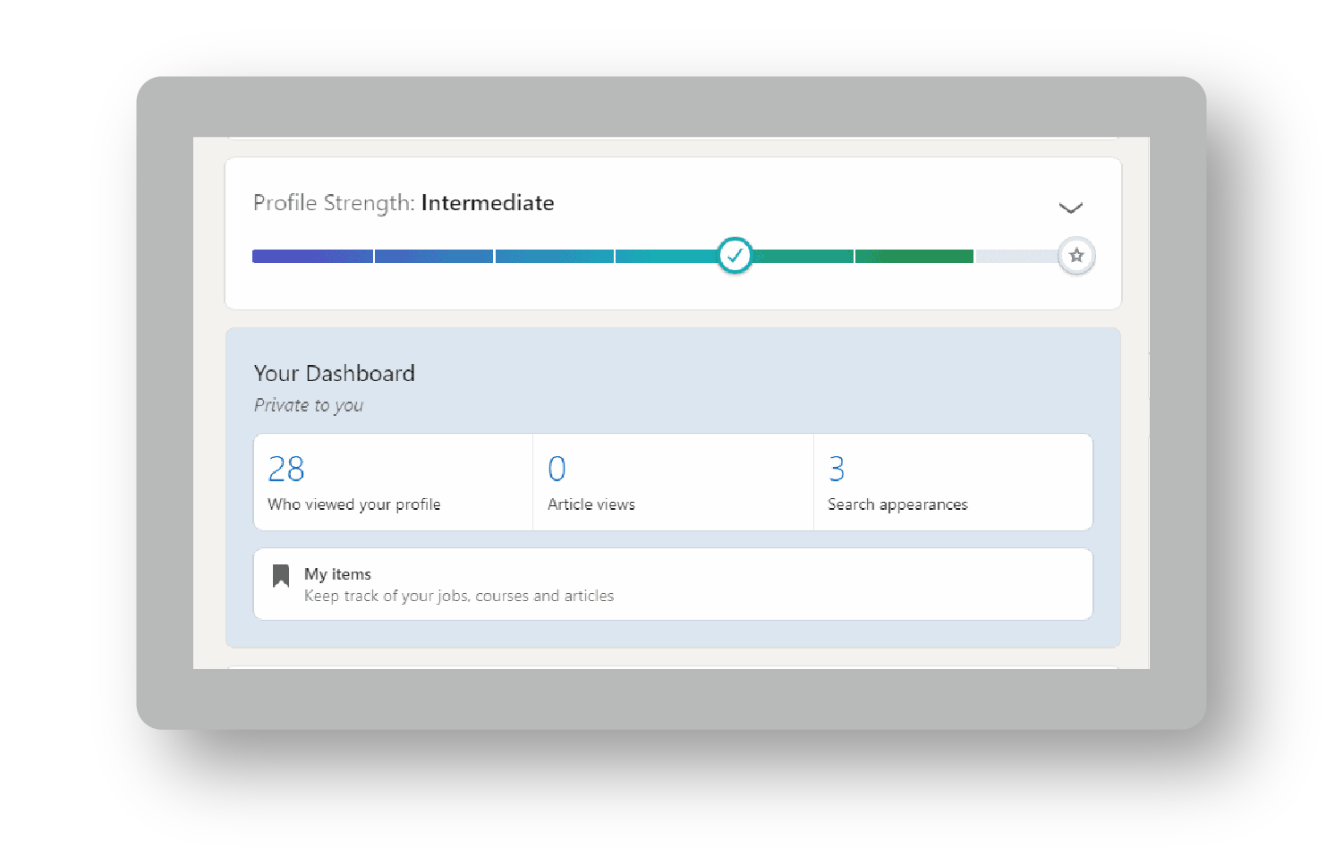
Progress Bars: Progress bars indicate how far a user has come and how far they need to go. You’re setting an expectation for how many steps are ahead to reassure them that onboarding won’t take long and that they’re only a few steps from completion.
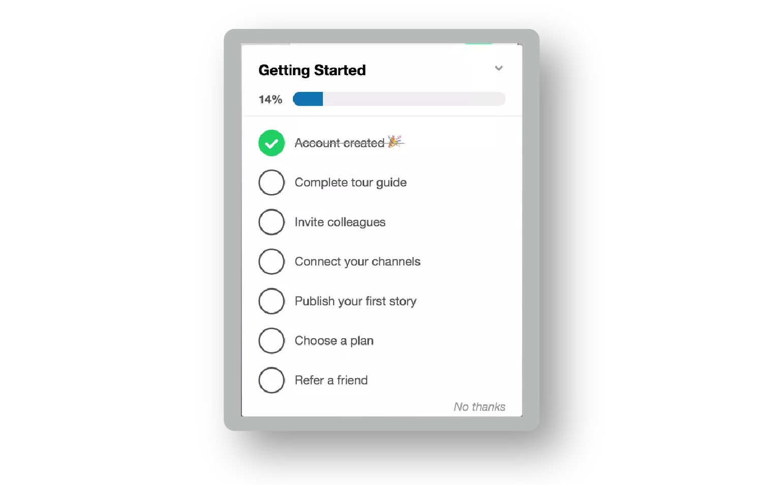
Checklists: Checklists break down big tasks into bite-sized ones. In addition to giving users an overview of how to set up their accounts, checklists simultaneously increase user motivation because users know how many steps it takes. Maximize their value by partially filling them out before the user sees them.
Onboarding Tooltips: These help users learn how to use a product. They can reduce the burden on support and scale usability. They offer helpful tips to new users and show experienced users new areas of the product.
Don’t drown users in a sea of tooltips. Keep it simple—guide them through the straight-line onboarding steps.
Empty States: Empty states are useful when a user first lands on a product’s dashboard. Empty states should prompt users to take action that leads them closer to experiencing meaningful value.
Do you have to use empty states, onboarding tooltips, checklists, and product tours? Absolutely not. Use product bumpers only when there’s a need (i.e. when users are dropping off—more on that in the Data Component).
Each bumper is an opportunity to guide users toward the outcome that motivated their signup. Once you’ve installed your product bumpers, it’s not uncommon to double the number of users who reach value and upgrade. Coincidence? I think not.
Let's explore how to pair product bumpers with conversational ones.
Phase 3: Conversational Bumpers
If someone signs up for your product but never sets foot in it, the best product bumpers won’t help you. Conversational bumpers will.
Conversational bumpers educate users. They bring users back to the application and encourage them to upgrade their accounts. Whether you’re using email, push notifications, explainer videos, direct mail, or even SMS, any communication medium can be a bumper.
Here are four reasons to use conversational bumpers:
- Educate users.
- Meet users where they are and pull them back into your product.
- Increase motivation to use and buy your product.
- Assist users in any way your product can’t.
Imagine I signed up for your software but didn't complete the key setup stage in the onboarding process. How could you support me?
- You could send an email asking if I need help setting up the product.
- You could send me an automated email with instructions on how to complete the setup stage quickly.
- You could text me a quick reminder to complete the setup stage.
- You could offer a free onboarding call to walk me through the process.
You can do so many things with conversational bumpers, which allow companies to smooth out friction in the product experience.
Not all conversational bumpers are created equal. Some, like specialists, require a lot of resources to deploy, while others, like external messaging, require very little effort once they’re set up.
I visualize conversational bumpers on a Care Continuum from hands-off to hands-on. There are six main types:
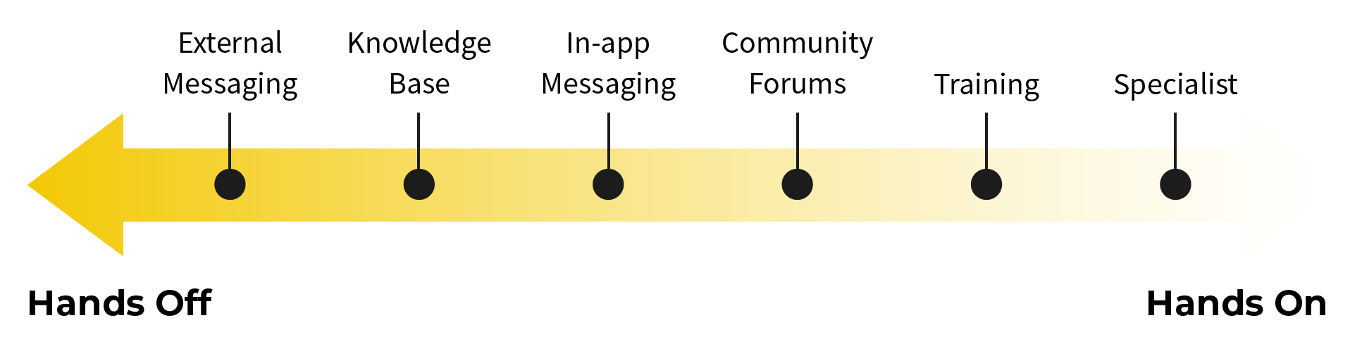
External messaging: These are texts, emails, LinkedIn connection requests—even snail mail! External messages should catch users wherever they spend their time. When users first sign up, they won’t be immediately hooked and log back in every day. The best external messages also provide users with clear next steps.
Knowledge Base: Nowadays, most in-app chat solutions pair with a knowledge base. This means that a user can get an instantaneous answer to a standard question and quickly fix it, empowering them to solve problems independently (and deflecting support tickets).
In-app messaging: I love in-app messaging because sometimes you’re struggling with something in an application, and you need to ask a very specific question. It’s incredible when you can immediately message a company in-app and get a near-instant solution from a live representative. Even if it takes a few hours to get a response, it’s still great to see there’s a team behind the product that cares for its users.
Community Forums: Many software companies launch communities around their products. This is partly because communities can serve new users in better and different ways. Take Notion. You can use the product in many different ways, so a community where users share templates for how they’re using the solution simultaneously increases adoption, engagement, and retention—a powerful combo.
Training: Let’s face it: most software solutions require expertise to master. You can make your product incredibly easy to use, but you're missing out on a massive opportunity if you don’t address the user’s knowledge gap. This can come in the form of weekly coaching calls, an academy, or a live cohort that teaches users how to solve their biggest issues.
Specialists: Technical support specialists make it easier for users to hit the First Strike. Sales specialists help users make a business case for purchasing a solution. Specialists are by far the most hands-on you can be for users, but they can speed up the time your users get to value and upgrade. They also happen to be one of the easiest to start rolling out.
Depending on the average lifetime value of your customers, some conversational bumpers won’t be sustainable (e.g., assigning everyone a specialist for a $10/month product). That said, optimize for being more hands-on at the beginning of your experience to accelerate learning.
You can always scale down your conversational bumpers once users get to value and upgrade on their own. You don’t want your conversational bumper to feel like a “helicopter parent” doing everything for their child. That can turn away motivated users. Instead, act as a coach, providing guidance to keep them on track when needed.
If it’s your first time building conversational bumpers, don’t implement all six. Start by rolling out the “VIP experience.” Give a select number of free signups the white-glove treatment. Let’s say you have 40 signups per week. Reach out to everyone. Send them a quick welcome email, ask them to schedule an onboarding call, give them a trial extension if they need more time, or manually set up their account.
Do everything possible to get these users to experience the core value of the product and upgrade. Once you identify a winning pattern of activities, that’s when you can roll out more scalable conversational bumpers (e.g., a manual welcome email could be automated, common questions answered during an onboarding call could be added to a knowledge base).
Do the unscalable tasks to optimize your learning about what makes users successful. Then, reverse engineer that process to give every signup the VIP experience.
Even with thousands of signups per week, offer VIP onboarding to high-value users. This helps your team understand exactly what users need to succeed, so you’re not guessing. The unscalable path is how you identify the scalable path.
Create a Frictionless Onboarding Experience
Crafting an effortless experience takes a lot of effort. But it takes a lot less if you deploy the Bowling Alley Framework. Use the Bowling Alley Framework Canvas to unlock frictionless onboarding.
🎁Action Tool: Bowling Alley Framework Canvas
Get your free Bowling Alley Framework Canvas at ProductLedPlaybook.com to help your users see value faster.
By starting with a straight-line onboarding journey, you typically slash 20 to 40% of steps that block users from value.
Once you’ve built your straight line, you can layer in a product bumper to make it dummy-proof for anyone to experience the core value of your product.
The conversational bumper will catch users where they are and assist them in whatever ways they need to succeed.
When you make your user experience effortless, you get rewarded with users who consistently engage with your product and are 10x more likely to become paid users.
And that’s what’s up next—pricing.
Actionable Takeaways
- 40 to 60% of first-time users visit your application once and never come back. Improving your first-time user onboarding experience is one of the most important things you can do. For a much deeper dive, read Product-Led Onboarding: How to Turn Users Into Lifelong Customers by Ramli John.
- Frictionless onboarding makes it effortless to sign up, get to value, and upgrade. You can design a frictionless experience by using the Bowling Alley Framework.
- To develop a straight-line onboarding experience, map out the fastest path to value, then triage every step to kill unnecessary ones, delay advanced ones, and pinpoint the must-haves. Those last ones are your straight-line.
- Product bumpers make it easy for your users to use your solution. Use them to direct users through your straight-line onboarding experience.
- Conversational bumpers catch users where they drop off and bring users back to the application. Use a more hands-on approach if you’re in the early days of crafting your self-serve motion or are dealing with users that have a high lifetime value. Scale down to a more hands-off approach once you’ve identified what it really takes to help your users succeed.