Welcome to another Product-Led Onboarding™ Teardown here at ProductLed. Our mission is to help companies like yours destroy bottlenecks in your onboarding experience to turn more of your users into happy, paying customers. Today, we’ll be breaking down the user onboarding of Deputy. We’ll be taking a look at five things:
- Pre-signup
- The signup flow
- The first product experience
- The purchase experience
- The Verdict
I also have Francois Bondiguel, the Head of Growth at Deputy, to shed more light on the user onboarding flow. Wes and I recently got a chance to chat with him on the Product-led Podcast about his obsession with optimizing the experience of new users within the first seven minutes. You can listen to the full episode on Apple Podcast, Spotify, Overcast, Google Podcast, and Breaker
Get our Product-Led Onboarding™ Checklist for free
Before we get started, I just want to let you know that we've put together a free one-page Product-Led Onboarding™ checklist.

Use it to take stock of your current onboarding experience, and run all your new designs past it before unleashing them on the world! Get the Product-Led Onboarding™ Checklist.
What is Deputy?
Let’s first find out what Deputy is. Here’s how Francois, the Head of Growth at Deputy, describes it:
Deputy is a SaaS employee management software. You can schedule your employees, manage timesheets and leave approvals, and more.
1. Pre-signup
Let’s first take a look at the homepage of Deputy.
Why do we start with the homepage if this is an onboarding teardown? The success of your new users really starts even before they start filling out the registration form. As I’ve said in the previous onboarding teardown of FullStory, your homepage, landing page, and other interactions with users shapes their expectations for three things:
- What is this product?
- How can it help solve your target customer’s problem
- Is it the best solution to solve that problem?
Anyway, let's jump into Deputy's homepage.

The headline reads, “Get started in minutes, schedule efficiently & handle unexpected changes.”
The text below reads, “Manage remote teams accurately and efficiently in one easy-to-use platform.”
This headline is vague and odd. First, it starts with a call-to-action, “Get started in minutes,” without even describing the what, who, and why of the product.
- What am I getting started in minutes?
- What does it mean to “schedule efficiently”?
- What unexpected changes am I handling?
The text below doesn’t help. It states that Deputy’s “easy-to-use platform” is for those who “manage remote teams.” And the value of Deputy is that it’s accurate and efficient. What does that even mean?
Notice how they used the word “efficiently” twice here. As much as I could, I avoid adverbs in any copy.
As copywriter Scott McKelvey perfectly puts it, “Flowery adjectives and adverbs are the enemies of content clarity and credibility.” What does it mean to “schedule efficiently” and “manage remote teams accurately”? Interestingly enough, the word “efficient” and “accurate” doesn’t appear anywhere else on this homepage, and instead, it talks about how Deputy saves you hours and simplifies your workday.
(As an aside, I reviewed the next section with the video thumbnail back in May. As a testament to Deputy’s growth team and their rapid experimentation, if you look at Deputy’s homepage now, they’ve removed the view. I had no part in this!)
The video to the right doesn’t clear this confusion. It looks like two scientists in lab coats looking at an x-ray.

There’s a disconnect with the thumbnail of this video with the headline and text to its left. Is this platform for remote teams of scientists or doctors? What does this video thumbnail have to do with Deputy?

I’ve already gone through the video. And there’s a quick two-second scene in it that features these two doctors. That’s it!
I’m harping about this video thumbnail because, according to HubSpot, a video’s thumbnail image can impact the number of clicks and views your video receives.
Think about it: The thumbnail is the only image that gives people a sense of what they’re about to invest their time in watching. If it looks unprofessional, dull, or (in this case) confusing, people aren’t going to watch it.
This can be cleared up by making the headline more descriptive and changing the video’s thumbnail. This is not a great first impression of Deputy so far. But, I promise you it gets a lot better. This is the most critical part of this teardown.
Anyway, let’s watch this video. What I love about this video is that it shows Deputy in the context of its use. You see delivery companies, warehouse workers, cleaners, office employees, food delivery couriers, doctors, and truck drivers using Deputy.

This is an excellent example of helping people visualize your product in its intended use. They don’t have to imagine it with the copy, you can see it with this video.
This video describes the value of Deputy much better than the headline. With deputy, you can:
- Create a schedule in minutes
- Forecast wages against sales to maintain profit
- Track cost by the hour to meet changing budgets
- Deploy it quickly with minimal training and cost
Those are all great things that I wished they mentioned in the headline and text.
If I had to be nitpicky about this video, there were a few shots that screamed “fake” and “stock footage.” For example, there’s a scene that shows a hand holding an iPad that looks Photoshopped:

But, with the great content, I can look past this
Taking a look at the signup form below the headline and text. You can fill in your work email and name to signup or signup with Google or Facebook. Providing alternatives to signing up with your work email is an excellent way to remove some friction to the signup process.
The button copy reads, “Try Deputy for free.” Along with the button copy in the navigation bar, “Start free trial,” it’s clear that you’re signing up to try out Deputy. We’ll find out later in the pricing how much the paid plans are.
Right below the headline and video is a row of logos that use Deputy. And, boy, do they got some big names like Amazon, Nike, and Ace Hardware.
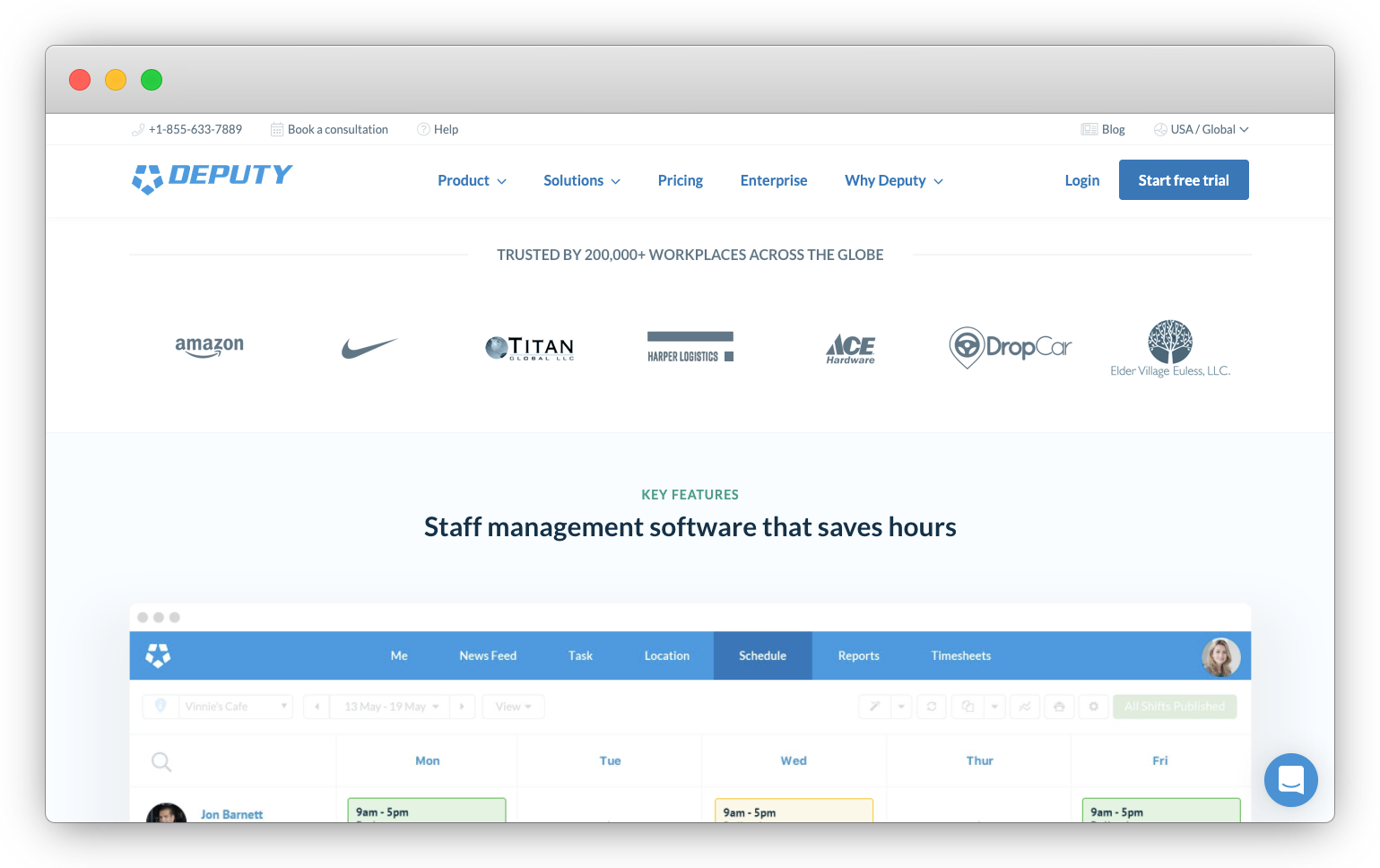
In contrast to these large companies, logos of small companies like DropCar, which, according to LinkedIn, has only 36 employees and Titan Global with about 100 employees also show up here.
Above these logos, it reads, “Trusted by 200,000+ workplaces across the globe.”
Wow! That’s an impressive number.

If you got numbers like this, you'd flaunt it. That’s a bit of overshadowing because they’ve got many other social proofs below this section.
Let’s move on. I’m going to briefly go through the rest of the page so we can focus more on the signup flow and first product experience.
Few things make everything below this fold much better than what I’ve seen so far above the fold.
First, the copy here better describes the value of Deputy. Right below the row of logos, it reads, “Staff management software that saves hours.” Who doesn’t want to save hours in a day? I know I do!
Right below this, it highlights features that do help managers save time, such as allowing employees to swap shifts with Deputy’s mobile app, automatically creating ideal staff schedules, and remotely managing leave requests.
Second, speaking about showing how they care about your business, they have a section that shows the different industries they support.

What I love about this is it speaks to the skeptical website visitor who might be thinking, “I’m in [insert industry such as healthcare, logistics, security] space. How can Deputy help MY business?” The links in this section direct you to the corresponding landing pages that address exactly how Deputy can save you time in your industry with their software.
Finally, I love how many types of social proof is on this page. Not only do they have the customer logos that we’ve already seen, but there are also four customer testimonials, and three ratings from Capterra, GetApp, and the App Store.
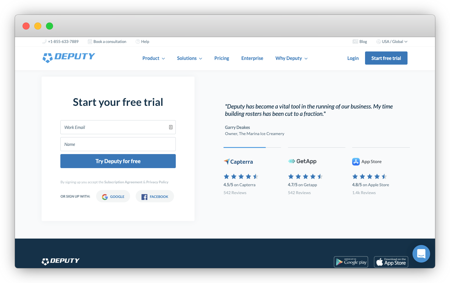
Most of these social proof appear right beside the “Start your free trial” section at the bottom of the page. The way that the customer testimonials automatically cycles through them really draws your attention to them. These are just one sentence testimonials, so they’re easy to read.
If you go to each of the ratings from the reviews aggregators, you’ll realize that these are clickable, which opens up a new tab to those sites. This is a nice touch for website visitors who are still skeptical.
This section screams, “Look how much our customers love us. Look at all these ratings, reviews, and love. If they love us, you will, too! Sign up now.”
Before we do, let’s briefly check out the pricing page.
The pricing page
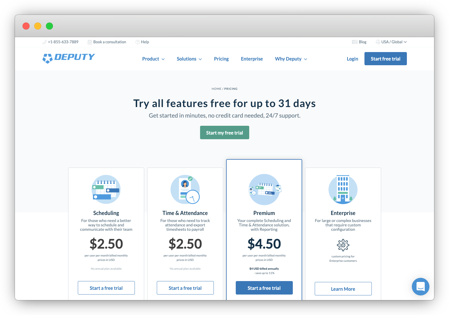
The pricing page’s headline reads, “Start your free trial. Full access to all features and 24/7 support. No credit card needed.”
By this point, Deputy assumes you already know what their product does and how it can help you. They just need to tip you over to sign up. So this headline addresses common objections that might come up:
- Is the free trial only for certain features? No, you get “full access to all features.”
- What if I need help? “Well, we have 24/7 support.”
- Do I need to give you my credit card? “No, you don’t!”
This is an excellent example of how you address objections right up front so people don’t have to scroll at the FAQ section. Kudos on the Deputy team.
If I had to be nitpicky, they could have re-iterated the value of Deputy right here again. Instead of “Start your free trial,” it could be more value-driven like, “Manage staff schedules, tasks, and timesheets in minutes… not hours”
The pricing comparison table below shows four columns.
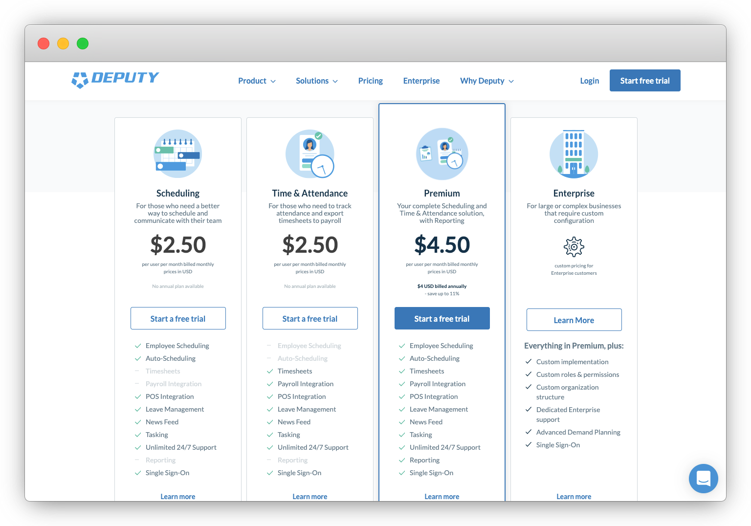
The premium plan stands out, not only because it juts out of the table, but it also has a blue border and is the only one with an animated icon. This is an excellent way to draw your attention here.
The prices are simple enough to understand. The Scheduling plan is $2.50 per user billed per month, which, as you look below, has all the features except the timesheets, payroll, and reporting.
The Time & Attendance plan is similar, except it doesn’t allow you to schedule employees and run reports.
The Premium plan has all the features and costs $4.50 per user per month. You save $0.50 if you sign up for premium instead of getting the Scheduling and Time & Attendance plans separately.
These prices are affordable, especially if you’re a startup and only have a few employees. The cost scales as your business and number of employees grow.
But, for larger companies with thousands of employees, you can select the Enterprise plan to get volume discounts. This plan has a “Learn More” button, which directs you to contact Deputy’s sales team.
The first three plans have buttons that read, “Start a free trial.” But, the button for the Premium Plan has a solid blue, which makes this plan stand out even more than the two other plans.
If you click on any of the buttons, they open up the same modal popup.

As we’ve previously read, the free trial includes all features, which I’m guessing is the Premium plan. Let’s go ahead and click on “Start a free trial” and get going!

2. The signup flow
The signup modal reads, “Try Deputy for free. Get started in minutes, no credit card required.”
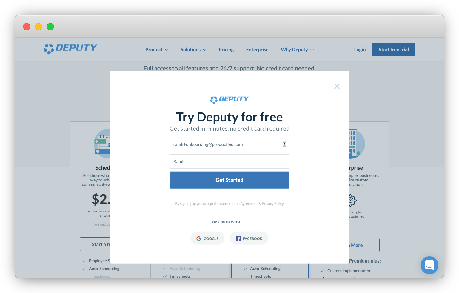
Once again, this copy addresses two objections when it comes to signing up: that it’ll take a long time to get started and that you have to enter your credit card to try it.
The rest of this is very similar to the signup form we saw on the homepage. Let’s go ahead and enter our work email and name. Then, click “Get Started.”
I’m going to preface the rest of this onboarding teardown with what Francois, the Head of Growth at Deputy told Wes and I. As you’ll soon see, the user onboarding of Deputy is on a different level!
And so you looked at the stats. It costs you $150 to generate a trial. And then, half of those people are not going to even go past that first experience. Even worse, 60 percent of those people will not have a second session. Meaning that you spend all that money, and more than half of them never come back. That was kind of the premise that really got me to say, “Hey, we need to really own this.” If you want to increase the unit economics.
I gotta say, I respect what Francois just said!

With that kind of perspective, I have to tell you that you’re really for a treat with the rest of this teardown. Let’s move on.
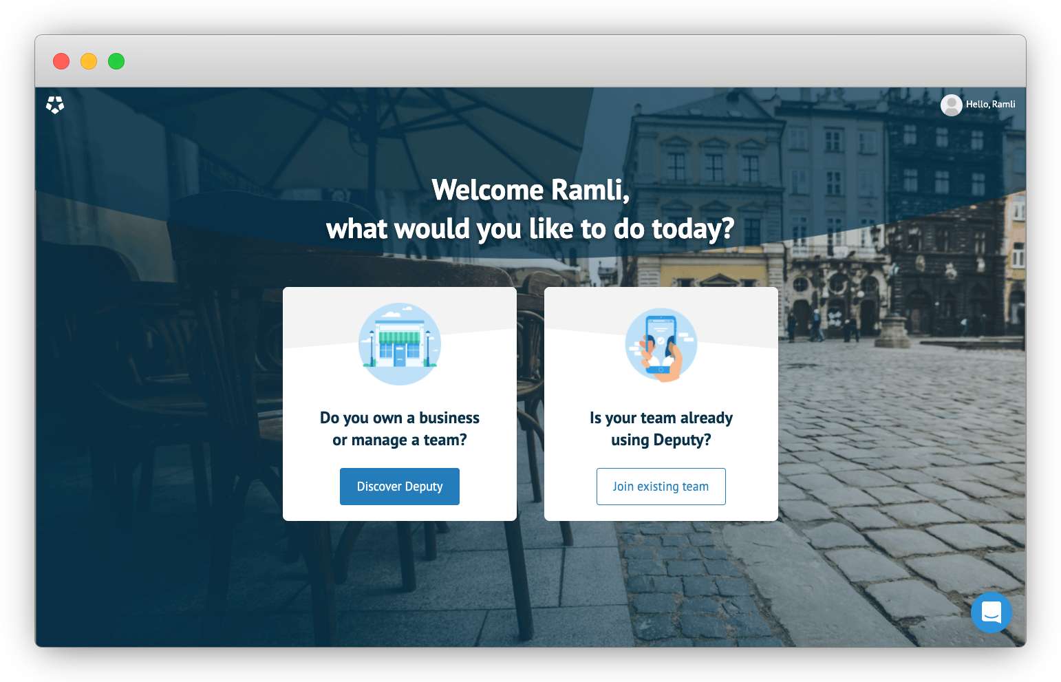
It starts with this page that reads, “Welcome Ramli, what would you like to do today?”
I love how they personalized it right away with my name. This also comes across as very conversational, it’s something you’d expect as soon as you enter a physical store. They don’t ask you for your password, company name, or job title, which are things I expected to see first.
The background image looks like you’re on an outdoor patio in Europe. This whole page is inviting, warm, and friendly. ♥️
You have two options. The first option is to start fresh. It reads, “Do you own a business or manage a team?” The button copy is “Discovery Deputy.” I love how this button is inviting new users to discover Deputy like an adventure instead of being vague like, “Continue,” or “Next.”
The other option is for those teams who are already using Deputy. Let’s click on “Discover Deputy,” since my team isn’t already using Deputy.
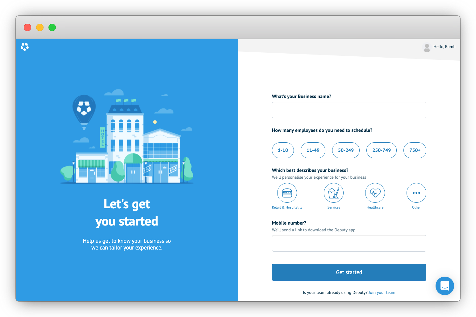
The next step in the onboarding flow reads, “Let’s get you started. Help us get to know your business so we can tailor your experience.”
I like how they explain why they’re asking for the info to the right. As a marketer, I know they’re asking this so that their sales team can better qualify me. Instead, this text explains what you’re going to get as a new user by filling out these fields, which is a more tailored experience.
Deputy asks for four information on this page:
- Your business name
- How many employees do you need to schedule
- Which best describes your business?
- Your mobile phone number
They provide a reason why they’re asking for your phone number here. The reason Deputy provides here makes sense, “We’ll send you a link to download the Deputy app.” Deputy described how useful their mobile app is to help you manage staff schedules, tasks, and timesheets on-the-go multiple times on the homepage. It makes sense to streamline this process by sending a link to download their app.
Let’s go ahead and fill in the business name and number of employees and click on “Get Started.”
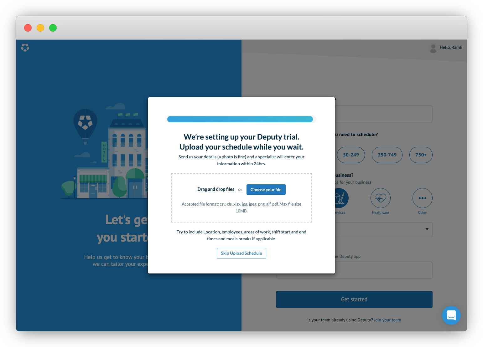
A modal appears with a progress bar. It reads, “We’re setting up your Deputy trial. Upload your schedule while you wait.” It further goes on that a photo is fine. A specialist will enter your information in 24 hours.
Wow!
Talk about getting a white-glove service. I am impressed. This is what Wes and I talked about with Francois, the Head of Growth at Deputy. This is about the obsession of Deputy’s growth team with optimizing the experience of new users within the first seven minutes.
If you’re looking to improve your product’s user onboarding, be more like Deputy. Figure out ways to get new users to experience the value of your product, even if it doesn’t scale.
Here, the reason for this step is to get managers to schedule their staff with Deputy as soon as possible. You don’t need to upload a CSV, or manually enter anything, just take a phone or screenshot and upload it here!
Since I don’t have any staff to schedule, I’m going to click on “Skip Upload Schedule.” With no indication of what’s next, you might think the next step is to set your password or fill out more fields.
If you thought that, you’d be wrong. Because that’s it for the signup flow! I’m just as shocked as you are.
3. The first product experience
Welcome to the first product experience of Deputy. You’re greeted with a welcome modal, which reads, “Welcome to Deputy, Ramli!”

I don’t know about you, but I like seeing my name. It’s like meeting someone for the first time and they immediately know your name.
It goes on, “Get started by choosing one of the options below.” You see two options before you.
The first option is to “learn what you can do in scheduling.” It reads, “Watch a quick tutorial to use scheduling in action.” I like that they gave you the option to take the tutorial. Too many apps just shove you into a product tour or tutorial. The button copy is descriptive and ties back to this option, “Watch a tutorial.”
The second option is for the brave souls who buy Ikea furniture, rips up the manual, and try to guess which pieces fit where. This option is for the users who say, “Screw the tutorial! I got this. I can figure it out.”
I’m going to take the safe route and click on, “Watch a tutorial.”

This brings up a video tutorial of Deputy. And it’s not just anyone giving the tutorial, it’s the founder and CEO of Deputy, Ashik Ahmed! According to LinkedIn, Deputy has over 292 employees. You’ve got the CEO, the head honcho of the company, giving you a video tutorial. I’m impressed.
The video is informative and goes through how to use the key features to get you started with scheduling your employees. It doesn’t overwhelm you by highlighting all of Deputy’s bells and whistles. The whole time, you can see Ashik on the bottom right section of the video. This is a nice touch to know that he didn’t outsource the rest of the video to one of his employees.
The button below reads, “Try Scheduling.” Let’s go try scheduling!

What follows next is a series of tooltips to walk you through adding employees and scheduling their shifts. This is a controversial move.
According to Appcues, “The beauty of tooltips is that they’re transient and highly contextual. Tooltips are not good for mission-critical information or anything that a user needs to refer back to frequently.” Tooltips can come across as heavy-handed and aren’t always appropriate if you want users to explore your product on their own and without constraints.
I personally appreciated how this helped me get started quickly and walked me through a complex workflow. I have a hunch that managers who try Deputy would find this helpful. They don’t have time to explore all the buttons. They got things to do!
Considering also that the copy on the homepage promises that you can get started with Deputy in minutes, it makes sense to provide a walkthrough like this to get them to the “aha” moment within the first seven minutes.
Once you’re done with publishing your first schedule, you see a modal that reads, “Shifts successfully published.” Oh, and what is this right above it, “You’ve unlocked 5 free days.”
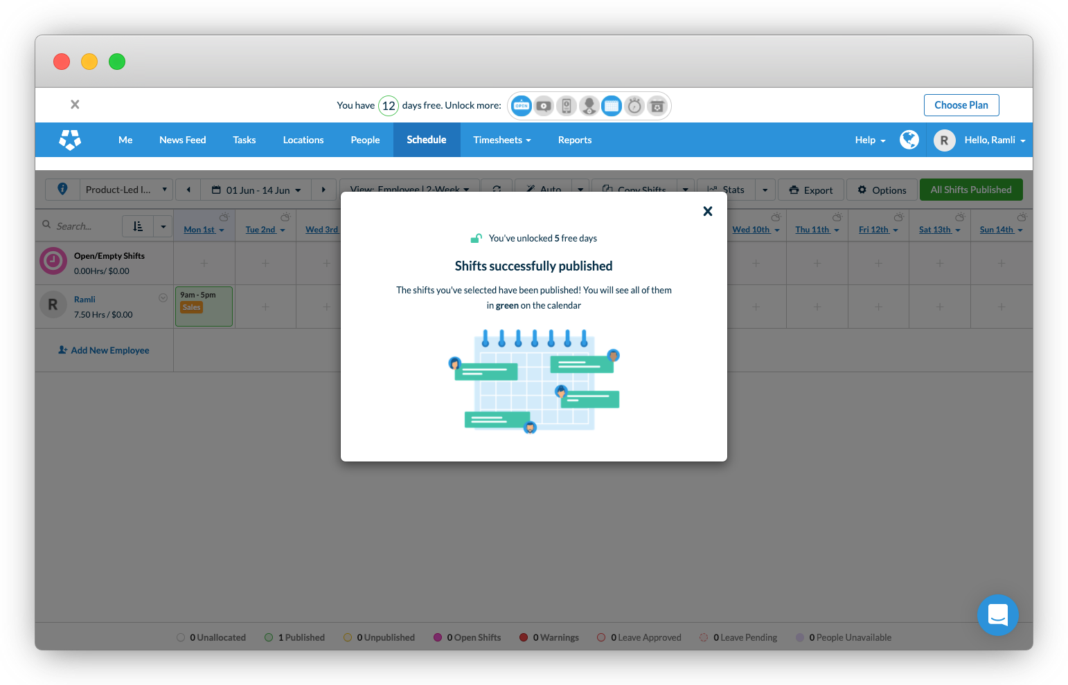
This leads you to the bar right above the page, which reads, “you have 12 days free. Unlock more.”
Wow, they’ve gamified the trial experience. The icons on the left look like badges you earn in video games. There are five that are grayed out. Let’s go see what those are.

4. The purchase experience
The purchase experience of Deputy is on a different level. I’ve seen other products try to gamify the trial experience by adding buttons. But it doesn’t come close to how everything comes together here. The badges really make this feel like a game.

The modal headline reads, “Get more free days. Unlock now.”
Below this headline is two badges that are unlocked and five that are grayed out. The text below reads, “You’ve unlocked 6 free days. Welcome, Product-Led Institute. Keep going! Complete the games above to earn more free days.”
This is amazin! I love how they called this out as a “game.” The inner child inside of me just wants to unlock it all, not because of the free days, but because I want to win this “game” and unlock all the badges.

In Nir Eyal’s book Hooked, calls this The Reward of the Hunt. These are rewards ingrained in us from our primal human brain to hunt for food to survive. Where we once hunted for food, today we hunt for other things – coupons, deals, and information.

In this case, the gamer in me really wants to see all of those badges turn blue!
Let’s click around to find out what we have to do to earn more badges. The first option is to talk to an expert. This reads, “Want an expert to show you around?” It doesn’t tell you how many free days you win if you complete this mission.

The button copy reads, “Book a free tutorial.” This is not a demo. This is not a sales pitch. It’s a tutorial from an expert. The text below further explains this, “We can have you up and running in no time.”
I really like how this is positioned. It’s not sales-y, but helpful.
Clicking on this button directs you to fill out a form. They’ve already pre-selected how many employees do I need to schedule since I already let Deputy know this during the onboarding process.
The heading indicates that I’m booking a free tutorial. But, the text below and the last question states that this for a demo. That’s odd. For consistency, I would change this to “tutorial.”
Let’s check out the rest of the badges.

The third badge is to download the Deputy mobile app.
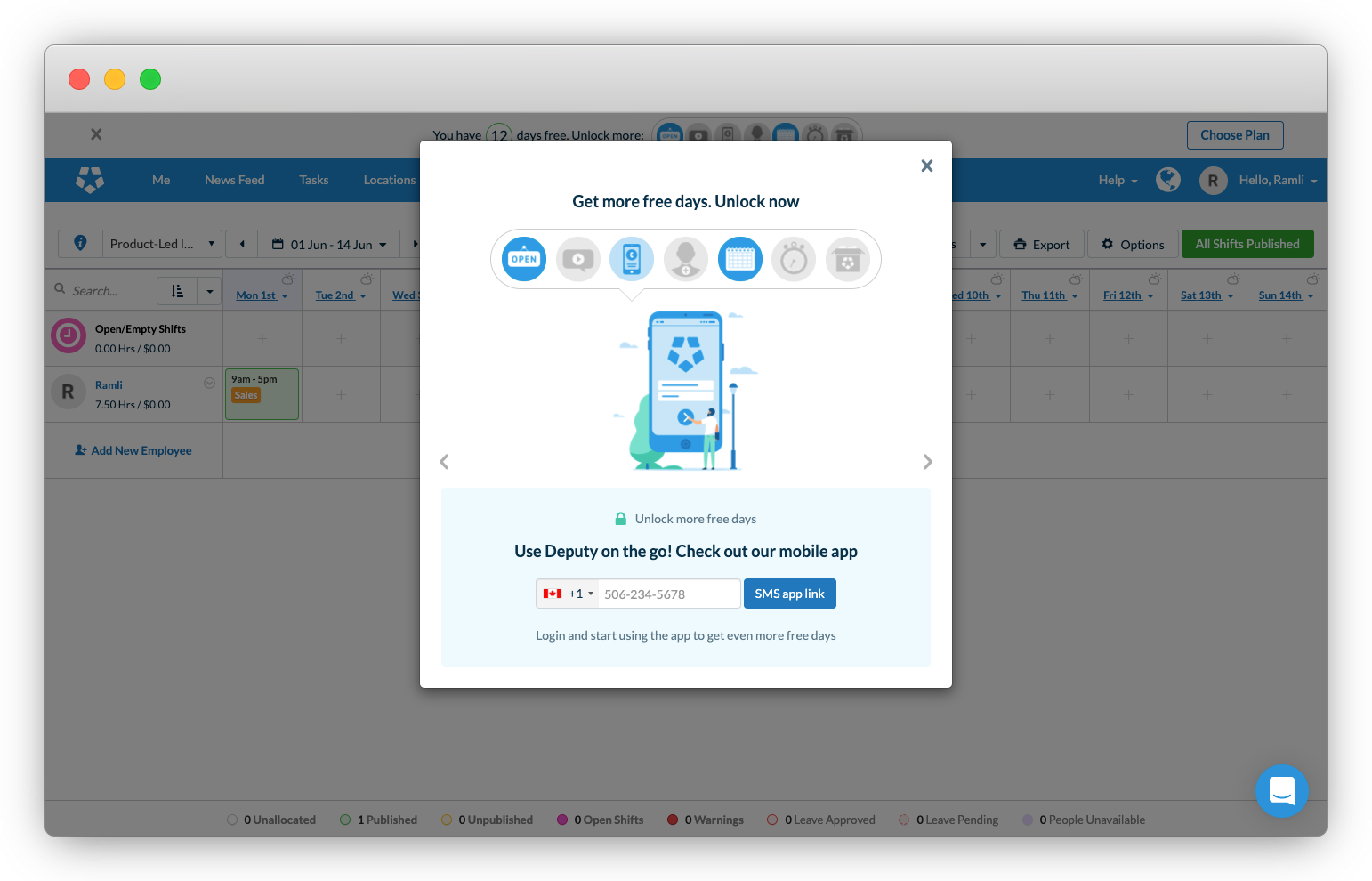
Anyway, let me enter my number just this once to unlock this badge. This shows how powerful gamifying the user experience is. You know how much I try to avoid giving my phone number on the Internet. But, because I want this badge, I'll throw caution to the wind!
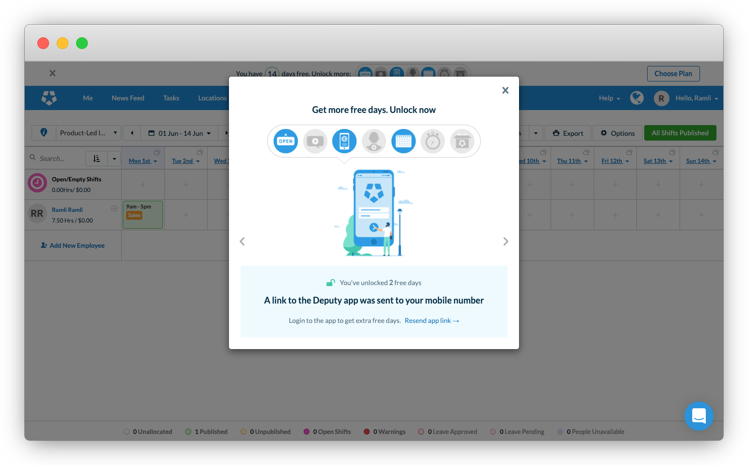
After I enter my phone number, I unlock 2 free days. Score! The text below let me know that I can unlock more days if I login to the app.
The fourth badge reads, “Start adding your employees.” The button reads, “Add Employees.” I don’t really have any employees at Product-Led Institute. Let’s skip this and check out the sixth badge.

The sixth badge reads, 'Tracking time & attendance has never been easier." This is a great way to upsell me more features and increase the Average Revenue per User or ARPU.

The seventh and final plan is to choose the plan. It reads, “Choose the plan today, keep your free days tomorrow.”
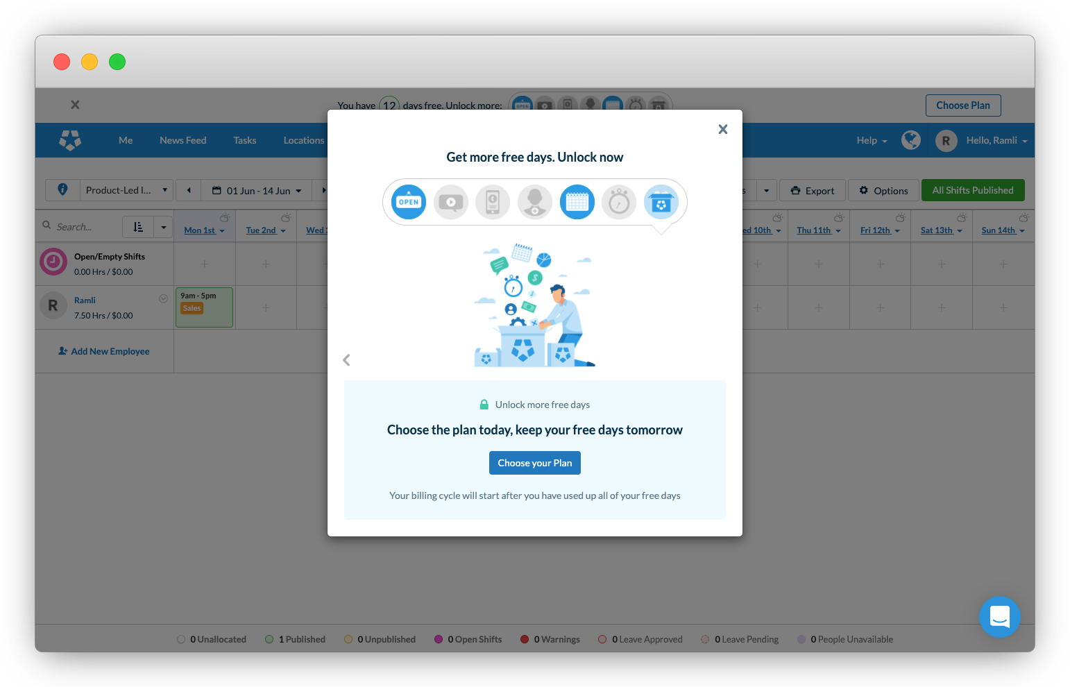
This opens up a modal with the plan comparison table that we saw on the pricing page. The Premium plan is smack dab in the middle. It’s easy to see here the difference in features between the plans. The text right below this describes Deputy Flexi for seasonal businesses.

I love how they get you to select your plan even before the free trial period is over to earn a new badge.
5. The Verdict
In summary, I would give Deputy’s user onboarding experience an A-plus. It would be an A++ for a few small minor things.
What Deputy did well
Here are the seven things that I thought Deputy did really well during the user onboarding experience:
First, overall, the copy from the beginning to the end has been outstanding. It has personality and comes across as conversational and helpful. I just love the first signup page, from the background image of a patio outside to the button copy "Discovery Deputy," this page was warm, welcoming, and inviting.
Also, during the signup process, they clearly explained why they're asking for information, especially for the phone number field. I'm not a big fan of giving my number to strangers on the Internet. But, the reason Deputy provides here makes sense, "We'll send you a link to download the Deputy app."
Second, they addressed objections before they came up. On the pricing page, they addressed three common objections that might cause skeptical visitors to hesitate in signing up.
Yes, you get full access to all the features. If you get stuck, you do have 24/7 support. And you don’t need to enter your credit card to get started. I didn’t have to scroll down to the FAQ section to find this out.
Third, the signup flow was frictionless and as short as possible. From the signup modal to the Deputy’s product, I went through three signup pages, filled out three mandatory fields, and selected an option from four different dropdown or option list.
I timed myself and it took me less than two-minute to get through that. This is how it’s done! This is the product-led approach to user signup flow.
Fourth, I really love that they provided a white-glove service to get new users up and running. Just before you got into Deputy’s product, a modal popup appears. It reads, “Send us your details (a photo is fine) and a specialist will enter our information in 24 hours.”
Wow! Sometimes, you have to do things that don’t scale to remove barriers new users face to getting started. This is what Wes and I talked about with Francois, the Head of Growth at Deputy, their growth team’s obsession with optimizing the experience of new users within the first seven minutes.
Fifth, they welcomed new users with a video tutorial from the CEO of the company, Ashik Ahmed.
With a company that has over 292 employees according to LinkedIn, you’ve got the CEO giving you a video tutorial. I’m impressed. The video is informative and goes through how to use the key features to get you started with scheduling your employees. It doesn’t overwhelm you by highlighting all of Deputy’s bells and whistles. The whole time, you can see Ashik on the bottom right section of the video. This is a nice touch.
Sixth, they walked new users through Deputy to get them to the "aha" moment in minutes.
Managers who have very little time to explore complex workflows just want to get their employees scheduled quickly. They don't have time to explore all the buttons. They got things to do! Considering that the copy on the homepage promise that you can get started with Deputy in minutes, the easy-to-follow product walkthrough delivers on this promise.
Finally, they gamified the free trial experience. This is my favorite part. It's the badges that make it stand out for me.
Even after I beat a game, I try to make sure to complete all the side missions so I can get all the badges or trophies in the game. With the badges grayed out, the inner child in me just wants to unlock them all. This is an excellent example of what Nir Eyal calls in his book Hooked The Reward of the Hunt.
What could be improved
In terms of what could have been better, I have to nitpick to really find anything. These three are things that could have improved the onboarding experience.
First, as I've previously mentioned, the homepage above the fold copy is confusing. The title and text don't clearly describe the value of Deputy. They used the word "efficiently" and "accurately." The video thumbnail of the doctors looking at an x-ray doesn't help. This makes it look like this is a product for medical professionals.
Second, though I personally found the product walkthrough helpful, for some, the tour using the tooltips could be seen as heavy-handed. It might discourage new users from exploring Deputy on their own and without constraints. This is a very minor thing that is probably more a matter of opinion. Without knowing the purchase and retention rates with new users who completed this walkthrough or not, I thought it was worth mentioning here.
Third, when earning the badge to book a tutorial with an expert, there was some inconsistency with calling it a demo. This is very minor and nitpicky. But I thought it's worth mentioning here. I like how they positioned this as a tutorial with an expert, so they "can have you up and running in no time." It's not sales-y, but helpful. But as soon as you go to the next step in booking a tutorial, it then asks you if there's anything specific you want to cover for your demo.
Maybe it's all those enterprise websites I've seen where the primary button copy is "Request a demo" or "Book a demo." But, for me, a tutorial is different from a demo.
Closing thoughts
What do you think? Did I miss something that Deputy did really well or something they did that could have been better? Let me know in the comments below. ????
Get our Product-Led Onboarding™ Checklist for free
Before you go, we've put together a free one-page Product-Led Onboarding™ checklist.
Use it to take stock of your current onboarding experience, and run all your new designs past it before unleashing them on the world! Get the Product-Led Onboarding™ Checklist.
Improve your onboarding experience
Second, we offer an intensive training program that will help you level-up your product’s user onboarding experience. It’s a bit like this, but more in-depth.
We’ll go through not just your the user experience, but also review what end user success is for your business, what you need to give away for free in your product-led model, and how to create a seamless upgrade experience. If you’re interested in improving your onboarding experience, you can learn more about it here.
That’s it for now! Until the next onboarding teardown.